Wyvern
Wyvern
About
- Username
- Wyvern
- Joined
- Visits
- 3,266
- Last Active
- Roles
- Member
- Points
- 5,584
- Rank
- Cartographer
- Badges
- 24
Latest Images


-
Community Atlas: The Sussara Region in Kumarikandam
Part of the reasoning in heading off next to tropical-desert Kumarikandam for my sort-of Dungeon24 project (outlined here earlier), was because by chance, that continent had come up as the next random choice for another dungeon based on more of the Inkwell Dice "Crypts" set designs. A second map had also been randomly allocated to this place later in the process, for one from the (City) "Ruins" set. It seemed sensible to tackle them together, especially because both had also been allocated to the Banjar Region map. That map is pretty large-scale however, so there isn't a lot of detail on it:
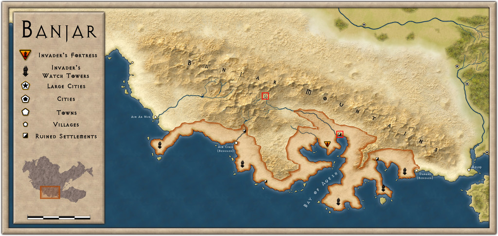
Despite that, picking a couple of suitable spots wasn't too difficult, using notes already provided from this zone for ideas (it's recently been invaded by mysterious assailants, who seem intent on slaughtering the tiny, sparse local populace, hence the ruined settlement markers and that ominous, creeping "conquest" line). It did though mean that my two selected settlements (shown by the tiny red squares on the above illustration) were going to need small area maps to better locate and describe them, aside from the "main" dungeon map. Each of those squares is really 20 miles on a side.
The "Crypts" dice map was to be first, and I opted for the inland site at the intact village in the heart of the Banjar Mountains for it, close to the headwaters of one of the two main rivers there, the one that drains into the Bay of Aqesh (my choice for the subsequent "Ruins" map was the ruined settlement near the mouth of that same river). So I began by mapping the dungeon, as that was already prepared in hand-scrawled form, and progressed outwards to the village, and then to the surrounding 20-mile area. Plus I also got distracted and did portraits for two of the main characters in the dungeon.
Here, we'll go from larger to smaller, starting with the 20-mile area map, called simply "Sussara" (which is also the name of the village):
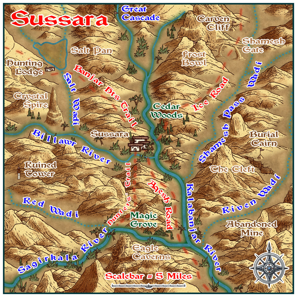
For what perhaps should be fairly obvious reasons, I selected the Scorching Sun Annual style for this map, labelled with the Vinque font from the 2015 CA. Quite a number of features, such as the various trails, and the names of the two nearby rivers, with Cedar Woods, had already been decided when completing the Sussara Village map. The other main river, the Sagirkala, was shown, though unnamed, on the Banjar Province map, as well as the main river, what I've called the Kalabanjar. However, the intermittent rivers were added to give a more complete look, with a range of extra elements decided from a couple of sets of random tables, notably those in the Atelier Clandestin book "Sandbox Generator" that I've mentioned, and used, before, adapted accordingly to suit this environment. As normal, there'll be PDF and text notes to accompany the map once in the Atlas, to explain a little more about the various features, and what some of the names mean.


-
Creating greater depth
There are various options for showing contouring beyond what's been discussed here, though some probably will work better, or with less effort, than others for this scale and type of map. The Fantasy Towns Annual issue might be the more suitable alternative to consider, which uses a version of shaded terrain using the transparent solid bitmap fills and bevel effects to generate a form of shaded terrain. I made extensive use of this style in mapping the Faerie City of Embra for the Community Atlas a couple of years ago, of which the "Hilly Places" maps are perhaps the more helpful to see some examples of what it can do (you can access the Atlas versions via the links in the last post at the end of the page, and also of course find the FCW files in the Atlas that way).
Shessar's Battlemat Tutorials (PDFs) provide another alternative, using cliffs drawn with symbols, and map shading, similarly to what you've been doing elsewhere using Sue's connecting cliff symbols, and not dissimilar to Sue's use of sheets in her famous Merelan City map.
Although it's more often used for larger-area overland maps, the various shaded relief options (again using bevel effects) may be worth exploring further, such as via the Shaded Relief Annual, or Hadrian VI's PDF tutorial.
Overall, nothing beats thinking things over and experimenting to see what works best for you, however!


-
[WIP] Community Atlas August Mapping Contest: Cloven House
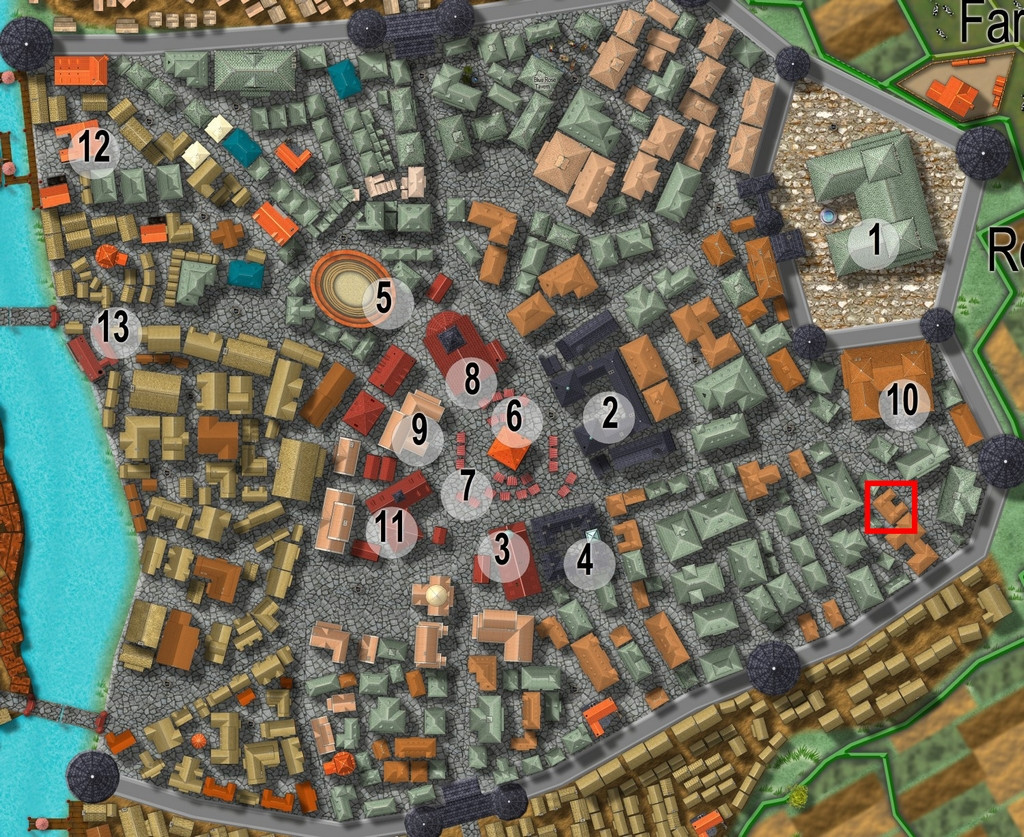
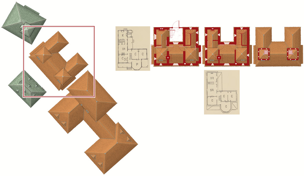
By the time I'd chosen a property to map the floorplans for from Vertshusen for this contest, I already had some ideas as to what it was going to be, and what mapping style I'd be going with. The chosen property is that marked by the red square in the SE corner of the walled area:
My initial thoughts had revolved around a haunted house theme, and because I've already done quite a bit of mapping for the Community Atlas using some of the more realistic floorplan styles, quickly decided I wanted to do something different. For me, part of the point in participating in the Atlas is to experiment with new ideas and different mapping styles.
Three possible styles were uppermost in mind, all very similar tech-drawing styles, the 1930s Travel Guide Floorplans from the April 2011 Cartographer's Annual, the 1800s Floorplans from April 2016, and the one I finally selected, the Dracula Dossier style from September 2015. Haunted house, after all!
However, I also took a look through the PDF of "Hobbs' Architecture", which was a recommended freely-available download from the Internet Archive site, mentioned in the mapping guide and webpage for the 1800s Floorplan style, to get a feel for what house layouts should look like and contain in this general type of map appearance.
The working title for the map was "The House That Wasn't There", as I had vague early ideas of creating a building that wasn't always there. Indeed, one initial concept had been to pick a completely empty space in the city, and map the house into that, only I couldn't find a space large enough!
Which building was chosen was partly down to something that looked interesting, that was also a little out of the way, and the final choice was swayed after I was drawn to one of the smaller buildings in "Hobbs'":
which just looked interesting, and had some features not dissimilar to the building in Vertshusen. The size and scaling weren't the same of course, as the Vertshusen buildings are uniformly tiny by contrast to the structures in "Hobbs'". It was a starting point though.
Having measured the house size on the Vertshusen FCW, I set up a suitable template in the Dracula Dossier style, and then directly imported (copy & pasted) the "Wasn't" House and its neighbouring properties, setting "my" house down in the centre of the map border area.
Of course, it's angled as originally drawn, and as others have commented in topics for this mapping contest already, that's not the friendliest layout for drawing rectilinear structures. So I copied the house again, and rotated it to better suit, and then copied that twice more (as my initial idea was for a ground floor plan, an upper floor plan, and a further plan for the two taller roof towers. I also imported copied scans from the Hobbs' book as reminders for the overall look of the plans, setting them up on their own Sheet with a Transparency Effect, so I could position them over the CD3 house roof and get a better idea of what might go where. And then started drawing. This illustrates where I'd got to with the drawings when I ran out of time yesterday:


-
Map critique
There's a possibility your system's showing "frames" (white lines connecting the nodes on a line or polygon). You can clear those from view using Ctrl + F, if memory serves (and if that's what was happening). It can be useful to show frames, as it makes picking out the nodes easier if you're trying to adjust them individually, but it quickly gets irritating when you're not doing that!
Nice-looking map, certainly!
If you're thinking of further tweaking beyond the point about the mountains (it's never easy deciding how much or how little you can cluster these things; it often depends on the style too, as some flow together better than others, and some styles won't overlap symbols properly), it might be worth adjusting the bitmap fill scaling for the woods and fields a little, to stop the repetition creeping in so much (most obvious in Evenwood), although that's quite a minor distraction once it catches your eye - so, sorry for mentioning it 😏😉...
I'd probably want to tweak the effect settings on the text too, especially the regional red labels that are fading into the terrain a little too much for my eye presently. Text tweaking is always one of the more difficult aspects of CC3+ mapping, as text is something the program doesn't handle as well as it might. It helps if you remember to set the fixed point before placing the text (albeit that gets a bit tedious if you need to change it every time), knowing the text may expand away from that point for different zoom and saved-image settings, or moving it about a little after placement, so that things like text on a curved line avoid having a letter over some key terrain element (always seems to happen for me...). I'd also be inclined to reduce the drop-shadow on the title text, and give that a somewhat broader outlining glow effect, just to help it stand out more than the "normal" text labels.
None of this is essential, or even all that significant, but you did invite comments!
-
Feature Suggestion Thread
We've had repeated discussions about submarine mapping styles on the Forum here. I've tinkered about with existing styles and a few additions of my own for use in the Community Atlas. I'd definitely love to see someone tackle these more fully, but am far from sure it'll happen in the short-term.
The main problems revolve around not having access to the same kind of imaging you can get easily for surface landforms, so it's much harder to create artistic symbols and fill styles, because these simply don't exist, and never have done. The Tharp style is fine, but essentially, this is all there is to draw upon of this type for the deep undersea environment especially, and it falls apart as soon as you try to use it for areas less than oceanic in scale, primarily because the detailed mapping to help also to a large extent doesn't exist (plus these maps are interpretations of instrumental readings, such as sonar, which don't give the same impression you would get if you saw the features in reality; the Tharp maps are calibrated and redrawn artistically to fit with more familiar visual landscape impressions - like using wall shadows in dungeons, say, even when you know those couldn't be really there).
There are undersea features that have no land-based equivalents, such as seamounts, trenches and mid-ocean ridges, much of which remain remarkably poorly-understood, often because the areas are difficult to access and impossible to image visually on anything beyond a very limited scale. Even trying to find a reliable drawing of what a single, fully-grown giant kelp looks like (they're usually far too big to image, at up to a couple of hundred metres in height), proved a nightmare when I tried to do so some years back for my Atlas symbols. Photo images show only bits at a time, or from oblique angles, because of the size issue, and the fact they grow in dense forests commonly makes it hard to tell which bit belongs to which kelp! It is possible to make an artistic interpretation, much as the overland styles often use slightly vague interpretations of trees, and it's that "vagueness" I relied on, certainly!
So yes, one more vote for more undersea mapping options (though I have voted for this repeatedly anyway 😁) - just don't hold your breath 😉!


-
Forest Trail project - part 1
After all - what would a walk through the forest be without the streams and the stepping stones?
Drier? 😉
![[Deleted User]](https://secure.gravatar.com/avatar/c75d9a245b74d9c59be0999ea81ca541/?default=https%3A%2F%2Fvanillicon.com%2F92add7f8c954488718110edc4896ad39_200.png&rating=g&size=200)
-
Community Atlas: Hopes Lost, Lampoteuo Region, Artemisia
Meanwhile, back at the topic in-hand...
Hunting for a potential Lower Level design meant checking through those unused from the Trailblazer dice, leading to one with suitable architecture and features being semi-randomly decided-upon, and mapped:
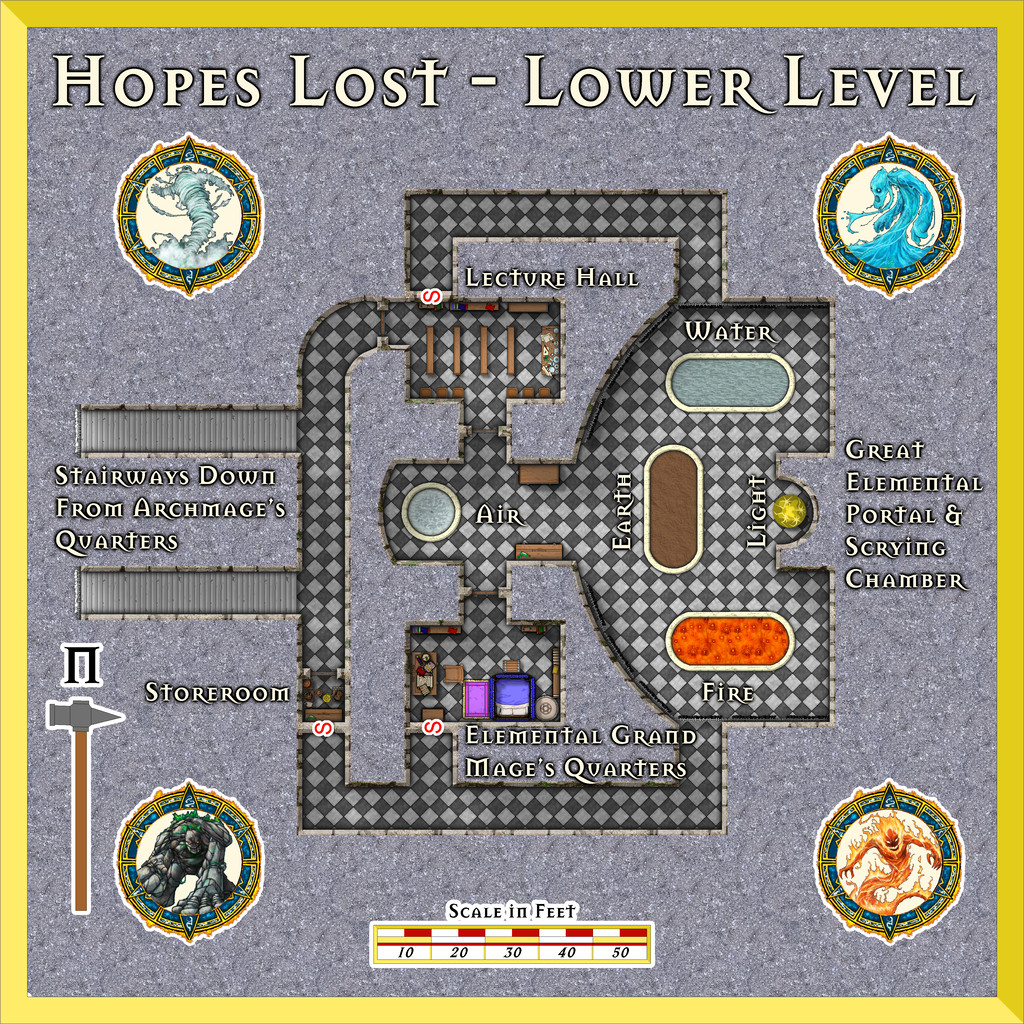
As a one-dice design, it did leave a bit of space around it, so picking the four elementals from the first Token Treasury set seemed an obvious decorative addition here. This time, I also opted to use the usual square-tile bitmap fill design for the chequered marble, now with that greyscale RGB Matrix Process effect I'd decided against for the Upper Level, because here, it IS the entire floor covering, so there's no unhelpful comparisons to be made with the "real" B&W marble textures. The Inkwell notes stated the design was diamond-form, and while I experimented with copy-and-pasted strips of my hand-drawn B&W marble chequer floor from the Upper Level, their sizing wouldn't fit evenly to the layout here. I then tried using the standard check fill for just the passageways and rooms, but trying to get those angled-by-edge to a neat 45° proved impossible for the shapes involved. So in the end, I just drew a large rectangle, rotated it, and then changed the design with angle-by-edge (and got rid of the roof shading look too, naturally).
This does lose the mild glow effect on the floor edges where they ordinarily meet the walls, although as I'd already left some pale shadow effects on the Upper Level walls anyway (which began as I wanted the external cliffs to have shadows on the outside), that shadowing, with the wall glows, seemed to work sufficiently well anyway. I don't often use shadows for dungeon maps, but in this case, they seemed to help everywhere.
Of course, there are elementals here, and the "pools" can be opened as scrying devices to their linked planes, as well as gates into them. If you look closely at the Elemental Grand Mage's Quarters (probably easiest on the Gallery version), you'll find how my attempt at making the view of a "roofless" four-poster bed turned out, as mentioned elsewhere on the Forum a few weeks ago.
Next time, it's back to northern Alarius, to find a spot somewhere in the Emerald Crown Forest region...

-
Community Atlas: Temple of Nidag, Stormwatch, Emerald Crown Forest, Alarius
The starting-point for the subterranean map was to save a fresh copy of the surface map that still had the line drawing of the underground setting in it, and then delete everything that didn't relate to the access-points from the surface drawing. The overall map background was changed to a brown stone bitmap fill along the way, and, so I didn't forget what I was doing, or indeed forget to do it later, the map title was amended too:
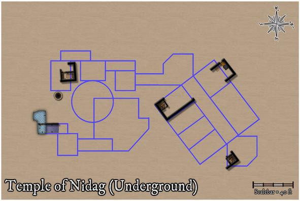
Also left here is the well from Maleng Square, given the shaft below would naturally pass-by this below-ground level. The other well on the surface map, at Bennart Cross, is too far from this underground level to worry about adding it. The surface wall lines and floor textures were simply left as reminders of how the access-points were laid-out in the earlier maps, and were to be removed subsequently.
Next was filling-in the wall lines, with the first subterranean floor textures, around those access points, and disposing of the unneeded surface elements:
All the northern area's walls have been added, given there are three separate access-points into this part of the complex. The spiral stair in the rectangular room has been walled-off with its own door, and more doors have been added to the two southernmost access route areas, with some extra wall-torches for the temple stairwell.
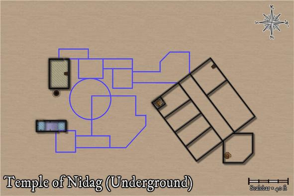
Effects on the wall lines were still the same as the surface ones at this point, hence the shadows. I hadn't been sure if these would still work satisfactorily, if with added wall masks, and this view convinced me they probably wouldn't, particularly with the outer glow on the floors as well, making the wall lines and shadows overall too dense. These were swiftly amended, and the rest of the upper part of the temple completed to give a better idea of how this would look:
I decided when preparing the surface map that blue was going to be the dominant colour for the pretend-good temple, and started to think at this point too that floor colourings might help enhance the different underground depths at which different parts of this level were intended to be. The blue area here also has no direct connection with any of the rest, except for the unseen drop-shaft below the altar. While said altar isn't as symmetrically-placed with respect to the deeper circular chamber any more, I'd rather taken to the idea that there would be imperfections in the overall designs involved, hinting that perhaps all was not well. Thus some of the upper wall-lines aren't quite true in the surface buildings - many were drawn purely by-eye deliberately for that. Aside from the fact this is a rather rough-and-ready part of the surface town, built outside the walls.
As ideas coalesced around this facet, my explanation for the complexity of the subterranean parts was that they'd been dug-out, or were created using existing surface hollows and hummocks, as the area was being developed by individuals and teams, the original temple group doing much of their own work, in digging out "cellars" for their surface properties, if oddly deep ones in places (obviously, trying to find an alternative well 😉).
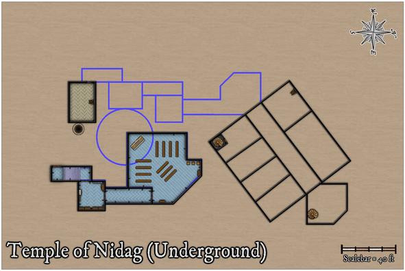
Moving ahead, the final wall-line conversions were carried out:
Followed by a more protracted spell of adding floor textures, staircases and doors to the western, in parts deepest, segment:
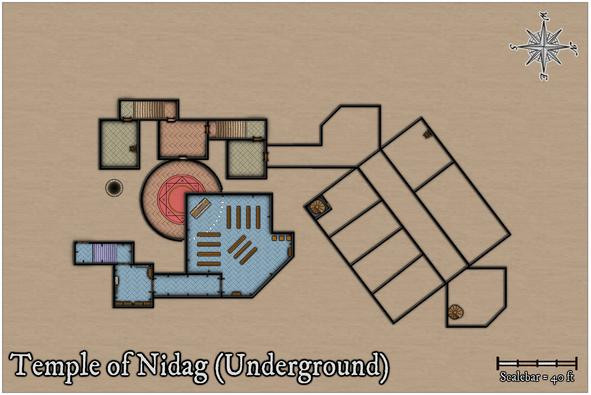
Apart from the new additions, after toying with the idea of a separate well-shaft access-point, ultimately, I decided to shrink the room nearest it instead, given the shaft had probably been sunk some while before the "cellar construction" had begun hereabouts. The segment of wall for the circular chamber below the upper temple has been changed to indicate that now, and the idea of using different floor textures to help show different vertical levels was continued in this area.
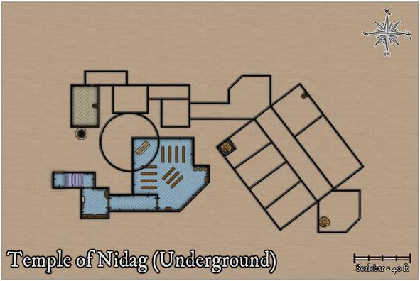
Progressing with this ran into problems for the final section, however, as adding one of the diagonal-tile bitmap fills to the connecting passage-room north of this freshly-completed part showed the northeastern wall-angle for the diagonal link into the large rectangular area was off. While something I already sort-of knew, it was one of those things easily forgotten until reality strikes! So currently, I've gone with something rather plainer in texture for the passageways only:
A few more adjustments have been made here too, because that northeastern end chamber not only had a forgotten extra wall line in it for a second chamber there, but its wall-lines didn't quite marry-up with the broad "corridor" trending away to the southwest either. Now though, I'm less happy with the placement of the spiral staircase in that northeastern room, which I think needs changing. The staircase has to be where it is to match the surface buildings, so the subterranean wall lines will have to be moved. Again!
One other element isn't demonstrated by these images. Somewhat like the upper floors on the surface level, the glows between, here, the walls and floors, have shown an irritating tendency to interact badly with one another in places, so an intervening sheet with copied, colour-changed, wall-lines with no effects on has been emplaced between the walls and floors ones to prevent that happening. That though can only be done once the doors have been cut through the walls, and while the res probably doesn't show it, doors have been added in the illustration above.
Still to do: complete the last area, fit-out the whole with more furniture, then worry about labelling, and whether the area surrounding the mapped region still needs to be quite so large. Thus, some way to go...

-
Richard Baker's World Builder's Guide Map Templates
OK. I think this might be what you're remembering: World Builder's Guidebook Templates, drawn by Walter E Starr.
They're in the old ProFantasy Map Library. Although this is still on the PF website, it's not easy to find, as there's no direct link to it from the site any longer. Luckily, there are links on some of the Forum topics, providing you can remember where to look...
Hope that solves the problem!

-
Mixing curves and straight lines?
It may be worth noting that using the "C" = corner command to add extra nodes can sometimes create problems because of the extra nodes very close together this generates, and you can end up with unwanted extra lines you didn't create apparently linking unconnected parts of the line to one another. You may only see these at certain zoom levels when viewing the CC3+ map, but if you can see them, they'll often export if you try to save an image, or print it out. This is far more likely to happen with fractal lines or polygons than smooth ones, as they have far more nodes in general, but that "C" command isn't always problem-free either, unfortunately.