[WIP] Community Atlas August Mapping Contest: Cloven House
 Wyvern
🖼️ 284 images Cartographer
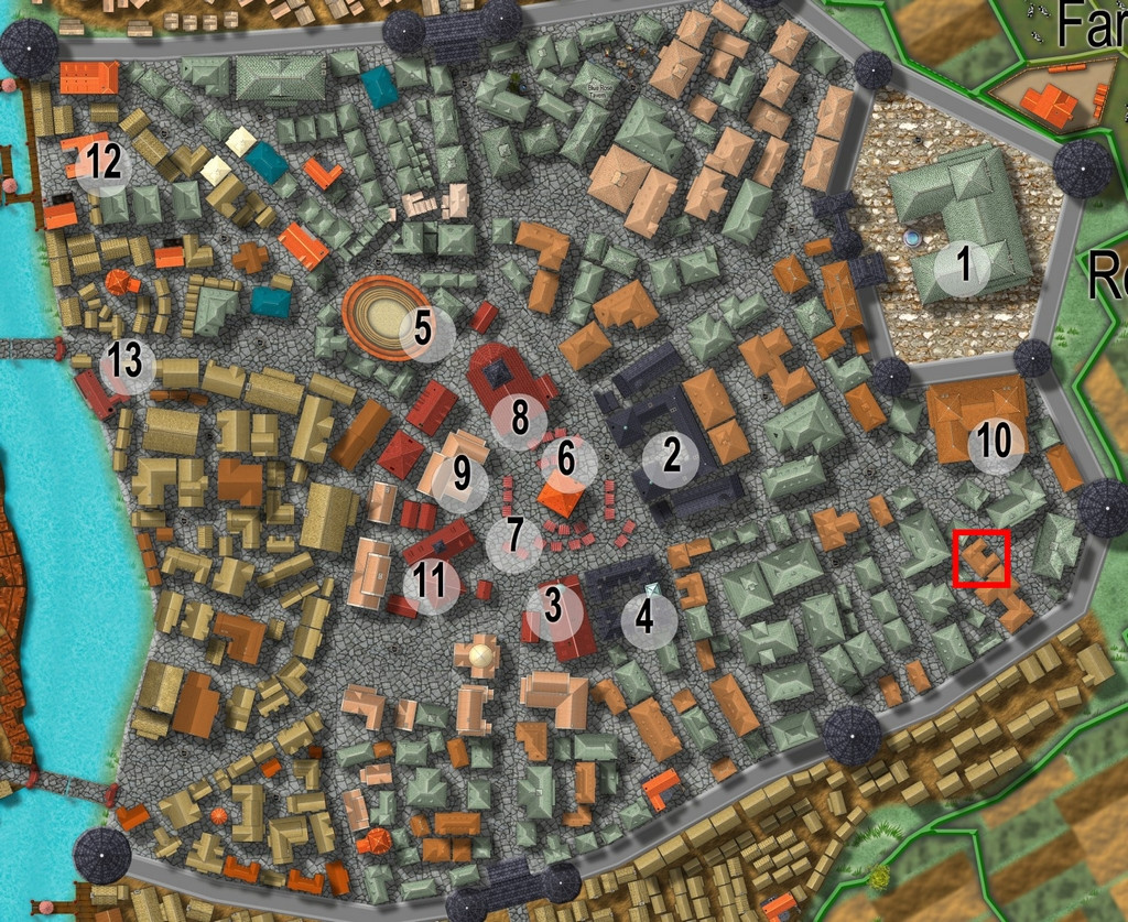
By the time I'd chosen a property to map the floorplans for from Vertshusen for this contest, I already had some ideas as to what it was going to be, and what mapping style I'd be going with. The chosen property is that marked by the red square in the SE corner of the walled area:
My initial thoughts had revolved around a haunted house theme, and because I've already done quite a bit of mapping for the Community Atlas using some of the more realistic floorplan styles, quickly decided I wanted to do something different. For me, part of the point in participating in the Atlas is to experiment with new ideas and different mapping styles.
Three possible styles were uppermost in mind, all very similar tech-drawing styles, the 1930s Travel Guide Floorplans from the April 2011 Cartographer's Annual, the 1800s Floorplans from April 2016, and the one I finally selected, the Dracula Dossier style from September 2015. Haunted house, after all!
However, I also took a look through the PDF of "Hobbs' Architecture", which was a recommended freely-available download from the Internet Archive site, mentioned in the mapping guide and webpage for the 1800s Floorplan style, to get a feel for what house layouts should look like and contain in this general type of map appearance.
The working title for the map was "The House That Wasn't There", as I had vague early ideas of creating a building that wasn't always there. Indeed, one initial concept had been to pick a completely empty space in the city, and map the house into that, only I couldn't find a space large enough!
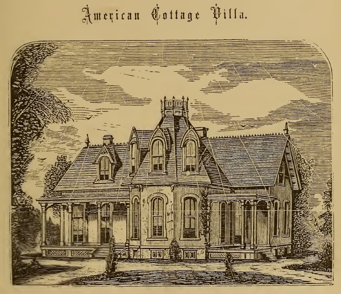
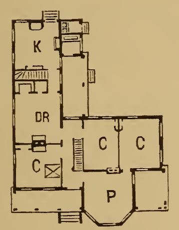
Which building was chosen was partly down to something that looked interesting, that was also a little out of the way, and the final choice was swayed after I was drawn to one of the smaller buildings in "Hobbs'":
which just looked interesting, and had some features not dissimilar to the building in Vertshusen. The size and scaling weren't the same of course, as the Vertshusen buildings are uniformly tiny by contrast to the structures in "Hobbs'". It was a starting point though.
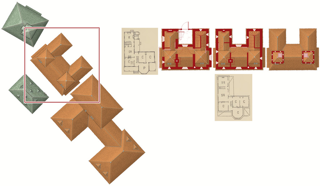
Having measured the house size on the Vertshusen FCW, I set up a suitable template in the Dracula Dossier style, and then directly imported (copy & pasted) the "Wasn't" House and its neighbouring properties, setting "my" house down in the centre of the map border area.
Of course, it's angled as originally drawn, and as others have commented in topics for this mapping contest already, that's not the friendliest layout for drawing rectilinear structures. So I copied the house again, and rotated it to better suit, and then copied that twice more (as my initial idea was for a ground floor plan, an upper floor plan, and a further plan for the two taller roof towers. I also imported copied scans from the Hobbs' book as reminders for the overall look of the plans, setting them up on their own Sheet with a Transparency Effect, so I could position them over the CD3 house roof and get a better idea of what might go where. And then started drawing. This illustrates where I'd got to with the drawings when I ran out of time yesterday:




Comments
Today, I've managed more, and relatively speaking, things have moved on some way from that. This is with the CD3 rooftop bitmaps still showing:
and this is it without:
Clearly, there's still lots to do - the roofing needs adding over the lower floor extension and porch on the upper floor plan, for instance, and other items need adding and tweaking in places. Such as a scale and the labelling! Plus I've decided life will be easier to reorient the north direction than the floorplans, and have rotated the surrounding buildings (or now technically building blanks) to suit that.
At some point, I'll need to work up some notes to go with this for the Atlas of course, though the map has the sharper deadline, obviously. The observant may notice the grille in the cellar. The local ghouls like to use the fabulous sewer network to get about unseen, especially after they created tunnels between the sewers and the cemetery beyond the city's northern wall. The ambiance of this haunted house - I'm thinking now "Cloven House" currently - and the fact nobody comes near the place ordinarily, makes it ideal for their feasts!
Looking great already :)
Oops, forgot to mention that I found a small glitch with the fill styles in Dracula's Dossier. The "Floor, Roof S" (= roof tile south-facing) tool is using the west style's fill, so needs swapping out (the "Roof 270" style needs replacing with the "Roof 180" one when you have the Fill Style Properties window open, essentially).
As this map's so small in scale, I had quite a battle getting the fill styles rescaled correctly more generally, especially the cobbled flooring for the backyard, which has a "Fog" fill that overlies the cobbles, to make them look worn and damaged. The Fog was so dense, all it showed as was white until I'd scaled it down to something I felt sure would be too tiny to work!
And thanks Sue!
If you would be kind enough to let Tech Support know, Wyvern?
That's similar to what I ran into, Wyvern. The tiny little house I mapped is only about 2 meters x 2 meters - a much smaller map than the Schley styles were set up for. I left the cobblestone fill outside set to the normal size, since that wouldn't change based on house size. But I had to resize the wood floor fill, and had to mess with the glow and shadows to get them to look right.
Less time than I'd hoped today for mapping, but a bit more progress, and things are starting to look a little more organised. Sort of!
Yes, I know the alignments aren't all quite the same between the different boxes. I ended up sorting things together for an image too rapidly and didn't have time for fine-tuning! However, the main part of the drawing's done now, and although the Dracula Dossier style doesn't usually use much, if anything, by way of effects, I felt the roofs looked too flat without some shadows, so much of today's effort went into getting those to look acceptable, subject to further tweaking, as ever (the roof towers stand out quite nicely now; perhaps a little too strongly though). The sixth, empty, box is there for a reason, mostly that it's currently anchoring the 0,0 point, so I don't forget where it is. The final layout's still not fixed in my mind, never mind in the drawing!
Away from the drawing, I've also been jotting down some notes for the Atlas PDF and textfile description, since that may have implications for features on the plans as well. One new item has already been added as a direct result of that. Not saying what, though it is fairly obvious in comparing yesterday's images to this one!
Also, and not sure if it may be something I've done or not, but the style doesn't seem to load the Dossier's symbols on opening the map. I noticed it yesterday too, and forgot to say then. I had a quick look at the On Open macro, and there may be an error in that, as it points at Symbols\Modern\Floorplans\Dracula_Symbols.FSC, whereas I think it should be pointing at Symbols\Modern\Floorplans\Dracula Dossier\Simple.FSC (according to the notes in the PDF mapping guide, at least; probably also should be "Dracula_Dossier"?). Haven't tried changing the On Open macro yet to check - time again! - and I'm no expert, but maybe someone else here could give it a try to see?
Sorry @Loopysue, didn't see your message earlier and haven't done that yet, though it looks as if there may be something else to sort for this style pack now anyway!
@Maidhc O Casain - I'm not sure I've ever mapped something that hasn't needed some kind of tweaking like this, either to change the look of a fill style, or tweak the effects, and that can sometimes be quite a battle. I think it's not really being sure what some of the parameters you can change mean in terms of whatever mapping scale you're using. The fact some of the effects work to completely different methods than what they seem to (the classic being the percentages for glow strengths and so forth, which actually go only in 12.5% steps) just complicates matters more!
More time today, and first-off, I checked the On New Macro as well as the On Open one, as I was fairly sure when I started the new file for this map, the Simple symbols set had indeed loaded. Which is where I discovered this was indeed the case, and that the correct CATALOG line should be :
@Symbols\Modern\Floorplans\Dracula Dossier\Simple.FSC
and not:
@Symbols\Modern\Floorplans\Dracula_Symbols.FSC.
The macro's easy enough to change in an existing map file drawn in this style using the edit facility. You can open it from the Drawing Properties icon on the top toolbar via "Settings - Map Notes", which brings up the "Select Note" pane.
Choose "OnNewMacro" and click "Edit", from where you can copy the last typed line with the correct location for the Dracula Dossier "Simple" symbols catalogue file.
Close the OnNewMacro without making any changes, and open the OnOpenMacro one the same way, then simply paste the copied text line over the last typed line there to correct it.
Before clicking "OK" to close the macro edit pane, make sure there is ONLY ONE BLANK LINE immediately below the typed line you've just replaced (try to move your cursor further down using the arrow key). If there is more than one, delete it, as if there's anything other than a single blank line there, the macro will become confused and sulk mightily at you! (That is, it won't work properly; note there MUST be one blank line there, however.)
Then save the file. You can check it's working by closing the file you've just saved and reopening it, where the 10 items in the Simple catalogue should now be showing in the symbols catalogue panel to the left of your drawing window in CC3+.
Meanwhile, back at the mapping, more progress, more battles!
Two main challenges today, firstly to get everything correctly aligned and pulled together into a single coherent map (I hope!). I decided that this simple style didn't justify a string of separate maps for each level in the building, so, as probably suggested by yesterday's image, I wanted to present everything on just the one drawing. This is the current state of play, now complete with labels:
I very nearly slipped-up on the labelling, as the original style on which the CC3+ Dracula Dossier style is based, uses the Blanch Caps font, which was linked from the Annual's PDF mapping guide, and which of course, being freely available online, I'd already downloaded and installed back in 2015. However, the font isn't available for free redistribution, so instead ProFantasy had substituted the similar free Franks font. As this map's intended for the Community Atlas, fonts not available with PF products or a standard Windows 10 installation can't be used (well, they can, but you have to explode the text to become polygons, so you can't change it as with normal text afterwards). Of course, the default font is set as Blanch Caps if it's available, so there was very nearly an "oops" moment, followed by Naughty Language, had I gone ahead with that! Franks it is though!
The second challenge was getting the scalebar correctly rescaled and then labelled. For reasons I won't pretend to understand, the scalebar symbol doesn't have equal divisions along its length, so trying to rescale it exactly to the scale grid, when all you can see is a ghostly outline in places when you move it proved, shall we say, trying... There may even have been an N.L. moment or two! Once it was finally sorted, I measured the irregular divisions, which turned out to be 0.8 metres long, something that still leaves me mystified. Perhaps something important from the original Dracula Dossier RPG book though (as I don't have that).
If you think the Cellar plan looks a little empty, you might be right:
There's a walled-up low cave concealed on the SECRET Layer, with the tops of some very ancient, worn, partly inscribed standing stones visible in its floor, one of which (admittedly smaller than it was yesterday now!) has been built into the actual cellar wall, and protrudes somewhat from it. The idea is this ancient circle, dating to long before the city was built here, is at least part of what's causing this house to be haunted and abandoned now. As well as such a favourite spot for ghoul feasts, naturally. The "S" = secret door, isn't technically a door at all, but a walled-up thinner part of the cellar wall, so it's obviously been used for access to the cave at some earlier time, and then deliberately sealed later, so it can't be told from the normal stone walls in the cellar now.
Still plenty to do though, more tweaking primarily, plus getting the notes typed up, and maybe adding some missing or slipped tiles on that roof. The house is meant to be boarded-up and shunned by the locals nearby, after all.
I know not everyone likes to provide typed notes to go with their Atlas maps, and that's fair enough. However, and partly I suppose because I've been designing RPG scenarios with both maps and written descriptions since I first discovered the original D&D booklets, it's something I like to do. I find moreover that both facets work together to create more detailed settings overall. So it wasn't a huge surprise that when I began typing-up my notes for this map yesterday, I started realising I'd missed something in the floorplans.
So, a bit of extra drawing, moving things around and so forth, beyond what I was anticipating in my comments here earlier, and now we have this version - normal first, then with the secret cave below:
Most of the changes are along the top row of drawings, with a few "missing teeth" scattered across the roofs now, and adding the chimney stacks, but they're mainly in the central plan, where we have an entire Loft and a new access door from the South Tower now. The Loft doesn't extend right out to the edge of the tiled roof, because I wanted to show only where access is practical - often just as a crawlspace - for creatures the size and form of a typical adult human, something that'll be explained in the notes.
Further tweaking is still required of course, and I'm sure I'll spot other things that need adjusting before this is done, aside from finishing-off typing in the notes. That got sidetracked when I decided I needed to add the Loft! Plus this is already the third iteration of how the Loft should look, as things developed and changed along the way. "Color Key" is your friend when suddenly deciding you need a major rejig of this sort, is all I can say!
Although I've already posted about this in the contest topic, to round-off this WIP topic too, here are the final versions of Cloven House, without and with its secret Cellar cave, now with added cupboard under the Cellar stairs:
For those who might be interested, and again something that's in the contest entry topic too, I've attached here the PDF notes for the map, which will be in the Atlas version in the fullness of time, for those wanting an early preview of this little haunted house:
Do be aware that there's a hint of "adults only" about a couple of the potential apparitions and other ghoulish elements in these notes. Nothing too salacious, just something to be aware of.
Incidentally, anyone thinking I might have abandoned my preference for random design mechanics in devising my Atlas maps in this instance, might be reassured that there were hints of that in selecting what ghostly items to pick from in constructing this description (I have a long list drawn from numerous past sources and ideas!). Such a mechanism was used less here than in other features I've designed previously, however.
And good luck to all the other contest entrants, especially those struggling to get things finished by the deadline!