


Wyvern
Wyvern
About
- Username
- Wyvern
- Joined
- Visits
- 3,302
- Last Active
- Roles
- Member
- Points
- 5,647
- Rank
- Cartographer
- Badges
- 24
Latest Images
-
A. Wainwright's Walking Guide Map Style
A repeat of a TV series on hill-walking in the British Isles this past week reminded me of another mapping style that might be worth examining here, a hand-drawn pen and ink style developed by the author and artist A. Wainwright for his extensive series of seven walking guides to the fells of the Lake District, published between 1955 and 1966, based on his own hill-walking, sketching and researching, beginning in the 1930s. While drawing heavily on the UK's Ordnance Survey maps, his own maps take a more pictorial view of the landscape. This is a typical double-page spread, extracted from this Eye Magazine webpage (itself worth a read - and to see another of Wainwright's mapping techniques, showing the distance and direction of other peaks from a given place):
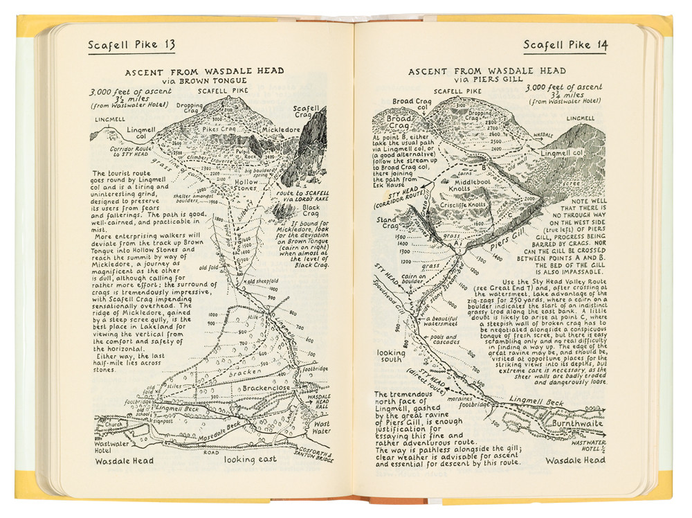
Yes, the books are also all neatly hand-written, not typeset as well!
What we have is a largely top-down view of the landscape, complete with contour lines, but the hilltops themselves are turned ideoplastically to be as seen in profile when approaching from below in the direction shown, and are often much more artistically drawn.
The books remain in-print, now in updated versions, while still presented in exactly this style, mostly as created by Wainwright himself (who sadly died in 1991, three days after his 84th birthday). The only main difference is now the recommended paths are shown as dashed lines of different styles in red, not black, as here (from the images shown on this Needle Sports webshop page):
Much of this could be accomplished using CC3+ now, of course, barring the artistic hilltop aspects, although it might be interesting to have it cast as a specific style at some point, especially as it highlights small regions only, rarely more than a couple of miles (3 kilometres or so) across. (I know B&W mapping styles are often less-favoured, unfortunately, albeit not by me!)
There are more examples, and further details about the man and his guides on this Wikipedia page and on the Wainwright.org website.


-
Ferraris Style MERGE Layer Problem
I discovered when using the Ferraris Style (CA158) over the weekend that clicking any of the symbol catalogue icons, except the Minerals/Mountains one, automatically changes the Layer to MERGE. Clicking to change the symbol catalogue by the manual system (the button between the "Options..." button and the currently-visible symbols) does not force this change however, keeping the Layer as whatever is currently chosen.
For anyone unaware, having any new items added to the MERGE Layer is an extraordinarily bad idea, as this Layer is part of what helps control the map effects. Unfortunately, it's very easy to accidentally do this because of this unexpected defaulting with this style.
Luckily, I spotted it before I'd added more than a few symbols, although it took a while to discover it affected all but one of the catalogue icons, and it was easily remedied, but ths behaviour is something prospective users should be aware of!


-
Great Western Railway "Legends" Pictorial Map
The UK press in the last couple of weeks has been running adverts for the Great Western Railway, one of the privately-owned British railway companies, that runs train services between London, Southwest England and South Wales. Ordinarily, this would naturally attract no attention here, of course. However, they've been using a pictorial map to do so. This one:
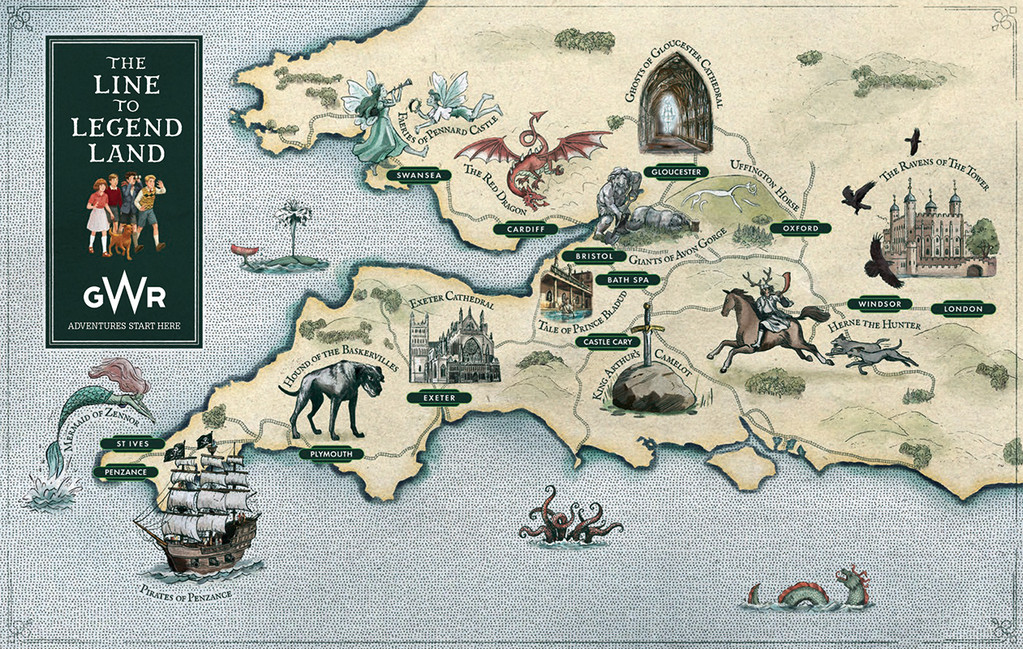
Which perhaps is of rather greater interest!
I'm never sure if folks outside the UK will be able to access the online sources involved, but the map and the press-marketing story behind it came from this webpage.
When I started digging around today to find a copy of the map to post here though, I discovered there are actually now TWO such maps, and they're not quite the same! The alternate one is shown on this webpage (again, same caveats as before for non-UK viewers, although this is part of the GWR website, not a separate marketing one), which has folklore notes on some of the sites involved, and also a link to a supposedly free download of an accompanying book (although the page it goes to has no download option; you can view the book there and flip/read right through it, however). This alternate map looks like this:
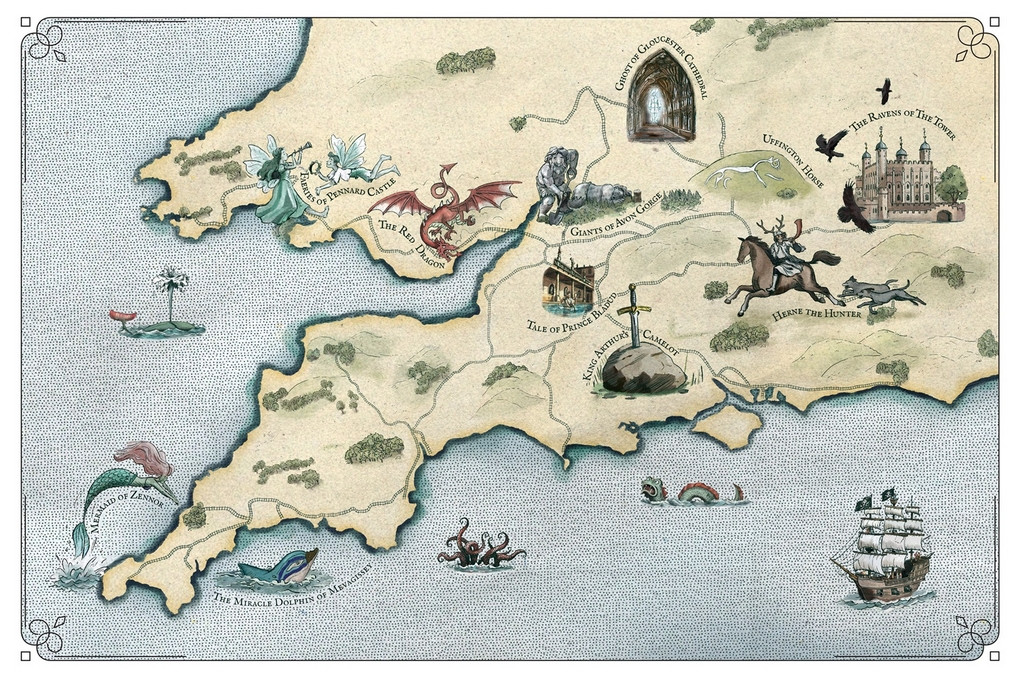
Fewer points of interest, and no railway station names on this one, but just as interesting as a pictorial map, I think.

-
Community Atlas: Oracle Mountains Area, Ruma Helrevy, Peredur
One thing I forgot to mention last time was the map's frame. While this may seem rather broad, I'd already cut it down in size by this point, and changed the effects on it. Initially, there was an unusual, quite strong, use of the Edge Fade, Inner effect set up on the MAP BORDER sheet, along with a Blur. While this seemed OK when zoomed right out, closer-to, it started to look odd, with a vague mistiness due to the fade extending some way into the drawing. I swapped that out for a basic Bevel effect, and reduced the Blur somewhat, which is what's seen here.
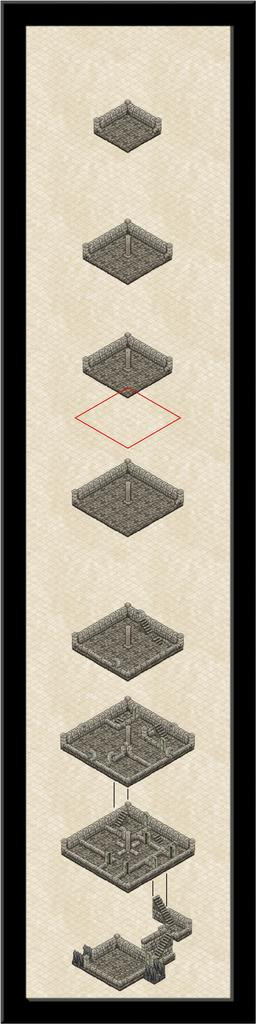
Back at the mapping, I started using some simple linear templates to help me get a better feeling for the sizes and placements of various features as the drawing proceeded. This is very much a WIP shot giving an idea of what this meant in practice:
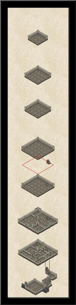
Also seen here (just!) is that the staircase in the "front" room has been shifted towards the back wall of that second above-ground level, that resizing of all the subsequent levels has been completed, a new staircase embedded into the floor of level three and placed on level two, with a red-line diamond and staircase just above level three, to illustrate how I was using that template to set-up the staircase placements. As the floor space decreases with height per alternate level, the red diamond shape is the size of the floor above, which, after placing the stairs on the next level above, is then moved down with a copy of the stairs to make sure they'll be in the right spot on the lower level, so as to pass through the floor above, and not drift off into space!
Looking closely, you may notice too that I've somehow managed to accidentally copy and paste a 10-foot floor tile in all this, tucked behind most of the top corner of level two here... There's so much to concentrate on with these isometric drawings, it's easy to lose track of things like this, particularly when coupled with the difficulties of clicking the right symbols when you want to move, reorder or copy them.
A little further on now, still with the drifting red-line diamond (having everything vertically aligned here was important, so as to be able to simply use the Ortho option when copying and moving things around, in conjunction with the snap grids. Often this was the 5-foot isometric grid, although the separation of the levels was done using the 10-foot, 2 snaps, square grid:
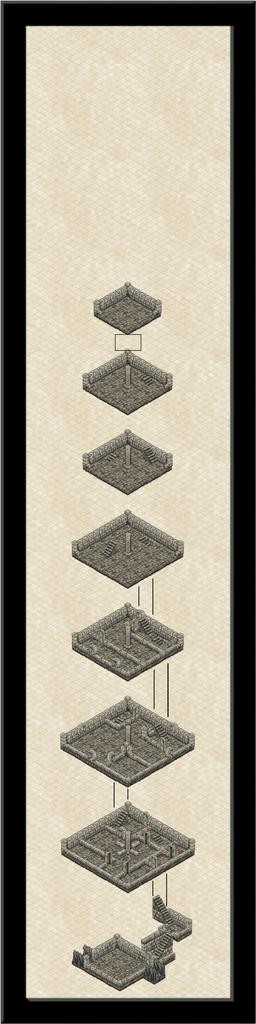
Progress here involved adding that great central pillar to most of the upper levels and the linking lines between levels one and two, completing the internal wall lines for level two, and adding the outer walls plus "windows" on level three, as well as sliding it down nearer the other levels. It was becoming clearer now that this overall drawing panel was going to be shrunk quite considerably in its final form, but for now, it was fine to have plenty of space to move things around in. I was starting to have doubts about that smallest, top level though.
Another session brought me to this stage:
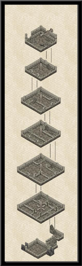
All the levels have been brought into their final locations, more or less, the stairs emplaced except up to that topmost level (which probably now won't survive), and the red diamond has gone, replaced by a black rectangle, a guide for keeping the level separations straight. It's also clear how much space can be removed at the top of the drawing, and the frame is starting to feel quite oppressive here, as too dominant compared to the interior drawing.
The penultimate session achieved this stage, just before all the labelling and fine-tuning, but after the frame's final resizing:
That small upper level has gone, replaced instead with a double-height level six one instead, where the pillar structure angles over to connect with the vanes on the outside. Token efforts to show part of the vanes using repurposed symbols or drawn lines came to nothing, unfortunately. The symbol orientations are too limited and with too few options to construct something suitable, and the available space meant the kind of sketchy lines possible never looked right. It had been a battle to get the ruined uppermost level to look reasonable as it was - again, the symbols available aren't designed for ruined exterior walls, so I just did what I could. There's also an unfortunate "tide-mark" because of the wall-colouring that darkens at the base, and which looks messy when stacked like this to give a double-height chamber.
Hopefully, the labelling helps distract a little from such imperfections. Two versions, one with, one without, the isometric 5-foot grid (which is only labelled when the grid is shown):
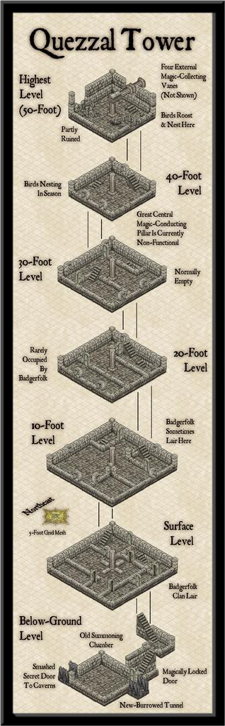
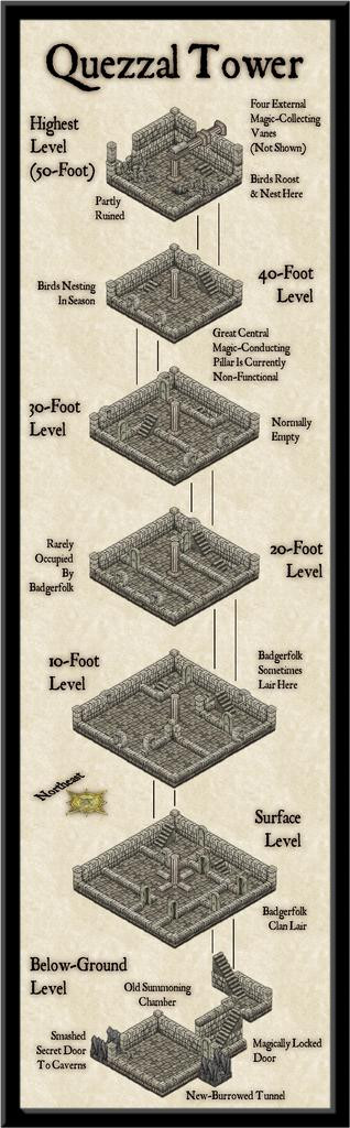
I thickened up the grid lines a little from their default zero-width, so they'd show-up on higher-res images, and also added one of the compass roses available in this style. That was then labelled using the technique outlined in the mapping guide to the Ancient Tombs Part 2 Annual, using the Perspectives 3 3D projection mechanism on exploded text. It is somewhat unfortunate that the labelled orientation has to be northeast, not due north, but within the limitations of what's available, that was unavoidable! There'll be some descriptive notes to go with the drawing in the Atlas too, and higher-res versions with and without the grid are in my Forum Gallery as well. These are amazingly tiny files, for once!
Next time, we begin the delve underground to see where that Old Summoning Chamber leads to...
-
[WIP] The Royal Chapel
Just settle for a mouth organ instead 😉.

