


Wyvern
Wyvern
About
- Username
- Wyvern
- Joined
- Visits
- 3,266
- Last Active
- Roles
- Member
- Points
- 5,585
- Rank
- Cartographer
- Badges
- 24
Latest Images


-
Winter Trail Project
The lower cliff edges could perhaps do with something to help them "sit down" in the terrain better; they have rather too crisp an edge currently, whereas in reality, there'd be some snow drifted or fallen around the base to make the edge a bit more irregular.


-
Community Atlas: The TlokPik Area of Nga-Whenuatoto
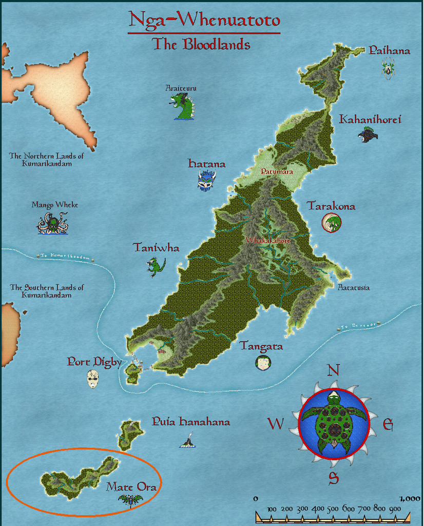
Hopping to the next continent east from my sojourn in Kumarikandam last month, took my sort-of Dungeon24 project (see this earlier topic for details) to the archipelago of Nga-Whenuatoto, and specifically the southernmost island in the chain, Mate Ora, as this was where the third of the Inkwell Dice "Crypts" set of designs had been randomly allocated.
Part of the design the Crypts dice had generated included the interior of a pyramidal structure. Later in the process of rolling-up the full set of base map designs, I discovered that the "Cities" and "Ruins" dice sets had identical patterns, except that the Ruins dice had parts of their designs - as you might expect - in ruins. This created a minor complication, since as mentioned before, I was intending to avoid using duplicates of the same dice design for the full set of base maps. Doing this for the Cities and Ruins sets meant I ended up with just four Ruins designs unused, and as luck had it, each of those had a single major feature on it. Since ruins are a handy feature found on many fantasy maps overall, I opted to add all four of these single-dice drawings to the final set of base maps. One of which was a central ziggurat with the same number of external "steps" as the interior from the Crypts set. So it seemed useful to combine both designs for these Mate Ora maps.
All that remained for the planning stage was to select a suitable ruin on Mate Ora, and I found one in the northeastern part of the island that seemed to fit what I'd begun thinking of:
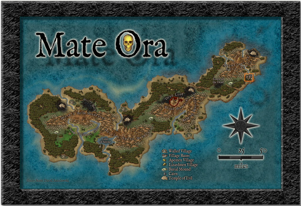
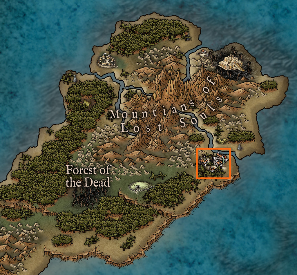
Mate Ora has a reputation as the Land of the (Living) Dead, so it was obvious the tombs here were going to be a little unquiet, and following a few more random rolls on suitable tables, and a bit of consideration, I decided on the primary denizen being a lich, but one who was trapped at the ruin site. From the map scale, it's clear that the orange rectangle shown above is about 9 by 8 miles in size, so the ruined village shown was going to be just one small feature within that area, and that I'd be looking at creating three maps, for the local area, the ruined village and only then the subterranean tombs. There's an ape-folk village just across the sea inlet from my selected site, and it seemed natural they'd have learnt to avoid this area, and would have named it.
I toyed with the idea of something vaguely Maori for the names, given this applies to the rest of the archipelago, only to decide against it, given how isolated and shunned Mate Ora has become, thanks to its fearsome reputation. However, I still wanted something a little out of the ordinary, so thought the ape-folk language might well consist of elements such as tongue-clicks and throaty sounds. So the village became TlokPik, or Yhangha (as the lich prefers), and the local area map took its name from the former version of the village name. As a translation, I went with TlokPik as meaning something like "Jungle hill(s)/burial mounds where the (living) dead walk", and for the ape-folk to treat it as a kind of taboo term, a place to be avoided.
The area map, while based on the terrain shown on the Mate Ora map, had a number of random additions, and others, applied. For this Mate Ora set of maps too, I drew on a broad selection of random table options, some of my own, some from the Atelier Clandestin "Sandbox Generator" used before, some from the Index Card RPG (Master Edition) by Runehammer Games, but still more this time were sourced from two newly-arrived RPG books from Kickstarters that have delivered in hardcopy during the last few weeks, the main Shadowdark RPG rulebook from the Arcane Library and Monte Cook Games' The Weird (which latter is a massive RPG sourcebook of purely random-idea tables).
Thus finally we arrive at the TlokPik Area Map:
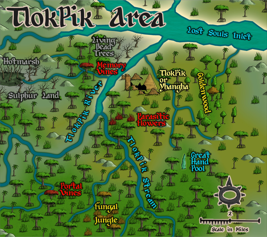
As ever, PDF and text notes will accompany this map, to explain a little more what the names refer to. For the map drawing, I needed some overland style jungle options, and settled upon the Myrklund style from the Cartographer's Annual. The options even so are a little limited, but this set does have varicolor versions of the jungle symbols too, which I needed to better highlight some of the specific features.
However, it might be helpful to see a few more styles better able to handle overland areas of this smaller size (less than 20 miles or so in either dimension), with a greater range of symbol options especially. Just two or three other drawings for jungle (not palm!) trees would have been a great help here, I felt, even though I was able to add a small patch of deciduous woods as well, thanks to one of the random rolls.

-
[WIP] Community Atlas August Mapping Contest: Cloven House
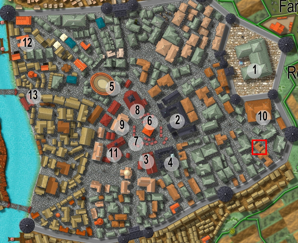
By the time I'd chosen a property to map the floorplans for from Vertshusen for this contest, I already had some ideas as to what it was going to be, and what mapping style I'd be going with. The chosen property is that marked by the red square in the SE corner of the walled area:
My initial thoughts had revolved around a haunted house theme, and because I've already done quite a bit of mapping for the Community Atlas using some of the more realistic floorplan styles, quickly decided I wanted to do something different. For me, part of the point in participating in the Atlas is to experiment with new ideas and different mapping styles.
Three possible styles were uppermost in mind, all very similar tech-drawing styles, the 1930s Travel Guide Floorplans from the April 2011 Cartographer's Annual, the 1800s Floorplans from April 2016, and the one I finally selected, the Dracula Dossier style from September 2015. Haunted house, after all!
However, I also took a look through the PDF of "Hobbs' Architecture", which was a recommended freely-available download from the Internet Archive site, mentioned in the mapping guide and webpage for the 1800s Floorplan style, to get a feel for what house layouts should look like and contain in this general type of map appearance.
The working title for the map was "The House That Wasn't There", as I had vague early ideas of creating a building that wasn't always there. Indeed, one initial concept had been to pick a completely empty space in the city, and map the house into that, only I couldn't find a space large enough!
Which building was chosen was partly down to something that looked interesting, that was also a little out of the way, and the final choice was swayed after I was drawn to one of the smaller buildings in "Hobbs'":
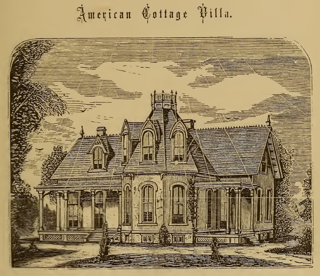
which just looked interesting, and had some features not dissimilar to the building in Vertshusen. The size and scaling weren't the same of course, as the Vertshusen buildings are uniformly tiny by contrast to the structures in "Hobbs'". It was a starting point though.
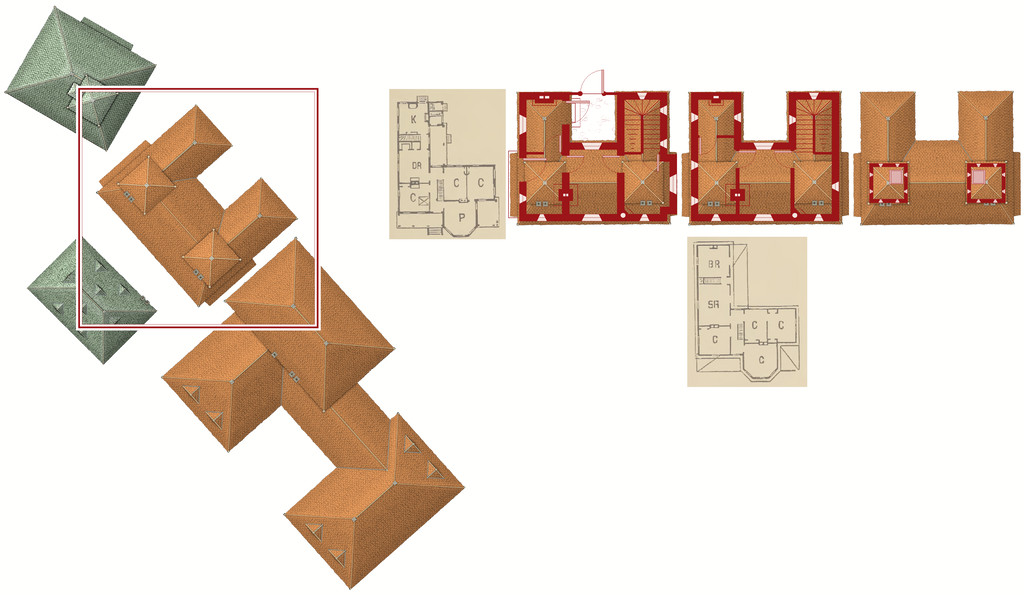
Having measured the house size on the Vertshusen FCW, I set up a suitable template in the Dracula Dossier style, and then directly imported (copy & pasted) the "Wasn't" House and its neighbouring properties, setting "my" house down in the centre of the map border area.
Of course, it's angled as originally drawn, and as others have commented in topics for this mapping contest already, that's not the friendliest layout for drawing rectilinear structures. So I copied the house again, and rotated it to better suit, and then copied that twice more (as my initial idea was for a ground floor plan, an upper floor plan, and a further plan for the two taller roof towers. I also imported copied scans from the Hobbs' book as reminders for the overall look of the plans, setting them up on their own Sheet with a Transparency Effect, so I could position them over the CD3 house roof and get a better idea of what might go where. And then started drawing. This illustrates where I'd got to with the drawings when I ran out of time yesterday:
-
Map critique
There's a possibility your system's showing "frames" (white lines connecting the nodes on a line or polygon). You can clear those from view using Ctrl + F, if memory serves (and if that's what was happening). It can be useful to show frames, as it makes picking out the nodes easier if you're trying to adjust them individually, but it quickly gets irritating when you're not doing that!
Nice-looking map, certainly!
If you're thinking of further tweaking beyond the point about the mountains (it's never easy deciding how much or how little you can cluster these things; it often depends on the style too, as some flow together better than others, and some styles won't overlap symbols properly), it might be worth adjusting the bitmap fill scaling for the woods and fields a little, to stop the repetition creeping in so much (most obvious in Evenwood), although that's quite a minor distraction once it catches your eye - so, sorry for mentioning it 😏😉...
I'd probably want to tweak the effect settings on the text too, especially the regional red labels that are fading into the terrain a little too much for my eye presently. Text tweaking is always one of the more difficult aspects of CC3+ mapping, as text is something the program doesn't handle as well as it might. It helps if you remember to set the fixed point before placing the text (albeit that gets a bit tedious if you need to change it every time), knowing the text may expand away from that point for different zoom and saved-image settings, or moving it about a little after placement, so that things like text on a curved line avoid having a letter over some key terrain element (always seems to happen for me...). I'd also be inclined to reduce the drop-shadow on the title text, and give that a somewhat broader outlining glow effect, just to help it stand out more than the "normal" text labels.
None of this is essential, or even all that significant, but you did invite comments!

-
Creating greater depth
There are various options for showing contouring beyond what's been discussed here, though some probably will work better, or with less effort, than others for this scale and type of map. The Fantasy Towns Annual issue might be the more suitable alternative to consider, which uses a version of shaded terrain using the transparent solid bitmap fills and bevel effects to generate a form of shaded terrain. I made extensive use of this style in mapping the Faerie City of Embra for the Community Atlas a couple of years ago, of which the "Hilly Places" maps are perhaps the more helpful to see some examples of what it can do (you can access the Atlas versions via the links in the last post at the end of the page, and also of course find the FCW files in the Atlas that way).
Shessar's Battlemat Tutorials (PDFs) provide another alternative, using cliffs drawn with symbols, and map shading, similarly to what you've been doing elsewhere using Sue's connecting cliff symbols, and not dissimilar to Sue's use of sheets in her famous Merelan City map.
Although it's more often used for larger-area overland maps, the various shaded relief options (again using bevel effects) may be worth exploring further, such as via the Shaded Relief Annual, or Hadrian VI's PDF tutorial.
Overall, nothing beats thinking things over and experimenting to see what works best for you, however!


-
making a game map from a historical map
It seems to me that I ought to be able to add the historical map on the bottom layer, add roads and my specific elements over the map, and then delete the historical map. Is this possible?
You'd need a bitmap image version (BMP, PNG or JPG) of the map you could import into the CC3+ drawing on one of the lower Sheets, and then resize it to fit the size of map you're intending to draw, but yes, this is eminently practical.
To import the bitmap, make a new Sheet and a new Layer both called BITMAP in the FCW file you'll be working with, and make sure both are checked to be the active Sheet and Layer.
Then to import the bitmap, use the drop-down "Draw" menu, and click on "Insert File". Navigate to wherever your file is stored, click on it and click OK.
You'll then have it on the cursor in your map. Click once to secure its top left corner, and then move the cursor to enlarge the bitmap to the size you need, and click again to finish the command.
You might find it helps to set up a snap grid of a size to be useful in finalising the bitmap size, and make use of that during the import process.
You can then check the image size is correct by using the CC3+ measuring tools against items of known sizes on the image. You can rescale the size of the drawing very precisely after import too, if necessary.
And if you get stuck, just ask again on the Forum!
One final thought. You might like to check around on the Forum for topics created by @mike robel who's done a lot of high-quality work of exactly the kind you're wanting to do, specifically to create board wargame maps using CC3+.


-
Using Mike Schley symbols
I don't think there is currently, although some do seem to appear in some of the catalogues - just not all. It is irritating.
Don't know if it will help, but this is my own list for what the Mike Schley dungeon (only) symbols are:
- Monthly 1 = Woodcutter
- Monthly 2 = Smithy
- Monthly 3 = Market
- Monthly 4 = Necromancer
- Monthly 5 = Temple
- Monthly 6 = Dragon Lair
- Monthly 7 = Prison
- Monthly 8 = Siege
- Monthly 9 = Stables
- Monthly 10 = Summoner
- Monthly 11 = Fungal
- Monthly 12 = Up and Down
- Monthly 13 = Thrones
- Monthly 14 = Man of Science
- Monthly 15 = Graveyard
Of course, you still need to remember what the names mean...


-
Richard Baker's World Builder's Guide Map Templates
OK. I think this might be what you're remembering: World Builder's Guidebook Templates, drawn by Walter E Starr.
They're in the old ProFantasy Map Library. Although this is still on the PF website, it's not easy to find, as there's no direct link to it from the site any longer. Luckily, there are links on some of the Forum topics, providing you can remember where to look...
Hope that solves the problem!
![[Deleted User]](https://secure.gravatar.com/avatar/c75d9a245b74d9c59be0999ea81ca541/?default=https%3A%2F%2Fvanillicon.com%2F92add7f8c954488718110edc4896ad39_200.png&rating=g&size=200)
-
Community Atlas: Map for the Duin Elisyr area, Doriant
Long preamble post today, sidling-up to the area map.
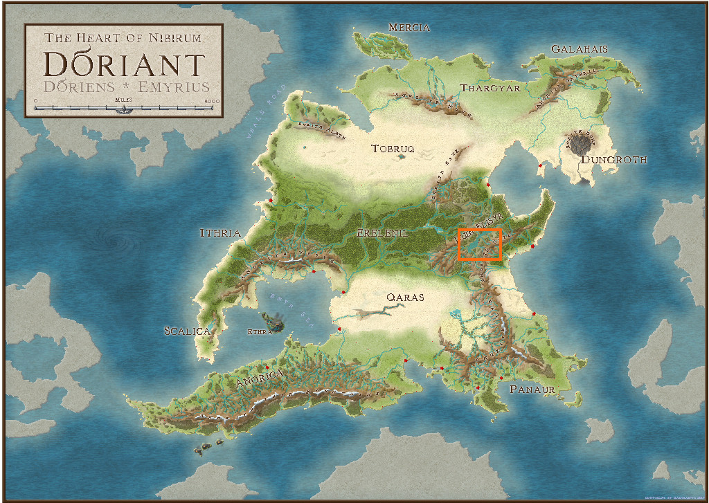
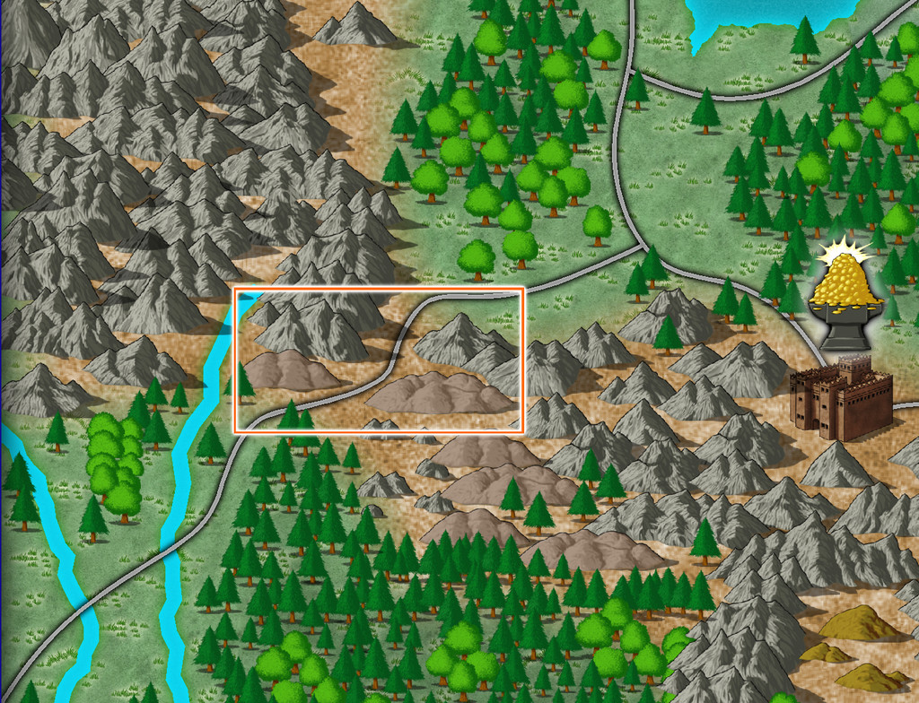
It's never been a secret where the underground map's to go, but the Duin Elisyr area in Doriant is huge, so clearly I needed to zoom-in to find somewhere suitable as an actual location. This is where Duin Elisyr is (the orange rectangle is about 1,000 by 800 miles):
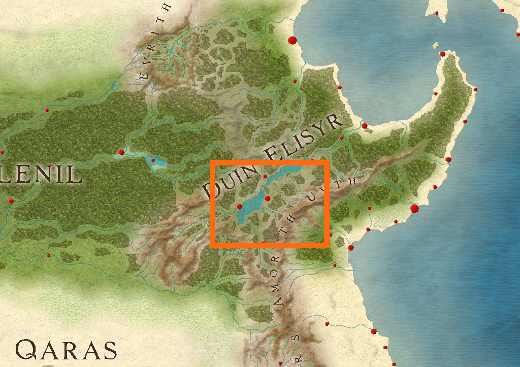
Nibirum's equator runs through this area, so from early on, I was contemplating vaguely warm to hot tracts of jungle-like vegetation, perhaps with savannah stretches, and of course mountains, as the whole area is somewhat elevated (albeit fairly modestly compared with other mountainous areas of Doriant). So it was something of a surprise to open the Duin Elisyr map and find only typical temperate vegetation symbols had been used there, even into the lower lands in the map's southeast corner, not that far from the near-desert lands a little further south.
However, that's what the map showed, and it didn't have a great bearing on my choice of a humanoid bee-folk as the inhabitants of the caverns. So I simply hunted around for a suitable spot, not too near any habitation, to create a new small area map, as no other smaller maps linked from this one when I arrived there. Snag was, my typical choice of about 20 miles square for such a map looked tiny in this vast region. I doubled it, only to find that still looked ridiculous, as just covering half the mountain pass zone I was looking at. Thus - gulp! - I doubled the horizontal length again to be now 80 miles by 40...
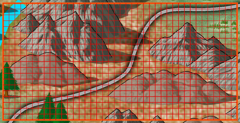
The Duin Elisyr map, complete with my selected rectangular zone:
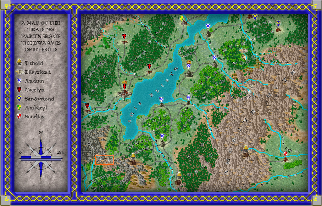
And a closer look:
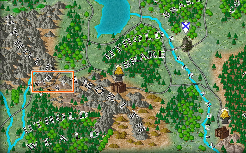
The new map's name had become obvious as "Evth Pass" by this stage, and suddenly those innocuous-seeming bee-folk had become bee-folk raiders, waiting to snare passing travellers using the mountain route from their hidden cavern lair, in this corner of rather peripheral lands to the Uthold Dwarfen realm.
For map-planning of course, we need a still closer view, and preferably without the labels:
Ordinarily, I'd hand-sketch the proposed area onto graph paper, having set an appropriate scale for each square first, which is typically a mile or two. As I'd intended to present the process here on the Forum this time though, I decided a version others might make sense of would be useful instead, so I simply added a two-mile-square grid to the area, thus:
As usual, I then rolled to see what random squares might contain points of interest at this mapping level. I choose a rough percentage value first of all, dependent on the overall terrain and what indications of habitation there may be nearby, which is normally between 10 and 20%. Here, as this is pretty wild country without substantial nearby settlements or farmland, I opted for 10%, of which I decided around 12% might be surface settlements of some kind (this proportion I often vary between roughly 8 to 20%). In this case, that meant rolling quite a lot of D10s (any 1s = the required 10%), and then checking which of those might be settlements by rolling a D8, with again "1" allocated as the determinative.
Once that was done, I had to identify what each feature actually was. The settlements were decided using my own random tables, but for everything else, I opted to use various published sets of information cards. One was a newly-arrived set of Monte Cook Games' "The Weird" cards (like their random RPG tables book of the same name that I've used before, but adding a whole fresh array of options for people, places and things beyond what's in the book). The others were seven different sets of Inkwell Ideas "Sidequest" decks with 52 to 54 cards in each, which provide an array of ideas for enlarging into RPG adventures. The choice of deck was rolled randomly from this group of eight, and then a random card from the relevant deck selected. From that, an option, or sometimes more than one, was picked, or adapted, to fit the map and what terrain the spot was in.
After completion, and some time spent poring over what all this showed, allowed the sketching-in of some basic river lines too (living settlements need a water source of some kind, after all). Which brings us to:
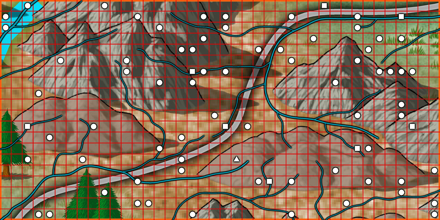
Here, white squares are the surface settlements (8), the white triangle is the bee-folk cavern location, and the numerous white circles are all the other points of interest (68), just a little under the expected random average of 80 items in all. The blue lines, of course, are the potential watercourses (including a substitute place-holder for the one actual river from the original map, up in the top left corner.
As the "new" river lines suggest, the terrain symbols here are simply being used to indicate raised areas and valleys now, and as if being viewed from top-down, not from their pictorial side-on appearance.
All of which (as I warned at the start😊) lengthy preamble means choosing the style and starting the area mapping will have to wait now till next time!

-
[WIP] Community Atlas, 1,000 Maps Contest: Villages in The Whispering Wastes of Haddmark, Peredur
And so to the third map, Hex 505, Ivan's Keep:
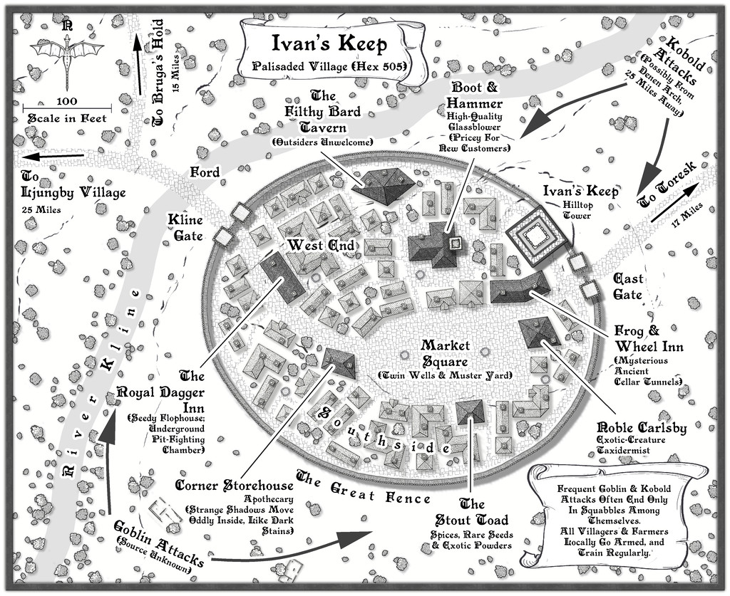
Subject to frequent attacks by bands of Goblins and Kobolds, this had to be a defended settlement, and I thought it might be fun to use what is actually the symbol of a short stretch of straight wooden town wall, to create a neatly rounded palisade! It wasn't actually that difficult, after setting up a guideline oval to work with, ensuring the village properties stayed within that boundary, and then fitting the wall afterwards. The shortness of the wall symbol meant it actually worked rather well in this manner. As to why it's so neatly symmetrical (if not entirely to the low hill the place is built on), there is an explanation in the accompanying notes.
While less intentional, the mix of shadows and road textures does help make the palisaded settlement a very definite focal point for the whole drawing. Plus the fact the village wasn't always where it is now meant a couple of the ruin symbols that come with this mapping style package could be employed to hint at that. Most were cleared away when the Fence was being constructed, to help build the newer properties in the settlement as it now is, of course.


