


Wyvern
Wyvern
About
- Username
- Wyvern
- Joined
- Visits
- 3,266
- Last Active
- Roles
- Member
- Points
- 5,584
- Rank
- Cartographer
- Badges
- 24
Latest Images


-
19 c. map - is there template I can use and where it is (modern? one of annals?)
It may help you decide how and what you'll need to draw by finding a real-world 19th century map that you like and think will work for what you're intending (suitable for the size and type of area you want to map, for instance). Then take a look at the thumbnail images for the various Annual issues that Loopysue created elsewhere on the Forum, to see if any of those match closely enough to what you're aiming for. Each thumbnail links to the correct issue on the main ProFantasy website, where there are different examples of the same style in use, which again should help you decide which might be better for what you want.


-
Community Atlas: Selenos, Statrippe, Artemisia
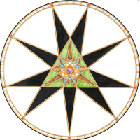
Next to be mapped was the Castle Peris area, various locations in which had a scattering of weird and wonderful items added to them thanks to the random card draws.
There are three main parts to the map, the Harbour (most of which has fallen into the sea), the Village (much of which has only had building foundations laid, and may never have been inhabited - or not for long, at least) and the eponymous Castle itself. Living here much of the time is that now-amended, card-derived "Chieftain", who has become Hypatos, the isle's sole permanent humanoid inhabitant, a self-exiled, hermit-like Human, and former chief sage, who successfully predicted a major eclipse and planetary alignment in the past, but being imaginative and forgetful, he then failed to warn of an abdication crisis he believed these celestial events portended, somewhere on the mainland (he is quite vague as to when and where all this took place). He still wishes to right the wrongs he thinks followed that crisis. He is convinced there is something on the isle that will help him resolve those perceived wrongs, although he does not know what (possibly that Talisman at the Watchtower of the Sea). He is also the sole priest, of sorts, for The Twisted Torchbearer, and is apparently under her protection. He is very knowledgeable about the isle, and seems to have been here for a very long time, although his appearance suggests no great age, merely late middle-age...
Further notes will be in the final Atlas version.
The drawing itself was done using the Jon Roberts Dungeon style from Annual 54, since it allows the easy draughting of surface areas like this as readily as underground ones. If it had building roof options, I might have been tempted to add those too, but the cross-sectional, ground-floor-only plan views are in-keeping with the original "Castles" book maps, at least!
Next time, the little dungeon map proper.


-
Wall Mural Symbol
This blog posting by Remy Monsen might be worth reviewing, as it will allow you to create an image of whatever you wish that looks as if it's been cut into the surface involved.


-
Community Atlas: Monseignor District in Kentoria
Thanks very much Remy!
Since I've had a couple of queries about the Inkwell dice sets outside the Forum, and to clarify for those interested here, the simplest solution is to visit the DungeonMorphs page of the Inkwell site. As you'll discover there, the designs are available also as cards and fonts, and there are books with descriptions and ideas for the more recent sets as well.
In addition, and because I think he actually started the whole concept of geomorphs with this ten-space design (that's ten spaces per side on the design), it's worth looking at the past postings on Dyson Logos' blog, as he's provided illustrations showing many - now maybe all - the designs he's produced over the years, including those he's done for Inkwell. There's a "Geomorphs" tab under the "Navigation" sidebar on his blog, but that only covers the 100 designs he did for a personal challenge in 2009-2010, all collected for easy download in one place. Using the "Post Categories" search box, the Geomorph Mapping Challenge has 217 blog entries, which goes WAY beyond those he's been commissioned to do for Inkwell and those 100 earlier maps!

-
Creating greater depth
There are various options for showing contouring beyond what's been discussed here, though some probably will work better, or with less effort, than others for this scale and type of map. The Fantasy Towns Annual issue might be the more suitable alternative to consider, which uses a version of shaded terrain using the transparent solid bitmap fills and bevel effects to generate a form of shaded terrain. I made extensive use of this style in mapping the Faerie City of Embra for the Community Atlas a couple of years ago, of which the "Hilly Places" maps are perhaps the more helpful to see some examples of what it can do (you can access the Atlas versions via the links in the last post at the end of the page, and also of course find the FCW files in the Atlas that way).
Shessar's Battlemat Tutorials (PDFs) provide another alternative, using cliffs drawn with symbols, and map shading, similarly to what you've been doing elsewhere using Sue's connecting cliff symbols, and not dissimilar to Sue's use of sheets in her famous Merelan City map.
Although it's more often used for larger-area overland maps, the various shaded relief options (again using bevel effects) may be worth exploring further, such as via the Shaded Relief Annual, or Hadrian VI's PDF tutorial.
Overall, nothing beats thinking things over and experimenting to see what works best for you, however!


-
[WIP] Post Station
The Cartographer's Annual 94, Vandel's Dwarven Dungeons has an anvil and a furnace in it, and you might find some suitable objects for use as tools in various places - try the weapons catalogues, for instance. The Munson's Mines pack from CA125 has some whole and broken mining tools, as well, for instance. Might take some finding all there could be of interest, and you might run into difficulties getting things to match if they're drawn in different styles, of course. And it depends whether you have all these add-ons, of course!
-
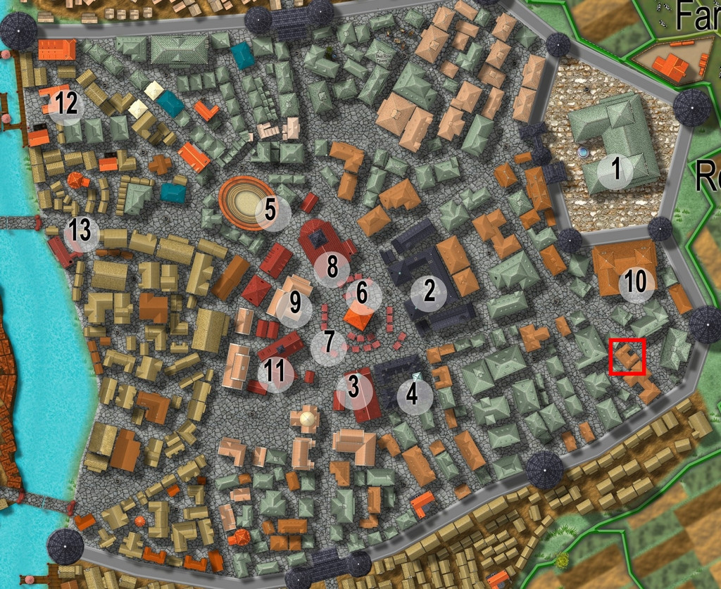
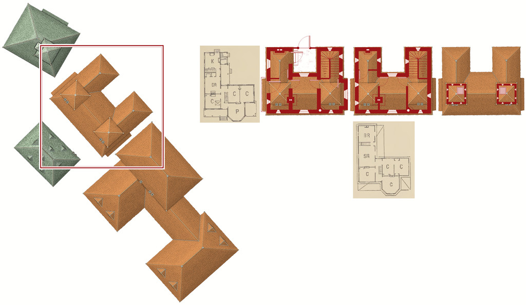
[WIP] Community Atlas August Mapping Contest: Cloven House
By the time I'd chosen a property to map the floorplans for from Vertshusen for this contest, I already had some ideas as to what it was going to be, and what mapping style I'd be going with. The chosen property is that marked by the red square in the SE corner of the walled area:
My initial thoughts had revolved around a haunted house theme, and because I've already done quite a bit of mapping for the Community Atlas using some of the more realistic floorplan styles, quickly decided I wanted to do something different. For me, part of the point in participating in the Atlas is to experiment with new ideas and different mapping styles.
Three possible styles were uppermost in mind, all very similar tech-drawing styles, the 1930s Travel Guide Floorplans from the April 2011 Cartographer's Annual, the 1800s Floorplans from April 2016, and the one I finally selected, the Dracula Dossier style from September 2015. Haunted house, after all!
However, I also took a look through the PDF of "Hobbs' Architecture", which was a recommended freely-available download from the Internet Archive site, mentioned in the mapping guide and webpage for the 1800s Floorplan style, to get a feel for what house layouts should look like and contain in this general type of map appearance.
The working title for the map was "The House That Wasn't There", as I had vague early ideas of creating a building that wasn't always there. Indeed, one initial concept had been to pick a completely empty space in the city, and map the house into that, only I couldn't find a space large enough!
Which building was chosen was partly down to something that looked interesting, that was also a little out of the way, and the final choice was swayed after I was drawn to one of the smaller buildings in "Hobbs'":
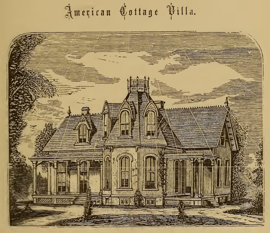
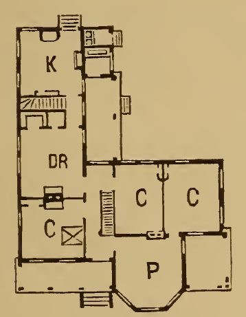
which just looked interesting, and had some features not dissimilar to the building in Vertshusen. The size and scaling weren't the same of course, as the Vertshusen buildings are uniformly tiny by contrast to the structures in "Hobbs'". It was a starting point though.
Having measured the house size on the Vertshusen FCW, I set up a suitable template in the Dracula Dossier style, and then directly imported (copy & pasted) the "Wasn't" House and its neighbouring properties, setting "my" house down in the centre of the map border area.
Of course, it's angled as originally drawn, and as others have commented in topics for this mapping contest already, that's not the friendliest layout for drawing rectilinear structures. So I copied the house again, and rotated it to better suit, and then copied that twice more (as my initial idea was for a ground floor plan, an upper floor plan, and a further plan for the two taller roof towers. I also imported copied scans from the Hobbs' book as reminders for the overall look of the plans, setting them up on their own Sheet with a Transparency Effect, so I could position them over the CD3 house roof and get a better idea of what might go where. And then started drawing. This illustrates where I'd got to with the drawings when I ran out of time yesterday:


-
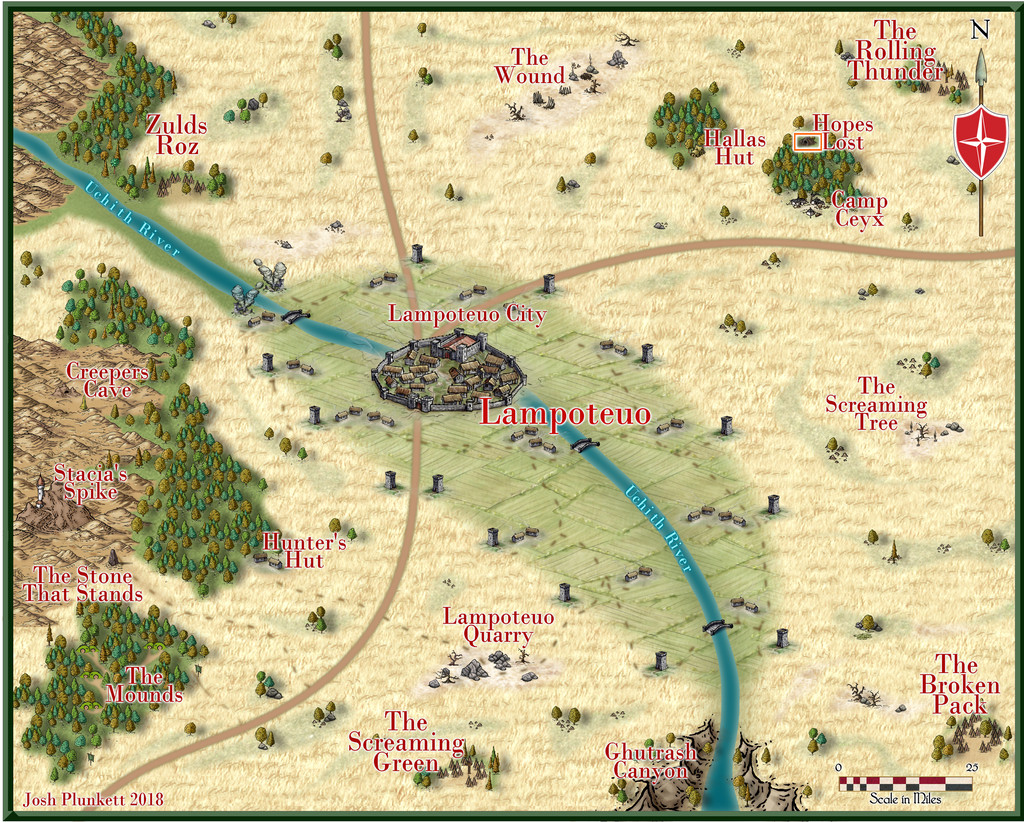
Community Atlas: Hopes Lost, Lampoteuo Region, Artemisia
A fresh visit to Artemisia randomly took me off to the Lampoteuo Region in the central-southern part of that island continent:
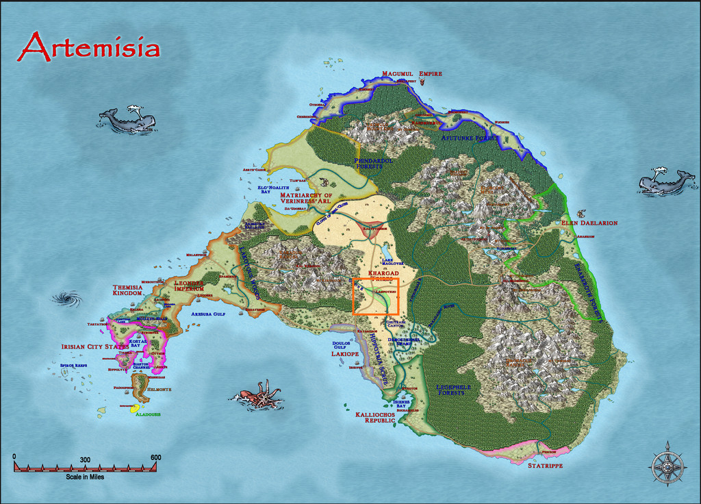
Like much of Artemisia, this area has been mapped at a regional, and often smaller, level already, so checking the existing Lampoteuo area maps narrowed down the options for where this latest small dungeon design could go. After much deliberation, heavily influenced by what I'd determined the contents of said dungeon were to be, I finally selected a cave symbol labelled as "Hopes Lost" here:
Having finally remembered there was a book of scenario suggestions that accompanied the Trailblazer set of Dungeonmorph Dice from Inkwell Ideas, the "Dungeonmorph Book of Modular Encounters: Delver, Trailblazer, & Voyager Edition", when preparing the previous map (Ruins of Shadow Keep), I'd already made use of that here prior to settling on a location. The essentials so-determined were that the place was run by Gnomes, and that it contained a planar nexus, with attendant higher-level magic-users. I reused and amended many of the details from the Inkwell book, as it provided some interesting architectural and decorative options, besides these aspects.
One complication was that one of the three randomly-chosen dice provided an elaborate tomb. Ultimately, that was converted into quarters for the Archmage and the four leading elemental mages at the complex, while retaining much of the design's layout.
A few other amendments were made, as usual, although handily, the Trailblazer set comes with one die of entrances, making an imposing way into the complex. Along the way, I'd decided this was also going to be both a teaching place for elemental mages, and a location people could come to and pay for scrying and access to other planes.
While there are no descriptive notes for the Lampoteuo map, there are general notes for Artemisia touching on who and what is around in this region, which beyond Lampoteuo city-state (central to the second map above), comprises a number of semi-nomadic tribes. Thus a new backstory developed. The complex originally had been a cave system in some rocky hills, in which was an oracular shrine where the local tribes would gather for an annual celebration. Generations ago, a disaster occurred during one festival, killing most involved, with the few survivors left to tell only conflicting tales. All were clear the site could never again be used, as the oracle had been either destroyed, or buried too deeply.
More recently, some Rock Gnome prospectors turned-up, and found there was something magically unusual here. The Rock Gnomes were chosen as having magical and physical expertise in handling rocks, precious stones and general stonework. Gnomes aren't mentioned as major inhabitants of Artemisia, and came just from the Inkwell book's ideas, as well as making a change from the more prevalent Dwarves.
The Gnomes set-to, called-up more of their folk, and reworked/rebuilt the lost caves into the current subterranean complex, reopening the planar gate in the process. So to the map:
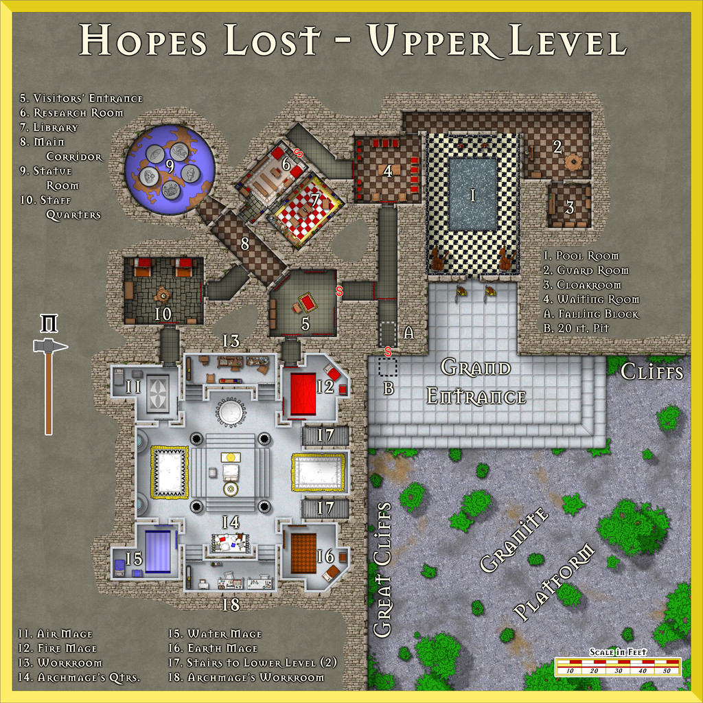
Much in the dice design was strongly rectilinear, so that became a distinctive feature, with straightened rock cliffs faced with granite brickwork, the spilled-over granite-brick fill around the complex hinting at how the former cave area had been reopened and restructured. The area outside then became levelled-off granite, with a great white marble stepped platform leading up to the way in.
I picked the DD3 Dungeon Digital style for the map, only to discover this was quite tricky to use, as rather than presenting the older-style vector symbols (I think from the "Filled" set of DD3 options; that's what I used, anyway), it tended to default to the normal DD3 raster ones instead. It does encourage use of the SS2 set as well, and that was heavily pressed into service. Being vector sets, there are plenty of options for all manner of objects. Dungeon Digital does use the DD3 bitmap fills too, partly why I'd picked it, because I knew there were going to be several square-tiled areas.
For the black-and-white marble in area 1 though, I drew out a series of small squares using the two marble textures, gradually combining them into larger strips to duplicate over the whole floor using the snap grid. I did try the standard chequerboard fill (in areas 2, 3, 4 and 8) with an RGB Matrix Process set to greyscale, but this looked a bit too washed-out compared to the white marble platform, black marble pool base and wall tiling of area 1. Then for the red and white check carpet in area 7, I selected a suitable red rug, enlarged it, and added a series of white, square cushions across it, as they gave a slightly textured look to the whole, more soft-carpet-like than the tile textures. A row of small rectangular white panels were added at the carpet's long ends, because the cushions didn't fit perfectly to both length and width, after a couple of quick trials.
Area 9, the Statue Room, is the planar gate. It has five 10-foot-tall statues in it, each of a different, loosely humanoid, creature from a different plane. When four of the five's "hands" are linked (their arms, only, can be moved and repositioned), this opens the gateway within the centre of their ring. The floor is decorated with a mosaic of an unknown world, as stated in the original notes, so I found a nice vector planet among the Cosmographer 3 designs that didn't have the spherical shading that so many do, and added that. The blue is intended to be lapis lazuli, the browns sardonyx. The Inkwell book provided various options for the planes involved, and I picked five that are a little unusual: Ash (a mix of Fire and Negative Energy), Dust (Earth + Negative Energy), Lightning (Air + Positive Energy), Minerals (Earth + Positive Energy), and Radiance (Fire + Positive Energy). It's also suggested in my notes for the Atlas that these may change, along with the statues, over long periods. I wanted to suggest that whatever had happened in the past to wreck the ancient oracle, was still having an unusual effect here.
The white marble southern part of the subterranean area was a design choice from the Inkwell descriptions for the original tomb there, including the wall-tiling, and it seemed to me the luminous look this gives the whole was delightfully striking. As is obvious, there are two staircases down from it, and they're weirdly located, because they're off the standard geomorphic connection points by 10 feet each. They should be where the two shallow indentations are in the adjacent walls of rooms 12 and 16. This is most unusual among the Inkwell designs, and initially caught me by surprise, as I thought I could simply rotate the design, and have this white marble area be at a lower level than the rest - except of course, the stairs don't fit to the entrances from areas 5 and 10! So that meant I needed to design a Lower Level as well. We'll come to that next time.

-
Using Mike Schley symbols
I don't think there is currently, although some do seem to appear in some of the catalogues - just not all. It is irritating.
Don't know if it will help, but this is my own list for what the Mike Schley dungeon (only) symbols are:
- Monthly 1 = Woodcutter
- Monthly 2 = Smithy
- Monthly 3 = Market
- Monthly 4 = Necromancer
- Monthly 5 = Temple
- Monthly 6 = Dragon Lair
- Monthly 7 = Prison
- Monthly 8 = Siege
- Monthly 9 = Stables
- Monthly 10 = Summoner
- Monthly 11 = Fungal
- Monthly 12 = Up and Down
- Monthly 13 = Thrones
- Monthly 14 = Man of Science
- Monthly 15 = Graveyard
Of course, you still need to remember what the names mean...


-
Feature Suggestion Thread
We've had repeated discussions about submarine mapping styles on the Forum here. I've tinkered about with existing styles and a few additions of my own for use in the Community Atlas. I'd definitely love to see someone tackle these more fully, but am far from sure it'll happen in the short-term.
The main problems revolve around not having access to the same kind of imaging you can get easily for surface landforms, so it's much harder to create artistic symbols and fill styles, because these simply don't exist, and never have done. The Tharp style is fine, but essentially, this is all there is to draw upon of this type for the deep undersea environment especially, and it falls apart as soon as you try to use it for areas less than oceanic in scale, primarily because the detailed mapping to help also to a large extent doesn't exist (plus these maps are interpretations of instrumental readings, such as sonar, which don't give the same impression you would get if you saw the features in reality; the Tharp maps are calibrated and redrawn artistically to fit with more familiar visual landscape impressions - like using wall shadows in dungeons, say, even when you know those couldn't be really there).
There are undersea features that have no land-based equivalents, such as seamounts, trenches and mid-ocean ridges, much of which remain remarkably poorly-understood, often because the areas are difficult to access and impossible to image visually on anything beyond a very limited scale. Even trying to find a reliable drawing of what a single, fully-grown giant kelp looks like (they're usually far too big to image, at up to a couple of hundred metres in height), proved a nightmare when I tried to do so some years back for my Atlas symbols. Photo images show only bits at a time, or from oblique angles, because of the size issue, and the fact they grow in dense forests commonly makes it hard to tell which bit belongs to which kelp! It is possible to make an artistic interpretation, much as the overland styles often use slightly vague interpretations of trees, and it's that "vagueness" I relied on, certainly!
So yes, one more vote for more undersea mapping options (though I have voted for this repeatedly anyway 😁) - just don't hold your breath 😉!

