[WIP] Post Station
 Fersus
🖼️ 11 images Surveyor
Hi guys!
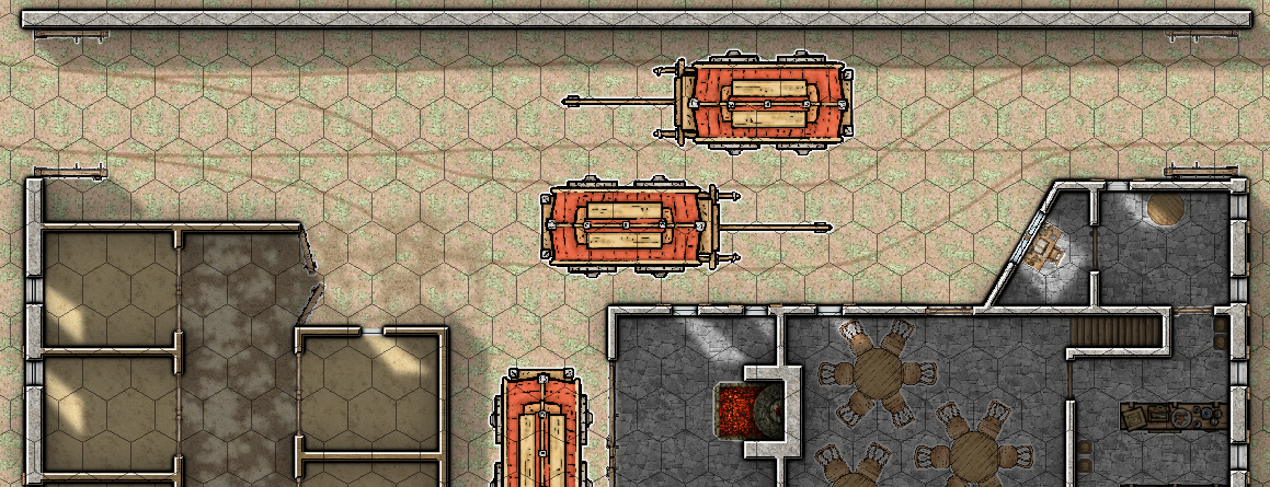
After a long hiatus I finally got to do a map again. It's going to be a small post station where horses can be changed, carts can be repaired and the riders/drivers and the occasional passengers can spend the night.
It's the first time I try something with light sources, and I did run into some troubles.
I already watched Ralfs introduction to lighted dungeons, but I still didn't figure out how to do what I want to achieve, so I improvised the effect by drawing shadows manually, just so I can show you, what I want: I'd like to have the building and the Walls having a Wall Shadow, as normal. The inside of the building should be cast in shadow, but the windows should let light in from the global sun. (see picture below)
In addition to that, the coals from the forge should have a point light source that brightens up the immediate surrounding.
That's where I've got the most troubles: I either get the Forge to shine, but then I don't have a global sun anymore, or I simulate the sun with a point light source that's far outside the map borders, but then I don't get the azimuth setting and the forges glow is reduced to nothing.
Hints and remarks are very welcome!


Comments
Good map :)
While sheet effects like Wall Shadow, Directional might have been easier than hand drawing the shadows, the specific length of the doorway and window lighting would have been tricky, so you have probably done better by doing it this way.
You don't seem to have added any shadows to the vehicles and interior furniture, though. I might add a shadow effect to the symbols sheet to make them pop up a bit.
Hey Sue!
Thanks for the response! So you mean that Wall shadow, directional can be used to cast light? How would that work? Is this some kind of color key sorcery (I couldn't wrap my head around that one either ^^)? I was thinking about just drawing a shadow polygon and letting the windows cast a "shadow" in pink and then do "something with color key" to let the global sun define the length of the light that falls into the building. Is that somehow possible?
I did try to put a color key effect on a test sheet for windows and on the Inside-Shadows Sheet but no matter the combination (windows above shadow, shadow above windows, shadow on the same layer as Symbols...) I don't get the color key effekt to punch a hole into the shadow. I only get it to either be visible or not (the latter when I give the windows sheet the color key effect).
About the drop-Shadow of the vehicles: a wall shadow was on by default, but I didn't like it, as the pole for the horses wouldn't cast a wall shadow, whereas the rest of the vehicle would. I tried a drop shadow, but that made it look like it was floating. I've to experiment with that a little bit more and will post an update, when I'm happy with the result.
Concerning the forge: Ralf mentioned in his video, that the point light effect will not work properly when combined with the global sun effect. I tried to use a glow instead, but that of course has the downside, that it'll penetrate the walls. Does anyone know a solution to that?
I meant that you can't do the same thing with a wall shadow because you wouldn't be able to 'cap' the open doorway lights like you have with the polygon. Your solution was a good one.
Unfortunately, I don't think Colour Key's work on shadow effects. I seem to remember trying something like that myself a while back.
You seem to be working this map on quite a complex level. That's good. I do stuff like that myself quite often. Regarding limiting the glow of that fire to just one side of the wall...
Try adding a new sheet that is just above the floor and drawing a circle of bright red/orange on it, then add an Edge Fade, Inner (EFI) sheet effect from zero to about 20% opacity, and a Blend Mode effect to that sheet in that order. Set the Blend Mode to overlay, or any mode that works to blend the red with the map in a similar way to that glow, then add a Colour Key effect to that sheet between the EFI and the blend mode, and set it to that nasty bright green (so that it doesn't interfere with the red glow in any way), and draw a bright green shape to mask off the bit that invades the wall and the next room.
I'm not sure what the "best" solution for the glow issue is, but when I have glows going places I don't want them, I create a new sheet above the one with the glow called something like GLOW COVERUP and just put a rectangle filled with the floor fill wherever I don't want the glow.
This sometimes requires playing around with the sheet order and I frequently end up with multiple "coverup" sheets, but it works. ?
That's another way of doing it, but it does require quite a lot of duplicate sheets. All the SYMBOLS sheets need to be duplicated as well so that you have a set for each level of flooring.
That's weird @Loopysue, your reply was not showing when I saved mine, or I wouldn't have said anything - your solution is a much better one. I seem to always do everything the hard way. ?
There are always several ways of doing a thing, Mark, so you should have made your comment anyway, even if mine had been visible at the time.
For the shadows of the carts, you could create a new sheet called CART SHADOWS just below the Symbols sheet the carts reside on, then draw simple Polygons below the parts of the Carts that should have shadows and give that sheet the wall shadow effect.
If you make it multiple sheets, you can give different parts of the symbol different strenghts of shadows, for example the wheels a wall shadow, and the cart itself and den poles different drop shadows. It would most likely need some tweaking to look good, but I find tweaking like that to be something completely different from day to day life and therefore fun...
It took me some days, but thanks to all your help I got some nice results!
first a nice glowing forge:
next nice shadow effects on the wagons:
But I still need help. After the nice forge I tried to make a brazier for the guards, glowing yellow near the fire and getting orange further away. But somehow the edge fade effects is not working properly:
Any idea what went wrong here (besides the obviously wrong lights being cast through the windows)?
And finally a question about outlines: normally I'd go for black outlines:
But as I've got a lot of symbols cast in the indoor shadows, I'm not sure if that's still a good idea. Should I go for white outlines instead?
At least for all the symbols indoors?
You've done excellent work with the details.
I think the white outlines look a bit strange and unnatural. I prefer the second to last image above, and to make the footprints slightly more subtle by adding a Transparency to that sheet (hoping that they are on a separate sheet).
Now that you have put the horses in, those stalls do seem a bit tiny. I'm not an equestrian, but I think I remember something about it being considered cruel to keep a horse in a stable where it can't easily turn all the way around because they have rigid spines and can't bend from side to side like a cat or a dog. However, it would probably be easier to make the horses a fraction smaller than enlarge the stables and stalls. You wouldn't be able to put it right by narrowing the central corridor because you can't bend a horse around the corner when you are getting them in or out of the stalls.
Yeah, you're right about the Horses. I seem to have them set to a wrong size. The stables should be fine, they are about 3x3 Meters. I know, that's not super spacious, but I dead read a little bit about stables and I found a reference to a 3x4 meter one, so it tight, but should be ok...
I'll make the horses a little bit smaller, and will play around a little bit more with the light setting (and the footprints) and then I'll post a final version.
One last thing: I couldn't find any anvil and similar work related Symbols. Is there a Symbol Set that has such things in it?
You could search for "Anvil" In the Symbols folder, but I'm not sure if there is one.
If not you might consider downloading the free third party assets from Vintyri. I remember someone else wanting an anvil not so long ago and a comment on that thread about there being one in one of the Vintyri distributed sets, but I'm not sure which one it might be. I have a suspicion it might be the Dundjinni collection. All of the Vintyri sets are really huge. If you go that route you will want to pay close attention to the installation instructions in the guide that comes with the installer.
Links to all the free stuff can be found here:
The Cartographer's Annual 94, Vandel's Dwarven Dungeons has an anvil and a furnace in it, and you might find some suitable objects for use as tools in various places - try the weapons catalogues, for instance. The Munson's Mines pack from CA125 has some whole and broken mining tools, as well, for instance. Might take some finding all there could be of interest, and you might run into difficulties getting things to match if they're drawn in different styles, of course. And it depends whether you have all these add-ons, of course!
Thanks for the hint! The vast collection of free symbols Sue suggested does have anvils, but the style is so very different to what i've going on at the moment that I'd have to start the whole map again in that style. Maybe another day, I'll have a look into anual 94. Thanks a lot!
The explanation of the color key effect was golden, Sue! Thank you so very much!
I might have overdone it though: I used this technique on nearly every symbol. That way I can use the black outline and still highlight them so they get noticed in the shadows (moving the grid below the symbols helped as well, but I'm not sure it's practical for gaming purposes...)
One thing I still can't get to work are the footprints. They just refuse to get a sheet effect. I even tried DELAYDRAWSYM, but that just lets them disappear completely. I do have the suspicion that the "Footprints Human" from DD3 might themselves be already an effect? Is this possible?
That's a great result :)
Have you checked which sheet those footprints are on, to make sure you are adding the transparency to the right sheet?
Yes, I even made sure by first adding a different symbol on the sheet and adding an unmistakable effect (glow: blue quite strong). The other symbol showed the glow as expected. Then, just to be extra sure, I even used "like" to put the footprints on the same sheet again. Then I used "hide all" to triple check that the footprints and the test symbol are really really really on the same sheet: and yes. Everything else is hidden, but only the barrel has the blue glow:
That's very strange.
I guess you will have to put up with them the way they are.
yeah, really seems so.
The fact that they disappear, wenn I set Delaydrawsym = 0 really makes me think. maybe these Symbols re generated by a shadoweffect and are therefor protected from sheeteffects to not mess with the innate shadow? IDK if such a thing is even possible, but the barrel stays, only the steps are gone...
The issues with the footprints is that every pixel are semi-transparent. The effects system doesn't like that too well. I initially tried to use them in my ice cave live stream as well, but got the same issue when adding effects. I think symbols like these is why DELAYDRAWSYM is enabled by default and you have to explicitly turn it off, because this causes them to be restored after the effects system have "lost" them.
Maybe the solution is to use TRACED on one symbol, and then delete the symbol and make a new vector symbol from the tracing. Then you could make them as transparent as you like and use other effects on them too.
I'm not very experienced as you probably gathered, but is it feasible to remove this symbol from the DD3 Database and make a non transparent one of my own to replace them? That they refuse to take sheet effects is a really big downside. Maybe that should be fixed in the installation files as well, as it runs totally against the basics that newcomers learn when they pick up CC3+...
You don't need to remove anything. You can add stuff without doing that.
If you are interested in making your own vector symbol like the one I hinted at above, I am wondering if you have the Tome of Ultimate Mapping?
If not, don't worry. Making vector symbols is as simple as drawing the symbol using a couple of polygons and then using the Symbol Manager menu to convert the drawing into a symbol.