Wyvern
Wyvern
About
- Username
- Wyvern
- Joined
- Visits
- 3,266
- Last Active
- Roles
- Member
- Points
- 5,585
- Rank
- Cartographer
- Badges
- 24
Latest Images


-
Community Atlas: Dendorlig Hall - A Sort-Of D23 Dungeon for Nibirum
Well, my original intention was to provide a progress update here during January. And then before the end of January. And here we are in February, so you can see how well that went...
However, progress HAS been made despite that, even if a lot of it's less easy to show here as yet. That's mainly because I've been preparing handwritten notes on the various itemised areas within this dungeon, which in turn has led to a few alterations in the look of the map. As I've reached area 100 of the 360 this way, things in that respect aren't going too badly. Typing-up my handwritten scrawlings is not moving at the same speed though, and that's still a LONG way behind.
As I mentioned briefly before, from the initial map, it was clear that the parts nearest the entrance cave (areas 1-49) formed a separate region within the overall dungeon, as all being linked to one another, with just a single access-route to the remainder. Looking at the Atlas notes regarding Malajuri, in conjunction with the relatively small sizes of the rooms, led me to the idea that this had originally been a Gnome subterranean complex. For obscure/now long-forgotten reasons, the Gnomes had had to leave it for long enough that its whereabouts had been lost, until the Gnomes under King Dendorlig XXX had managed to find it again, and start to reoccupy, renovate and explore it in more recent years.
As also noted, the description of what's where within the complex has been drawing heavily on the random details generated by the Wizardawn system, albeit amended or adapted in places, particularly in this first Gnome-reoccupied zone, where random monsters are not going to be lurking! Instead, things like that have been reimagined as alternative features, such as wall-paintings or sculptures, and rather more has been added to have the whole make sense, since there's now a village (in cavern 22) and a military compound covering access to the rest of the dungeon (where dangers DO still lurk), around and off the muster courtyard 39. Along the way, a powerful maybe-deity nature spirit of the mountain has been inserted, Dendorla, at the great Water Temple (17), since water is a) naturally vital for living things, and b) the Gnomes long had elements such as piped water supplies and flushing toilets. I've mentioned before how making sense of random descriptions and area layouts helps me better visualise what may have been happening/is still occurring in such places. There's even a serious danger I may yet have to devise a small area map for the Gnome and Halfling farmlands in the hidden Dendorlig Vale area just beyond the underground complex here (food, after all!). Yes, Halflings too, taking on-board the Tolkienian idea of Halflings being natural farmers and gardeners. Plus as there are almost no Halflings in the area of Alarius I've been mapping, I thought this would give a chance to explore something a little different this way.
Since other parts of the map are still subject to change, I've not tried to present the whole again currently, so this is a view of just the reoccupied "Village" area and a small part of the adjacent areas, from the top right corner of the original map:
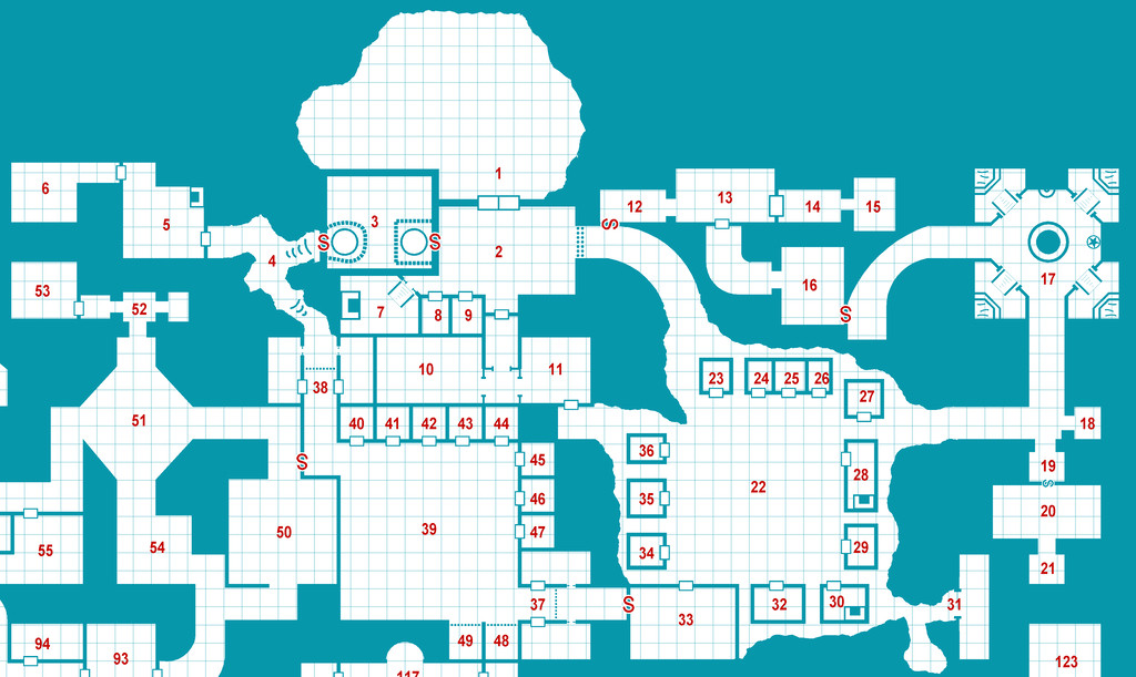
As is rather obvious, the top edge of the map has grown, to better illustrate the full extent of cavern 1 (and yes, the number for that needs moving on this shot still!), and there have been other changes too. The "red-S" doors are no longer secret doors, but sliding ones, operated by magical card-keys only, to better restrict access to various places, such as the Royal Apartments (12-16), the Keep (3), and the route to the remainder of Dendorlig Hall (between 39 and 50).
While not illustrated again here, as I'm still compiling notes and map amendments for the latter stages, I've set areas 50-66, 93-110 and 143-146 on the original plan as those areas the reoccupying Gnomes have currently explored, at least cursorily. The other areas - so most of the map - have yet to be looked over by them, and this is where things can get especially interesting. Even if that "cursorily" proviso means even the explored regions might not be quite so "safe" as expected. That stout, well-secured, red-S door between areas 50 and 39 isn't merely for show!
All being well, further updates to follow (not saying they'll be any more frequent/regular though...).


![[Deleted User]](https://secure.gravatar.com/avatar/c75d9a245b74d9c59be0999ea81ca541/?default=https%3A%2F%2Fvanillicon.com%2F92add7f8c954488718110edc4896ad39_200.png&rating=g&size=200)


-
Community Atlas: Dendorlig Hall - A Sort-Of D23 Dungeon for Nibirum
Those of you who follow the RPG world online will be aware already that all kinds of hell have been breaking loose in recent days, regarding the curious acronym "OGL" and its current and future uses. Those unaware of, or disinterested in, the RPG world - you're very fortunate; DO NOT get involved in this morass!
Consequently, a distraction was obviously in order. So I distracted myself away from my latest Errynor map (not sure that was intentional, however!), and was thinking about another recent suggestion from the online RPG world, with the equally curious acronym "D23". Essentially, the original idea behind this, which I think loosely expands to mean "Dungeon 2023", was to set a personal challenge for anyone interested to design a dungeon room a day throughout 2023, to end up with a 365-room megadungeon for those lasting the course.
As you may imagine, people have approached this with varying degrees of optimism, since trying to persist with this for an entire year is quite an undertaking, particularly given how unpredictable the broader events affecting everyone have been in recent years. Quite a number of folks seem to be giving it a trial-run during January, followed by a "we'll see..." beyond that.
Being no stranger to long-term projects, unfortunately, I learnt about this only on Dec 31st last year, which was a bit late to start planning anything! Several ideas have been mulled over since then though, a couple of which might be of interest to some people here looking for a less challenging way to participate in this project - maybe a small dungeon level a month, say, perhaps using one of the free online random dungeon designer systems to generate suitable base maps, or possibly one or more dungeons containing each a dozen rooms. These could be for contribution to the Community Atlas during the year, though some might need an outdoor area map preparing as well, depending on exactly where they'd be located. I'm sure some of our more active area mappers like Quenten and JimP could suggest some potential locations, for instance, if you can't find somewhere satisfactory yourself.
While this list won't be complete, these are the random dungeon generators I've become familiar with in recent times. I'm sure others here can suggest alternatives:
https://donjon.bin.sh/d20/dungeon/
https://watabou.itch.io/one-page-dungeon
https://www.d20srd.org/d20/dungeon/
https://osricrpg.com/tools/index.php
This latter site, also known as the "Robe of Useful Items", includes the old Wizardawn content as part of it. Wizardawn, as I've mentioned on the Forum before, is no longer available live online. Instead the OSRIC RPG site has a link letting you download an HTML version of the complete old site, which still works in a browser under Win 10 (at least - not sure about Win 11), though it is a little clunky to set-up. It contains a vast treasury of "Old School" style RPG features and random generators created by various people over many years, however.
So, what have I done? (Or should that be clasping-head-style, "On no; what have I DONE?!") Well, thus far, I decided a sort-of D23 dungeon for Nibirum wouldn't have 365 rooms, but 360, because of course Nibirum's year is 360 days long. So I generated a suitably-sized random dungeon using the Wizardawn system. This creates the map from a large series of old hand-drawn dungeon geomorphs, so comes out a little rough-and-ready, with the sort of imprecisions you might expect. Which I then traced into CC3+, along the way deciding I wasn't going to remove all those imprecisions, so not all the walls are quite straight, or always parallel to the one opposite, or wholly symmetrical, and so forth.
On that "Old School" basis - although personally, I still can't get away from the idea the style's quite new-fangled really (I come from still further away in time with RPGs, after all!) - I went with the Old School Blue Dungeon style from Cartographer's Annual 12. This is a very forgiving drawing style, and uses no effects, so despite the 700-foot-square size of the random dungeon, it only took a few days to put together, a bit at a time:
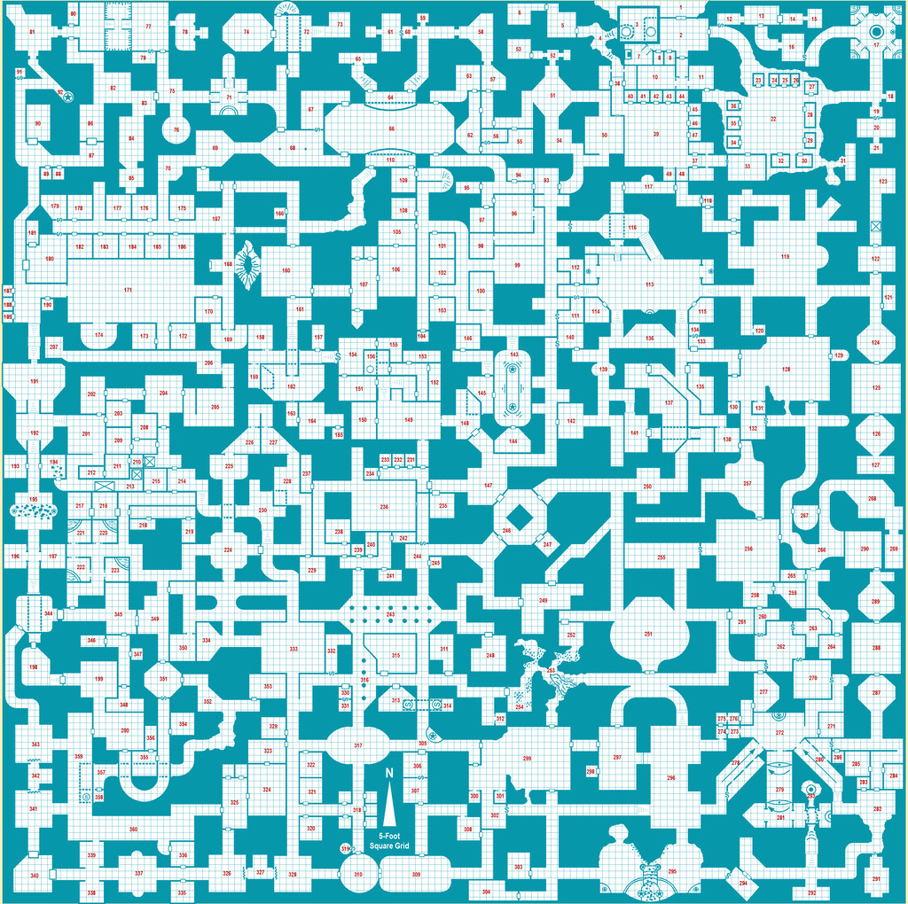
This is still work-in-progress, as even at this blurry scale, I'm sure you can spot some elements that need adjusting. I know I can! And if not, I've uploaded a larger version to my Gallery! Plus, I may want to add or amend details in places subsequently, once the content description is finalised. A symbol key will need adding as well, I suspect. Luckily, the Wizardawn set-up generates a vast amount of text data as well as random maps - albeit the description only has the same number of labelled rooms, and isn't fitted to whatever the random dungeon design plan looks like, so it takes some work to knock that into a shape that makes sense. Which may be where the "2023" facet comes in here!
That's all to come, but for now, it would be helpful if someone could point me towards a place on Nibirum where such a substantial dungeon might be situated. I'd thought about adding it to the existing Community Atlas megadungeon there, but as it's a megadungeon in itself already, that seemed counterproductive. Ideally, I'd like to place it somewhere that already has a suitable overland map at a small enough scale to show where a dungeon entrance could be, and while it's not firmly fixed, the original was chosen for "Mountains" as the nearby outdoor terrain during generation. It would be nice too to set it on a continent/landmass on Nibirum I've not mapped in before - so EXCLUDING Alarius, Kentoria, Ezrute and Peredur ideally (this is not a hard-and-fast rule, however).
There is an exterior entrance in a large cave towards the top right of the map (area 1), which has a heavily-walled military keep-like structure (3), and an external wall with a double door (the north wall of 2), and while I'd imagine the entire structure is no longer used by the people who originally constructed it, or not for the purpose it was first intended, at least, that may be something to bear in mind when looking for suitable sites on Nibirum for this to go.
More details to follow, if all goes to plan.


and 1 other.
-
Community Atlas: Errynor Map 33 - Siolforland
While the choice and location for most of the map's non-landscape features were decided randomly, as done, and discussed, for previous of these Errynor maps, this time not all the settlements were, as just over half the smaller ones were added subsequently, chiefly along the main river lines in the lower half of the area:
Those that were located randomly had helped determine the general layout for the river lines, in combination with the more obvious geographic requirements. After the resources were added, again randomly, the curious concentration of several coal markers near these established waterways helped provide the spark for what became the civilisation hereabouts, as portrayed in the map's PDF file. Adding the "missing" coal mining villages deliberately to complete the pattern, led naturally to providing mining settlements near the mercury deposits that didn't already have one, plus of course there would be further smaller places, down to individual farmsteads, were this map not at the "large-regional" scale it is.
Route junctions, bridging points, minor landscape features and nearby creatures then helped generate ideas for the varying local character of particular settlements, with names then either chosen to suit those, or sometimes where the names helped give an extra concept of what might be happening at certain places, beyond anything obvious from their physical siting.
Having done that on land, a couple of smaller settlements were added undersea as well to round things off more, along with one last non-random settlement on Hwael Igland ("Whale Island"), since this little island took on an increasingly important role during the development of ideas regarding the ocean trade-route to Arkant from here. However, Hwael Igland is the subject of another Atlas map, so that's a story for another time!


-
Community Atlas: Errynor Map 33 - Siolforland
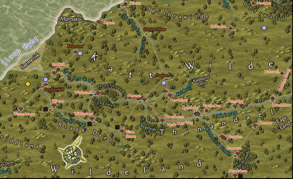
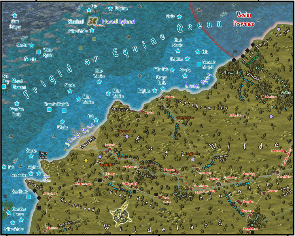
The next map in the set of 250 x 200 mile areas from "my" corner of Alarius is now ready for the Atlas. It's the one in the lowest left corner of the Errynor region, Map 33:
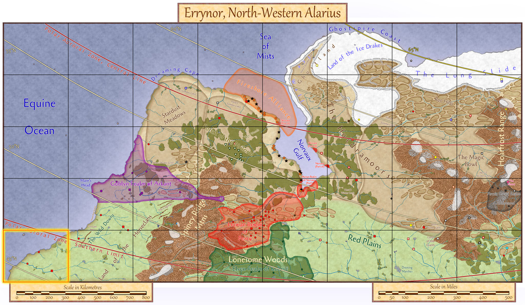
This map choice was part of the ongoing process of gradually introducing fresh major elements to each new early map. Having completed the corner maps for the deep waters far offshore (Map 01, top left) and the area furthest from the sea (Map 40, lowest right), it seemed logical to proceed with a coastal and shallower water map this time. While Map 8 (top right) includes those aspects, it also has the extra feature of an ice sheet which conceals part of the underlying coastal terrain. Map 33 then more or less chose itself.
The final Atlas FCW map will have toggles to show various viewing options, as usual. Starting with the sea surface view, the first image below has the full map with scales, keys and so forth, while the second is just a close-up of the map, where hopefully more of the labels can be read still at the typical Forum resolution (the map views have been added at a somewhat higher res in my Gallery too):
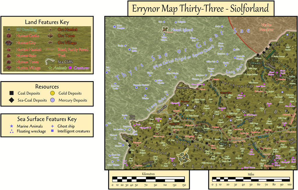
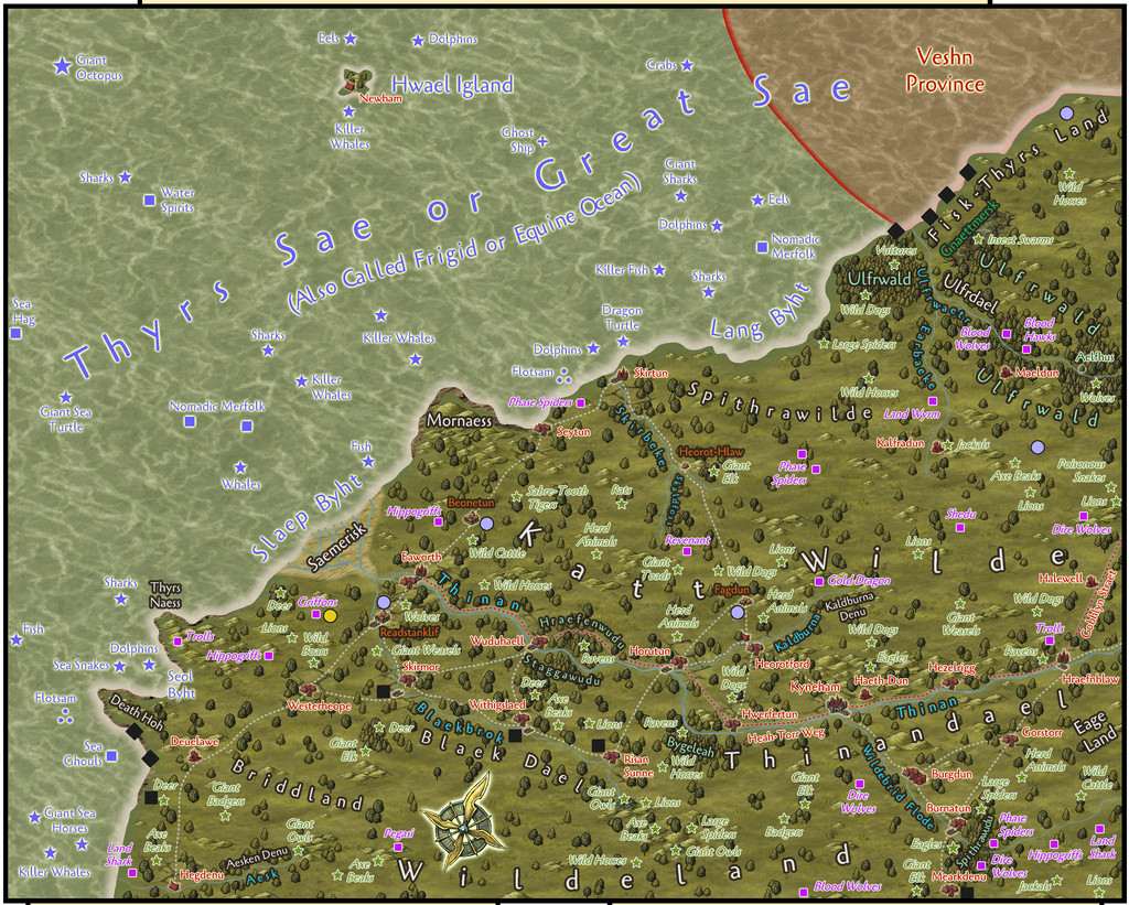
Labels for the illustrated overland creatures and sea creatures & features can be turned-off independently using more of the FCW file's toggles, as they can make things a bit cluttered, especially when viewing something like this overlay of the latitude and polar auroral lines:

As this image demonstrates, we're in the southernmost part of Errynor, between roughly latitudes 44½° and 47½° North (in the extreme map corners), and that the area is almost all south of Nibirum's Polar Auroral Zone. The aurora can be seen still, and its magical influence detected, across the mapped area, though with a lower frequency than within much of the Zone itself.
Then there are the undersea water column and seabed views, again with two images of each to illustrate the separate map keys as laid-out, and more of just the map's detail. The land creatures are not shown on these:
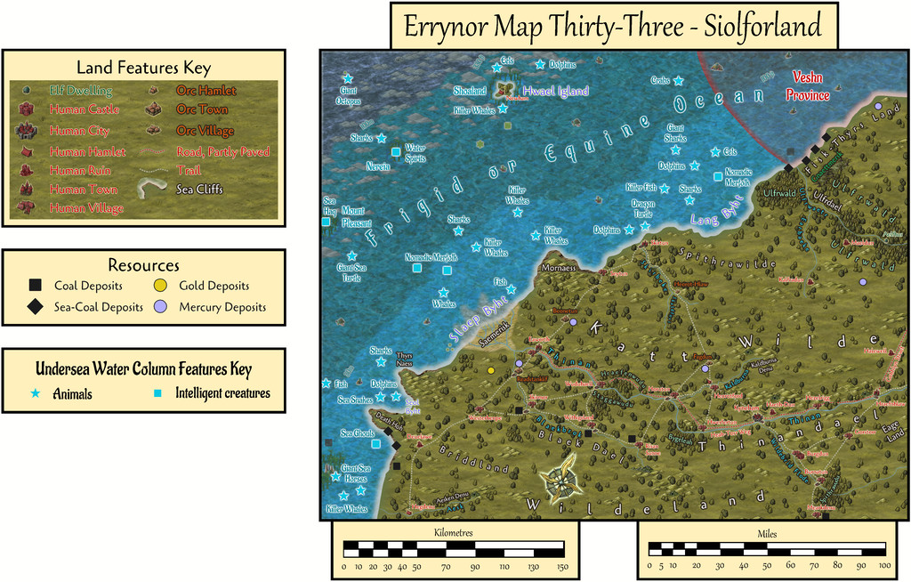
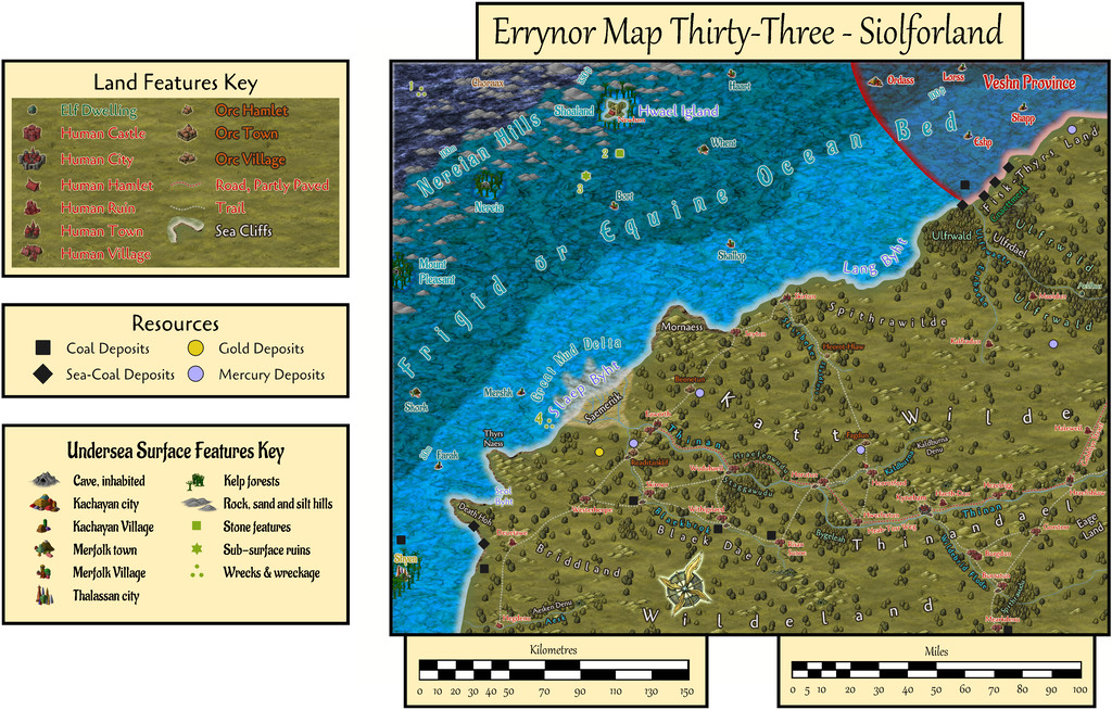
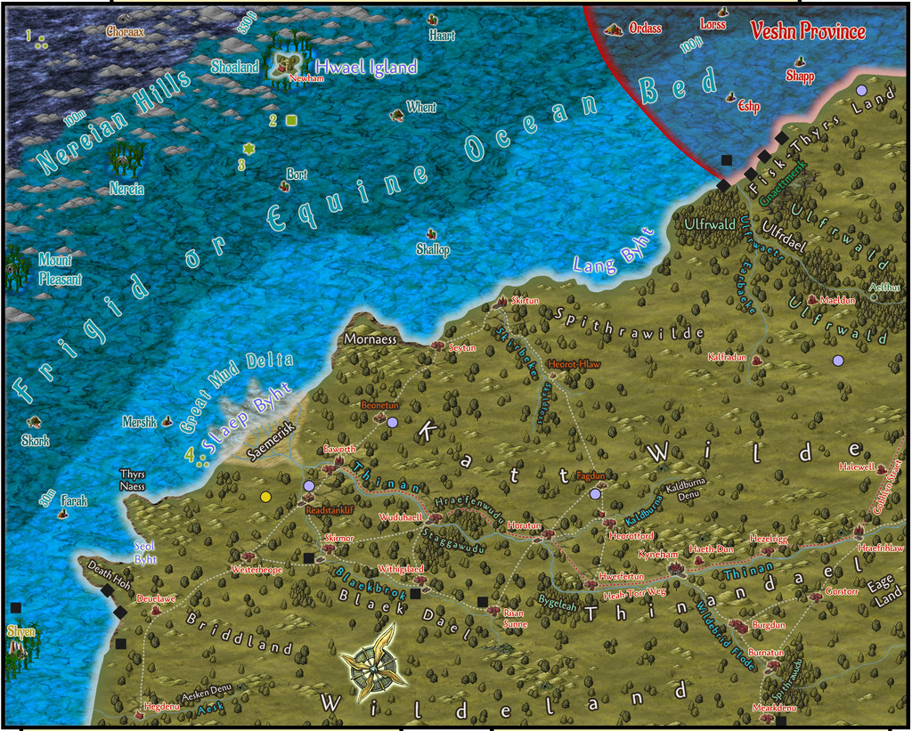
After setting-up the map template and importing the image files I'd be needing to trace-in all the prepared details, my primary concern was resolving the appearance of the two inshore undersea water-depth contours, something I'd not done before. The deepest sliver of the seabed here, furthest offshore, is that below 100 metres water depth, and the look of that, the region between the 100m and 200m depth contours, had been decided already for the map showing the limits of Deep-Sea Hag Aunty MacKassa's domain, across the junction of Maps 1, 2, 9 & 10. These two new shallow-water contours though took days to complete, after a lengthy battle with the complex RGB Matrix Process in combination with the Adjust Hue/Saturation Sheet Effects, and a few more, ultimately unsatisfactory, ideas that were finally discarded.
A further struggle was getting those three isolated low seamounts, Mount Pleasant, Nereia and Shoaland, to still stand out sufficiently among the kelp and other symbols overlying them. Actually, even getting them to be visible with NO symbols over them proved remarkably difficult, because for all the 30m boundary is clear at the edge of its broad strip off the coast, in smaller patches, that definition is quickly lost. However, those small seamounts are meant to have steep, cliff-like sides, not a gradual slope down, so adding the dark edge glow to them seemed justifiable, and made them stand out against the 30-100m water contour band's colouring better, albeit adjusting that "cliff" colouring and size took almost more time than resolving the colouring of the two inshore depth contour bands!
Among the preparations for the map ahead of time was how places were to be named on the land and sea surface view. This was to be using a minor variant of Old English for the local overland dialect of the "Common Tongue". Some of the terms will be likely obvious enough, simply with different spellings and pronunciations - "Sae" is clearly "Sea", for instance, and "Byht" = "Bight". Others may be less-so, such as "Thyrs" meaning either "Giant" or "Demon" depending on context, or "Slaep", which means both "Miry" and "Slippery". The PDF notes accompanying the map will explain more, with translations for all such names.
As for what's meant to be going on here on land and at sea, well there's a quite complex interweaving of activities, mostly associated with the map's resources of coal and mercury (locally "kwikusiolfor", quicksilver in translation, hence Siolforland = Silverland), mining and shipping both out as trade commodities, with the problems of distance and what might also want to seize the goods, or the humanoids and creatures doing the transporting, along the way. The exports are going primarily to the Goblyn Realm of Arkant to the north, a journey of about 900 km, 550 miles, by sea, or at least 650 km, 400 miles, by road. Some also pass east over land to and through the Spiney Ridge Mountains, which start around 550 km, 350 miles, away, over rather poorer roads and even more hazardous lands.
The PDF again has more details, including about the local Orcs, the Siolforfolk, who gain their wild magical abilities from being able to tolerate the presence of mercury without problems or side effects, and the difficulties of the ongoing civil war in the undersea Kachayan (or Sea Devil) Veshn Province. Oh, and there's a Gold Dragon with a fascination for the activities of humanoids across this region.
Incidentally, for anyone peering at the land place-names and wondering how they originated, or those who might be thinking one or two seem vaguely familiar, it's a distinct possibility most derived from real-world place-names in the former coalfield areas of Northeast England (many of which also have modern names determined by their Old English originals)...

-
Importing vector symbols with no background for a parchment background
As long everything except the solid-colour parts of the vector drawings are transparent, and in a PNG format, this should be perfectly practical.
Not sure exactly what parts of the process you may need help with, but perhaps these two half-hour video tutorials may help: