


Loopysue
Loopysue
About
- Username
- Loopysue
- Joined
- Visits
- 10,415
- Last Active
- Roles
- Member, ProFantasy
- Points
- 10,161
- Birthday
- June 29, 1966
- Location
- Dorset, England, UK
- Real Name
- Sue Daniel (aka 'Mouse')
- Rank
- Cartographer
- Badges
- 27
Latest Images


-
Live Mapping: Mercator Historical
Hi Everyone :)
In this week's Live Mapping session Ralf will be creating a map in the Mercator Historical style, which was the very first issue of the very first Cartographer's Annual 15 years ago now.
Come along and join in the fun! :)

![[Deleted User]](https://secure.gravatar.com/avatar/c75d9a245b74d9c59be0999ea81ca541/?default=https%3A%2F%2Fvanillicon.com%2F92add7f8c954488718110edc4896ad39_200.png&rating=g&size=200)

-
Creating greater depth
I think you are doing well with the contouring. It does take some time and patience to get it right. Roads are a tricky one. I did a city a long time ago and cheated a little bit by using 6 or 7 tiers a bit like a disorganised wedding cake. That way each tier cast a shadow where necessary over the roads and houses on the tiers below.


-
The Creepy Crypt project
Yes, I managed to make them look quite a lot more scary by removing the broad band and making them less like actual Earthworms than before ;)
Its strange isn't it. Something can be made far more scary by making it even just slightly abnormal in some relatively small way. Maybe it's because we don't have a memory of seeing it in real life and have to look twice, before failing to identify it?
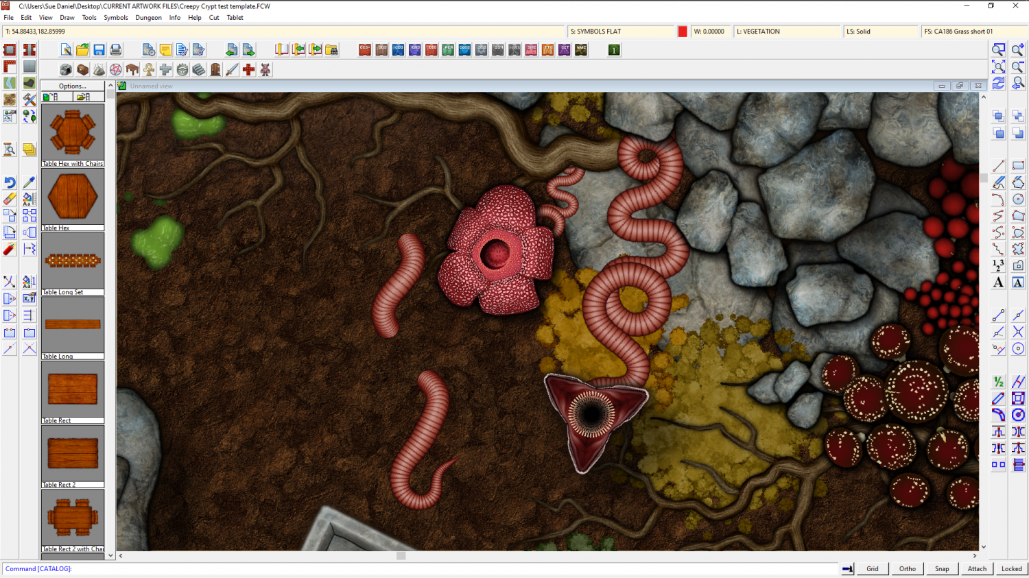
Oh, I did a rafflesia flower for Joe, and cheated by using a scaled down worm body as the short stem from the roots. They just pop up out of the ground, but I thought it would look a bit more creepy with a long worm-like stem. Maybe when I've done some mummies and things like that it will be even more creepy having them appear to be growing out of the bodies.


-
Creating greater depth
You do have to have as many ROADS sheets as you do tiers, and then one more to try and blend any joins... unless you hide the join with a bridge or a tree.
-
Correct order to install
CC3+, the latest update, then everything else in no particular order, then the latest CC3+ update again right at the end.
Always have CC3 shut when you install, and do it by right clicking the installer and picking "Run as administrator".
Sometimes the installer will ask to open CC3 at the end of the run. Allow this to happen, then close the app again ready for the next install.
The free monthly symbols can be installed at any time and do not require you to re-run the latest update again.


-
[WIP] Cliff City B&W
It looks quite complicated.
If you aren't happy with it yet, consider working on one level at a time. Start with the base level and get that right first, and then move up a level and get that right.
Drop shadows are not ideal in this situation, since the shadow can end up detached from the cliff. It is better to use a fairly light shadow with a reasonable blur at each level of the cliff. Don't forget to cap each level with a white polygon to cover the inside, like putting the lid on that level, or the shadows will show inside the cliff as well as outside it.


-
FT3+ to CC3+ export with style?
When you export your file there should be a small range of styles you can pick at the top of the list. At the moment these appear to be the core styles plus 'Jerion', which I think you may already have used.
This is FT3+ by the way. FT3 doesn't have these options.
I think there might be a way to add to that list, but I'm not entirely sure how it's done.
-
Live Mapping: Modern Atlas
I keep telling him not to play dare with Thor!
LOL!
-
Help with lighting
When you use the command, what figure are you getting in response at the command prompt? Is is 4000000, or 40000000?
If it is only 4000000, type 40000000 and press enter to change the setting.
(I had to count those zeros several times! There are no commas to help you, but one is 4 million, and the other is 40 million)


-
Help with editing a landmass
Hello pabadger :)
The simplest way to do this is to Use the Land drawing tool to draw a third landmass that traces both of the existing ones.
1. First, ensure that both those landmasses are made of straight polygons instead of smooth ones by right clicking the Fractalise button |CC2FRX|and picking smooth to straight. Use the tool to turn both landmasses straight. This may make it look slightly different if they happen to be smooth, but you can reverse the process using Straight to Smooth from the same right click menu on the new landmass when you are done tracing.
2. Pick the land drawing tool (preferably the straight one if there is a choice) and click once on any point of the land, then press letter T on your keyboard to enter tracing mode.
3. Pick the coast not far away from where you started, and then start the trace with a second click between where you started the line and where you indicated the trace operation.
4. Drag the trace line to where the two landmasses join, making sure you don't trace any of that bit where it overlaps, and end the first trace by clicking there. Don't end the drawing. Just end the trace operation. Then press T again and start a second trace operation to trace all the way around the other landmass until you get back to the other side of the overlap.
5. Do a third trace to finish the job by completing the trace around the first landmass back to where you started. When you get there, that is the point where you need to end the third trace and then finish the drawing operation.
Once the single landmass has been drawn in that single 3 part tracing operation you can delete the 2 older parts, and turn the coastline back to smooth if you prefer it that way.

