Loopysue
Loopysue
About
- Username
- Loopysue
- Joined
- Visits
- 10,414
- Last Active
- Roles
- Member, ProFantasy
- Points
- 10,161
- Birthday
- June 29, 1966
- Location
- Dorset, England, UK
- Real Name
- Sue Daniel (aka 'Mouse')
- Rank
- Cartographer
- Badges
- 27
Latest Images


-
Exploring the Annuals
If you click Add-ons in the Tools menu it will show you a list of all the add-ons and annuals you have installed. If you pick one of the annuals from the list you will be taken to the relevant webpage with a short description and links to the all the issues Mapping Guides. That will probably be more efficient way of finding things than having to search a huge volume of them all stuck together.
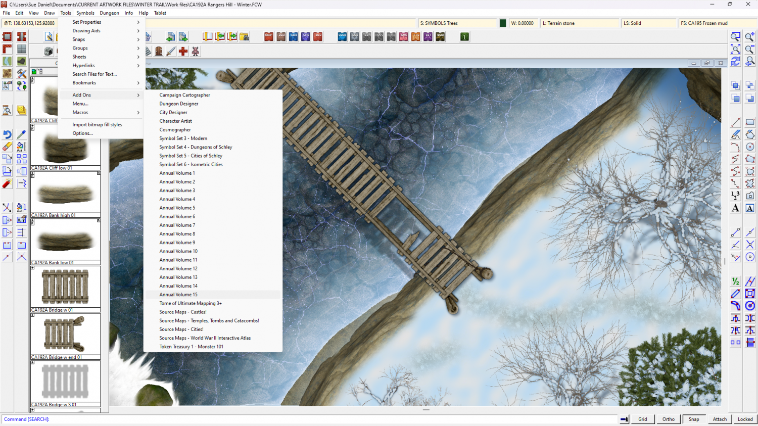
If you just want to look at a page of thumbnails to remind yourself of what's in each one, there's a slightly out of date one here:


-
Birdseye Continental - style development thread
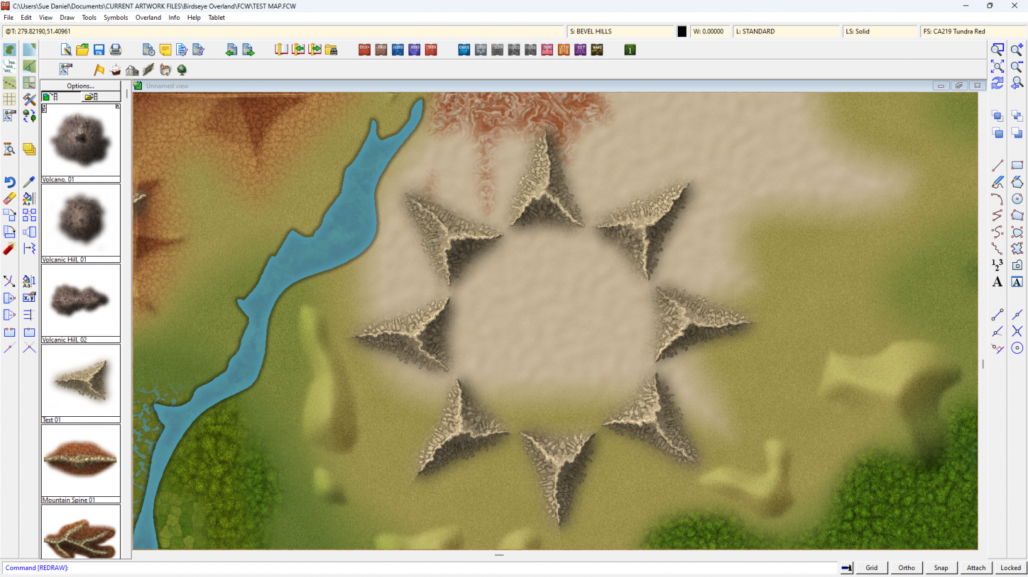
Rivers aside, I've been doing some work on the appearance of these mountain lego bits.
The shape leaves a lot to be desired at the moment, but I think I've got a workable style.
This is a ring of the same test symbol - testing the map file shades correctly.


-
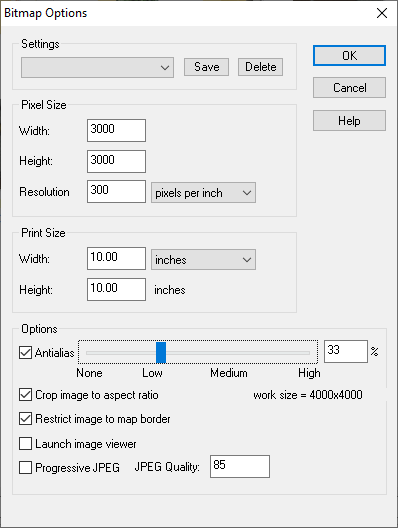
Why doesn't my jpg look like the image in CC3+
Here are the settings I use to generate a reasonably clear map, though the larger the area of the map the larger I go with the number of pixels width and height - up to 6000. Don't worry about the proportions being square. This setup should automatically crop to whatever the proportions of your map are. That's what those two options I have checked at the bottom do.

-
ProFantasy is looking for a web developer and graphic artists
Profantasy is a most excellent employer - the best I've ever had in all my 57 years :)


-
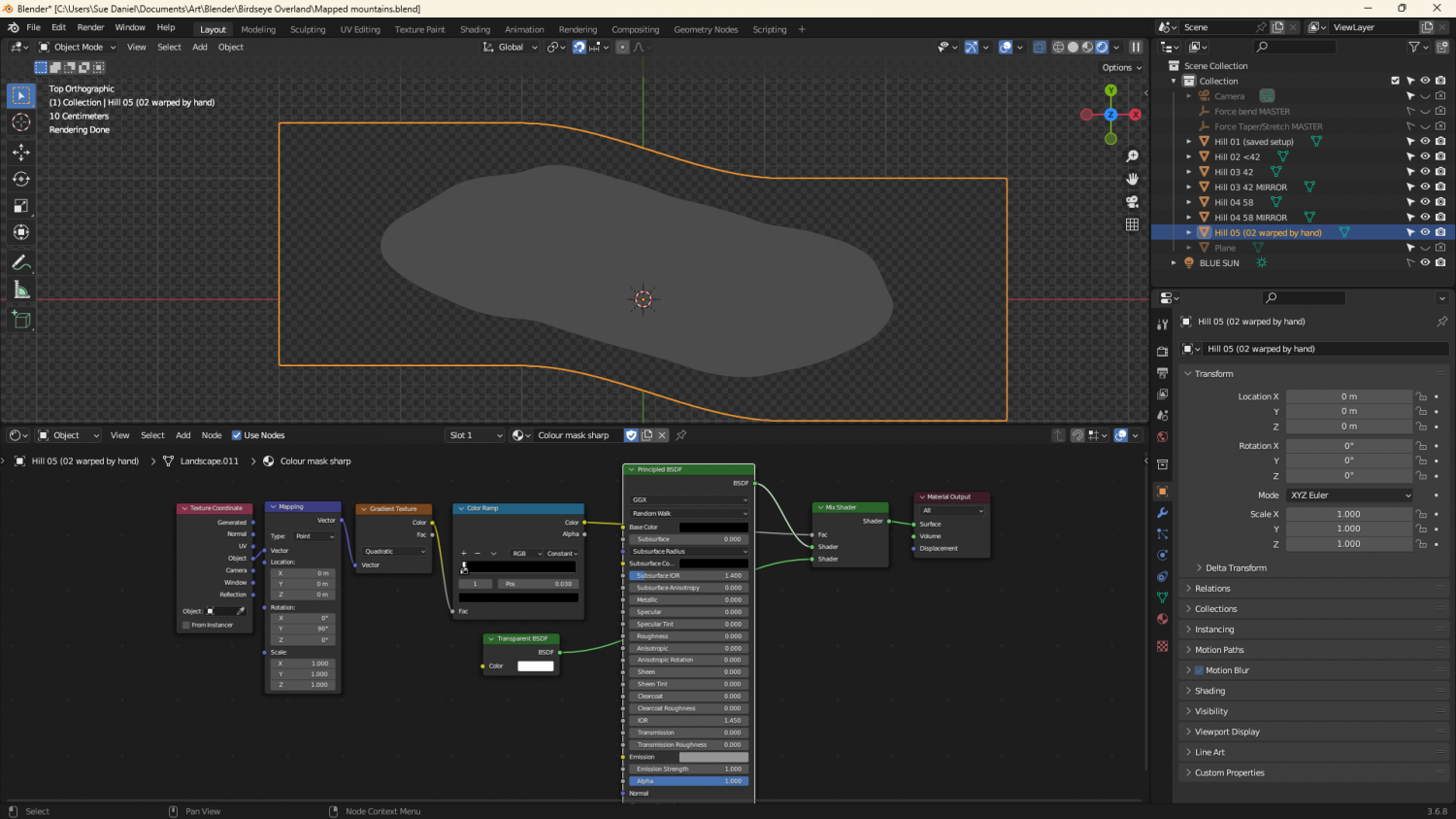
Birdseye Continental - style development thread
They're solid grey, just a bit darker than neutral grey, and because they are mapped symbols I can use an Overlay Blend Mode to make them take up the colour of the terrain.
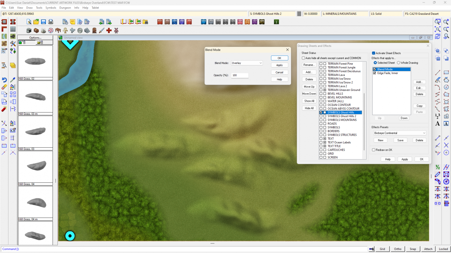
The blend mode does odd things around the edges if I feather the edge of the symbol, so the EFI after the Blend Mode is to soften the base and help the hill sit into the terrain.
They're relatively simple map files, exported from Blender. I made a material that could mimic a map file and put it on a very simplified 'Landscape' object. The blue part of the map material is a simple blue material that reflects more or less light from the 'BLUE SUN' directly above it. The red part of the material is a radial gradient based on the normals of the object faces, and expressed as an emission, rather than reflected light. That way it stays constant depending on the direction each face is facing, and regardless of the sun.
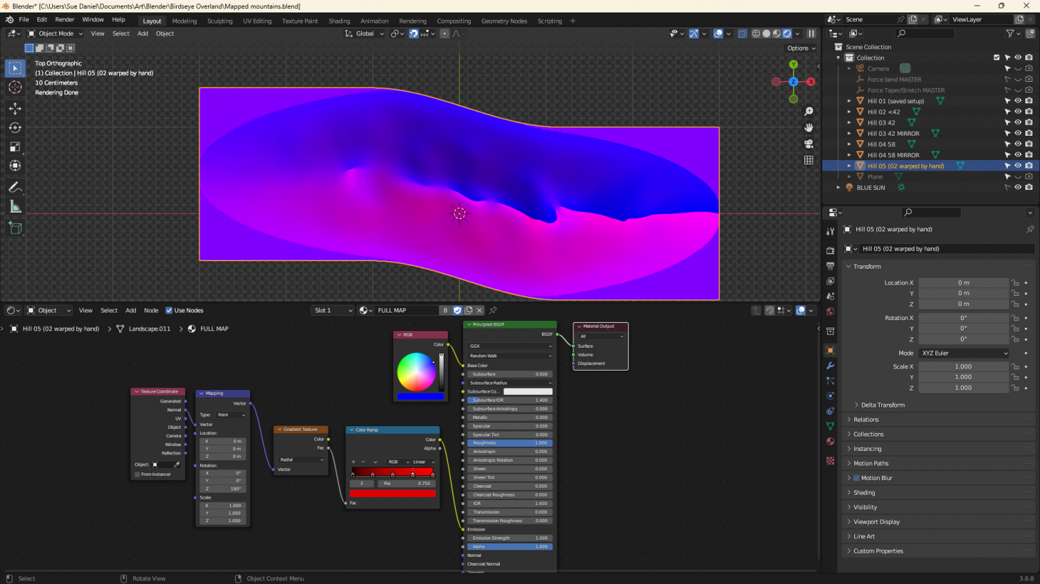
The grey image is a gradient material that maps only the parts of the ladscape above a certain point.


-
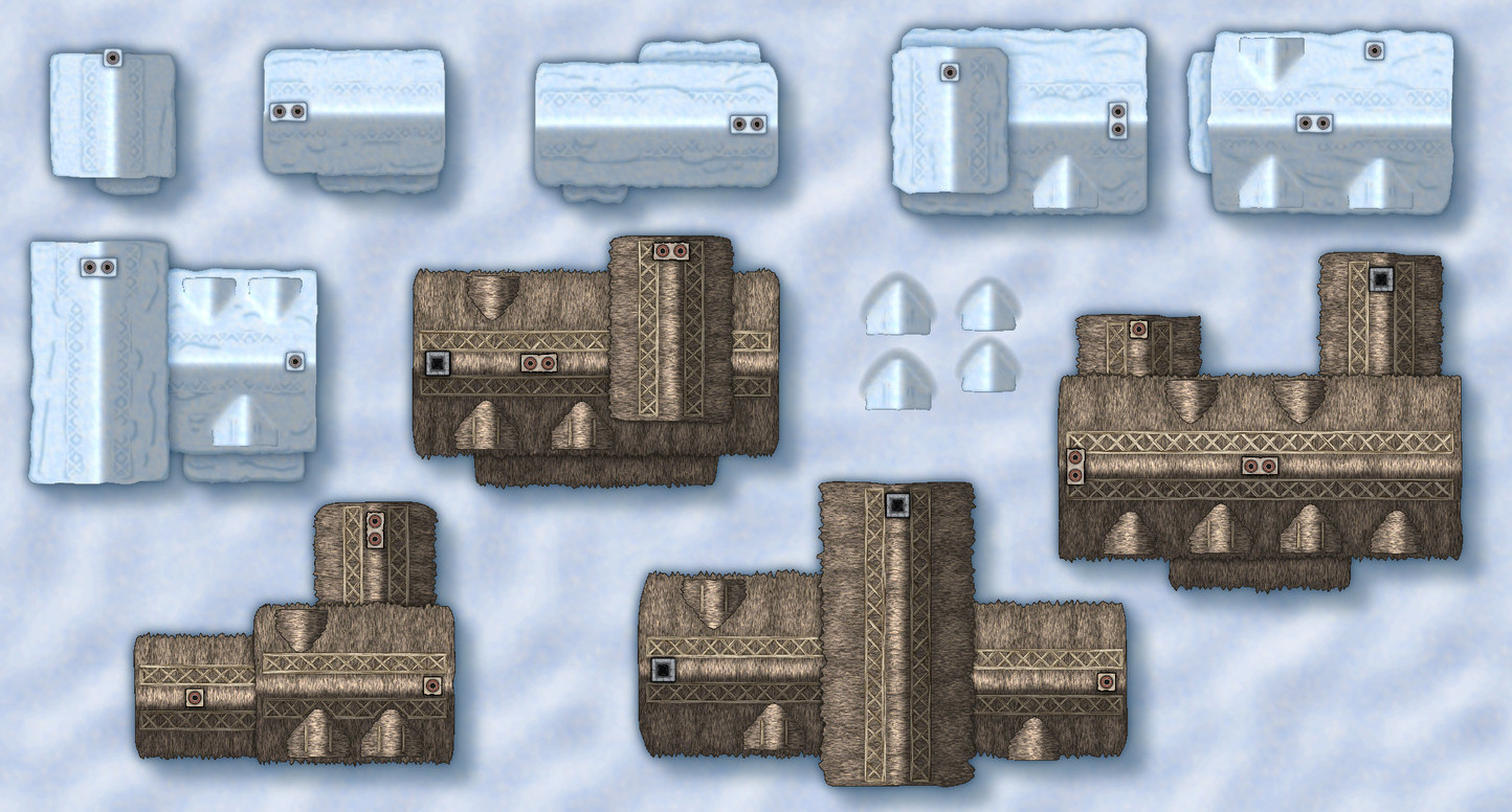
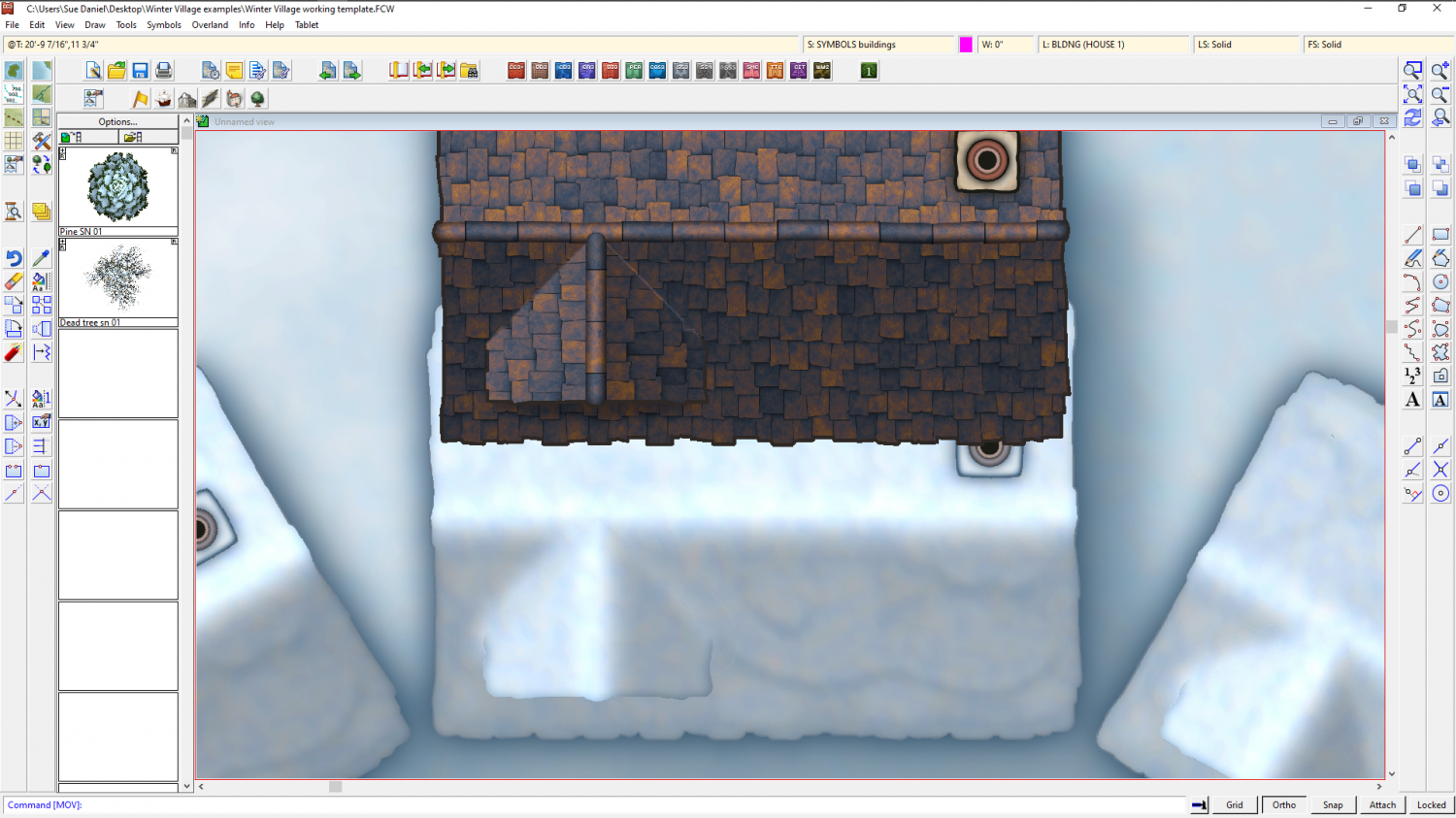
Winter Village style development (March 2022 CA issue)
A little more progress - a few more houses converted from DC to WV


-
Winter Village style development (March 2022 CA issue)
On the progress side (or lack of it today) I've had quite a struggle getting the gradient shading of the map file correct so that the hollows around the dormer look filled with snow, and everything the right size and shape to be the same as the original but with a layer of snow on it. Not sure how all this is going to work when I start combining them, but we'll see in the morning now.


-
Banners
(6 symbol connectivity test using the "bright" version of Title A style)
![[Deleted User]](https://secure.gravatar.com/avatar/c75d9a245b74d9c59be0999ea81ca541/?default=https%3A%2F%2Fvanillicon.com%2F92add7f8c954488718110edc4896ad39_200.png&rating=g&size=200)
-
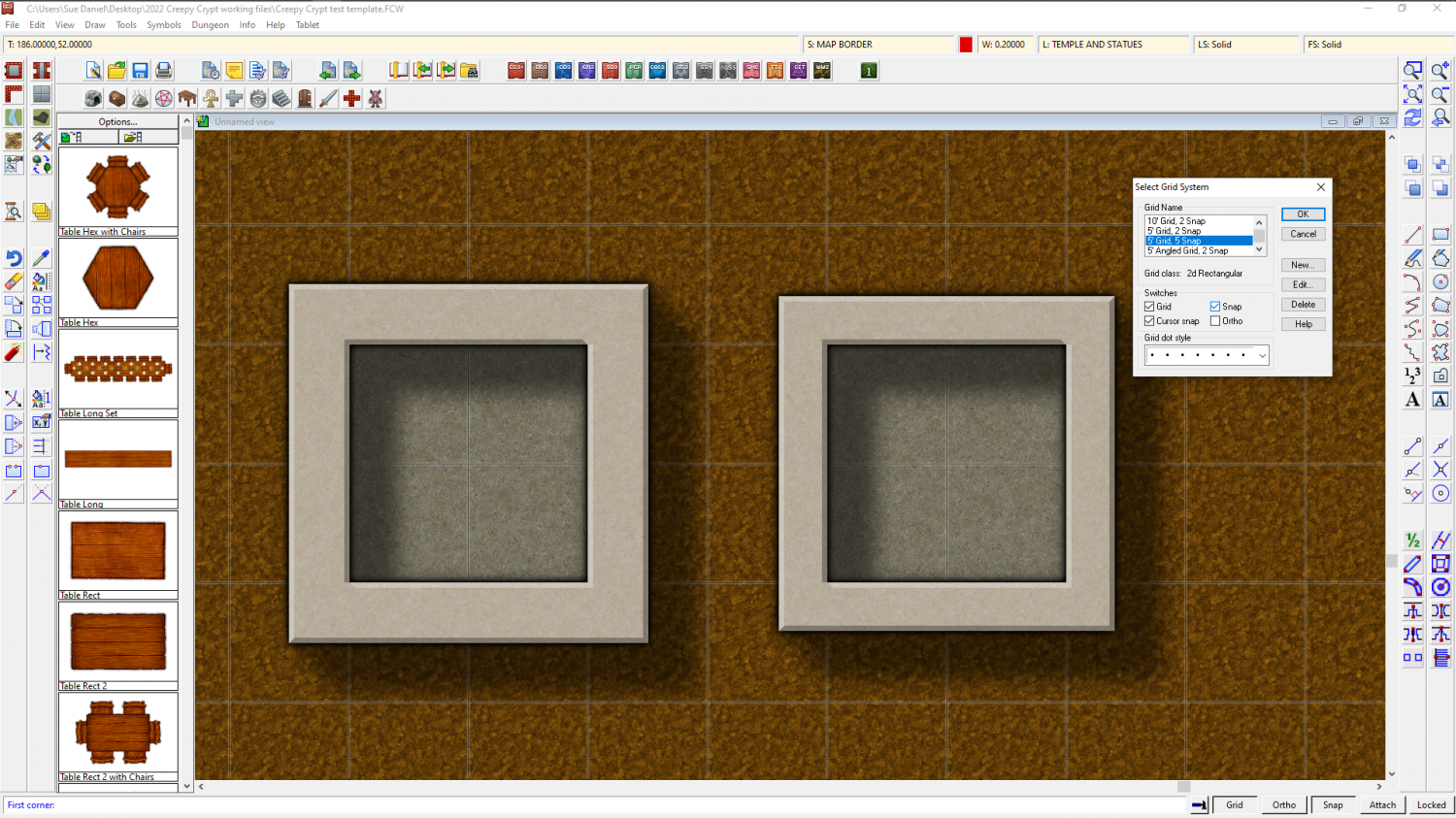
How do I create walls that do not cross into half or more of the floor square?
Similarly, if you want 2.5 foot wide walls you will need to edit the 5ft snap grid (right click the Snap button to do this) and make 4 snap points instead of 2, then draw your room 1.75 ft larger than you want it on the first snap point outside the boundary of the floor space.
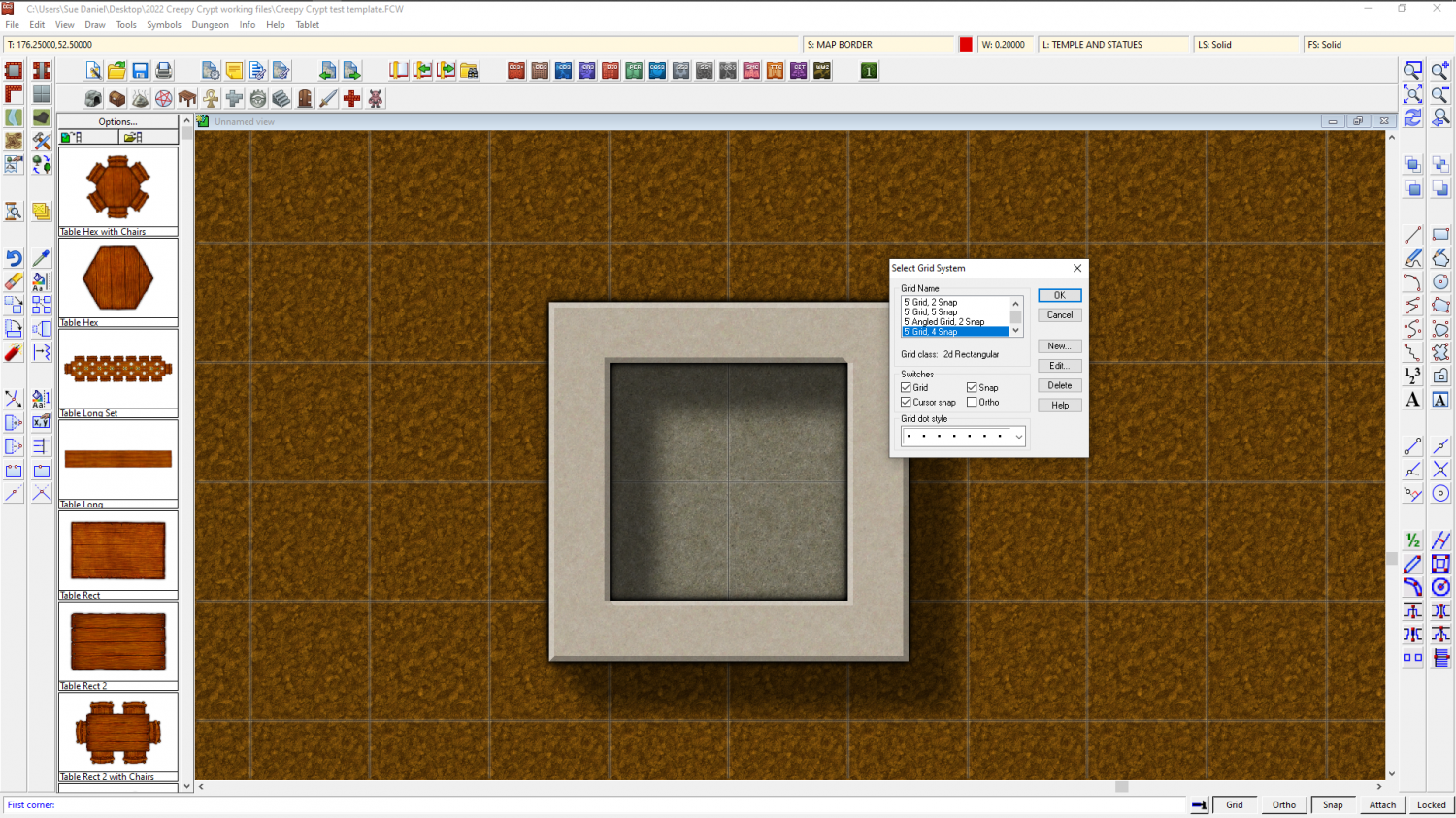
Or for 2 ft wide walls you need to use the 5 snap 5 ft grid.
-
Jim Pierce 1947 - 2024
What a huge body of work to leave behind! Besides being a lovely, gentle man he will probably be one of the most prolific fantasy mappers in history.