Loopysue
Loopysue
About
- Username
- Loopysue
- Joined
- Visits
- 10,354
- Last Active
- Roles
- Member, ProFantasy
- Points
- 10,107
- Birthday
- June 29, 1966
- Location
- Dorset, England, UK
- Real Name
- Sue Daniel (aka 'Mouse')
- Rank
- Cartographer
- Badges
- 27
Latest Images


-
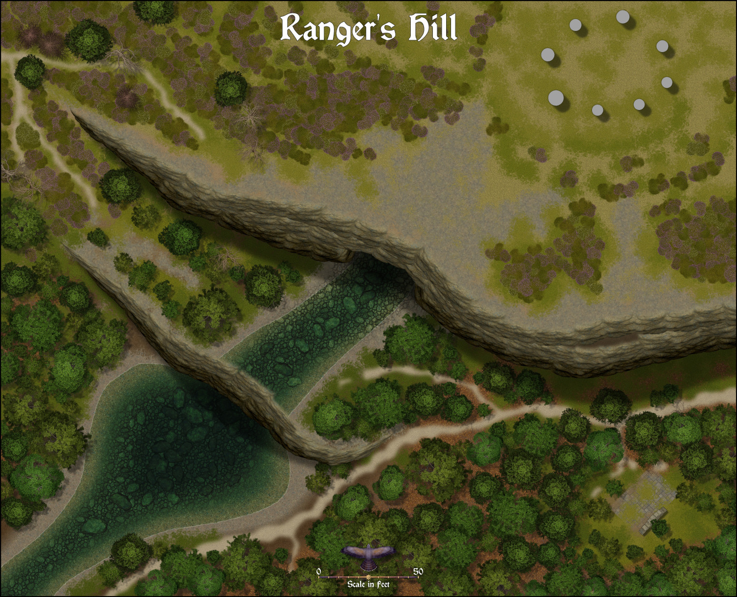
Forest Trail project - part 1
Part 1 will be published soon with all the trees and forest stuff, including the ruin parts.
I'm now working on part 2. So far I've done cliffs and heather. Standing stones are next, and then waterfalls and bridge sections. Bit of a strange bald spot in this map. I haven't decided what to put there just yet.


-
Crypt
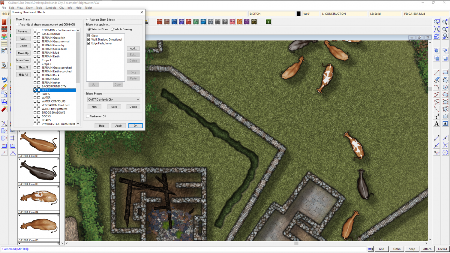
The easiest way to do this quickly, even if your building is quite complex in shape, is to use a Color key.
The first thing I do is move the GRID sheet to just below the SYMBOLS FLAT sheet in the sheet list. This places the grid underneath the wall.
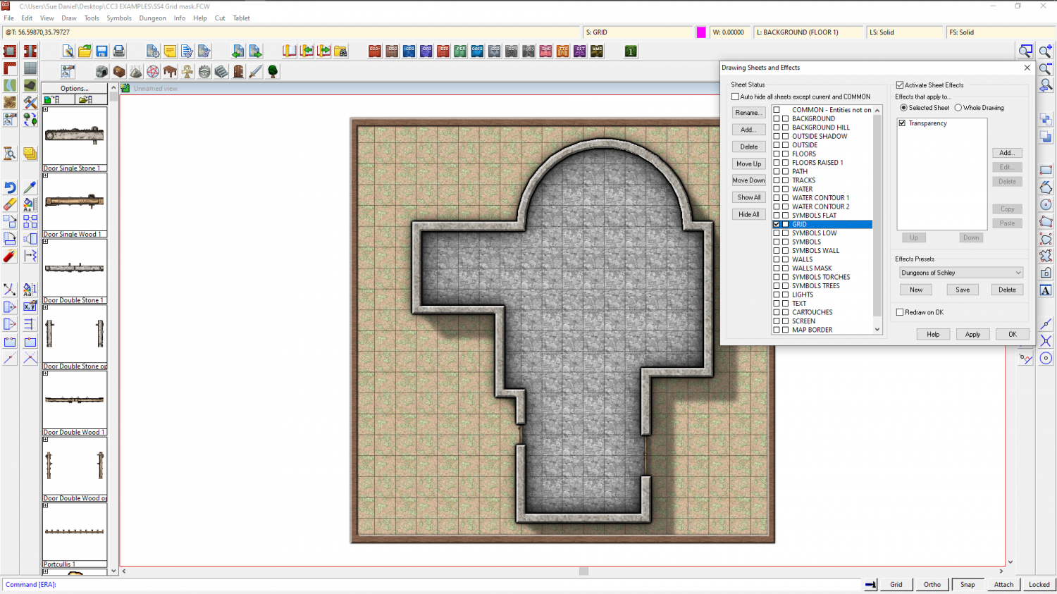
Then I add a Color key sheet effect to the GRID sheet and move it to the top of the list of sheet effects.
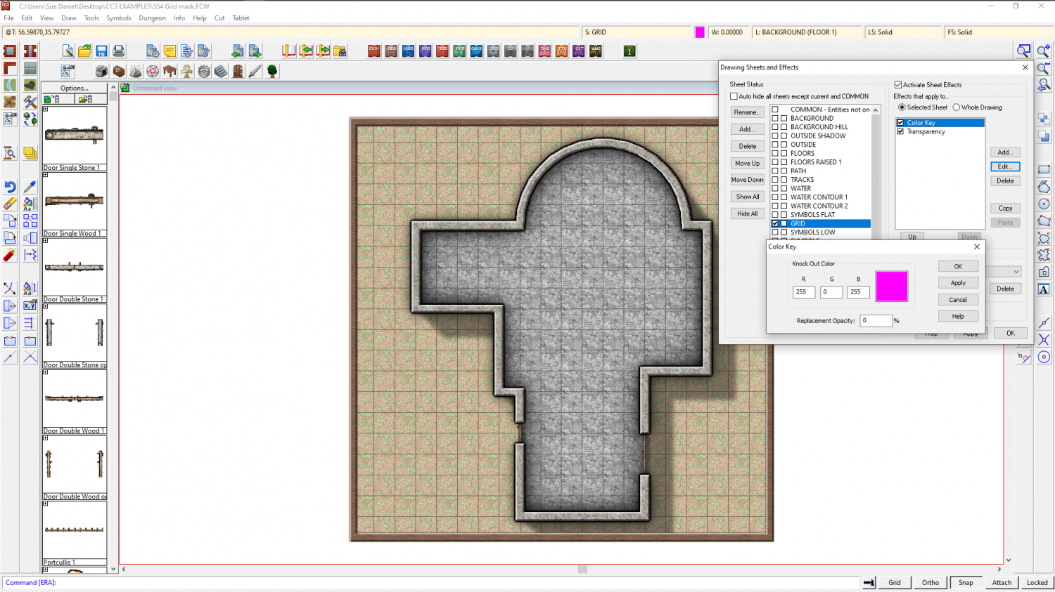
Ok all of that and make sure you have Solid fill and colour 6 selected as active. 6 is magenta - the same colour as was showing in the Color key effect.
Then draw a polygon on the GRID sheet that covers all the area where you don't want the grid to be visible. Here I have left a deliberate gap on the right hand side so that you can see how it was drawn.
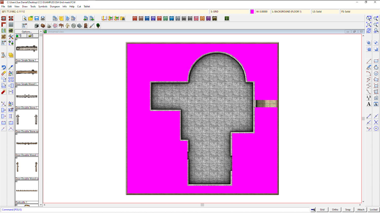
Refresh, and the magenta polygon vanishes, taking the grid with it.
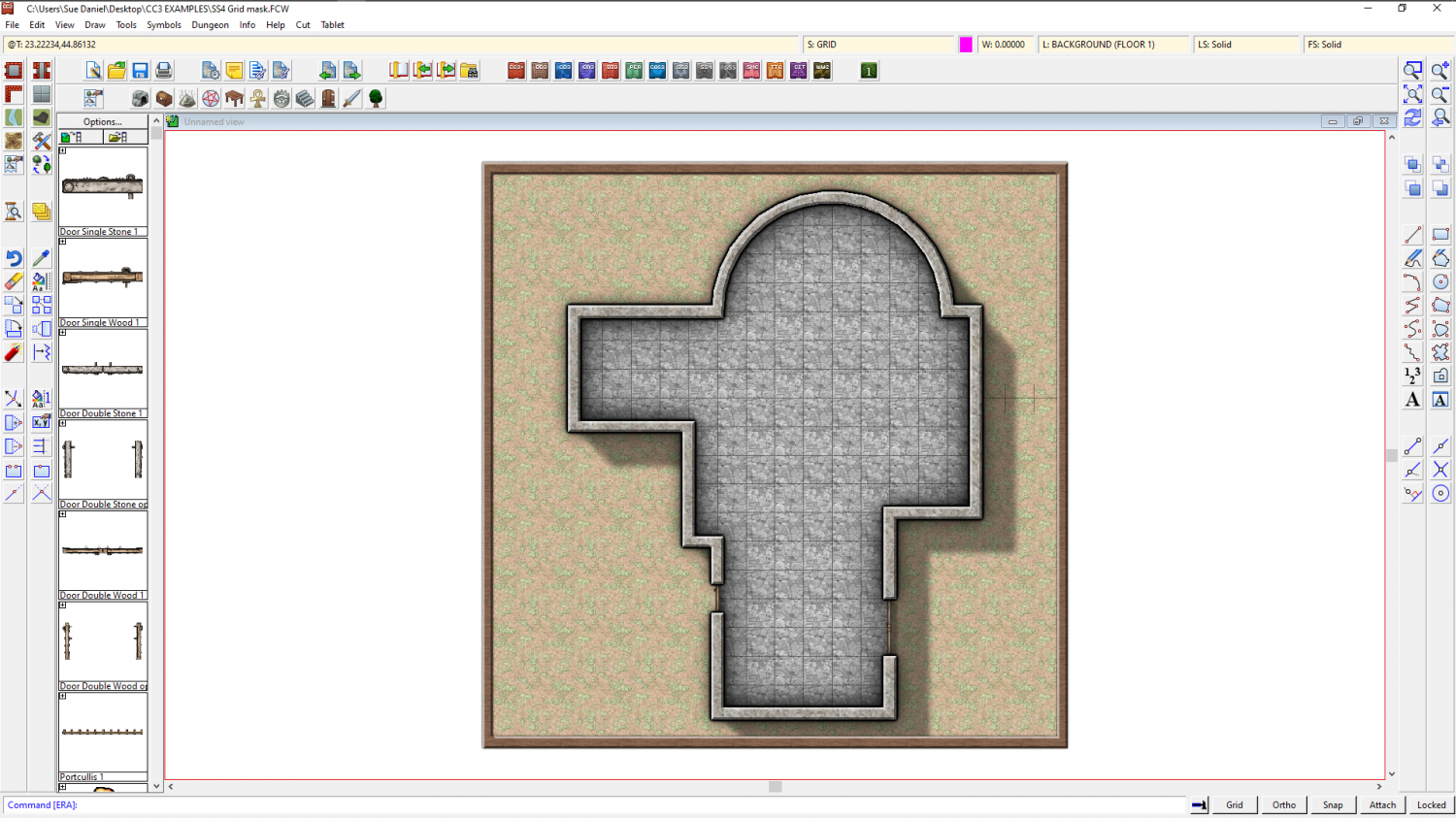
Once I move the nodes on that magenta polygon so that they cover that gap I left, I have a perfectly cropped grid.
Here is the file for that example
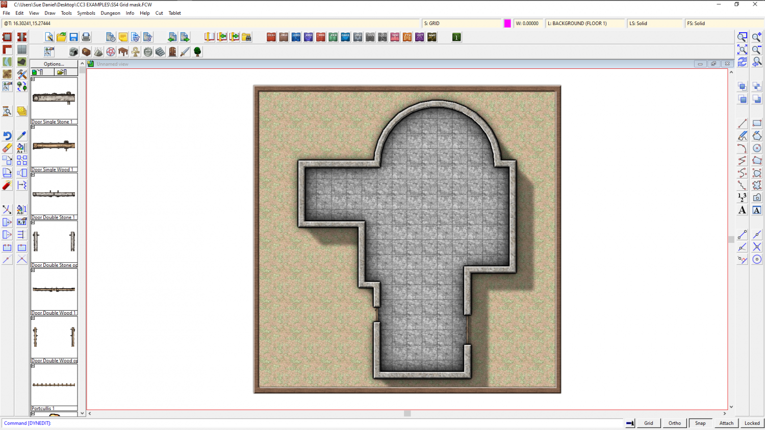
The other way I might do it, if I didn't want to be bothered with drawing a large and complicated magenta polygon, is by trimming the grid. Use the property picker tool to pick the grid so that you have all the right settings, and then hide everything but the floor and the grid. Then explode the grid and use Trim to entity from the Edit menu to trim the individual lines of the exploded grid to the inside of the floor extent. This usually takes longer to do than using a Color key, so I only rarely use it. There are also a few little glitches that can occur, such as lines that refuse to trim to the floor shape seen below. You can tidy them up by hand though using other types of trim.
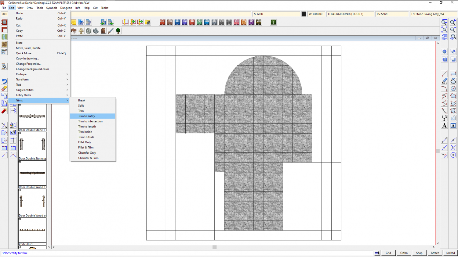
This is the tidied up result. To make sure you don't keep accidentally selecting the separated lines of the grid, group them (as they were before you exploded them) and then make sure the grid is on the HEX/SQUARE GRID layer and freeze the layer.
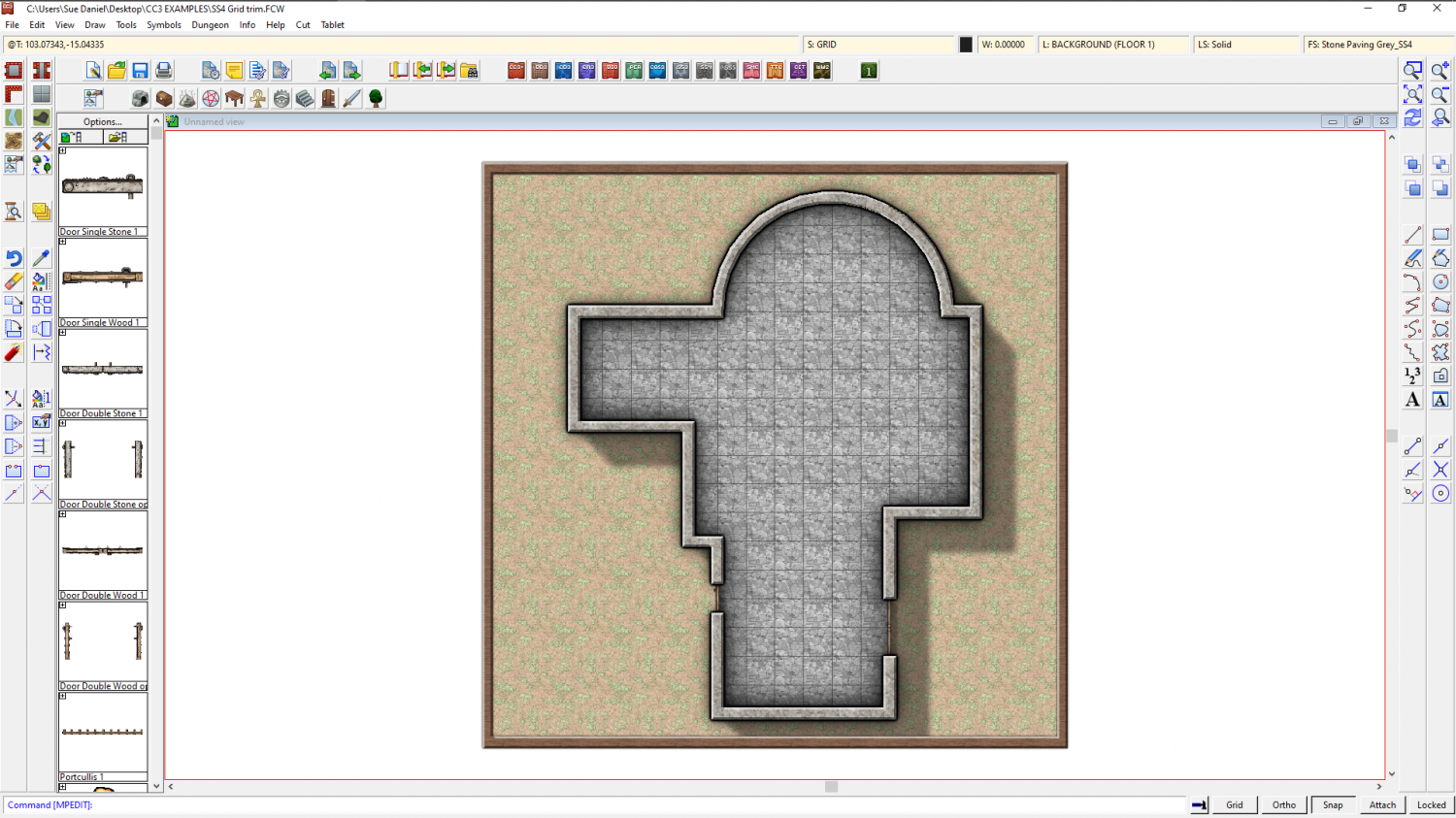
As you can see, the result is the same. Perhaps the main disadvantage of trimming the grid is that it's not so easy to edit the shape of the floor.
This is the trimmed grid example.
![[Deleted User]](https://secure.gravatar.com/avatar/c75d9a245b74d9c59be0999ea81ca541/?default=https%3A%2F%2Fvanillicon.com%2F92add7f8c954488718110edc4896ad39_200.png&rating=g&size=200)

-
[WIP] August Competition - Vertshusen Town Hall and Tax Office
Ok. I've had a bad time with 2 full restarts, so this is the final version of all 5 levels - no fancy stuff - just maps. If anyone wants to adjust it to taste after the competition that's fine by me.
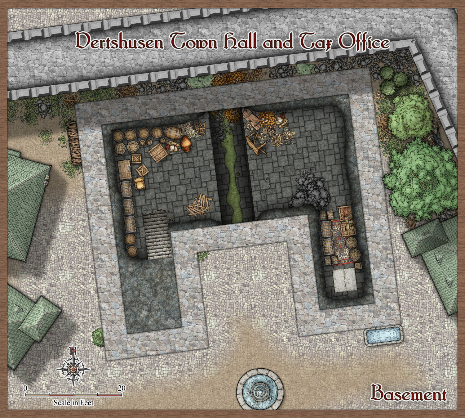
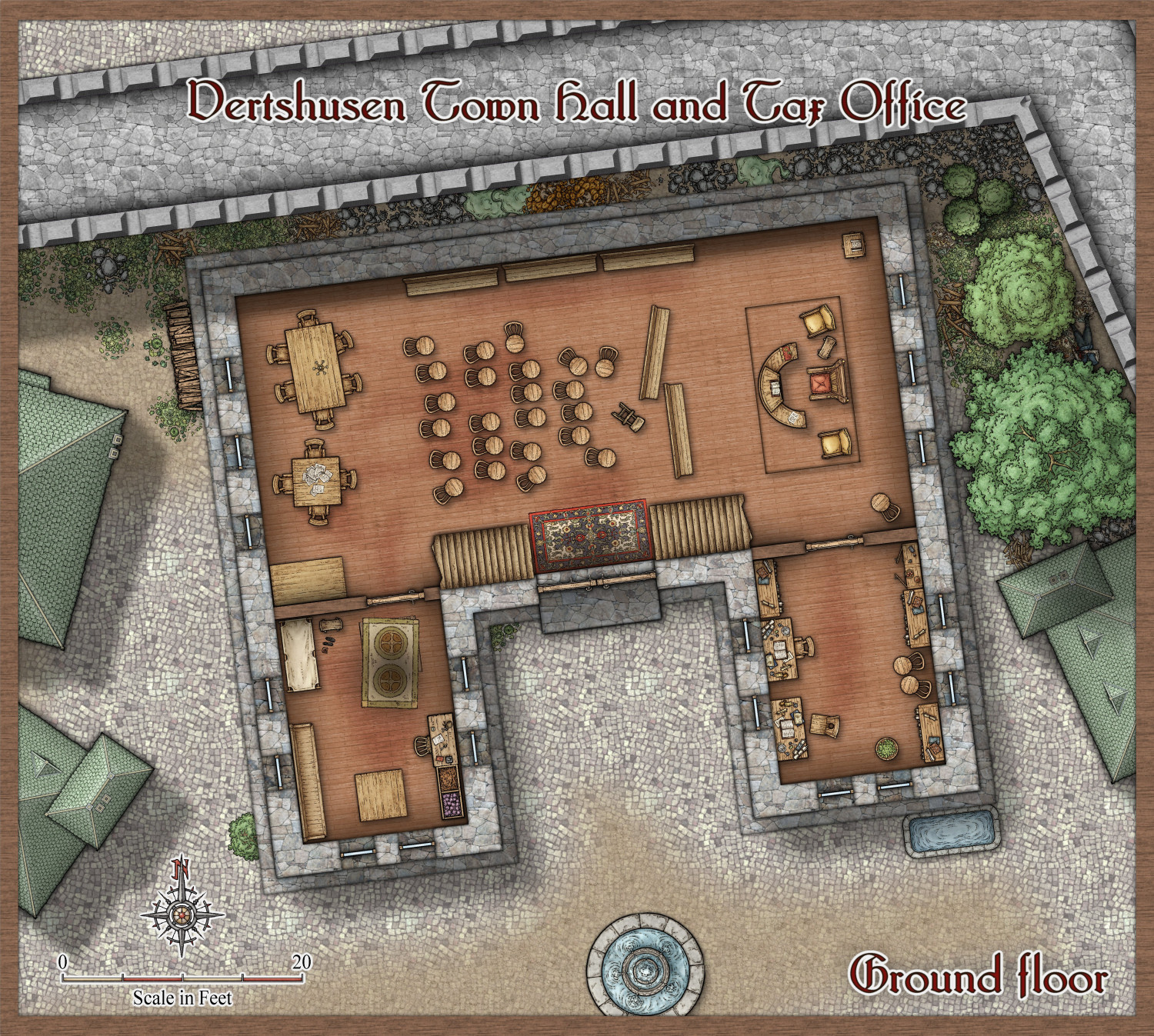
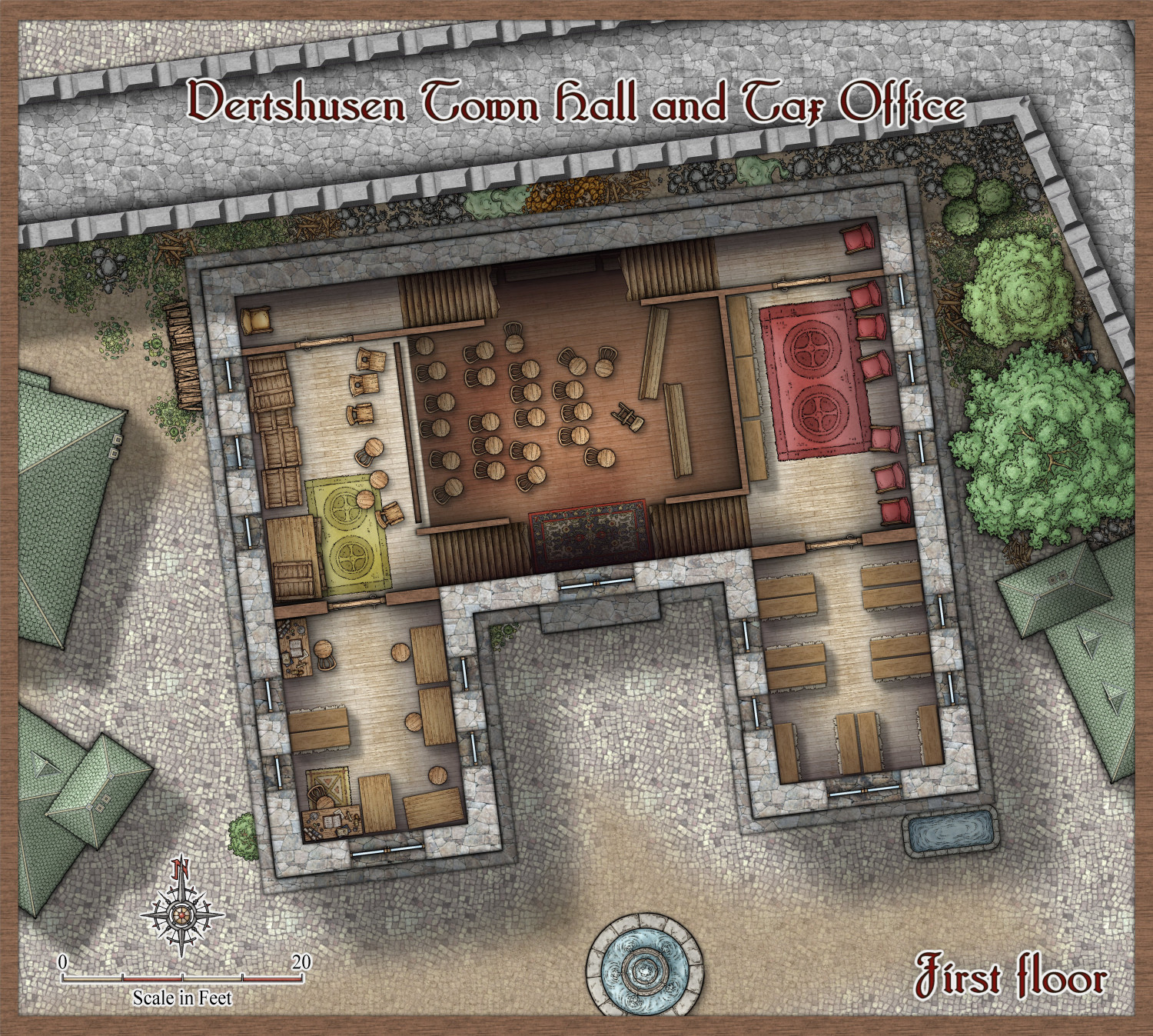
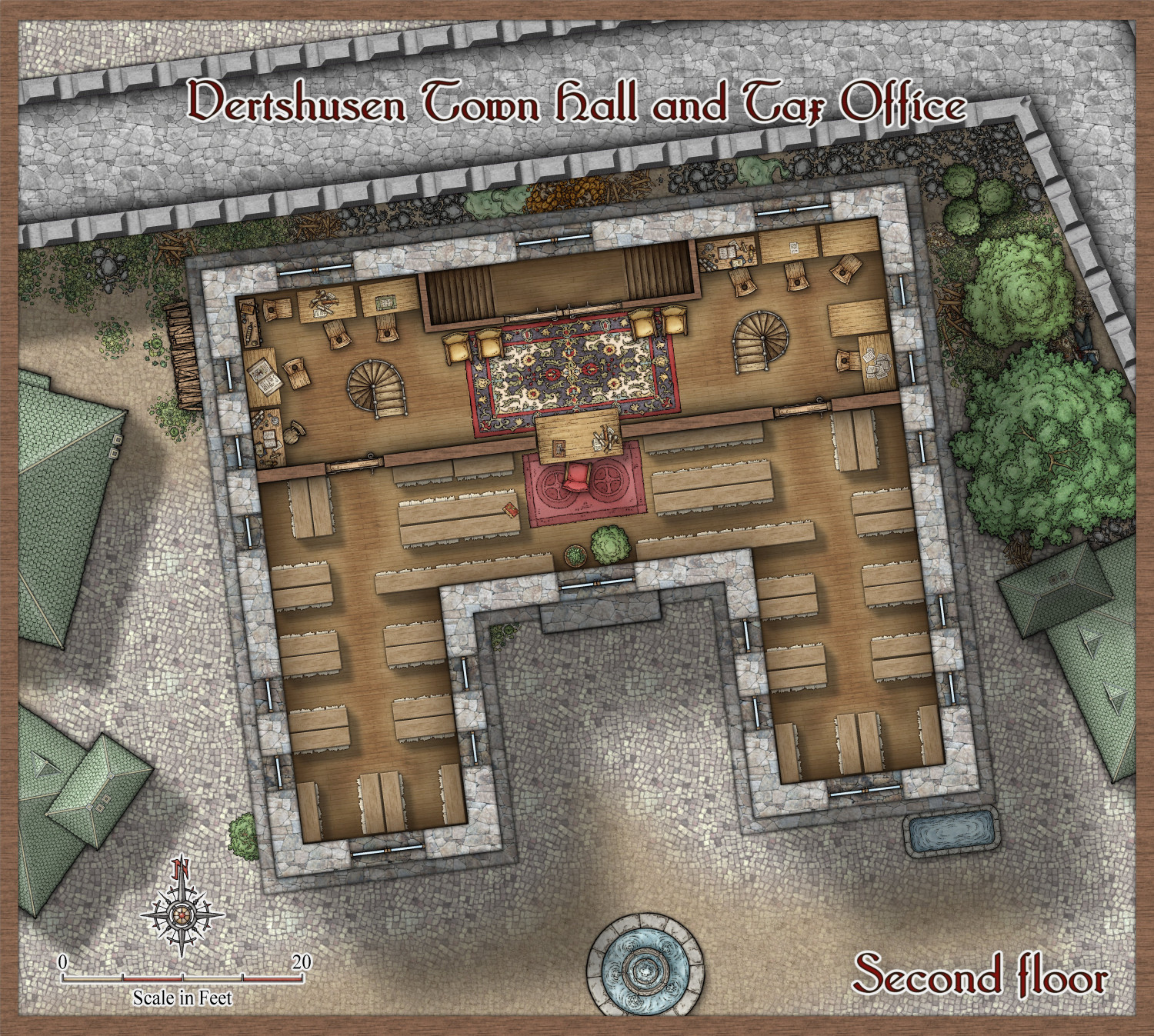
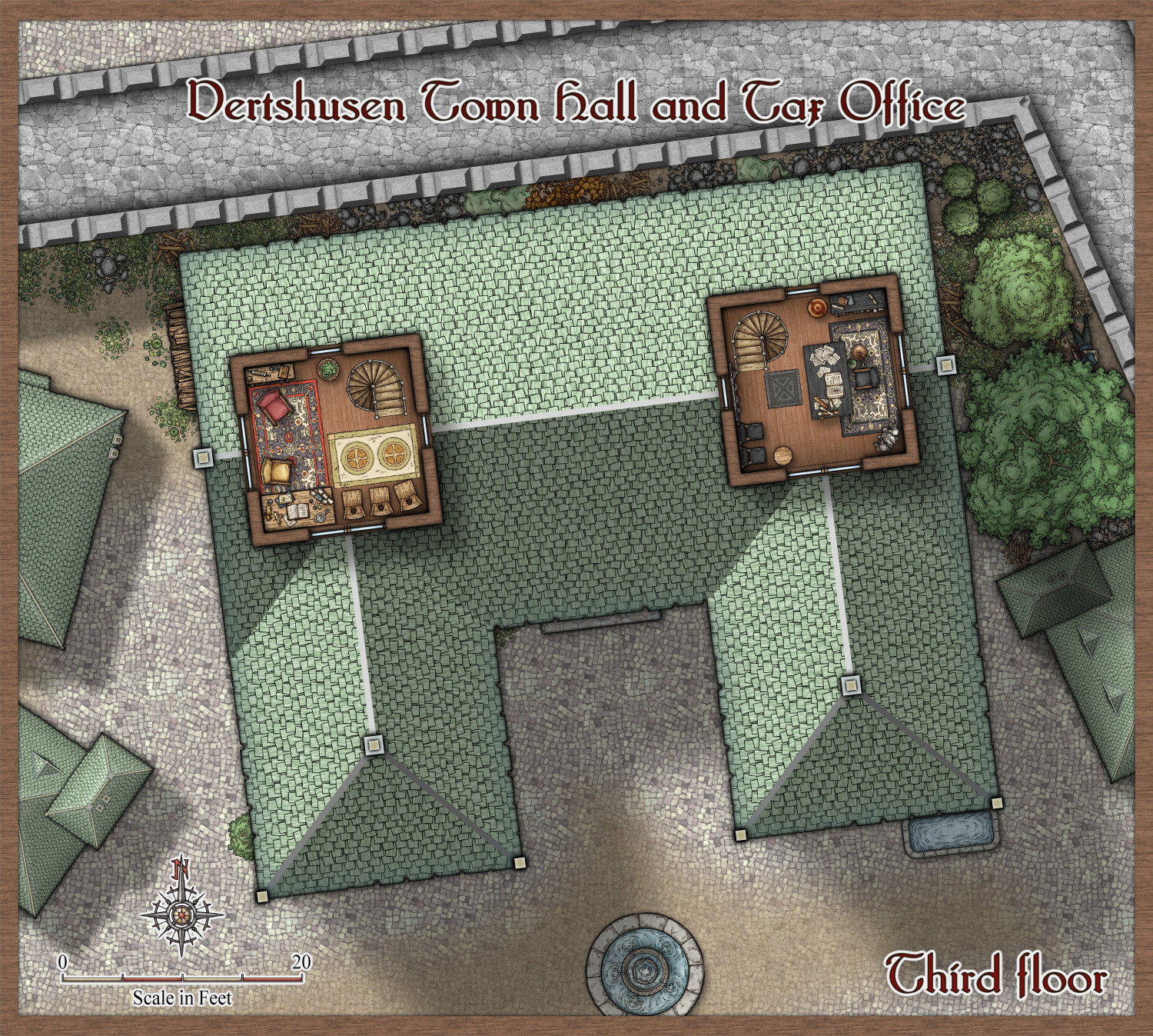
Enjoy! :)


-
The Creepy Crypt project
Working on the statuary a lot of people asked for.


-
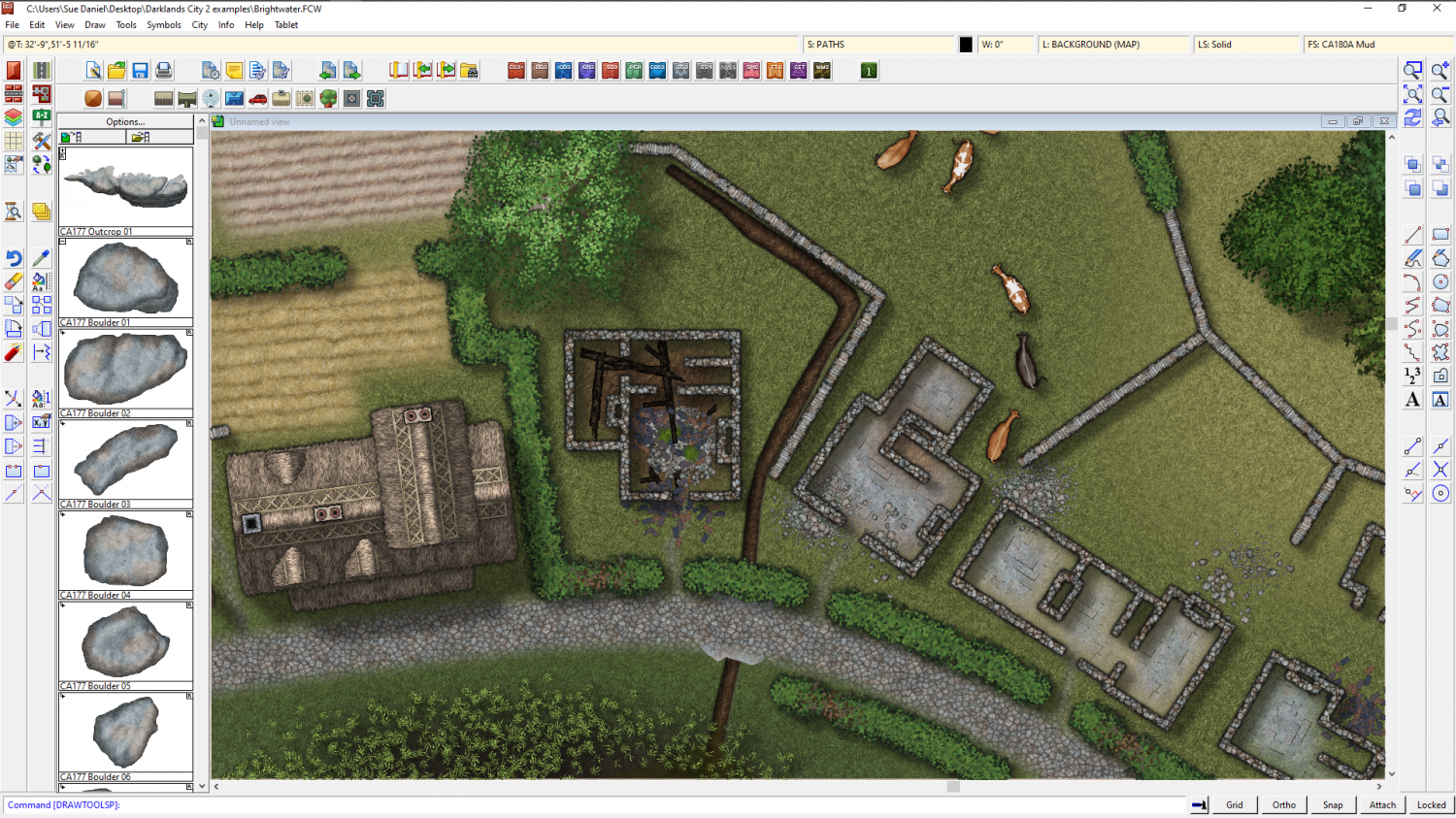
CA style development - "Darklands City" (issues for September and December 2021)
A ditch at city scale is relatively easy because you only need to worry about the general appearance of the thing rather than adding too much detail.
Would something like this do?
That's a fractal polygon of the darkest grass shade drawn on top of the field with those three effects employed to give the illusion that it is sunken into the field. That's a dark glow set to outer, a pale shadow of the same extent, and an edge fade inner that is twice the width of the other two. You could use the same effect in any city map. I will find a way to leave it in the example map for you.
I've made it drain into the marsh and put mud in it instead of grass, so it makes sense in the map now


-
Cyberpunk: Proof of Concept
This is exactly the problem I had when deciding which way to go with Marine Dungeon.
In the end, because it is only one small issue in 12-13 of a Cartographer's Annual, I had to be firm in my thinking and select the most commonly requested themes. This may leave some mappers a little disappointed with the end result, but it is better to have a well defined theme and to do it well, than try to mix in all kinds of stuff and end up with a style that is too pick and mix to be useful to all that many mappers.


-
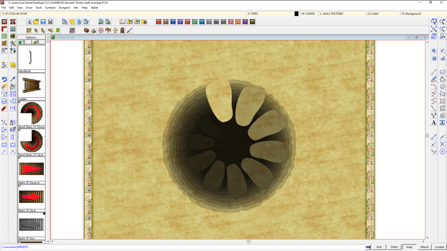
WIP Commission, Ancient Tombs
Would something like this help?

-
The Lakes of Michigami (Jerry's Map) - WIP thread
Thank you, @Raiko :)
@mahler - thanks :) I have no idea. I think this is probably too small a scale to show anything but the location of the settlements. Maybe Jerry will have the answer for that when the larger scale city maps are drawn.
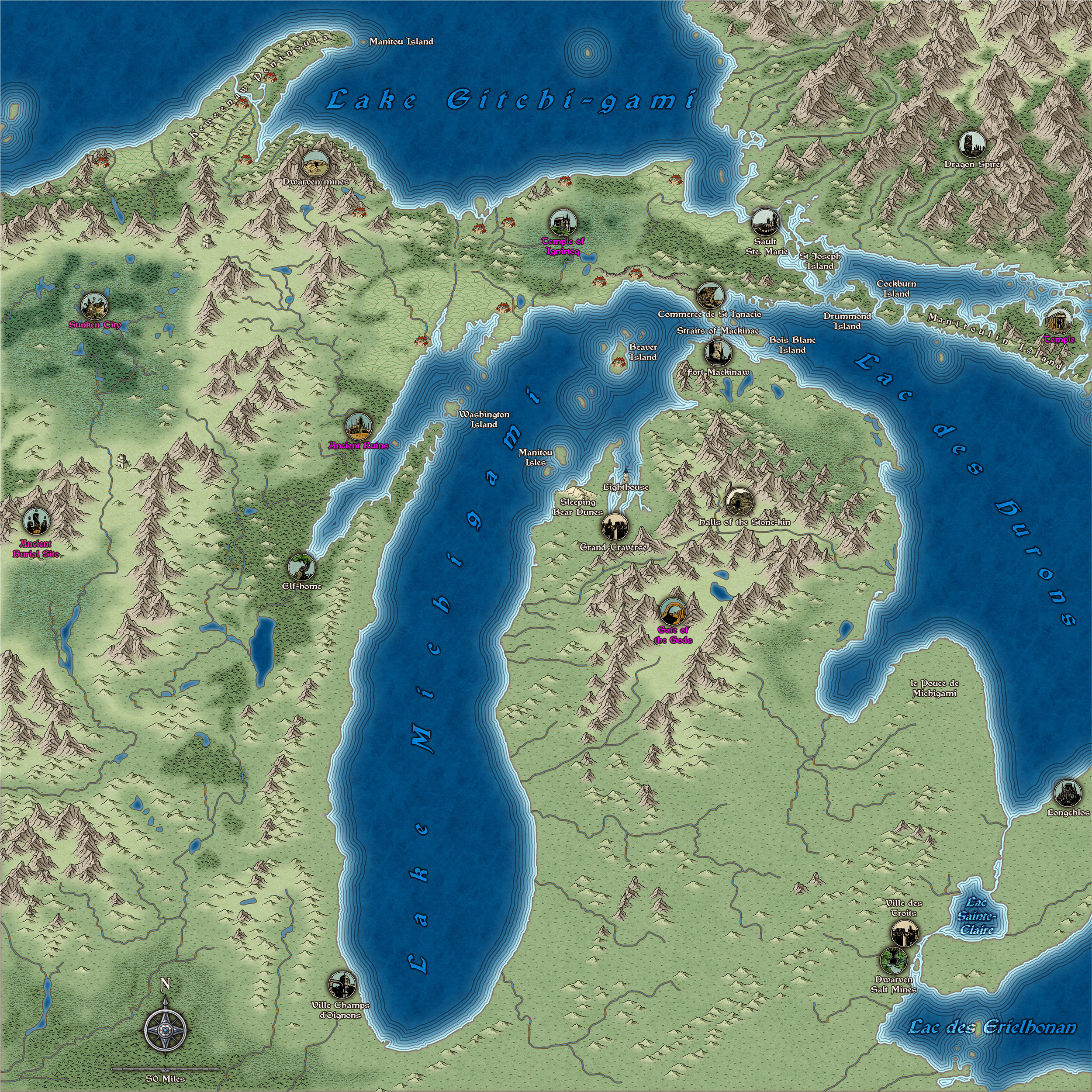
I've done a bit more work - adjusted the river system according to the US Geological Survey maps and then adjusted the mountain ranges and terrain around them. The locations labelled in pink are only vague suggestions from me, and may not appear in the final map.
And I've just noticed that by repairing the shoreline where it was missing bits (I did a trace from a heightmap from Tangram if you remember), the labelling of the water bodies in the south east now needs a bit of attention.
-
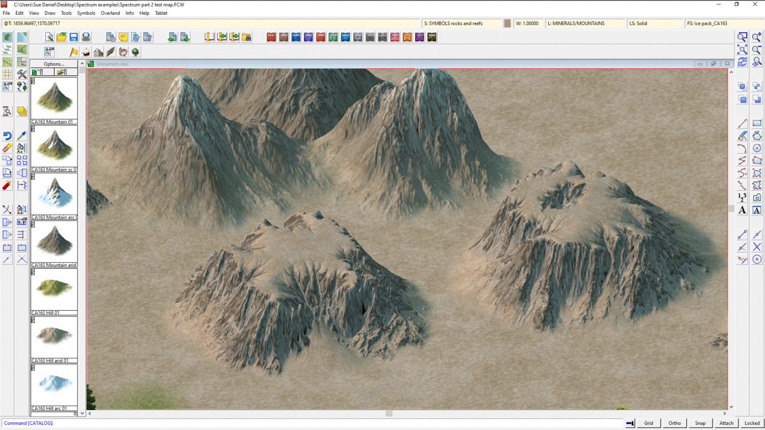
Project Spectrum - Part 2
I did some mesas.
Do you think they look right compared with the arid mountains behind them?


-
Map Blanking Out When Moving From Last Entry
Hi Mike :)
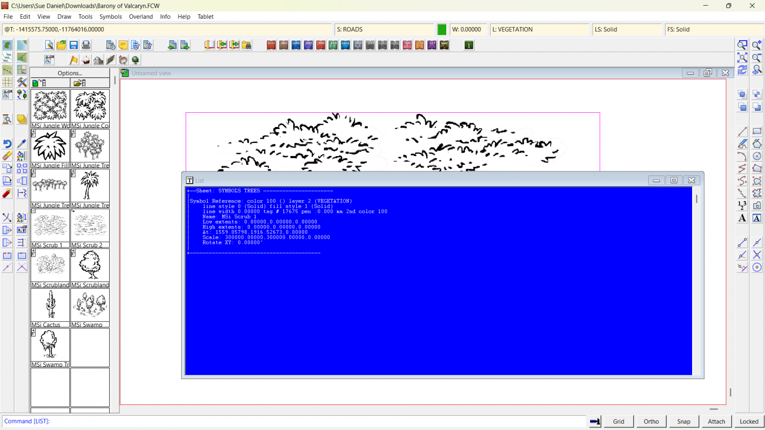
For some reason there is a humungously gigantic copy of that very same symbol pasted in the drawing that completely dwarfs the entire map to the relative size of a pinhead. What you see is the one symbol that is 300,000 x the default scale. I have deleted it in the attached copy of your map.
If it happens again, check what scale you are pasting symbols at (right click while you have a symbol on the crosshair), and hit the Set Normal button if necessary.
I discovered the size by using List in the Info menu on that one symbol.