Loopysue
Loopysue
About
- Username
- Loopysue
- Joined
- Visits
- 10,412
- Last Active
- Roles
- Member, ProFantasy
- Points
- 10,161
- Birthday
- June 29, 1966
- Location
- Dorset, England, UK
- Real Name
- Sue Daniel (aka 'Mouse')
- Rank
- Cartographer
- Badges
- 27
Latest Images


-
Spectrum - the mesa poll
Thank you! :)
I've just done an open-topped variation of the flat one so people can have whatever they want on top, or just let the background show through.


![[Deleted User]](https://secure.gravatar.com/avatar/c75d9a245b74d9c59be0999ea81ca541/?default=https%3A%2F%2Fvanillicon.com%2F92add7f8c954488718110edc4896ad39_200.png&rating=g&size=200)


-
Strange Artifacts in Lighted Bezel Function
That's Transparency Acne. It happens when you use very similar or the same texuture on two different sheets, and the upper one has a Bevel, Bevel, Lighted, Glow or Edge Fade, Inner sheet effect.
There are a number of ways to remedy this.
- Use a different grass texture for the polygon on top.
- Use Change properties to switch out the texture on the topmost sheet for Solid 10 Bitmap, or Solid 20 Bitmap.
- Duplicate the topmost sheet (make a new sheet and copy the polygon from the top sheet onto it), and use Change Properties to change the green texture on this new middle sheet to a solid purple (or any colour that isn't in the texture).


-
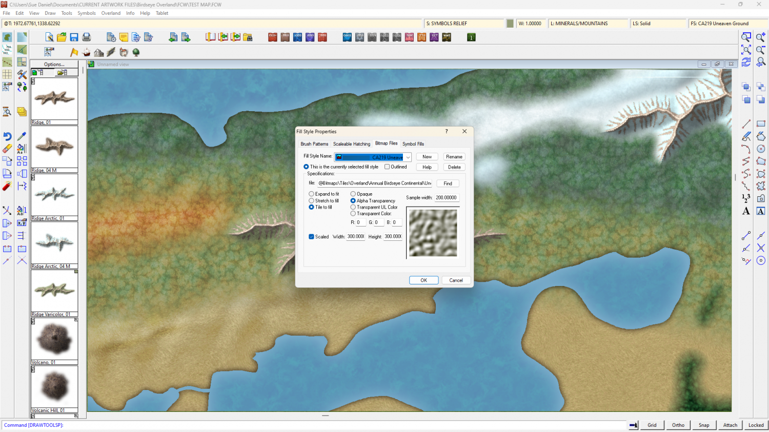
How to Merge Roads CC3+ Pro
Hi :)
Roads drawn as lines can't be joined. Most of the time that's ok because the cobbles are small enough that you can't really see where the texture joins. In your example, however, the cobbles are quite huge and the misalignment in the texture between the two roads is easily visible.
Click the box in the Status Bar (along the top) where you can see FS:..., and pick the Bitmap Fills tab, and the Cobble Bitmap from the Fill Style Name: dropdown.
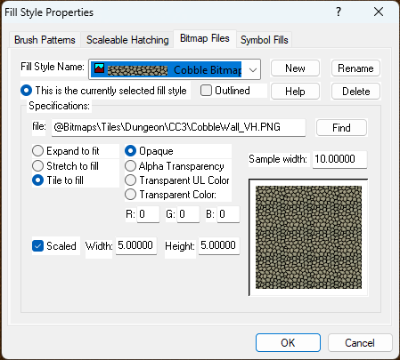
Check that the Scaled box is checked, and that you have a reasonable scale set in the Width and Height text boxes. You can set those numbers to anything you like, but remember that they represent metres in a metric map, and feet in an imperial map, and dictate the size of the area that one patch of that texture should cover.
...
If you want the cobble scale as large as you have it in your screen shot, and you really need the roads to match, you might have to draw the shape of them as a polygon with zero line width, instead of a line with a road width. That solution is ok in a dungeon map or a very tiny village map, but in a city map that would be unrealistically labour-costly.


-
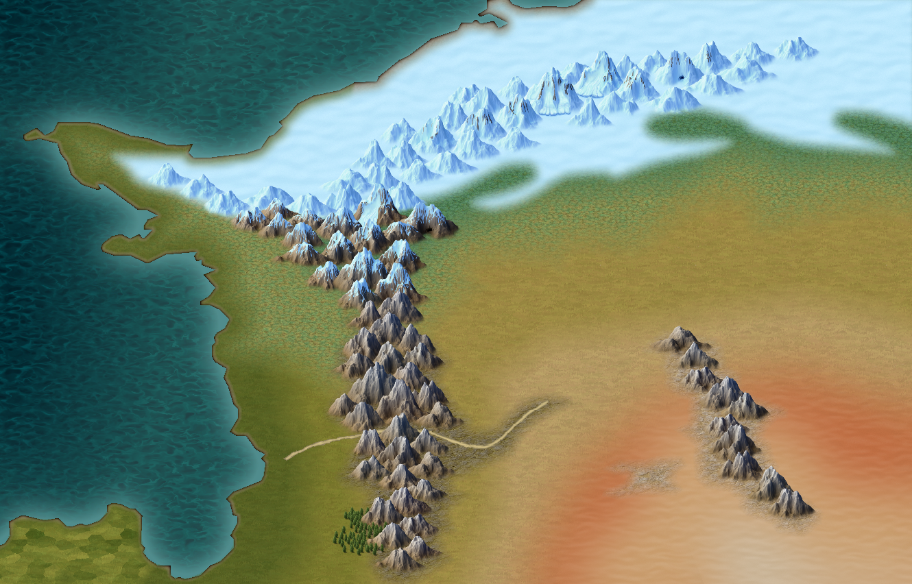
CC4 Overland Development Thread
Things have moved on a bit now. I've given the colour scheme a bit more depth and earthiness and done quite a bit to the mountains.
As always - say what you think. There's still time to change things yet.


-
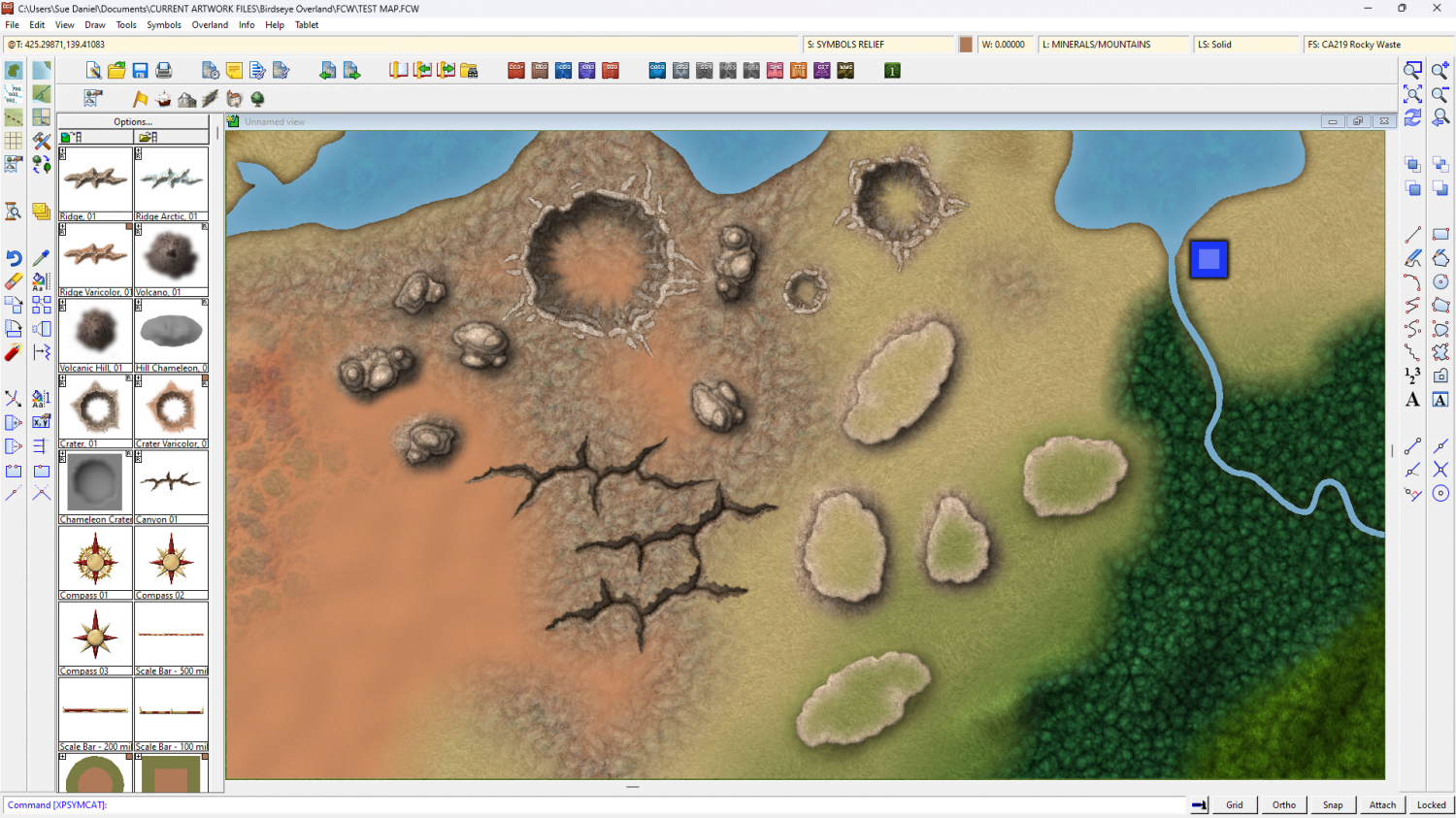
Birdseye Continental - style development thread
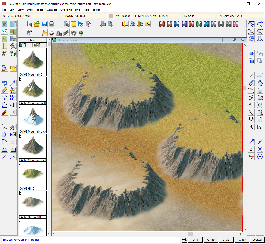
I've managed to get a few mesas, canyons and buttes together.


-
Birdseye Continental - style development thread
Thank you :)
@Calibre - most of that is a texture called Uneaven Ground, which you can use... or not, according to taste.
This is the map without it.
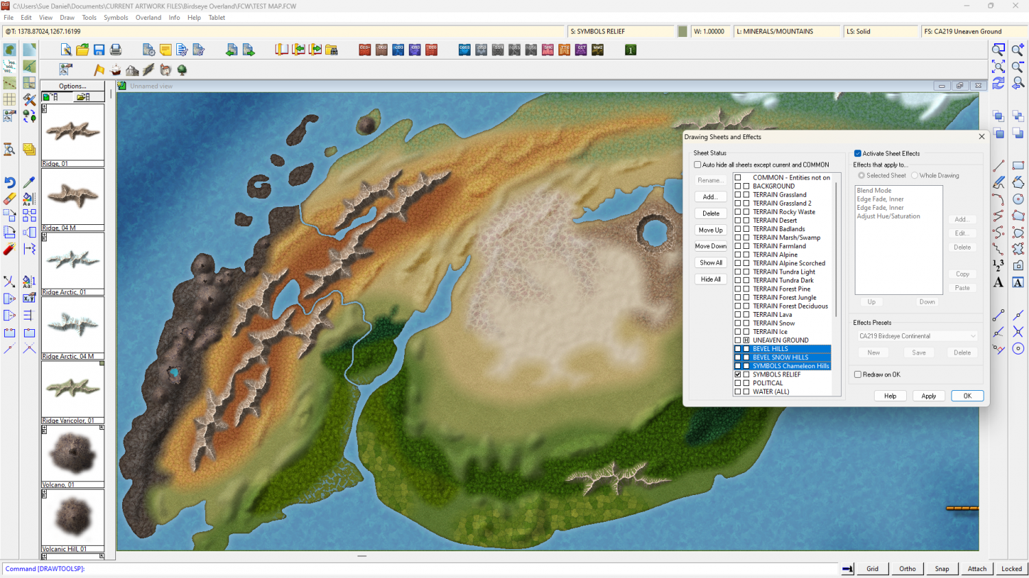
The 3 highlighted sheets have different kinds of hill on them with different sheet effects - bevel hills on 2, and the chameleon hills on 1.
You can adjust the sheet effects as you prefer. I like a more natural rolling hill effect but you can make the edges harsher if you prefer.

-
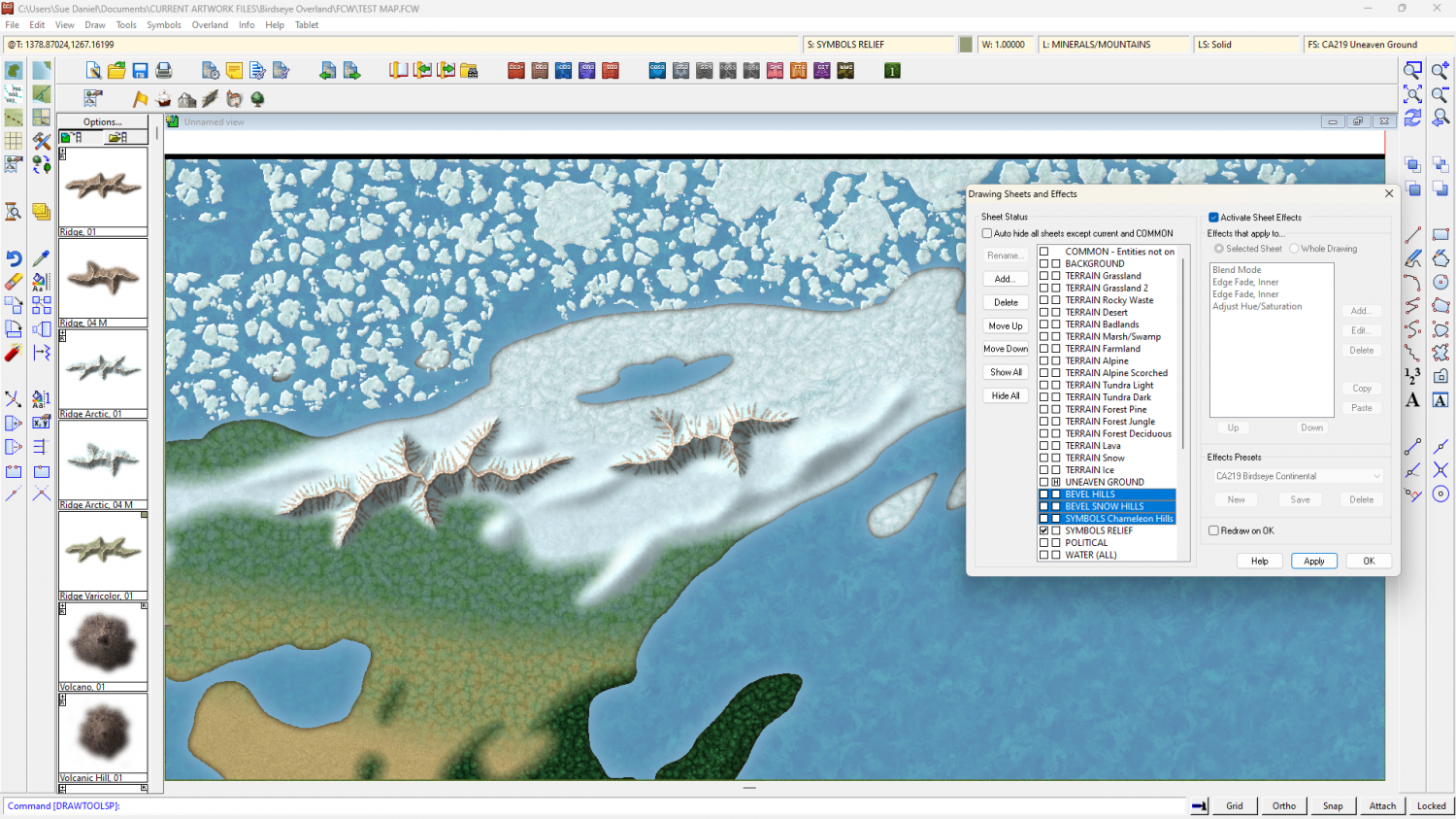
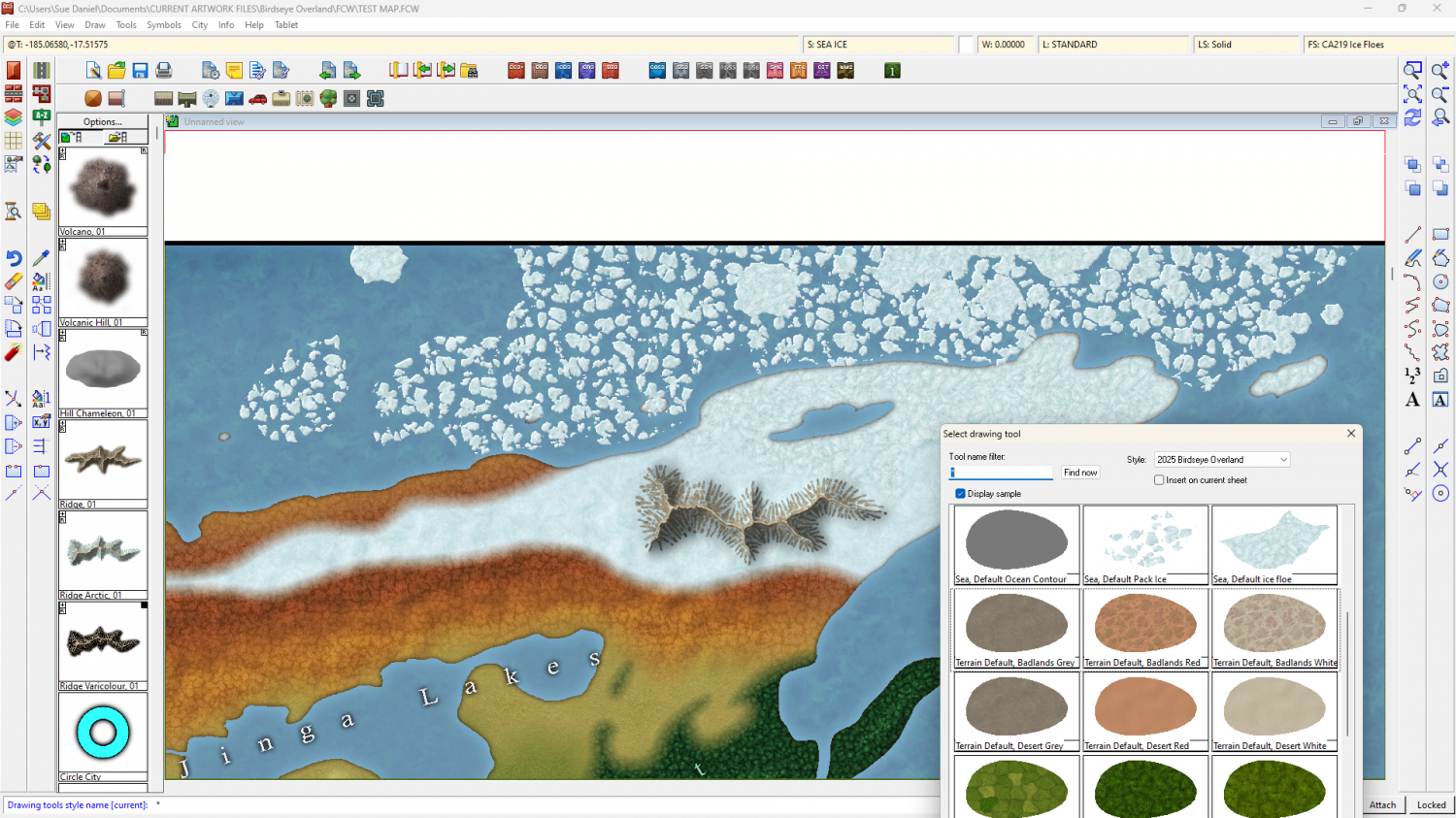
Birdseye Continental - style development thread
And now we have an Pack Ice fill, as well as a drawing tool for individual floes.
-
[WIP] 1000th Map Competition: Elkton, Alarius North Central
I totally forgot to extend the forest and the cliff shadow where I expanded the map a little to make more room for the legend, so here is the final version uploaded to the competition thread.

There's a hi res image in my gallery here.


-
Sinister Sewers - Style Development Thread (CA207)
Well, yes.
I think there is also another reason that green is used rather than brown. I've got to the point where I need to start adding the... lumpy bits. Where I was starting down the path of making everything a nice brown I realised that the lumpy bits might be a bit offensive in their actual colour. Maybe that is why most artists head for green.
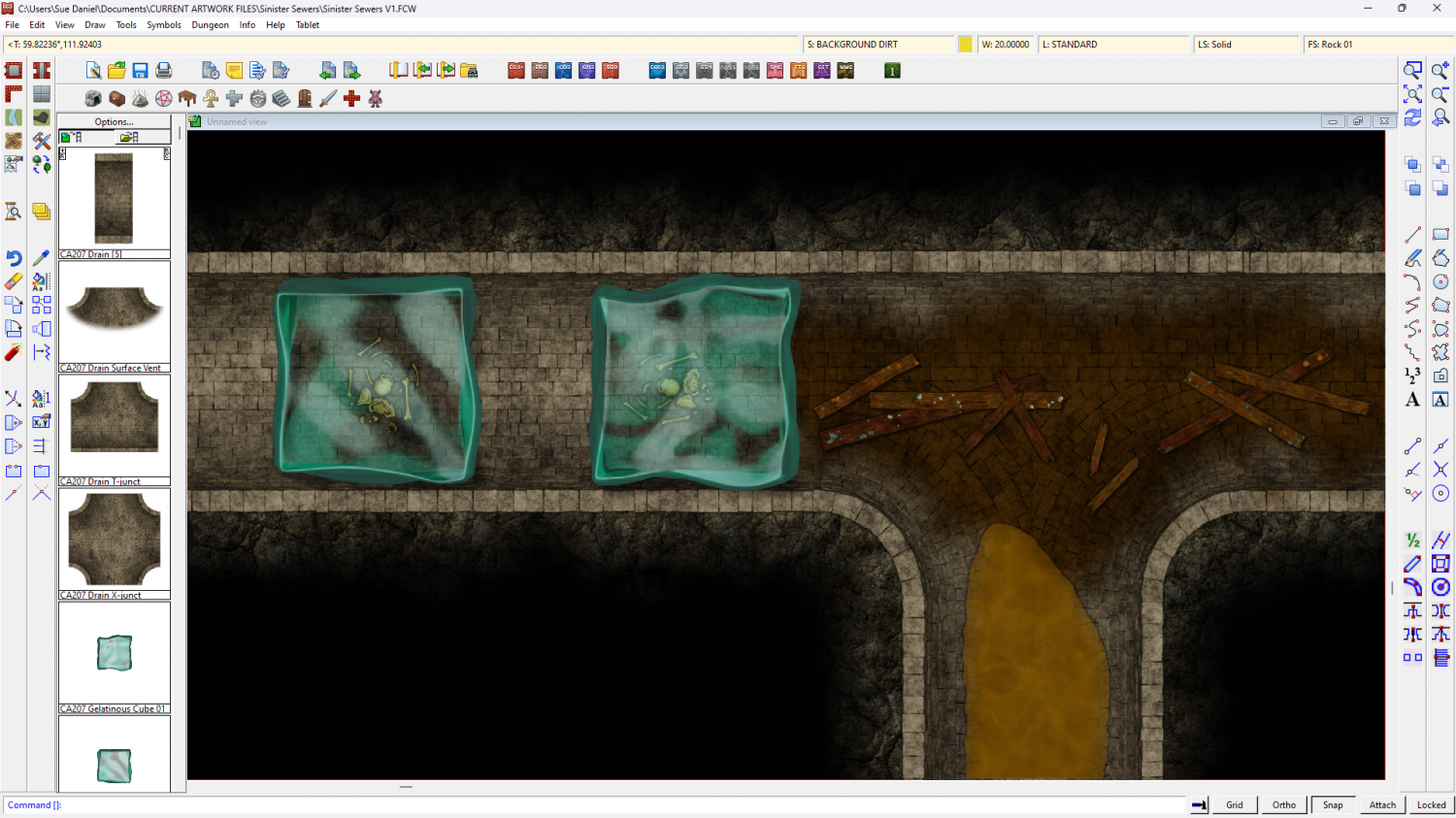
I also modified the cubes after reading a lot of comments here and in the FB Group about how they are practically invisible. I can't make them invisible, but I hope this is an improved representation of them.

-
Path along the coast
I like it, but in answer to your questions:
- For the border maybe just use a simple unaltered border of a fixed width - a line. Less complicated is clearer.
- The stairs look ok to me.
- If the shadows are on a sheet that are higher in the sheet list than the symbols the symbols will appear on top of it in the map.
...
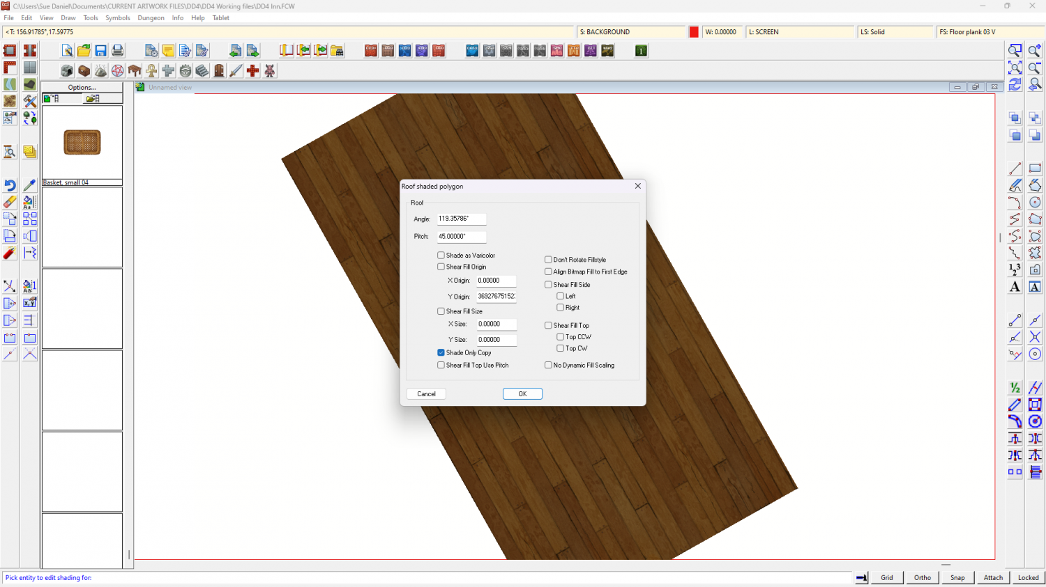
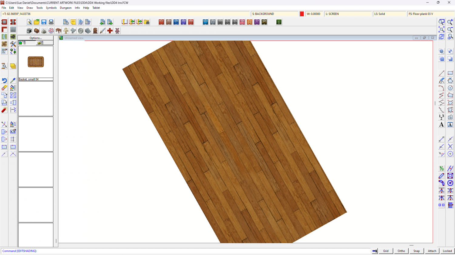
I'm finding the alginment of the deck texture more distracting than anything else.
If you right click the Polygon tool on the right and pick 'Shaded Polygon (Angle by Edge)', then pick the edge of the deck polygon that you want the fill to be aligned with you can make those planks line up with the ship.
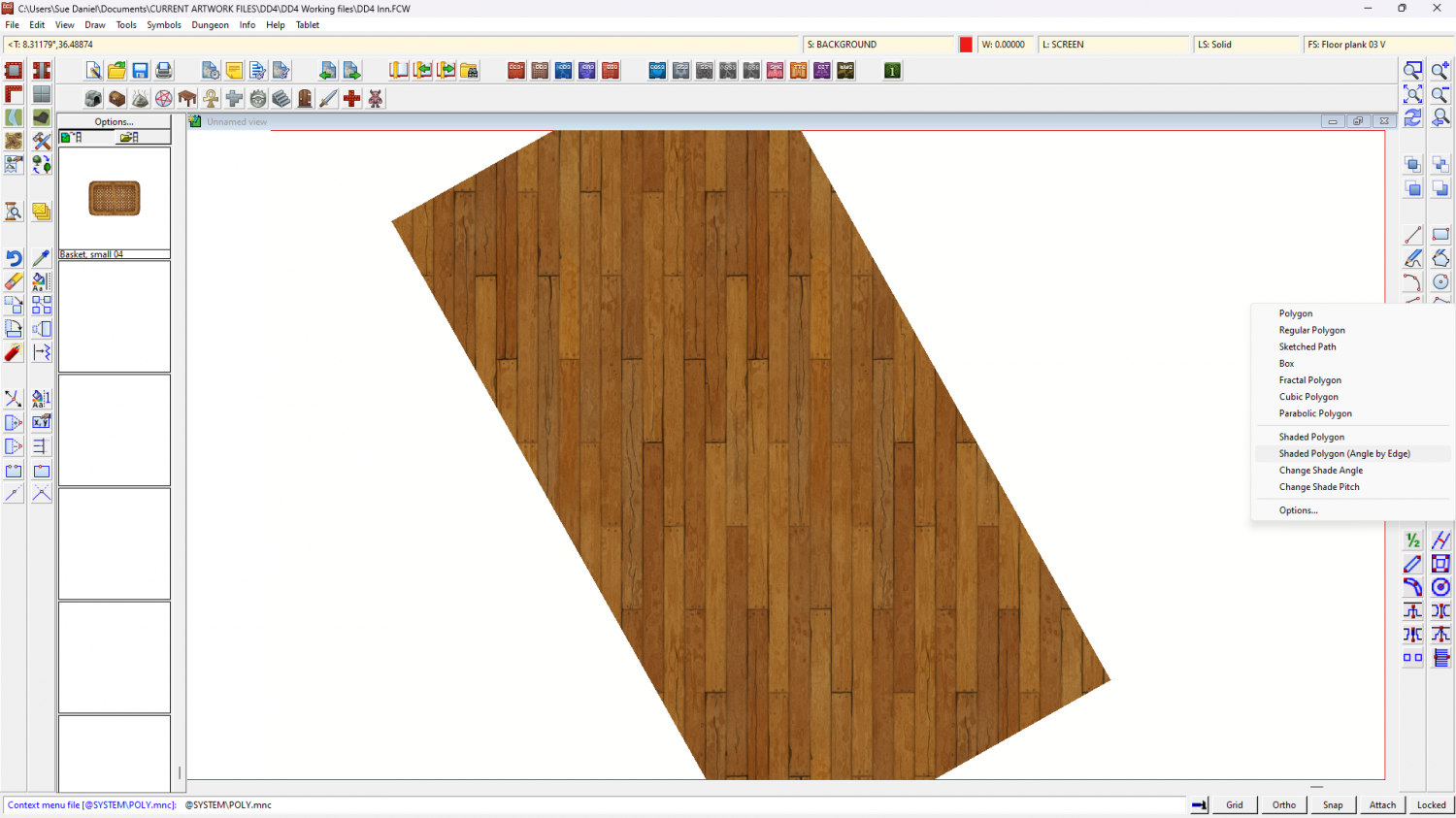
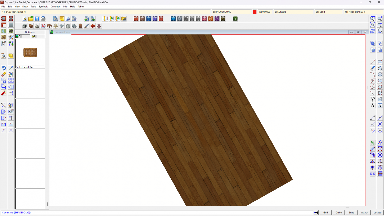
The second step is then to cancel the 'roof shading' of those aligned polygons (that's why it went dark looking), which you can do by typing EDITSHADING on your keyboard and picking one of them. This dialog appears. All you have to do then is check the little box called 'Shade only copy' and hit OK