Wyvern
Wyvern
About
- Username
- Wyvern
- Joined
- Visits
- 3,302
- Last Active
- Roles
- Member
- Points
- 5,647
- Rank
- Cartographer
- Badges
- 24
Latest Images
-
Community Atlas: Errynor - Aunty MacKassa's Home & Vehicles
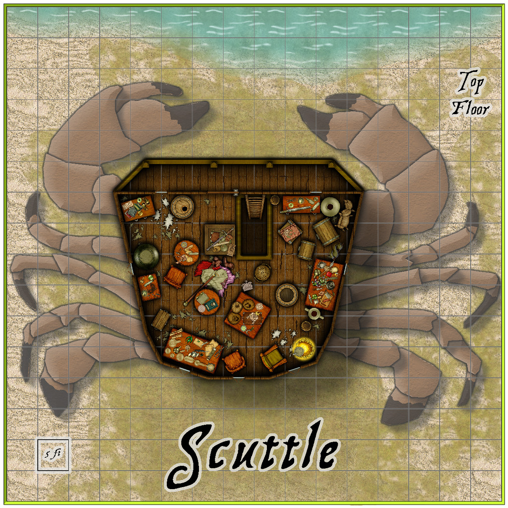
The second of Aunty's vehicles, and the concluding drawing in this whole Errynor Map 01 set, is Scuttle, as promised earlier, a giant-crab-legged, ramshackle, shipwreck hut. This has two floors, accessed by toggling in the Atlas' FCW map, with a further toggle option to add a five-foot grid:
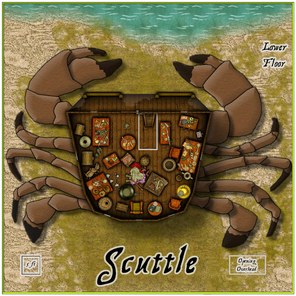
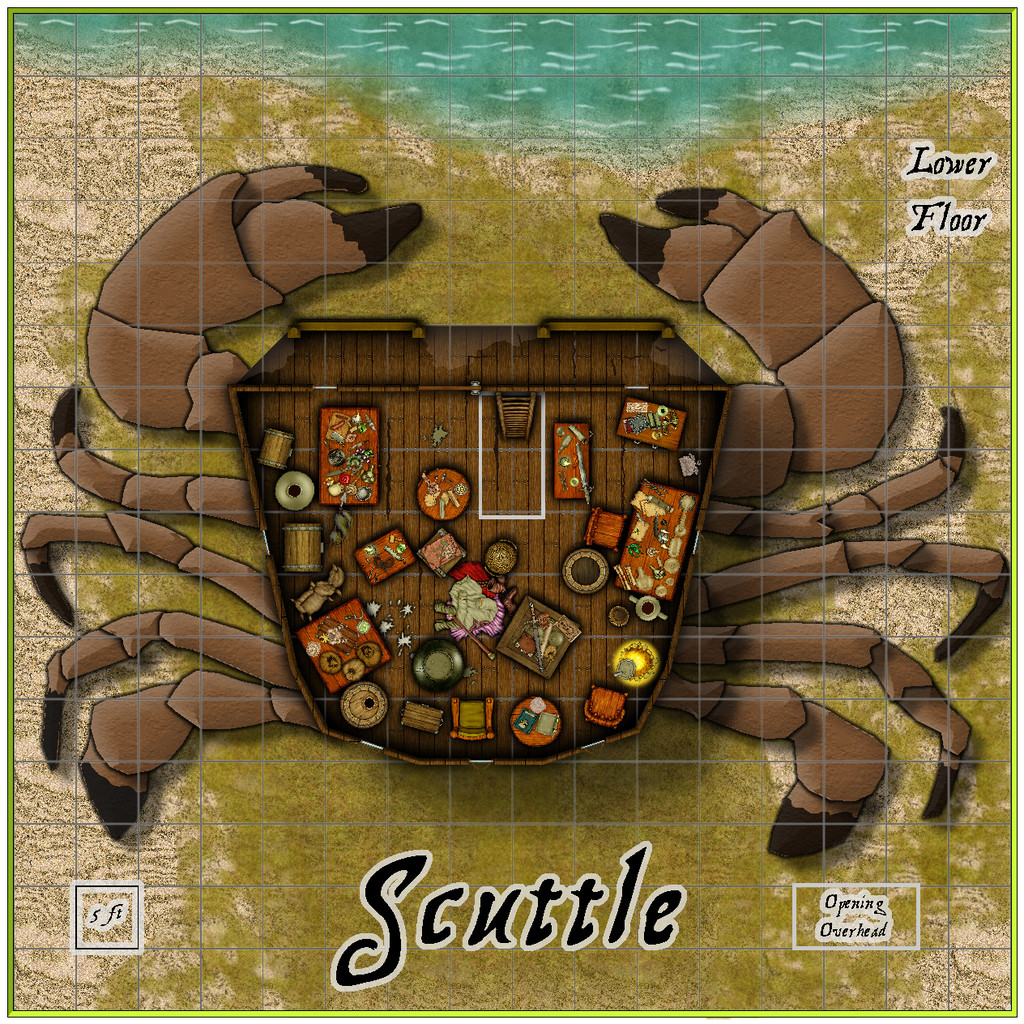
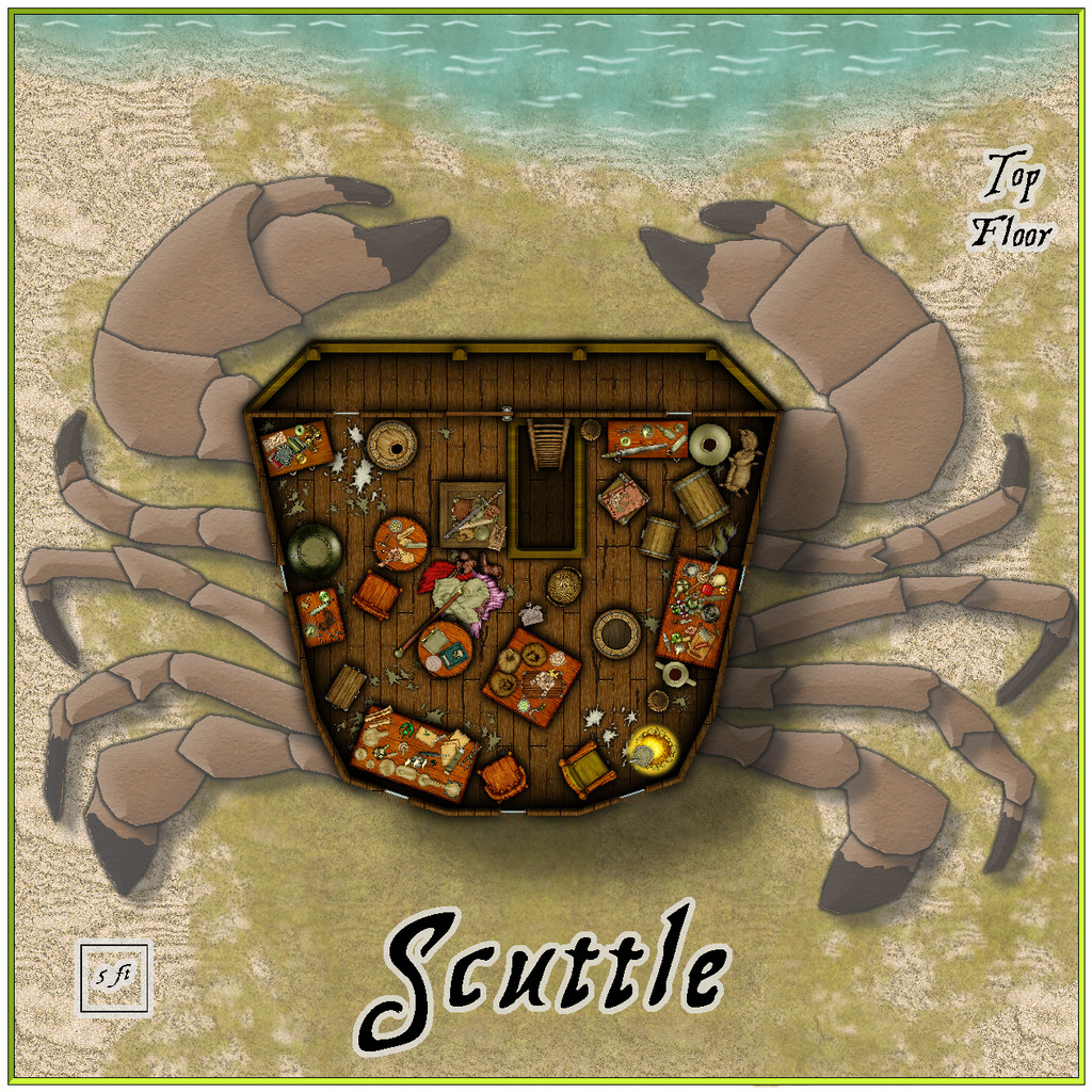
For the crab legs, I tried sourcing top-down crab images online, but couldn't find one that worked well enough for what I wanted for tracing. There are few crab symbols in CC3+ and its add-ons, and although I did find one that looked good among the free Dundjinni Archives collection, it wouldn't scale-up properly without becoming too pixelated. In the end, I used that enlarged symbol as the base, and partly traced, partly redrew, the legs as individual segments on different Sheets, and then fitted them to the base of the hut, as now illustrated.
The bulk of the hut and its contents were copied from The Naughty Lass deck plans, the walls and windows redrawn, and a driftwood balcony added to the front of both lower and upper floors, partly to increase its overall crab-like appearance. By contrast to the ship, these drawings largely flew together quickly. A fresh PDF and text file of notes and - done!
Hopefully, more Errynor maps to follow!


![[Deleted User]](https://secure.gravatar.com/avatar/c75d9a245b74d9c59be0999ea81ca541/?default=https%3A%2F%2Fvanillicon.com%2F92add7f8c954488718110edc4896ad39_200.png&rating=g&size=200)


-
Community Atlas: Errynor - Ruined Thalassan Castle
In theory, this ruins map was going to be one of the smaller, thus quicker, maps to draw. I wanted to add it to the set from Errynor Map 01 as it was the only Thalassan (Fish-folk) structure in the area, and it seemed useful to provide at least one sample settlement for each of the represented undersea humanoid folks shown on that map.
The overall pattern for it was easily established randomly from a few dice rolls, and I had already some ideas for its appearance, with whatever else might be concealed by the ruins. Given the site lies below almost 3,300 metres of ocean (nearly 11,000 feet), I wanted to use a black-and-white mapping style, in-keeping with most of the other deep-water maps in the set. It was though obvious that no style would provide the symbols I'd need for the structures, which would have to be hand-drawn. So I settled upon the Black & White Towns style by Pär Lindström from the 2015 April Cartographer's Annual, mostly because I thought the sketchy contour-line symbols in it might work well for the silt-covered rubble piles I'd envisaged as surrounding this ruin. While these did work out quite nicely, adding shading to give the rubble more definition took a lot more time than expected, particularly in showing the whole site in an elevation drawing as seen from the sea-bed.
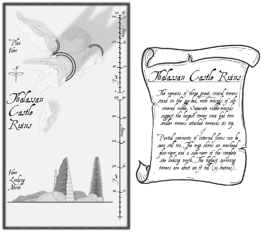
The font is AquilineTwo from the 2012 CA, as I originally thought to use the scale-bar symbol as well as the draconic north indicator from this style, and that's the font employed in these.
Clearly, there's a lot of blank space here, and the scale-lines look a little odd too. The reasons for both are explained by activating the Residual Magic toggle in the FCW file:

The explanatory banner text has also been increased here, although for clarity, those notes are repeated and expanded upon in the map's accompanying text-file and PDF notes.
As the magical blue glow extends some distance below the sea-floor surface, it's obvious there's something more happening there too, and activating the Subterranean Tunnels toggle shows what this is:
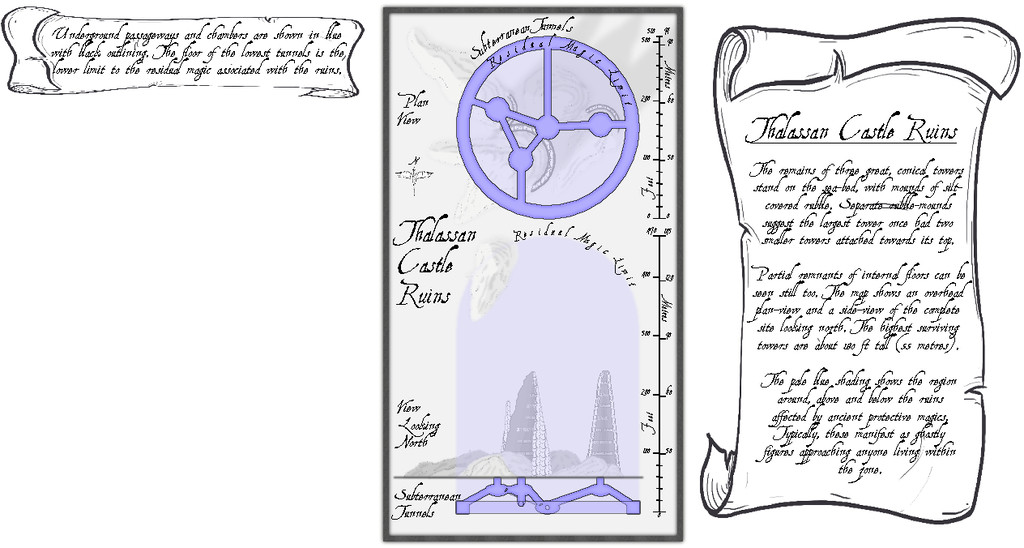
A series of subterranean chambers and tunnels, essentially, with a further banner note of explanation. The latter of course hints at still more to come, given the vast blank space beneath it. So activating the Original Towers toggle reveals...:
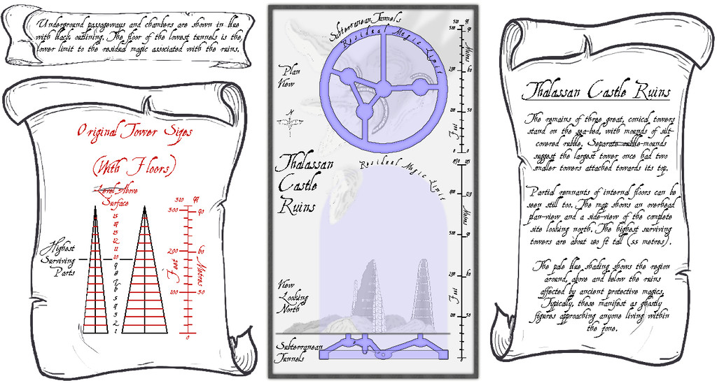
I'd had to draw out in advance what the towers would have looked like before they became ruins, to get the look, sizes and angles right, so it seemed probable this would be something other GMs might find helpful.
For the underground maps, I added a "concealer" Sheet with a Transparency Effect to reduce the strength of the surface features and magical glow for clarity, which is largely why the shadows on the surface views ended up so relatively strong, when the subterranean areas are hidden. Naturally, the shadows are unrealistic anyway, as there'd be ordinarily no light at all at such depth. Without them though, the drawings are much too flat, as some shadows at least are what the eye more or less expects.


-
Community Atlas 500th Map Competition Results
I wanted to add my thanks also to PF and JimP for providing the prizes here.
I also wanted to add that though it was my good fortune to be awarded the 500th Atlas map thanks to the random draw, the Atlas wouldn't have reached this milestone without the input from large numbers of other people, many of whom have contributed far more to the Atlas project overall than myself (with a special mention for Remy Monsen as not simply being a mapping contributor, but for the huge amount of work he's put in to setting up and maintaining the entire Atlas website as well). It really is and has been a Community enterprise throughout. I hope those here new to the Atlas, as well as those who've already submitted any maps to it, will feel inspired to keep on contributing towards the next 500 maps and beyond!


-
Community Atlas: Oracle Mountains Area, Ruma Helrevy, Peredur
The last part of the area mapping involved adding a lot more fine detail, to make it look more like a living landscape:
Further small adjustments have been made along the way. A couple of marker-stones have been added by that central-right red roadway, because it is actually a way-marked route, and the marker-areas have especial significance (the Atlas notes will have more details). I've also changed-up one symbol in the lower-centre of the map, to what now looks like (indeed is!) an inverted obelisk hovering above a crater in the ground. Originally, the hovering stone (it actually looks like a huge stone shard hovering over a crater) was drawn with a couple of rescaled, one inverted and mirrored, varicolor mountain symbols. However, reducing their sizes so dramatically meant their lines lost too much definition, making it hard to see where the marker was on the map, especially after adding more little stones, bushes and extra trees nearby. I hadn't been happy with it earlier, so the change here was one of the first things done. The crater's not altogether ideal, a vertically squashed version (different X and Y scaling) of the varicolor dormant volcano symbol, but it doesn't look too bad with extra dressing over and nearby.
The final stage was to add the labels, always something of a challenge. I'd hoped to make more use of the idea from the Peredur notes, that names from the region should have a vaguely Cornish form. However, when I looked-up a couple of online Cornish-English dictionaries and translation options (yes, I know; albeit, perhaps luckily, Google Translate doesn't consider Cornish a language, apparently), a lot of the key words - such as "oracle", "relic", "griffon" - remain the same as in English, and the whole started to feel more effort than it was worth. This was especially so, as my opening thought had been to have a toggle to swap the Cornish and English name-labels in the final Atlas FCW file. Sadly then, just the vague "Mummerset" of the dungeon location's "Quezzal Tower" name makes a token not-really Cornish element here. Even that came merely from a slurred "Quetzal" in the random-word lists extracted from the Knave RPG!
Thus the completed map:
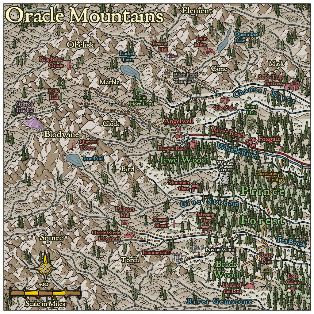
As to how the map's name came about, that's largely because several of the Inkwell card random option notes came up as magical vision-gates and oracular settings. The PDF notes will have more.
Next time, the start of a closer visit to Quezzal Tower...


-
Community Atlas: The Sussara Region in Kumarikandam
All of which preparation finally brings us to the dungeon map, entitled "The Tomb of the Prophet and the Sailor Prince", albeit in the Atlas to be known by the somewhat more manageable name of "Tomb of the Prophet", which some may feel is probably no loss (sorry...):
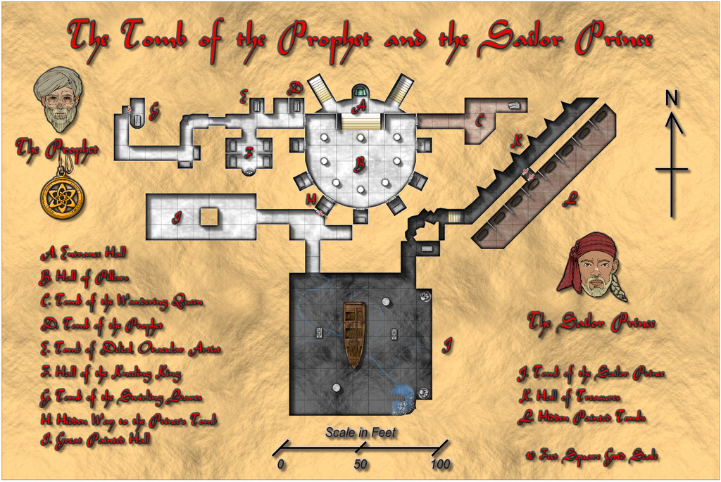
This was drawn using the SS2 Bitmap B style, with a few bits and pieces from its "A" variant, and was selected primarily because I needed a white marble bitmap fill, sarcophagi and coffin variants. The boat was the trickiest feature, as it's intended to be a large river-going vessel, with detached masts (ceiling's not high enough!), whereas the best the "A" style could offer was a rowboat, so that needed a bit of fiddling to look like something closer. The font is "Arabian" from the 2010 Annual.
Adding a mask to half-hide the walls was a late addition, as the shadows "inside" the solid rock surrounds beyond the walls seemed too distracting. This had a serious disadvantage, as the floors and walls had been drawn rather piecemeal, largely thanks to a few quite complex shapes (areas K and L were drawn square to the grid and then rotated, for instance. Areas A and B proved devilishly complicated to get right, particularly as for some reason, during the rotated copy operations for two of those small square peripheral tombs, the room size had slightly shrunk in one direction (well, one, but then that was mirror-copied to the opposite wall), something I didn't realise until I started connecting area H to the chamber between tombs I and J. Thus I couldn't do a simple series of "Trace" commands for a Color Key inner mask, and indeed ran into so many problems with it tracing the wrong bit repeatedly, I gave up trying to do that, and did a couple of external polygons instead, albeit that wasn't much easier...
In terms of the contents and area descriptions (in the map's PDF and text files), I found some of the options for the dice designs I'd used in the accompanying Inkwell Ideas "Dungeonmorph Delves and Descriptions" book for the Crypts, Lairs and Sewers sets very appealing. Most of the occupants and mechanics originated there, with a fair bit of subsequent tweaking in places, and the assorted treasure items scattered liberally throughout - together with the caveats on removing some - also derived from the same book, many as determined from the random tables towards the back.
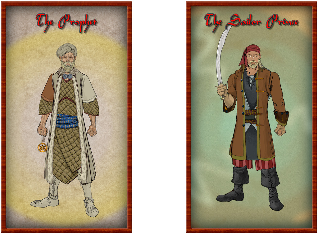
Once the key and scale notes had been added, there was enough space left for portraits of a couple of the people buried here, created using Character Artist 3, naturally. The Sailor Prince is as he appeared in the later prime of his life, while the more ghostly appearance of The Prophet is because that is how he may appear in the Tomb, if the right ceremony is performed, for all he is not an undead creature. His holy symbol features repeatedly in the Tomb, so it was important one version of that should be added too. All those available have an attached cord in CA3, and while I thought of using a mask to disguise this, it proved possible to "attach" this version of it to the caption, to look as if it's hanging there.
Of course, it only really needs a few extra clicks in CA3 to generate full-body character portraits, and as I wasn't sure if I might need necks and shoulders for the versions to be used in the dungeon map, simply went ahead and drew the lot. It seemed a shame to not provide an Atlas version as well, so here they are:
Now, it's off to the ruins by the mouth of the Kalabanjar!

-
Community Atlas: Queen Mica's Scintillant Palace
Once the Faerie City of Embra had been completed for adding to the Clack Valley map in the Community Atlas, there was one further place left there I wanted to add maps for, the fancifully-titled Queen Mica's Scintillant Palace, on its hilltop east of the Faerie Town of Dumbra in the lower Clack Vale, south of the river:

The reason was quite simple, as I'd decided some time ago that a version of The Hive maps, prepared for a mapping contest some years ago, should be converted for use in the Atlas too, once a suitable giant insect nest was located for them. Those maps had been prepared originally as just one small part of a far larger complex of subterranean insect hives, with five vertical levels and four links in more or less cardinal directions to other such hives elsewhere which were not part of that set of maps.
While a number of potential sites had been set-up for giant insect colonies across my Errynor maps during the planning and early random construction phases, it seemed there might be more potential for something unusual in one located in a highly magical region, which the Faerie Land of Errynor Map 40, where the Clack Valley is situated, provided.
Once this particular giant ant nest had been chosen, it was clear the ant queen here would have been affected by the magical nature of the place too, so the colony was going to be thought of as a great castle-palace of magical wonders. At least as far as the queen was concerned. Giving her a more intelligent personality than normal, magically-enhanced, one that made her curious to learn more about the dominant humanoids, their ways and magics, was a natural development. As the ants live on fungi they grow themselves on rotting vegetation, they are not liable to be antipathetic towards other creatures that respect their nest and the region they habitually use for foraging. Thus small bands of humanoids found wandering in that area - about half a mile, 0.8 kilometres, around the nest - would be more likely invited to the place as honoured guests than attacked, providing they respected the queen and her folk.
It would though be immediately obvious to the queen that both ants and their nest in its natural state were not people or places most humanoids would care to visit or interact with. So Faerie magics in the area - the ant nest already being a Faerie Portal site - would give the queen the ability to conceal the reality of both ants and the colony to outsiders. At least those less-attuned to Faerie. Thus in its illusory form, the subterranean colony would become a wonderful, glowing, magical above-ground castle-palace, the Scintillant Palace of Queen Mica, no less:
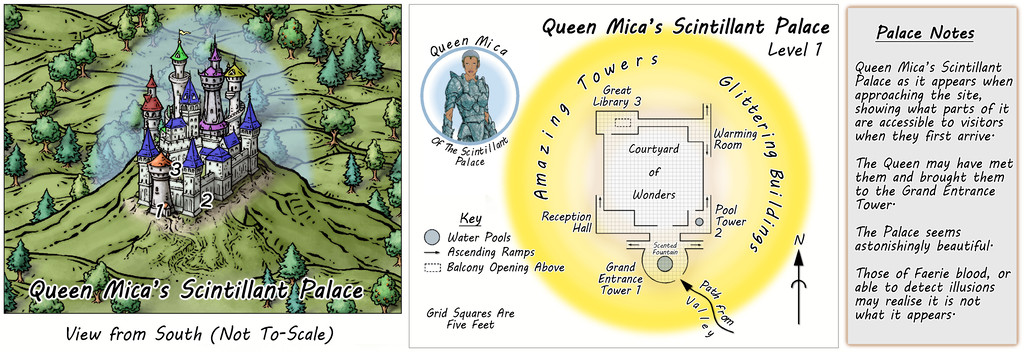
So the initial Palace map looks like this in its illusory form, which is, as might be anticipated, a little vague on details. Essentially, much of it could look as wonderful as the GM can imagine, because it's impossible to access most of it, as it simply doesn't exist.
The Queen of course gets her own separate portrait map in the Atlas, linked from her torso shot in the middle section of this map:
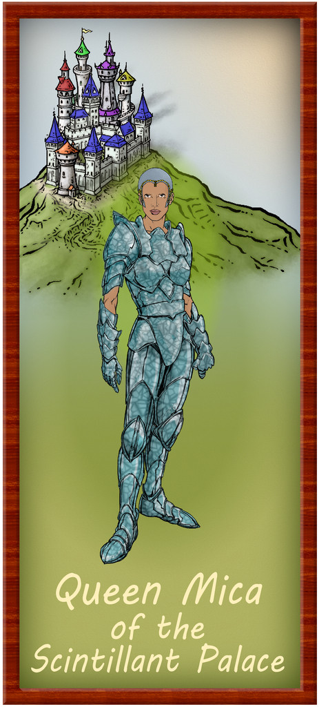
She has a fondness for the colour blue, and all her people wear it as similar crystalline armour, although even the guards don't carry weapons. Well, they do, but not the kind humanoids would expect of someone in this form. None have any body hair of course. And all her people have a curious facial resemblance to the Queen. She never leaves the Palace, though she can appear anywhere in the foraging area, either as an illusion that can still physically interact with things there in a limited way (Faerie magics allow the twisting of reality, after all), or projected onto one of her folk, using them as a physical avatar. A toggle in the FCW portrait map may help begin revealing the reality here:
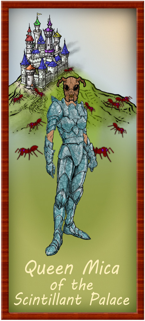
The limitations of what's readily available in CA3 meant while a full-blown upright giant ant figure would have been ideal, the head starts to suggest things are ... different here at least. Plus the original CA symbol options have some handy giant ants, which in the background and a little blurred work quite nicely here. The Palace look has been retained intact for all this, because this version of the portrait then becomes a sort-of halfway point in seeing through the illusions. There should be a "Reality" toggle for the Palace's Level 1 FCW map though, which strips away all the illusion:
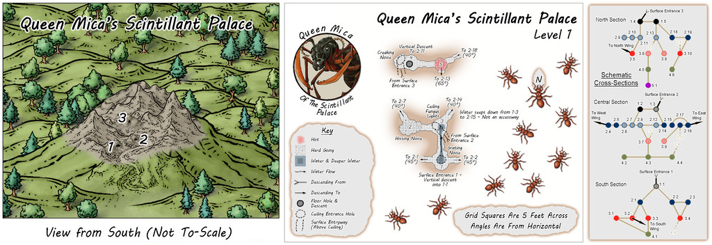
Still impressive, if perhaps rather less inviting now. The central part of the map repeats the first underground level of the earlier "Hive" maps, as does the cross-sectional diagram, though both have been amended in places to fit the Palace concept as now developed. All the features of this version of Level 1 have their equivalents in the Illusory version, and of course, there are PDF and text file descriptions to assist those wishing to make full use of the setting.
The original "Hive" was constructed randomly using the Carapace Pay-What-You-Want booklet by Goblin's Henchman on the DriveThru RPG download site, something that remained unchanged here, so the earlier Forum notes regarding that still apply. However, the connections to other hives were changed here to become four separate Wings for the Palace, and fresh maps had to be devised for those, though not using the same "Carapace" mechanism. We'll get to discussing what that was subsequently.
The main mapping style is that used for the original "Hive" maps, the CA07 Caves & Caverns one, while of course the ever-superb artwork of Mike Schley made possible the accompanying surface sketch views!


-
Community Atlas: Embra - Villages
When approaching, or leaving, the Faerie city of Embra, and as discussed previously on the Forum, the settlement seems to be merely a village, whose appearance can be different depending on the direction involved. Eight such Village maps are provided for the Atlas, one for each of the main compass directions - north, northeast, east, southeast, south, southwest, west and northwest. As also noted earlier, the bases for these eight were randomly-picked maps from the two Judges Guild "Village" RPG map books, published in the late 1970s, reworked and amended in places to fit what was needed here.
Those base maps were all placed within hexagons, though I decided a circle would be more suitable here from very early in the process. Having set that, the overall appearance of the eight Village maps was quickly established, partly thanks to the banner, scalebar and compass-rose assets available in the CA169 Fantasy Town package chosen for the mapping.
A decision had been made too that variant Celtic knotwork borders were going to be key aspects of all the Embra maps. Finding a circular design was fairly straightforward - if unfortunately not using the CA23 Map Border options (as they work only for rectilinear borders). Those CC3+ designs did influence the general look to an extent, however, with the "Village" colours partly chosen following those used in the "Official Guide" map's border:
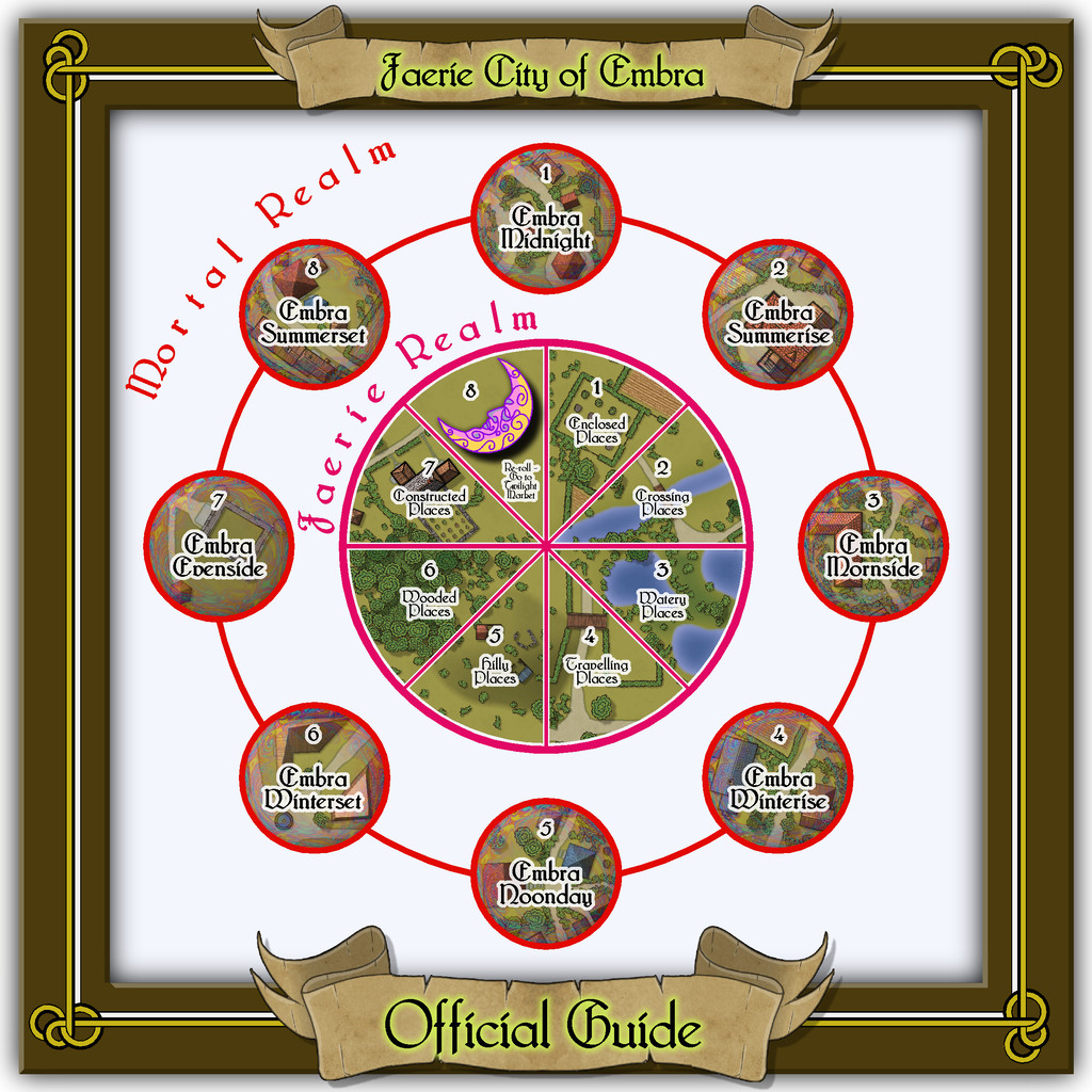
The final Village knotwork design was based on a couple found online, although one of those, what turned out to be my final choice, was also virtually identical to one in the Dover Clip-Art "Celtic Borders on Layout Grids" hardcopy book, mentioned in the introductory Forum topic as well. This then is the map for the "north" Village, Embra - Midnight:

The nature of these eight Villages, on the border between the Mortal and Faerie Realms, invited adding something to each map to reflect that, hence the pale, misty, oil-iridescence colours towards the edges, fading into the middle. This also gives a suggestion of viewing the map through an old, round window, lens, or in a mirror - Embra Through The Looking Glass, perhaps. That oil-patterning comes courtesy of @Loopysue's transparent City Domes symbols from CA144A.
Although scales and an unlabelled compass-rose are provided, nothing in the Faerie Realm is strongly fixed, so while the map is correctly drawn to the scales, GMs can adjust those distances, sizes and directions to best-suit their own needs. Similarly, the featured text below the compass-rose alongside the map can be used, adapted or ignored as the GM may wish. It was determined by a random tarot-card draw, as described previously, as an interpretation of what the card artwork showed or inspired.
Place-names on the maps were sometimes taken from their obvious nature, the surroundings of Embra as established on the Clack Valley map, my own earlier RPG mapping, or more commonly from a random choice of adapted names in Celtic mythology, primarily drawn from entries in James MacKillop's Dictionary of Celtic Mythology (Oxford University Press, 1998). Some of these are explored a little more in the PDF and text notes accompanying each map. The placement of the labels is necessarily somewhat obstructive at times, so a toggle in the Atlas FCW versions will allow them to be switched off for better clarity.
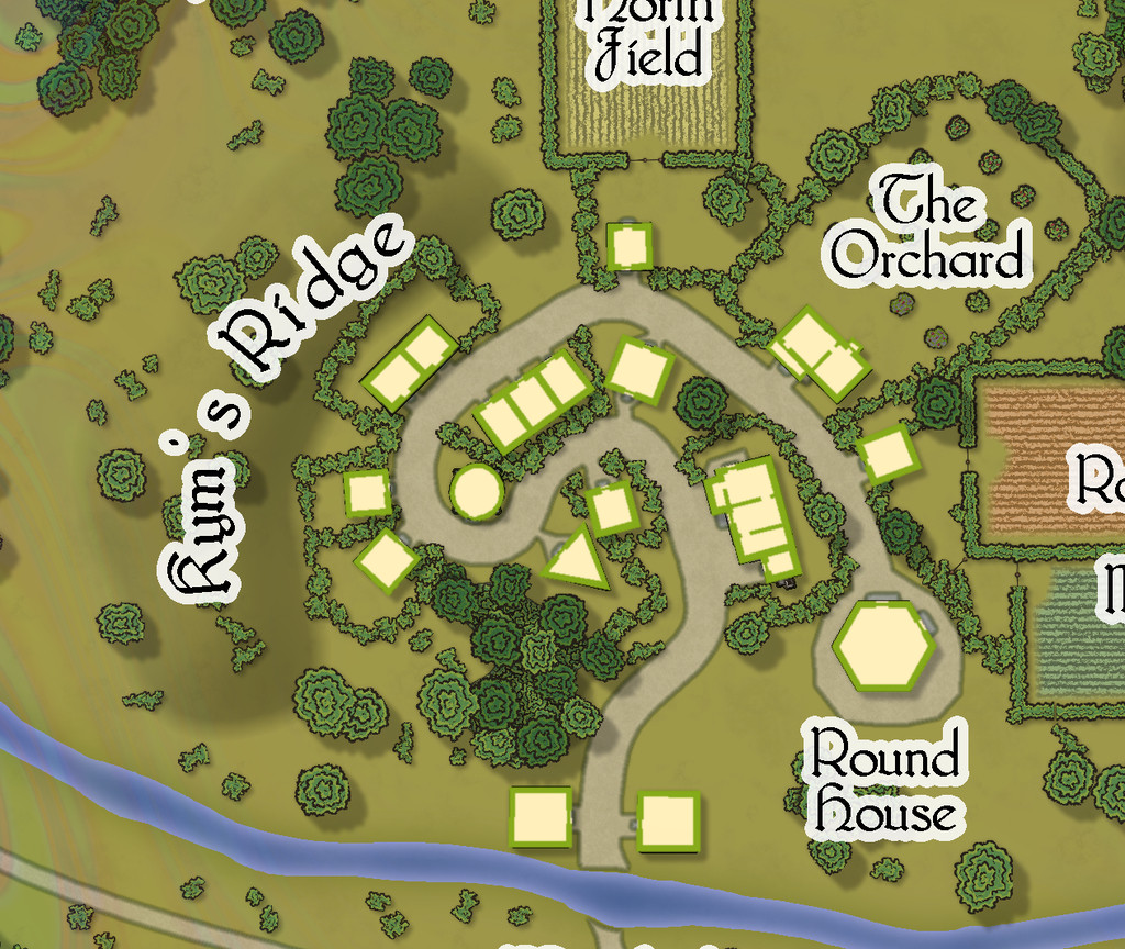
A second Atlas toggle on this Embra - Midnight map allows simple internal layouts for each building to be shown. The original Judges Guild settlement maps were always drawn like this, showing only cross-sections through the surface level's outer and interior walls and doorways, for almost every building. Indeed, this was established so early as the norm for RPG settlement maps, that I still struggle to make sense of the more recent RPG tendency of settlement plans that DON'T provide this option, but show just a - to me - sometimes confusing series of rooftops. This was part of the reason I decided to add this element for the Village, and many of the Places, maps for Embra, although a lesser aspect was I found it wasn't always easy to tell where the buildings were on some of the more heavily-vegetated maps. Most of the buildings have just a single room inside, while all occupy only the surface level on this map:
One aspect on most, but not all, these Village maps is the River Clack, which, as the Clack Valley map indicated, runs through the city. In Embra - Midnight, it is quite narrow, and crossed by a ford. Elsewhere among the Village maps, it can be broader or narrower, and bridged. In some cases, it becomes almost ditch-like. This variation, while adopted from the Judges Guild base-maps, was a deliberate choice from very early in the planning and construction process, to emphasize that Faerie is not the mundane world outside, where things may not be what they seem, even at such liminal places as these "outer" Villages.
While the Atlas connections favour moving from outside to an entry-village, and then on into parts of the city itself in Faerie (or reversing the process when wishing to leave Embra), there is no reason GMs could not opt to move the party from one Village to another as an extra possibility too, perhaps camping, or taking rooms at an inn, in one Village, only to wake next day in a quite different one - perhaps where the inhabitants are identical, say, for a little further confusion!


-
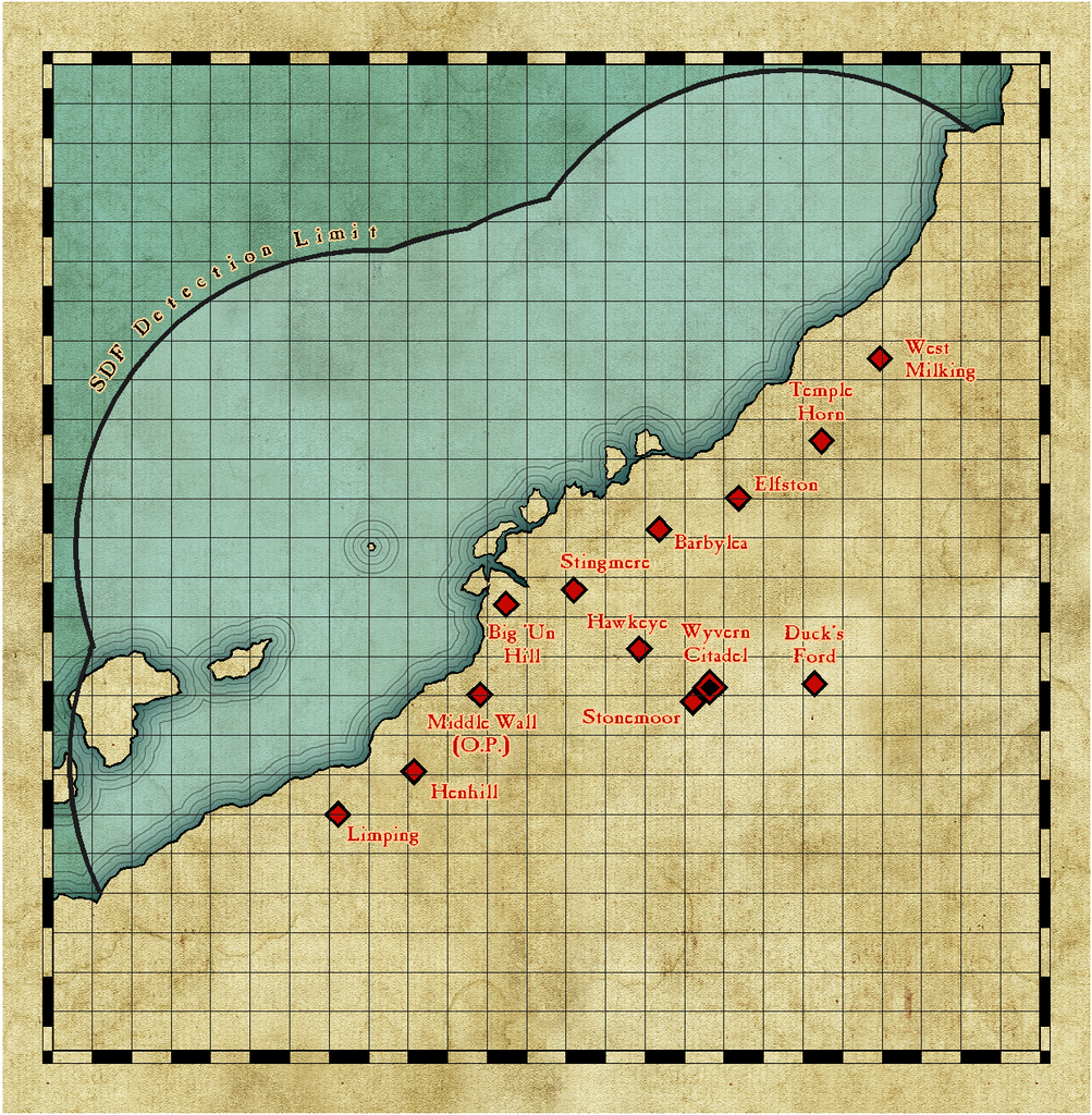
Community Atlas: Wyvern Citadel Defence Zone on Kentoria
The fortress of the Citadel. The idea is it's a reused ancient castle, which has been brought up-to-date with modern Kentorian conveniences. Being a high magic land, I've gone with these being things like decent indoor plumbing, heating (to an extent; this is in the tropics, after all) and lighting comparable to mid-late 20th century norms, fitting with the overall concept of the Defence Zone's basis too. I think "electrickery" (not my invention as a term!) fits the bill for how it all works. It also means I've been playing around with some repurposed Cosmographer 3 symbols in places. Eventually, there will be magical rooftop Strickfaden Lightning Cannons in place of arbalests and ballistae. [Strickfaden? Look him up!!!]
I'd already decided some while back that the basis for the actual fortress was going to be the castle in this video, produced by Dwarven Forge in July 2020, Build of the Month: UnNamed Castle.
For those who don't know, Dwarven Forge make highly-detailed, modular, cast scenery for RPGs and wargames in 28mm scale. They started out as a one-man operation in New York City back in the later 1990s, when all their castings were made in a solid type of resin, pretty robust for its time, and indeed it still is (mine's survived completely intact since '03, for instance). The great selling point, aside from the incredible detailing (all hand-sculpted, also as still), was that all of it came hand-painted, with primarily options for dungeon and cave settings. At the time, nobody else made modular caves as cast models, so this was really A Thing!
Time passed, and the company, while still quite small (about eight or nine full-time staff currently, I think), remained NYC based, but their business model shifted to a KickStarter one, roughly one major KS per year since 2013. This different funding model allowed them to move away from resin to (now) a proprietary resin-plastic mix, trademarked as "Dwarvenite". This is lighter and a lot more robust than the old resin - many users quite happily let their kids play with it, as it's pretty well indestructible through any kind of normal use or accidents. It also now comes with the option of being DIY unpainted, or hand-painted still.
Nobody would pretend it's cheap; the painted version of that castle model in the video would, if all its component parts were in-stock currently (they aren't, in case anyone should be tempted!) would cost you nearly $1500 before shipping (or taxes & import duty, etc., if you're not in the USA). The modular castle pieces are however particularly expensive, as being complex castings requiring more expensive moulds.
For all the model has a nice, clear, 5-foot-scale square grid engraved across its horizontal surfaces, this has proven a tricky conversion into a CC3+ drawing so far. Plus I'd already amended it in places to add some internal-courtyard ancillary buildings, and add or move some of the internal accessways. Even to get to a hand-sketched version needed stills extracting from that video, poring over printouts of them and from the product pages on the webstore, plus the free PDF downloads showing how each component section is built. Even then, a few places have had to be winged, as I could find no useful images of certain areas, and the video castle build has a few minor variants compared with the standard build in the PDFs. It is modular after all!
Of course, a hand-sketch is all fine and good till you start fitting that into the precision of a CAD drawing, when suddenly things like whether those shooting slits in the wall-tops might be better at 1 foot 3 inches, not 1 foot 6 inches, wide starts to become an issue. I have made compromises, and there are likely to be more subsequently!
And then the castle drawing is only one part of the whole, as it needs to have a background as well. I'd decided in advance that the Citadel was going to be on a rocky ridge, probably one of its higher parts, and separated from the rest of it by deep trenches/cliffs to give greater protection, as well as some point to retaining that wooden drawbridge.
My first thought was to try some bevelled polygons for the ridge in the castle's vicinity. This is an early version of those on the Ground Level drawing for the fortress:
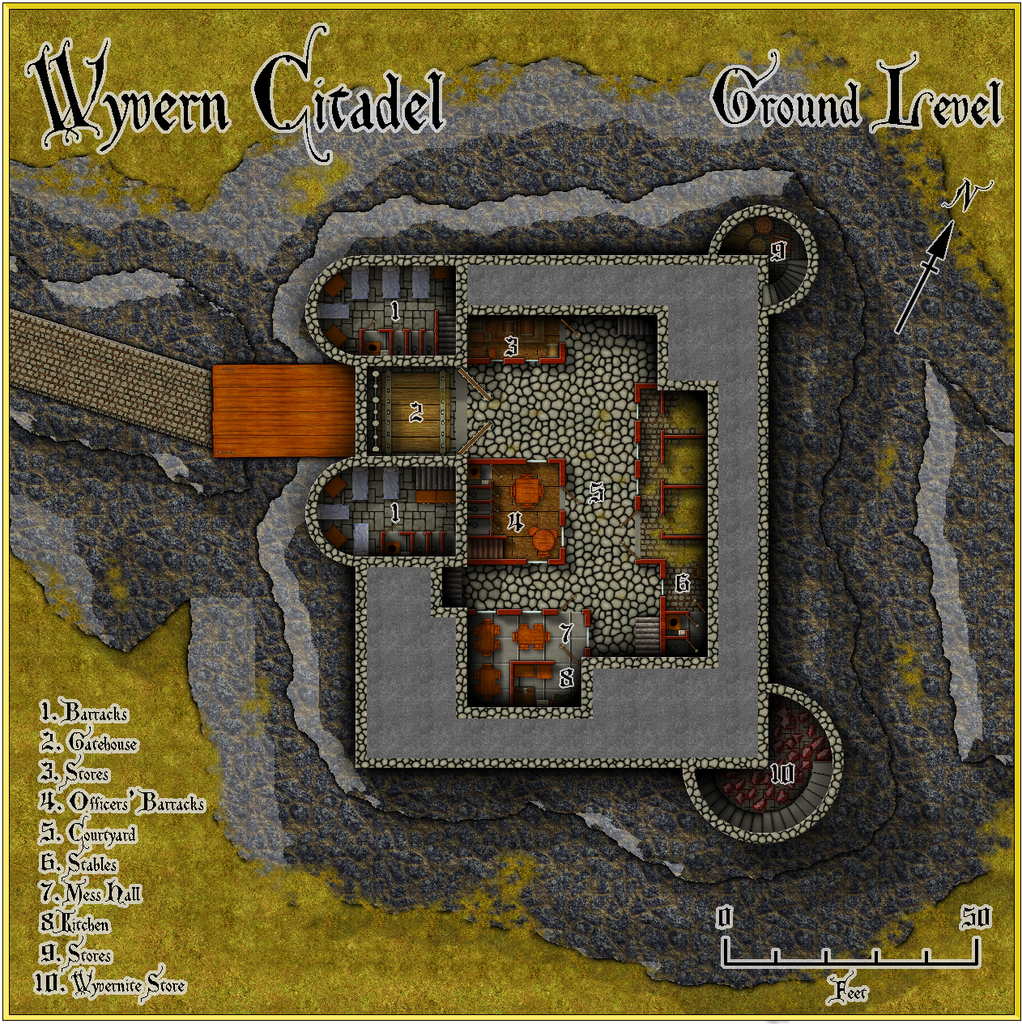
The castle itself here is in the basic DD3 style, though I had to add the Bogie stone steps, and the beds from the Jon Roberts Dungeons CA style, as the DD3 beds were just too elaborate for what's essentially a military base. And don't ask about the spiral stairs... Each step is on its own Sheet!
I'd picked the cooled lava fill for the ridge, because that has a suitably rough, rocky texture, but the bevelling - and I persisted with it for some time - just never looked right. Oh yes, and I really loathed the angled roadway from almost the moment I'd finished it; it just looks wrong approaching the drawbridge anything other than directly. So that didn't last long...
Having abandoned the bevel idea, I thought I'd try Shessar's cliffs and contours options (PDF guides available elsewhere on the Forum here), and after a bit of tinkering around with those, this is what I've settled on at present:
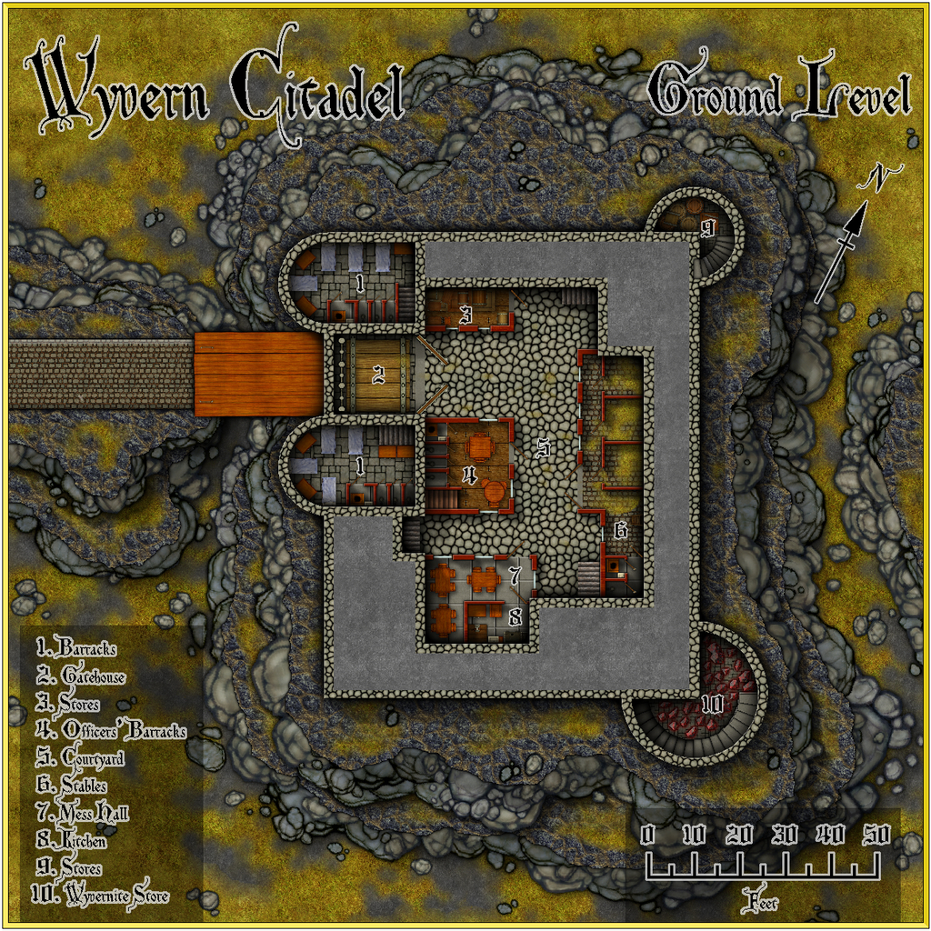
The castle's had a couple of minor tweaks, which may not show at this resolution, since as I've been drawing the higher levels, I've had to make fresh adjustments of some of the lower level drawings as well. The current plan is there should be five above-ground levels and two smaller subterranean ones. The below-ground ones - haven't quite decided on their full extent yet, perhaps with some old unused sections, as well as those in-action presently - will also be prepared drawing on some old Dwarven Forge dungeon layouts, to maintain this part of the theme of the project, and will include the Citadel's main purpose now, as the command and control centre for the Defence Zone. I already have the design for the table-top in the Operations Room, based loosely on the appearance of actual Ops Room tables during the Battle of Britain:
Although a reduced-size version is intended for the table in the final drawing, it seems useful to add this map as a separate FCW file with the set, I think. Ten-mile grid squares, incidentally.
Enough for now though, since on any given day, I've essentially the choice of providing an update here, or getting on with the actual mapping ?


-
A Hand-Drawn Fantasy Map of Jack Vance's Dying Earth
Thanks everyone for the positive comments!
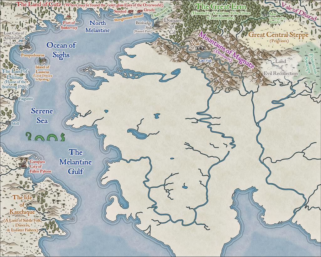
Progress update from the next couple of sessions today, heading south in the main landmass:
The perceptive may spot a new annotation saying "Pelgranes" in the Great Central Steppe - so yes, that is the same as Pelgrane Press (who have some peripheral connection with ProFantasy, I believe 😉), who also have their own, very detailed, Dying Earth RPG and its book-derived setting (first published in 2000; DriveThru RPG link), later including maps with actual scales on by Sarah Wroot (from 2002)! The maps are only available on Pelgrane's own website, however - link, on which site also are various free downloads about the game and its setting. Pelgranes in the Dying Earth though are gigantic flying creatures, with furry bodies, capable of intelligent thought and speech, apt to eat you just as soon as they can spot you, and swoop down to feed.
And so to the present state of play:
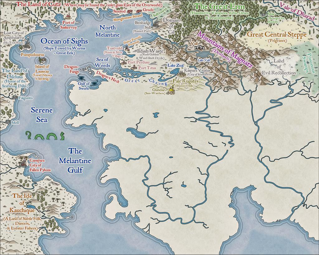
That amount of blankness though still argues for a lot more mapping to follow...


-
Community Atlas: Mingjue Ruins, Xinxing Region, Kumarikandam
As mentioned in my latest post regarding the Temple of Nidag maps in Alarius, the next maps in this series were going to be visited upon Kumarikandam, somewhere in the Xinxing Region on the great Tiantang Grasslands:
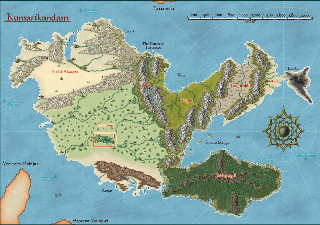
Looking over the extant Atlas mapping for this area showed a number of possibilities, as relatively little had been mapped in more detail here previously; essentially just the settlements of Shinsato and Ylangxi. Having already established, from adapted materials in the Inkwell Ideas book that accompanies the Trailblazer geomorphic dungeon designs I'd be using here, that this was going to be a combined maze and tomb, I wanted somewhere more out of the way to place it, and eventually settled on the Mingjue Ruins, next to the map's top edge:
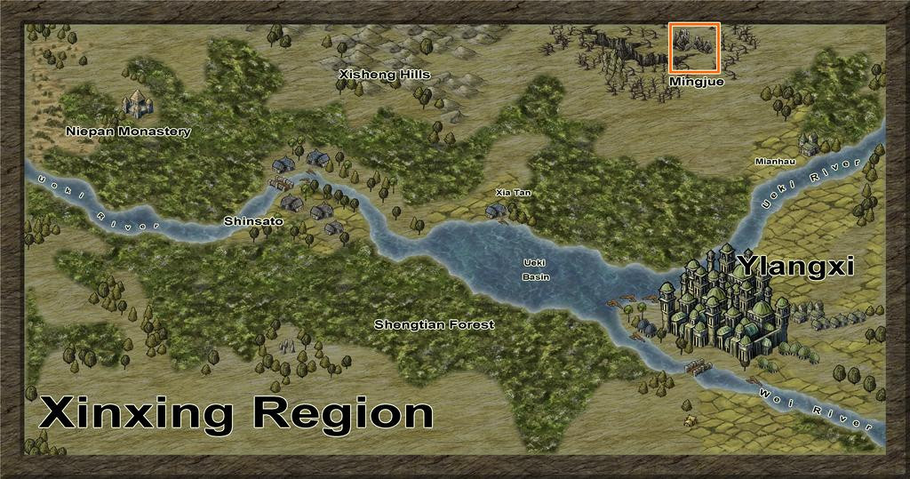
The various pictorial structures on this Xinxing map are, as so often, overscale, as that orange square outlining my selected place is actually 20 miles per side!
Thus, when zoomed-in to just that area, the ruins stretch almost right across the whole zone, here with the usual numerical grid added, with one-mile squares, so I can randomly place features of interest subsequently:
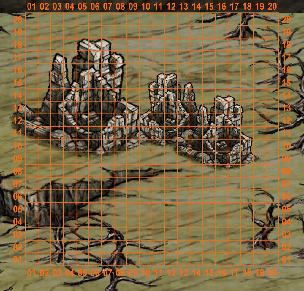
Preferring to try to work with what this showed, rather than simply reducing the region occupied by the ruins, I decided that something weird must have happened in the past to create the huge areas of dead forest all around that enormous chasm, and which was perhaps associated with why the ruins were here, and so seemingly extensive. Thus rather than all being structural ruins, I instead made the ground across the ruins area especially rough, with low, grassy hills and rockier tors, as well as some genuine old structures, given it's frequently hard to say modernly whether this or that grassy knoll or tor is really a natural feature, or an ancient ruin, without detailed investigation. Being in the tropics too, around 15°S latitude, the grasslands were set as having very tall grasses in season, to help further disguise the nature of the land here.
While I didn't prepare a series of WIP shots while preparing this map, I did a couple of test images to check if the symbol scaling I'd settled upon was working satisfactorily, which give an impression of what had been decided and where, all prepared using Ralf's new Hand-Drawn Fantasy style:
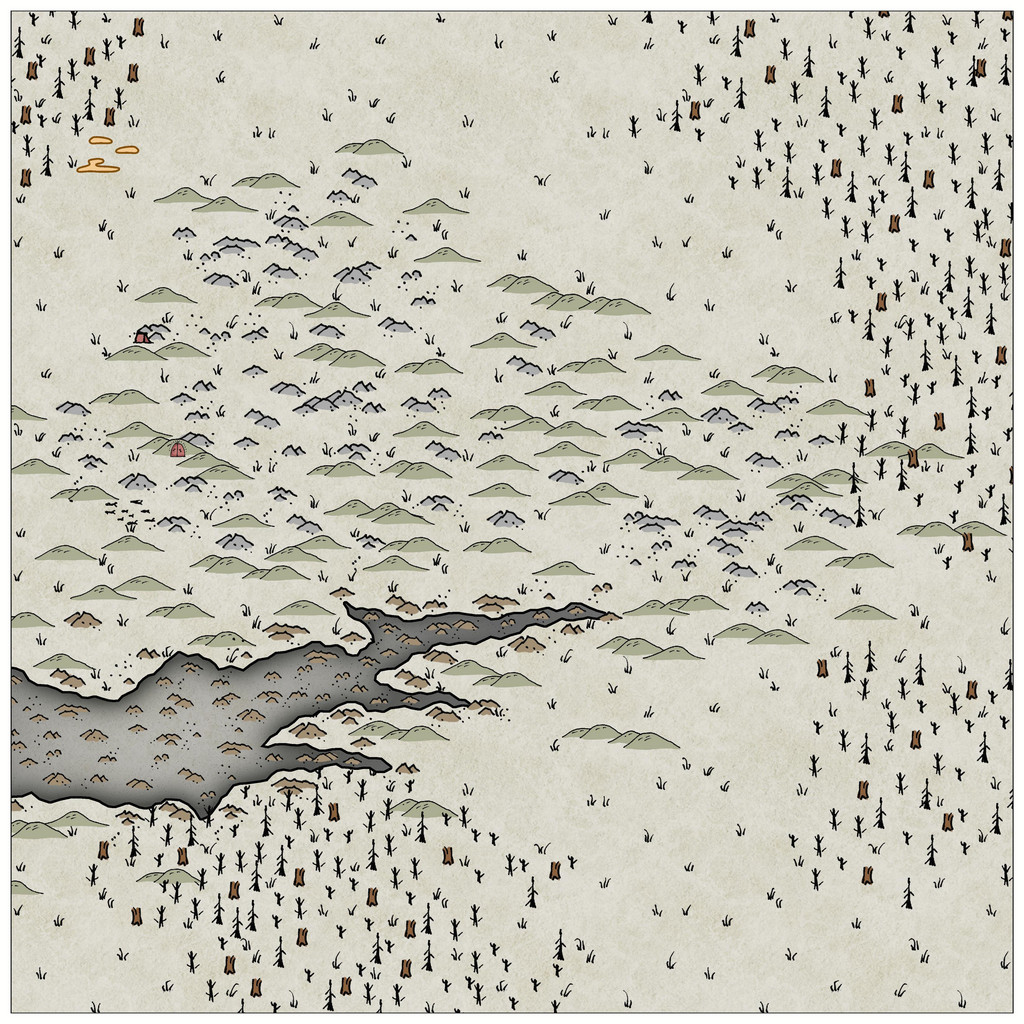
This one was very early in the process, with only a few features, beyond sketching-in much of the existing terrain, but it gives an idea of how I'd opted to lay-out the are-they-aren't-they ruins.
The following image was much further along in the mapping, and was done as a test to check the font sizing and effects as much as anything. The Tomb of General Chengdai, incidentally, is the site for the dungeon map here, hence why it's already been labelled:
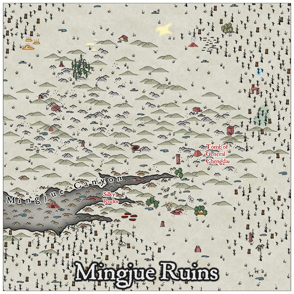
A few further tweaks were necessary subsequently, of which perhaps the most major was swapping-out all those brown broken tree-trunk symbols for more of the simpler black-line dead trees, mostly because, having had doubts earlier, I realised it was a bit confusing/distracting for some of the smaller feature symbols. This was so even after I'd added the rest of the labels. Which brings us to the final version of the map:
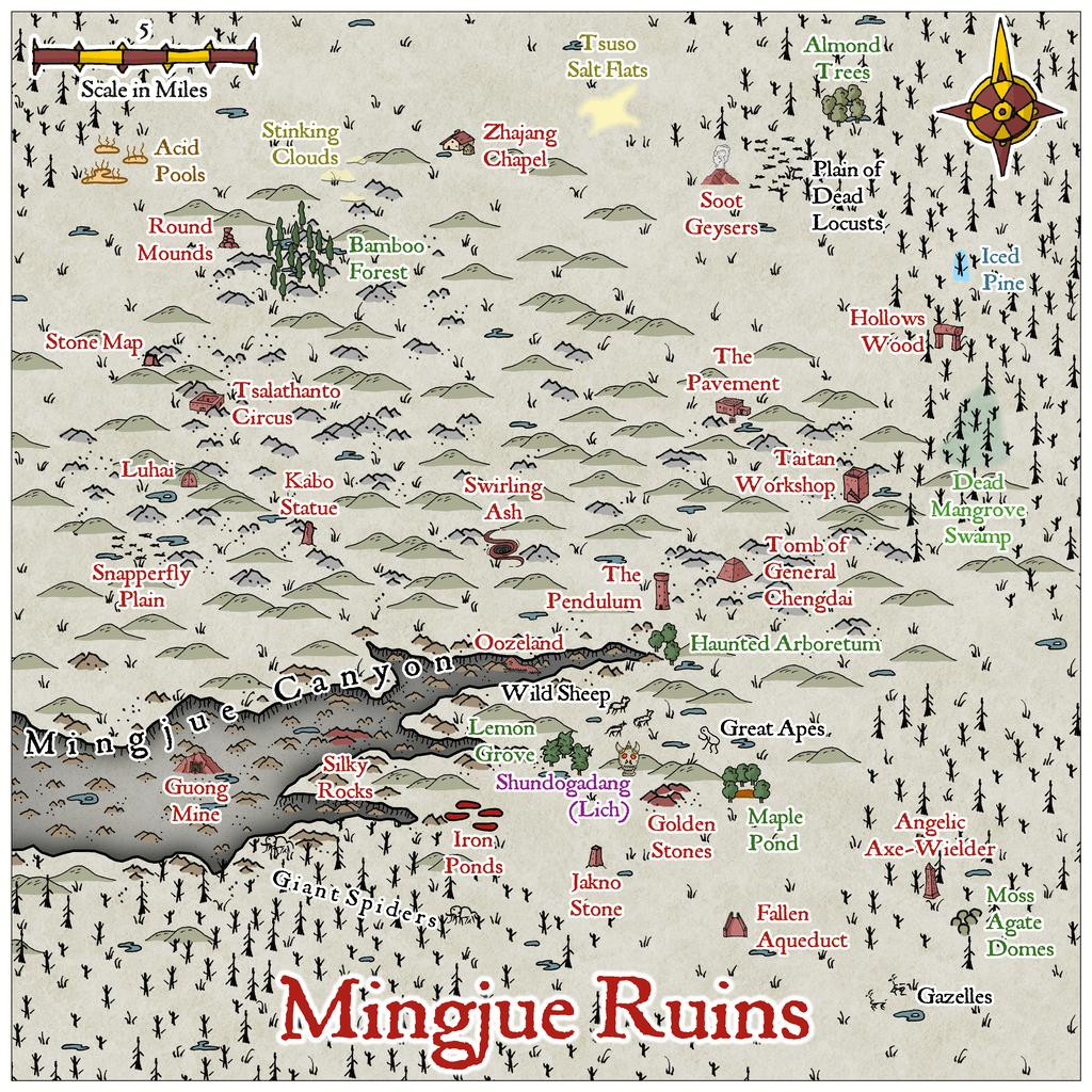
Options for what the various features were, were determined using random tables found throughout the "Knave" 2nd edition RPG rules, published by Jacob Hurst & Swordfish Islands LLC, with most of the names determined also randomly from tables in the "Nomicon", published by Mythmere Games.
I chose not to add any streams, just ponds, partly to sustain the overall feeling of ruination hereabouts, partly because I felt allowing GMs to add minor brooks wherever might seem interesting, was a better idea. I did add a comment about this in the PDF notes for the Atlas, as well as notes on the various labelled features.
There was one further very late change, following the publication of the latest free Hand-Drawn Fantasy monthly symbols for cliffs, in late January. I toyed momentarily with adding those new cliff symbols along the visible edges of the Canyon, but that proved unworkable, as the mapped edges were already drawn, and the symbols couldn't be easily fitted to them. Instead, I hand-drew some little vertical "cliff-lines" along those same visible edges, which seem to help enhance the existing darker effects shading around the Canyon edges. Many ended-up hidden by the Canyon's label, but at least I know they're there!
With this completed, it was time to head underground (next time)...