Loopysue
Loopysue
About
- Username
- Loopysue
- Joined
- Visits
- 10,415
- Last Active
- Roles
- Member, ProFantasy
- Points
- 10,161
- Birthday
- June 29, 1966
- Location
- Dorset, England, UK
- Real Name
- Sue Daniel (aka 'Mouse')
- Rank
- Cartographer
- Badges
- 27
Latest Images


-
Live Mapping: Fantasy Worlds (Annual Vol 3)
Hi Everyone :D
In this session Ralf will create a world map with the first Annual style by Pär Lindström from the Cartographer's Annual Vol 3 (2009).
Come along and join in, or watch later on YouTube :)
![[Deleted User]](https://secure.gravatar.com/avatar/c75d9a245b74d9c59be0999ea81ca541/?default=https%3A%2F%2Fvanillicon.com%2F92add7f8c954488718110edc4896ad39_200.png&rating=g&size=200)

-
CC3+ Going back to the basics-Dungeon
Excellent work :)
Unfortunately, bitmap symbols don't work as walls. You can't cut them in any way, so you would have to create your rooms with built-in doors and windows.
There are a couple of videos that might help with symbol catalogues here:
These links were borrowed from Remy Monsen's wall of video links. There are more videos there which might be of use to you either now or in the future.


-
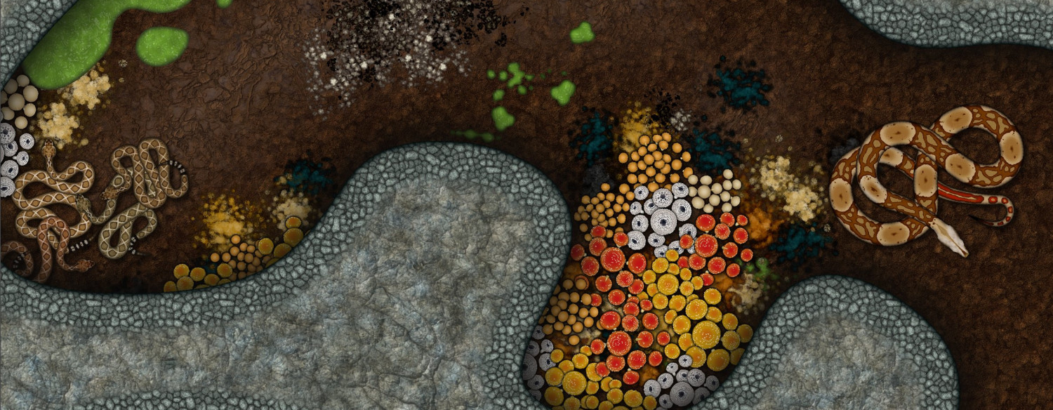
The Creepy Crypt project
Ok. This is iteration number... well I'm not sure, actually. I've done lots. But I think it looks better than the last one I showed anyway.
I have to move on to new stuff now, though, so unless anyone really hates it I think this is the final result.


-
The Creepy Crypt project
This is partly true, Dalton. Though a lot of what a symbol looks like is controlled by what the artist does inside the artwork. On the left is the current boa symbol, while on the left is the one I'm working on in light of the flatness issue.
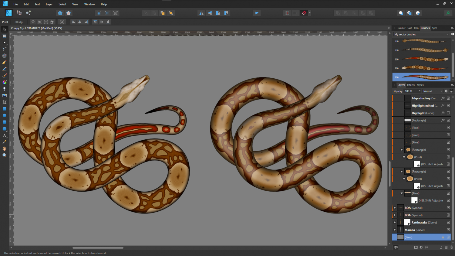
The rattlesnakes will be a slightly bigger problem, since they are really quite rough-skinned, so they don't have a glow down the back like a boa does.
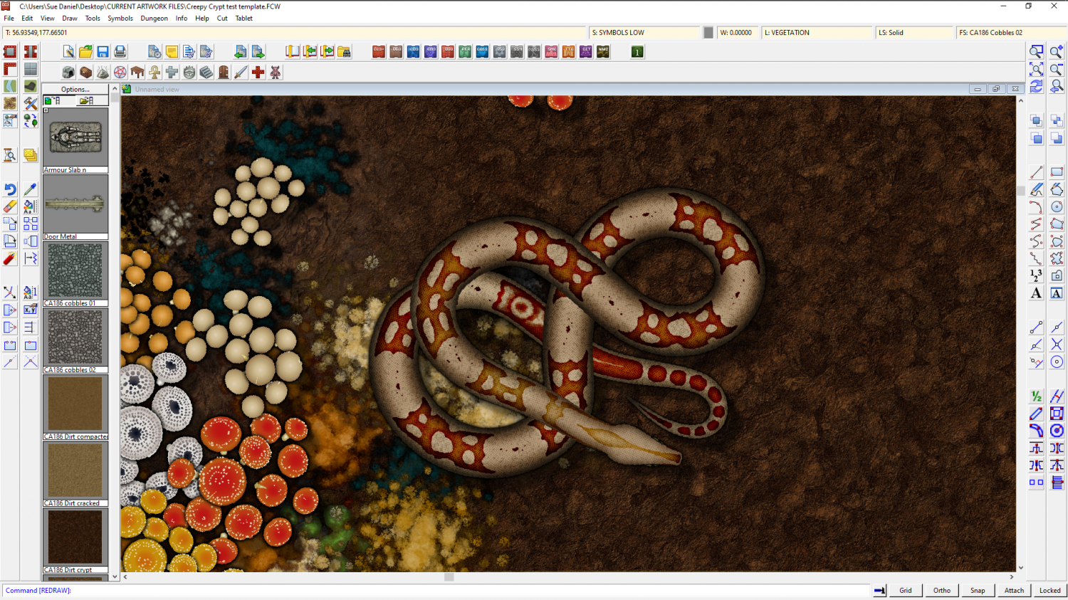
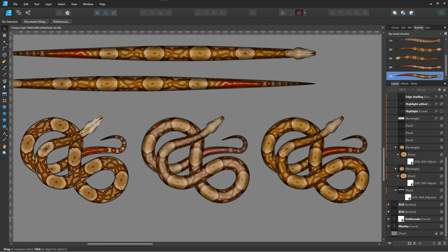
Incidentally, if anyone is wondering how these things are made with a view to making their own snake symbols, check out the brushes top right in this shot. Affinity allows me to draw a perfectly straight snake (which looks really odd considering they never lie in a dead straight line), and then convert that image into a brush. So once the initial drawing is done I can draw the shape and apply the image to that shape.
These are the original dead straight boas used to create the snake brushes.
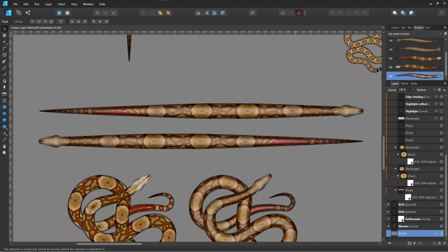
It works a bit like a cross between symbols along and a connecting symbol, with the central section of the snake repeated as many times as necessary to generate the length.
I think the second option is a bit too plastic looking, so I'll probably use the third version below.
-
The Creepy Crypt project
Snakes, fungi, mould and guano...