


Loopysue
Loopysue
About
- Username
- Loopysue
- Joined
- Visits
- 10,416
- Last Active
- Roles
- Member, ProFantasy
- Points
- 10,161
- Birthday
- June 29, 1966
- Location
- Dorset, England, UK
- Real Name
- Sue Daniel (aka 'Mouse')
- Rank
- Cartographer
- Badges
- 27
Latest Images


-
Birdseye Continental - style development thread
My experience of volcanoes is limited to recent Icelandic and Hawaiian erruptions - the last 4 years of them anyway, so the fill reflects at least the mood of what I've seen of the relatively flat ground around those eruptions, which seems to be surprisingly pale except where vehicles off road and turn the surface to reveal the darker colours, but I'll keep it for something else and try a volcanic-coloured version of the tundra fills.
Another reason for making it relatively pale is that the darker the fill is, the darker the symbols have to be, and the darker the symbols are, the less effective the map files are, to the point where you can hardly see any shading at all. Map files work best on mid-tone symbols like rooftops. We'll be ok with the regular mountains because they aren't as dark as volcanoes, but the volcanoes are certainly proving to be quite a challenge.

-
Birdseye Continental - style development thread
Hi everyone! :D
I'll be working on a new top view overland style for the Cartographer's Annual in 2025. If you would like to make any suggestions about what you would like to see, or just want to chat about the possibilities, please feel free to do so on this thread.
Thanks in advance for your contributions.
[Images to come]


-
Birdseye Continental - style development thread
Thanks Don :)
This is Affinity Designer, which is a vector graphics app that can also do most things Affinity Photo can do - if you pick the bitmap mode instead of the vector mode. Everything except the warping of bitmaps, and since that is such fun I also have Photo.
I used Krita to do nearly all of the Ferraris Style, but I don't use it that often these days now that Affinity has taken over most roles. The only thing I can't get it to do is, ironically, the really simple stuff, like alpha mask. For that I export a png and work in GIMP.
It pays to have a wide range of tools in your toolbox for making new assets. I sometimes use CC3 to make new seamless textures from symbols like trees.
The only kind of app I don't have in my toolbox is rental apps, like PS.

-
After Day's of Watching Videos
Yeah, that's actually a record minimum. When I developed The One Day Worldbuilder I had about 75 worlds saved up to chose from.

-
[WIP] Fantasy World
You have obviously put a lot of thought into this map, and I think it's looking good so far.
Watch you don't make the mountains too big, and scale the farmland fill down quite a lot if you can.

-
Birdseye Continental - style development thread
@Wyvern - I forgot how many points a snowflake had ;)
This particular symbol is a complete ridge, starting with a mountain and extended into a ridge from one of it's 3 buttresses. I think 3 seems to be the magic number of butresses (or maybe in tight folds only 2 buttresses). All the Himalayan watershed lines join at 3-way nodes. 4 would be rare, I guess. Even Mt Everest only seems to have 3 main butresses. There's probably a really simple geomorphological reason for this, but I can't think why it might be.
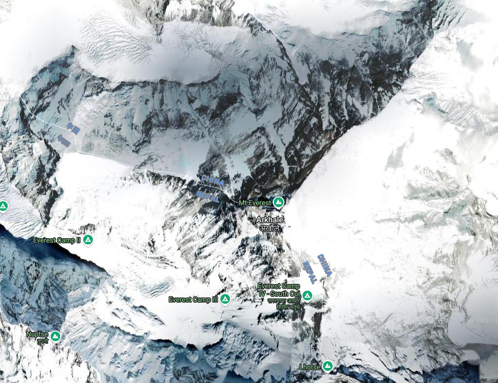
Incidentally, I rather like the Nepalese(?) name for Everest - Arkhale. I wonder how it's pronounced.
@Royal Scribe - Thank you :)
-
Live Mapping: Mike Schley Regional
This week in live mapping, Ralf will be creating a regional adventuring map using the the Mike Schley overland style. Come along and join in the chat live on Youtube: https://www.youtube.com/watch?v=Aq2Vh5oz05Q
Or watch it right here if you prefer*
*There's no live chat on the forum.
All the live mapping sessions are recorded and available on the Profantasy Youtube channel.
-
Birdseye Continental - style development thread
Thanks :)
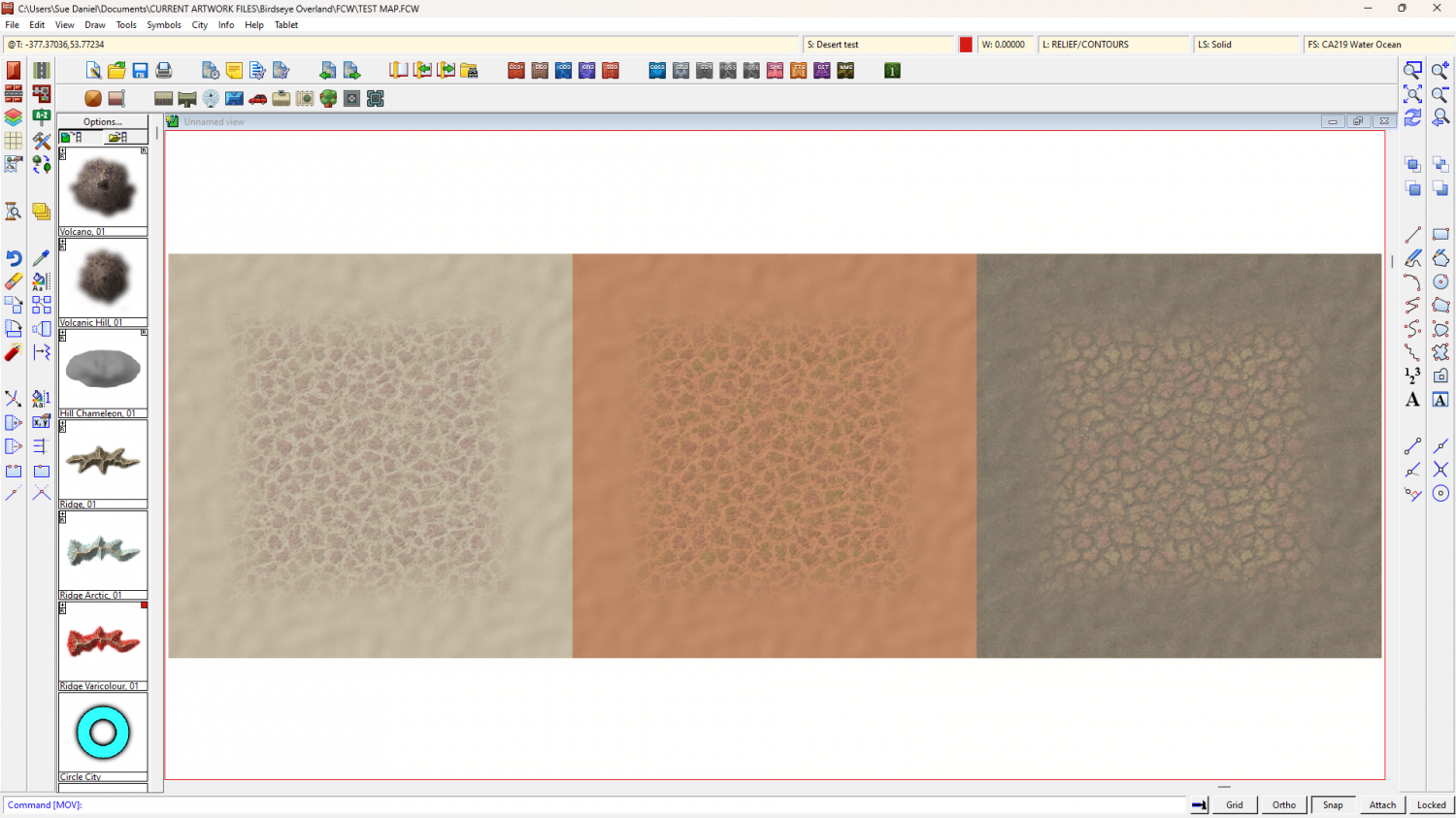
I've adjusted the badland fills. The backgrounds now all match, but I'm a little unsure of the patch colours.

-
How to Recombine Text
You could group or multipoly them.

-
Birdseye Continental - style development thread
It depends what season you see it in.

