Loopysue
Loopysue
About
- Username
- Loopysue
- Joined
- Visits
- 10,415
- Last Active
- Roles
- Member, ProFantasy
- Points
- 10,161
- Birthday
- June 29, 1966
- Location
- Dorset, England, UK
- Real Name
- Sue Daniel (aka 'Mouse')
- Rank
- Cartographer
- Badges
- 27
Latest Images


-
Banners
I decided against buying font creating software since it would probably take too much of my time ;)
(I would get hooked on it and not be able to give up)


![[Deleted User]](https://secure.gravatar.com/avatar/c75d9a245b74d9c59be0999ea81ca541/?default=https%3A%2F%2Fvanillicon.com%2F92add7f8c954488718110edc4896ad39_200.png&rating=g&size=200)
-
Cannot figure out how I broke the sheet effects - they won't show up
Your effects aren't broken. They are just scaled really tiny - so tiny you can't even see them.
I've just been through the whole set and discovered that you have them all set to Percent of Drawing Extents Width as the Effect Units. This means that whatever figure you had in the Edge Width box (these were also really tiny before I started on the map) is only that percentage of the map width.
I've changed them all to Map Units and given them about 10 map units Edge Fade Inner. I've also moved that piece of scrubland fill to the TERRAIN DESERT sheet because it was on the same sheet as the grassland behind it. That was why it wouldn't edge fade.
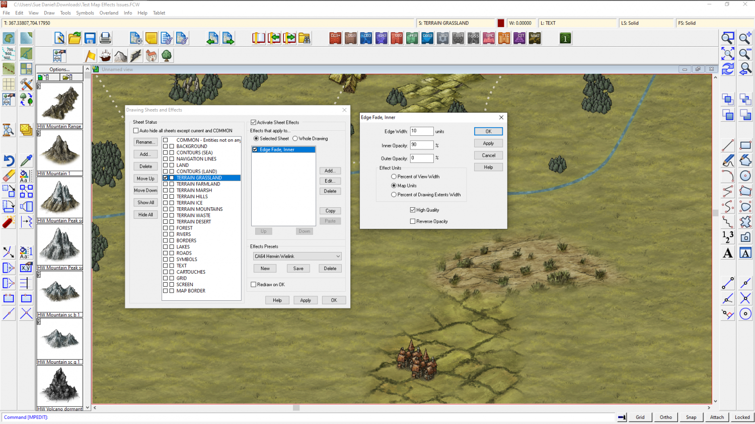
You will probably still need to adjust them all to suit your taste, but at least you are on the right track now.
To edit a sheet effect you need to pick the sheet in the list on the left and then pick the effect you want to edit and click the Edit button on the right.


-
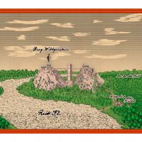
[WIP] DOTR The End of Castle Wittgenstein
Wall tool:
The wall tool is a line drawing tool and doesn't join into a closed polygon. A wall is a line with a width. Conversely, the room drawing tool automatically draws a closed polygon wall (which is rendered hollow by the line width) because it doesn't know where you want the door to be, or even if you want a door.
The bridge symbols meet at the highest resolution. There are 4 images of each symbol in a graded set of resolutions to speed up the zooming process, and where they are fuzzy-edged pixel images sitting on a precision vector reference grid they can appear to have gaps between them at lower resolutions. If you have issues with this it may be necessary to draw another line of them off the map somewhere initially using the snap grid so they are perfectly horizontal or vertical, and jink them closer together by hand. Then the string of bridge bits can either be grouped and moved, or just moved to position on the map.
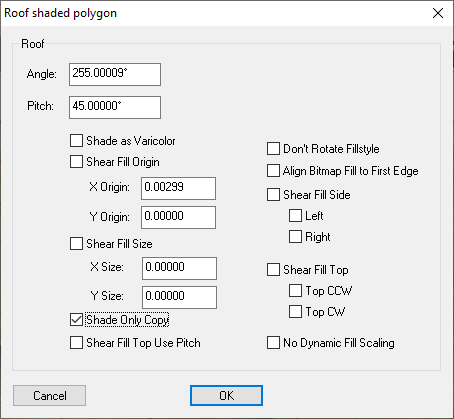
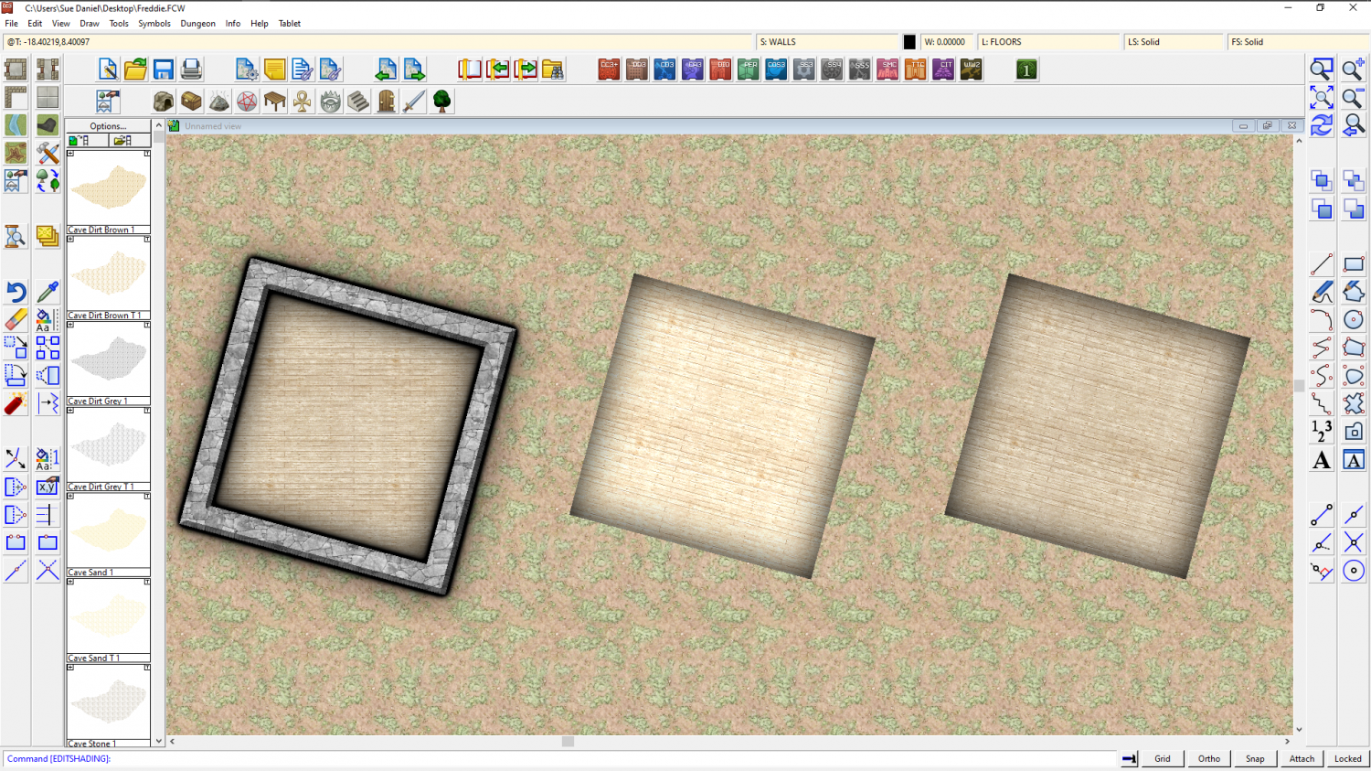
1) Textures aren't aligned unless they are made to align, and you can only do that with a filled polygon, not a wall. Happily, your floor is a filled polygon. Hide all sheets but the floors and right click the Polygon button on the right toolbar. Click the floor on one of its long sides. The fill will align to that side, but it will also shade like a pitched roof. To get rid of this you need to type EDITSHADING on your keyboard and hit the Enter key. This is a command you have just given CC3. Check the command line at the bottom of the window and see that you are being asked for the entity to be edited. Pick the floor and then in the dialog that appears check the little box called "Shade Only Copy" and OK.
You should end up with something like this. Here I have shown the 2 steps from left to right.
2) Before you place the symbols, but while you have them on the crosshairs ready to paste, right click your mouse and then click the Set normal button and the More button and see if that works better for scale. The stairs align perfectly with the snap grid for me.
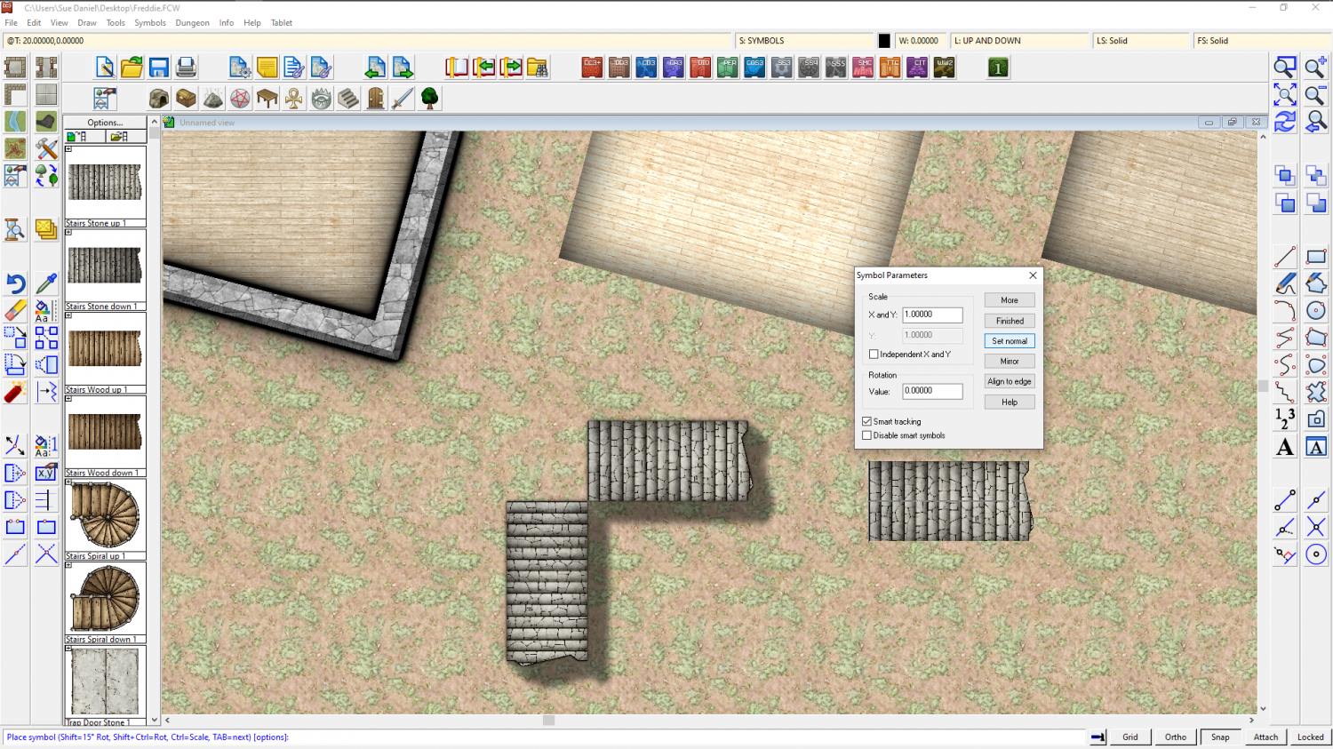
3) The interior wall is a symbol, not a fill. I rarely use them at all because they don't match the fills that well. I usually use thinner regular walls drawn with the wall drawing tools, or I draw the entire building in these interior walls.
I think I got everything there?
-
Grimdark Fantasy (renamed "Darklands") - development thread
@Monsen Thanks Remy :) Your most recent comment is clearer than all of mine put together. It's not an exact science and pretty difficult to describe with great clarity. The arrangement varies depending on the artist. Because I am also employed part time by Profantasy as a Cartographer and Community Assistant (The latter part of that chiefly on FB where experts are a little thinner on the ground than here on the forum) it is sometimes the case that mappers think I have some kind of control over events. That is just plain wrong, though. I am an artist, and that is all I am. I can make suggestions, point to other promising artists, and offer the things I'm working on right now - just like anyone else can, but while PF are extremely good at listening and fortunately for me seem to like quite a lot of the things I do myself, I never make any of the actual decisions about what comes next or what the annual content should be.
@Wyvern Yes, having gathered the information I've been given both here and over on the FB Group I can see that I have been a bit confused about what Grimdark really is. There are some incredibly fuzzy edges to the whole description, and parts where it almost seems to cross over with what, at other times, has been described to me as Steampunk, or which seems to make Grimdark seem to be a horror version of Steampunk. That's ok. I can do that. I just hope everyone is ready for the darker shades of Mouse!
-
[WIP] Overland Mapping
I really like the floating island in the Wurm Wastes. Nice effects. And the cliff coastline in the bottom map is good.
I'm not sure about the mountain placement. Ranges don't usually form circular shapes, so they feel a bit unnatural. However, since there's clearly a lot of work involved here You could always say they are 3 supervolcano calderas. Maybe that's what you meant them to be anyway, in which case they are perfect.
-
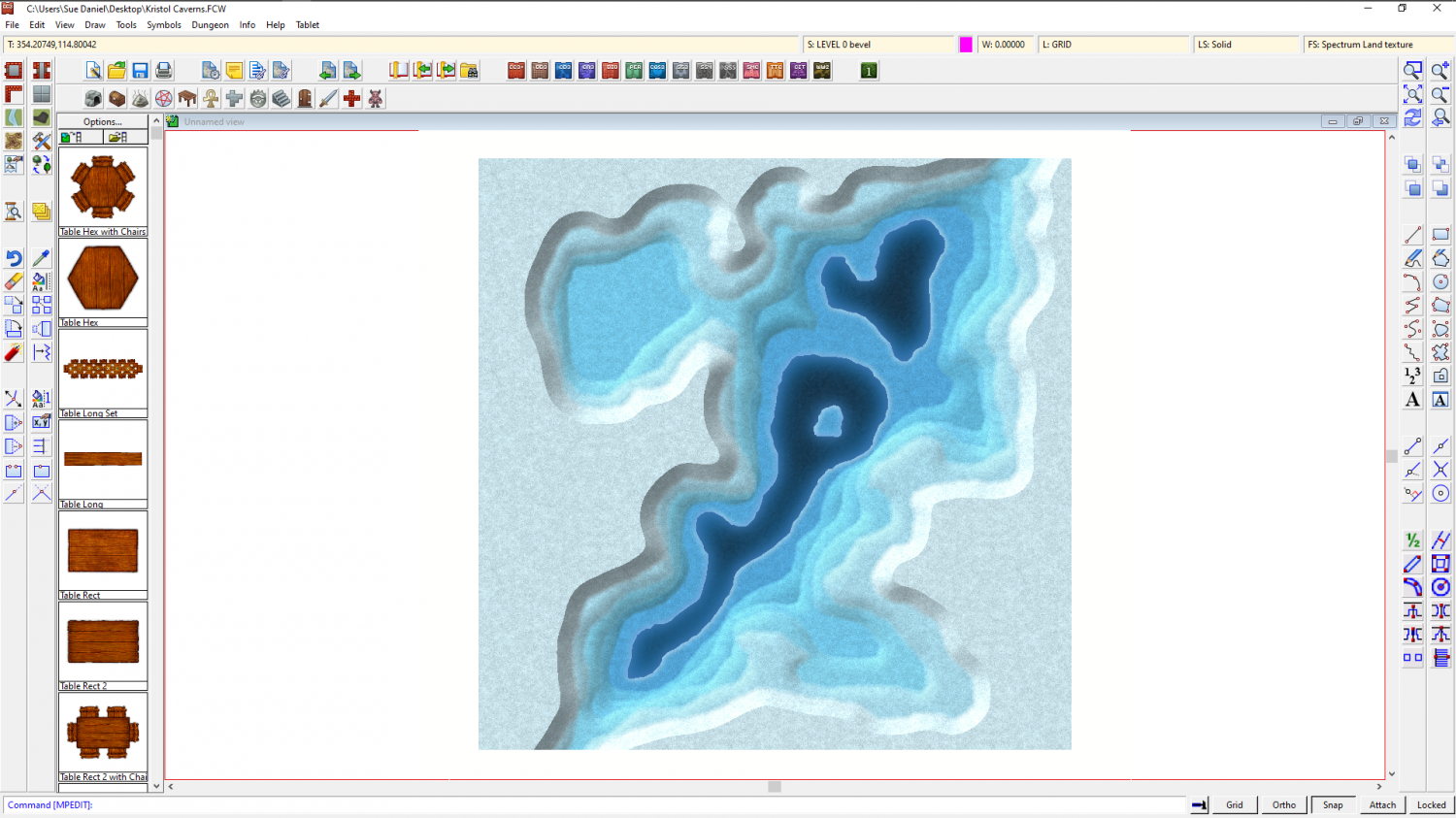
Community Atlas competition: Kristol Caverns
Thanks Wyvern! :)
I might just have gone and spoiled that very woodcut look by introducing surface sheets above each one with an edge fade inner to hide those sharp edges.
I think that even though I started without any backstory one is evolving in my mind. I'm thinking about why there would be an ice cave so close to the Yellowstone-like area of the Kristol Springs. I guess it would have to be magic, if that is ok?


-
Live Mapping: Erdan Worlds Style
Hi Everyone :)
In this week's Live Mapping Session Ralf will be using Medio's great new Erdan Worlds style to make an overland map.
Come along and join in the fun - learn how to use this new issue of the 2021 Cartographer's Annual, or just get to see a bit of what you will have if you buy the annual.

-
Grimdark Fantasy (renamed "Darklands") - development thread
Thank you, Remy :)
I didn't want to limit them to only ever being used in dense forest, so I didn't draw any trees in the symbols. To start with I put them on the same sheet as the tree symbols, but found they were being obliterated a bit too much by the trees after using Sort symbols in Map. There is no reason why they can't be more carefully placed (the trees that is) so that they aren't as obscured, but I lifted them above the canopy so that you could see what they really looked like.

They might do, but I haven't been checking it against Spectrum, and I know for certain that I have used a slightly lower angle to do this set where I sometimes find Spectrum a little too steep. It might work. You will have to try it.
-
Community Atlas 500th Map Competition Results
Well done everyone, and congratulations to Autumn! :D

-
Community Atlas 500th Map Competition Results
I forgot to as well, so don't feel bad.
Thank you Jim :D
And congratulations to all the other prize-winners too :D