


Loopysue
Loopysue
About
- Username
- Loopysue
- Joined
- Visits
- 10,415
- Last Active
- Roles
- Member, ProFantasy
- Points
- 10,161
- Birthday
- June 29, 1966
- Location
- Dorset, England, UK
- Real Name
- Sue Daniel (aka 'Mouse')
- Rank
- Cartographer
- Badges
- 27
Latest Images


-
How to export very large maps
The Rendering engine can't manage the whole job in one go when the export is large, so it divides the map into passes - horizontal strips starting at the top of the map. The smaller your MPPP is the narrower those bands will be, and the longer it will take to render the whole map. The current default of 4 million pixels was set a while back when machines were smaller, so for most people increasing the size by a factor of 10 is a reasonable thing to do. The fewer passes the rendering engine has to do the faster the job is done.
I'm very used to waiting a minute or two for my 5000 px exports with 33% antialiasing (6666 x 6666 work size), but I have my MPPP set to 20 million instead of 40 million right at the moment, so it takes 2 passes to do that size. There's no way a render should take hours.

-
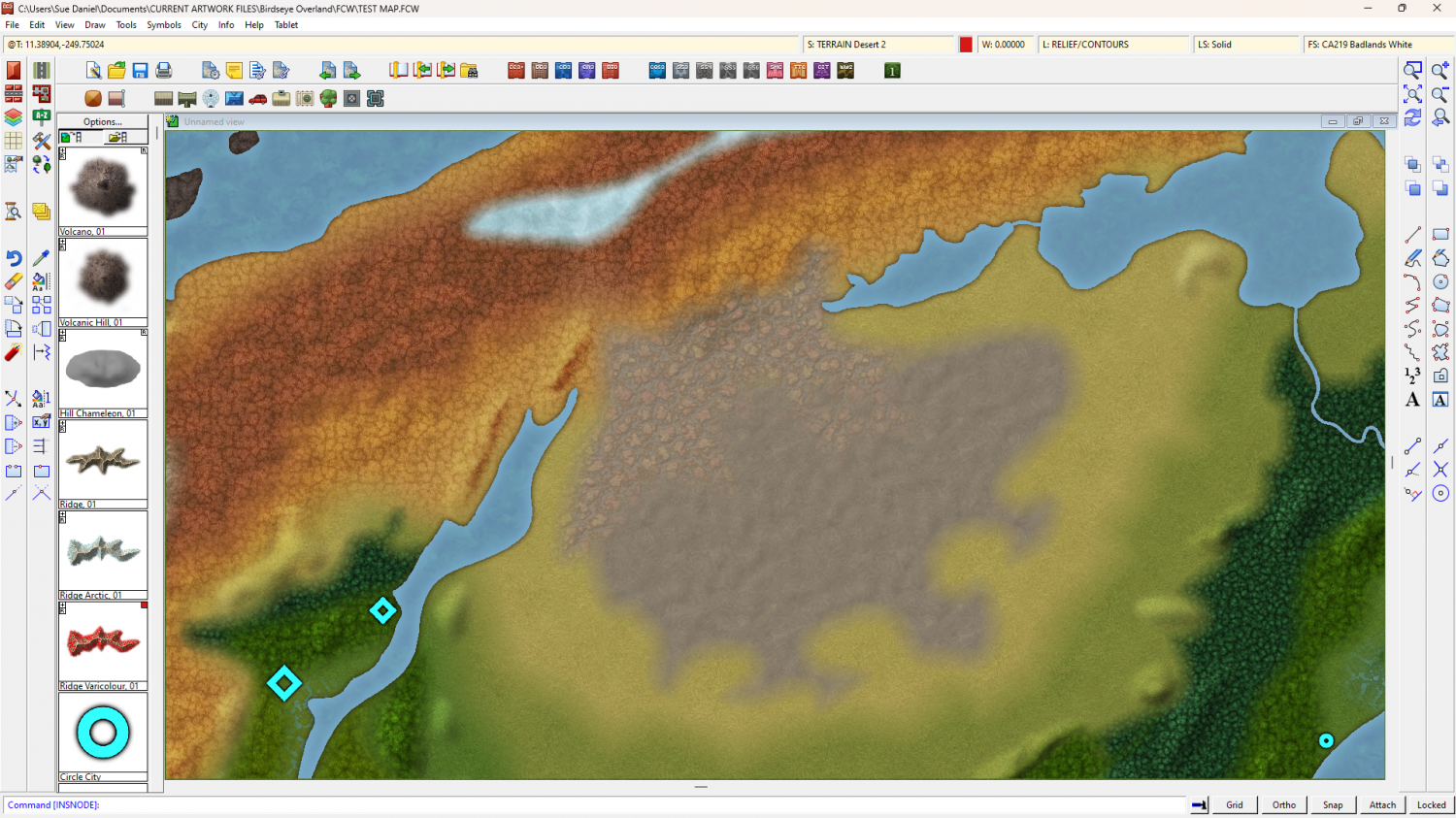
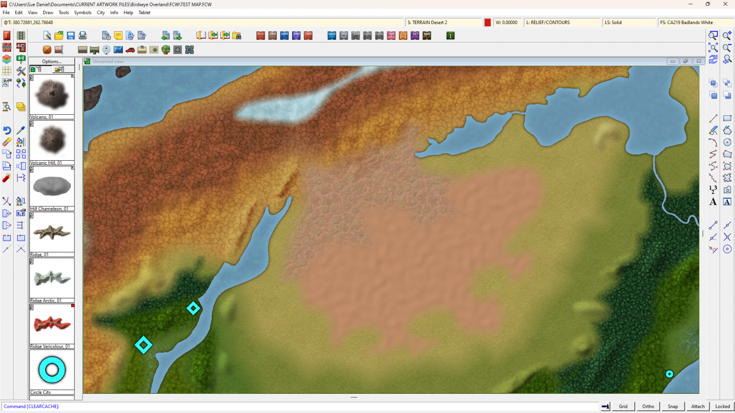
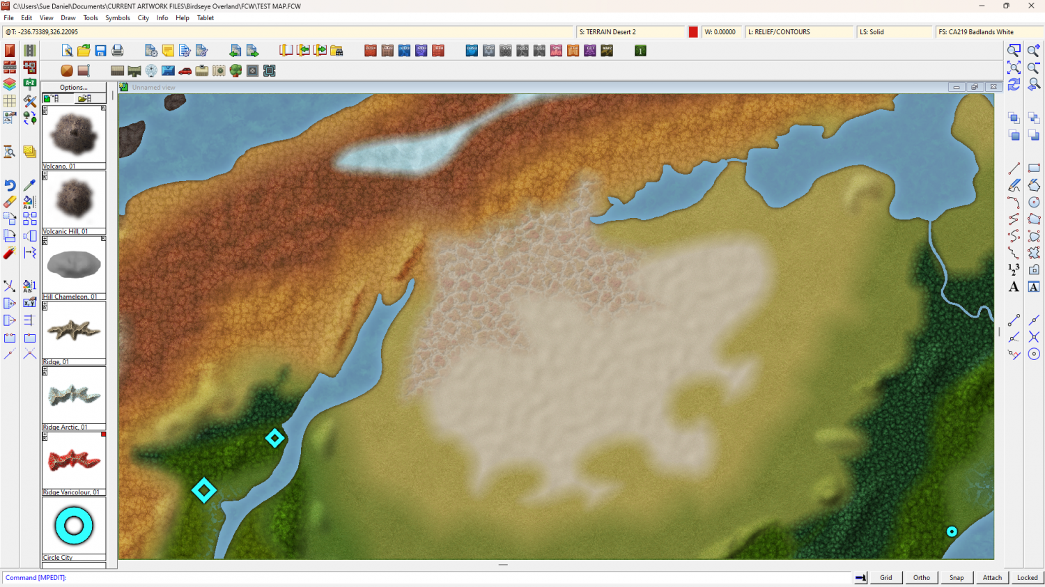
Birdseye Continental - style development thread
I always struggle quite a bit with Badland textures. There are 3 types of desert, so I did 3 types of badland to blend into them. Let me know what you think of them.
Grey desert and badlands:
Red desert and badlands:
White desert and badlands:


-
Community Atlas competition: Kristol Caverns
And now I am wondering if a longer bevel would be better.
I'm also thinking about adding something to that southern end. It looks a bit bland.
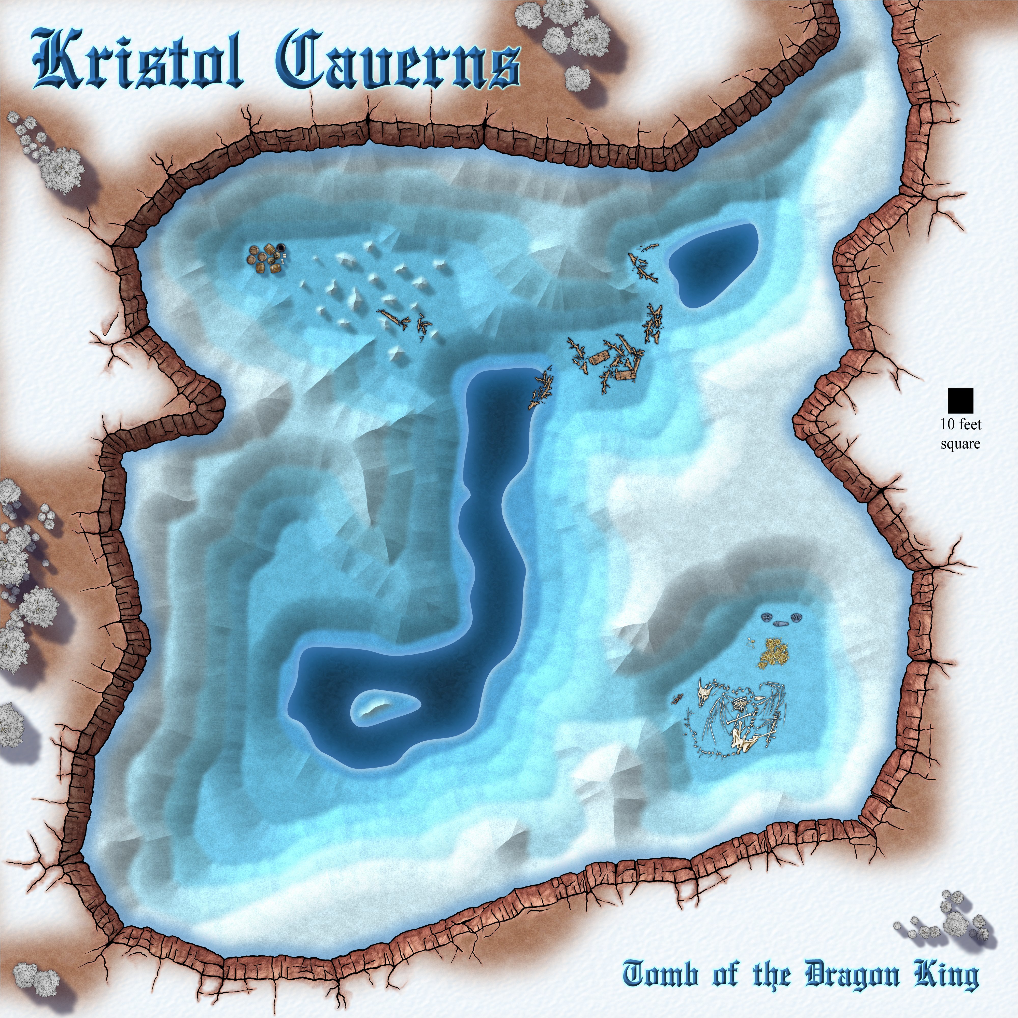
Long bevel, or short bevel - what do you think?


-
Printing a jpg image is giving me a white box of nothing
The problem with your original file was a corrupted sheet. I also got an out of memory warning the first time I tried it. Then I discovered there was a problem with the SYMBOLS sheet and created a new one. Once I copied everything across and deleted the original SYMBOLS sheet everything worked ok.
Your system has plenty of memory and should cope ok with 40 million PPP on export. How does it do with the repaired map?

-
Community Atlas 500th Map Voting Thread - Please vote
Sorry! I give you a thumbs up for thanking Remy, but when I reconsidered I realised it might have looked like I was agreeing that your work was rubbish. It's NOT rubbish. So I took back my thumbs up.


-
How to move stubborn symbols to the back?
Color key doesn't generally work on symbols because of the way symbols are drawn twice by the rendering engine.
The only exception to this rule are 'mapped' city symbols (building roofs that shade themselves according to the position of the global sun), which are only drawn once to preserve the roof shading.
You can copy the png file for the symbol and delete the parts you don't want in the new copy in a bitmap editor, then use your modified copies instead, but be careful to remember they are modified symbols and shouldn't be gifted to anyone else. Using them in your own maps for all the usual purposes, including commercial sale of the map, is fine.
There is really only one big drawback when making your own versions of the public set, and that is if you share your FCW file with others they will only see red X's where they don't have the necessary artwork.


-
Trace Command Issues With Fractal Entities
I never use fractal tracing tools. Straight line ones are faster and follow the fractal original just as well because a fractal line is just a straight line with a few displaced nodes it.
EDIT: I've learned there is no actual speed difference between a fractal drawing tool and a straight line drawing tool when tracing. They behave the same. So personal perception also plays a part in this.

-
How to export very large maps
What size are you trying to export?
The critical number in any export isn't the size you set in the px hieght and width but the work size, which is a pair of numbers at the bottom right of the Options box. If both are significantly over 10,000 px you may have to reduce antialiasing quite a bit to bring them under that number.
When it crashes what do you mean? Does CC3 crash to desktop, or does the process just stop and not finish?
Would you be willing to upload the FCW here so that we can have a go at exporting it?
-
Displace moving everything to the left
I will try that, Joe - Thanks very much for taking the time to create it.
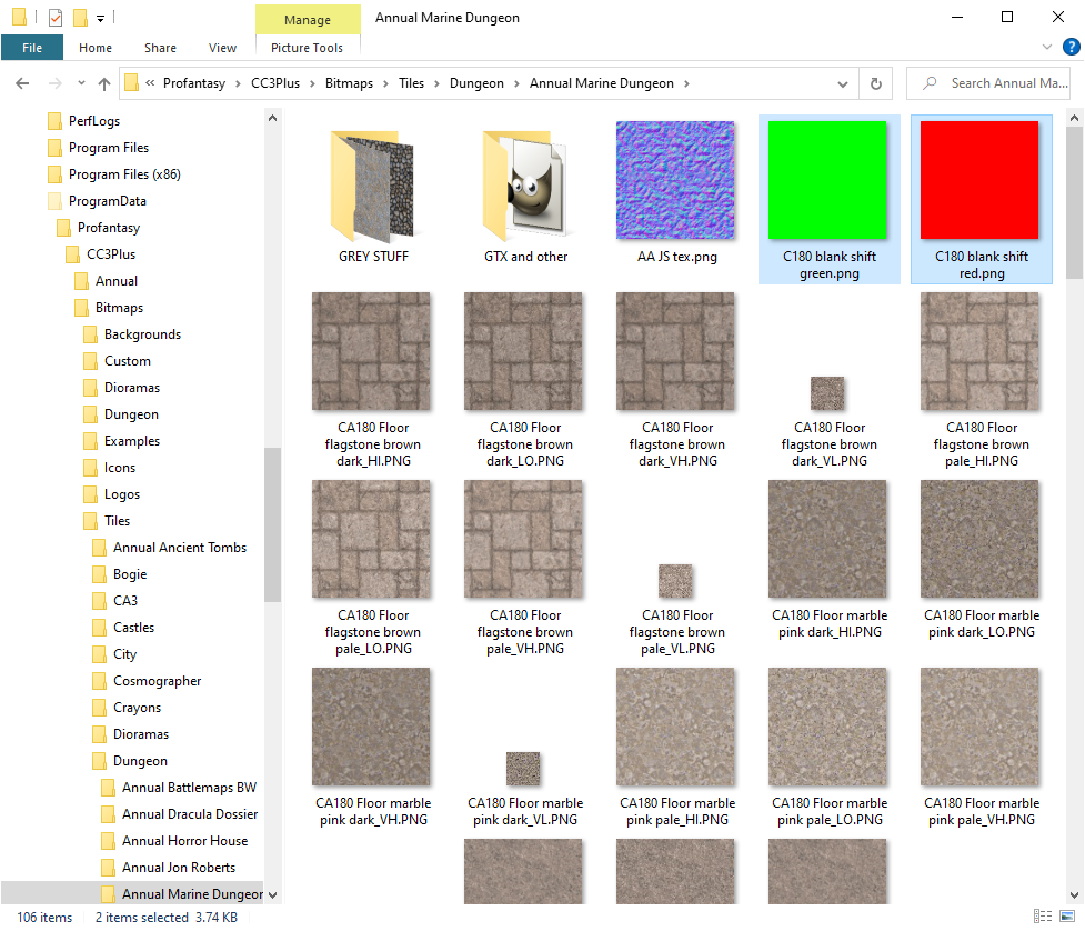
I found a way around it by playing with a red png and a green png for adjustment.
This shot shows the shift happening with just the displace I was using before, a little exaggerated to make it clear.
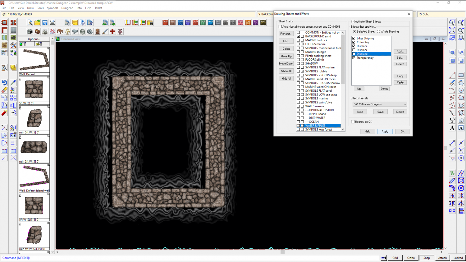
This is with the plain red png distort

And this is with the plain green distort.

I am thinking that my normal map might be at fault somehow, so this is your normal map without the extra adjusting distorts
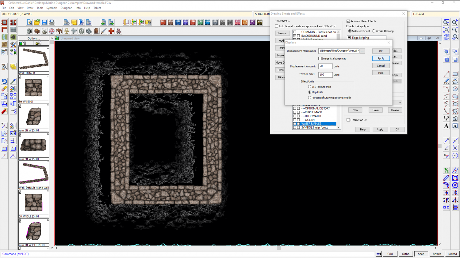
And then again with them (though I had to increase the Displacemet amount on the correction effects by a factor of 3 to make it go right for your normal map). It's a bit like using the Displace to move the whole thing back on x and y axis separately, but I guess that's quite an accurate description if the 'normal' maps I'm using are just two plates of solid colour.
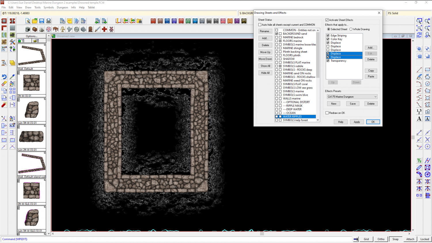
Here are the adjustment pngs I was using - one green, and one red.

-
WIP: ESTONISCH CONTINENT BIRDSEYE
There is already a light blue glow set to inside on the WATER(ALL) sheet. You could make that wider? Be careful how wide and how pale, though, since that will be the colour of your rivers and smaller lakes.
I tried an Edge Stripe. It doesn't work as expected. To do what you want you would have to turn the style inside out (ie, Land on Water, rather than Water on Land) - have the land on top of the water and the edge stripe on the LAND sheet (which is currently the BACKGROUND).
However, that would mean you are back to having to trace the coastline with your terrain fills to keep the terrain on the land, and will probably have to greatly reduce the EFI on all the terrain sheets.
This is the one big disadvantage of creating a Water on Land style. Coastal effects are relatively limited.
Alternatively, if you are hell bent on having edge striping, maybe try duplicating all the land polygons from the WATER(All) sheet to a brand new sheet above the WATER(All) sheet, leave them pink and add first an edge stripe, then a colour key. I haven't done it myself yet, so it may not work.
