


Loopysue
Loopysue
About
- Username
- Loopysue
- Joined
- Visits
- 10,415
- Last Active
- Roles
- Member, ProFantasy
- Points
- 10,161
- Birthday
- June 29, 1966
- Location
- Dorset, England, UK
- Real Name
- Sue Daniel (aka 'Mouse')
- Rank
- Cartographer
- Badges
- 27
Latest Images


-
Frozen arctic lands
Maybe if you thin them out as they get closer to the snow line so you end up with a sort of edge fade, but done in tree symbols?


-
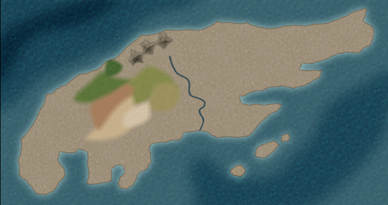
[WIP] 1000th Map Competition: Elkton, Alarius North Central
I decided I didn't like the rocky stuff at the top of the map, so I replaced it with a stony bluff that probably marks the cap of the hill. This is a hill, after all, and not an actual mountain.
Don't worry about that unintentional pattern in the tundra plain. I'll be carving that up a bit later today.
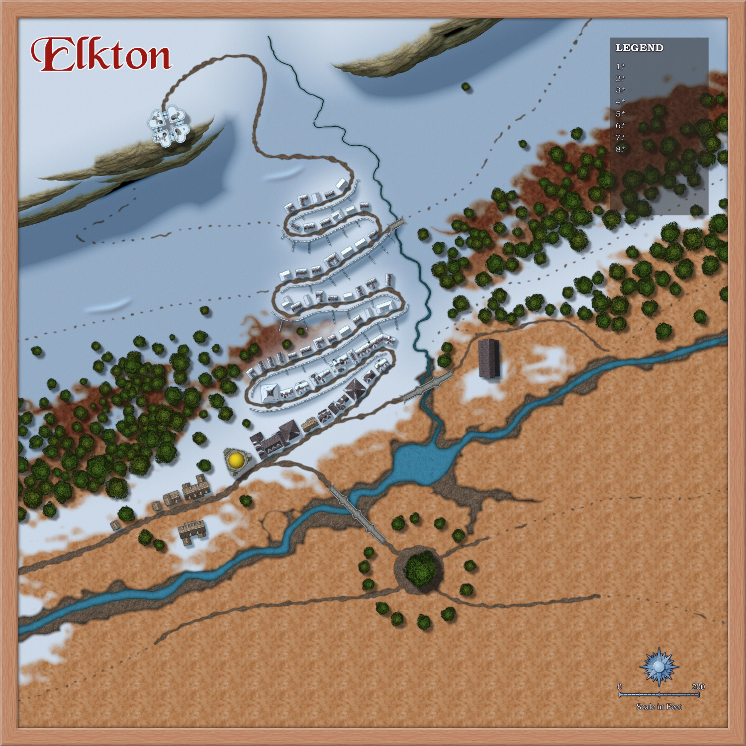
I hope you like the experimental snow slump lines, Wyvern ;)


-
Grimdark Fantasy (renamed "Darklands") - development thread
Sometimes there are second parts for the same style, like there was for the Spectrum Overland style I did last year, but it is less common for there to be an overland/dungeon style pair.
There's a scale between those two things anyway - city scale. Going straight from Overland to Dungeon scale while completely missing out City scale doesn't make sense. And since doing 3 issues of 12 in exactly the same overall style would mean dedicating 1/4 of the entire annual to just one basic style (which not everyone will be interested in) this is very unlikely to happen.
However, if enough people show an interest in a grimdark dungeon style and can show me what this actually means... There was never really an actual style for Grimdark as far as I am aware, but only a sense of atmosphere... that could be something that might appear at some point in time.
...
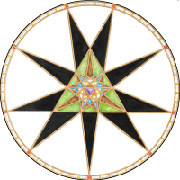
I had an idea for a compass I thought you all might like
![[Deleted User]](https://secure.gravatar.com/avatar/c75d9a245b74d9c59be0999ea81ca541/?default=https%3A%2F%2Fvanillicon.com%2F92add7f8c954488718110edc4896ad39_200.png&rating=g&size=200)
-
Live Mapping: Monthly Symbols Dungeon
Hi Everyone! :D
I think this week's announcement should have a 'seriously cute symbol' warning.
Ralf has decided it's time to take another look at the free monthly symbols and how to make use of them for a dungeon map.
You can watch it here:
Or you can catch us on YouTube live and join in the chat here:


-
Live Mapping: Selecting and Editing in CC3+
Hi everyone :)
In this week's Live Mapping Session Ralf will be taking a detailed look at selection methods in CC3+ and how to edit various entities.
You are all very welcome to come along and join in, or if you miss it you can watch later.
-
Deep sea problem
How about this?
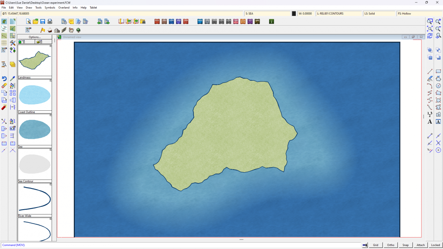
I added a Colorize to the background and then drew the shallow water under the land with the "Sea" drawing tool.

-
Birdseye Continental - style development thread
It looks like Glow is the only one that does that. I've reduced the opacity to 90% so it's not quite as distracting.


-
Questions about converting into a png file
@Quenten You're welcome :)
It does relate to the thread more than you think, because it explains why AA shouldn't be used to export an image when you intend to remove the background in GIMP or PS. Using the colour picker to pick the background is complicated by the many different shades of variation around the edges as Remy pointed out above.
There is a way around it in GIMP, but it is a crude method and doesn't always work very well. I pick the background white with the selection colour picker, invert the selection, sharpen it, shrink it by 1 or maybe even 2 pixels, invert the selection again and then delete the background along with the fuzzy edge. It is much easier if the fuzzy edge created by AA doesn't exist in the first place.

-
Critique
While Julian and Monsen are both right, and you are discussing function and scale, there is also an artistic aspect of getting the right Level of Detail (LOD) in a map.
Even in this day of technology some things are still better if they are judged by eye. Create your map to the correct CC3 scale for the area you are mapping (map units are miles or kilometers in an overland map, and feet or metres in city and dungeon maps), and paste a handful of the symbols you intend to use in that space at the default scale set by CC3 at the creation of the map (not too many - don't go overboard and start the map just yet), then render the mostly empty test map to the final size and examine it at 100% zoom, or print it the size it will be published at if you can at home - no need to get professional prints just yet.
Judge how much larger or smaller you want everything to be so that you have enough room to show the information you want in the map, and to be able to enjoy the symbols themselves - even though each mountain or tree may end up representing several mountains or trees due to their size relative to the scale of the map.
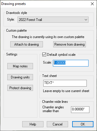
I don't recommend using different scales for different types of symbols in the same style unless, as Monsen points out, the settlements are a bit on the small side and not easy to identify. Pick a scale for the whole set and stick to it unless you have a rare exception (such as a world tree). Once you know what the symbol scale should be, set the default symbol scale in the Drawing Presets dialog |CC2PRESETS| and save the map.
Do two more tests like this to see:
- How thick your lines for coast and river should be, and how much detail you really need to draw in those two things. You would be surprised how messy a really accurate coastline with tens of thousands of nodes can look when printed on a piece of A4. Most maps have grossly simplified coastlines to avoid that mess and look so much better for it.
- Set the right font and size for your labels. Labels don't need to be huge (unless you are naming a continent, in which case they would probably be quite transparent as well to allow more regular town names to show through those enormous continent labels). But they must be readable without squinting.
It's worth the time and trouble to run a few quick tests first than to spend hours, days or possibly weeks making a fantastically beautiful map only to realise that it is a meaningless unreadable jumble when rendered to production size.
-
Cartographer's Annual - all the issues linked in one place
Ok, I've done it. The link wall is complete - for now")
If you hover your mouse over each thumbnail you should now see the name of the issue displayed, which should make it easier for people checking that they are looking at the annual with the issue in it they just heard about in another thread or elsewhere.
Just for the record, I don't have a favourite annual. I love all of them")


