Loopysue
Loopysue
About
- Username
- Loopysue
- Joined
- Visits
- 10,414
- Last Active
- Roles
- Member, ProFantasy
- Points
- 10,161
- Birthday
- June 29, 1966
- Location
- Dorset, England, UK
- Real Name
- Sue Daniel (aka 'Mouse')
- Rank
- Cartographer
- Badges
- 27
Latest Images


-
Weird lines when I export my map (glowing effect?)
Each of those bands is a pass made by the rendering engine.
You can use wider passes by typing the command EXPORTSETMPPP and hitting return. The command line will tell you the current Maximum Pixels Per Pass, which at default setting is 4000000 (4 million without commas).
Try typing 40000000 (40 million), hitting return, and trying your export again.


-
Creating greater depth
I think you are doing well with the contouring. It does take some time and patience to get it right. Roads are a tricky one. I did a city a long time ago and cheated a little bit by using 6 or 7 tiers a bit like a disorganised wedding cake. That way each tier cast a shadow where necessary over the roads and houses on the tiers below.


-
non-rectangular stairs in dungeons
Hi Mika :)
There is no right or wrong way to do a thing in CC3. Only variations on a theme.
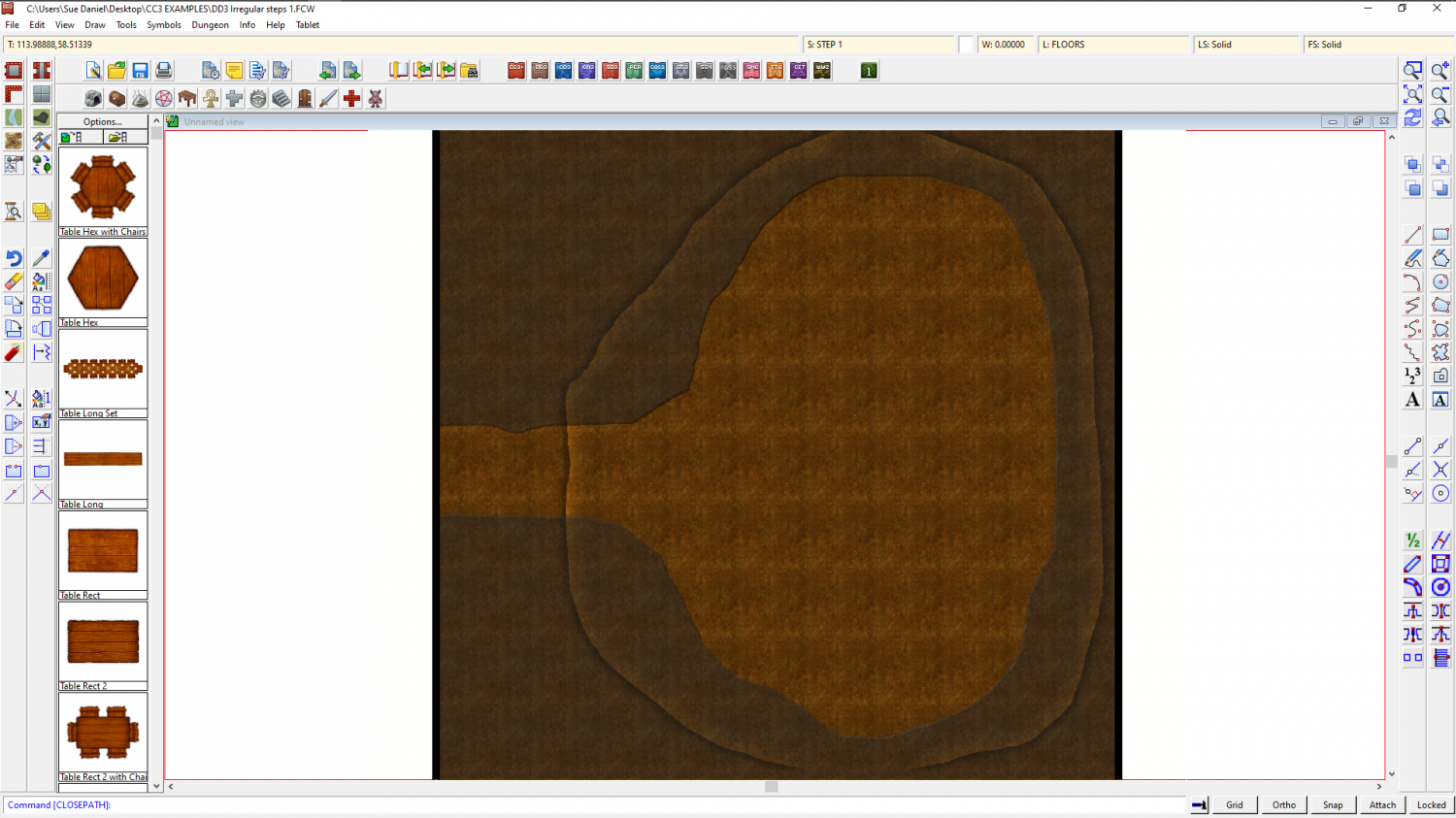
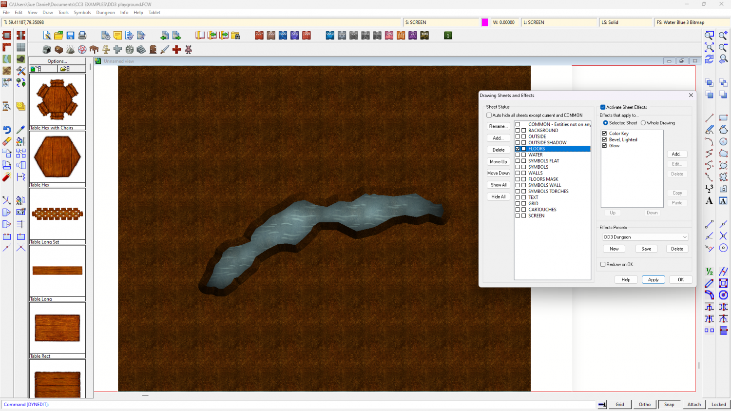
For my suggestion I have started with a standard DD3 template for this map (using one of the dirt bitmaps as the background), and prepared it by adding 10 new sheets. 9 of those sheets are STEP sheets, and one is a SCREEN sheet. This last sheet is designed to hide things that fall outside the area of the map. Some styles have it, but some don't. My copy of the DD3 template doesn't.
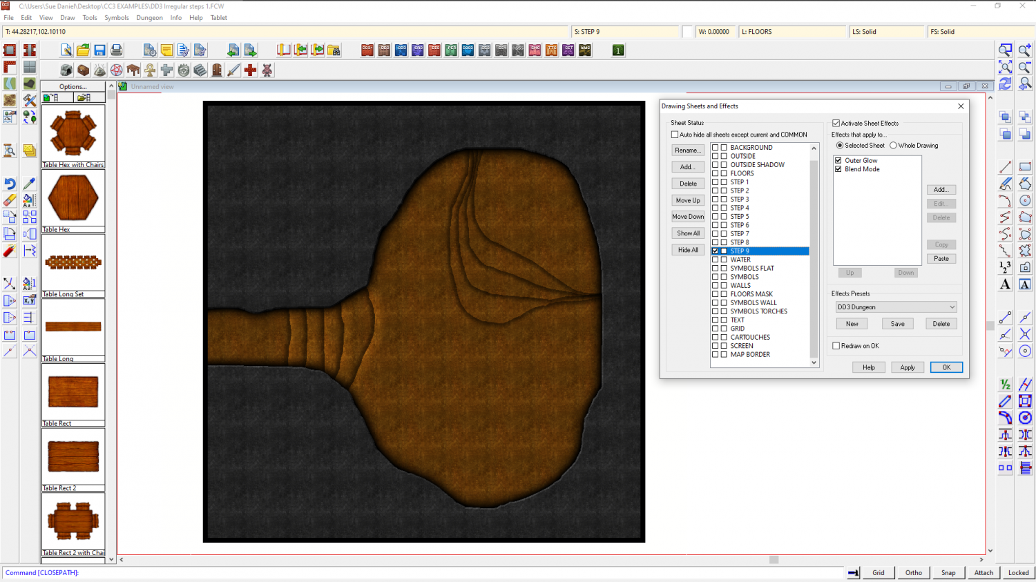
I didn't use the FLOORS sheet at all, but drew the mass of the rock directly onto the FLOORS MASK sheet using the freehand drawing tool. I modified the sheet effects to make the edge more prominent by adding a Bevel, Lighted, and strengthening the glow that was already there.
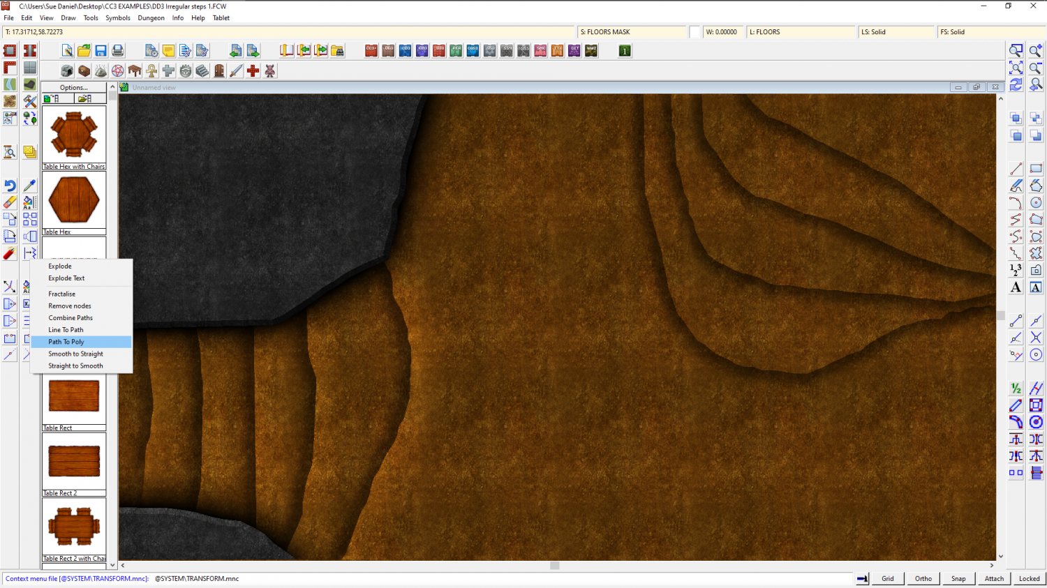
Each of the 9 steps is a simple white polygon drawn with the freehand drawing tool, such that it covers the entire extent of the level it represents and extends under the edge of the FLOORS MASK. Here is one of the step shapes with effects adjusted to show it's extent.
The freehand drawing tool doesn't create a polygon all by itself. You have to draw the outline a bit like you would on a piece of paper with a pencil, and then use Path to polygon from the right click menu of the Fractalize tool to convert it.
As you can see from the screen shot above, I have used 2 different techniques on the 2 sets of steps. Rather than carry on describing these effects and adding loads more to this description, I have attached the FCW file below, so that you can see how the Blend modes are set up. There is one important trick that is very useful to know, however, and that is if you set a Blend mode to 'Multiply' all the white is taken out of the fill. If the fill is solid white (as it is with these steps), then all you are left with is the line and the shadow showing on the top set.
I used Multiply as the Blend Mode on that top set of steps because the highlight effect on the other steps became extra concentrated where the edges were closer together.
Here is the FCW file for you to have a look at. If there is anything you don't understand just shout. Or you may decide to do it a different way.
![[Deleted User]](https://secure.gravatar.com/avatar/c75d9a245b74d9c59be0999ea81ca541/?default=https%3A%2F%2Fvanillicon.com%2F92add7f8c954488718110edc4896ad39_200.png&rating=g&size=200)

-
A Command that Changes the Number of Passes when Rendering.
EXPORTSETMPPP
Try typing the same figure as you are given at the command line with an extra zero on the end of it, and hit Enter.

-
Live Mapping: Banners and Seals
This week Ralf will be presenting the Banners & Seals symbol pack from the Cartographer's Annual 2021. As part of the process he will also be explaining catalogue settings and how to create them, so it is well worth coming along to see how it is done.
You can visit Youtube and book a reminder by clicking the link above.


-
Advice on what looks better, please, on a completed map
Hi Simon :)
Both are good looking maps, though I recommend getting rid of the drop shadow on the text on the first top view map for the sake of clarity.
If this is an ebook you should really check what they both look like when they are reduced to the correct resolution for publication. Check in particular if the labels are legible.
If they are for a printed book (and unless the book is going to be printed in full colour), I recommend printing both of them the correct size in black and white to see what they look like. You might find that a black and white style is more appropriate in that case.

-
Chasm/Crevices in SS4 dungeon?
That's another way of doing it I think, and there are many alternatives.
I made an example file using DD3 to show what I described above if you would like to have it.
The water is the background polygon, and the dirt is a polygon on the FLOORS sheet that extends beyond the edge of the map to hide the bevel where it appears on the outside edge as well as the edge of the crevice. If you hide the sheet called SCREEN you will see what I mean about hiding that outer edge.
I added 3 effects to the FLOORS sheet and drew the magenta cut out shape on that sheet. The first two effects were as I described above, and the third was a glow to enhance the illusion of there being a shadow cast on the water below by the edges of the crevice.

-
Live Mapping: Creating your own style
Hi Everyone :)
Tomorrow's Live Mapping session will start an hour earlier than the usual time, so please be careful not to miss it if you want to catch it live.
Ralf will be demonstrating how you can create your own custom style in Campaign Cartographer 3+.
We would love to see you there :)


-
August Mapping Competition - Building Floorplans - Win Prizes
I'm late! Oh dear.
I'm also pretty crazy, so I've picked one of the largest remaining buildings - the Town Hall and Tax Office.

-
CD3+ Texture issue
Click the little text box in the bar at the top where it says "FS:...."
A dialog called Fill Style Properties will open. Make sure the Bitmap Files tab is active and pick the fill you want to rescale from the dropdown box called Fill Style Name.
Make sure the Scaled checkbox near the bottom of the dialog is checked and adjust the Width and Height of the fill in map units.
In this screen shot the fill I have picked is scaled to 15 x 15 map units.
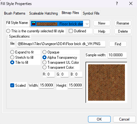
Click OK and the fill should rescale itself in the map.