


Loopysue
Loopysue
About
- Username
- Loopysue
- Joined
- Visits
- 10,414
- Last Active
- Roles
- Member, ProFantasy
- Points
- 10,161
- Birthday
- June 29, 1966
- Location
- Dorset, England, UK
- Real Name
- Sue Daniel (aka 'Mouse')
- Rank
- Cartographer
- Badges
- 27
Latest Images


-
Birdseye Continental - style development thread
Is this better?
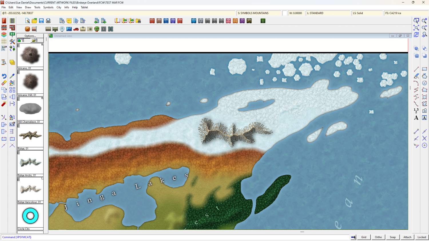
When the ocean was dark the ice looked white, even though it was blue.


-
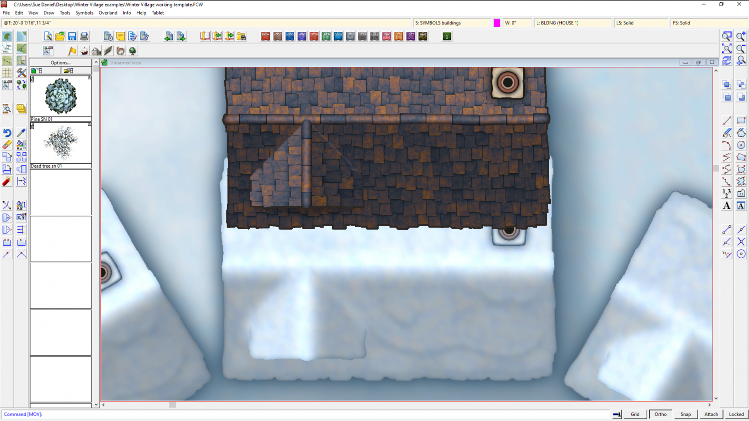
Winter Village style development (March 2022 CA issue)
On the progress side (or lack of it today) I've had quite a struggle getting the gradient shading of the map file correct so that the hollows around the dormer look filled with snow, and everything the right size and shape to be the same as the original but with a layer of snow on it. Not sure how all this is going to work when I start combining them, but we'll see in the morning now.


-
Several maps for (random forest) encounters
The default sun position in CC3 is from the north west. That's because most modern atlas maps with hill shading are shaded as if lit from the north west, even though the sun is only ever in that direction for real if you live in the southern hemisphere. The reason for this is that the human brain expects to see things as if shaded from 'above', as if the map is hung like a picture on a wall. It's easier for us to see the shape of those shaded hills.
That's just a lot of possibly quite useless information there, but it is the reason the default sun position is 315 degrees. I tend to leave it there unless there is a reason for changing it - dramatic effect, or some other reason.
But again - as Dalton says it really is a matter of personal preference.


-
The Lakes of Michigami (Jerry's Map) - WIP thread
Is this better?
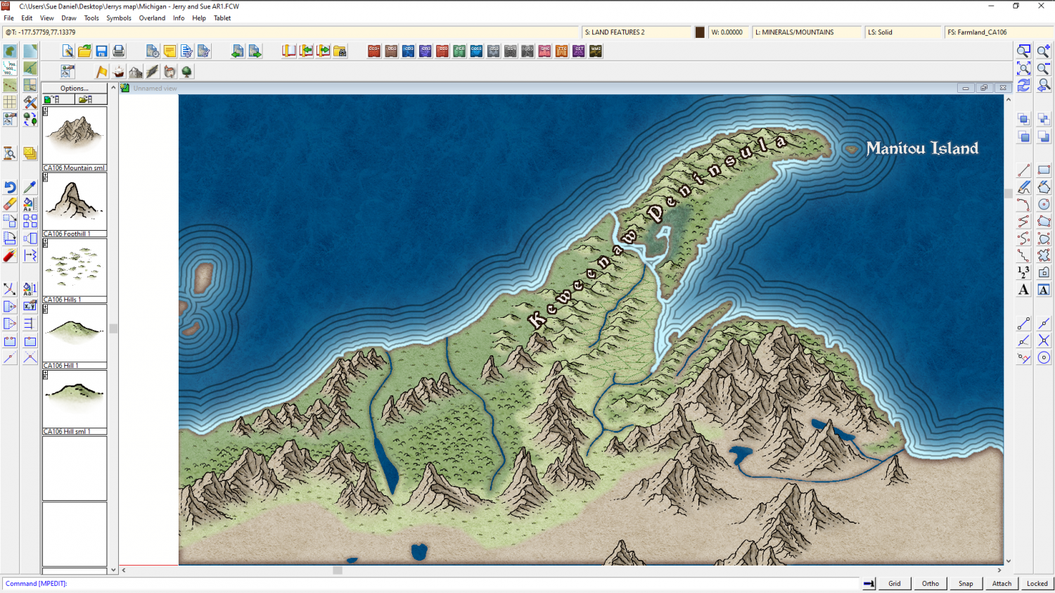
The reason I'm adding the real world names is to give us a reference for further instructions. It's easier if you say change "Fred" to "Burt", than if you give me a lengthy description of where you want a label that doesn't exist yet.

-
Birdseye Continental - style development thread
They're solid grey, just a bit darker than neutral grey, and because they are mapped symbols I can use an Overlay Blend Mode to make them take up the colour of the terrain.
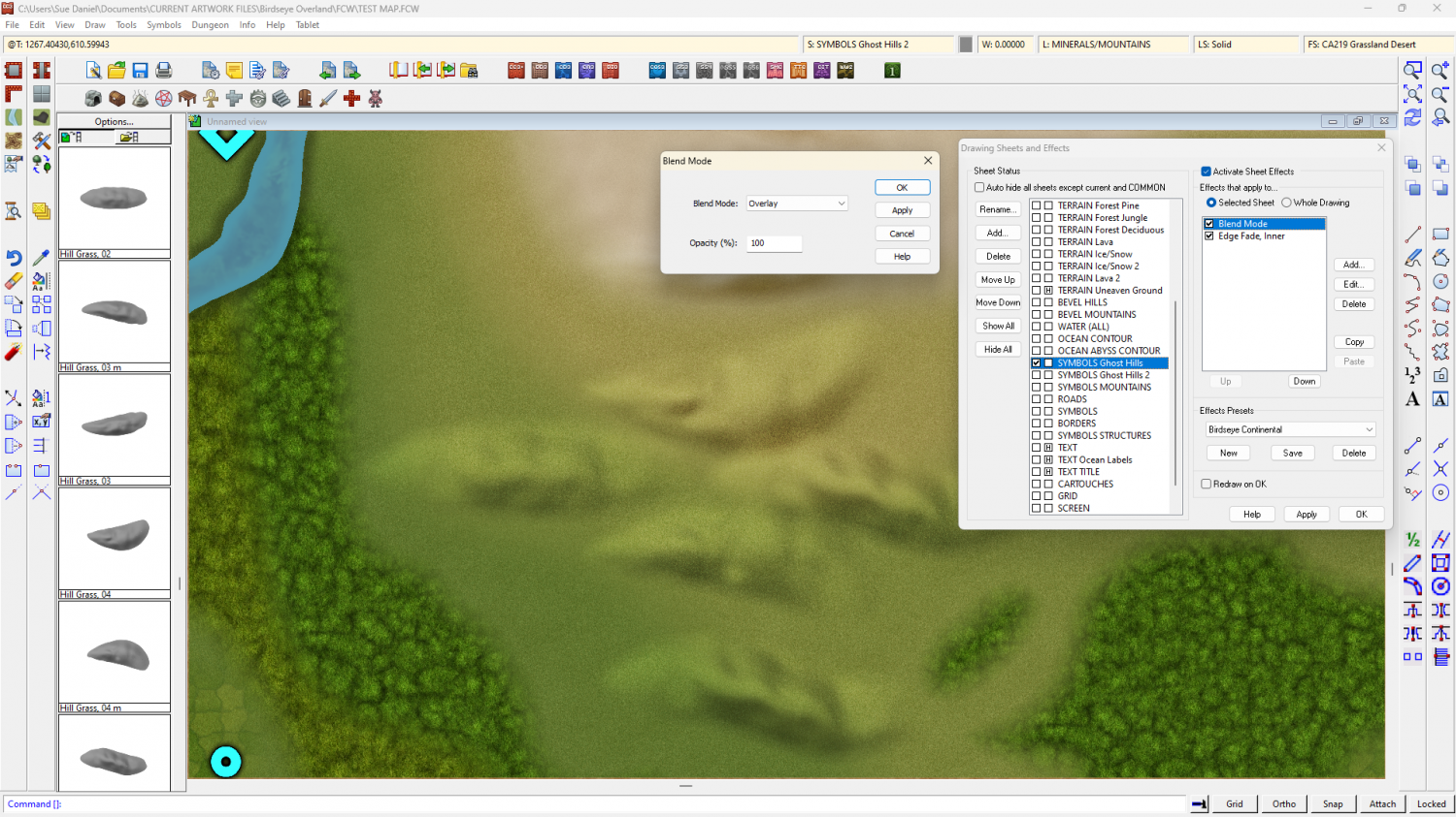
The blend mode does odd things around the edges if I feather the edge of the symbol, so the EFI after the Blend Mode is to soften the base and help the hill sit into the terrain.
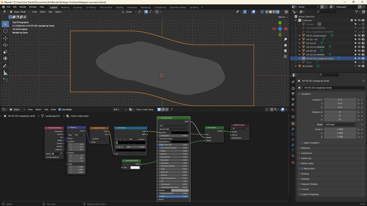
They're relatively simple map files, exported from Blender. I made a material that could mimic a map file and put it on a very simplified 'Landscape' object. The blue part of the map material is a simple blue material that reflects more or less light from the 'BLUE SUN' directly above it. The red part of the material is a radial gradient based on the normals of the object faces, and expressed as an emission, rather than reflected light. That way it stays constant depending on the direction each face is facing, and regardless of the sun.
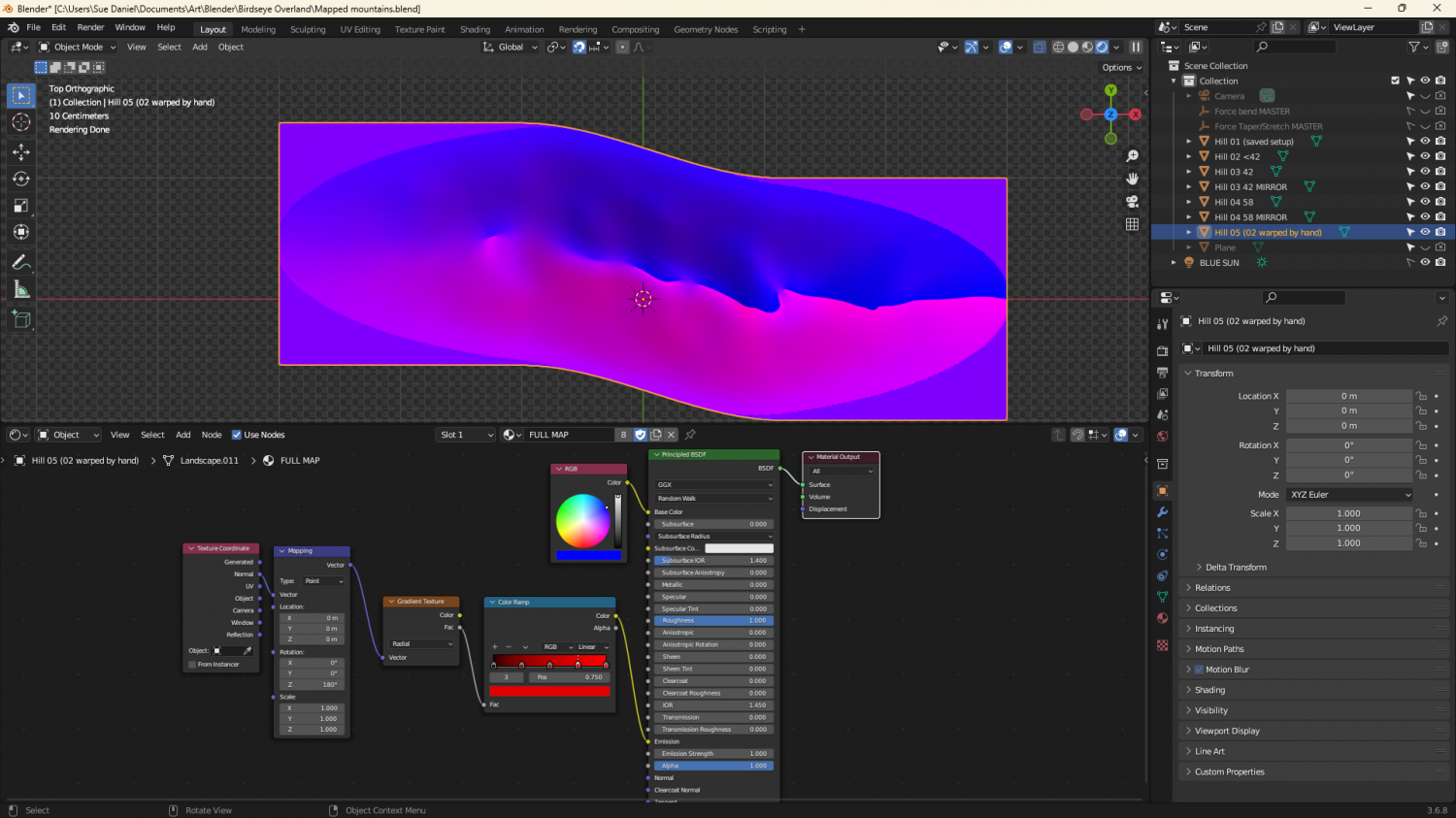
The grey image is a gradient material that maps only the parts of the ladscape above a certain point.

-
Lighning Rendering problem
That is most usually caused by the lights not being present in the current render pass, and not accounted for in the total light falling in the current render pass. At a guess that image took 2 passes to render.
Type EXPORTSETMPPP and hit enter.
The number showing in your command line will most likely be 4000000 (4 million)
Type 40000000 (40 million) and hit enter.
That will expand the size of each pass over the map as it is rendered, and hopefully prevent the artefact by completing the whole map in a single pass.

-
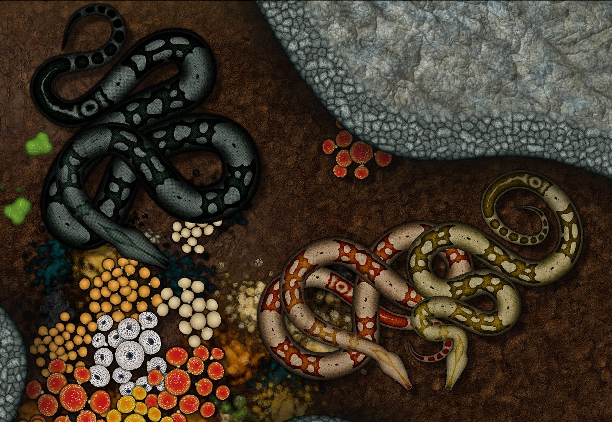
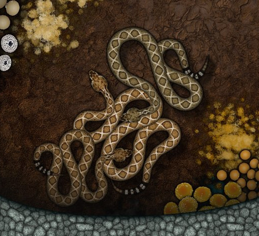
The Creepy Crypt project
I think this is all of them so far. I say 'so far', but I can only add more snakes if I get to the end of the wish list and still have some time left.


![[Deleted User]](https://secure.gravatar.com/avatar/c75d9a245b74d9c59be0999ea81ca541/?default=https%3A%2F%2Fvanillicon.com%2F92add7f8c954488718110edc4896ad39_200.png&rating=g&size=200)
-
Birdseye Continental - style development thread
Maybe this is slightly better?
Or even more discontinuous?


-
ProFantasy is looking for a web developer and graphic artists
Profantasy is a most excellent employer - the best I've ever had in all my 57 years :)


-
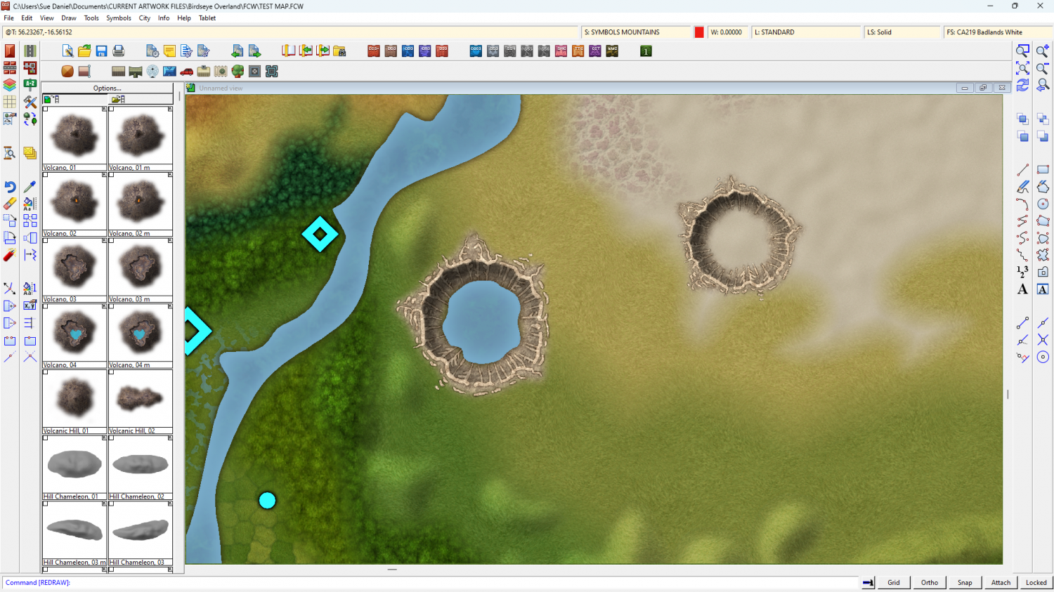
Birdseye Continental - style development thread
Thanks Quenten :)
A crater sample.
The water in this style is drawn over the top of everything else, like in city styles, so it's easy to add a lake.
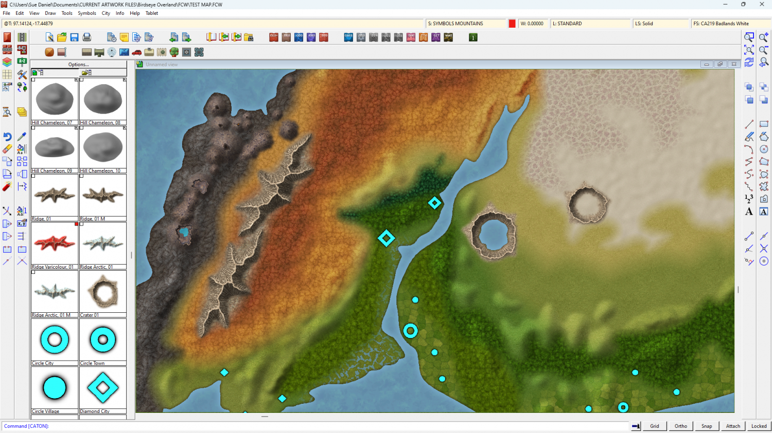
I am thinking that the structure markers might be a little too large at this continental scale. What do you think?
For reference, the larger crater is 90 miles (144 km) across.

