Loopysue
Loopysue
About
- Username
- Loopysue
- Joined
- Visits
- 10,414
- Last Active
- Roles
- Member, ProFantasy
- Points
- 10,161
- Birthday
- June 29, 1966
- Location
- Dorset, England, UK
- Real Name
- Sue Daniel (aka 'Mouse')
- Rank
- Cartographer
- Badges
- 27
Latest Images


-
There any master printable lists of symbols?
Hi :)
If you open the catalogue file (that's the [Foldername].FSC file usually visible in the parent folder of the [Foldername] containing the symbols), you can export an FCW file with all the symbols arranged neatly and ready for printing using the "Create catalog thumbnail file..." option.
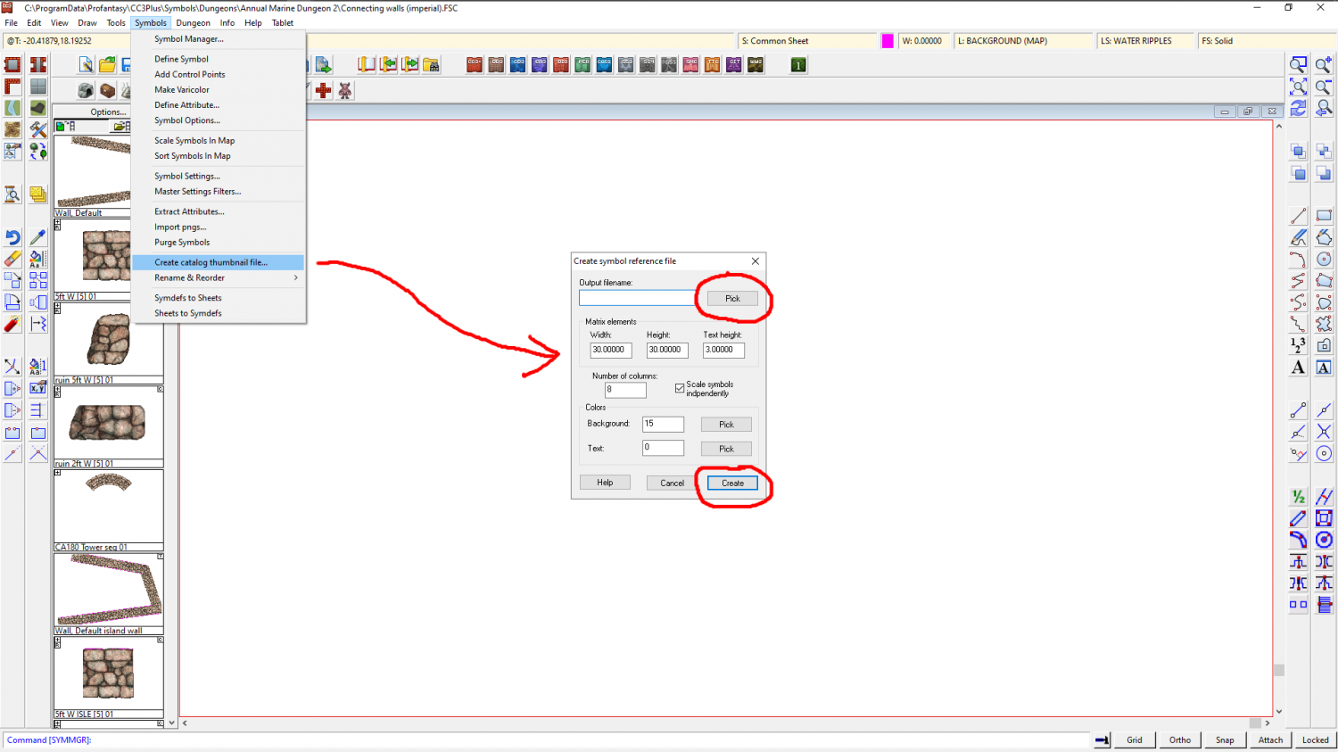
In this example I created a Test.FCW file on my desktop which looked like this when opened.
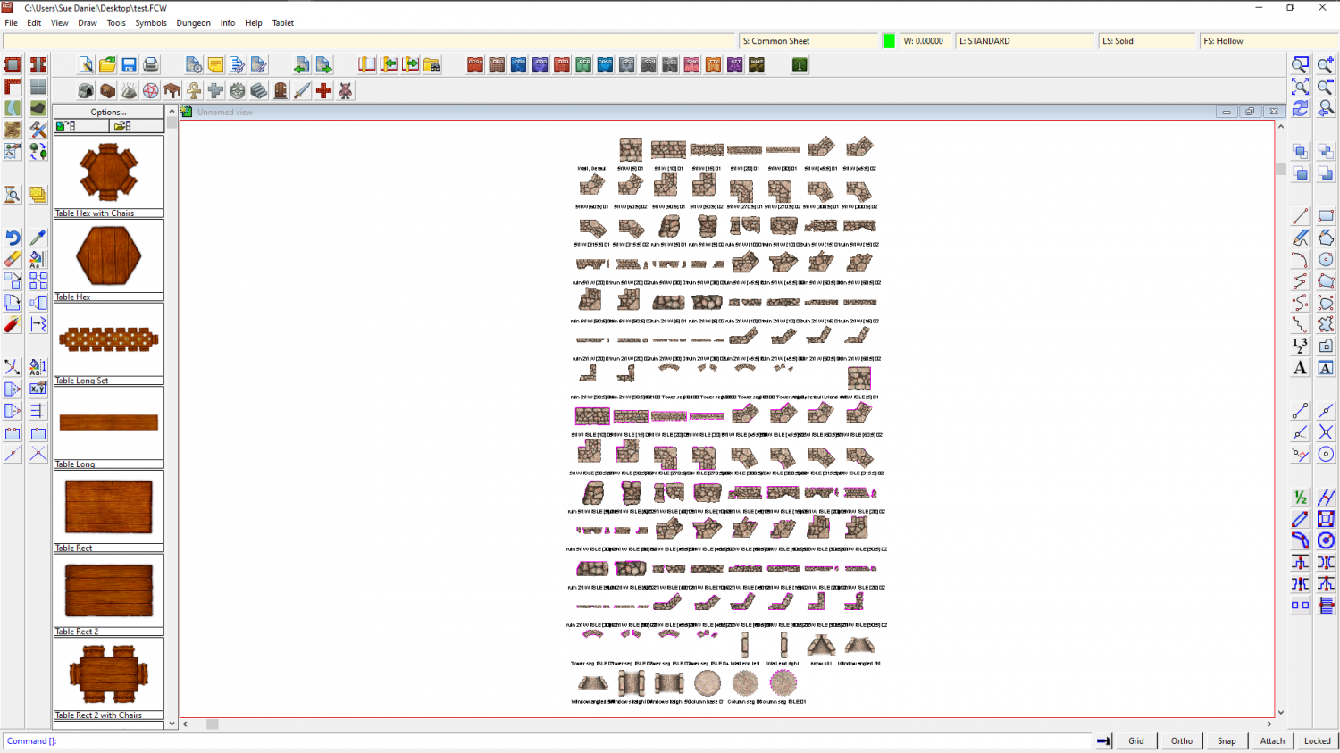
The blank space at the top left is a drawtool and not a symbol, so it's name is there but the sample line is not.
I then exported a jpg bitmap from this and got this result (this is only a 500 px export to preserve the copyright on these symbols on the forum, but you can set it any size you prefer using the Options button in the Save as dialog.
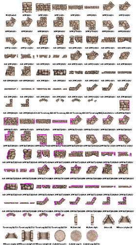
This works for each catalogue at a time, but it doesn't take too long to do, and if you print each one you can make a reference book of them for yourself.


-
Live Mapping: Parchment Backgrounds
Hi Everyone :)
In this week's Live Mapping Session Ralf will be showing us how to add a parchment background to an existing map, and how to use the tools provided by the June issue of the 2007 Cartographer's Annual.
Come along and join in the fun :)


-
Humble Bundle
@grandula - good news for you. I was just discussing the need for an underwater mapping style with another member of the Profantasy team, and the go ahead was given for planning to commence. This will probably be a new style in next year's Cartographer's Annual, so although it is not an immediate solution for you it will be there eventually :)


-
Style for underwater maps
@Merion - Well, we finally got around to sorting something out at Dungeon scale.
Marine Dungeon is due to be published as July's Cartographer's Annual issue if any of you are still interested in this.
-
Banners
Thank you, Calibre :)
Quenten - yes, that's what it is. Two ends and a middle, but with the middle being a connecting symbol which means you can make it go all the way across the map if you wish.
![[Deleted User]](https://secure.gravatar.com/avatar/c75d9a245b74d9c59be0999ea81ca541/?default=https%3A%2F%2Fvanillicon.com%2F92add7f8c954488718110edc4896ad39_200.png&rating=g&size=200)


-
Hedge Tool
I've located the original work files for this set of hedges from about 3-4 years ago. Unfortunately the symbols themselves need to be regenerated and the source files look a bit of a mess. But is this the sort of thing you were looking for? If it is then I can do a free symbol pack here on the forum, but it may have to wait for more pressing projects to be completed first. That might be several weeks.


-
How to export very large maps
A number of hours?
Not really appropriate for this problem and right now, but for other maps to speed up the process type EXPORTSETMPPP and hit enter. Check your Maximum Pixels Per Pass in the command line. If its only 4 million type "40000000" (40 million) and hit enter.
Unfortunately, I don't have CSUAC so I can't do a proper actual test on the map, but maybe someone else can try?
How does it render if you drop the antialiasing to 15%, or whatever number you need to drop it to in order to reduce that work size to fractionally under 10,000px each way?
Other things you can do to help include clearing the cache before you export and exporting straight away before you pan or zoom at all. You get to the cache by clicking the Display Speed button|CC2RESMODE|. Just hit the Clear bitmap cache button. My map is only using 63 MB at the moment, but yours may be a lot closer to the limit.

Another option is to render it as JPG rather than PNG, and/or to render it in quarters using the Rectangular Section exports then stitch it together in GIMP or another bitmap editor. This export in parts idea is easier if you have a small overlap on each quarter of the map.

-
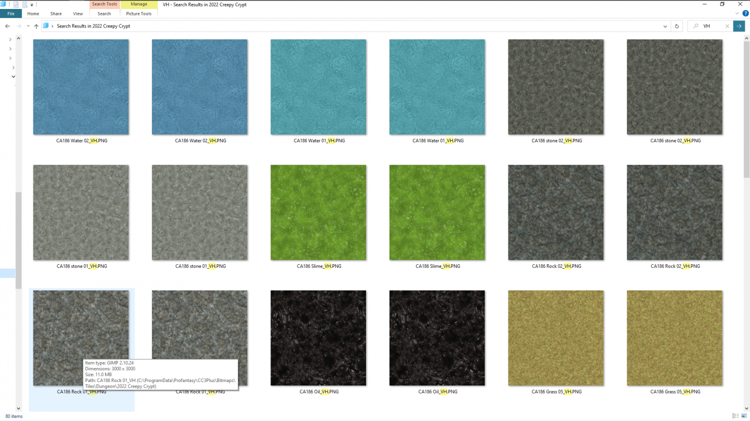
The Creepy Crypt project
Sorry, @JulianDracos! I got notification that there was a comment on my thread and only saw Dalton's at the bottom of the page.
Those two textures are indeed marble, and I was already thinking that they are too purplish blue. The strange thing is that this has only looked wrong since I made the rock a warmer grey than it was to start with. It's one of those curious things that happen when you start making lots of different greys to use together. They don't always look all that great unless you use the same kind of grey, or very closely related greys. In effect they are now a very dull mix of purple and orange together (the marbles and the rest of the stone stuff). No worries - it will look better when I'm done with it ;)
The grout on the flagstones is deliberately flat with equal shadow all around each stone. That is because if you give it a 3D effect the light has to come from a particular direction, so the floor looks odd if you align the fill to a different angle. We'll see how it goes.
There are other textures. I just didn't manage to get them all in shot. There's another surface dirt loam texture, green slime and the mud is there around the water's edge. There's not quite enough of it showing for you to see it properly. The textures in this shot seem to have been doubled up, even though I did a search for VH. I think it looked in a subfolder as well as the main fill folder.
There are two stone and two rock textures at the moment. I'm having to keep the number of variations down just a bit to compensate for the fact that these are some very large textures (as you can see from the info box on that rock texture - 3000 px square). That's so you don't get as much of the repeating pattern, but it does mean that every texture has to really carry its weight and be worth the expense on the cache memory in CC3. So it's best to start with just two of each thing and work from there ;)

-
Birdseye Continental - style development thread
The forests still aren't finished, but what do you think of everything else so far?


-
Creating Hollow Tree Dungeon Style
I think that's how I learned how to use graphics software back in the beginning, where I once painted in oil paints on hand stretched canvas ;)
If the walls already include heartwood then you've already got the potential there for a contrast between the walls and the floor, which is what you are after.
I don't have any tree stump photos to show you anything with, so I've scribbled something here for you in GIMP. I've not tried to copy what you are doing, which is a lot more detailed and artistic. I've only done something to illustrate what I was talking about above.
I don't know what software you are using, but I can do it again in that app if you would prefer.
Starting with the straight photograph (in this case my scribble) I've drawn a black shape on a new layer above the stump that represents the hollow core.

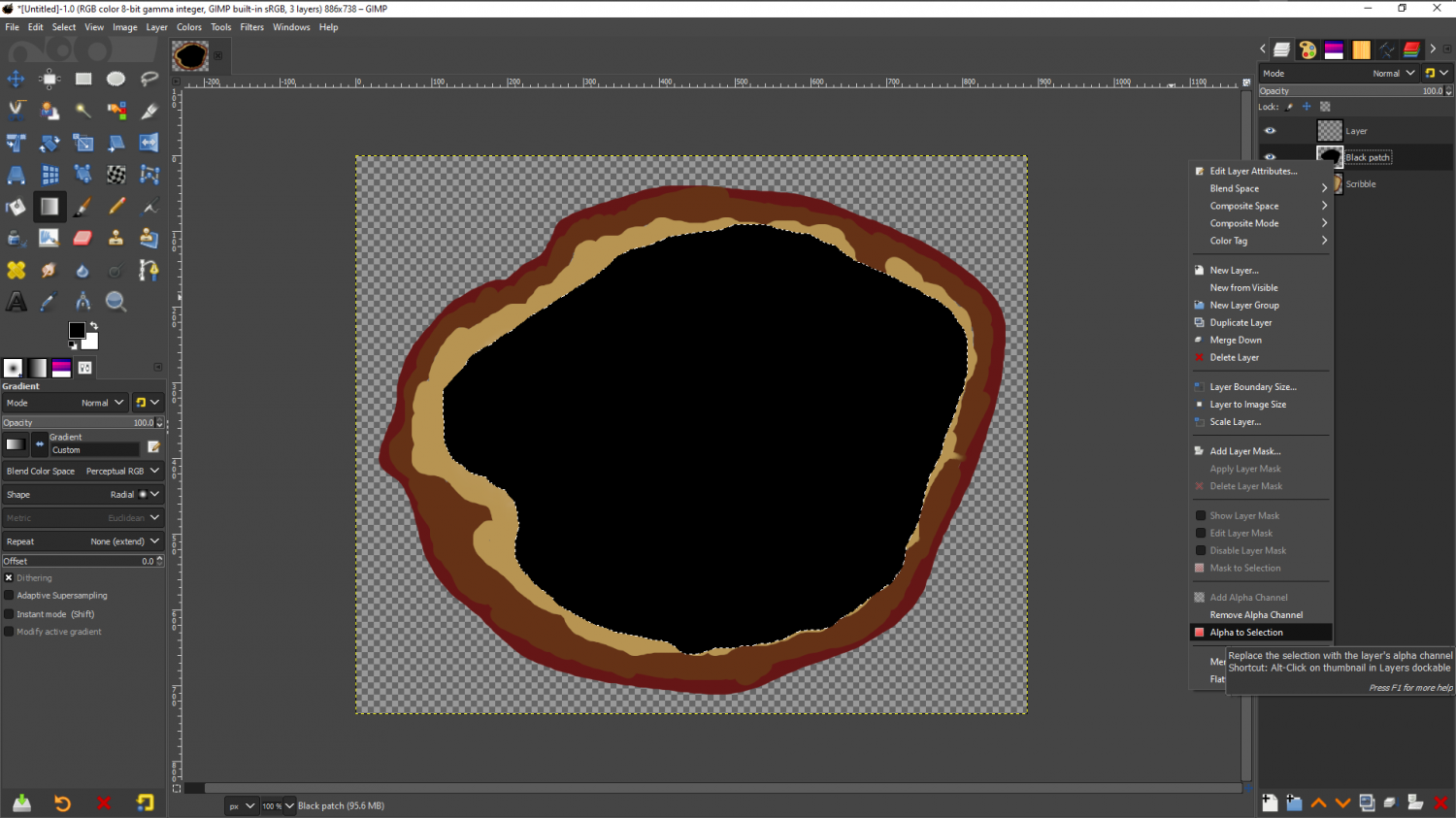
Then I've right clicked the black patch layer and picked 'Alpha to selection', so that there is a marque around it. I've then hidden the black patch and moved it below the stump where it won't get in the way, and added a new blank and transparent layer on top of the stump.
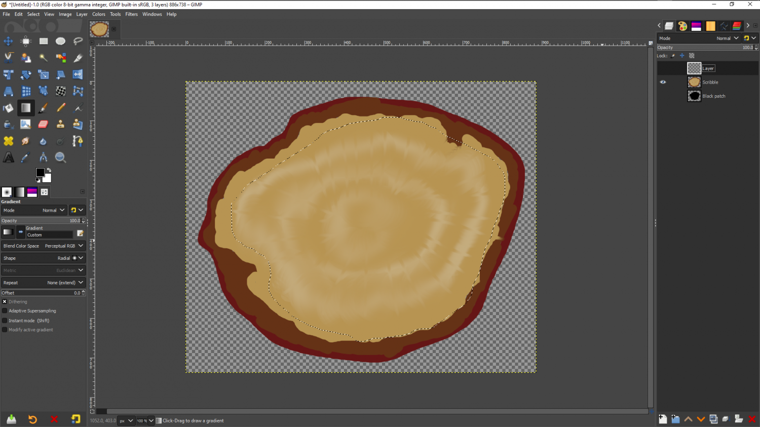
Using a very large very soft brush I've then drawn all the way around the edge with black on this new layer
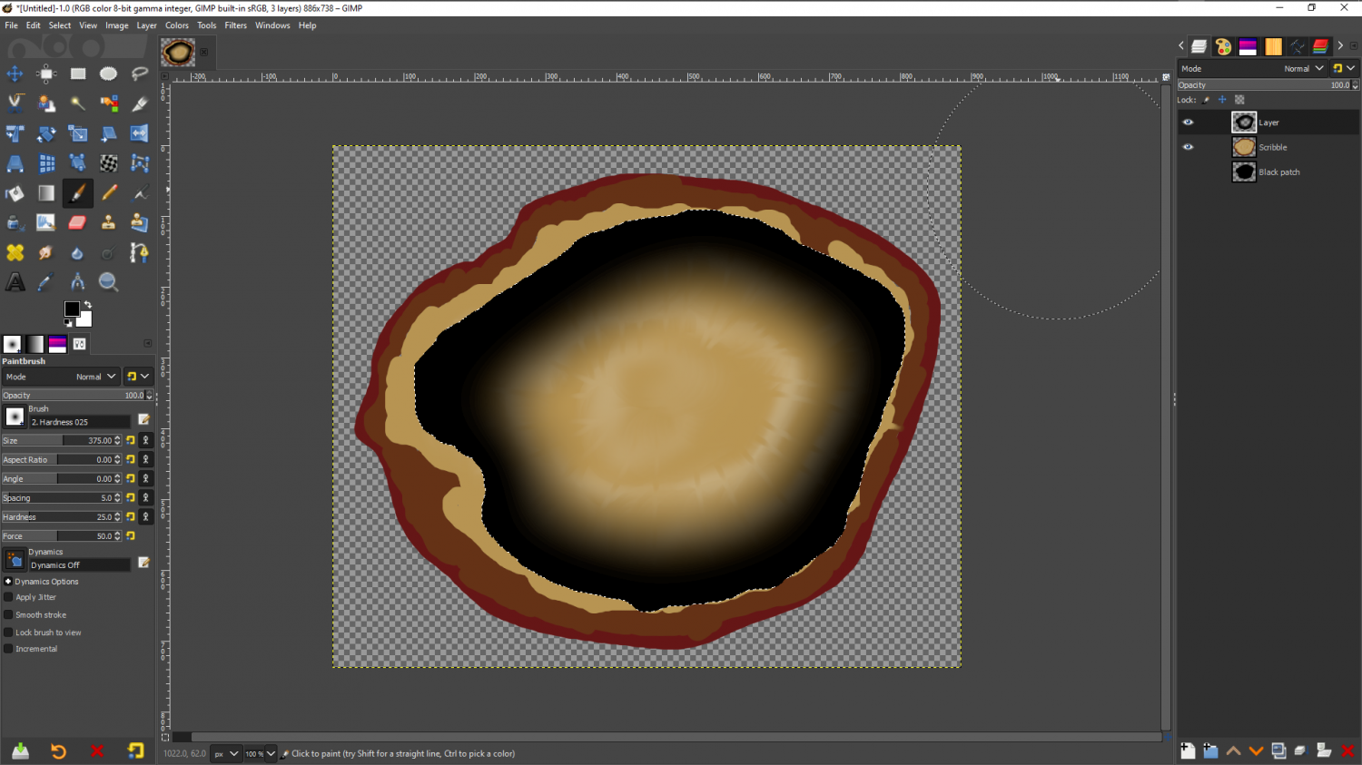
Then I've reduced the opacity to about 50-60% and changed the blend mode of this new layer to 'Soft Light', and removed the selection.
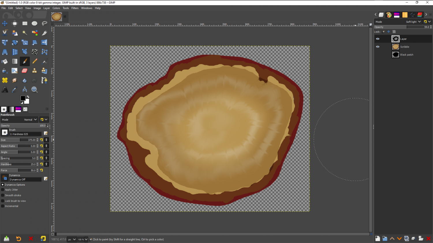
It's not a perfect hole in a stump, and indeed some of yours actually look better than this already (I mean the shading here - obviously your lovely photographs are much better than my scribbled stump), but I hope that you can see that where the black shading is darker and less saturated than anything else in the picture, it's produced a line of contrast between the edge of the wall and the floor lying close to it, while the hole in the middle of the black has allowed the floor to remain relatively light instead of being dark all the way across.