Loopysue
Loopysue
About
- Username
- Loopysue
- Joined
- Visits
- 10,413
- Last Active
- Roles
- Member, ProFantasy
- Points
- 10,161
- Birthday
- June 29, 1966
- Location
- Dorset, England, UK
- Real Name
- Sue Daniel (aka 'Mouse')
- Rank
- Cartographer
- Badges
- 27
Latest Images


-
[WIP] 1000th Map Competition: Elkton, Alarius North Central
And a little more...


-
Winter Trail Project
Well, I finished the more simple map as one of the example maps, and I think it shows the style more clearly. One of the other examples is a conversion of Ranger's Hill from Forest Trail part 2. It should be reasonably easy to convert Forest Trail maps to Winter Trail maps.
Winter Trail is due out as the March issue this year.
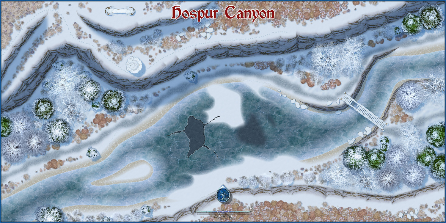
Both of my example maps can be viewed at much higher resolution in my New Style Example Maps gallery.


-
Banners
@DaltonSpence - I'm wondering if what you really mean is a three+ part symbol rather than a connecting symbol?
I've modified the ribbon symbol shown above to be in 3 parts because it is well over 6000 px long and far too huge to be thrown around as a symbol - especially if there is more than one of them in a single map. Here it is with all 3 parts neatly aligned, and with the middle section dropped away so you can see how it works. You would have to use snap to align them and then group the 3 parts together so you could move and scale it. There will be different length middle sections to make the ribbon longer or shorter.
The end pieces have to have a fade on them so that any mismatches between the texture of the ends and the texture of the middle section will be softened, but you will have to make sure that the overlap is complete for the effect to work.
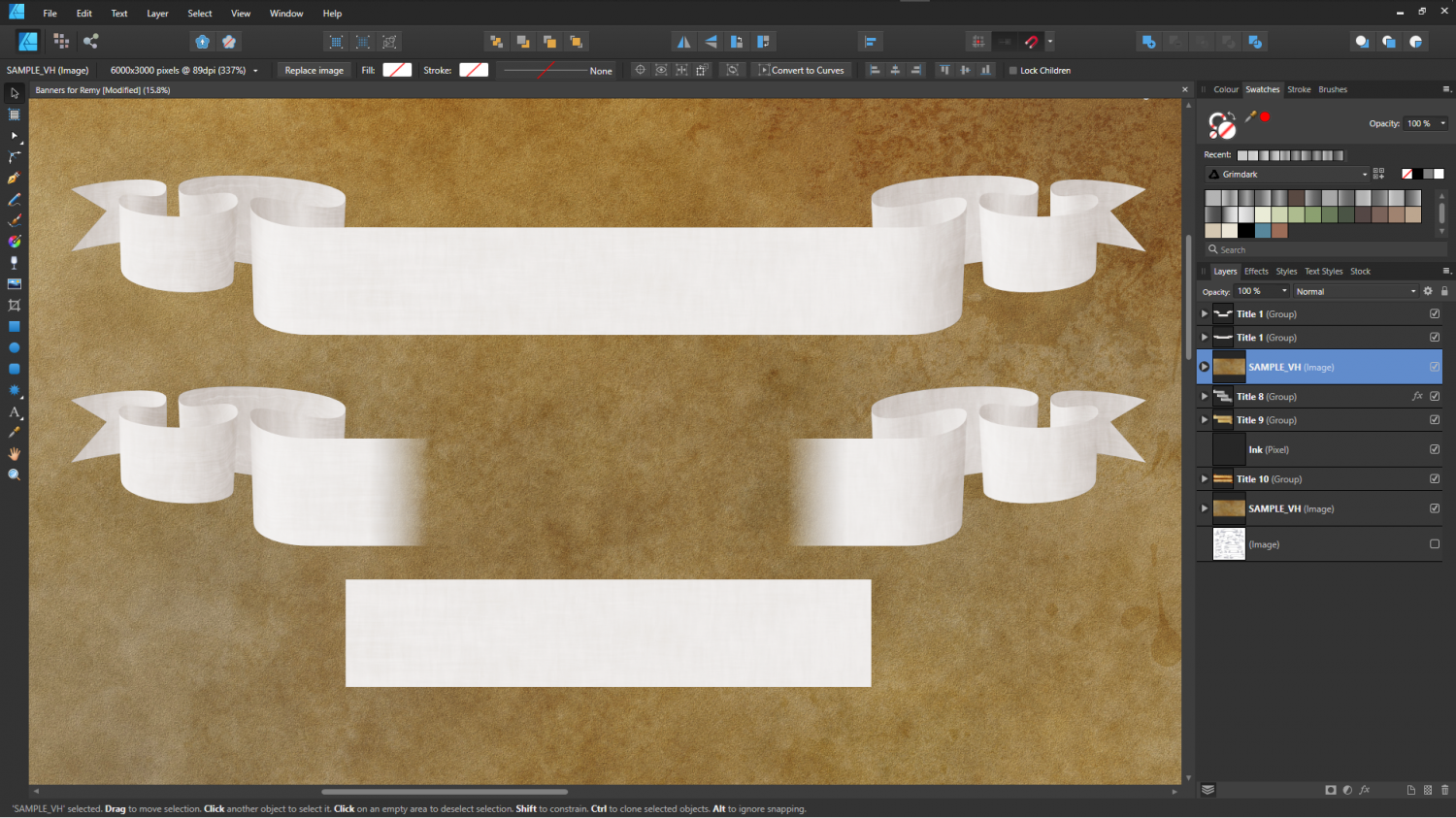
The question is - will this be too fiddly to use?
![[Deleted User]](https://secure.gravatar.com/avatar/c75d9a245b74d9c59be0999ea81ca541/?default=https%3A%2F%2Fvanillicon.com%2F92add7f8c954488718110edc4896ad39_200.png&rating=g&size=200)


-
Birdseye Continental - style development thread
The forests still aren't finished, but what do you think of everything else so far?

-
The Creepy Crypt project
Sorry, @JulianDracos! I got notification that there was a comment on my thread and only saw Dalton's at the bottom of the page.
Those two textures are indeed marble, and I was already thinking that they are too purplish blue. The strange thing is that this has only looked wrong since I made the rock a warmer grey than it was to start with. It's one of those curious things that happen when you start making lots of different greys to use together. They don't always look all that great unless you use the same kind of grey, or very closely related greys. In effect they are now a very dull mix of purple and orange together (the marbles and the rest of the stone stuff). No worries - it will look better when I'm done with it ;)
The grout on the flagstones is deliberately flat with equal shadow all around each stone. That is because if you give it a 3D effect the light has to come from a particular direction, so the floor looks odd if you align the fill to a different angle. We'll see how it goes.
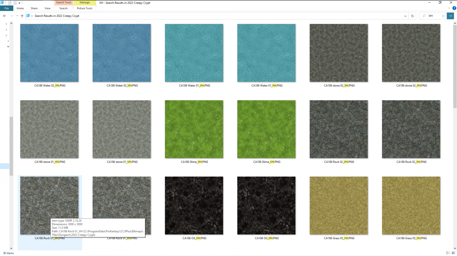
There are other textures. I just didn't manage to get them all in shot. There's another surface dirt loam texture, green slime and the mud is there around the water's edge. There's not quite enough of it showing for you to see it properly. The textures in this shot seem to have been doubled up, even though I did a search for VH. I think it looked in a subfolder as well as the main fill folder.
There are two stone and two rock textures at the moment. I'm having to keep the number of variations down just a bit to compensate for the fact that these are some very large textures (as you can see from the info box on that rock texture - 3000 px square). That's so you don't get as much of the repeating pattern, but it does mean that every texture has to really carry its weight and be worth the expense on the cache memory in CC3. So it's best to start with just two of each thing and work from there ;)


-
New Humble Bundle
Hello MoonBrew :)
You can learn a lot about CC3 by watching a few of our Live Stream recordings available here on Profantasy's channel:
We are having another one this evening if you want to come along and have a look. It's at the top of that list.
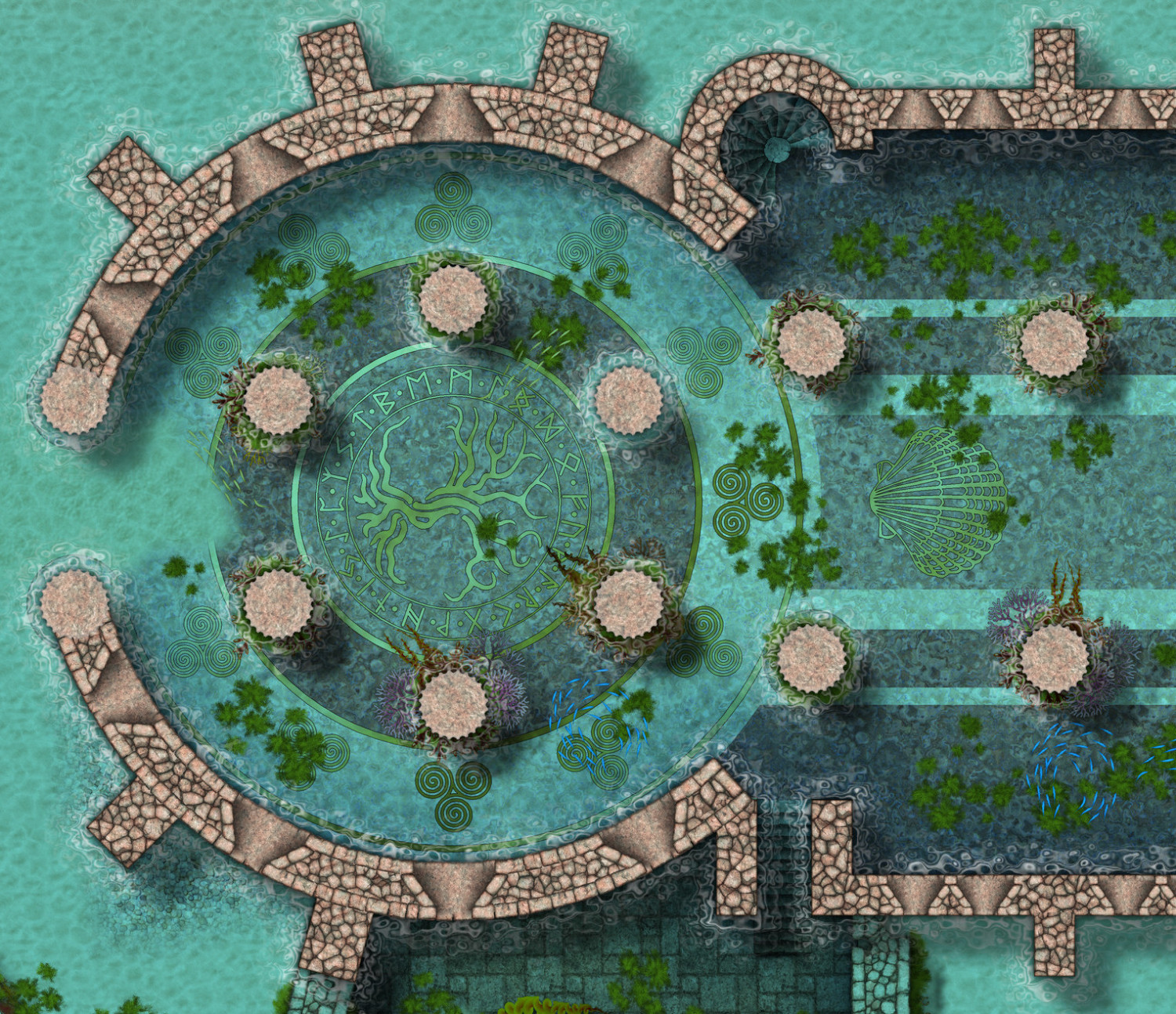
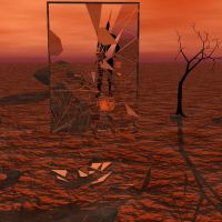
Animated water maps aren't possible in CC just yet, but there is a very recent underwater style I've just finished working on (this style is not included in the current bundle). Here is an example map extract.

-
Handling irregular shaped or "round" dungeons
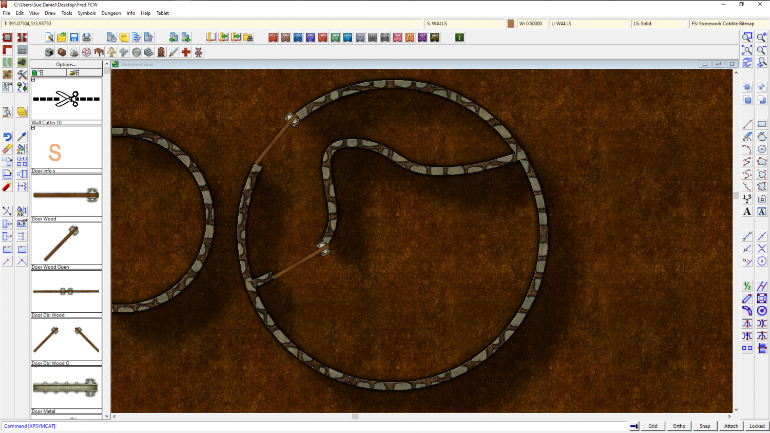
I think you should be able to use the cutting doors and windows anyway, as long as you copied the properties of the sample wall and used them. It's all about which layer the walls are on.
I cut this circle I drew with a regular cutting door symbol after I converted it to a path using "Line to path" in the right click menu of the Fractalize button. Looking back I can see I forgot to mention the conversion.

If you treat the smooth walls the same way they should also cut.
And in fact I've just tried it and discovered that you don't even need to convert them. Both Circle and smooth line should cut, but they must be on the same sheet and layer as the walls drawn by the regular wall drawing tools.


-
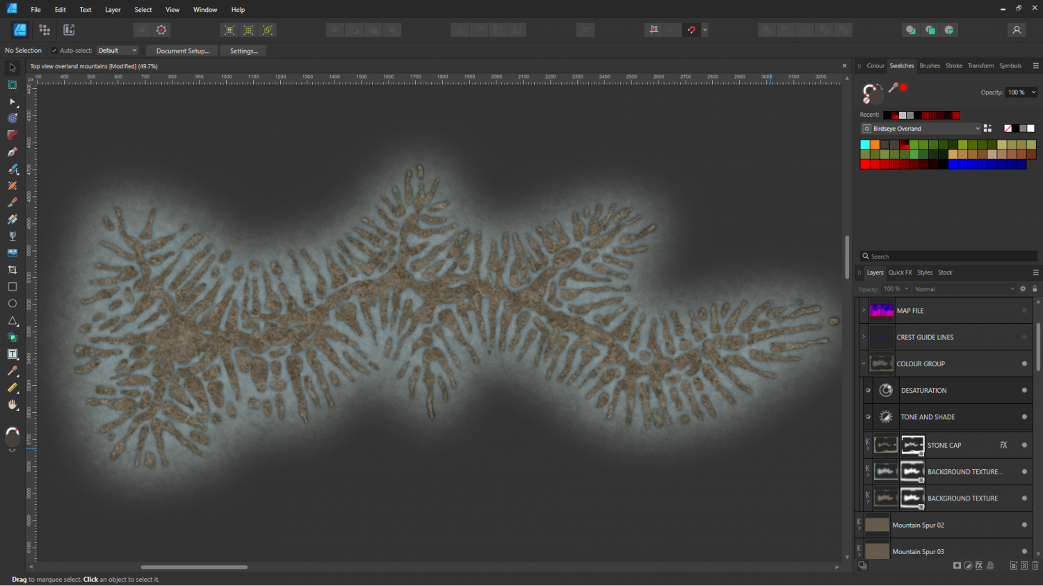
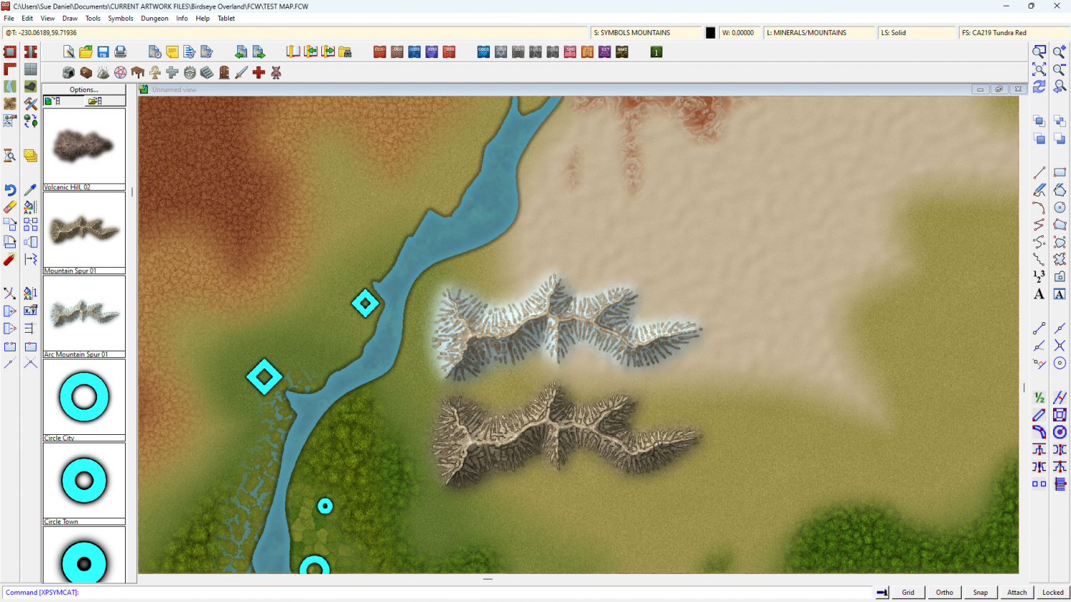
Birdseye Continental - style development thread
Ah, no. They aren't filigree wonders, Quenten. Just carefully matched background textures. Here's the Arctic version without the map file, in an 'as-drawn' state - before exporting to png for CC3+. It just happens to be a really good match for the snow fill in CC. That's partly because it IS the snow fill, and partly because I've made it just the right amount darker and duller.
Map files shade fantastically, but they also make everything brighter and more vivid than the original.
I guess I'd better do a desert one as well...
@Rosemont_Line - Thank you :)
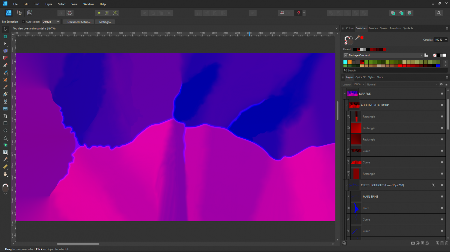
One of the reasons it's taking so long to make one mountain ridge is the hand drawn map file. If you look at the layers panel on the right you will see how much fiddling is involved. There is a way to export map files from FT3 and Wilbur, but I have found them to be too good - too detailed to work well. So I drew a grossly simplified one by hand, as if this was a house symbol, rather than a mountain.
I am hoping to get faster and tidier as I do more of them.
The smudge/smear tool leaves a lot to be desired in Affinity, or these would be smoother transitions ;)
-
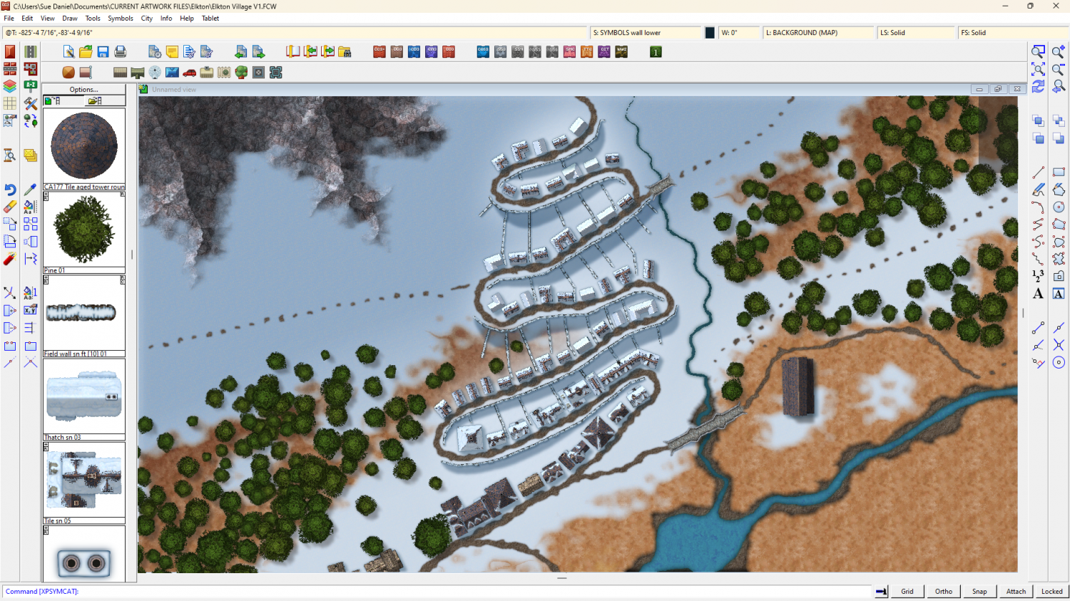
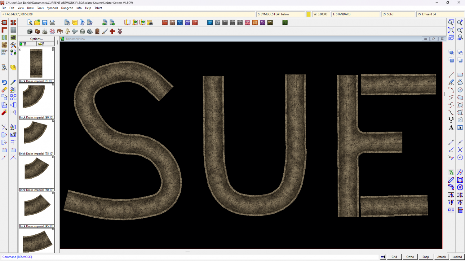
Sinister Sewers - Style Development Thread (CA207)
Ok, so I got a bit side tracked over Christmas, but I did make a connecting symbol. This is a smaller sewer of a fixed 10ft width between the insides of the walls.
Looks a bit boring, but I've got a whole lot of ideas about debris and creatures on the way.
The larger sewer is still in progress, so don't worry. You won't be stuck drawing everything in 10 ft tubes.

-
Birdseye Continental - style development thread
Well, different tastes... :)
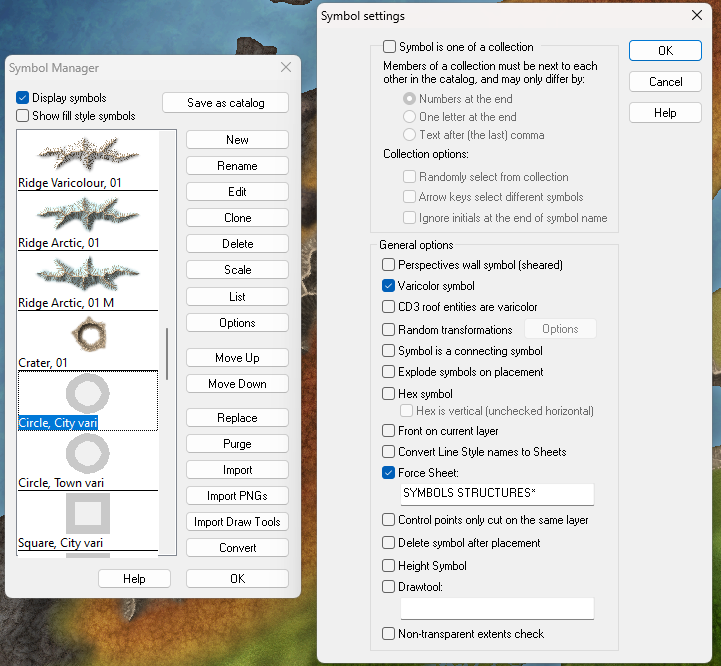
Anyone can make their own or modify the existing. These are really easy to do. If you want the outer ring to be lighter rather than darker you just add a new layer called VARICOLOR+3, and edit the symbols to place the larger circle/square/triangle on the new layer, then save.
Currently, the darker outer ring is on VARICOLOR-3, with the centre on VARICOLOR0 (that's actually a zero, but the forum font makes it look like a lower case 'o').

It means the centre is the colour you picked in the palette, while the outer ring is 3 shades darker.
I didn't bother to do stars, since they were more spike than colour at the given size and didn't show up well, but there's nothing stopping anyone from creating a simple one-colour star shape and putting it on VARICOLORo.
To make them work as varicolour symbols, all the newly created vector symbols must then have the Varicolor symbol option checked in the General options box.