


Loopysue
Loopysue
About
- Username
- Loopysue
- Joined
- Visits
- 10,419
- Last Active
- Roles
- Member, ProFantasy
- Points
- 10,163
- Birthday
- June 29, 1966
- Location
- Dorset, England, UK
- Real Name
- Sue Daniel (aka 'Mouse')
- Rank
- Cartographer
- Badges
- 27
Latest Images


-
Birdseye Continental - style development thread
I walked right into that one! LOL!

-
[WIP] Fantasy World
Mountains will be larger than life in an overland map. You can probably just about get away with the existing ones, but don't go too much larger or the whole continent will start to look like a small island.


-
Ricko's Questions
Do you mean scale it?
If you do, open the Fill Style dialog and pick the fill you want to alter from the dropdown list,
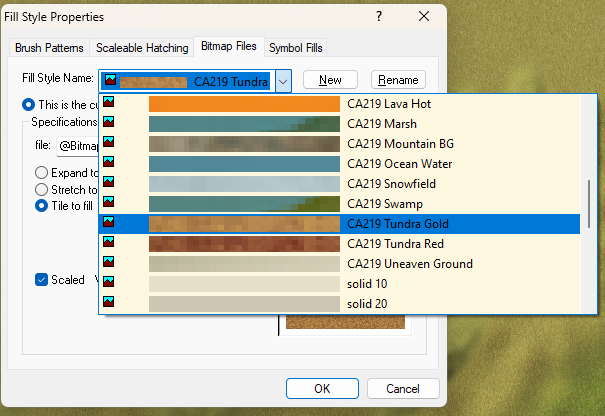
then adjust the hieght and width accordingly.


-
Birdseye Continental - style development thread
Yeah, roundish or shorter would be good.
They look weird if they overlap on the same sheet, but ok if you use a second sheet for the ones on top.
In a top view style there's not much point in overlapping them too much. It's not like an isometric view.


-
Best approaches for tree shadows?
It's an interesting idea, but the reason it's not responding to some of the sheet effects is because you are using symbols instead of polygons.
To best copy the Forest Trail tree shadows, instead of using copies of the trees on the tree shadow sheet, trace the rough outline of each tree with a black polygon on that sheet. Then use the same sheet effects as are used in Forest Trail for the tree shadows. I think that was a blur and a blend mode. Blur to soften the edges, and a Blend Mode set to Multiply, and about 20-30 percent. Adjust to taste.
-
Birdseye Continental - style development thread
Both are available. The desert is drawn on both sheets, so you hide one and show the other.
-
Question about CA143 Asian Town "well" symbol
If the well still has the problem in the redownloaded and reinstalled version, please let Support know. I think all it is is a slipped polygon part within the symbol itself, but current installers shouldn't still be having that problem.
-
Unable to access styles on my system
It is unlikely the installer has put the files anywhere they shouldn't be, but if they have somehow ended up in the wrong place it is probably easier to try reinstalling that package.
I've never used that particular installer myself so I don't know if there's a repair option if you just run it again on top of itself (so to speak). Worth a try?
If a reinstall doesn't work please contact Tech Support through the form on the Support tab of your registration page (when you log on to your account on the main Profantasy website).
-
[WIP] Community Atlas: Kumarikandam - SE Tiantang Region
These are some lovely maps, Ricko.
I hope you have a lovely break in Santiago.
-
Dragon sheet
LOL! Yes, I used to be much better at drawing dragons...
Many years ago, at art college, I was berated for drawing fantasy creatures by my tutors, so I stopped doing it. And now, 40 years later, I'm not as good at dragons as I could have been if I hadn't listened to them.


