Loopysue
Loopysue
About
- Username
- Loopysue
- Joined
- Visits
- 10,354
- Last Active
- Roles
- Member, ProFantasy
- Points
- 10,107
- Birthday
- June 29, 1966
- Location
- Dorset, England, UK
- Real Name
- Sue Daniel (aka 'Mouse')
- Rank
- Cartographer
- Badges
- 27
Latest Images


-
Tabletop Wargames 2D Terrain with CC3+?
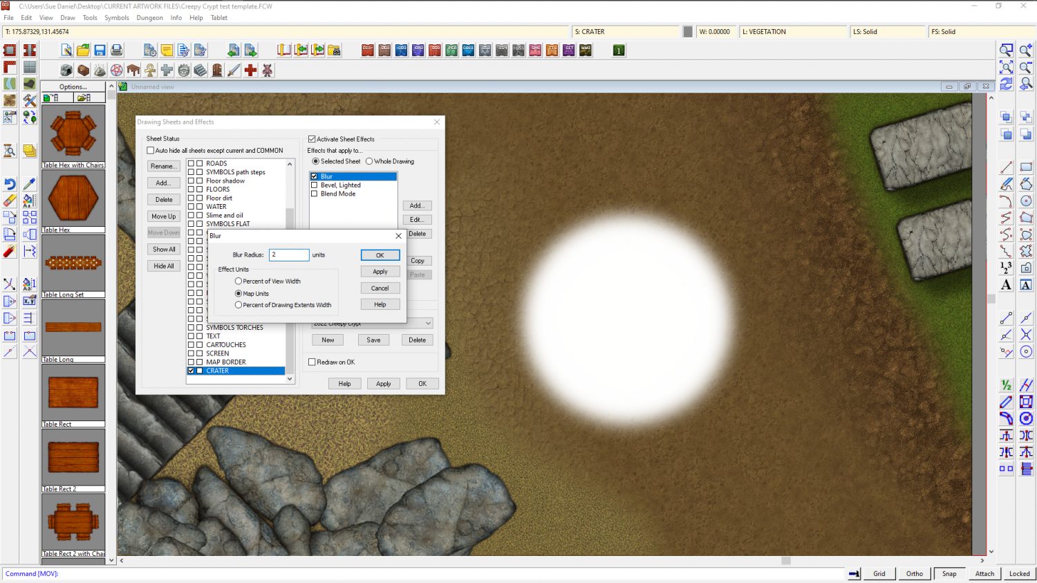
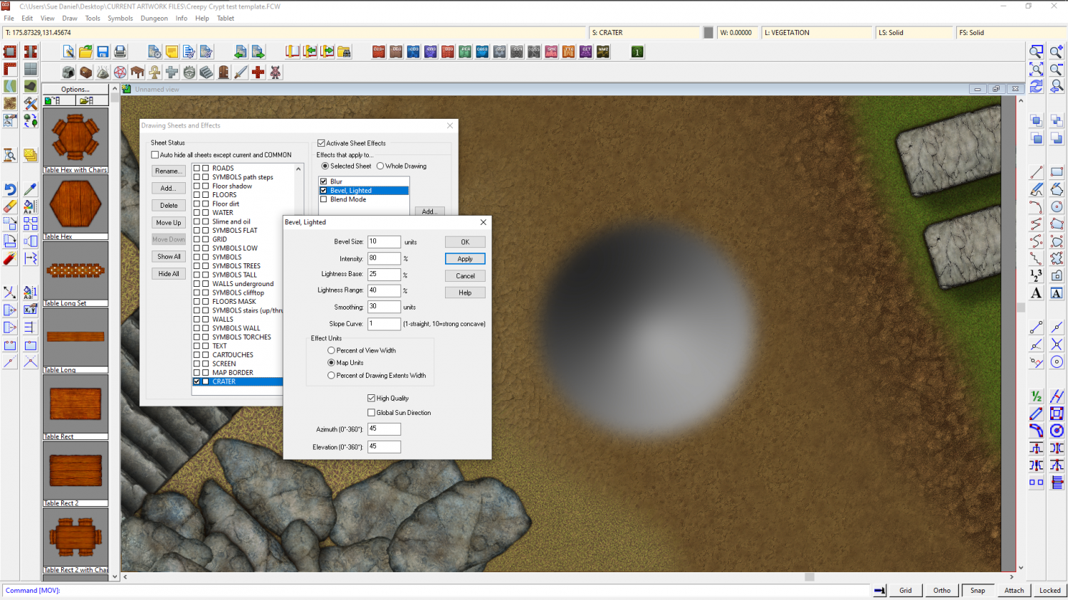
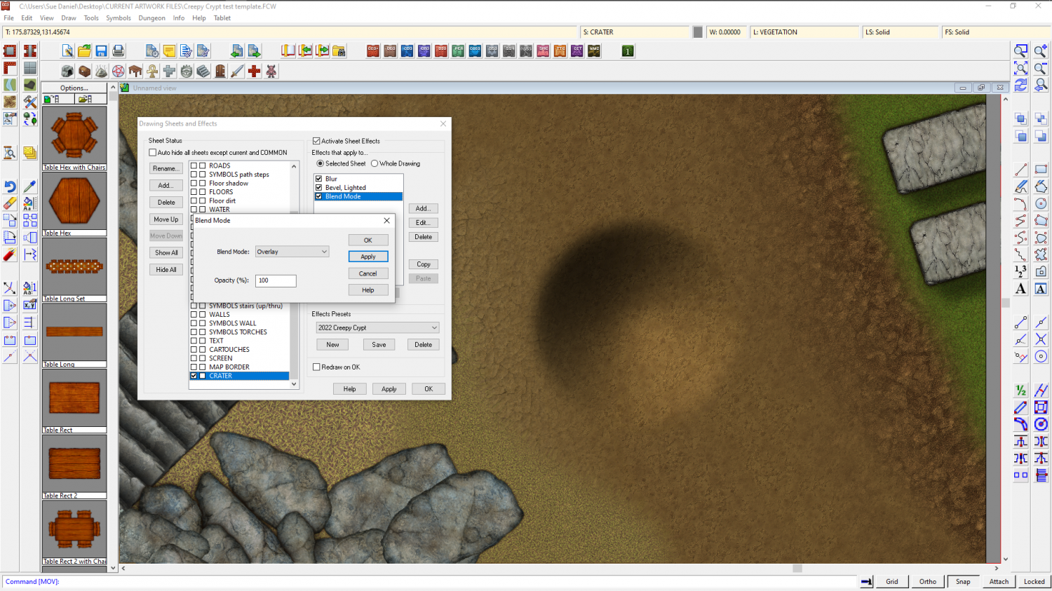
Pure gradients (setting up a fill in a polygon that shades from one colour to another straight across, radially, conically, etc) aren't currently possible in CC3, but you can use a large Bevel, Lighted effect on the crater sheet in combination with a crater shaped polygon of a solid colour, followed by a Blend Mode sheet effect set to overlay.
You will need to edit the effects and play with all the settings to get it just right for your particular map. These are the ones I used on a plain white circle of about 12 feet in diameter, though you can use any shape or size you like.


-
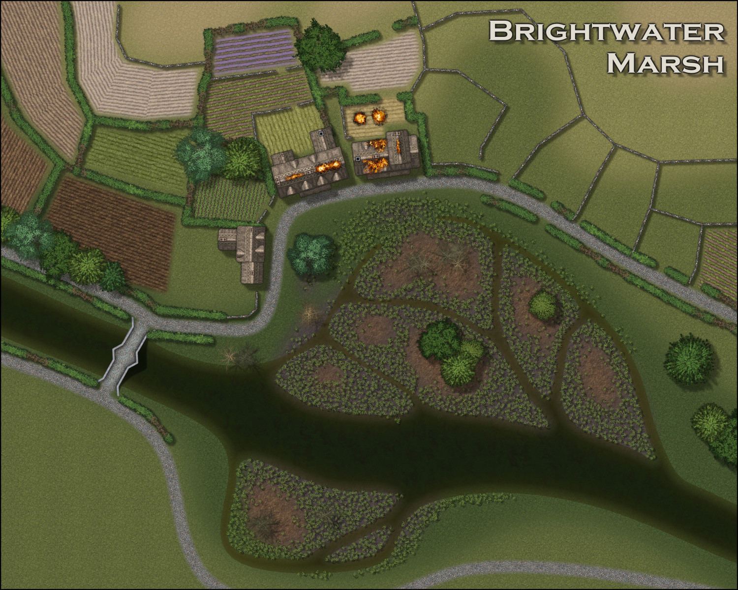
CA style development - "Darklands City" (issues for September and December 2021)
Think I've got it now.
A reedbed isn't as dense as it looks from the side. You can see the mud between the stems in overhead photographs, which means I can use Symbols in Area and allow sufficient spacing to keep the number of symbols down just a bit.


-
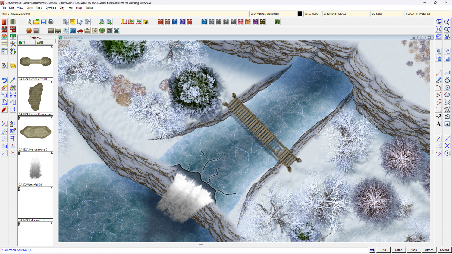
Winter Trail Project
And the cliffs...
(The bridge isn't done yet ;) )

![[Deleted User]](https://secure.gravatar.com/avatar/c75d9a245b74d9c59be0999ea81ca541/?default=https%3A%2F%2Fvanillicon.com%2F92add7f8c954488718110edc4896ad39_200.png&rating=g&size=200)
-
What Style for 1600-1700 West Indies Map
You can solve the white background by putting the symbols behind the parchment and using a Blend mode effect on the parchment set to Multiply and 100%. This is how the parchment version of SS6 was done.
The white parts of the symbols are to obscure the bits of other symbols that might appear through them.
These symbols all have white backgrounds, but the parchment is multiplied over the top of the entire map.

-
The Creepy Crypt project
Hi Everyone! :)
I'm hoping to create an annual style that will be pretty similar to DD3, but concentrating on the needs of the crypt mapper.
I guess we would need lots of bones and tombs, and suitable wall and floor fills, but what else would you like to help you make the perfect creepy crypt?


-
Grimdark Fantasy (renamed "Darklands") - development thread
At the time I wrote that last comment I was just trying to work out what it meant as a result of being asked to do a grimdark version of one of my city maps for another member of the team.
Since then, however, I've started generating a few fills and talked a bit with Ralf about a Grimdark Fantasy overland style for next year's Cartographer's Annual. The basic colour scheme will probably be cream->dull green->dull purple with blue water and gold leaf border. Not sure about anything yet, though, so it might not be anything like that at all.


-
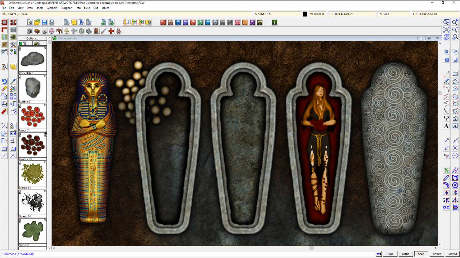
The Creepy Crypt project
Sorry, Wyvern! I moved onto shaped sarcophagi, but I hope you can find a use for some of these?

-
The Creepy Crypt project
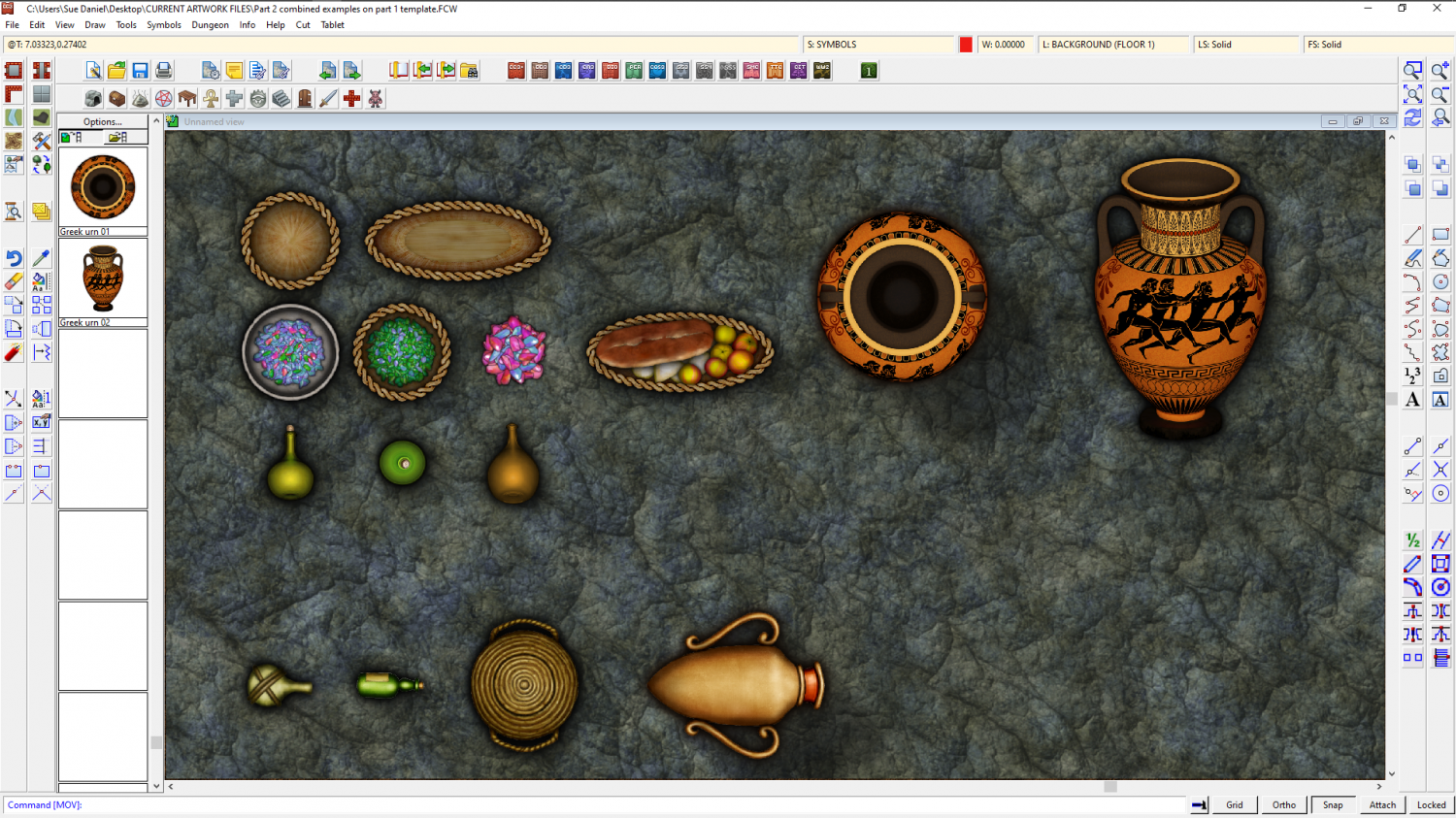
With part 1 published I've started on part 2.
While there will me more themed stuff to go with the style name, I've taken the opportunity to add a few things to the Containers and Treasure folder that could double as offerings. The bottom line of symbols are DD3 for colour and style comparison.
-
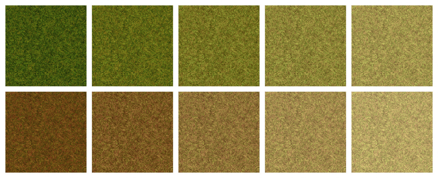
The Creepy Crypt project
Well, whether they get used or not, I've 10 new grass textures to start the collection off for this style, most of which can be mixed and matched with DD3 grass textures (probably not the dry grass ones, though).
Next job are the dirt textures.

-
WIP: Cartographer Guild May Challenge
Nice work on the rivers so far :)
The way the terrain textures are designed, it may be easier to add the rest of the various greens and browns before the mountain background, though it depends on your personal taste. All of them (the colours - including the mountain background) are just polygons drawn on the same sheet and massively blurred, then blended with the paper, so whatever you add first tends to diminish beneath later colours that overlap. If this happens to your map just use the bring to front tool and grab the mountain background colours (there are 3 of them in fact in various shades of increasingly dark grey) to bring them forward.
You may find that doubling or trebling the size of the blur on the TERRAIN Colour sheet will improve the overall appearance of the map, since it is quite a large map. The colours are meant to work like a smooth gradient across the map without any noticeable edges. Edges are for the scrub and farmland textures, which are on different sheets to the terrain colour.
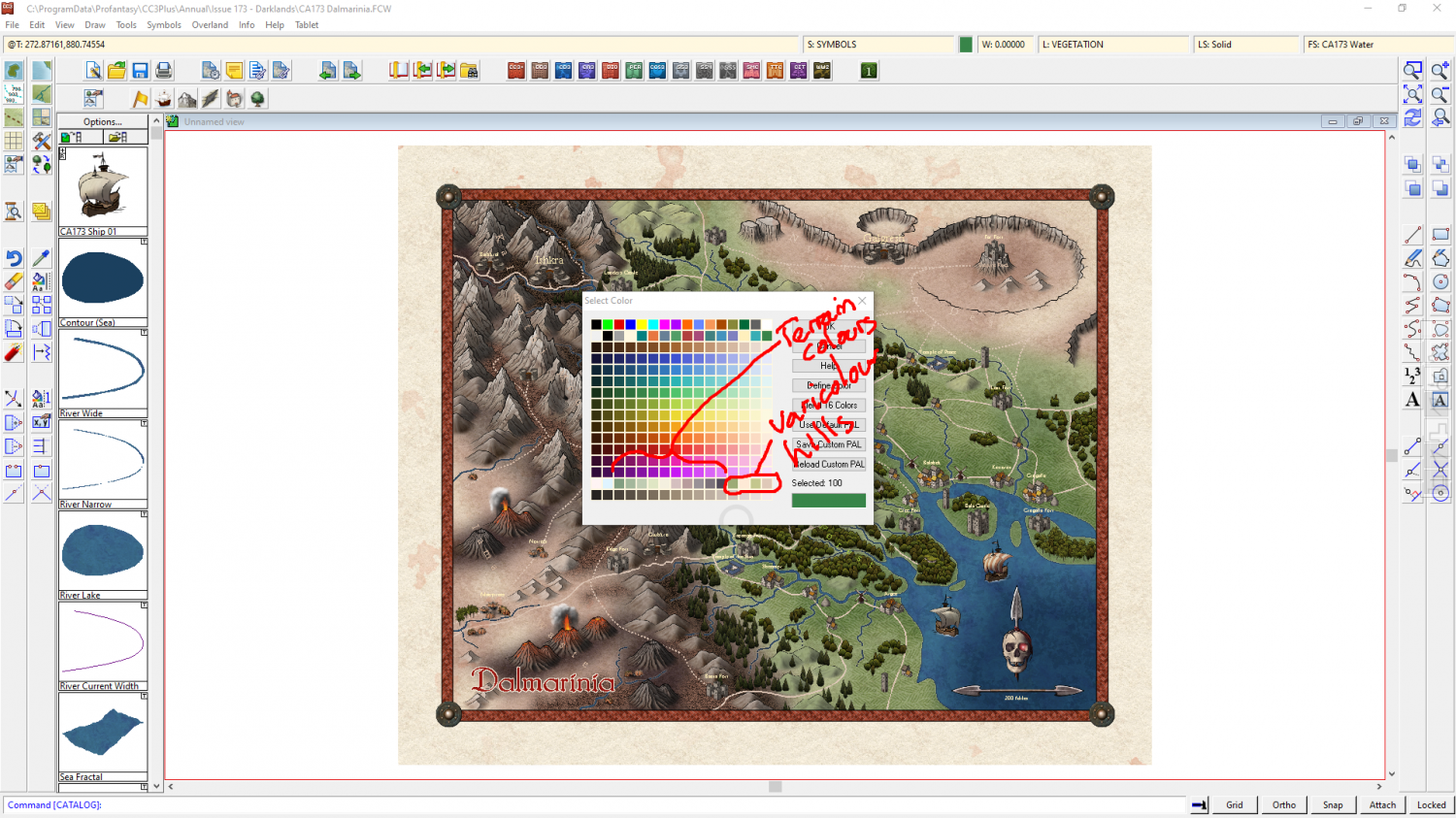
The colour palette with this style contains all the terrain colours in a single row. Towards the right hand end of that row of colours there are a range of colours for the varicolour hills so that you can match them with the terrain colours a little better when you have finished colouring the terrain. You can change the colour of a varicolour hill using the change properties tool if you end up with any mismatches by the end.