


Loopysue
Loopysue
About
- Username
- Loopysue
- Joined
- Visits
- 10,416
- Last Active
- Roles
- Member, ProFantasy
- Points
- 10,161
- Birthday
- June 29, 1966
- Location
- Dorset, England, UK
- Real Name
- Sue Daniel (aka 'Mouse')
- Rank
- Cartographer
- Badges
- 27
Latest Images


-
Making new line style?
You can't make that as an all in one line style, but you can make railroad tracks without too much trouble.
This video should be helpful.

-
[WIP] 1000th Map Competition: Elkton, Alarius North Central
Yes, I see.
I think I'm stuck in dungeon mode at the moment. I'm automatically assuming that everything is lit from above, which is quite wrong since the shadows in the map indicate a north west light source. I might flip that to a more realistic angle from the south, bearing in mind the position of the continent in the northern hemisphere.
I made more trouble for myself by making the snow really thin. Maybe it should all be in the valley bottom with the slope bare.
Anyway! I decided that snow loaded pines looked wrong on the ground that wasn't snowy and switched them out (maybe temporarily) for trees from Darklands City.
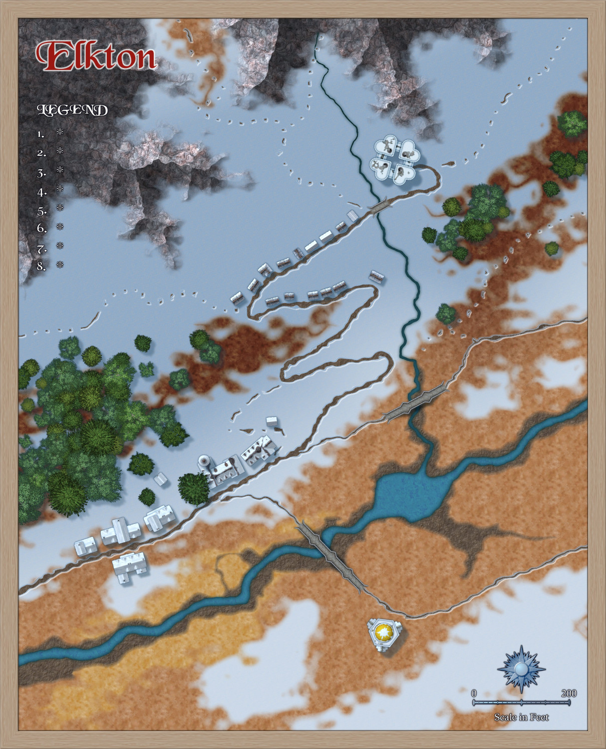
I like the map with these colours, but it doesn't really make sense.


-
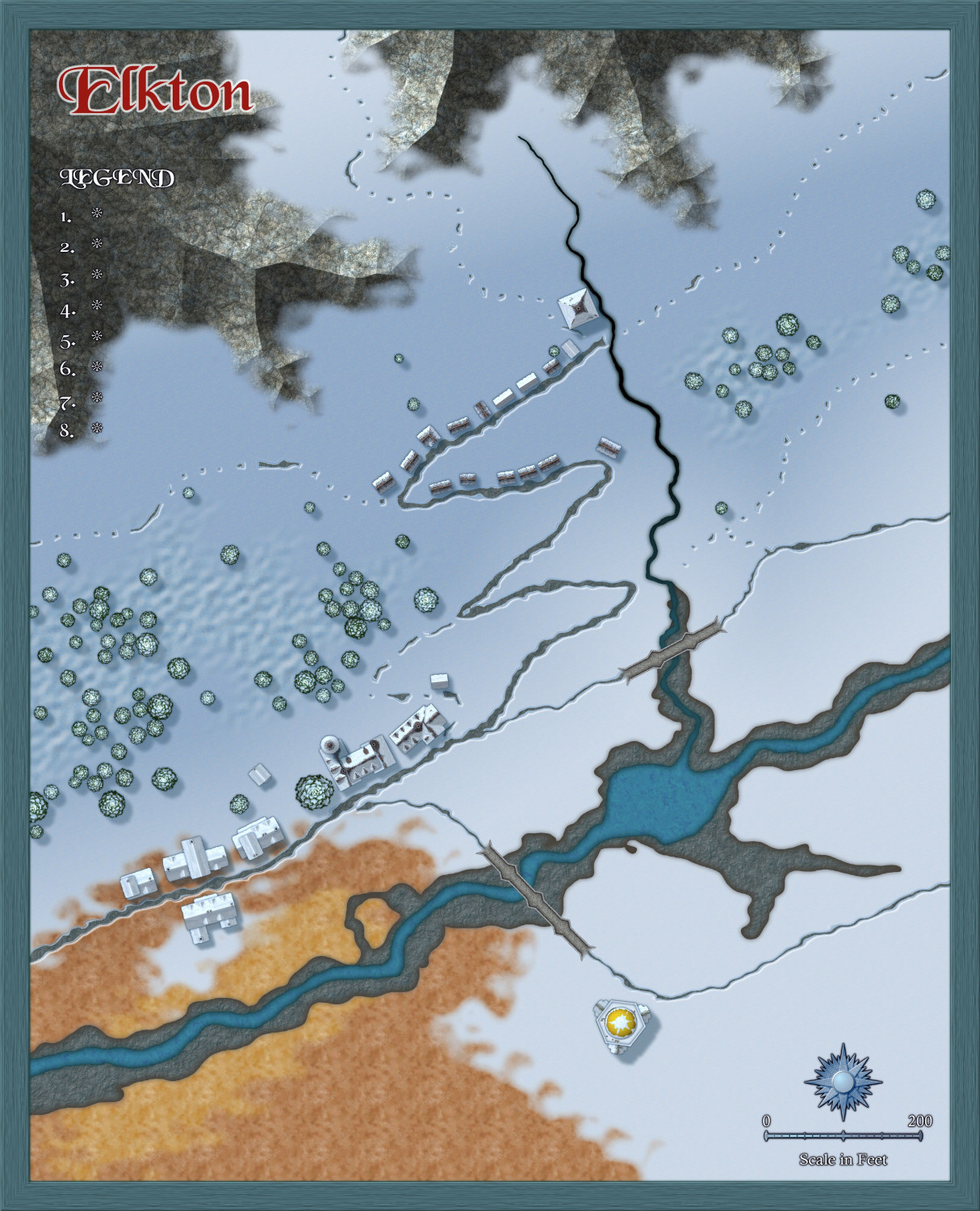
[WIP] 1000th Map Competition: Elkton, Alarius North Central
Starting to have a bit more shape.
Do trees really have longer shadows on a slope if viewed from directly above?


-
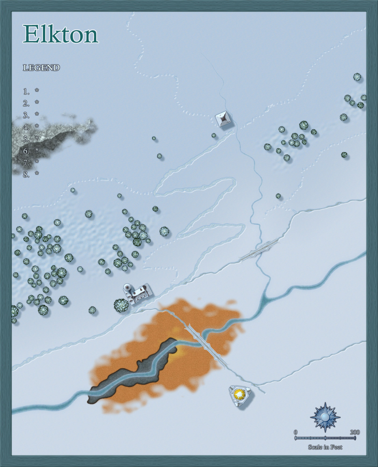
[WIP] 1000th Map Competition: Elkton, Alarius North Central
Experimentation with rocky bits and patches of possible mud and tundra.
I hope it looks like the village that isn't there yet is on a steep slope.
-
[WIP] 1000th Map Competition: Elkton, Alarius North Central
Ok. The streams stay :)
Can't have the were-elks wandering away in search of water.
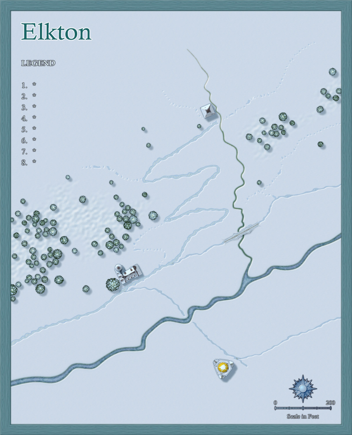
Still playing with map size and composition, but soon it will be time to start looking at the rocky north and the tundra plain in the south.
