


Loopysue
Loopysue
About
- Username
- Loopysue
- Joined
- Visits
- 10,413
- Last Active
- Roles
- Member, ProFantasy
- Points
- 10,161
- Birthday
- June 29, 1966
- Location
- Dorset, England, UK
- Real Name
- Sue Daniel (aka 'Mouse')
- Rank
- Cartographer
- Badges
- 27
Latest Images


-
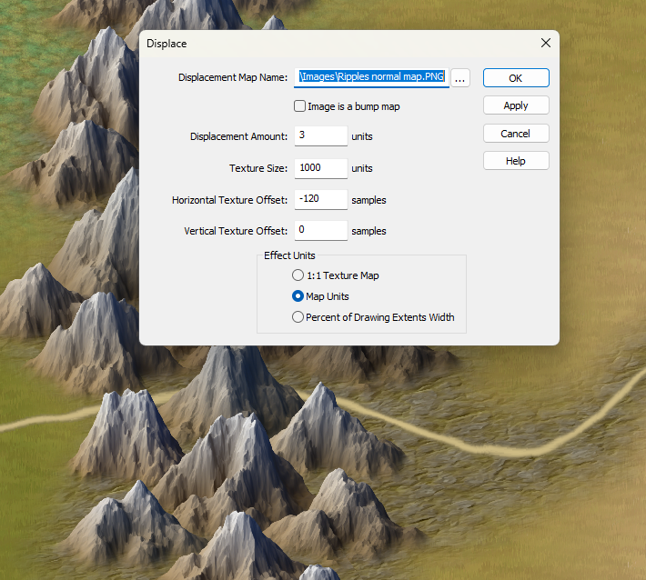
CC4 Overland Development Thread
I've added a Displace to the ROADS sheet. It may be a bit too much.
Take it off?


-
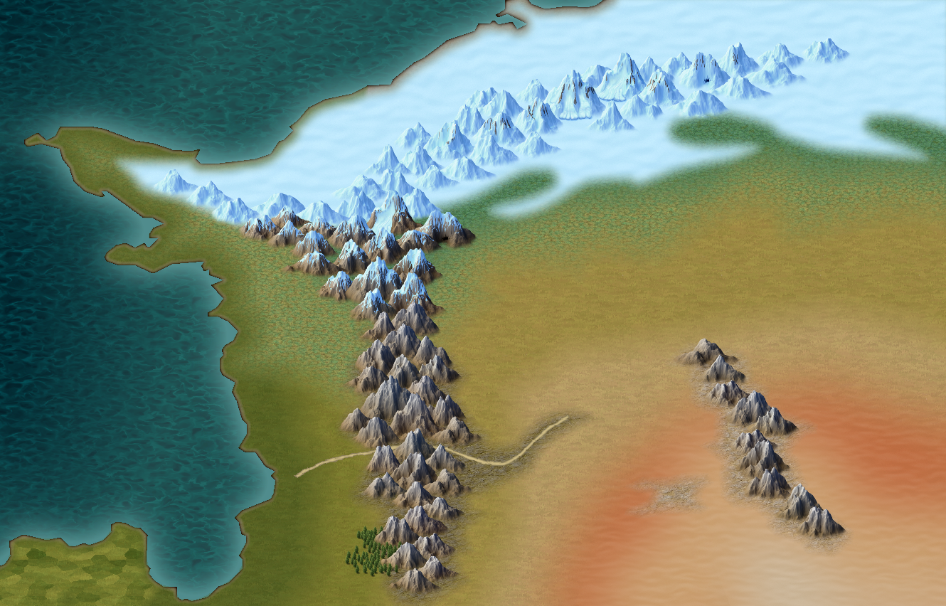
CC4 Overland Development Thread
Things have moved on a bit now. I've given the colour scheme a bit more depth and earthiness and done quite a bit to the mountains.
As always - say what you think. There's still time to change things yet.


-
How to use the Ball Filter?
It has it's limitations since you can't cut a slot out of it, but you're welcome :)
-
Changing properties on a sheet that has cut through bits
So the islands are vanishing?
When you change the properties of the water you are also changing the properties of the magenta cut-outs. They need to remain unchanged.
Try starting from the state of your first screen shot and change the ocean again without picking the islands, or carefully deselecting them so they remain unchanged.
Or, if you have already changed everything to the other water fill, try picking the islands only and changing them back to magenta polygons using Change Properties.
-
Changing properties on a sheet that has cut through bits
Because those bits have been cut out on the water sheet they no longer exist to have properties changed on that sheet. If you want to change what you see through that hole you will need to modify the terrain you can see on the sheets that are revealed by those holes, and not the holes themselves.
What changes to you need to make to the islands?

