


Loopysue
Loopysue
About
- Username
- Loopysue
- Joined
- Visits
- 10,415
- Last Active
- Roles
- Member, ProFantasy
- Points
- 10,161
- Birthday
- June 29, 1966
- Location
- Dorset, England, UK
- Real Name
- Sue Daniel (aka 'Mouse')
- Rank
- Cartographer
- Badges
- 27
Latest Images


-
Crypt
Of course I can :)
Which style did you start with? Is it SS4?

-
Crypt
Another lovely map, Ricko :)
You can limit the extent of the grid by adding a Color Key effect on the GRID sheet and drawing a polygon of magenta over the bits you don't want, or you can hide everything except the GRID and FLOORS sheets and use the floor to trim all the grid lines.
-
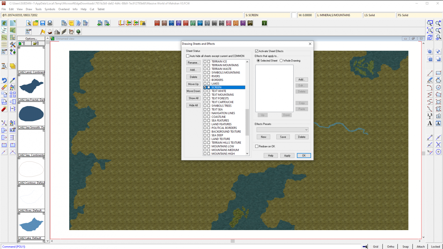
I Lost My Screen Border that Hides Symbols and Land/Terrain Fills
You're welcome :)
All I did was draw the white polygon. That's the only difference. I figured that I could sort the sheets into a more logical order for you, but I decided not to mess with them, because my logical order probably won't be the same as your logical order.
If you want to make the screen broader I recommend temporarily changing the view window colour to something other than white so that you can see what you're doing. Go to View->View Window Color and pick it.
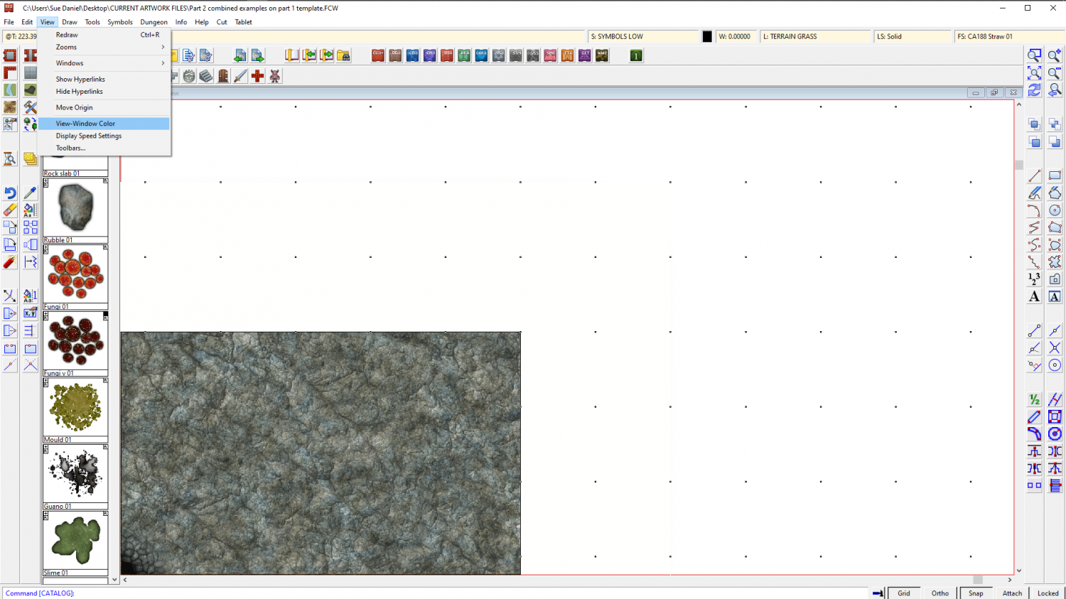
Look at the command line and it will say:
"color #[15]:"
That's white. Remember that so you can go back to it.
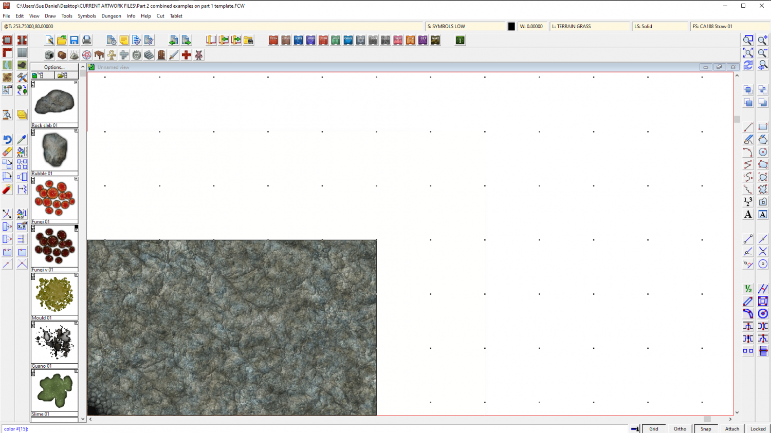
Type 0 (zero) and hit enter. That will turn your view window black, so that you can see the white polygon on the SCREEN sheet.
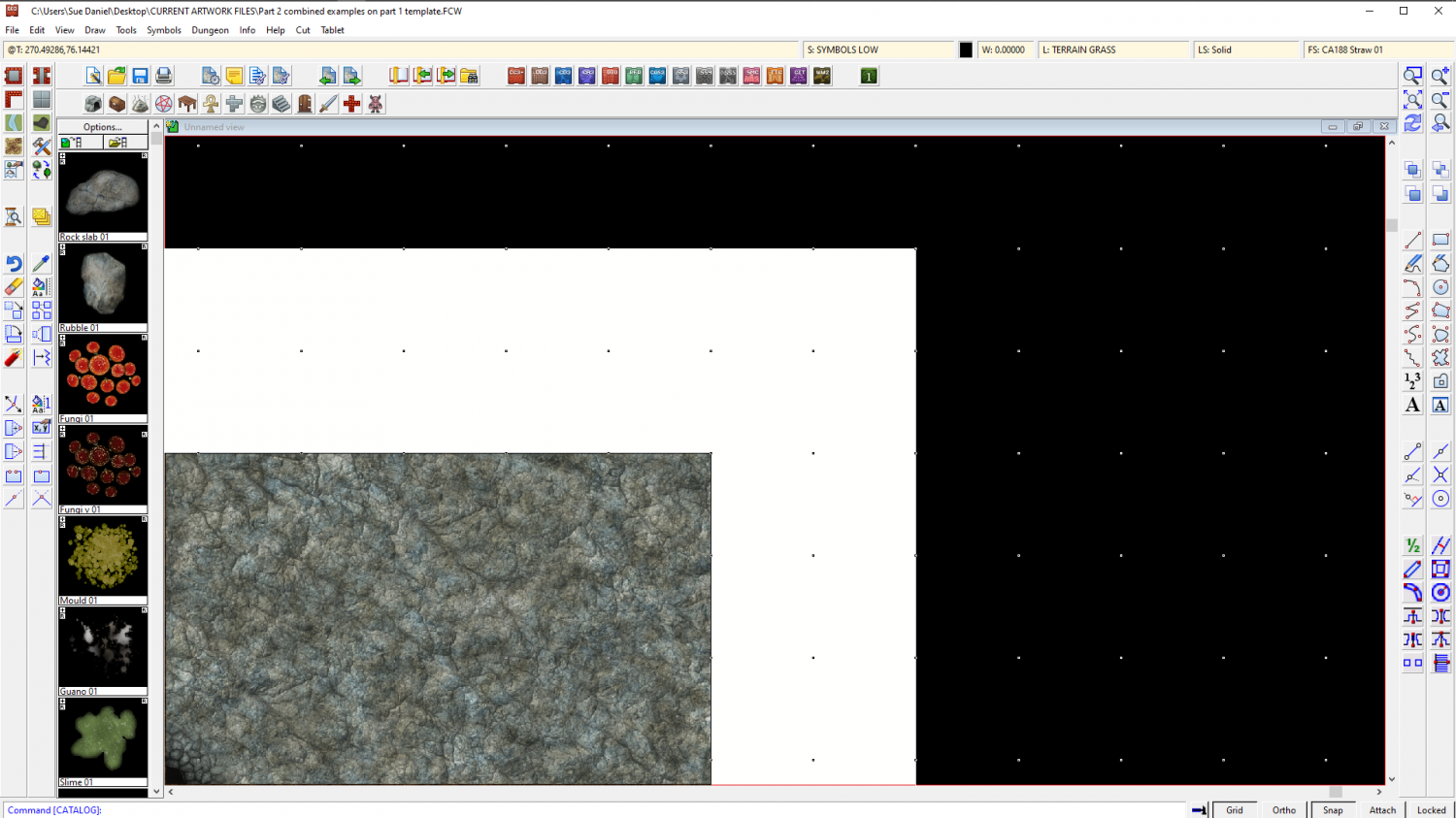
Now that you can see it you can use the node move tool to pick the corners and move them outward to wherever you want them to be. Turn snap on and you can have everything neat and tidy.
I don't recommend using huge fat wide screens because if you zoom to extents you will get an awfully wide swathe of white space and your map will be tiny. It may be worth the time and effort of editing that one piece that sticks out to tuck it under the existing screen.
When you have finished adjusting the screen you can change the view window colour back to white the same way that you turned it black.

-
I Lost My Screen Border that Hides Symbols and Land/Terrain Fills
Is it just that you want the screen back?
If so, here it is as far as I can tell where you want it. I've had to assume a few things based on the straight lines at the edges of your map. I have also drawn it a reasonable width, rather than the extreme width that would be required to completely cover the land part that protrudes in the north. You can use the move node tool to adjust the screen polygon on that side if you wish.
I noticed that the sheet order was a little mixed up, which may cause you a few problems as you progress. The SCREEN should really be right down at the bottom of the list or near enough to it, since it is intended to block the view of protruding symbols and fills. But since I don't know what you want to do with this map I have left it to you to move it.
-
Duskwood Manor - A Village Scale Mood Piece
I think it looks pretty good :)
You can change the colour of the cliffs using either an Adjust Hue/Saturation or Colorize sheet effect on that sheet. While these effects don't normally work with symbols they will with the cliffs because the cliffs have map files.


