Loopysue
Loopysue
About
- Username
- Loopysue
- Joined
- Visits
- 10,413
- Last Active
- Roles
- Member, ProFantasy
- Points
- 10,161
- Birthday
- June 29, 1966
- Location
- Dorset, England, UK
- Real Name
- Sue Daniel (aka 'Mouse')
- Rank
- Cartographer
- Badges
- 27
Latest Images


-
Birdseye Continental - style development thread
I'm messing with the colours. I made all the tree textures darker and adjusted the rest of the textures to fit.
An improvement?
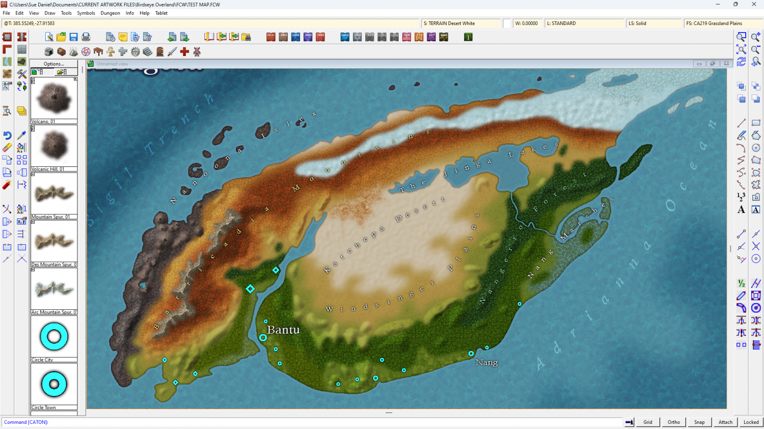
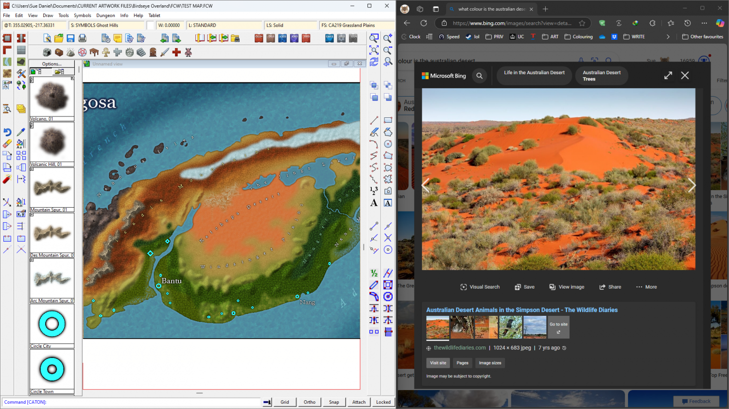
Personally, I'm not very keen on the red desert alternative, but it's a real thing. What do you think?


-
Birdseye Continental - style development thread
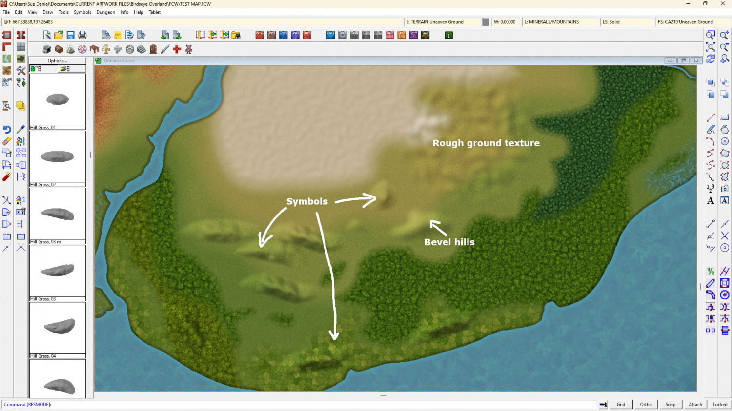
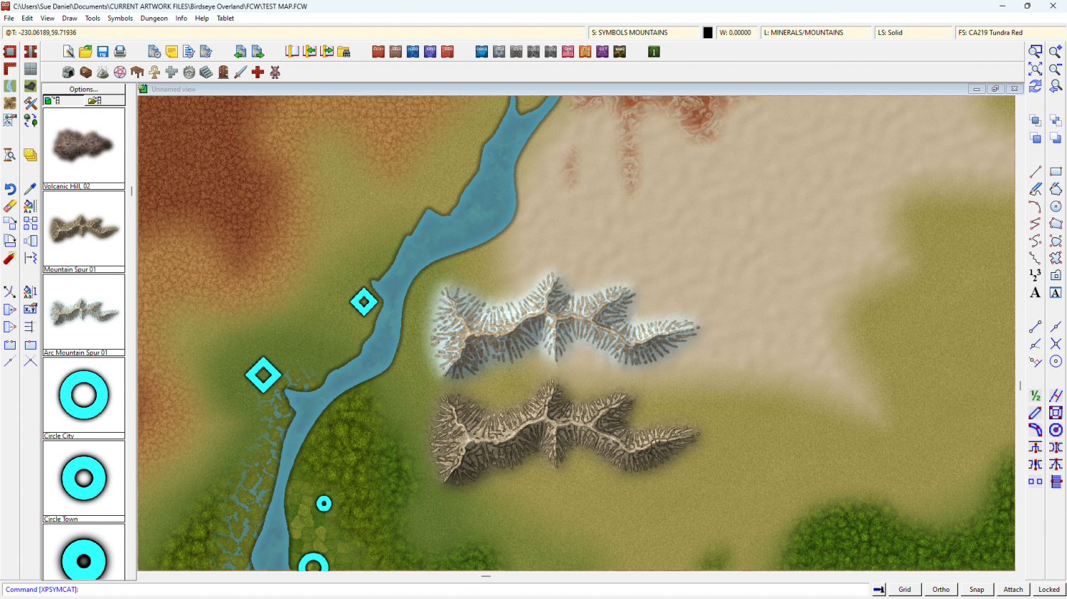
There are 3 ways to make hills in this style.


-
Ricko's Questions
Do you mean scale it?
If you do, open the Fill Style dialog and pick the fill you want to alter from the dropdown list,
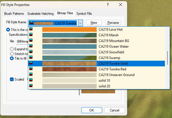
then adjust the hieght and width accordingly.


-
Birdseye Continental - style development thread
Ah, no. They aren't filigree wonders, Quenten. Just carefully matched background textures. Here's the Arctic version without the map file, in an 'as-drawn' state - before exporting to png for CC3+. It just happens to be a really good match for the snow fill in CC. That's partly because it IS the snow fill, and partly because I've made it just the right amount darker and duller.
Map files shade fantastically, but they also make everything brighter and more vivid than the original.
I guess I'd better do a desert one as well...
@Rosemont_Line - Thank you :)
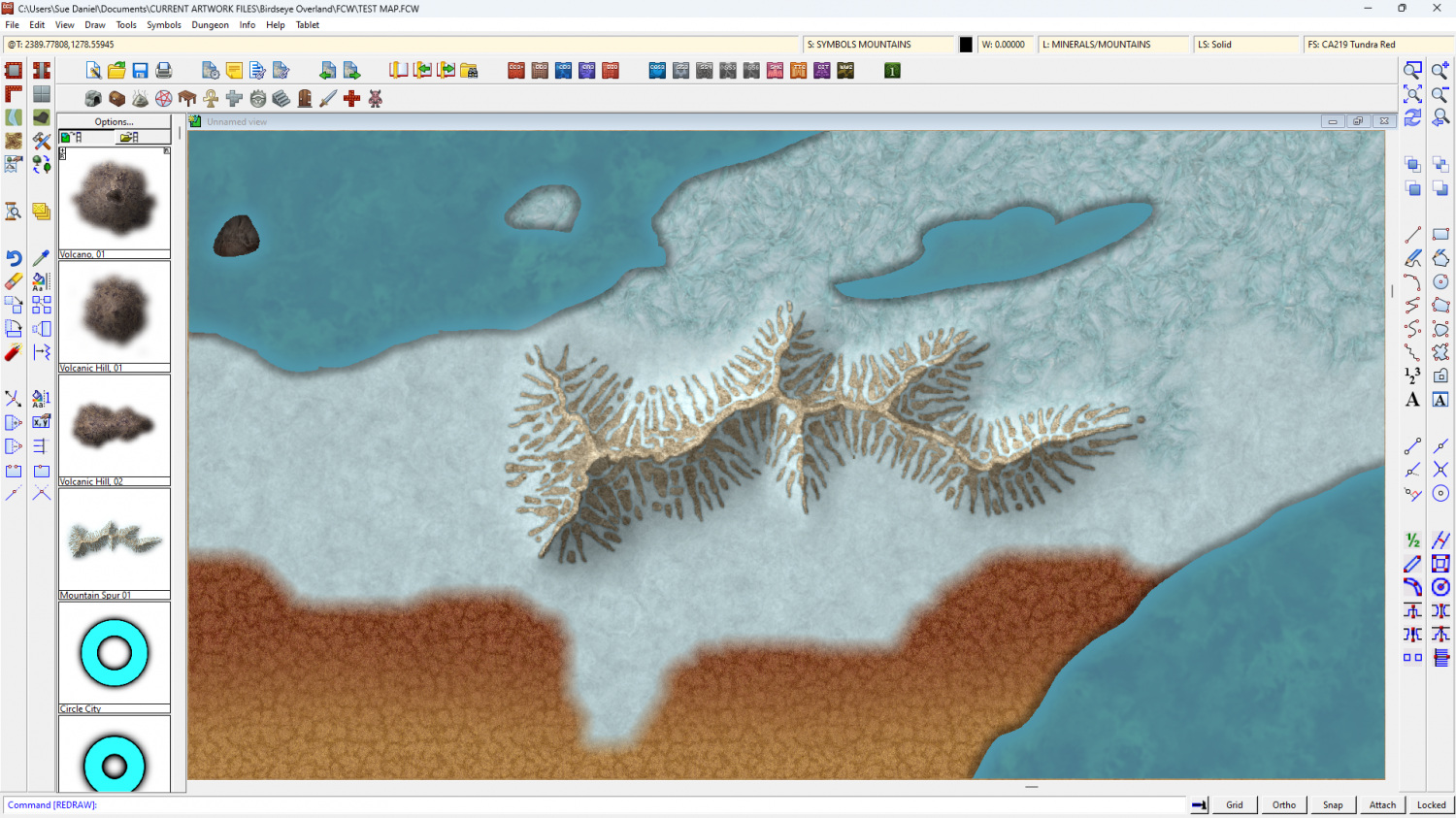
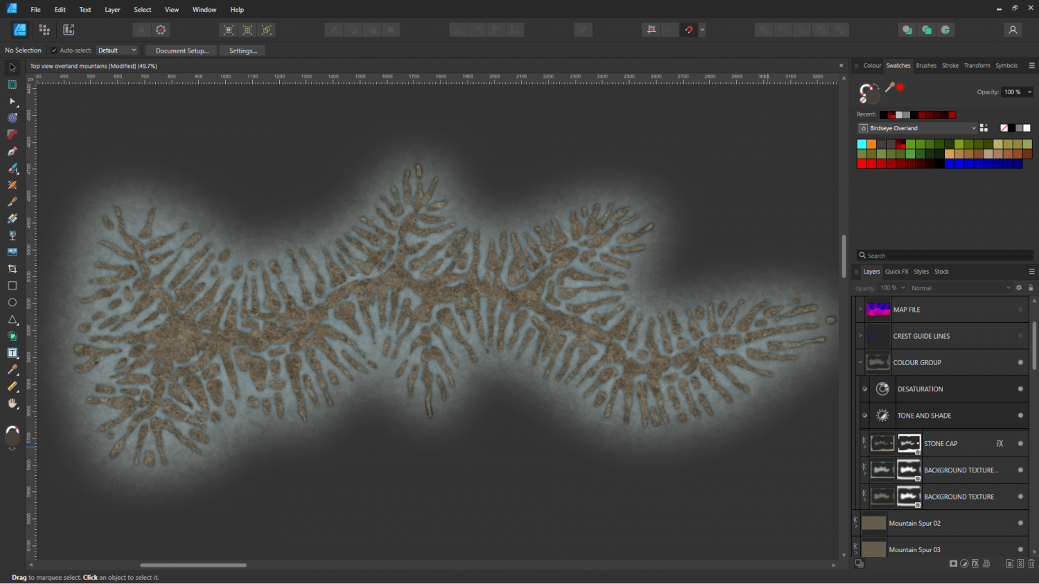
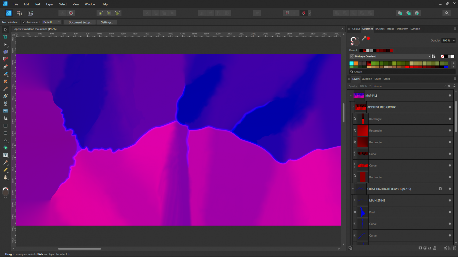
One of the reasons it's taking so long to make one mountain ridge is the hand drawn map file. If you look at the layers panel on the right you will see how much fiddling is involved. There is a way to export map files from FT3 and Wilbur, but I have found them to be too good - too detailed to work well. So I drew a grossly simplified one by hand, as if this was a house symbol, rather than a mountain.
I am hoping to get faster and tidier as I do more of them.
The smudge/smear tool leaves a lot to be desired in Affinity, or these would be smoother transitions ;)
-
Birdseye Continental - style development thread
Snowflakes have 8 points if I draw them :)
Arctic version of the same symbol.