Loopysue
Loopysue
About
- Username
- Loopysue
- Joined
- Visits
- 10,412
- Last Active
- Roles
- Member, ProFantasy
- Points
- 10,161
- Birthday
- June 29, 1966
- Location
- Dorset, England, UK
- Real Name
- Sue Daniel (aka 'Mouse')
- Rank
- Cartographer
- Badges
- 27
Latest Images


-
Project Spectrum - Part 2
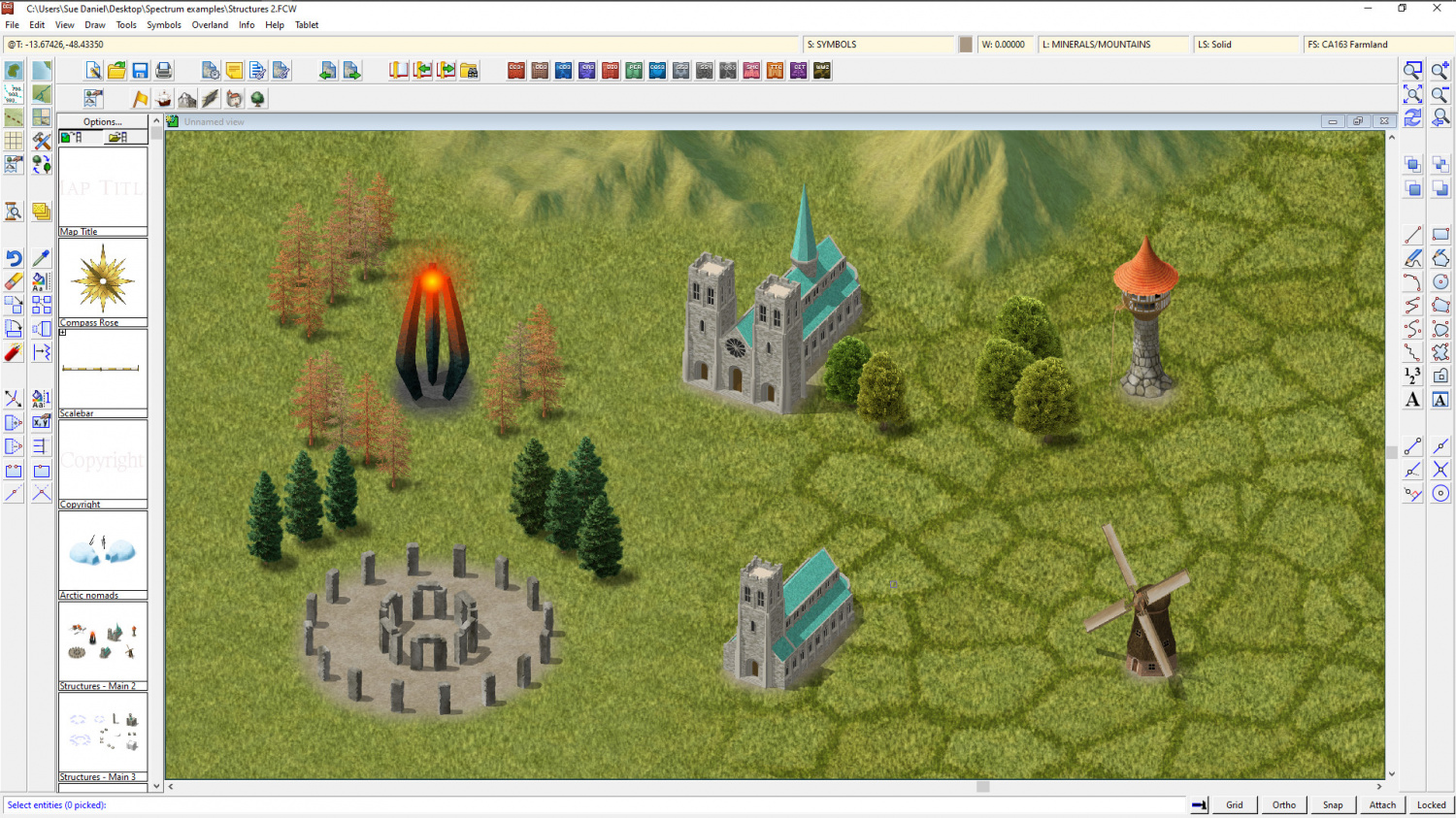
Well its a... it's a.... well... it's a... tower. Yes, that's what it is on the record :)
It's meant to be an 'evil tower', but it can be whatever you want it to be. My thinking about a tower of (or for) evil is that since evil is an inanimate thing of some kind it doesn't really need a house with windows and walls, but just a place to exist in a greater concentration. That greater concentration is symbolised by the glow.
-
Project Spectrum - Part 2
No, it's not just you, Medio. It does look better zoomed in. I think this is probably one of those styles that suit small regional maps more than world maps, but you can use it either way.
Here are the last few symbols for part 2. There are a few more in progress, but the completion date is today/tomorrow, so these are (officially at least) the last ones shown with a few of the existing trees and hills for scale. It might be worth noting that I have reduced the inner opacity on the edge fade of the farmland to 80 from 100. That makes it easier to see the symbols.

![[Deleted User]](https://secure.gravatar.com/avatar/c75d9a245b74d9c59be0999ea81ca541/?default=https%3A%2F%2Fvanillicon.com%2F92add7f8c954488718110edc4896ad39_200.png&rating=g&size=200)


-
Project Spectrum - Part 2
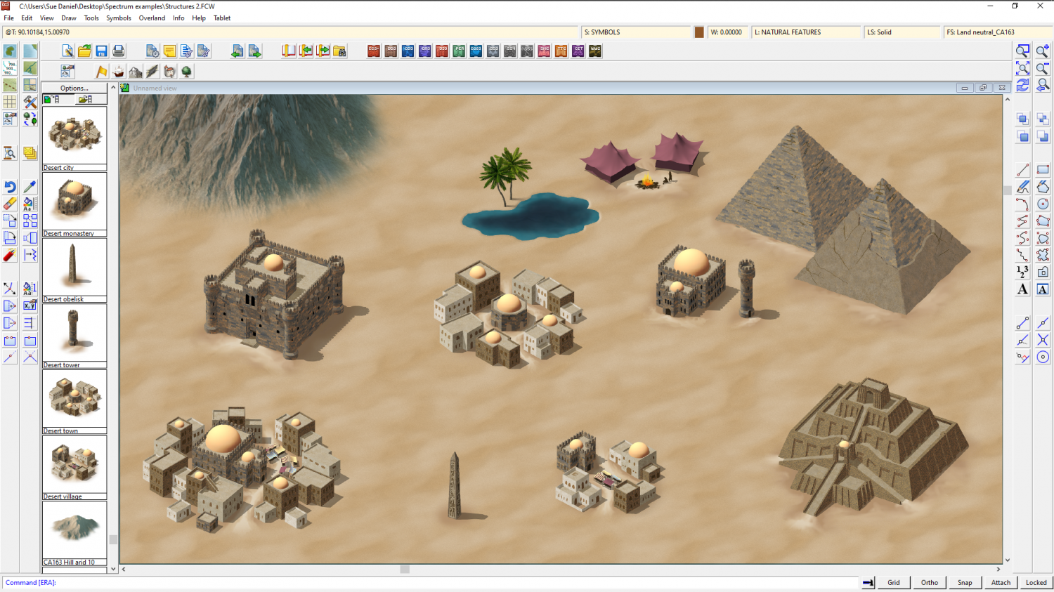
Here are the desert symbols all done up.


-
Aegean Isles
That's pretty great for a first map :)

-
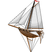
Small white dots on buildings when exporting city maps to PNG
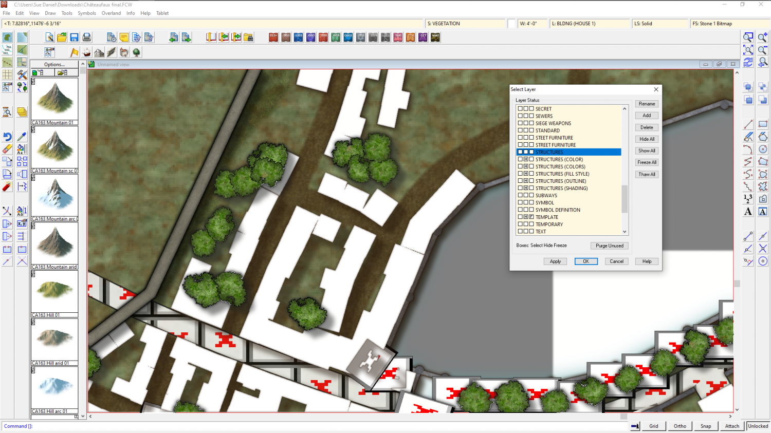
I reopened it and managed to convert a tiny patch of them here like this. Note how I have the Locked button depressed at the bottom right. I believe this is why it crashed the first time I tried. I forgot to unlock the groups.
Unless Remy (Monsen) knows a much better way of doing this, this is how I do it when I forget to change the colour to black when I'm generating buildings.
First you need to hide these layers.
Then change the properties of the white polys marking the extent of the houses.
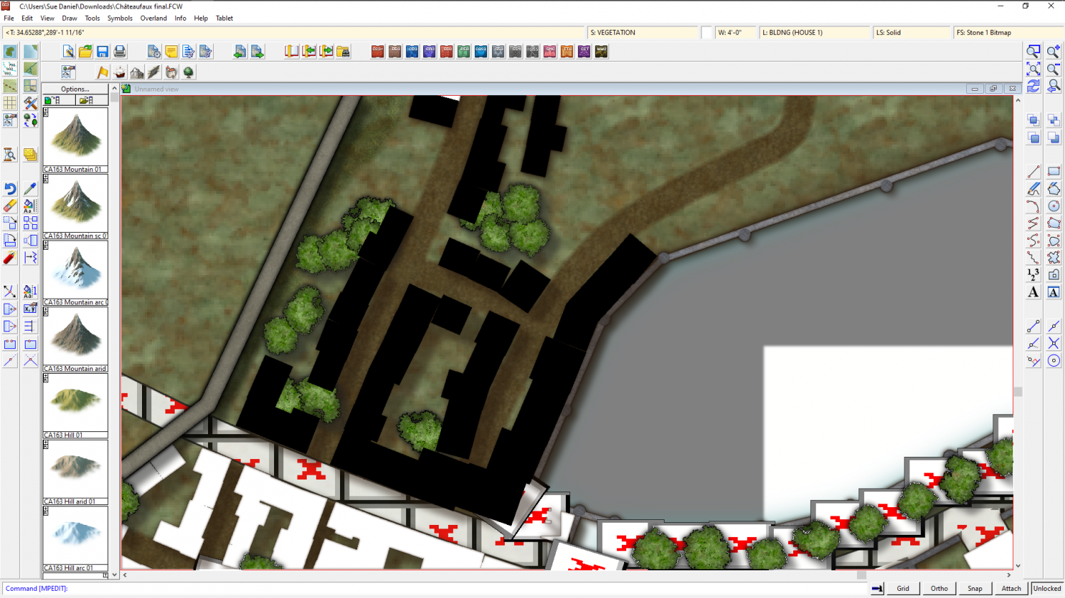
Then show the layers you just hid again.