


Loopysue
Loopysue
About
- Username
- Loopysue
- Joined
- Visits
- 10,415
- Last Active
- Roles
- Member, ProFantasy
- Points
- 10,161
- Birthday
- June 29, 1966
- Location
- Dorset, England, UK
- Real Name
- Sue Daniel (aka 'Mouse')
- Rank
- Cartographer
- Badges
- 27
Latest Images


-
Humble Bundle 2022 - Contents?
The rules don't normally change between bundles, and if they ever do I'm sure Profantasy will let everyone know ahead of the time.

-
Humble Bundle 2022 - Contents?
I can't say exactly what is in which bundle, but these annual issues are all included somewhere in there.
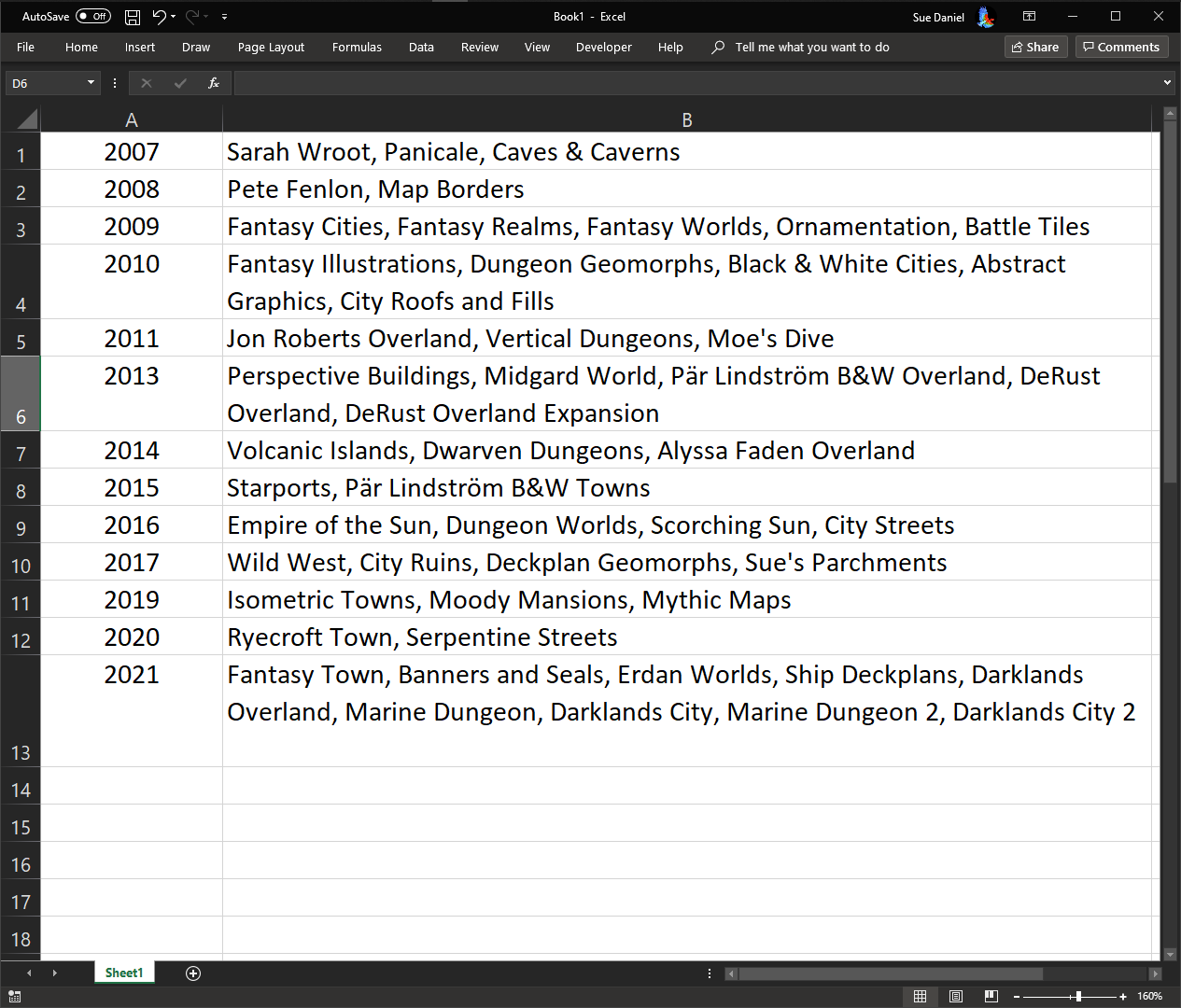
EDIT: This is a much better spreadsheet showing which issues are in which part of the bundle:


-
Where can I find palm trees and beach items?
Oh I think those are palm tree tops, which are isometric and meant for creating forests where the trunks wouldn't be visible, but I've seen other top view maps use them a bit like bent over palms. I'm not sure they would really work as far as resolution goes either, since you would have to enlarge them beyond the limit where rasterization would occur to be a realistic size for a dungeon map.
-
[WIP] Bā Dà Chéng Shì
It may be that the Length (how far it goes into the edge) is too great. If you know the width of those lines set the length to half of that. Then try putting 100% fade on it. That should give you a rounded bevel like the ridge of a roof.
![[Deleted User]](https://secure.gravatar.com/avatar/c75d9a245b74d9c59be0999ea81ca541/?default=https%3A%2F%2Fvanillicon.com%2F92add7f8c954488718110edc4896ad39_200.png&rating=g&size=200)
-
Community Atlas - Forlorn Archipelago - Fisher Isle, several villages and surrounding areas
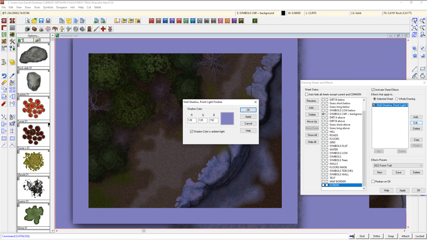
The simplest way is probably to add a Wall Shadow, Point Light Finalize sheet effect to one of the last sheets in the list, check the Shadow Color is ambient light box and pick a nice bluish colour. That way you can turn the effect on and off.

