


Loopysue
Loopysue
About
- Username
- Loopysue
- Joined
- Visits
- 10,411
- Last Active
- Roles
- Member, ProFantasy
- Points
- 10,161
- Birthday
- June 29, 1966
- Location
- Dorset, England, UK
- Real Name
- Sue Daniel (aka 'Mouse')
- Rank
- Cartographer
- Badges
- 27
Latest Images


-
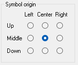
How can I import my own Hextiles into CC3+?
To have your hexes origins set at the centre there must be no space in the png around the edge of the hex, or if there is a space the space must be exactly the same number of pixels all around.
When you import your hexes again, having remedied any edge discrepancies, make sure that you import them with the "Symbol origin" set to the centre of that grid of radio buttons, like this.


-
Issue with beach on Spectrum Overland
Centre of shot - to the right of the explode button. It looks like this |CC2FRX|

-
Issue with beach on Spectrum Overland
Quenten is right.
Right click the Fractalise tool and pick Smooth to Straight, then select the beach polygon and hit D for do it.
-
Map Size - ReSize
Ah, I see what the problem is. There's a white polygon on the SCREEN sheet and layer. It goes all the way around the map to hide bits of mountains and things that are only half inside the map. It's called (rather unsurprisingly) the screen.
Resize Drawing Area usually works without a hitch. Sometimes, however, if the difference between the original size and the new size is very great, it doesn't scale the Screen properly, and that is what's covering your background on the right side.
You can get rid of the damaged screen either by deleting it now that your SCREEN layer is unfrozen, or by using the command COLLARDEL, which you type on your keyboard and then hit Enter.
To make a new one just type the command COLLARAUTO and hit enter again. That should automatically draw a new screen on the correct sheet and layer. Once done, it would be worth re-freezing the SCREEN layer so you don't keep accidentally picking it while you are working on your map.
If you are having problems printing the map because of it's size you could try exporting a jpeg instead of going straight to print. Printing an image is easier to control in a lot of ways - mostly because it's a commonly done thing.
-
Is there a way to add topographic lines to your map?
FT3 shows elevation already. Most of the shaders blend the contours and add hill shading.
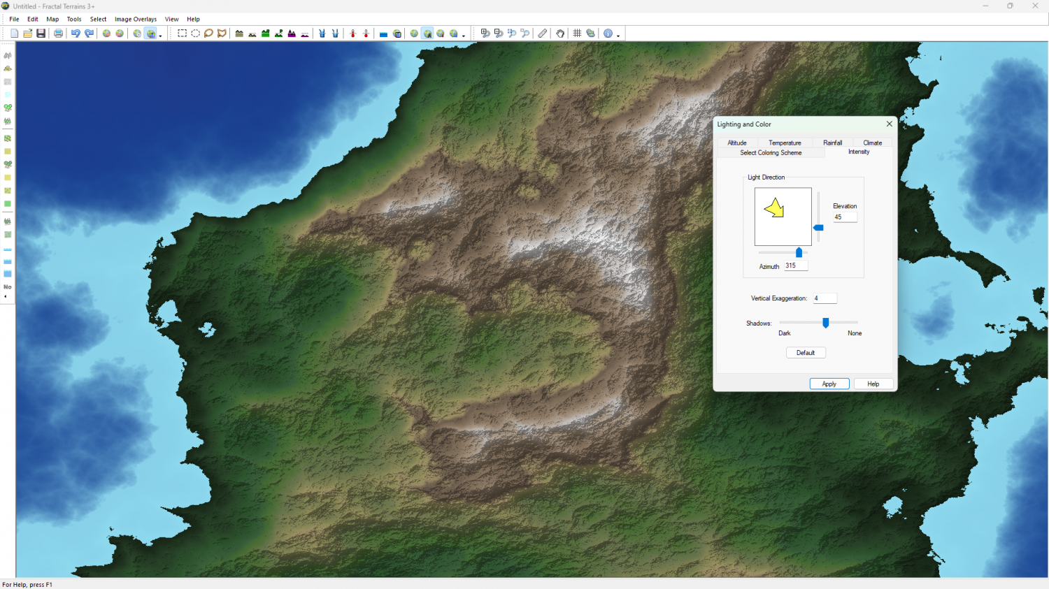
If you open World Colouring and find the Intensity tab you can switch off the hill shading by moving the Shadows slider to "none" and hitting Apply.
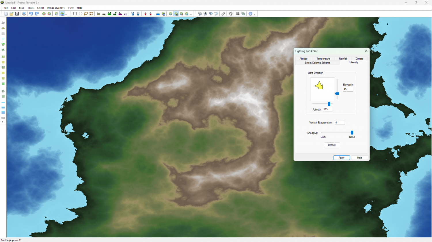
Then if you go to the Altitude tab and uncheck the Blend tickboxes you will see something more akin to contours.
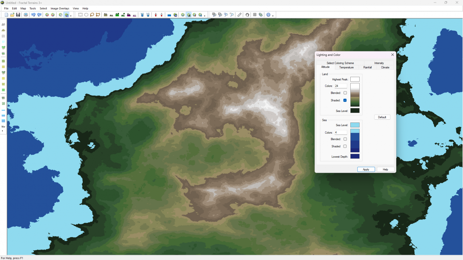
How many contours you see will depend on how many colours there are in the colour scheme.
If you want to export contours from FT3 to CC3 use one of the export settings that has contours, which you can tell by the name in most cases. You can create your own export setting by hitting the Create button in that dialog and set your own contours.
In CC3 you can draw contour lines as polygons with a Hollow fill type, in whatever colour you wish. If you mean to draw a whole lot of them you might want to create your own drawing tools for them. If you are interested in how to do that just ask.


