


Loopysue
Loopysue
About
- Username
- Loopysue
- Joined
- Visits
- 10,354
- Last Active
- Roles
- Member, ProFantasy
- Points
- 10,108
- Birthday
- June 29, 1966
- Location
- Dorset, England, UK
- Real Name
- Sue Daniel (aka 'Mouse')
- Rank
- Cartographer
- Badges
- 27
Latest Images


-
Grimdark Fantasy (renamed "Darklands") - development thread
Hello Linn :)
That sounds quite fascinating. I would love to read an introduction thread by you!
The last time I ever had the critique of an art tutor (about 35 years ago) I was told that my style wasn't fashionable, and that I wouldn't get onto a degree course. He was quite right as it turned out, so all I have to show for that time in my life is a Foundation Diploma in Fine Art. I do landscape paintings - or at least I used to in the old days. They just weren't abstract enough for contemporary taste and didn't sell as well as all those pink, orange, blue and viridian expressions I saw in the window.
So I took an office job and laid all those things to one side until very recently, when I became involved with fantasy mapping art. I've done the digital version of drawing my own maps from scratch, but only ever one map on real paper using real pencils. It turned into more of a landscape than a map. Well, that was no surprise given my background.
Things happened in my life at that point and I drew my horns in quite a bit. I also discovered at that time the great pleasure of producing assets for other people to use in their maps, and eventually became far more interested in doing that than in drawing maps for myself.
I wouldn't claim to know very much about fantasy mapping styles because there is just so much to consider beyond the drawing itself, but I have worked out that maps differ from paintings in that the elements are more symbolic than real at this scale. The example map represents 1000 x 800 miles, which means that the volcanoes are gigantic, and the mountains themselves are super massive beyond that. In a non-photorealistic style it is not the scale of the elements that is important as much as the clarity - the ease of identification of each thing. Hence everything is several hundred times bigger than it would be if it was drawn actual size, and each tree might represent a whole woodland.
However, and having explained my personal take on scale and symbolisation, I can see that the ash clouds may be too large relative to the rest of the volcano, and also that this slightly discomforting distortion isn't helped by them being less cartoony than the rest of the elements. I look at them again, now, and I can see something that is neither cartoon nor photorealistic but a rather distracting hybrid of the two things.
Thank you for helping me to work this out and get it straight in my head. I think I will probably reduce the size of the ash clouds a bit and make them more cartoony, but I will leave that until I have done a draft version of the full set so I can smooth out the bumps all in one go.
And also, thank you very much for the reference material. I have bookmarked those pages for personal interest, since I currently have something of a fascination with volcanoes :)


![[Deleted User]](https://secure.gravatar.com/avatar/c75d9a245b74d9c59be0999ea81ca541/?default=https%3A%2F%2Fvanillicon.com%2F92add7f8c954488718110edc4896ad39_200.png&rating=g&size=200)

-
Windows in Walls
They need to be on the right sheet and layer for the windows to recognise them as walls.
Draw a short and temporary section of wall using the default wall drawing tool and use List on it (Info menu) to find out which sheet and layer they need to be on, and then hide all but the walls and use Change Properties on them to move them to the right place.
Once you have done that the doors and windows should cut them perfectly.

-
Changing Properties and Importing SRTM Contour Lines from FT3
Ok. With only that one sheet visible use the Change Properties tool |CC2MCHANGE|to set their fill to hollow, and the outline to black. That will help you to see them properly. Then you will be able to do what you wanted to do with them, whether that is to set them up with different colour fills or just use them as contour lines.

-
Community Atlas 500th map and 4 year anniversary competition with prizes.
And this is mine.
These don't really qualify as map notes. They are more of a description, or a tourist guide if you like.


 and 3 others.
 -
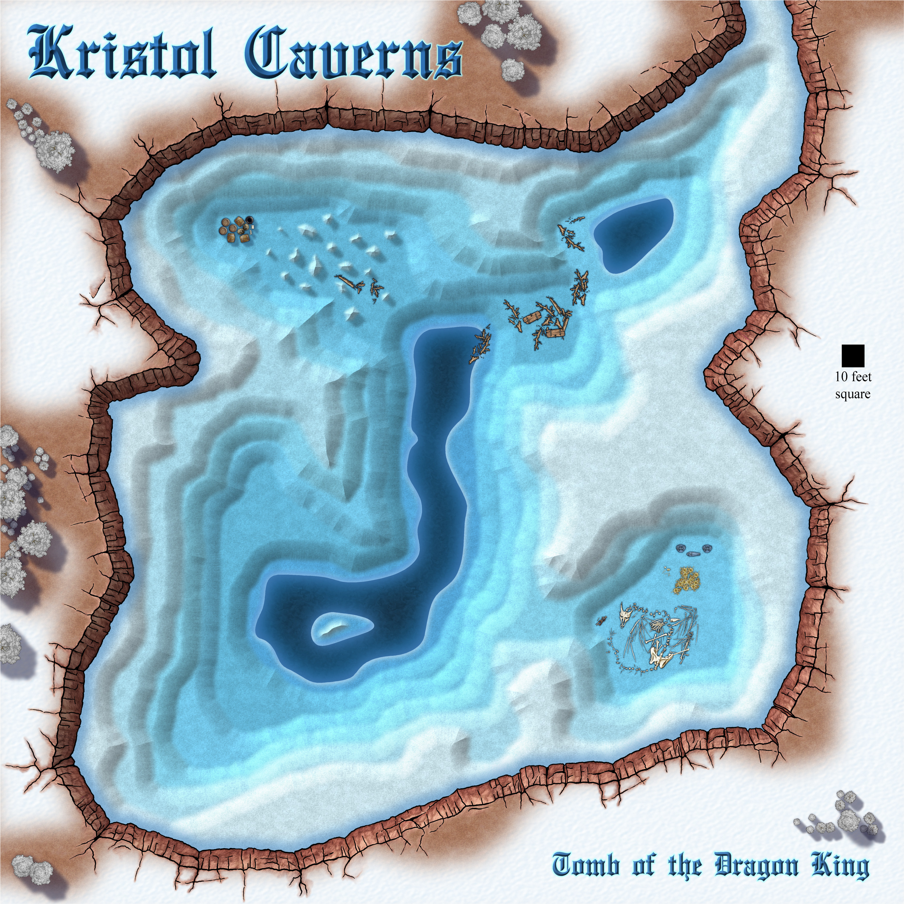
[WIP] It is strictly prohibited to throw jewellery into the lake.
Part of the reason I had that many was that the map had 8 terraces, so each had at the very least a rock sheet and two grass sheets, never mind the 3 types of building sheets for each if that terrace had houses on it.
I kept track of everything in a notebook. In those days it wasn't possible to copy and paste effects, so I had to cross out and update things I changed so that I could see what I'd just done to the lower terraces in terms of colour and bevel changes, so that I could carry on the series up the hill.
