Wyvern
Wyvern
About
- Username
- Wyvern
- Joined
- Visits
- 3,303
- Last Active
- Roles
- Member
- Points
- 5,647
- Rank
- Cartographer
- Badges
- 24
Latest Images
-
Community Atlas: Dendorlig Hall - A Sort-Of D23 Dungeon for Nibirum
Day 200 of 2023 seemed an apt moment for a fresh update on this project, so here we are, whole map first:
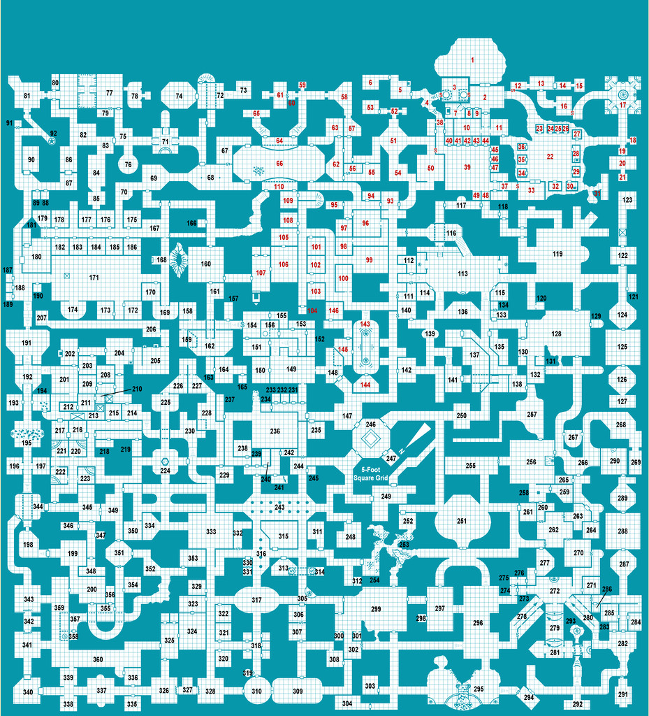
Further tweaking of labels and minor map features has proceeded apace since my late June update, and the type-up of my notes is in the early part of the University, area 259, currently, while the hand-scrawled preparatory notes are nearing the end of the Manufacturing District, area 293. Still a way from the area 360 end, but well up on the area 200 the day per area idea might have indicated otherwise 😁. (And yes, I STILL haven't got round to adding a symbol key or map title...)
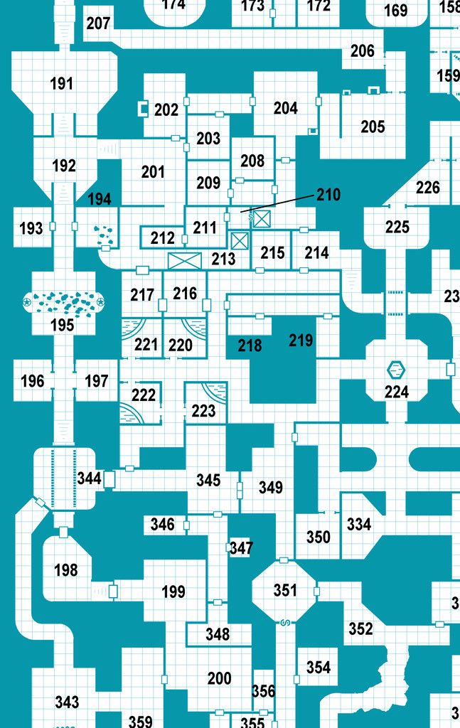
For today's closer look, following last month's minor temptational mention, we have the extracted PDF notes for the less-well-off living areas of the Hall in The Dell, areas 191-224:
All being well, still more to follow!
Meanwhile elsewhere, most folks I'm aware of who were trying the D23 project seem to have been struggling to continue it of late. Some recent discussions on one of my more active Discords, where D23 was A Thing earlier, have indicated no one there's still persisting unfortunately, although a couple of folks on a separate Discord server were still posting occasional updates into early July at least. Certainly, having the base map and ideas for every area randomly generated in advance, as I did, seems to have helped keep my attention focused at least, so that might be a way to go for anyone contemplating something similar later this year or next, or on a smaller scale, for instance.


-
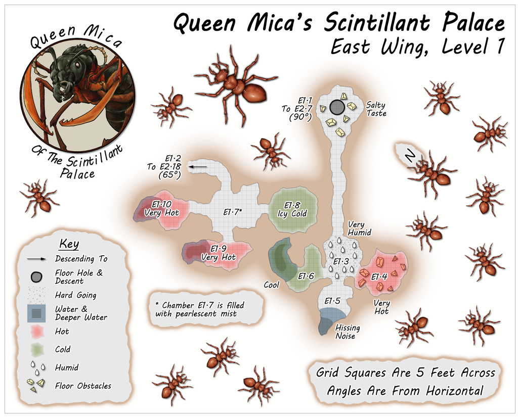
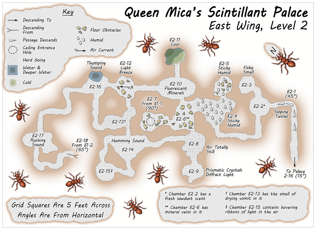
Community Atlas: Queen Mica's Scintillant Palace
The East Wing runs to a mere two vertical Levels by contrast, based on images of a couple of layouts on the DF Discord, combined here with the usual additions and amendments, for all the final plans are much simpler than for either of the preceding pair of Wings, and clearly show their rectilinear original forms rather more. This was though quite deliberate, as part of the concept of the various Wings was to show differences between them, suggesting they could likely be put to different uses, and that this area was probably still largely under construction. Plus it wasn't only the layouts that had been getting figuratively tied in knots with some of the other maps!
Simplicity only counts for so much though, so the entryway from the Palace this time isn't on Level 1, but on the lower Level 2 (which is also a somewhat larger map than the others):
![[Deleted User]](https://secure.gravatar.com/avatar/c75d9a245b74d9c59be0999ea81ca541/?default=https%3A%2F%2Fvanillicon.com%2F92add7f8c954488718110edc4896ad39_200.png&rating=g&size=200)

-
August Mapping Competition - Building Floorplans - Win Prizes
Yes, it's coming up to that time isn't it? So here's my final version of Cloven House, firstly with the secret cave hidden, and then revealed:
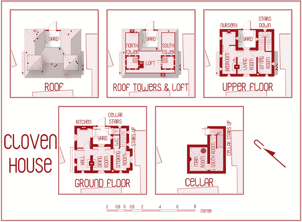
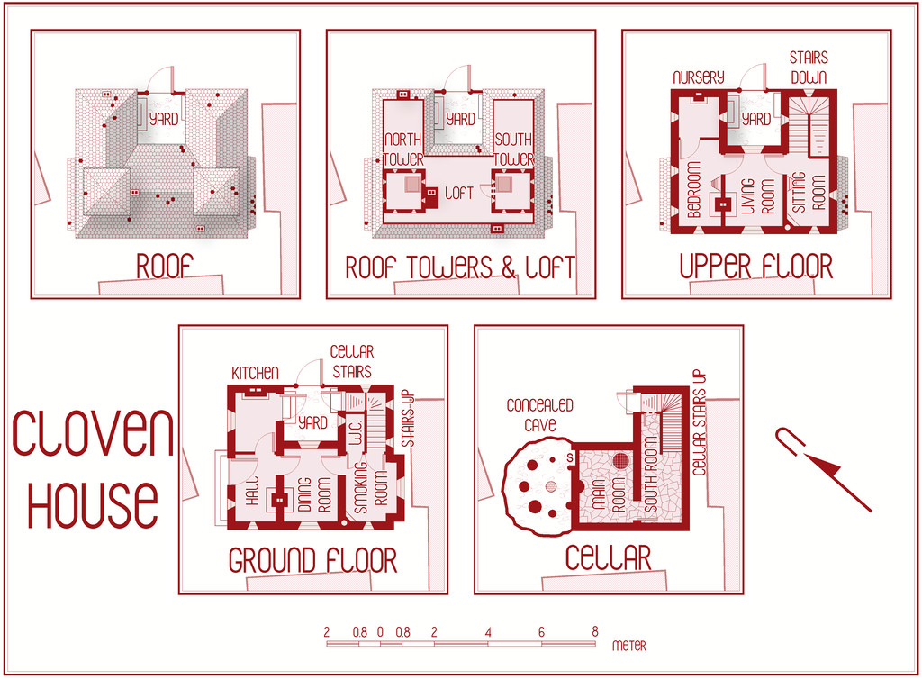
This will be winging its way to Remy for the Atlas shortly, with its text and PDF notes, but in case anyone might be interested, the PDF description is here as well, should anyone wish to be "enlightened" further on the nature of this haunted house:
Worth noting though that a few comments are a trifle "adults only", concerning a couple of the potential apparitions and other ghoulish elements.


-
Community Atlas: Embra - Enclosed Places
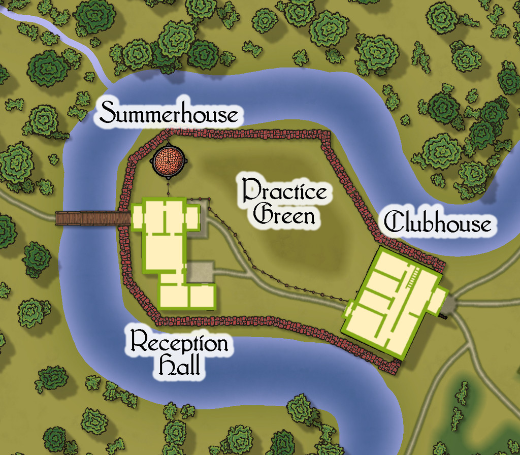
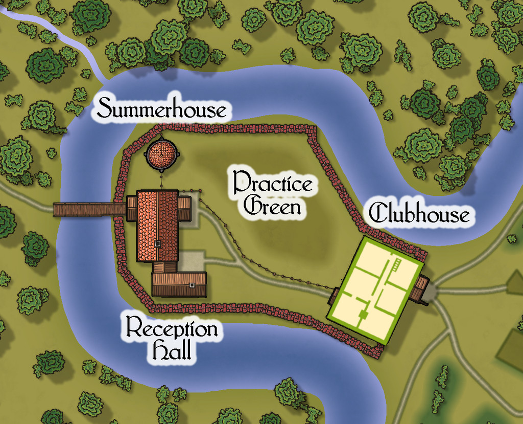
Place 2 is the "famous" Red Picket Golf Course (given Embra is, extremely loosely, derived ultimately from the real city of Edinburgh in Scotland, it proved impossible not to include something relating to golf in these maps of the Faerie city):

This time, there is the option to hide the labels for the course separately from any other map labels, to make the various hazards and obstacles easier to see, although the labelling is essential to work out what is meant to be where in terms of trying to complete the course:
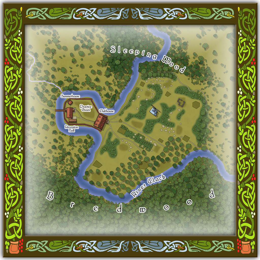
A small key has been provided with this map as well, to better clarify what the recurrent features of the course are meant to be. The PDF and text files for this map describe in detail the Faerie elements of the course, which plays as something like a cross between "real" golf and miniature or crazy golf, with fantasy aspects to-boot. Of course, those descriptions also explain why the course seems both a lot smaller and shorter than real-world golf courses (key word "seems"...), and that it may take players, non-Faerie players especially, days to complete a round of the nine holes. Benefits may accrue for those who do persist and finish the course, however. And they may find their time has not been nearly so wasted as they may have felt while still playing (Faerie time-dilation can work both ways, after all).
There are just a couple of buildings on the map, and these have been provided with internal-layout drawings via a couple more toggles in the Atlas FCW file for the ground floor, and the upper storey of the Clubhouse (only):


-
Community Atlas: Embra - Villages
Completing the circuit is Embra - Summerset in the northwest, with its small village of single-storey properties, the River Clack with a bridge (albeit the bridge seems detached from the village rather), both the main Clack Valley tributaries, plus a curiously unlabelled third tributary stream, which seems more significant than the named Silverburn (a deliberate choice!). However, dominating the map's centre are two substantial lakes and a marsh:

Next-up will be the first of Embra city's contents, the Enclosed Places.


-
Developing a map loosely based on Bronze-Age Mesopotamia
It's certainly a very beautiful map, and I know well how difficult it is to find a suitable real-world base map from which to draw this region, so I think you've done a splendid job with it!
As Sue said, the seas look a little "double-exposed" currently though.
How historically-accurate were you intending to be with it?
I ask, as ancient Mesopotamia is a particular place of interest for me, especially around the 3rd-2nd millennia BCE, along with the Black Sea and places adjacent around the 2nd-early 1st millennia BCE, and east to what is now Afghanistan, Pakistan and western India. They're places I've mapped and studied in some detail previously, and there are points I could make which might be of use, though only if you were wanting it to be more historical.
The river lines are very complex, particularly if you're going for that historical route, and a specific time-frame. The Tigris has pretty much held its course over the millennia, largely thanks to a stonier bed, but the Euphrates has drifted hither and yon across the silts of southern Mesopotamia especially, encouraged by deliberately-dug irrigation canals in places, beginning around the later 4th millennium BCE, for instance.
I know when I started out trying to map parts of this region, something that surprised me was how poorly different published atlas maps compared with one another as regards the modern watercourses, especially for anything other than the major river channels, even in the specialist (i.e. archaeological-historical) literature.

-
Community Atlas competition entry: The Summer Palace of the Winter Queen
Thanks Jim!
And thanks for the explanation, Remy. I appreciate fonts can be problematic in CC3+ at times, although in this case, the two ocean labels seemed to have changed far less than the placement of the four numerals and their associated snowflake markers, which had moved closer to the labels - on the version above here, much closer - than where they were set on the CC3+ drawing. Interestingly, on the higher res printout I did, the texts hadn't altered at all, so far as I could tell, but the earlier placement of the four markers and labels was wrong; not by so much as the lower res version above, but very noticeably all the same. Which does make me think still that it's been primarily a proximity issue along the same horizontal lines (maybe because both the snowflake and ocean text labels were placed using the same horizontal snap-grid placement). Odd the snowflakes should have dragged the numerals with them all the same, as they're not grouped, just individually placed, and the numerals aren't all on the same horizontal lines. Just one of life's little mysteries, perhaps ?
I had another look at the Locations map again today anyway, and decided to try moving just the numerals and markers further out from the labels, and that seems to have worked OK:
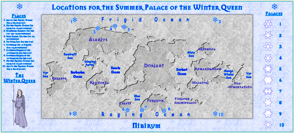
The separation is now only about twice what it was previously, yet as you can see, the difference in where they appear is very much greater, and almost exactly where the markers currently are in the FCW file, as well as on the higher res jpg and printout I tried.
Final checking of the accompanying texts is still to complete, but I'm hopeful of having the set ready to submit by maybe tomorrow or Saturday.

-
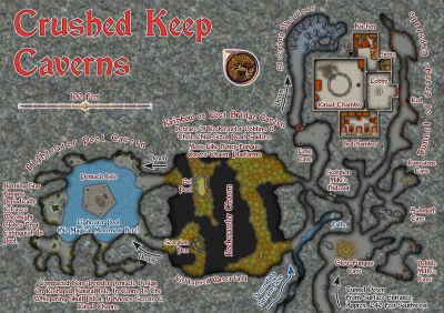
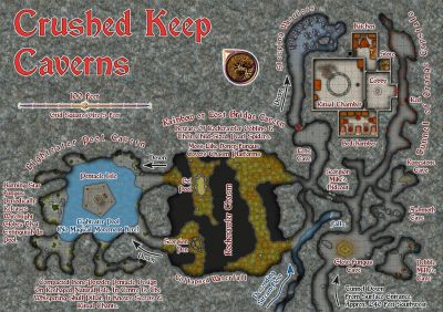
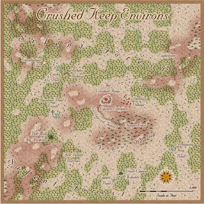
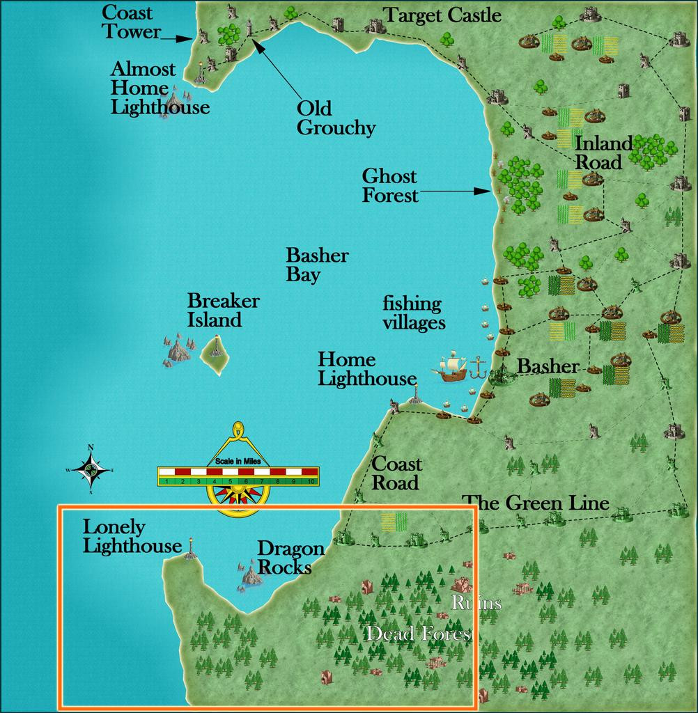
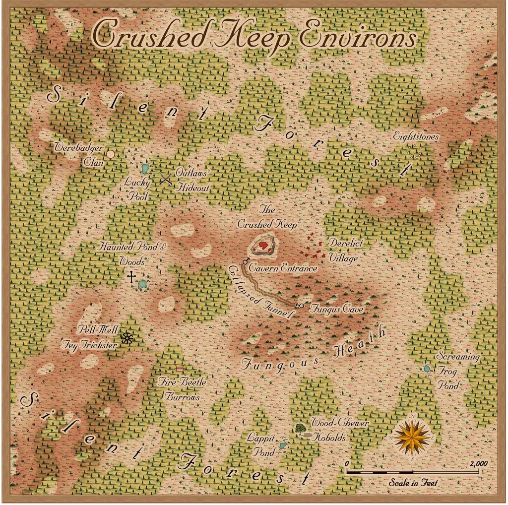
Community Atlas: The Crushed Keep Environs of Silent Forest, Fisher Island, Forlorn Archipelago
As noted in my closing descriptive post for the recent Oracle Mountains Atlas maps in Peredur, these next maps were to bring a return visit to the Forlorn Archipelago, not this time to the central Kraken Island, but the northernmost Fisher Island:
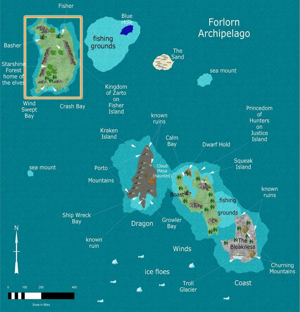
However, this was originally unintended. Over a year ago, while checking through the list of what was still to do in this project, I realised (despite previous double-checking) there was a duplicate location set for this map to one already completed. Luckily, I'd kept a list of "possibles" that hadn't made the final cut for sites to place maps, hence this one's choice.
This proved especially interesting, as drilling-down through the extant Atlas maps for Fisher Island, it became practical to zero-in on an unusually small area. So, the Island itself led to Basher Bay:
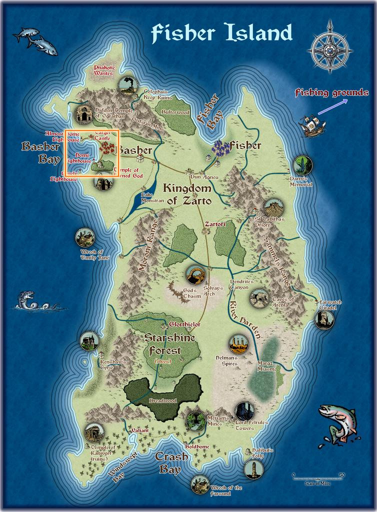
Which led to South Basher Bay:
And finally to the Silent Forest:
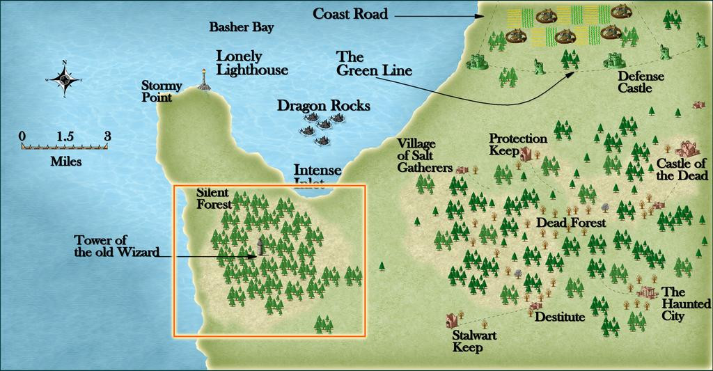
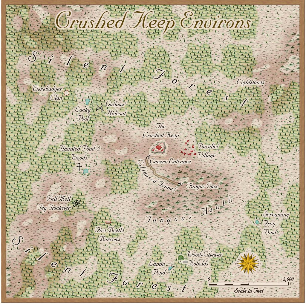
From where I opted to zoom-in to an identified, but unmapped, spot, The Crushed Keep:
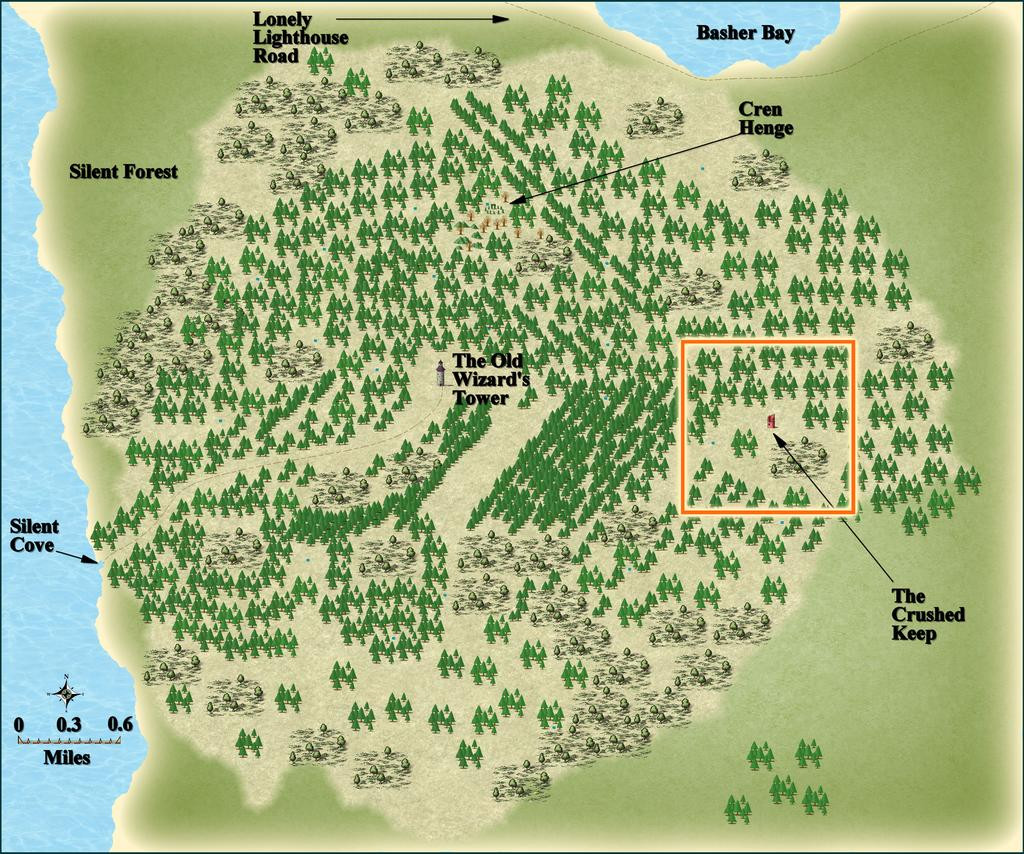
The final three maps shown above here, from Basher Bay to the Silent Forest, were all constructed by JimP, who also provided some interesting notes for them, including that the Silent Forest was so-named as the Old Wizard there dislikes noise, so there are no animal or bird calls hereabouts, that other towers, now ruined, had been built close to that central Tower (which nearby area Jim had also mapped) to keep watch on the Wizard's activities, and that further away, nobody was really sure if the Old Wizard still lived or not, hinting that his Tower too might well be ruined by now. This though was mistaken! Jim's notes for Crushed Keep mentioned for all it was a ruin, there was no debris or mislaid items there, as might be expected ordinarily, and it looked as if it might never have been inhabited, so there was enough mystery here to play around with.
That orange square outline on the last map above was to be my one-mile area map, and such an unusually small region provided the opportunity for a different mapping style to the normal overland ones I often force into smaller spaces than they're used to, which was to be Sue's Ferraris Style from Cartographer's Annual 158. After gridding the area, and randomly choosing places to add a few extra features (not many, as this is meant to be a largely uninhabited wilderness), I sought inspiration from cards drawn randomly from three of Inkwell Ideas' Hexploration Decks, "Into the Wilderness", "Settled Lands" and "Beyond the Pale", with a couple more from two of the Creature Decks, "Fey, Constructs, & Wildlife" and "Animals & Vermin". These ideas were then adapted to fit the overall pattern from JimP's notes, with a few extra thoughts of my own.
Thus the area map:

Of course, the Ferraris Style is really intended more for settled places than areas mostly devoid of habitation, but it seemed to work nicely here anyway, with a few repurposed symbols, and a road line that really represents a collapsed subterranean tunnel.
I decided from the start that I wanted to respect Jim's use of broken, almost spiralling, patterns in the way the woodlands are laid out, while appreciating they were drawn within the constraints of the symbols in his preferred mapping style. I did though add some minor topography, to help mix-up the colours and look a little more. The tiny ponds were from Jim's original map, and I added a couple more of my own. Jim's notes on them give leeway for such additions: "A number of small ponds. Unknown depths. Anything falls in, the leaves close back up. No signs of anything nor anyone had come by there." So ones that have closed must also periodically reopen, where nothing had been mapped earlier!
There are other oddities here as well, and the card ideas included several connected with fungi, which seemed an interesting concept, perhaps further helping to deaden sounds in the region. The map's notes for the final Atlas version will, as ever, say more.
Mapping in the Ferraris style took a degree of getting used to, mostly because there are a lot of options for how things can be drawn, the different fill styles, effects and so forth. I kept both the sample maps that come with the style's package open while I was drawing this to help keep me right. Despite that, the map went together really quickly, after some brief experimentation, so this isn't a detailed WIP topic for once!
One thing I did test out at the end though were the options for different final looks to the map, by selecting three hidden Layers the style has built-in. While I was happy with the "vanilla" map, as above here, I also rather liked these three alternatives too, so hopefully, each can be toggled in the final Atlas FCW file as well. Thus we have a faded look:
A worn and dirty look:
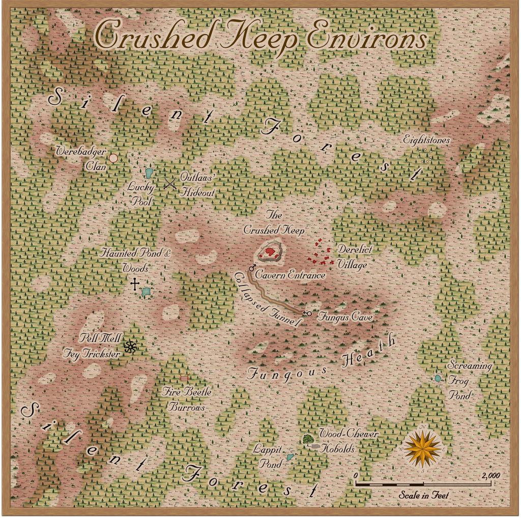
And a yellowed with age look:
Next time, we'll delve beneath Crushed Keep's small hill...


-
Ferraris Style MERGE Layer Problem
I discovered when using the Ferraris Style (CA158) over the weekend that clicking any of the symbol catalogue icons, except the Minerals/Mountains one, automatically changes the Layer to MERGE. Clicking to change the symbol catalogue by the manual system (the button between the "Options..." button and the currently-visible symbols) does not force this change however, keeping the Layer as whatever is currently chosen.
For anyone unaware, having any new items added to the MERGE Layer is an extraordinarily bad idea, as this Layer is part of what helps control the map effects. Unfortunately, it's very easy to accidentally do this because of this unexpected defaulting with this style.
Luckily, I spotted it before I'd added more than a few symbols, although it took a while to discover it affected all but one of the catalogue icons, and it was easily remedied, but ths behaviour is something prospective users should be aware of!

-
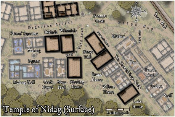
Community Atlas: Temple of Nidag, Stormwatch, Emerald Crown Forest, Alarius
With the main surface part completed, it was time to ascend in the properties with rising stairs. A new sheet was added appropriately in the stack to allow the addition of a "haze" blanket, to mist-down the lower level buildings and features. This was achieved very simply by adding a map-sized rectangle of the "Solid White 40" bitmap onto said new sheet.
After that, copies of the full wall lines (from the initial line-tracing, shown back in the second and third posts above, from the 2nd and 5th of November), the floors, and staircases were placed on three more new "Upper Storey" sheets, to give this result:
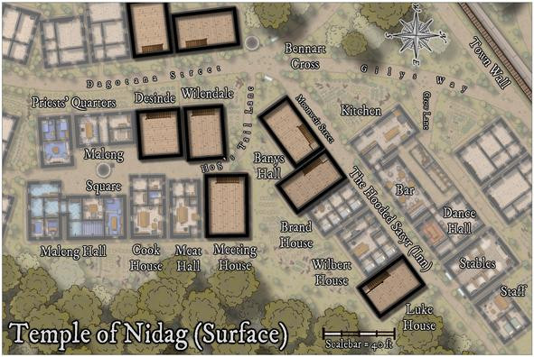
This illustrates too that higher features, such as the main trees and battlements of the Town Wall, were also set above the "mist" panel. The stairs look very flat at this stage, as they're essentially simply markers for where the stairwells will go.
The next step involved cutting holes to show parts of the existing stairs rising to their landings on this upper level. Of course, the holes had to be cut through not just the new upper-level floors, but that mist panel as well. "Color Key" effects on both sheets provided the mechanism, although to prevent any mishandling, colour 6 (magenta) was used only on the upper floors sheet; colour 4 (yellow) was used on the mist panel sheet:
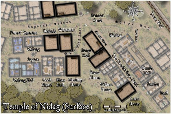
Further refinements would be needed to make these stairwells look a bit more real (including adding shadow lines and an upper banister rail), which became practical only after the new upper interior walls were in place.
One complication was that because I wanted the final Atlas map to have a toggle to hide or show this new upper level, everything had to be added only onto a new "Upper Storey" layer. That created a few issues later.
Next though was a much simpler step - adding all the new upper storey fireplaces:
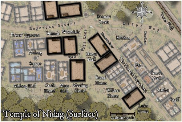
They're in the same places as those on the lower level, although some were moved a little subsequently to better fit their new locations.
Then the walls, windows and doors started to be added. This initially took a degree of organising, because to have things like doors and windows cut the wall lines, the walls MUST be on the "WALLS" layer. The wall-cutting tools and symbols don't function otherwise. Only they also have to be on the Upper Storeys layer to work in the final map! So this led to a lot of hiding and showing various sheets and layers at different stages of the process, which all needed to be done in order.
And (of course!) there was a further difficulty, because with identical wall colours and effects for both the upper and lower storeys, wherever the two levels of walling stacked, there were clashes of transparency acne oddities along some of the upper storey walls. So that meant adding yet another sheet, onto which the final cut new wall lines could be copied, with no effects, and their colouring changed, to stop that. Much of this was worked-out using the two west-side buildings, and a heavy use of the "Undo" function:
The process eventually stabilised per building as:
- Draw new internal walls
- Add door and window symbols inside (not on) the new wall lines
- Hide everything but the upper storey walls, window and door symbols
- Change the wall lines to be on the WALLS layer and unhide it
- Hide the lower walls (because they're also on the now-visible WALLS layer, so can be cut again too)
- Add new windows and doors to cut the new upper wall lines; then delete the previous door and window symbol markers
- Change the wall lines back to the Upper Storeys layer
- Copy the wall lines to the Walls Upper Mask sheet
- Change the colour of the wall lines on said Walls Upper Mask sheet
- Unhide all sheets and layers to check everything works, then turn off the Upper Storeys layer to ensure nothing's been missed that should be on it
One more, variable, interjection of an additional number-point anywhere in this list was:
- Scream in frustration (other options are available...) when something's been done wrongly, stop and redo said problem, possibly more than once.
Eventually, however, this was the result:
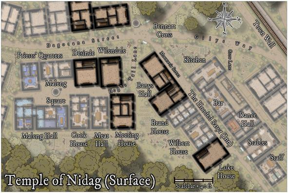
As envisaged, most of the upper storeys were to be dormitory-style communal rooms for cult followers, hence the large open spaces, albeit there is also the practical consideration if these were genuine buildings, to help reduce the weight the lower storey needs to support. The first buildings to be furnished show what this meant:
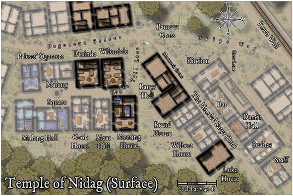
Meeting House is a bit different, with a library and a couple of somewhat higher-ranked cult leaders in separate rooms. As before, the structures not directly connected with the cult on the western map edge, are to be left unfurnished. The remaining three properties were not to be so left alone though, and this is the higher-res final version of this map:
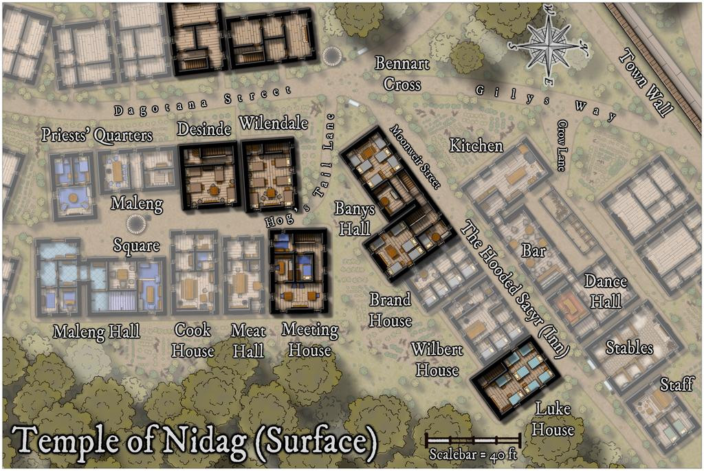
While not mentioned sooner, this view is now hopefully clear enough that the hinted-at connection between the two parts of Banys Hall, is obvious. I'd been intending this ever since deciding to place the two stairwells on the lower floor as they were.
Next time, the delve underground begins!