


Wyvern
Wyvern
About
- Username
- Wyvern
- Joined
- Visits
- 3,266
- Last Active
- Roles
- Member
- Points
- 5,585
- Rank
- Cartographer
- Badges
- 24
Latest Images


-
Ancient maps
That 22-foot Roman Empire map is the Peutinger Table, aka Tabula Peutingeriana, and the Wikipedia page includes a high-res complete image of the whole - may take a while to load, however, as the full-size JPG is about 15 MB. This is the direct link to that Wikimedia image.


![[Deleted User]](https://secure.gravatar.com/avatar/c75d9a245b74d9c59be0999ea81ca541/?default=https%3A%2F%2Fvanillicon.com%2F92add7f8c954488718110edc4896ad39_200.png&rating=g&size=200)
-
Trying to salvage a very old map....
If you're using the Outer Glow effect for the text, you might want to try just using Glow instead, as that sometimes seems to be less "misty" when used with text. Or you could try with a pale glow around some of the lettering, not a dark one. Larger text should help, certainly, but you may need to use different sheets for the different text sizes so you can adjust the effects more easily (and also perhaps separate sheets for the darker and lighter text colours).


-
Live Mapping: Character Artist 3
This is a very quick and dirty example of a very long-ago Monk character I ran solo back in the mists of time (about 1978?) who ended-up with a pet stirge, just using some basic CA3 options and the Stirge in a fancy circle from TT2, no labels, no tidying up, just a 10-minute rush-job:
Res is lousy, but it's really just to give an idea of how you could do this for a familiar or pet - if the image exists. Slap a couple of labels on, get everything neatly centred, frame resized and fully finished, with some nice sheet effects, and it would look perfectly acceptable, I think. You could even replace the wooden rectangular frame with a fancy oval one from one of the TT sets for the main character, say!


-
Interesting Political Take on the Mercator Projection
Interesting broader discussion here. The earliest surviving topographical (known-)world maps tend to show the map creator's country/city in the centre, and many are circular around that point. Wikipedia's Early World Maps page has some useful illustrations in this regard. While that may have had a political motive, there's also an eminently practical one, because then you're able to draw the world moving out from where you started.
Into the medieval period, European maps often had the eastern end of the Mediterranean as their central point, because of its significance for the dominant Christian religion there at the time, and were drawn as circles or ovals out from that area.
If the region around your home site ends up larger and more detailed, that's at least as likely because you'll have more, and far better, information about that area than any other, which you might visit - if at all - maybe once in a lifetime for a few hours to days, in ancient to medieval times. So there doesn't always need to have been a political-patron motive there, significant though that undoubtedly was for some early cartographers.
Maps for planning intercontinental aircraft journeys are still prepared with the originating airport at the centre, and extend out in a circle from there, for instance, to allow the selection of the great-circle line required to reach the destination in the minimum of time, using the least fuel possible.
-
Community Atlas: Embra - Wooded Places
Not content with the complexities of a spiralling maze-like design, Wooded Places map 4 was to be a complete maze, the Hydras In Smoke Maze, no less. An apparently overblown title, though one that may make more sense if you consider the woods hereabouts are always notably misty - hydra/hydro-"smoke", or very loosely "water-smoke", if you will... This one DID take quite some time to complete, as it's a big maze. Firstly, the whole map:
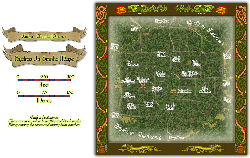
Then a closer view of just the mapped place:
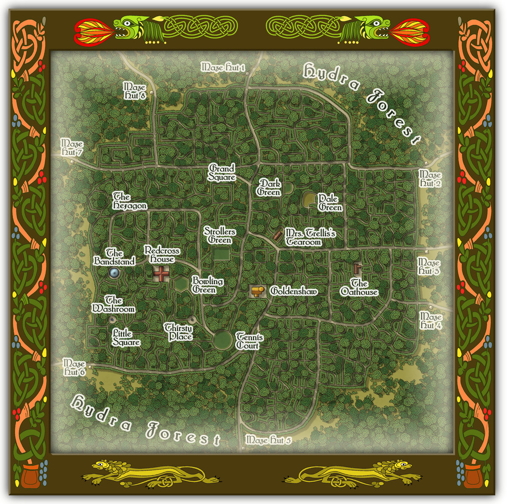
And for anyone wondering, yes it's THAT Mrs. Trellis (from the very long-running "I'm Sorry, I Haven't A Clue" BBC radio comedy series for those unfamiliar; don't worry if this is strange territory, as she features in the series only occasionally in confused, reported written speech). Here, she comes complete with a strong North Welsh accent, now and then lapsing into full Welsh when stressed, albeit also transformed into a powerful Faerie being, serving the most exquisite cream teas.
The handful of buildings have interior views as well:
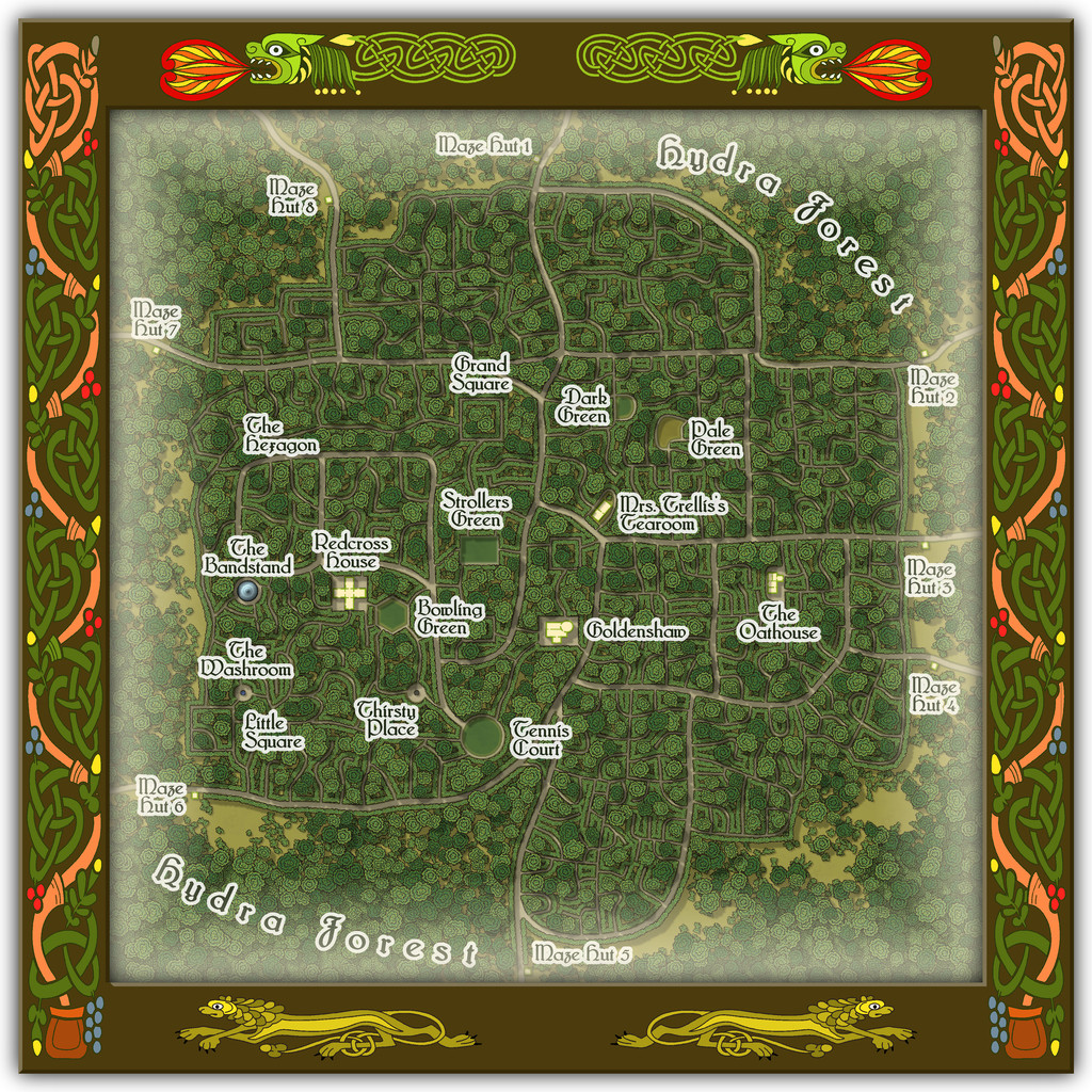
To help anyone struggling to define the maze pathways, there should be an extra toggle in the Atlas FCW file to show just that layout:
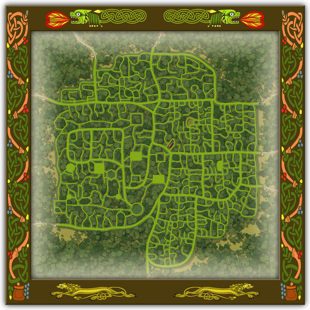
As you'll likely have realised, the choice of what went where within the Maze was very deliberate, such as the circular Tennis Court, the hexagonal Bowling Green and the Bandstand with no room for anyone to sit and listen to the music nearby, when other locations would have been clearly far more "suitable", had this been anywhere other than a Faerie city, at least.
-
Ricko's Questions
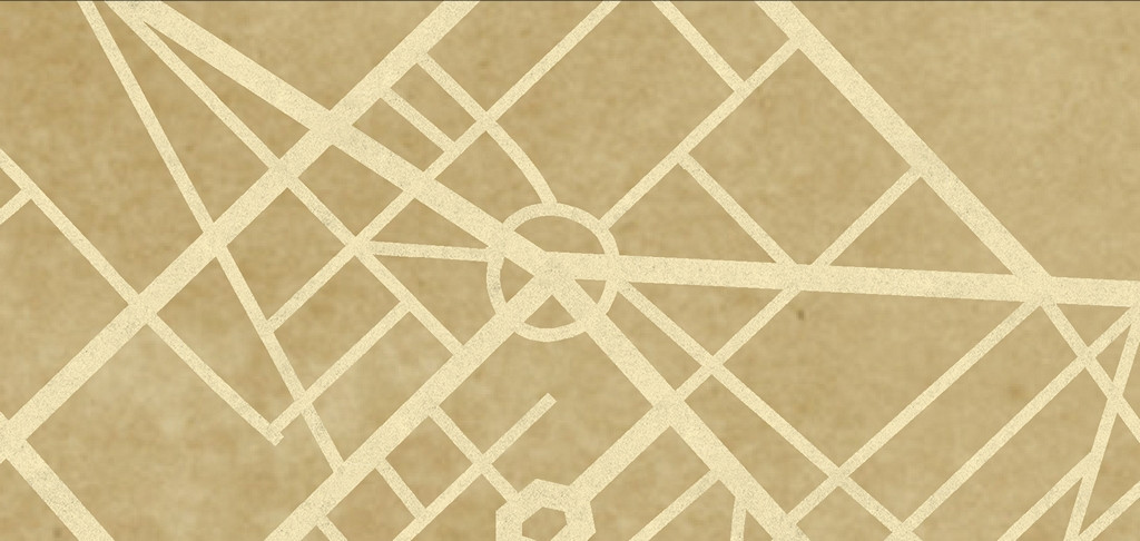
Ricko asked: I'd like to know how I can export the file in the highest quality possible, since exporting with JPEG Quality gives me a small, pixelated file on the street lines when I zoom in below 100%.
This will be for an A0 print.
I tried a couple of tests using the "Save As... - Rectangular Section JPG" option in CC3+.
Ordinarily, I use a small amount of antialiasing on JPG exports, generally 30% to 35%, and forgot to turn that off, which meant the export failed! So I tried again with Antialiasing turned off.
I suspect the single key thing is to ensure the final export size is set to for A0 paper, so I turned that up to 119 cm. This is my settings pane:
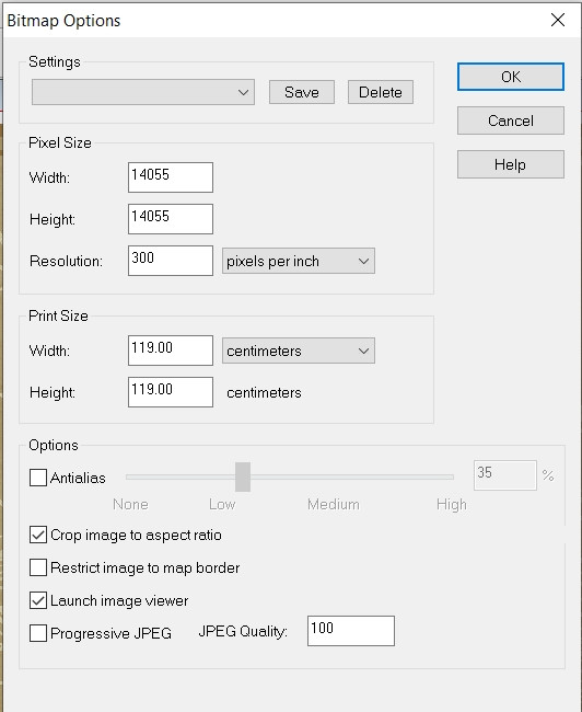
And then I ran the export. The final file size is about 66 MB, but this is a sample zoomed-in to be 100% and then resaved as an image the Forum will accept (so it's smaller than the true 100%). However, when I was zoomed-in at that level, there was no pixellation whatsoever on the roads. This is that smaller image, but using the above settings:
I think all you really need do is ensure the final image size matches the paper size you want the export for print to be - A0 in this case. Good luck!

-
Sticky Note Dungeon
But one corner isn't curling-up where the glue hasn't stuck properly, unlike the real things 😉!
-
Commission Map - Realm of Arduin
Yeah, this is really big! Presumably going for a wall-hanging poster-sized version if it's to be printed-out, I'd imagine, or all that intricate detail is going to be lost!
Congratulations on getting the borders to work with the dash and double-dot arrangement with no issues. These things are ever a nightmare in CC3, I know. (And on the more detailed view, all the other dashed lines as well!)
On the easy-to-view Forum version, I'm losing the knotwork corner details in the mountains especially - the colour's too similar. Maybe try a glow of some kind, or maybe a different shadow to pull-up the decorative elements?
The "Khorsar" label right beside the "Arduin" cartouche is very distracting; one or other would benefit from moving further away.
The surrounding nation/area labels aren't as clear as they might be in places, ironically including the Khorsar one, particularly where they overlie the mountains. Again, maybe a glow or shadow would help.
Is there a particular reason why only the Ozharen border has been colour-highlighted? That name-label might be tweaked slightly too, as the "O" is currently a little too near the map border overall.
The scalebar and compass rose are partly buried below the lower-left corner decoration currently, and the North point of the compass rose is obscuring part of the "Talafar" label.
On the more detailed Gallery view (and also on the Forum view version), the watercourses maybe aren't as clear as they could be, notably again in the mountains, plus in the woods at times. In places, they also seem to be impossibly narrow, to the point of almost vanishing, between far broader stretches, which looks odd, if perhaps required as a quirk by the commissioner (given how common these features seem to be). Several lakes appear rather too angular as well, though again this could be simply a required quirk, as they too are pretty frequently-seen.
The City Cliffs symbols in The Great Rift area could perhaps use some tweaking, as they look rather too angular in places, compared with how nicely curving they are in others. This could be worth considering too in that Devil's Footprint crater.
In the lower right corner, there's a tiny label that I think reads "Gast Water" which is too close to the corner decoration. The "Maragore" label could be moved lower, to fit within the border lines better, and the "Barbarian Hobbit Tribes" label it's currently partly obscuring should probably be moved as well, and perhaps set-up on two text lines, not just the one, to shorten it to fit with the moved Maragore label.
That's what I spotted easily in a quick check, at least, though obviously many of the smaller details can't be viewed properly even using the Gallery version.
Good luck!

-
How do i know what i currently have installed?
Go to CC3+, find the drop-down menu "Tools" in the bar along the top of the window, and then go to the "Add Ons" label in that drop-down. That will show you everything you have currently installed, and you can click on any one of those names to access each individual item's description in an HTML file.
-
Panzer sample thread
Looking good!
I agree on the ground tracks point, particularly for the six and eight-wheelers as they had variations on independent steering per wheel group (and the four-wheelers had independent wheel drives too), so could give much broader overall track spreads.
It might be helpful to have an additional group of aerials to fit to the command vehicles variants (e.g. both the 231 variants, the 232s (6- and 8-rad) and the 222 variant 223), as these are such obvious fixed features in an overhead view, and they have to pass above the turrets, so would need to be drawn that way to allow for the turret pieces to rotate properly.
If you're including the 247, you might want to have the Kfz 13, and the variant Kfz 14 command vehicle - again, it has an overhead aerial, if no turret problem this time!
There are also the SdKfz 221, 260 and 261 (radio car variant of the 260), which you might be able to draw as simply variant top structures/turrets, as being similar to the 222 overall. The 231 (8-rad) headquarters variant, the 263 might be another possibility, along with the 263 (6-rad).
I'll go away now 😎


