Wyvern
Wyvern
About
- Username
- Wyvern
- Joined
- Visits
- 3,266
- Last Active
- Roles
- Member
- Points
- 5,584
- Rank
- Cartographer
- Badges
- 24
Latest Images


-
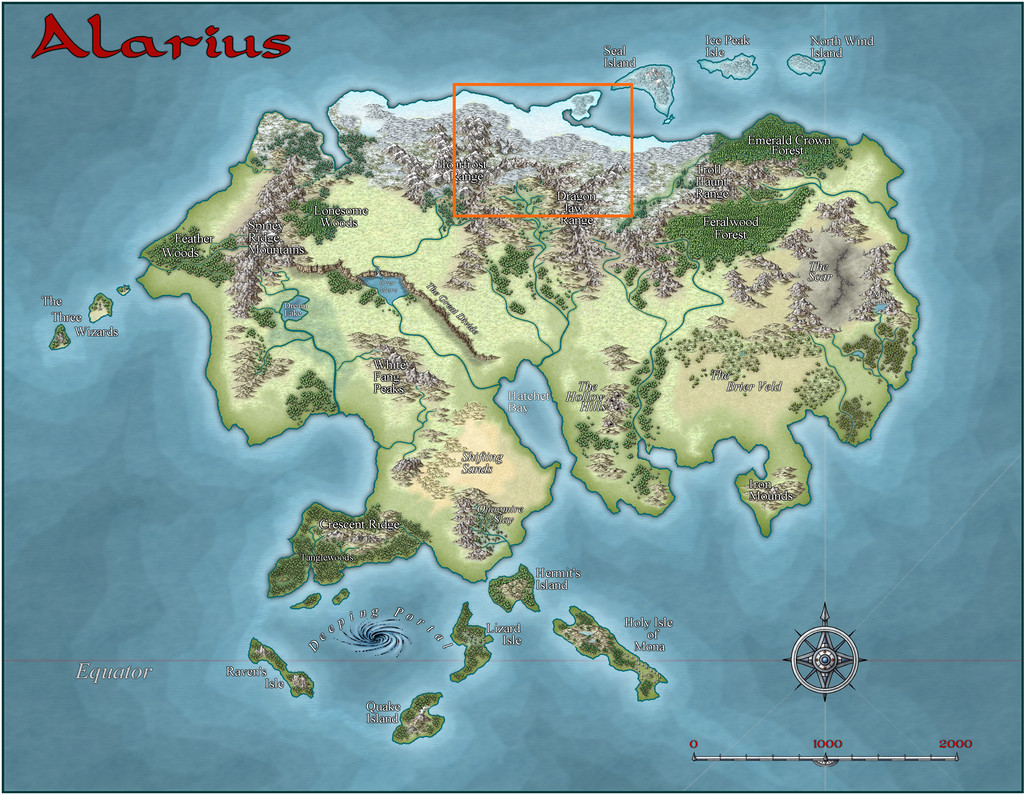
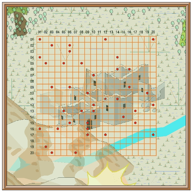
Community Atlas: Petroc Hills area, North Central Alarius
As mentioned with my previous map in this series (Gruvrå's Mine in Peredur), for the next, I'd be returning closer to my "home" territory in Alarius, as the map chosen to place this one in was the Alarius North Central region:
The base map from the Inkwell Ideas geomorphic dice rolls was another using just two designs from the "Delver" set, so I checked the Inkwell book for these (the "Dungeonmorph Book of Modular Encounters: Delver, Trailblazer & Voyager Edition"), finding there an interesting group of suggestions of which I ended-up using rather a lot in the final map and accompanying notes. They also influenced where the map could be placed within what is really a vast area of Alarius.
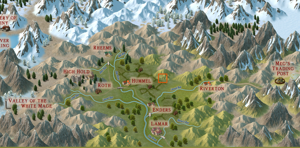
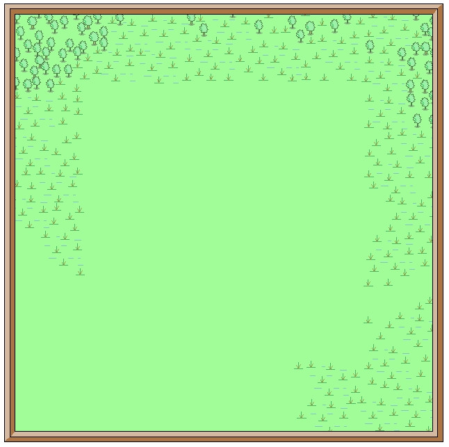
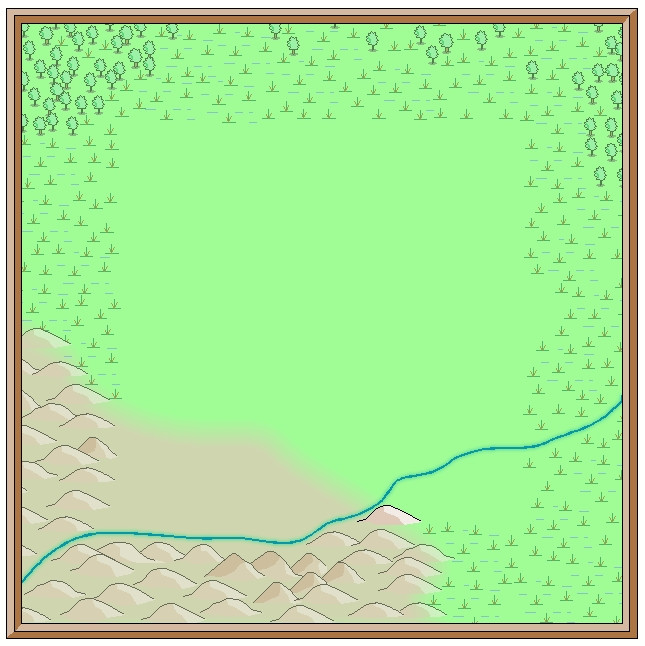
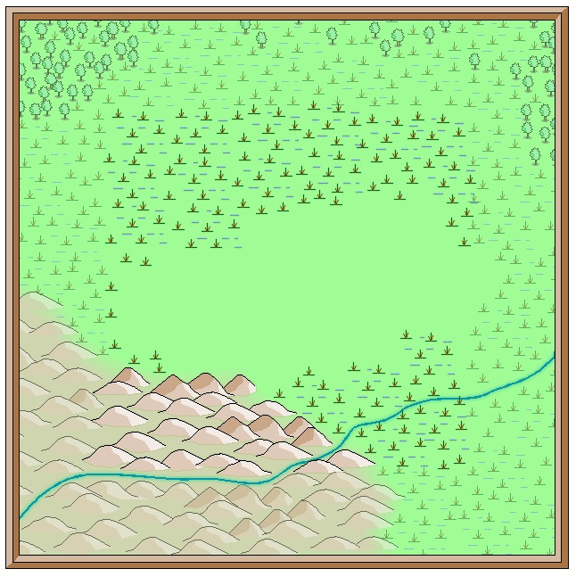
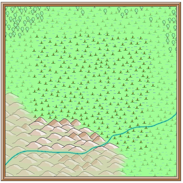
Indeed, several smaller maps have been set within the Alarius North Central region already, so I checked those. As I couldn't find quite what I was looking for among them, I decided to pick a fresh spot suitable for a new area map, on the edge of the large agricultural basin around the Elm River's headwaters (that's the river large and important enough to be shown even on the continental map above). In both the next images, the orange-outlined square of my selected area is 20 miles per side:
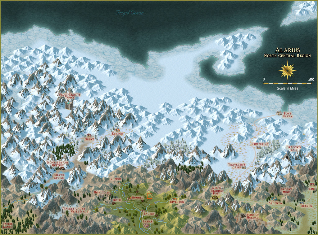
This is right on the edge of the "civilised" lands here, around 56° N latitude, and from the appearance of the terrain, a cool temperate spot, but not iced-in year round thanks to being sheltered by the mountains surrounding the fertile riverine plains. Then I devised a hand-drawn graph-paper map for it, with the main terrain types sketched-in, and randomly rolled up some feature options, this time chiefly using just my own random tables. These in turn led to the main watercourse layout, based on where the settlements and other points of interest were. During this process came a realisation that there were quite a few "awakened plant" and "interesting wildlife" features which fitted nicely with the loose druidic theme already generated from the Inkwell Ideas dice book.
And so to the CC3+ mapping. Following my attempts in recent maps of this group to combine more-or-less matching overland and dungeon styles, I thought it would be worth trying-out the Jon Roberts overland and dungeon styles, using the Cartographer's Annual 190 Jon Roberts Revisited overland style for the small area map:
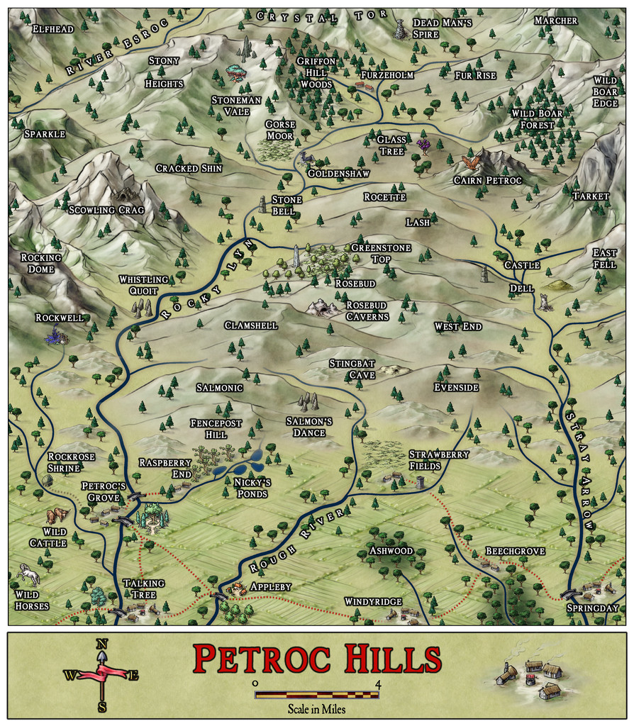
So, welcome to the Petroc Hills! After finding I'd be having giant eagles on this map, I decided the local dialect term would be "petroc" for them, as meaning "small" or "little" roc (= gigantic bird), which also accounts in part for the repeated reuse of "roc" and "rock" in the names (because the pronunciation's the same!). As luck had it, the random locations for some of the settlements on the farmland were close to the map's southern edge, and I decided to site them right on, or extend them slightly over, that border, helping to reinforce that edge-of-civilisation theme. Plus I dislike having maps of this sort which show too marked an "edge of the world" effect. Thus of course, many hills are just peeping onto this map from beyond it too.
I found this style a delight to work with, as the terrain symbol drawings are of such high-quality, they can be greatly enlarged, yet still look superb, and I was especially pleased to find that by rescaling the farmland bitmap fill, the pattern in it would work perfectly for each diamond shape to represent the size of an individual farmstead or family group of smallholdings at this scale, without having to include every farmhouse. When it came to naming the features so-mapped, I found just the hill shapes and forms to be sufficiently inspiring, without having to resort to random tables for their names, and in some cases, their characters. And I did like that pastel grey-green, watercolour-like colouring; very restful 😎 .
However, the style's range beyond the non-terrain symbols is rather restricted, with just a single fashion of settlement types, and some basic trees, so I also used some of the Mike Schley, Herwin Wielink and standard CC3+ overland symbols to indicate others of the special features. Most don't seem all that out of place here, luckily.
For those interested in such things, most of the settlements are predominantly Human in population, although there is a sizable Hill Dwarf community in places (their main settlements are at Appleby, Strawberry Fields and Furzeholm), along with features such as a glassworks in the Strawberry Fields area and apple orchards at (naturally!) Appleby, while most places - even some of the small farmsteads - have their own minor breweries and distilleries, as the whisky from places here is highly prized elsewhere.
Out in the wilds, we have stingbats (that phrasing a minor in-joke for any Shadowdark RPG enthusiasts 😊), which are essentially the blood-sucking, small bat-like creatures called "stirges" in D&D, griffons, cave bears and wild boars, aside from the giant eagles, and also a community of Stone Trolls at the top of Stoneman Vale on the great hill of Stony Heights (also called Griffon Hill). Stone Trolls here highly prize certain kinds of stone, and especially jealously guard the magical Jewel Tree in "their" Vale (it fruits genuine gemstones each autumn).
And right in the middle of the map, at the foot of Rosebud hill, we have Rosebud Caverns, the little underground complex, and cause of all this mapping...


-
Show me your science fiction maps!
Not sci-fi, since they were all done for the Nibirum Community Atlas, which is all fantasy mapping, but they were done in the general style of planetary-system mapping, so may still be of interest. However, I did a series of maps for said Atlas back in 2018 - Forum thread here, Nibirum Solar System start page here, with a sample map to give you an idea, just for the inner planets:
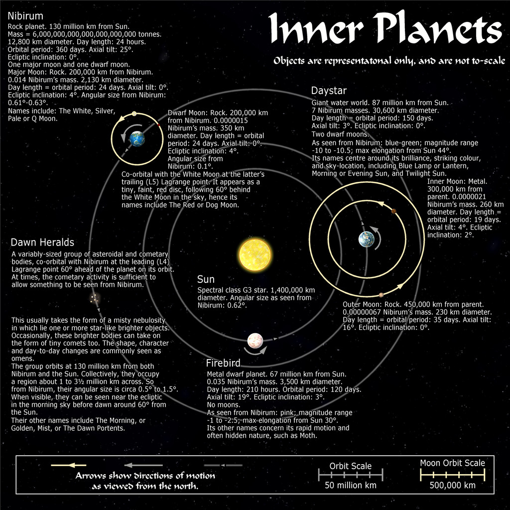
All these maps are also in my Forum Gallery here.


-
[WIP] Community Atlas: Snakeden Swamp, Lizard Isle, Alarius - Dedicated to JimP
So, back for an update today!
Opening the New Drawing Wizard, and naturally picking the CCPro Overland style, I set-up a 30 by 30 mile square area (to give room around the base 20-mile-square mapped region for a title, possibly some labels, and suchlike), and changed the background colour from its default sea-blue to green, to fit the landlocked swamp I had in mind. Then I went to set-up a new BITMAP sheet and layer to import the base map image into, and was surprised to find there was more than just a single sheet available (which was what I'd expected), and that some of those sheets already had effects on them. I'd been assuming I'd be working without sheet effects (beyond a transparency on the BITMAP sheet, at least). This though opened up some fresh possibilities, as one concern I'd had was that a lot of the early vector symbols and fills use zero-width lines, which tend to vanish when extracting higher-res images. Being able to add elements like glows could help them stand out better, so this was going to be a somewhat more sophisticated map than I'd anticipated!
This is the opening scene with just the imported bitmap image in the map (I'm keeping these opening images deliberately under-sized for the Forum, as there's fairly little detail on them):
And this is it with the transparency effect on:
Next, I started sketching-in some base terrain elements beyond the centrally-mapped area, using only symbols, to have more control over their sizes. Here, I'm working with the BITMAP sheet's transparency turned off:
This is the appearance without the bitmap image entirely:
One advantage of this vector mapping style is that you can add effects such as transparency to the symbols sheets, and see - as here - that the symbols fade out a little, which is what I wanted to do for the area beyond the mapped zone, showing the terrain there still, yet without so much detail. There's no need for technicalities like the forced redraw command that would be needed for raster symbols, though these were all set-up on their own new sheet, of course. The symbols, incidentally, were all from the extensive "Filled" vector set available under the CC3+ overland style, which was the default set available on opening the new map.
The next snapshot shows this whole border zone completed, with the hills and river added, as well as a background colour showing the full extent of the hills into the central region as well:
I amended the edge fade on the terrain sheet to retain the softer transition at the edge of the hilly area. The perceptive may notice too that one hill seems a little less transparent than the others, as that one's now on the main symbols sheet, that has no transparency effect on it. That difference is a little more obvious as the central area gradually fills-in fully:
With that completed, deciding what symbols would be suitable to highlight the features on the fully-mapped area could begin - next time!


-
Community Atlas: Kara's Vale, Ethra, Doriant
Back to topic!
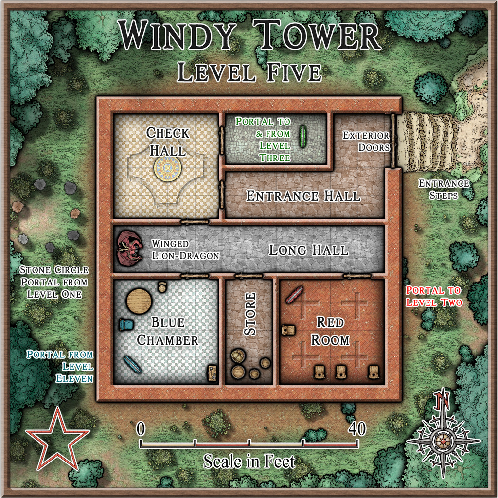
Windy Tower: Sited near the east bank of Summer River in the Kara's Vale map's northwest, northeast of the line of Quarry Cliffs, and surrounded by jungle, is this fabulously ancient Tower, said to be a Wonder of the Ancient World. Notable for its unusual red stone.
Which is a slight paraphrase of the Kara's Vale map notes about it. I'm not sure quite why, but my thoughts for how this might be mapped drifted away to a 50-year-old fantasy skirmish wargame from 1976 called "Citadel: A Quest Within A Wizard's Tower" published by Fantasy Games Unlimited. This used basic thin-card-printed maps (brown ink on pale yellow card) drawn to 25 mm scale (the general height of cast-metal, normal-human-sized wargame miniatures back then), with square, thin card markers for the creatures defending the tower, the treasures and traps inside, and the connections between the different tower levels. Hero miniatures had to be provided by the players, and their relative strengths also decided that way, which made for quite a bit of work in advance, before being able to play the game originally. There were six card maps, printed on both sides, giving a dozen different floorplan layouts, only six of which were used per game, and the blank reverse counter sides created a fog-of-war situation, meaning the heroes had to check every counter to navigate their way between the tower's levels, find the treasure, and battle the monsters, without knowing what each counter might be in advance. As a game, it was OK, though often quite lengthy to play, and the card markers made it very easy to accidentally knock things out of position, albeit these were common elements in other games of the period. It also didn't look great, so we sometimes substituted monster miniatures for the card markers, only to then forget what strength each monster was meant to have... Joys of youth, eh?!
Feeling this to be a suitably Ancient Wonder of the World, I thought it would be interesting to adapt it for the Windy Tower maps. The floorplans meant the layouts for each level were available straight away, although those were amended in places to add doors (the original game had none) and a few extra walls. The connections between levels were originally portals in essence, because any on a given level might go to, or from, or both to and from, any other level in the tower, a concept retained here too, along with the two main treasure options, an amulet and a talisman, and the use of three types of defending creatures. In the original game these were "humans", "near-humans" and "non-humans" of varying numerical strengths. That, and the general "ancient" concept, drew me to warriors and mythological creatures from ancient Mesopotamia on Earth, because artworks from the 3rd to 2nd millennia BCE and later there show a similar range of beings - humans, demi-humans and non-human creatures. We know very little about any of these, even archaeologically for the human warriors, so there'd be options for some suitable expansion and interpolation of fantasy elements here.
Having got this far, with a list of possible options for all three defending creature types, some semi-random rolls helped decide what was where (limited so as not to have too many creatures or portals on any given level), after a further decision had been made to use all twelve tower floorplans, so Windy Tower would have twelve levels. Naturally, not all the creature options were chosen in the final version, but those that were are all provided with notes in the Atlas version (and here too for clarity), with statistics for the Shadowdark RPG, to help provide some pointers to their strengths, powers and abilities.
And so to the map. As each level in the Tower is an identically-sized square in area, there was the possibility of setting up twelve separate Atlas maps, using a simple copy & paste option between each map to draw their outlines and other basic features. However, that seemed a bit "ordinary", and as part of the point of this project has been to try new (for me) things from time to time, I decided instead to draw the Tower in a single map, with the contents for each level on its own Layer, and then to set-up hyperlinks for the portals on each level that would then allow one click on said portal to show each Tower level as it was encountered, using the FCW version of the map. After first checking with Remy Monsen to ensure A) that this wouldn't cause problems with the normal Atlas navigation processes, and B) that I had the correct macro commands to actually do this!
Following which, the mapping could begin. As the connections between levels were randomly set, including the surface entry point, the first level encountered when approaching from outside is Level Five:
While the original floorplans were fairly basic, they did commonly show variations between the flooring in separate areas, so something of that concept was adopted here too, with effects and furnishings to liven things up further.
One significant problem was finding suitable markers for the different defending creatures per level. I'd already decided that these would appear as statues until activated by intruders in their part of their own level, so their starting locations needed to be identified. However, the range of top-down statues and creatures in the Mike Schley style - even with all the monthly symbol options - is extremely limited, especially as some of the statues have large bases as well. Adding the original DD3 creature options only helps marginally, again thanks to a limited range of options, most of which don't include varicolor that will allow creatures to appear as statues instead. So the creature options used here were purely a compromise, using varicolor shading at times to separate the different kinds, and occasionally adjusting the sizing as well for the larger non-humans.
From Level Five, we have portal options to go to Levels 2 or 3, but rather than following such convoluted paths in showing the rest of the maps, the remainder will be presented simply in numerical sequence.
That though will have to wait for another time - like the notes on what a "Winged Lion-Dragon" might actually look like!

-
Community Atlas: Embra - Travelling Places
Which brings us to the last map in this group, covering the eight "ways":
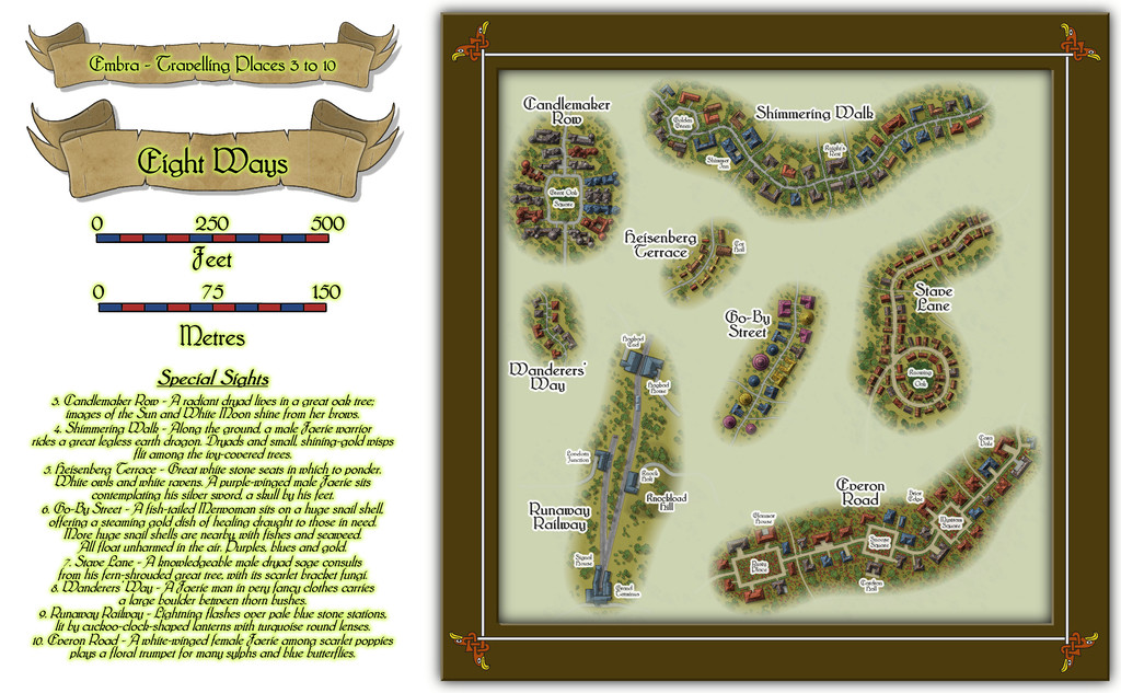
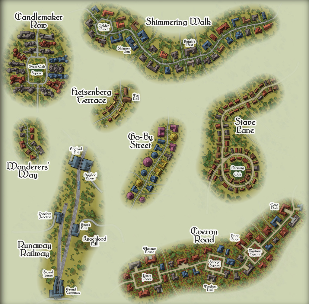
While the seven streets were constructed randomly from the simple system I'd devised and used previously, the railway needed some further adaptations, reducing the angles turns and junctions could have, and such like. In drawing the final maps, I kept the roads deliberately free from as much obstruction as possible (vegetation and the proximity of the properties along each), since the essence of Travelling Places relates to movement. In the accompanying notes, I've suggested GMs should allow speedier normal movement when using any of these routes, as long as the party sticks to the way itself. And naturally, there are oddities. Such as the large, complex building shapes along Candlemaker Row, where sadly, I fear the giant standing candelabra that light this route at night will be barely visible, and likely unidentifiable, at the Forum's resolution on the above maps. So let's try this view instead:
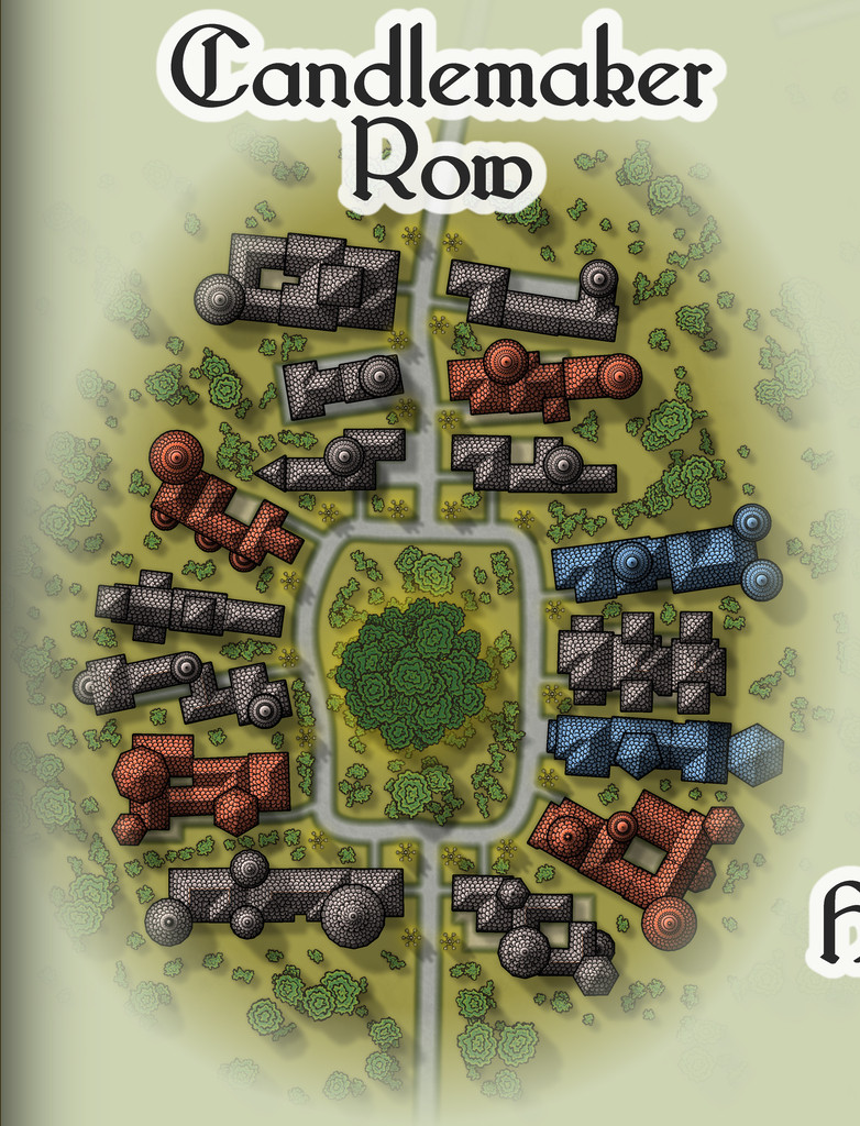
That weird loop in Stave Lane came from the construction process alone, which was a pleasantly amusing surprise when I plotted-out what the dice had rolled for the first time, especially as it made Stave Lane - a name yielding expectations of being straight and direct - one of the most convoluted of Embra's mapped streets!
Heisenberg Terrace, naturally, isn't always there, while the bazaar in Cat Hall is run by a humanoid feline, Shrew Dinger... Go-By Street is easily missed too, without care (aside from being a test for people's knowledge of fantasy literature; a good spot to place The Genuine Magic Shop, perhaps - despite its different author). The literary origins of Everon Road's name might be an easier test though.
As for Runaway Railway, aside from the real-world city of Edinburgh (very loosely the inspiration for some of Embra's place-names, as well as its actual name) being a major railway centre in Scotland, it also has the surviving remnants of a far earlier horse-drawn passenger rail-line, the "Innocent Railway", so I felt I had to include a railway of some sort in Embra. It's obviously short and simple, though as with everything else in Embra, its size can be as deceptive as GMs require. Rather than get bogged-down in detailing the line's operation, I chose to have the rolling stock run by the magical forces of electrickery (see Wyvern Citadel on this, if necessary). Conveniently, the featured text - and remember, these things were chosen randomly! - involved lightning flashes, which made that decision very easy.

![[Deleted User]](https://secure.gravatar.com/avatar/c75d9a245b74d9c59be0999ea81ca541/?default=https%3A%2F%2Fvanillicon.com%2F92add7f8c954488718110edc4896ad39_200.png&rating=g&size=200)

-
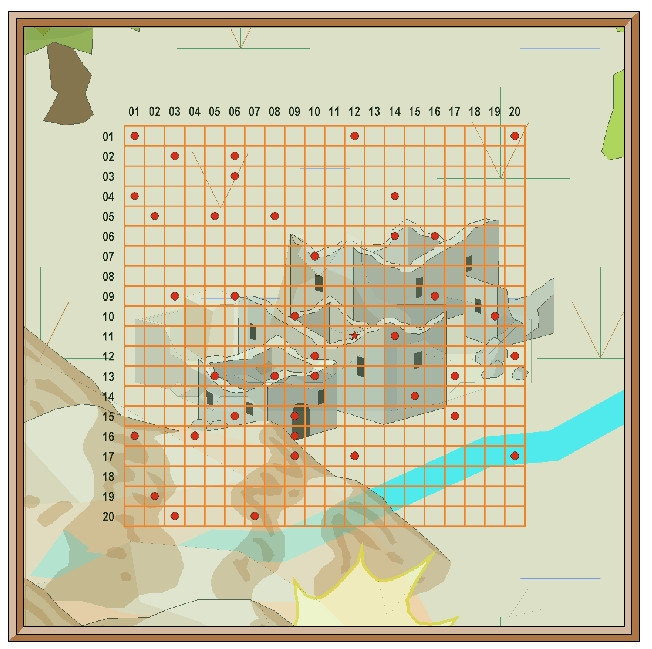
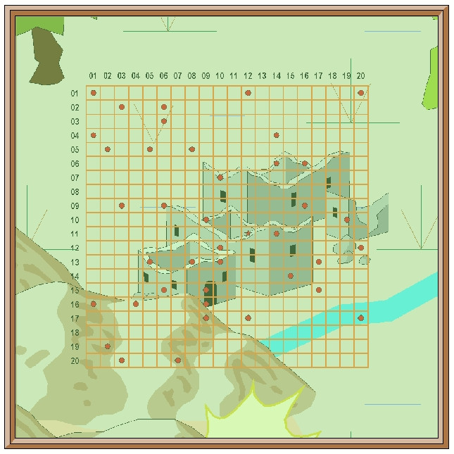
[WIP] Community Atlas, 1,000 Maps Contest: Villages in The Whispering Wastes of Haddmark, Peredur
Having thus generated the surrounding wilder lands, it was then time to construct the random, geomorphic-dungeon-designed map, as noted earlier, using the OSR Dungeon style from the 2015 Annual, in the manner established for my immediately prior map, again mirroring that used in the Shadowdark supplements. Since the Inkwell Explorer dice are one of the sets for which no written descriptions are available, I'd had to work up some ideas about the content well in advance, so seeds for some could be planted in the regional Whispering Wastes map. One of the random map designs for this layout was a fairly obvious temple structure, albeit with a curiously crystalline-looking central focus:
Having tried a few random rolls on the main Shadowdark tables, I came up with a cult that spoke only in whispers (which of course ultimately developed into the area's name), but nothing that seemed to match the temple's crystal focus. So I turned instead, and rather by-chance, to a free PDF Shadowdark supplement, created by the online Discord community earlier this year, which allows the design of slightly weird mega-dungeons randomly, on-the-fly. This is called "Shadowdome: Thunderdark" (SD:TD), and was used to create a random mega-dungeon, run through by two teams of players in direct competition, at Gary Con 16 in Lake Geneva, Wisconsin, USA, in March 2024.
I began with a few random rolls from tables in SD:TD, and stumbled onto several items with a crystalline theme that way. Some quick adaptations to extract other related features, more random rolls and a few deliberate choices, and suddenly the layout became The Crystal Cathedral of the Whispering Wastes, or "Crystal Cathedral" for short:
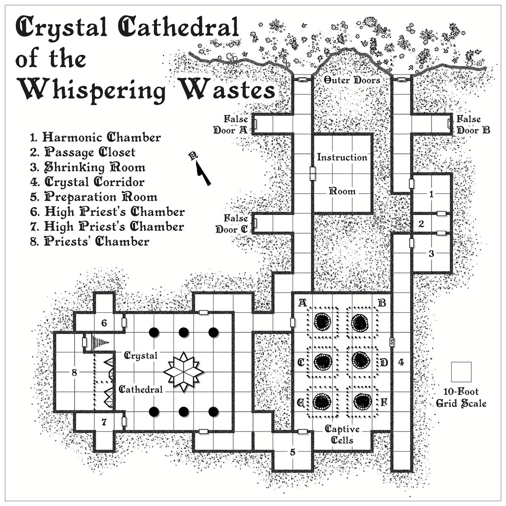
This was located, hidden away and hard to find, in Lightning Ravine, Hex 1002, with the Outer Doors opening onto a ledge partway down one of the side-canyons in said Ravine. It was rather fun to watch the whole coming together from what was provided by SD:TD, with some expansions and a little adaptation in places.
Ultimately, the process provided a gigantic creature, "The Shimmering", that was living in the crystal, and which had descended from the stars long ago, sinking into the earth and creating a protective crystalline casing for itself. It had set-up a cult of humanoids (The Shimmering Cult) to provide living creatures it can feed upon, turning them into fresh parts of the crystalline features scattered throughout this little complex, with a view to eventually having sufficient power and energy to return to the cosmos. (Freely acknowledging here influence from Lovecraft's "Colour Out of Space", and Nigel Kneale's "Quatermass 2", where even the cult acolytes receive a small "mark".) The cultists become transformed into parts of the crystalline structures eventually, gaining extra powers and abilities along the way. Plus parts of the cult can be found in other places in the Whispering Wastes, as the notes for that map, and this one will suggest. Cultists who are always on the lookout for lone travellers and others who seem unlikely to be missed...
Ordinarily, that would have been that, submission ready for the Atlas, and I'd have been moving on to the next small dungeon map in the series, intended for somewhere in the Feralwood Forest of Alarius. However, while I was finalising the notes for both these maps, Remy Monsen dropped-in the 1,000 Atlas Maps Competition. As noted in my first posting here, the Shadowdark hex-mapping system allows the creation of individual sites as well, including settlements, of which there are ten on the hex map, all village or hamlet sized. As I'd already done the basic layout designs for these in preparing the map notes anyway, I decided to try mapping all ten. Whether they'll all be finished before the contest ends is, of course, another matter. I will complete them, if other things allow, regardless of that though.
First village is to come next - Ljungby (Hex 005)!


-
Community Atlas: The Hall of the Seer, Glaciär Kristol, Ezrute
Third map in this group, for the Hall of the Seer, was actually drafted first, using the same style and look as established for all four underground maps in this "Explorer" dice batch, using the two dice designs involved for the layouts of the above-ground and subterranean segments, as mentioned last time. It was really this map though that led to establishing the "gritty" look of the stone-edged roads and paths outside, largely to help give a better contrast between the outside and inside of this little complex. Originally, I did think of just using gravel-filled polygons for the roads, but that appeared confusing with the similar dot-shading to represent the solid interior of the hill lying adjacent to the entrances. Ultimately, I did use the polygon drawing tool for both, altered by the stone edging outside, which with the trees, buildings and blank ground surface seemed to provide sufficient contrast.
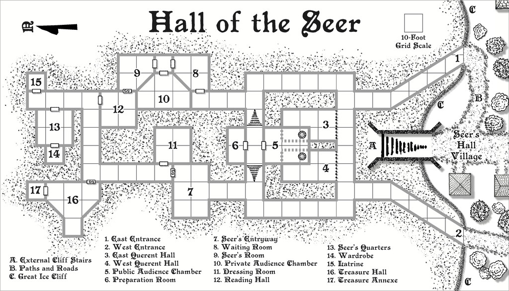
For the internal layout, this was largely what the dice designs provided, omitting the geomorphic connectors in places beyond this layout, and adding one secret door between rooms 9 and 12, as I wanted to provide an inner sanctum as the private domain of the Seer herself. This was chiefly because (and there are hints in the label descriptions) that the Seer had been randomly determined as a Frost Dragon from Shadowdark, modified here to be also an ancient, prophetic creature, able to shapechange to various forms under the local magical influences. There are also three "ordinary" Ice Dwarf Oracles as well (lesser, humanoid seers, in effect), who live in the Village, and provide aid and prophecies here too, when required. I decided to really push the legendary significance, importance and reliability of the Seer - who has the randomly-determined name of Leminsiskiel - to help enhance the significance of this little site overall. After all, there needs to be a serious reason for folks to traipse across the vast, frozen wastes of the surrounding larger region to get here!
As ever, there's more detail in the accompanying notes for the Atlas as to how the set-up here works, as it's not really intended as the traditional kill-the-monsters-and-steal-their-treasure dungeon, more a living place of importance for the lands around - and perhaps even further afield.
Next time, I'm heading off to map somewhere a little more tropical, a site in the Demosthenes Swamp of central-southern Artemisia, according to the random rolls...

-
Community Atlas: Embra - Travelling Places
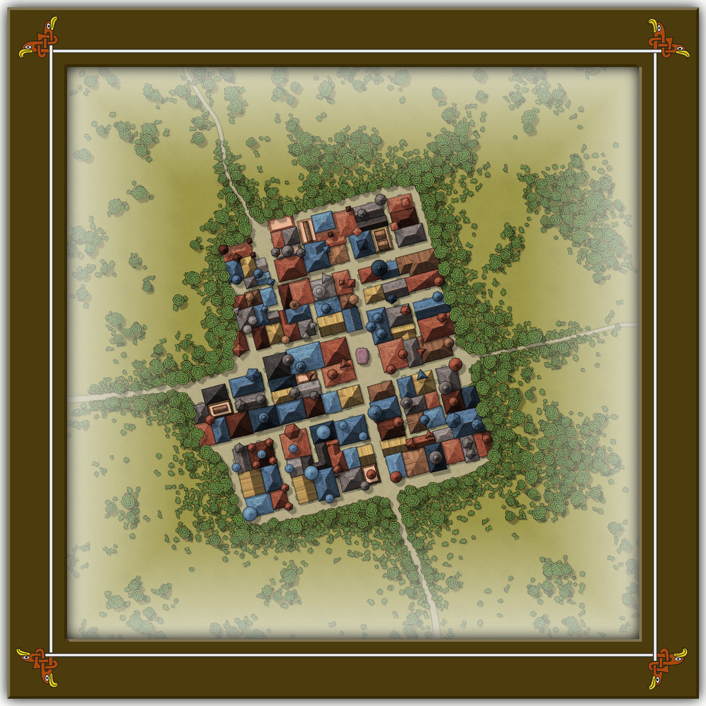
Travelling Place 1 is Toll Cross, which as we see, is an unusually heavily built-up area, surrounded by dense greenery, beyond which is open grassland or moor:
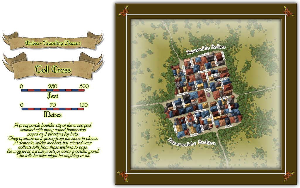
While the base-map was a similarly heavily-urbanised area, the nature of Toll Cross (and indeed even its final name) derived chiefly from the accompanying featured text, and especially that demonic satyr figure. The Impassable Hedges mean anyone wanting to visit the shops or houses here, or even just pass through it directly as a crossroads, is channelled into using one of the four access-routes. Then I adjusted the layout of the buildings slightly in places so those on foot can get to only a fraction of the properties inside unless they pass through the central Boulder Square, where Guess Who waits, like a spider in a web... This view is with the labels turned off to get a better impression of the settlement:
This looks a bit odd (or at least, it's meant to), with some strange rooflines, and what seem to be many towers. An extract from the accompanying text and PDF file may help explain:
There are...many tall spires and tower-like structures of different sizes and forms, some of which are visible above the trees from outside the settlement. These features are all entirely solid, and appear to have simply grown from the roofs and upper walls of the buildings. Few are straight, and many could pass for horns. Quite a number of roofs overhang their properties as well, and can give the impression of being ill-fitting, or as if they were worn as wigs that have slipped slightly. The whole can be quite unsettling for those not used to Faerie, and even those visitors with Faerie blood may feel there is something a little off-kilter about Toll Cross.
Despite the range of building shapes and sizes, they all have just a single accessible storey at ground level inside, as the toggled view to show the building interiors indicates:
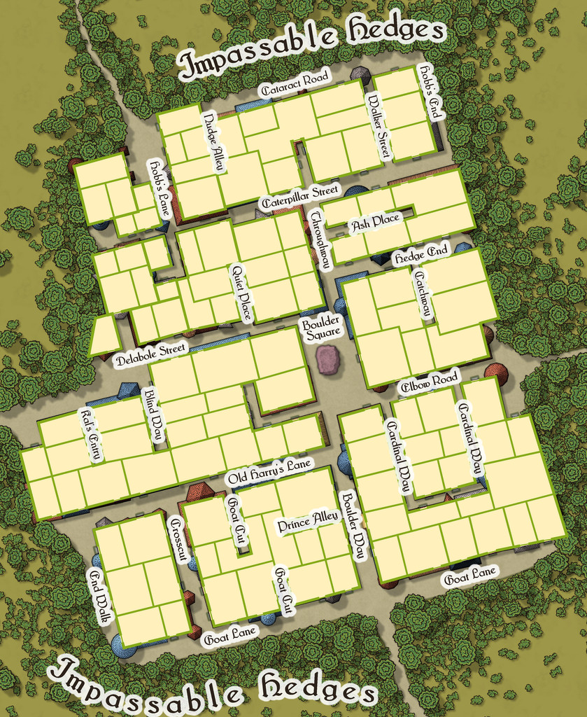
This also shows just how much some of the rooflines, and particularly those horn-towers, don't marry-up with the building outlines, yet the buildings, thanks to their lack of internal connections, further help block any attempts to avoid using Boulder Square. And if you try to fly in, it turns out those roofs aren't so immobile as they may appear...

-
Community Atlas: Embra - Crossing Places
The last of the individual Crossing Places maps covers the part of the Twilight Market here, Slateford Market (with a second view below showing just the map, hopefully for a little better clarity at the typical Forum resolution):
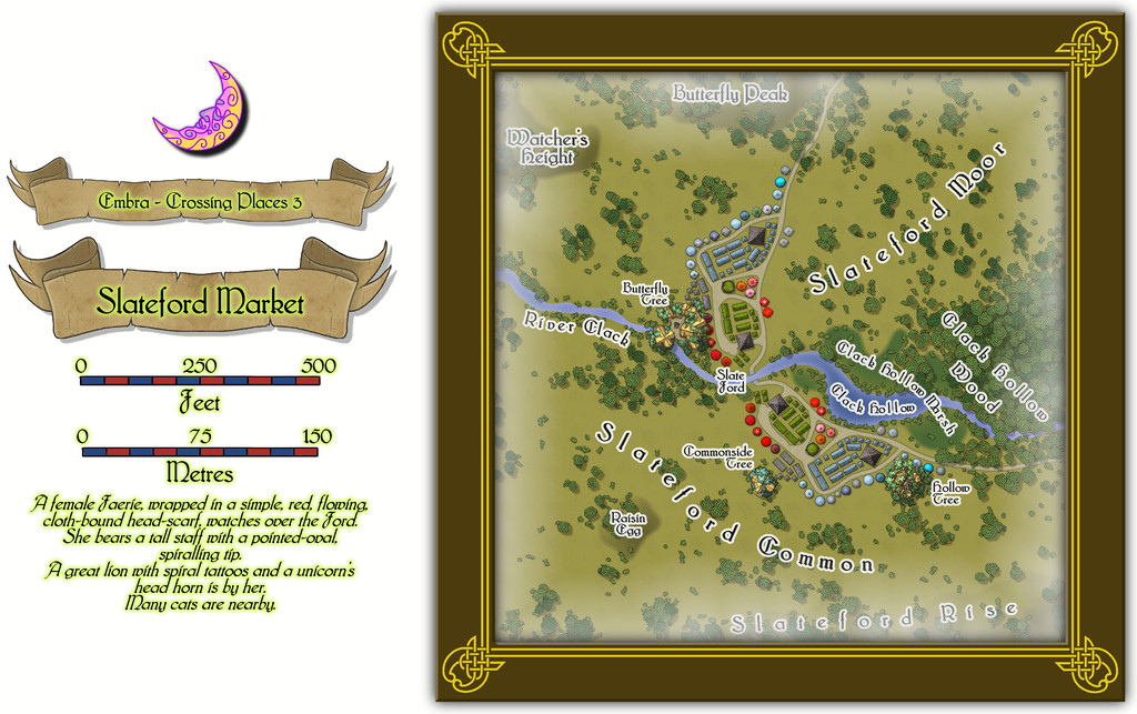
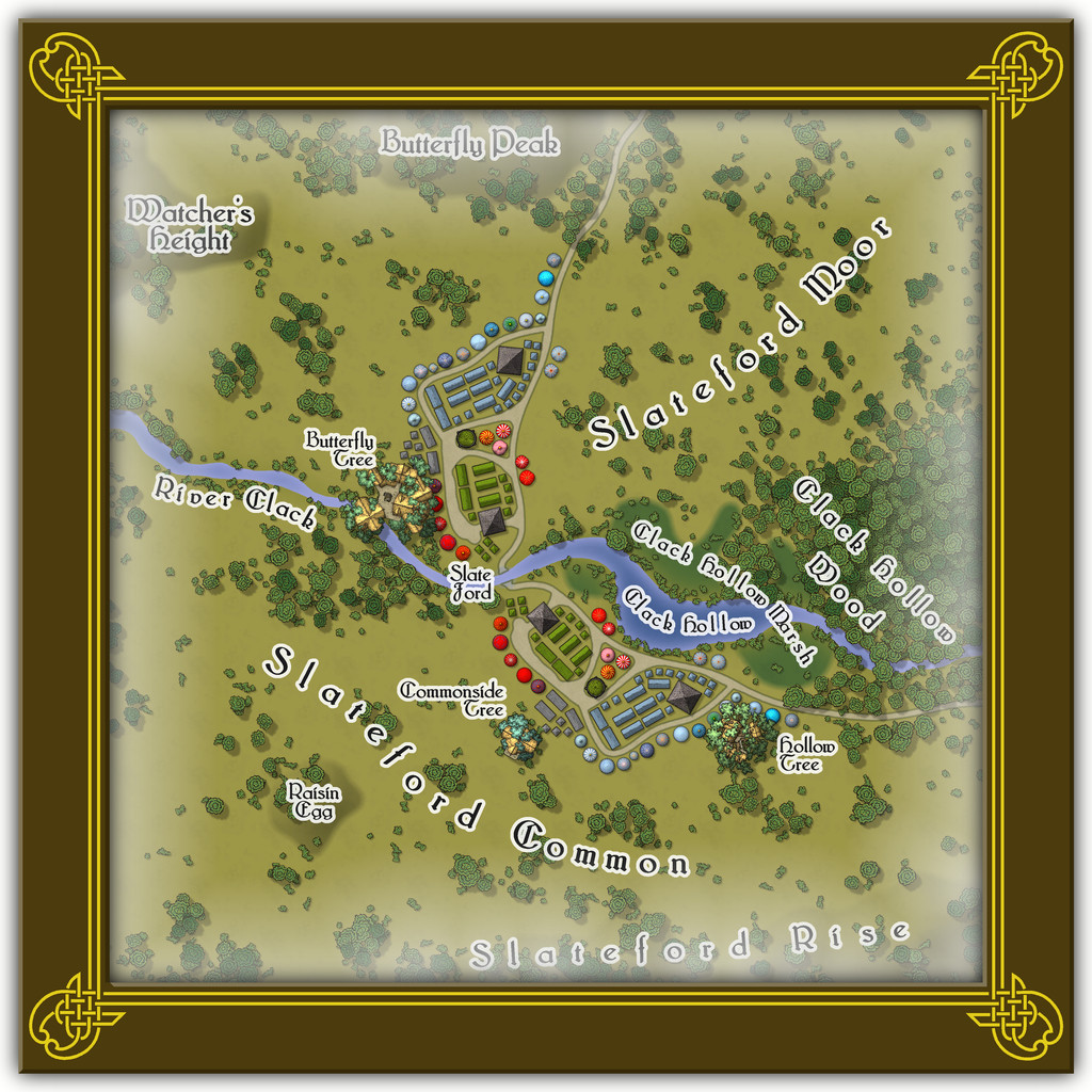
That the road layout and market stall placements look like the wings of a butterfly is not accidental. The original Judges Guild map on which this was based only had the layout on one side of the stream. It was though obvious that a simple ink-blot-style mirror image would produce this more pleasing pattern, thus this segment of the Twilight Market was designed with that in mind. Of course there's a watcher at the ford (from the featured text), and some more of the Mike Schley tree-houses, including an aerial tavern in the bough-structure overhanging the River Clack in the Butterfly Tree, "The Tasty Drop" (also a comment on patrons who miss their footing and end up in the Clack below...).
There aren't any actual buildings here however, simply tents, stalls, awnings, wagons and several open-plan covered spots (including a pair of green-tiled, circular bandstands). The thatched buildings in the treetops are intended as living parts of the trees, so aren't real buildings as such. Or that was my excuse for not providing interior layouts for them anyway!

-
Community Atlas 500th Map Voting Thread - Please vote
I second Sue's comments; this was an extremely difficult vote, as there are just so many fascinating maps produced in such different styles.
Hopefully, everyone contributing enjoyed their mapping, and perhaps learnt something fresh along the way.
It's certainly been a delight reviewing them all again now!
Get voting folks!