


Wyvern
Wyvern
About
- Username
- Wyvern
- Joined
- Visits
- 3,303
- Last Active
- Roles
- Member
- Points
- 5,647
- Rank
- Cartographer
- Badges
- 24
Latest Images
-
WIP - Senan
You should think about uploading a higher-res version of this to your Forum Gallery (maximum size there is 8 MB).

-
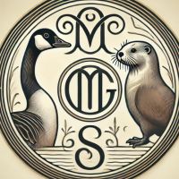
[WIP] August Mapping Competition -- The Blue Rose Tavern
Does the name derive from the Blue Rose RPG?
Actually I don't know 😅. The name is present in the original map on the Atlas.
I should have spotted that!
Interesting to know you've been working with the Midjourney AI as well. I learnt about this recently through the Handiwork Games KickStarter for their new RPG setting "Maskwitches of Forgotten Doggerland", which finished very successfully last week, as all the artwork for that has been done using Midjourney, tweaked subsequently to tidy a few things up, I gather, as the final renders aren't of pro-printable quality (I'm a bit vague on that element, however, so may be wrong!). It seems a very capable system though, as your Blue Rose emblems clearly show!

-
Large Pit room with Pillar Platforms
Yes, you can change the X and Y scaling for symbols very simply. When you've picked a symbol, just right-click to call up the Symbol Parameters pane as you would if you wanted to change the scaling ordinarily. There, you'll see an empty checkbox for "Independent X and Y". Click that box, and try whatever scaling seems appropriate for each axis - this is almost always trial and error, so you just need to persist. I usually find that what I thought should be the X axis is really the Y, but that's likely just me 😉...
-
[WIP] Town of Kukaar (Ancient Cities Annual)
Amazing amount of work in this, and looking excellent!
Rather reminded of the reconstructed layout of the ancient Near Eastern city of Mari by it now. Except that has been done as rather more circularly-symmetrical, and has a broad canal stream running through it, rather than the main river channel. Two-thirds were washed away by the shifting over time of the Euphrates' channel anyway, so there's a fair bit of guesswork involved with that, of course.
In terms of the number labels, the larger size ones seem clear enough to me now without enlarging the glow, although you could increase it if you need them to really stand out more. Sometimes just moving them slightly to have a different background colour surrounding them might be enough to "cure" any perceived difficulties, I suspect.
Not sure about the "13" label in the city for the patch of green there; not certain that's really needed.
You might add a few more trees and bushes along both river banks. These could be regularly cleared and/or farmed in the city, but outside, they'll grow wherever they please, and there's enough water.
Maybe add labels for the two circular canal basins, or even a couple of the main canals, along with a fancy name for the bridge, say? And perhaps a name for the river too?
-
Character Artist_Cultist and Monk
So this is what goes on on the Plateau of Leng then... 😉🤴😷
[Do I need to mention those last emotes are for The King In Yellow and The High Priest Not To Be Described - and yes I know it's his mask that's meant to be yellow, but what can you do? 😁]
-
[WIP] Northern Powys (Sarah Wroot Revisited)
Sorry, isn't Powys entirely landlocked? Oh no, wait, this is a fantasy version of Powys... 😉😁
[If anyone's confused by this, Powys is a landlocked county in Wales, along part of the border with England, and has no shoreline!]
-
Cartographer's Annuals and content
This is though an excellent time to consider a complete Annuals purchase, because by buying the Annual Bundle, you get all eleven years' worth of Annuals for the discounted price of 189 GBP, less ANOTHER 30%, because of the ongoing Black Friday Promotion (ends 2017 Nov 27), so making the total just over 132 GBP, less than half price overall.
I mention this because that's what I did last year, after also trawling through all the Annuals, and finally realising there were too many interesting things to be selective (for me anyway)!
-
Cartographer's Annuals and content
I didn't find any real missed marketing opportunities among the Annual descriptions personally, but you are probably correct to suggest most folks come to the Annuals after they've been using the main Campaign Cartographer software for a while - so the lists of what each contains mean perhaps rather more than they might for someone coming to them "cold". Certainly, those, plus the text descriptions and illustrations were enough to sway me. But I have long been a sucker for a pretty map anyway!
As for the Forum contributor connections, there may be earlier discussions I don't recall now, but there was an interesting What Are Everyone's RPG Connections? topic started back in June. And there are quite a number of writers/novelists who are active here too - making maps for their books, especially. -
Vienna map
I'm not aware of anyone having tackled a map of Vienna for any time period so far in Campaign Cartographer, and a quick search has confirmed that general absence online, although there could be something hidden away I've missed, of course.
As for creating one yourself, that very much depends what you're wanting to accomplish with it. If you've a map (a historical map, for instance) you want to duplicate and amend in CC3+, and have a good-quality image of that (as a JPG or a similar bitmap file), you could simply import that into a CC3+ drawing and hand-trace the various elements you want to reproduce in the program. If it's a modern map that interests you, you may be able to circumvent parts of the drawing process by using digital vector mapping data, although that is quite an involved process. Ralf recently did a live mapping video session doing just this, albeit that was for a much larger region than a city (Australia!).
If you can be more specific with what you're wanting to achieve with your map, it may be someone here can advise you better, however.
-
Hexcrawling starter maps
That's certainly a fresh possibility, although having tried it out recently, I think the Annual 121 B&W Fantasy set provides a broader range of mapping options, given it's a normal style, and not hex-based, so you can fit symbols to the hexes, yet still have it look more naturalistic. It's what I used for my Whispering Wastes map at least. Even so, that style would benefit from expansion with a wider range of symbol options too (then again, we always want more symbols, don't we 😉?!).

