a large city, I have been putting off, now started
 JimP
🖼️ 280 images Departed Legend - Rest in Peace
An evil, good, chaotic, evil, lawful city in a nation of the same type, nation if Kingdom of Lad-tod-quill. (Yes, sometimes I make difficult to pronounce names. I added the hyphens '-' for clarity.
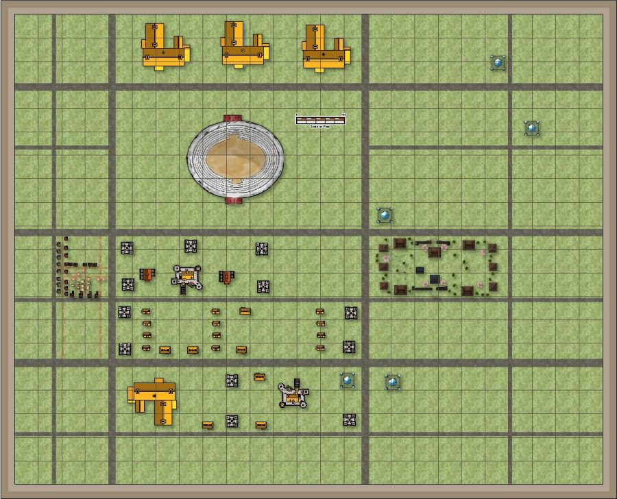
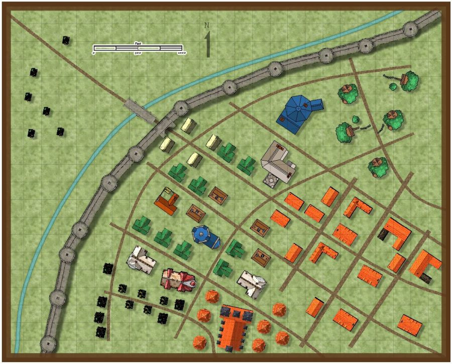
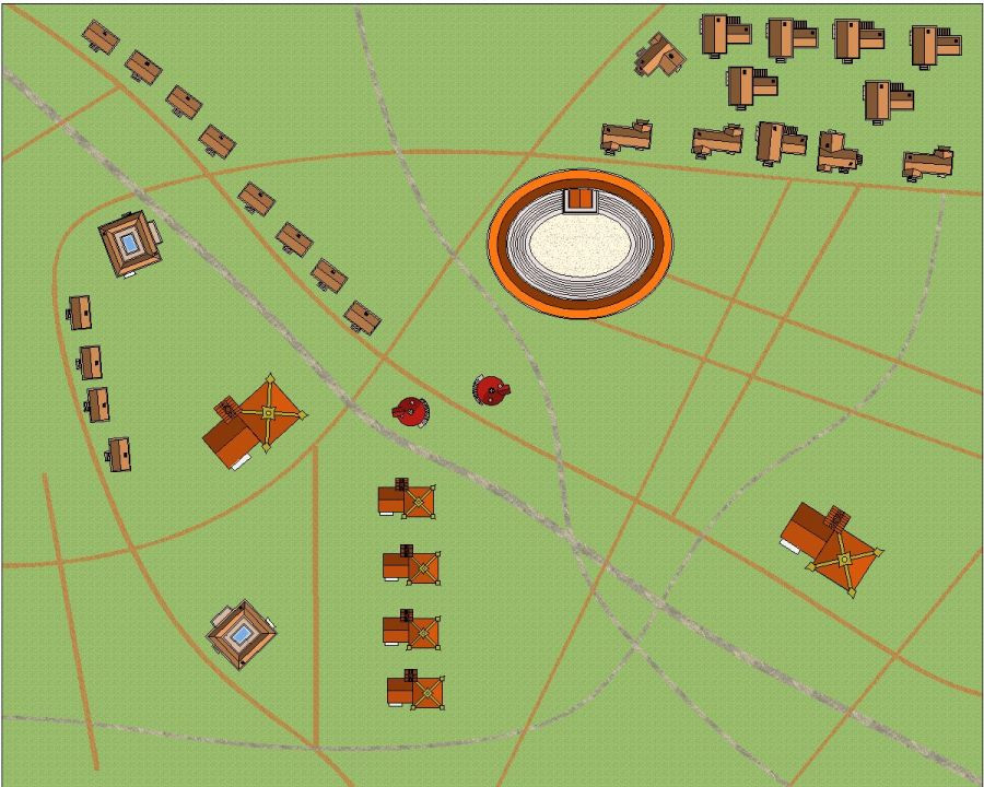
One part of the city, 5000 x 4000 feet. Those are 200' squares. Multiple symbols sets, and different scales, to give a variety of locations. This is my version of the City-State of the Invincible Overlord.
The city is named 'The City'.
Changing maps to jpg.
and the third map so far. They aren't connected. That will take additional maps.
Yes, some of the houses could be better aligned to the roads. Some aren't intended, at least not yet, to be near a road.
I'm not even going to try and add footpaths to these maps. The smallest road is 10 feet. The largest are 60 feet.


Comments
Jim, in a big city, many districts would have houses and shops adjoining each other.
Have you tried out Watabou city for a layout
Some of these buildings are shops, some homes. The large ones can be mansions or apartment blocks. Two amphitheaters.
I have the Japanese town buildings in one of the maps.
The tiny looking houses are scale 2. The rest of the symbols are scale 2 up to 6. With most being 3 or 5. The top most map, the small buildings/houses are scale 2.
The original maps are just different color blocks and shapes. So I decided to not use Watabou for that reason.
Added more buildings to this one, including a ruined area. Made use of vari-color symbols. to.
This one I saved as 1000 pixels, 2000 pixel one in my gallery.
I will be making for my own use, might put it up on my old Crestar website when done, a html page so I can see more easily where the roads, etc. connect together.
I could use grids on the maps, but I like this method better.
And here is a screenshot of this city, a total of 25 maps.
Some filling in left to do.
That will keep you busy, Jim
Well, matching the roads can be a bit troublesome, but I've done this before.
forgot to mention, I was going to make 56 maps... and decided to do only 25.
I think you mentioned it on another thread ;)
That is what I get for having multiple projects going at the same time.
It is huge!
Yup. 25000 feet by 20000 feet.
And that's just the size of the complete map 😉
[If so, that would be the classic mistake of using a 1:1 scale 😁]
Well, as long as I don't print it that size, it will be okay.
Here is slight update. I could align some up and get edges matching, etc, but I have a bit of a headache at the moment. Anyway, the full scale one is in my gallery.
and this shows where it belongs. Part 25 of 25 parts.
Another update. Map part 2. As you can see, the roads and walls don't match with part 1 and part 8. I'll fix that later.
the parts, partial map.
Update on Part 2. Added a bit of land type from Part 1 to this map. I haven't extended the moat over to Part 1.
The wood palisade in the approximately center of the map, is a Fighters' School, for adventurers. Ruins to practice in.
I'm getting tired and making mistakes, so that is it for today.
A bit more to the same city part.
Larger in the gallery.
In case you can't read the scale bar, and I can't, the thatched buildings upper right are 60' x 41'.
That desert? edge screams for a switch to smooth, and a little bit of edge fade to make the transistion less harsh.
Don't think it is desert, but I'll work on it.
Oof. Almost, I think, done with my Traveller site.
I think I'll work on this city as my next map.
Done with my Traveller site as far as I can tell.
I'll be working on this in a bit.
Screen shot, then updated maps 1, 2, and 6.
The edge fade was there, sheet was Background, City. I had to increase it up to 75 units, 90%, 30% for it to show up. The bitmap fill is Paper CA158. Makes a nice sand or tiny gravel bits.
City Part 9. Screen shot so you can see where it goes. Larger Part 09 in gallery.
I don't know if I'll be making the lake a city water supply, or just something for animals like ducks and geese to swim in.
The scale bars on these maps are too small. I'll eventually increase them so they are readable. Each square on this map is 200' x 200'.
I misstated the size of these maps. They are 5000' x 4000', not 3000' x 2500'.
@JimP wrote:
Each square on this map is 200' x 200'.
That scale does sound a bit weird when I look at the symbols on your map. Even the tiniest buildings I can find in your latest map would then be about 50'x50' and the trees fill almost an entire 200x200 square on their own.
Well, I just didn't want them to disappear on the map, but oak trees get that big. At the university I attended, there were two that were 300 feet across.
I'll probably make the rest of the city trees smaller.
It's an interesting point about the size of tree symbols more generally. I've noticed that many in the city styles that have any can seem undersized at the usual 1.0 scale. Of course, you can always enlarge them, or (sometimes - doesn't work so well in all styles) combine them to make "proper" larger trees. And at normal size, they will work for younger trees, of course, or smaller bushes and shrubs.