

AleD
AleD
About
- Username
- AleD
- Joined
- Visits
- 943
- Last Active
- Roles
- Member
- Points
- 826
- Birthday
- February 21, 1982
- Location
- Padova, Italy
- Real Name
- Alessandro Devigili
- Rank
- Surveyor
- Badges
- 9
Latest Images
Reactions
-
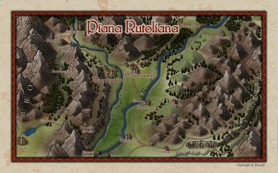
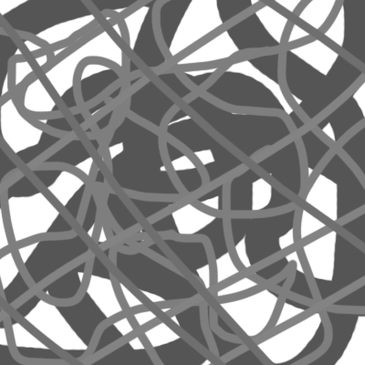
WIP Large Area, small village and battle maps. For a viking-ish Trudvang campaign
So... In the cited post I had a pool, asking what the adventurers would have done... Last week we managed to play that campaign (finally!!) and what happened was that the party split, they didn't protect the breach and almost died! Oh my... Players are unpredictable!


![[Deleted User]](https://secure.gravatar.com/avatar/c75d9a245b74d9c59be0999ea81ca541/?default=https%3A%2F%2Fvanillicon.com%2F92add7f8c954488718110edc4896ad39_200.png&rating=g&size=200)
-
Ink Paint effects
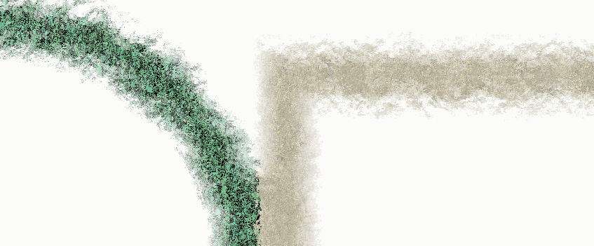
I recently wanted to have something on my map that looked like ink (for a frame). So I started to explore a bit the possibilities that the "displace" effect has (inspired by this discussion by @WeathermanSweden), especially when used multiple times.
I wanted to get something similar to a watercolour but, after some testing, I stumbled in something that resembles (for me at least) oil colour or wax colour. I created different sheets where the effect works better for lines of different widths but is always based on a series of "displace" effects and some edge fade. For the displace I created some .png files (displace maps). This can definitively be improved but it doesn't look too bad:
The first two are not super nice and have a touch of waterish... The wider the line, the better the "oil effect".
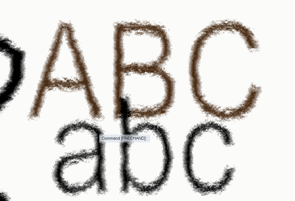
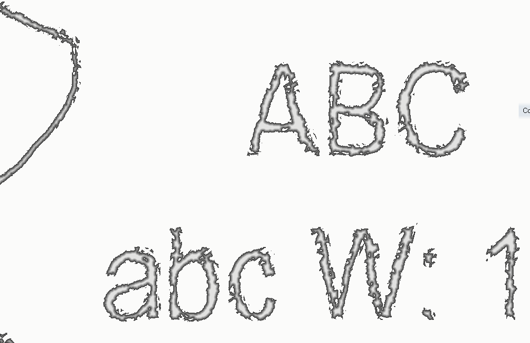
Of course, it can be used on text:
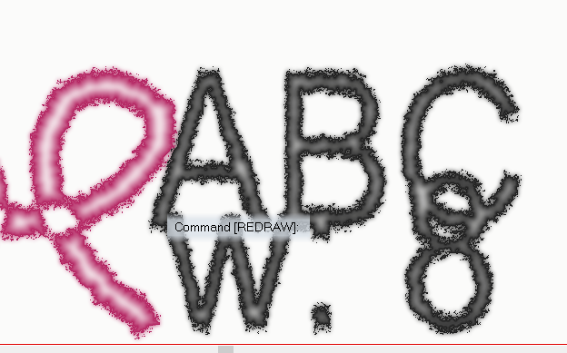
Or with textures rather than solid colours:
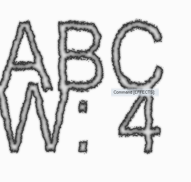
A quite different result can be obtained just by moving up and down the effects on the sheet. For example:
This is an "old ink" effect (for narrow lines).
The wider the line the closer to wet paint or spray it becomes:
These are all based on "normal" png files:
and this
that was originally provided by @WeathermanSweden.
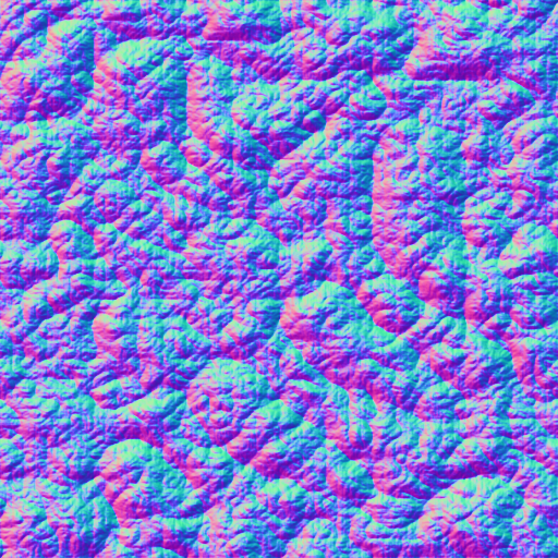
Using "bump maps" can also result in interesting things (those seem to work, generally, on a more detailed scale, given the same "displacement amount" and "texture size") and you can easily get them from the web.
Below two maps (Mike Schley inks) with the 4 sheets used for the examples above.
To use them just copy the .png images to the "...CC3Plus\Filters\Images" folder.
I suggest to play around a bit to get how the displace efefct works (also trying other displace map files). Adding "blurs", "fades" and "transparencies" can also give some interesting extra twists.
Note that @roflo1 opened a super interesting topic about "pencil drawing effect" and @Lillhans provides a suuper cool way to get that result completely different from the one I explored here.
I think I will explore a bit more this topic, maybe combine the two methods and post the results here.


-
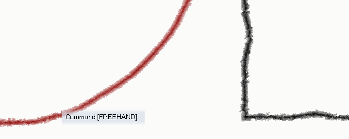
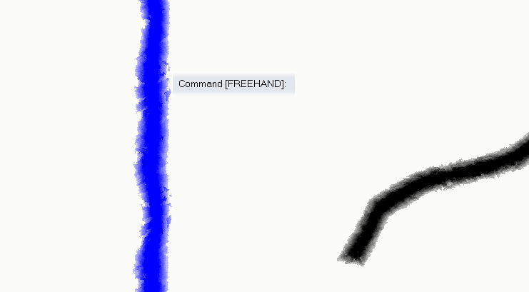
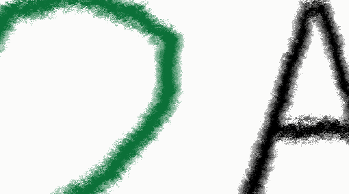
Simulating a hand-drawn line
-
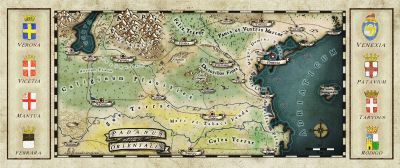
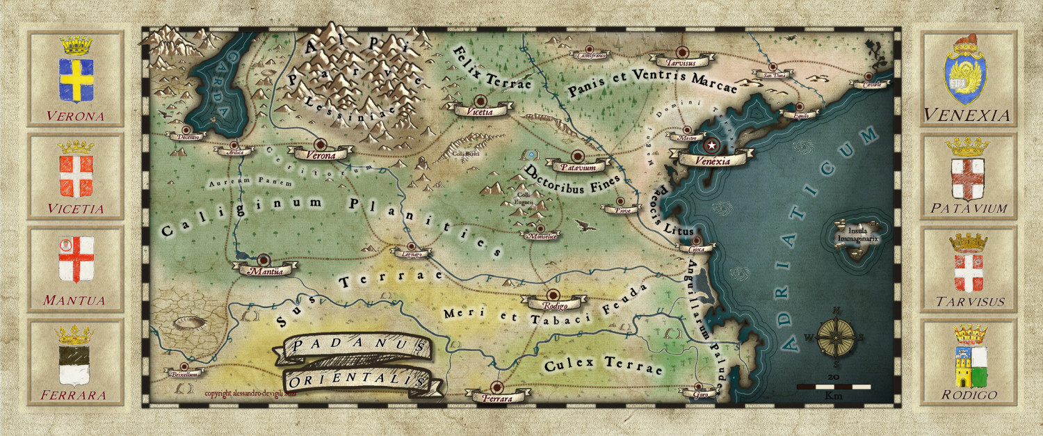
Map of a real region
I worked a bit more on the map, basically changing the heralds png files and trying to add a frame for them in the map.
For the heralds I added a couple of layers on the original files with the style background texture and a mix of darkening and lighting effects. They don't look bad when in the original size. The "paper" effect get a bit lost in the map. I think this is due to the different size of the texture in the map and in the symbol. Something I may work on in the future.
The frame for the heralds don't satisfy me to much. Do you have suggestions on how to make something that could look more drawn?

-
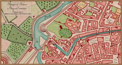
Frames
Thanks @JimP
I'll try following your suggestion.
