WIP Large Area, small village and battle maps. For a viking-ish Trudvang campaign
 AleD
🖼️ 11 images Surveyor
Hi everyone.
I started a project that involves making an area map, a couple of villages and some battle maps. I'll use them for a playng Trudvang Chronicles, a RPG with a Scandinavian flavor.
Please feel free to comment and suggest
I started sketching the region map (central Ejland):
This is far from being done an I will work on that next days...
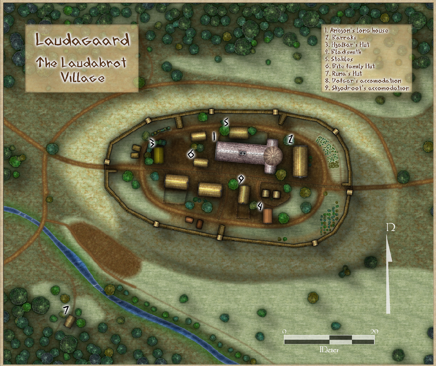
The adventure so far brought the adventurers to a farm/village, called Laudagaard (which is the bottom left in the triangle of villages at the center of the map). It is a small village, or a big farm located above a hill. It is held by the family Laudabrot and something nasty happened the last gaming session here and some people didn't leave the long house with their foots after the dinner.
The next session the farm will probably be under attack. Adventures will be asked to protect the village or rescue an old witch (a "Vedma"). They may also flee.
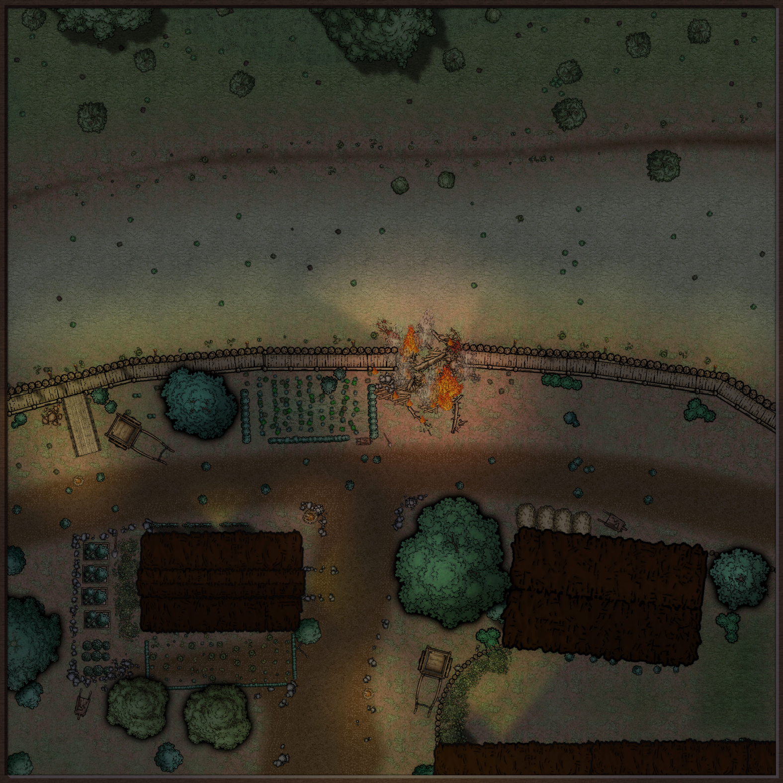
For the village defense I set up a battle map with a wall breach in the north of the village (above the stables):
For this one i learned a bit how to use lights. This tool is amazing once you get how it works (thanks Ralf for the video!).
The next one will be a small map of the small Vedma's hut in the south-west of the village map (n°7).
☺️
- What do you think the adventures will do?12 votes
- Save the old woman8.33%
- Protect the breach83.33%
- Split and die0.00%
- Flee8.33%







Comments
Some changes and a new map.
I changed a bit the first battle map, adding a small tower, some details here and there and a bit more darkness.
And below the new map (again a night map) to be used as location for RPG. It is "Runa's Hut", number 7 in the village map. It is a very simple use of SS4. I tried to add some lights to simulate fireflies. What do you think?
(UPDATE: I did add some - probably too small- yellow dots close to the lights of the fireflies. It looks well in CC3+ but the final result is not much different, unless suuper zoomed in. I'll try to do slightly bigger spots ??)
Below the CC3+ files.
How do you do a night map? I am trying to find some help but it seems kind of shady. (pun intended)
@TheBlackVolk - Remy Monsen posted this video last July which may help.
@TheBlackVolk - I followed the suggestions in the video by Ralf here. It is very clear and insightful. Basically there is an option for the lights in the menu. Just remember that you have also to set the effect of "blocking light" on what you want (as walls) to actually see the effect. Then I just added an RGB layer (thanks Remy @Monsen) to make everything a bit "blu-ish", as under a full moon...
But now I'll watch the one @Wyvern suggested! I am super curious!
Moving on on the mapping...
I did not finish the map of the region as planned but I started a new location map.
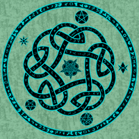
It is supposed to be a "Vitner node" which is, in the world of Trudvang, a place where the "winds" of magic (Vitner) are particularly strong... I was planning to do something like an ancient ruin temple in the fashion of Stonehenge, but simpler. I came up with this, taking as model one recurrent symbol in the RPG book.
This is the preliminary structure to which I'll add more details (as trees, mushrooms, ecc ).
If I may ask for suggestions:
I'll appreciate any suggestion but, of course, don't feel obligated!
I would increase the bevel on the large stones so that it met in the middle, and then add a new sheet above them and copy the shapes over, but add an Edge Fade, Inner sheet effect to that one instead of a bevel. You can then play around with the settings of the edge fade effect to make the tops as rounded as you want.
That's how I would do the moss.
I can't really be sure of the style because the resolution of the image, but it looks like SS5. If it is, then you should have a hill drawing tool you can use on a HILLS sheet that has a very large and very much smoothed Bevel, Lighted effect on it. It also has an Edge Fade Inner sheet effect, but I tend to increase the width of that one quite a lot when I use it to smooth out the join between hill and land.
Thanks @Loopysue!
The first method is the one you used for the Kristol Caverns, right? That's a supper good point! I didn't think to use it in this situation but it sound a good idea!
The style is the SS4. It also has a HILLS sheet, but it didn't really worked with the grass... However, I didn't try that of SS5 and I'll do it ASAP.
Thanks again for the help!
And actually,
This is the result after the rounding operation. It worked beautifully!
Thanks @Loopysue!
You're welcome :)
Yes, its the same method I used in Kristol Caverns. I didn't invent that method, by the way. I think it's been invented and reinvented down through the ages.
If you create a quick SS5 map and play with the hill drawing tool you will find out what kind of sheets and effects you need to create in your SS4 map.
A super quick update. HILLS!
Again, thanks @Loopysue for pointing me to the solution.
I copypasted the effects on the "hill" sheet of SS5 to a sheet on my map and tweaked the size of bevel and fade (those are set to HUGE due to the map type). The main thing to take in mind is that the hill effect is obtained with a light grey solid fill. So, following the suggestion you can see in THIS recent video (thanks @Ralf! Your livemappings are always inspirational) I made a new Hill tool (which i called "Terrain, Hill3D"...) to get something in SS4 similar to the one present in SS5.
I found that having a couple of "hills" sheets on different positions (and with some differences in bevel and fade) helps in giving a less homogeneous surface. There are probably better solution for that, but this is a simple and working one. Below a snapshot of the map with the effects off:
And now the map with the effects:
News steps will be:
Oh, this is the symbol I used as inspiration (from the Trudvang RPG manual):
It's looking really great. You're rapidly becoming a really good mapper :)
I did some extra progress in the map managing to add moss and ruins here and there.
the result at a first glance is quite ok for me:
I wanted to tell how I did add the moss to the stones and ruins. I used 2 different techniques:
For the ruins I simply added on top of them a drawing using a bitmap I found in the CC3+ bitmap folder (thanks @Monsen for the "opendoc" command trick on the video on ice caves). It is on a separate sheet, with some transparency and fade and below the result. I think it works better on the narrow walls.
For the stones I tried something more consistent, using the "texture overblend" effect on the second sheet (the one without the bevel). I first (on the small stones) used the same bitmap as above, but it may look a bit to "realistic" or "photograph-ish" for a ss4 map. So I tried to use the dark grass from "Forlorn Cottage" and a RGB matrix to match the color (big stones). I am not sure which looks better on the map but i guess it is just a matter of personal taste. In both cases it is important to tweak a bit the size of the texture ;).
Finally I tried to add a bit of personality to the central paving. I tried to add a sheet with "ornamental tiles" with a "blend mode-color dodge" but the result I obtained is not great (but I admit I tried different effects without really knowing what they do).
I'll try to change the size of the bitmap and/or the bitmap itself. Maybe it is just not a good idea.
If someone has suggestions, they will be welcome!?
The moss is looking really good.
The best way to learn is to experiment. Try a few more of the blend modes if you haven't already.
I forgot to mention this the other day, but you might have also tried the Jon Roberts Dungeon style mushrooms (among the "Cave" symbols for that style), as they look quite similar to the standing stones as you currently have them, and some of the single rocks in that style (same catalogue) would work equally as different-look standing stones, as many are elongated along one axis.
Looking at your new ruins (oxymoron alert!), they look a little too uniform in height. You could try moving some to Sheets with different Glow Effects (looks lower than with a shadow) or different length shadows, as you have for some of the standing stones already. You might also add a few smaller areas that are raised above the flatness of some of the current pieces, placed on top of the existing walls; if set on a different Sheet even with similar Effects to the lower ruin walls, they'll help break up that uniform appearance more.
I agree with Sue. The moss looks really good, and yes, keep experimenting!
Thanks @Wyvern for the comments and the suggestions!
I think I am almost done with this map. I did add a lot of vegetation, some mushrooms, details here and there and so on.
I tired to make the new ruins (persisting oxymoron) more 3d, moving different parts in 4 different sheets, all with slightly different effects. I don't dislike them. I also added some debris on top of the walls as Wyvern suggested. It helps a lot, especially at the edges of the walls.
My general feeling now is that it misses something in the central area. It is supposed to be a battle map, so maybe an open section may be good. However I feel something is missing. It is supposed to be an ancient magic circle built over a extremely ancient ruined city, lost in the middle of a forest (which is conquering more and more space).
Anyway, below the result so far:
Something odd and glowing in the centre, perhaps - something apparently out of place, say? Or maybe an odd animal that doesn't scare off as the players approach? Or perhaps some kind of offering - old flowers, oddly tied rags, something unusual made of sticks, a symbol of some kind? Important places often attract small tokens being left in profusion (someone starts and everyone else copies) in the real-world, so maybe something similar here might work - try looking up "clootie well" online, for more ideas.
Thanks @Wyvern, that is a good suggestion. I Think I'll try to add a "magic symbol" in the shape of the one I used as inspiration right in the middle... Maybe over a stone altar...
Tnx!
I am really digging these maps. I'm going to have to get into using the lighting like this, it looks great. Keep up the awesome work!
Thanks!
So... In the cited post I had a pool, asking what the adventurers would have done... Last week we managed to play that campaign (finally!!) and what happened was that the party split, they didn't protect the breach and almost died! Oh my... Players are unpredictable!
My home players started paying attention to my right eyebrow.
I would raise it and says, 'Are you sure you want to do that ?'.
They, most of the time, changed their minds.
😅😆
@AleD commented: Players are unpredictable!
No, no, they're actually very predictable. You can guarantee that whatever you've carefully prepared in game, they'll go the opposite way, and the direction they'll pick is inversely proportional to the time and effort you've put into designing the area they're now totally ignoring...
If they started to go way off, I told them they encountered a road sign and it said, 'Under Construction ! Wrong Way ! Go Back !'