


Wyvern
Wyvern
About
- Username
- Wyvern
- Joined
- Visits
- 3,303
- Last Active
- Roles
- Member
- Points
- 5,647
- Rank
- Cartographer
- Badges
- 24
Latest Images
-
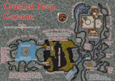
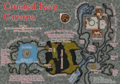
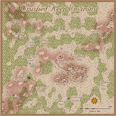
Community Atlas: Temple of Nidag, Stormwatch, Emerald Crown Forest, Alarius
@Don Anderson Jr. asked: How did I miss the entirety of this thread?
Honestly, I do this all the time on the Forum. I come back a few days later and find there's something among showing as unread way down the list, when I'm sure I'd clicked to check all the new topics here. Probably just get distracted with too many other things at the same time. At least you found it now! Thanks too for your very positive comments!
And particular thanks, as ever, to Remy for fitting these into the Atlas now!
-
A Hand-Drawn Fantasy Map of Jack Vance's Dying Earth
Heading further south in the main landmass area now:
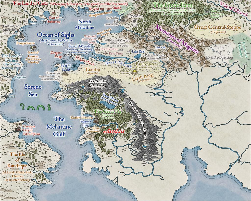
Plus making tweaks to a few labels previously-placed. Every now and then, something just doesn't look right, or something's been forgotten. Or occasionally realising there's more space than was thought before, etc...
Everything here has been placed individually, incidentally, except for some of the areas of wasteland/steppe symbols, where the black outline drawing fill designs were used instead (mostly because few of those outline versions are available as separate symbols too - only the grass and dead trees, in fact). As those fills can look a little sparse, I did a mixture of adding some extra symbols by-hand, and duplicating the filled polygon to a separate sheet, then changing its fill type. There are several sheets for different terrain types in the default style setting, so there's a choice of picking sheets that do or don't have effects on with these - the black outline drawing fills don't usually need the edge fade effect some sheets like the mountain background terrain one has, for instance. As an example, for the Tundra, Lirrh Aing Wastes and Steppe areas, I began by adding a coloured polygon using the Desert Terrain drawing tool, and then just copied that polygon onto two or three more sheets to add the black-line symbol-fills (using separate sheets in case I needed to remove one after its "test fitting").
Down to the map's southern edge next, giving a chance to play with some sand dunes in the unnamed Desert (although I'd already added a few dunes to Kauchique in the early stages, these were more concentrated here). Not to mention sneaking-in a couple more sea creatures:
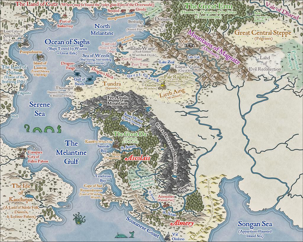
The results of the last session for this update finally sees the label added for perhaps the most evocative of the Dying Earth place-names, The Land of the Falling Wall, where may be found the dark-eyed necrophages and the great Walking Serpents (couldn't quite find space to squeeze in a label saying this, unfortunately, after a couple of failed attempts; at least I'll remember!):
I didn't actually realise until I was typing-up these notes and checking through the images, that for some reason, without having altered the image size or resolution, or changed the map effects, the sea lines just off the coasts are slightly different on this image to all the rest - fractionally thicker and further from the shore-lines. No idea why though! One more mystery of The Land of the Falling Wall, mayhap?
Last segment to complete - needing maybe just another couple of sessions...


-
[WIP] Community Atlas - Town of Shessaria
"I've forgotten what I had intended for many of them, so I'll have to wrack my brain to either remember, or come up with new ideas."
Best I can suggest is to keep written notes, and then hope you can remember what they meant when you come back to them however long it may be later! 😊 I look at my notes sometimes and think, "What was that again..."
-
A Hand-Drawn Fantasy Map of Jack Vance's Dying Earth
The one downside is you need to remember to have a sea/water sheet below the land sheet you're cutting through, of course! This is an issue if you're doing a landlocked map, and changed the default sea-fill background to a land one during the New Map creation process. Not saying I've done this, but, y'know...😊
I have become very attached to this Hand-Drawn overland style; just something about it that's very appealing overall. I think my next Atlas maps are going to stick with it for a while too.
-
A Hand-Drawn Fantasy Map of Jack Vance's Dying Earth
Thanks everyone for the positive comments!
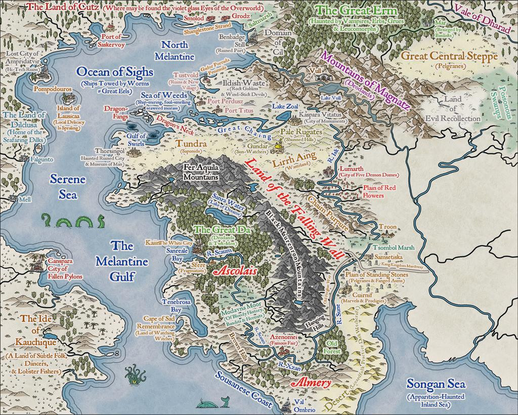
Progress update from the next couple of sessions today, heading south in the main landmass:
The perceptive may spot a new annotation saying "Pelgranes" in the Great Central Steppe - so yes, that is the same as Pelgrane Press (who have some peripheral connection with ProFantasy, I believe 😉), who also have their own, very detailed, Dying Earth RPG and its book-derived setting (first published in 2000; DriveThru RPG link), later including maps with actual scales on by Sarah Wroot (from 2002)! The maps are only available on Pelgrane's own website, however - link, on which site also are various free downloads about the game and its setting. Pelgranes in the Dying Earth though are gigantic flying creatures, with furry bodies, capable of intelligent thought and speech, apt to eat you just as soon as they can spot you, and swoop down to feed.
And so to the present state of play:
That amount of blankness though still argues for a lot more mapping to follow...


