


Wyvern
Wyvern
About
- Username
- Wyvern
- Joined
- Visits
- 3,267
- Last Active
- Roles
- Member
- Points
- 5,585
- Rank
- Cartographer
- Badges
- 24
Latest Images


-
Feedback on Decluttering Text/Map Improvements
Don't forget simple tricks like underlining or using italics (though this may not work equally well with all fonts), or changing the glow on the font (maybe using a different colour glow to represent different things, such as highlighting countries from terrain items or places). Might be worth testing dark lettering with a light outer glow, in case that could be clearer. Sometimes having a letter colouring nearly the same as the main map background (but not identical) suddenly jumps out simply because there's a light glow added to the letters.
Nice-looking map!

-
Wishlist for CC4
@Glitch - Something else you might try is having a second window with another program (such as Windows Explorer) on full screen mode, so it hides the CC3+ window completely. This helps stop the looping as much, and you can check the thumbnail view to see when the CC3+ screen is showing correctly again. I spotted Ralf did exactly this on this week's livestream at one point, so I know it's not just me who finds this helps sometimes!


-
Marine Dungeon - further developments
And tides are not all the same either, so you tend to have a "highest recent" tide line of dead/stranded weed, shells, etc., which is often dry and/or rotting, and then the "latest" high tide line nearer the sea than that "highest" line. All that though assumes an Earth-like setting, which doesn't necessarily apply to all fantasy worlds.
Meanwhile, Atlantis, here we come!

-
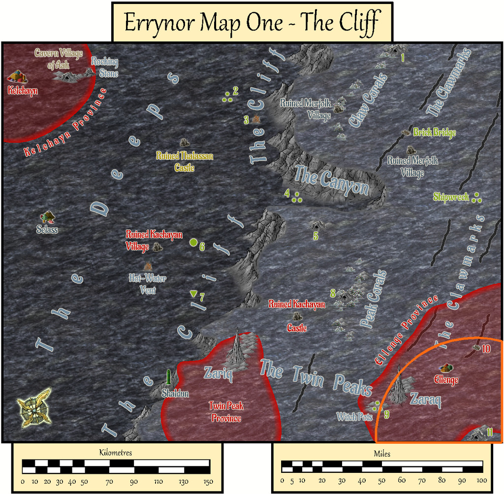
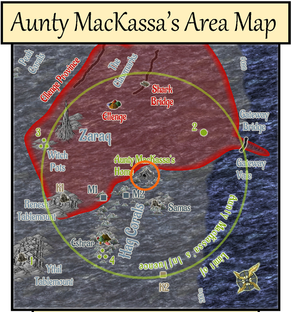
Community Atlas: Errynor - Aunty MacKassa, the Area Maps
The set of Aunty MacKassa maps is the final group in the series of sub-maps from Map 01 of my Errynor mapping project. I'm not intending anything quite so extensive for the other 39 250 x 200 mile maps in the set, though you never know! Indeed this group of drawings grew rather out of hand anyway, albeit I've long found RPG scenario planning has a tendency to do that as the ideas build up along the way. My original intentions for three maps to detail deep-sea hag Aunty MacKassa's lair (site 11 in the lower right corner of Map 01) have ended-up as seven separate drawings!
Partly, this was because while working on some of the other detail maps in that corner of Map 01, I'd realised Aunty MacKassa could have been long-influencing events elsewhere across the region, especially at the Kachayan settlements of Shark Bridge and Ellenge. Aunty's backstory in all this is given among the various map notes with this set, incidentally.
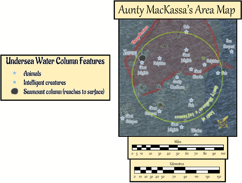
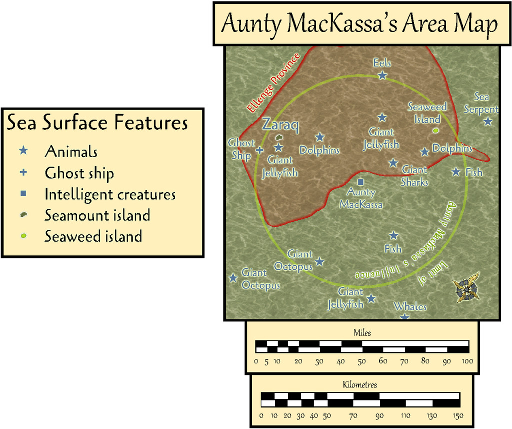
As Shark Bridge is almost 50 miles from Aunty's coral cave lair, I decided to set a 50-mile radius limit to her influence overall, a zone where she might sometimes be seen, and within which she might wish sometimes to act. This had the further possibility to reduce the edge-of-the-world syndrome of Errynor Map 01, because this zone spans parts of Maps 01, 02, 09 and 10. Of which only Map 01 has so far been completed, of course:
Thus came about the first Area Map, in three versions, following the standard pattern established by Map 01, for the sea-bed, water column, and sea-surface views, using the Herwin Wielink mapping style:
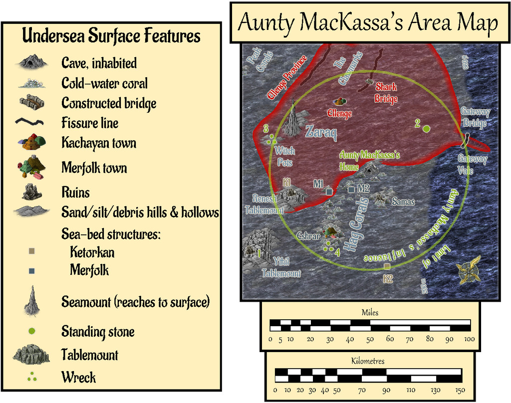
Fresh PDF and text notes were prepared to accompany this map.
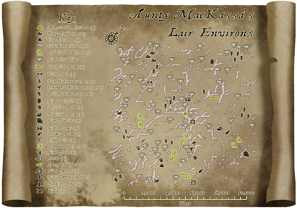
Next, I began zeroing-in on just Aunty's lair:
The next map shows in detail the sea-bed region a little over a mile in extent all around Aunty's Cave home. I'd rather enjoyed drawing the Shark Bridge area map earlier, using a different background and simple vector not-symbols (they're just copied small drawings, not true CC3+ symbols), so opted for a variant on that, choosing one of Sue's Parchments from CA132A for this map's backdrop, and sketching-in the cold-water coral reefs, with the local wildlife and other surface features, all of which had been previously randomly-rolled in preparation. The "symbol"-drawings were much-expanded from the collection used in the Shark Bridge map, naturally:

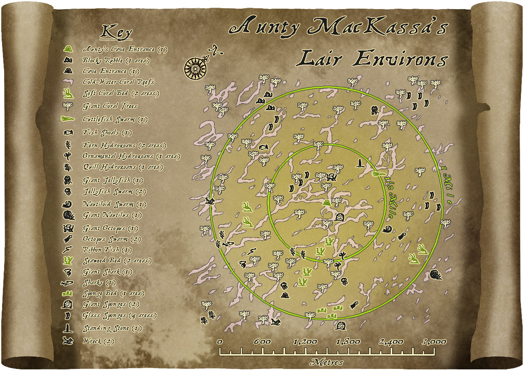
The second version allows the zones closest to Aunty's lair to be precisely identified for GMs, using toggled circle overlays. The nature of the features themselves is detailed in a further set of PDF and text-files notes accompanying this map.
There wasn't space to add a metric scalebar too, so that's been provided as an option via toggle for the Atlas FCW version:
The remaining five drawings in this set should follow shortly, all being well!
![[Deleted User]](https://secure.gravatar.com/avatar/c75d9a245b74d9c59be0999ea81ca541/?default=https%3A%2F%2Fvanillicon.com%2F92add7f8c954488718110edc4896ad39_200.png&rating=g&size=200)


-
Will there be an October Newsletter?
I wasn't really suggesting it was the fault of the English; just commenting on how many different nationalities had decided to call the tenth month "the eighth" 😉
In fact, it goes back way before the Christian Church, to the ancient Romans in the first millennium BCE, and survived as a month name even after the Julian calendar reforms of 46 BCE shifted it to being the tenth, not the eighth, month (by the Julius that was Caesar - hence also "July"), and on to today.
Well...
So far as I recall, the earliest record of the Christmas tree is from the 1520s CE Rhineland, which was of course firmly Christian at the time. There were earlier records of different, much smaller, forms of green vegetation, up to small branch size, being taken to, or into, homes around the Christmas/northern winter solstice period in various parts of Europe long before this, including back into the first millennium BCE. However, this seems to have been a common theme for pagan celebrations at many other times of year as well. Setting Christmas as Dec 25 is definitely recorded only from 354 CE at Rome though. The date was chosen (in preference to others at the time and before, which were usually sometime in the northern spring) apparently because there was indeed a pagan solstice festival for the Roman Sun God on the same date, albeit that was decreed only in 274 CE, and seemingly wasn't a particularly major event. The pagans overall were rather more "distracted" by whatever was the current Roman Emperor's preferred choice of deity. (Pretty much what happened in Britain too during Tudor and Stuart times, but with Protestant or Catholic Church beliefs holding sway, for instance.)
Eggs were one of the foods prohibited by the medieval Christian Church during Lent, in the six weeks before Easter, and while eggs were long a popular symbol of new life and spring-time in general, their attachment to Easter (in various subsequent forms) seems to have come about simply through the Christian Lenten prohibition, rather than because of any pre-existing pagan significance associated with the Easter festival time (mobile anyway, as Easter was and is tied to the timing of the first full Moon after the northern vernal equinox). Eggs were a regular delicacy for those unable to afford meat (i.e. most of the population in Europe) in medieval times, for instance.
[All a bit fresh in mind, as I was looking into European calendar customs in some detail recently, part of something for my latest Community Atlas mapping.]
Just as well this thread was answered a while back, as I've thoroughly hijacked it now - sorry!
