


Wyvern
Wyvern
About
- Username
- Wyvern
- Joined
- Visits
- 3,266
- Last Active
- Roles
- Member
- Points
- 5,584
- Rank
- Cartographer
- Badges
- 24
Latest Images


-
Community Atlas: Wyvern Citadel Defence Zone on Kentoria
The fortress of the Citadel. The idea is it's a reused ancient castle, which has been brought up-to-date with modern Kentorian conveniences. Being a high magic land, I've gone with these being things like decent indoor plumbing, heating (to an extent; this is in the tropics, after all) and lighting comparable to mid-late 20th century norms, fitting with the overall concept of the Defence Zone's basis too. I think "electrickery" (not my invention as a term!) fits the bill for how it all works. It also means I've been playing around with some repurposed Cosmographer 3 symbols in places. Eventually, there will be magical rooftop Strickfaden Lightning Cannons in place of arbalests and ballistae. [Strickfaden? Look him up!!!]
I'd already decided some while back that the basis for the actual fortress was going to be the castle in this video, produced by Dwarven Forge in July 2020, Build of the Month: UnNamed Castle.
For those who don't know, Dwarven Forge make highly-detailed, modular, cast scenery for RPGs and wargames in 28mm scale. They started out as a one-man operation in New York City back in the later 1990s, when all their castings were made in a solid type of resin, pretty robust for its time, and indeed it still is (mine's survived completely intact since '03, for instance). The great selling point, aside from the incredible detailing (all hand-sculpted, also as still), was that all of it came hand-painted, with primarily options for dungeon and cave settings. At the time, nobody else made modular caves as cast models, so this was really A Thing!
Time passed, and the company, while still quite small (about eight or nine full-time staff currently, I think), remained NYC based, but their business model shifted to a KickStarter one, roughly one major KS per year since 2013. This different funding model allowed them to move away from resin to (now) a proprietary resin-plastic mix, trademarked as "Dwarvenite". This is lighter and a lot more robust than the old resin - many users quite happily let their kids play with it, as it's pretty well indestructible through any kind of normal use or accidents. It also now comes with the option of being DIY unpainted, or hand-painted still.
Nobody would pretend it's cheap; the painted version of that castle model in the video would, if all its component parts were in-stock currently (they aren't, in case anyone should be tempted!) would cost you nearly $1500 before shipping (or taxes & import duty, etc., if you're not in the USA). The modular castle pieces are however particularly expensive, as being complex castings requiring more expensive moulds.
For all the model has a nice, clear, 5-foot-scale square grid engraved across its horizontal surfaces, this has proven a tricky conversion into a CC3+ drawing so far. Plus I'd already amended it in places to add some internal-courtyard ancillary buildings, and add or move some of the internal accessways. Even to get to a hand-sketched version needed stills extracting from that video, poring over printouts of them and from the product pages on the webstore, plus the free PDF downloads showing how each component section is built. Even then, a few places have had to be winged, as I could find no useful images of certain areas, and the video castle build has a few minor variants compared with the standard build in the PDFs. It is modular after all!
Of course, a hand-sketch is all fine and good till you start fitting that into the precision of a CAD drawing, when suddenly things like whether those shooting slits in the wall-tops might be better at 1 foot 3 inches, not 1 foot 6 inches, wide starts to become an issue. I have made compromises, and there are likely to be more subsequently!
And then the castle drawing is only one part of the whole, as it needs to have a background as well. I'd decided in advance that the Citadel was going to be on a rocky ridge, probably one of its higher parts, and separated from the rest of it by deep trenches/cliffs to give greater protection, as well as some point to retaining that wooden drawbridge.
My first thought was to try some bevelled polygons for the ridge in the castle's vicinity. This is an early version of those on the Ground Level drawing for the fortress:
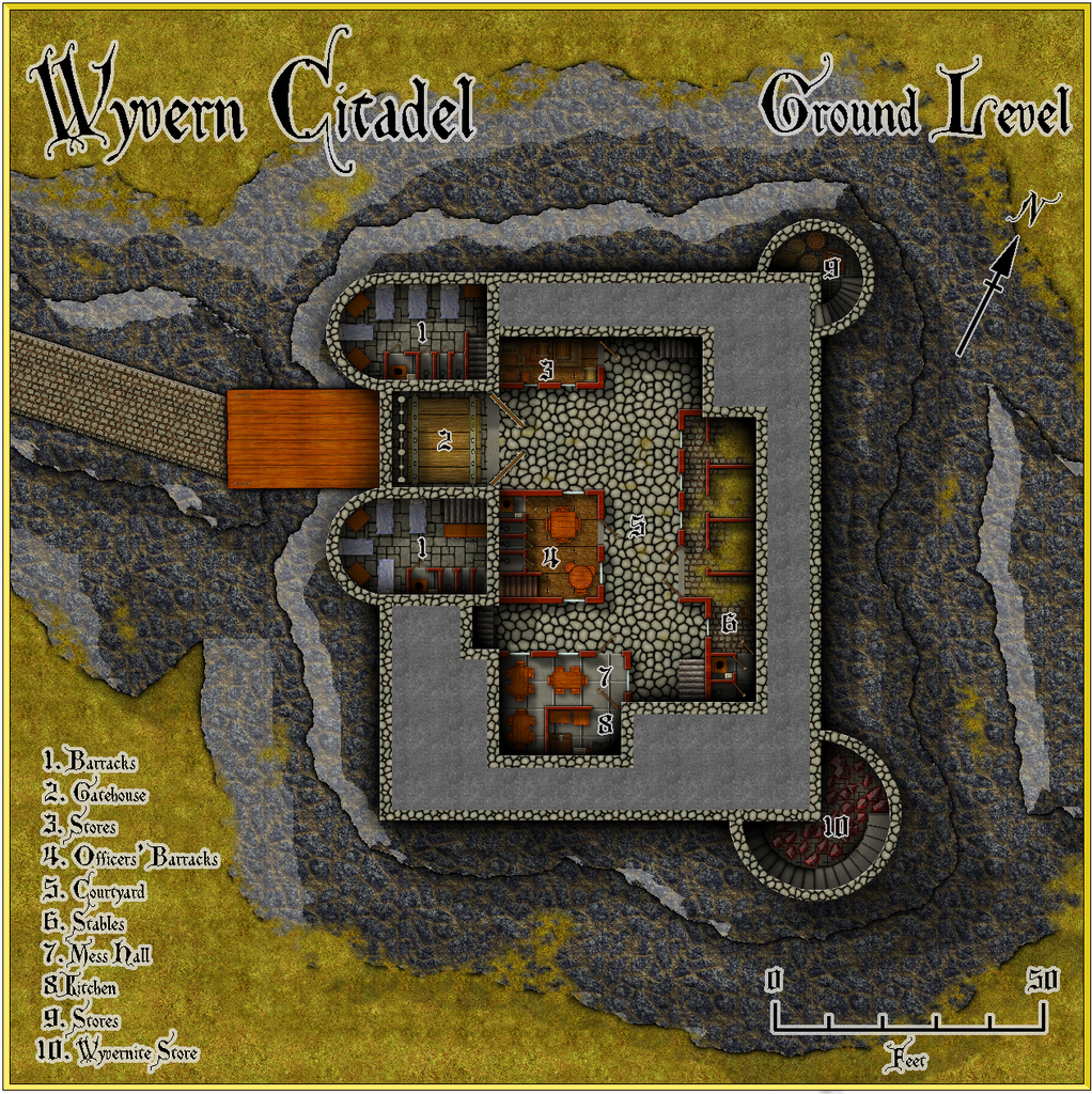
The castle itself here is in the basic DD3 style, though I had to add the Bogie stone steps, and the beds from the Jon Roberts Dungeons CA style, as the DD3 beds were just too elaborate for what's essentially a military base. And don't ask about the spiral stairs... Each step is on its own Sheet!
I'd picked the cooled lava fill for the ridge, because that has a suitably rough, rocky texture, but the bevelling - and I persisted with it for some time - just never looked right. Oh yes, and I really loathed the angled roadway from almost the moment I'd finished it; it just looks wrong approaching the drawbridge anything other than directly. So that didn't last long...
Having abandoned the bevel idea, I thought I'd try Shessar's cliffs and contours options (PDF guides available elsewhere on the Forum here), and after a bit of tinkering around with those, this is what I've settled on at present:
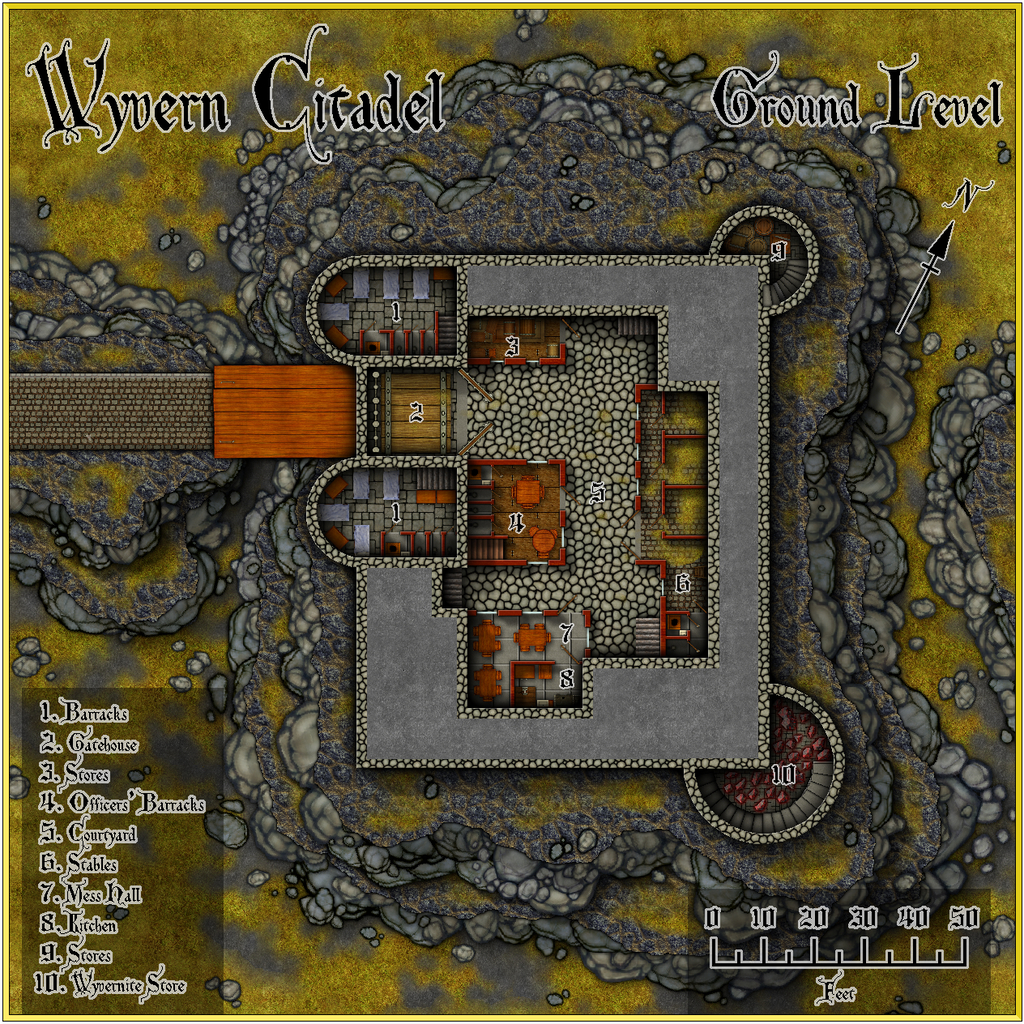
The castle's had a couple of minor tweaks, which may not show at this resolution, since as I've been drawing the higher levels, I've had to make fresh adjustments of some of the lower level drawings as well. The current plan is there should be five above-ground levels and two smaller subterranean ones. The below-ground ones - haven't quite decided on their full extent yet, perhaps with some old unused sections, as well as those in-action presently - will also be prepared drawing on some old Dwarven Forge dungeon layouts, to maintain this part of the theme of the project, and will include the Citadel's main purpose now, as the command and control centre for the Defence Zone. I already have the design for the table-top in the Operations Room, based loosely on the appearance of actual Ops Room tables during the Battle of Britain:
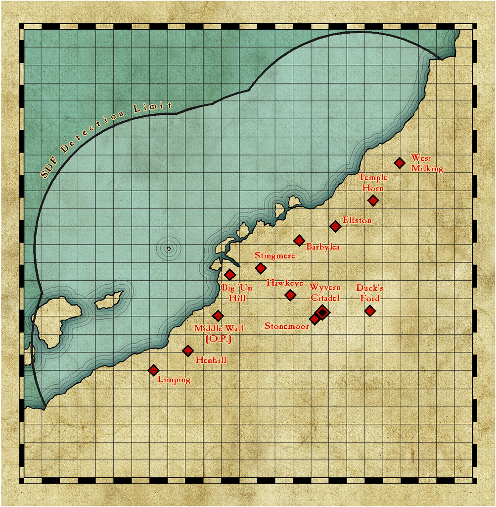
Although a reduced-size version is intended for the table in the final drawing, it seems useful to add this map as a separate FCW file with the set, I think. Ten-mile grid squares, incidentally.
Enough for now though, since on any given day, I've essentially the choice of providing an update here, or getting on with the actual mapping ?


![[Deleted User]](https://secure.gravatar.com/avatar/c75d9a245b74d9c59be0999ea81ca541/?default=https%3A%2F%2Fvanillicon.com%2F92add7f8c954488718110edc4896ad39_200.png&rating=g&size=200)


-
Community Atlas 500th map and 4 year anniversary competition with prizes.
@Monsen commented:
Map notes... I think Wyvern has the record with a 20-part map note.
I just don't know when to stop sometimes ?. Lifetime of designing RPG scenarios, I suspect, coupled with a desire to explore many avenues. All the time...

-
Community Atlas 500th Map Voting Thread - Please vote
I second Sue's comments; this was an extremely difficult vote, as there are just so many fascinating maps produced in such different styles.
Hopefully, everyone contributing enjoyed their mapping, and perhaps learnt something fresh along the way.
It's certainly been a delight reviewing them all again now!
Get voting folks!


-
Community Atlas: Wyvern Citadel Defence Zone on Kentoria
As suggested when I requested this part of Kentoria a few days ago, this is the WIP thread to try to show something of how this mapping project's been developing, and where I'm up to with it.
It all began in 2020 July, when Quenten suggested a series of potential mapping projects for various Forum "regulars" from an area in western Kentoria he'd just been mapping, called Shoenia. While I had no time then to do any mapping for "my" bit, Wyvern Citadel, I did some basic exploration of the area and made a few notes even then. Not much has been said about Kentoria, but what there is suggested to me a high magic-use continent, now threatened (if presumably only to an extent) by barbarians. I also discovered that this Citadel was the sole structure shown near the western shores of Kentoria on the continent map:
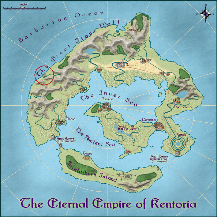
That suggested it was of considerable significance, and being next to the Barbarian Ocean (despite the considerable separation from the nearest land on that side of Kentoria) started suggesting reasons why, particularly seeing that Quenten's Shoenia map had provided a lot of obviously high-yielding agricultural land in the region, stretching for several hundred miles into the surrounding valleys (told by the numbers of settlements, as well as the extent of the farmed lands).
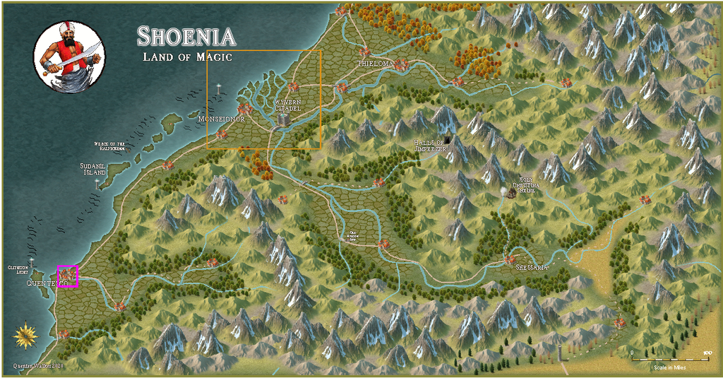
I toyed with a few ideas around all of this at different times, but it's only been this past week or so that ideas have really firmed-up. The orange boxed area on the Shoenia map here shows the area I decided would be useful to map in a little more detail around the Citadel itself, because that large, swampy, river delta seemed a likely place for barbarian sea-raiders to be able to strike unseen, tempted in by the obvious agricultural richness of its surroundings, ones likely equally rich in other resources, like gold, say!
What I've come up with is that the delta vicinity was attacked by barbarians last year, when an unusual sickness in Kentoria laid low much of the population, and prevented the folks hereabouts being as vigilant as normal. The raid also happened in the winter - or as much of winter as Nibirum's southern tropics ever get - during a spell of abnormally severe weather. It was so bad, the snowy remnants can still be seen on the south-facing slopes of many of the mountains hereabouts. It appears the weather was magically augmented by one or more powerful druids/shamans that accompanied the raiders. Some of the raiding ships were driven-off, though one larger fleet especially managed to land in the southernmost estuary of the delta, nearest Monseignor, which city was raided particularly heavily, losing much treasure, and having its Forum destroyed. While the Forum was quickly rebuilt, as the political leaders locally say, "bigger and better than before", the population remains very nervous, and has demanded further action, especially as the sickness seems to be dragging on in places into another year.
The area has been long known for its colourful wyverns. Indeed, some say the smallest kinds outnumber the birds in these parts, and are of comparable sizes. The region is sometimes called the Wyvern Coast elsewhere in Kentoria as a result.
So, wyverns. Wyverns in defence. Wyverns and their riders. Squadrons of wyvern-riders. Thinking here something on the lines of Anne McCaffrey's Pernese dragon-riders, with mentally-bonded wyvern and rider pairs. Aerial defenders made me think of the Battle of Britain in 1940, particularly because of KENToria, Kent being the English county above and near which much of the aerial combats then took place. Thus came about the recently-constructed Wyvern Citadel Defence Zone:
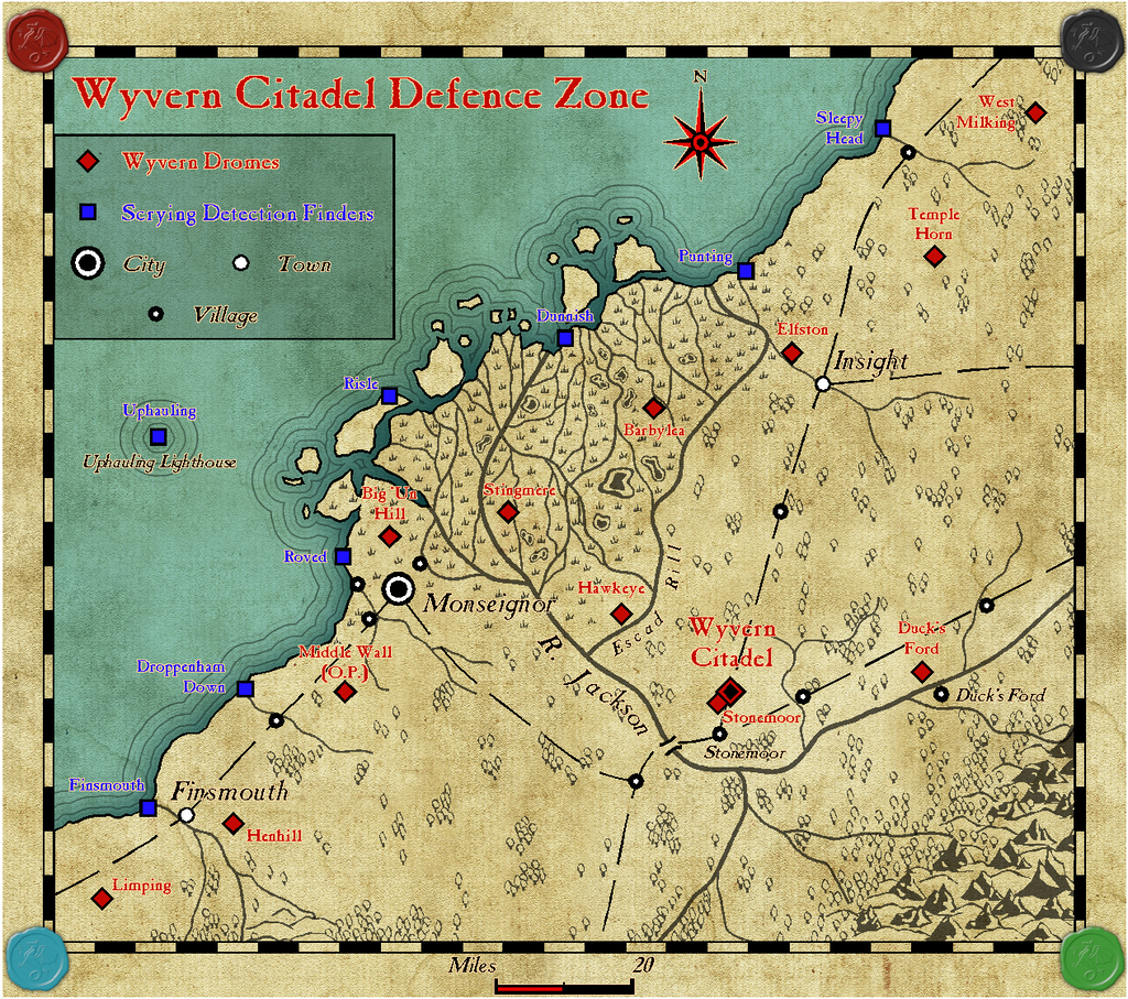
The perceptive may notice a certain - familiarity, shall we say - about some of the new place names. And some are just... well, why not?! I had to name the river and its delta, and The Great Stone Wall mountains conjured up for me the famous American Civil War general "Stonewall" Jackson. There'll be PDF and text-file notes to add more flavour to all this eventually in the Atlas.
There are four main colours of wyvern, as illustrated here by the four wyvern seals from Sue's brilliant new symbols pack with this month's Annual issue. Couldn't resist! Each colour has its own particular powers. The blue wyverns, for example, are extraordinarily powerful flyers, able to fly higher and for far longer than any other type of wyvern hereabouts. They also have the greatest wingspan of any of the wyverns. Or big wings, if you prefer. So, their primary training ground is the drome nearer the mountains where they're often found wild, at Duck's Ford. Obvious, if you know your Battle of Britain history, of course!
As for the Scrying Detection Finders, I'm sure someone will eventually start calling this system "Scrydar"...
The mapping was done using the CA128 Parchment Maps style from 2017 August, including the font, plus Sue's seals, as mentioned.
I'll add a copy of the Defence Zone map to my Gallery shortly, with more to follow on the area later!


-
[WIP] Atlas Competition Entry - Coils of the Cold Coroner
Does it actually matter? It gives me the impression that the blocky ice of the more northerly area continues in places through the hills and mountains, but only by straining quite hard at the image. Gives a feeling that something's not quite what it seems as well, perhaps.
However, I suspect Monsen's right, that the opacity of the fills simply needs adjusting upwards to resolve!
