


Wyvern
Wyvern
About
- Username
- Wyvern
- Joined
- Visits
- 3,266
- Last Active
- Roles
- Member
- Points
- 5,585
- Rank
- Cartographer
- Badges
- 24
Latest Images


-
Community Atlas: Mirror Maze of the Shrouded King, a Map for Lich Land, Peredur
In the series of small dungeon maps I've been drawing this year in my sort-of Dungeon24 project, the next was the first rolled-up using the Explorer set of Inkwell Ideas Dungeonmorph Dice designs. The Explorer set is one of the earlier in the Dungeonmorph range, so it doesn't have an accompanying descriptive book. As I'd been having some discussions with a few folks about the whole Dungeon24 concept on the Arcane Library Discord (Arcane Library is the publisher of the new Shadowdark RPG) just before starting this map, I thought it might be fun to use the numerous random tables in the Shadowdark rulebook to generate the contents for it.
Shadowdark greatly encourages making things as unique as possible - so creatures might get unusual abilities or quirks, and perhaps as importantly, their own motivations, all of which helps encourage role-playing, of course. That process was fascinating, and, with a little bit of tweaking here and there, is how the dungeon became "The Mirror Maze of the Shrouded King". It has quite a selection of undead creatures within.
I'd also randomly decided earlier that it would be placed somewhere in the Godtagel area of northeastern Peredur:
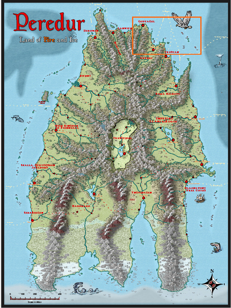
Peredur's one of the Atlas continents that's been quite heavily mapped in places so far, so I was hopeful I'd not be needing to prepare an extra area map as well this time. After quite a search (as indeed, a lot of spots have maps here already), I found somewhere that seemed vaguely suitable, a delightful spot by the name of Lich Land:
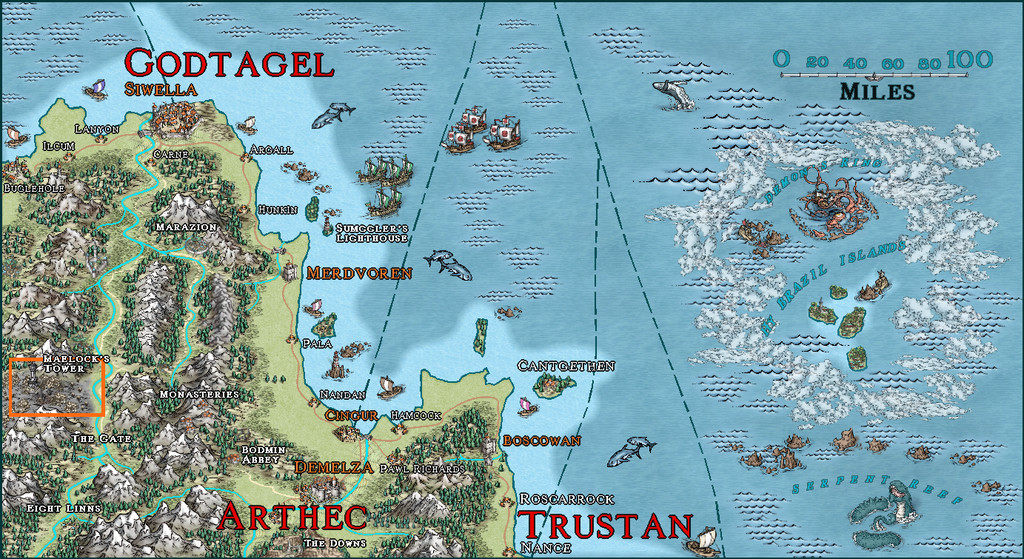
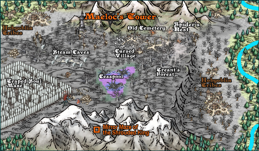
When I drilled down into the map for this area, I had a few problems finding somewhere suitable to choose, as while the pictorial drawing style used for the Lich Land map has its own charms, it has a tendency too to sometimes present the places on it as very over-sized for the map scale, which makes finding somewhere a small dungeon map can be dropped-in rather difficult. In the end, I went with what seemed the least-worst option, if not wholly ideal, a blank spot in some mountains where luckily nothing else had been sited. To give some impression of the scale of the whole mapped area, the orange square that marks my selected location is one mile per side:
Shadowdark makes use of clear, black-and-white, hand-drawn maps with dot-shading for where the solid rock is in subterranean areas. That was definitely something I wanted to try for this dungeon map, although none of the available black-and-white styles for CC3+ really quite capture that look, especially for the shading.
What I decided upon was the OSR Dungeon style from Annual 97, as although many of the floor and rock-shading textures in that are too densely-packed with lines to fit this concept, there were other features from it I thought would work to give a closer approximation to the cleaner Shadowdark map look. And this is what I came up with:
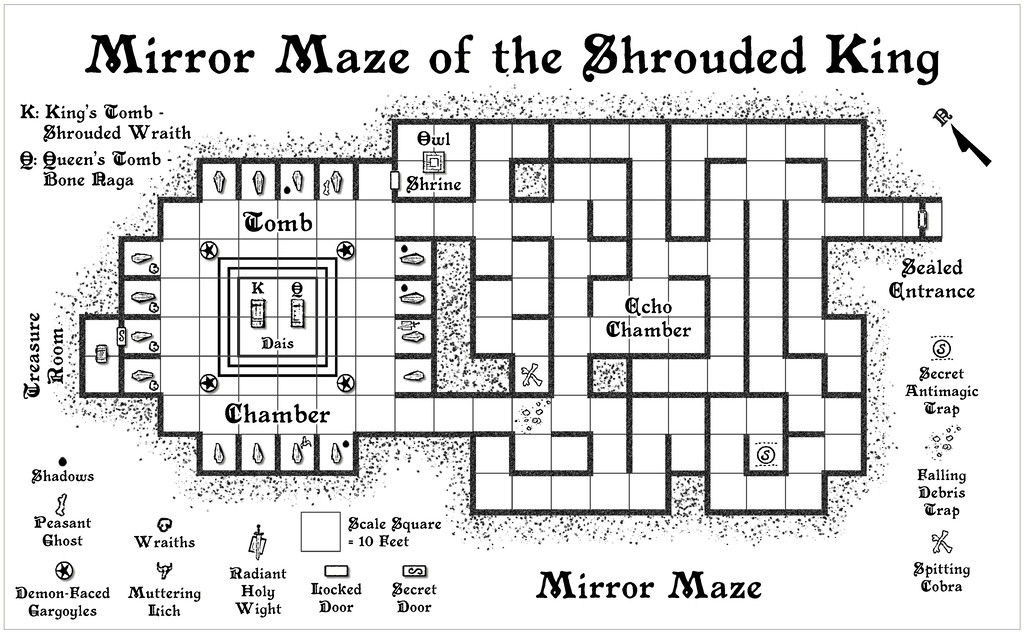
The dot-shaded look was achieved first by laying down a base smooth polygon using the "Stones" fill texture, and then adding random selections from the two "Gravel" symbols over that on a separate sheet, all placed by hand, which allowed variable densities of such shading nearer the outer wall lines, and within the design, where rock pillars had been left in the Mirror Maze section particularly. The Stones texture had to be rescaled in the drawing to better fit the size of the Gravel symbol dots, which was pretty straightforward, and the whole does give quite a nice hand-drawn-like look to the shading.
I did experiment briefly with the Fill with Symbols and Symbols in Area commands, which often can take a lot of effort to get right. However, they both would have added many extra symbols to the map, most of which would have gone unseen as hidden below the floors, to give a similar density pattern. This way, I only had to add enough symbols to "spray-paint" those areas that needed it, and had far better control over the final appearance.
The thin grid squares on the clear floor is another deliberate choice, as this is a regular feature of Shadowdark maps, hand-drawn lines that provide a - usually - ten-foot grid scaling, while still looking somewhat like a flagstone floor texture, with occasional extra small marks suggestive of little bits of floor debris. There are some "Floor Tiles" textures in the OSR Dungeon style that have a similar look, although when scaled-up enough to give 10-foot squares, their lines look too thick, and the textures' highest resolution isn't sufficient to get a neatly clear appearance at that increased scaling level, unfortunately. Thus I simply made do with a standard 10-foot grid set above a plain, untextured floor polygon. It is a little unfortunate this'll be hidden on the Atlas images, as it's really part of the drawing, though at least it will be available for those with access to the FCW file, as well as on the Forum here.
I did need to add a compass pointer from the CA 160 Inked Dungeon set, as the OSR style doesn't have one, and even that had to have its letter-marker replaced, as the original font in the symbol jarred with the Primitive font from the 2015 OSR Annual. That just took a simple edit of the symbol to accomplish for this map only, however.
The Maze from the Inkwell dice design, of course, is what drew me to the Lich Land map, and I sort-of reused the "Trapped Soul" area-map concept from Lich Land in the Mirror Maze idea here, making it the reason so many variant undead are to be found in the Tomb Chamber; basically, they can't get out because of the Mirror Maze. There are hints in the map legend as to what Shadowdark is capable of helping to create, such as the "Muttering Lich" and "Radiant Holy Wight". Plus I added a few ideas of my own, generated because of what had already come up randomly, thus the Tomb Chamber contains the folk, now as undead, from the Shrouded King's formerly living inner court circle.
Normally, I'd just set-up descriptive text and PDF files to go into the Atlas to accompany the map. However, because this was created with heavy use of Shadowdark elements, I prepared a variant PDF that has the usual write-up, plus rules-specific notes on the creatures that aren't identical to the standard versions, monetary values for the treasures, and a couple of other items for those wanting to reuse it for Shadowdark games. I'll be adding that to the Arcane Library Discord in due course, but for those who aren't on there who might find it useful, this is a copy of the file:
Next time, I'll be staying in Peredur to find a spot to place the second "Explorer" dice dungeon, down in the southern region, somewhere in Haddmark...


-
WIP Ruins of Charn
I'm with Sue, in not seeing there's anything so very wrong with it overall.
Maybe a shadow effect under/near the table would help, and possibly separating each of the chairs/thrones a little. Less sure about this second point.
The bell does look a bit odd, so that might benefit from a minor rethink, and repurposing some symbols to help. A quick skim through the Perspectives 3 Bitmap B options suggests one of those open stone doorways (called "Doorway" in the Wall Features symbol catalogue) scaled-down, could work for the stand, and as a bell, maybe try one of the "Dish covered" symbols from the Bitmap B Furniture catalogue, though you might need to tweak the scaling a little, using slightly different X and Y scales to make it a little more vertically elongated.
You could then draw a suitable little line as the support rod for the bell (or probably two short lines, so it looks as if the support rod passes though the loop on top of the "bell". You could though perhaps resize and repurpose the "Quarterstaff" from the Weapons catalogue similarly for this instead. For the hammer, maybe try the "Maul" from the same Weapons catalogue.
ADDED EDIT: You might also think of using an alternative stone base for the bell instead of the table - perhaps the Bitmap B "Altar Nature", the "Altar Simple", one of the stone "Pillar Base" options, or perhaps that "Pedestal sm", all from the Temple and Statues catalogue.
-
[WIP] Sea Elves Outpost
Glad to be able to kelp a little 😊!
I'm not averse to hydrothermal vents myself, of course, if on a larger scale of mapping (so far).
-
Community Atlas: Map for the Duin Elisyr area, Doriant
So at last, everything's ready, and has now been submitted to the Atlas. This is the final version of the Evth Pass map (higher res version in my Gallery):
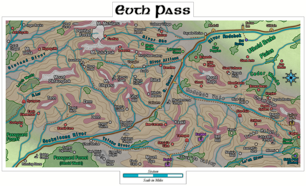
Quite a journey from those three rolled dice that began it all!
Next time, the deities of randomness seem to be dictating a return to Peredur, in its northeastern part, somewhere in the Godtagel area, apparently...
-
Seven Pines Lodge (keep it simple stupid)
Nothing to do with this topic, but I did just want to say very well done to C.C. Charron for creating the new Ancient Cities mapping style that's just been released by ProFantasy as June's Annual issue! Based on the "Sumerian Kinda" Forum posting here, of course!

