


Wyvern
Wyvern
About
- Username
- Wyvern
- Joined
- Visits
- 3,266
- Last Active
- Roles
- Member
- Points
- 5,585
- Rank
- Cartographer
- Badges
- 24
Latest Images


-
[WIP] Community Atlas, 1,000 Maps Contest: Villages in The Whispering Wastes of Haddmark, Peredur
Halfway point, or map five of the ten, if you prefer, is reached via Hex 1105, Osalin Village:
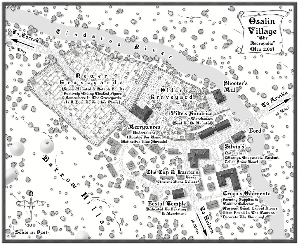
One interesting aspect for me as mapper with this sub-project was how readily the places each developed their own character, partly a result of their broader map setting, partly thanks to whatever features the Shadowdark random tables had come up with. In this case, there was the chance to map an unusually extensive area of burials, an aspect which truly defines the settlement, given that the area occupied by the dead is greater than that of the living village. Everything there was placed individually, to make sure things were never too neatly-ordered, although it's perhaps best not to peer too closely at what some of the repurposed symbols involved as the grave markers actually are! What's important at this map-view is the shape, texture and the shadows (or equivalent effects - there are some "Solid 10" shapes with variant Lighted Bevels in places, for instance). While time-consuming, it was rather satisfying to see the whole area growing in a more or less organic manner.
I'd already decided there might be hints of connections with a couple of the barrow-fields in hexes some way from the settlement on the Whispering Wastes area map, so adding a few more Solid 10 bevelled shapes for a few barrows closer-by seemed simply a natural adjunct. What was perhaps more surprising was the random tables provided by-chance an undertaker, properties hinting further at the ancientness, not to say weirdness, of the setting here, haunted warehouses and a little old temple suitable for hosting celebrations for the deceased (and anyone else at other times, of course). I've mentioned before, there are times when you start to wonder just how "random" these things really are! All I needed to add was a mill, a few contours and those barrow-shapes.
Onward now to the second half of the ten!


-
Community Atlas 1000th map Competition - with Prizes [August/September]
Map four of my ten small settlements is Toresk Village:
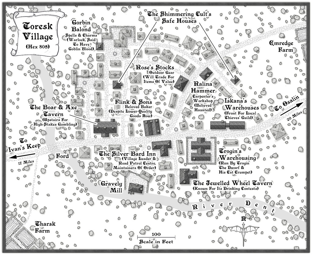
I've updated my WIP topic with this map today too, and there's a higher-res version in my Gallery as well. The FCW and PDF notes follow:


-
Community Atlas 1000th map Competition - with Prizes [August/September]
The third of my potentially ten villages from The Whispering Wastes in Peredur is Ivan's Keep:

As previously, there are more details in my WIP Forum topic here, and the FCW and PDF notes files are below, with a higher res version of the map image in my Gallery:
-
[WIP] Community Atlas, 1,000 Maps Contest: Villages in The Whispering Wastes of Haddmark, Peredur
And so to the third map, Hex 505, Ivan's Keep:
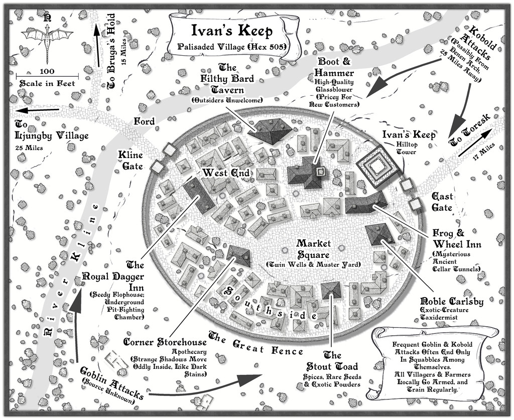
Subject to frequent attacks by bands of Goblins and Kobolds, this had to be a defended settlement, and I thought it might be fun to use what is actually the symbol of a short stretch of straight wooden town wall, to create a neatly rounded palisade! It wasn't actually that difficult, after setting up a guideline oval to work with, ensuring the village properties stayed within that boundary, and then fitting the wall afterwards. The shortness of the wall symbol meant it actually worked rather well in this manner. As to why it's so neatly symmetrical (if not entirely to the low hill the place is built on), there is an explanation in the accompanying notes.
While less intentional, the mix of shadows and road textures does help make the palisaded settlement a very definite focal point for the whole drawing. Plus the fact the village wasn't always where it is now meant a couple of the ruin symbols that come with this mapping style package could be employed to hint at that. Most were cleared away when the Fence was being constructed, to help build the newer properties in the settlement as it now is, of course.
-
Community Atlas 1000th map Competition - with Prizes [August/September]
Map two in my group of small settlements is for Bruga's Hold in Hex 403:
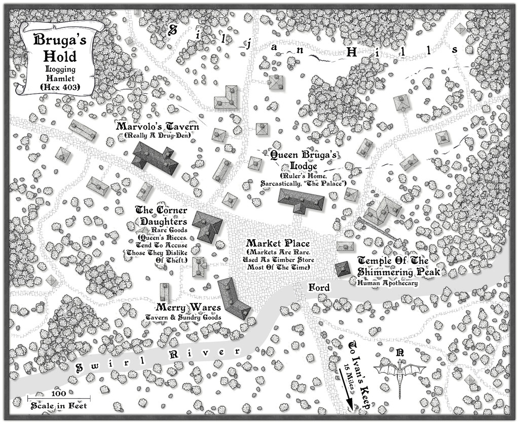
I've updated the notes in my WIP topic about this set as well, and there's a larger version of the map in my Gallery too. Meanwhile, the FCW file and PDF notes are here:

