


mike robel
mike robel
About
- Username
- mike robel
- Joined
- Visits
- 4,196
- Last Active
- Roles
- Member
- Points
- 435
- Rank
- Surveyor
- Badges
- 6
Latest Images
Reactions
-
Elevation Lines on Small Maps
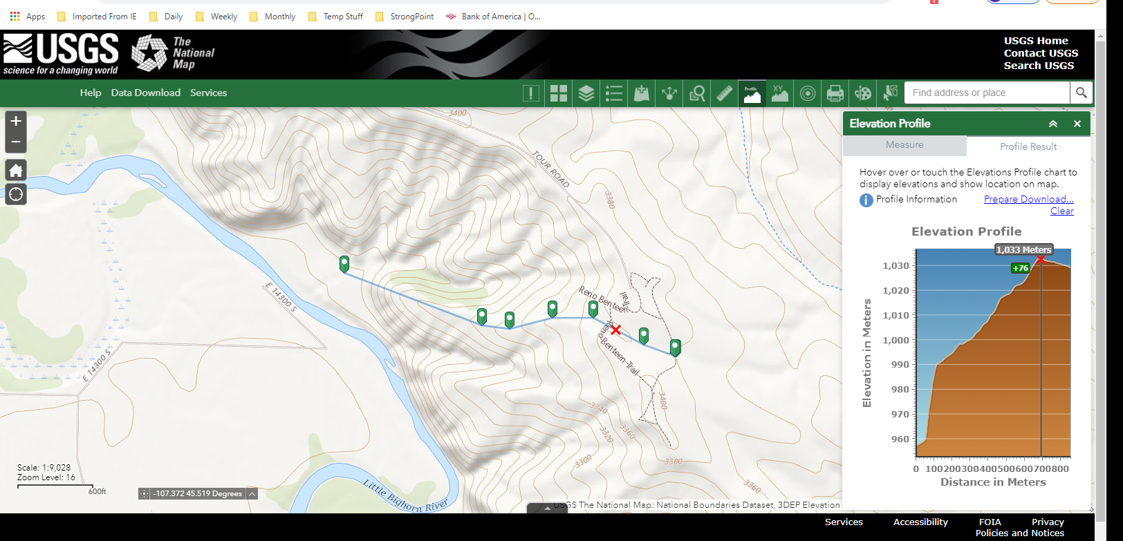
You can go here to the National Map https://apps.nationalmap.gov/viewer/ and select areas in the US and zoom in pretty far and you can display the contour lines. There are measureing tools so you can see how far a given path is and a profile tool so you can see the roughness of the terrain. However, the height is exaggerated so it looks like you are climbing mount everest, but it can give you a good idea of how things are in relative terms.
The closer together the contour lines, the steeper the slope. If they come together, or are very dense, or even end, with just one contour along a spot, then you have reached a cliff. Here's a screen shot which may help.
There are similar sites that provide information in other ways.

![[Deleted User]](https://secure.gravatar.com/avatar/c75d9a245b74d9c59be0999ea81ca541/?default=https%3A%2F%2Fvanillicon.com%2F92add7f8c954488718110edc4896ad39_200.png&rating=g&size=200)
-
isometric contours
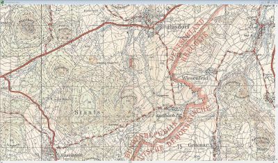
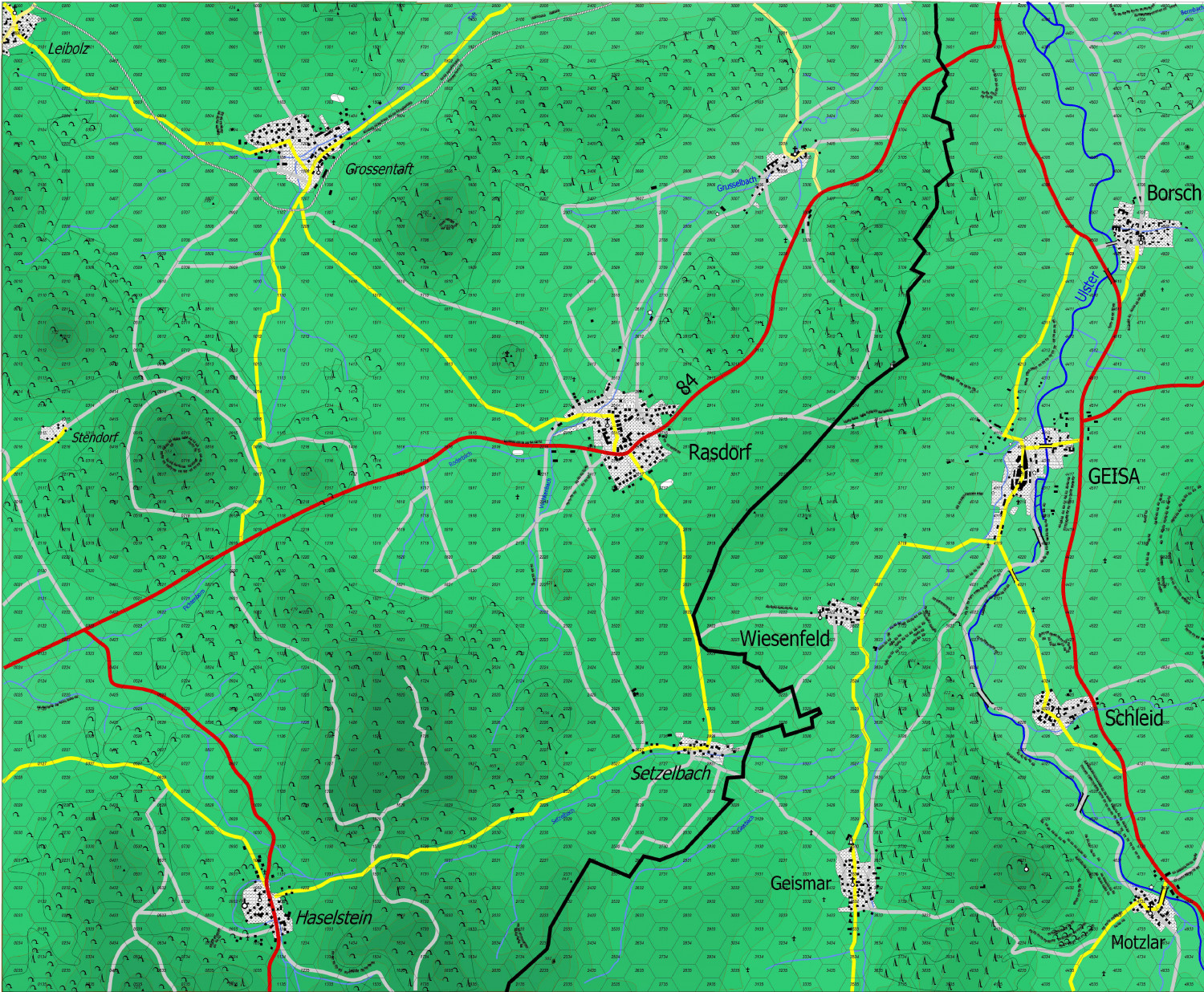
Here is a region of Germany where I served. The first one shows the area without contour lines. The little symbols are for coniferous and deciduous trees.
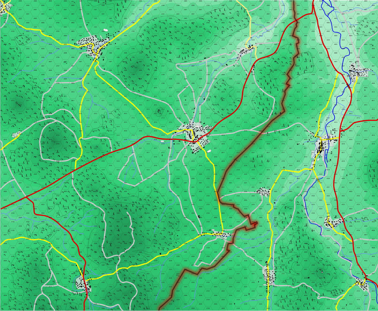
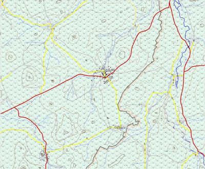
And here I turned on brown contour lines.


-
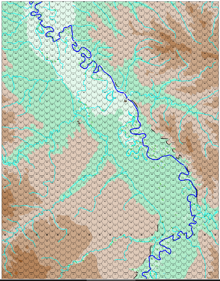
Yet Another Wargame Map set in ...
Well. I decided to fill in the contour lines using the special palette Monsen made me with 48 shades of green and changed the contour interval from 50 meters to 20 meters. The 50 meter contours are still in there. Because I have trouble following contour lines, I decided to work backwards from highest to lowest. I thought I was saving regularly and saved the thing this morning a little while ago because its the 29th, not the 28th, but I obviously failed to "early and often" because the thing crashed and so I lost about an hour of work.
At any rate, here is an overall view of how things are. It will look much better.
The black lines are the 400 meter contour interval. When those are all changed, they contours will start to meander more and spread across the map. When I am done with this I will have to decisions to make. Switch to the 48 brown palette Monsen made for me and/or skip a color between contour lines (instead of 196-197-198 go to 196 - 198 - 200) to make the elevation change easier to see for my poor eyes.
Sue will be annoyed because darker is higher. :)
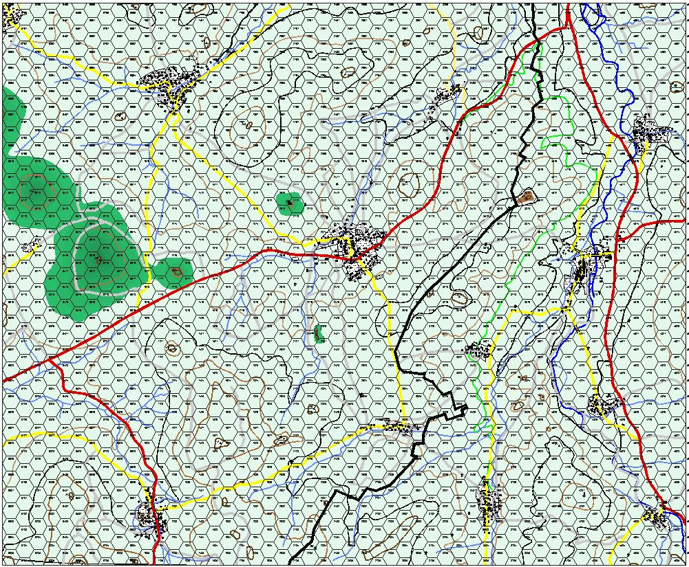
, but I will be able to focus better on where they go.


-
Yet Another Wargame Map set in ...
Sometimes, things just go well. I thought the colors were too vibrant for Germany, so I made them 50% transparent. I still may need to town them down.
Also added the Forest. Decided to go with a Green Outline and then put the symbols inside.

-
Gettysburg
Hey @WeathermanSweden Here it is with the green to brown transition in 48 colors. This looks like dynamite!


-
Sinister Sewers - Style Development Thread (CA207)
Your creativity astounds me. I look forward to following your development. Not 'dirty' sewers, but the sewers in Lex Luthor's domain of the first Christopher Reeves Superman Movie are an interesting take off of a pleasent life underneath the streets of NYC.

-
How long have you been using Campaign Cartographer?
I think I started using it in 2010-2011 to make maps for my wargames and occasional maps for other people. I've had about a 18-24 month break but am now using it again. Time to relearn a bunch of stuff...


-
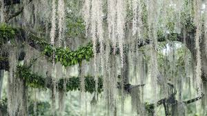
Project Spectrum - Part 2
A little late. Your "swamp trees" reminded me of Spanish Moss which grows in the South-Eastern US and in the Gulf of Mexico and Caribbean. Once used as cushions in Model T's until Ford learned they had mites in them that made everyone itch, then they had to boil it. It's really not a moss. Apparently, its related to pineapple. Go figure.

-
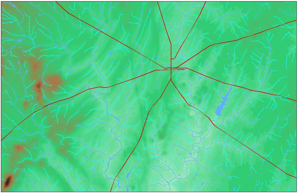
Representing Cliffs and Ridgelines
Here an overall view of the map. The actual map is 34 inches x 44 inches.

-
World Map
Quadrilateral! 😎


