


Wyvern
Wyvern
About
- Username
- Wyvern
- Joined
- Visits
- 3,303
- Last Active
- Roles
- Member
- Points
- 5,647
- Rank
- Cartographer
- Badges
- 24
Latest Images
-
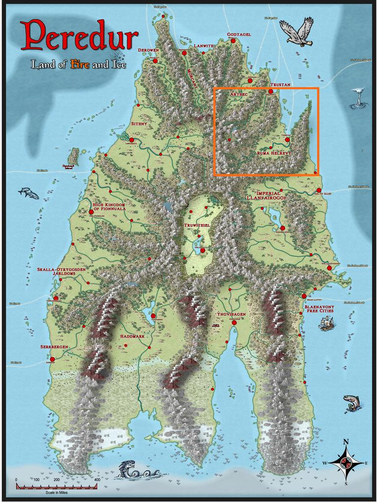
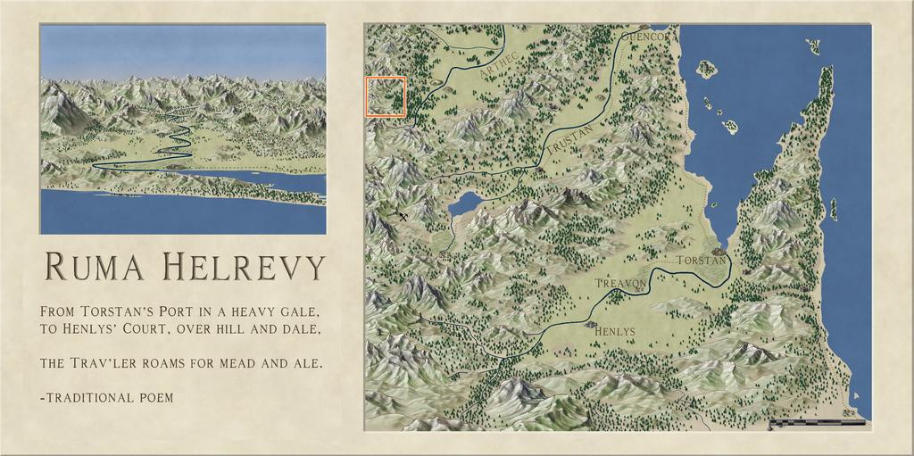
Community Atlas: Oracle Mountains Area, Ruma Helrevy, Peredur
Having concluded my recent diversion to The Dying Earth of Jack Vance, it's now time to resume mapping for the Community Atlas. The next maps were intended for somewhere in the substantial Ruma Helrevy region of Peredur, as noted previously in the final post here:
This also brought a switch to a new Inkwell Ideas Dungeonmorph Dice set, as the next four dungeony maps were to be from designs in the Lairs pack. These are quite a contrast to the recent Trailblazer set's layouts, because most of the Lairs ones are caverns, or otherwise irregular spaces. As luck had it though, one of the dice designs randomly selected here was something transitional, with a square entrance room leading into a large series of caves. These dice also have an accompanying Inkwell Ideas book of suggestions for every design, "Dungeonmorph: Delves and Descriptions - Crypts, Lairs & Sewers Edition".
As usual, I checked through the book notes, with random rolls, to spark off some initial concepts, in conjunction with examining the existing Atlas maps for the region, and any notes with those, to find a suitable spot to locate this map. Almost nothing has been mapped in the Ruma Helrevy area, except the main settlement of Torstan, and most of the map's notes revolved around that more southerly broad valley as well. Meanwhile, what I'd determined/adapted from the Inkwell book were some Ogre-sized Badgerfolk who'd broken into the cellar (the square entrance room), which was a former summoning chamber in the base of a ruined wizard's tower. This led, by a now shattered secret door, to the cavern complex. In the caves were a Naga in a pool cavern, a whole group of Spidermages, one of whom was a strange, oracular creature, all of which mages had originally inhabited a far deeper world, led to by a great chasm, come nearer the surface to collect ambient magic in their special web-nets, and a second entrance, via a narrow, open-sky cleft, where a group of Wyverns (yay! 😁) were nesting.
The whole magic-from-the-air concept led me to think of a stone windmill-like wizard's tower, with four fixed, stone-framed sails, now partly ruined, designed to draw magic from the sky in a remote mountain valley (because of the Wyvern-cleft). And suddenly one map became three, because aside from the dungeon one, this needed an area map, and some sort of design for the surface tower too.
There are plenty of mountains in Ruma Helrevy, and I quickly narrowed the options down to a zone in that map's northwest, away from the more civilised parts. Ordinarily, I'd have gone with a 20-mile square area for this, which has become fairly, if not exclusively, typical during this project. That looked ridiculously tiny here though, so I doubled-up, and went with a 40-mile square instead, right on the extant map's northwestern edge:
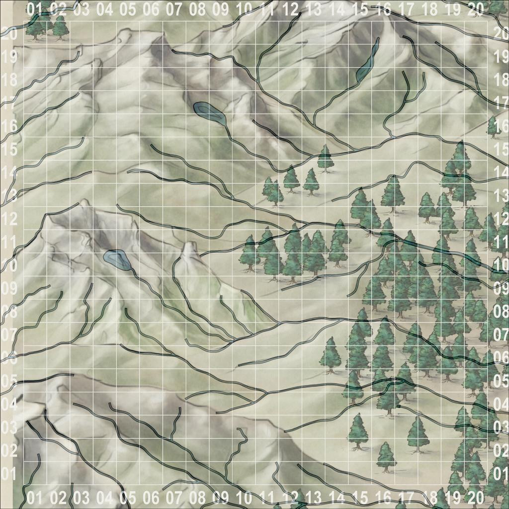
Following what's become my normal practice, I set-up a, here, 2-mile square grid across that area, and randomly-rolled for locations of interest among those. I also randomly rolled up some name-options for the leading creatures from Mythmere Games' "Nomicon", and a whole series of mostly single-word idea-prompts for more names from the random tables in the "Knave: Second Edition" RPG rules (Jacob Hurst & Swordfish Islands LLC). However, for the location details, I decided to try out another, much newer, Inkwell Ideas product, the "Hexploration Kit". This comes with a large group of pre-drawn, coaster-sized, hexagonal terrain maps printed on card, and five separate card decks with an evocative illustration on one side (by The Forge Studios), and random tables of text ideas on the reverse. Several cards per deck have ideas and random tables on both sides, to further expand the options. I used cards here from three of these decks, "Stranger Places", "Into the Wilderness" and "Settled Lands", with suitable random rolls and further adaptations.
With all this decided, finally, I could start mapping! I opted to stay with Ralf's Hand-Drawn Fantasy style again for the area map (and the dungeon one too), and set-to.
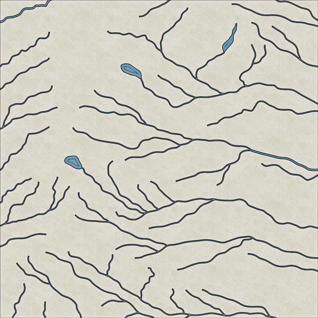
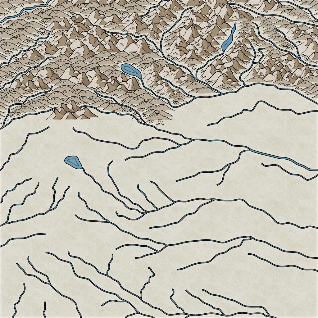
While using the gridded map to place locations, I'd been struck by the flowing lines of the Jon Roberts' style mountains, and thought those lines could be readily adapted to show rivers. This first image illustrates how I drew those, still with the imported, semi-transparent, gridded base bitmap showing:
I also added a few small lakes, partly because I'd developed a mental image of how I wanted the ruined tower to look (aimed for the lake-head around square 0411, facing southeast down the valley), and it seemed likely such glaciated mountains (this is around 53°S latitude) would have small lakes of this kind. As you can see too, I've not simply gone with the valleys from the Jon Roberts symbols, but have used some of the crest lines too, essentially because that looked more interesting!
This shot gives a better idea of the final riverine layout:
With that completed, I started sketching-in the physical terrain:
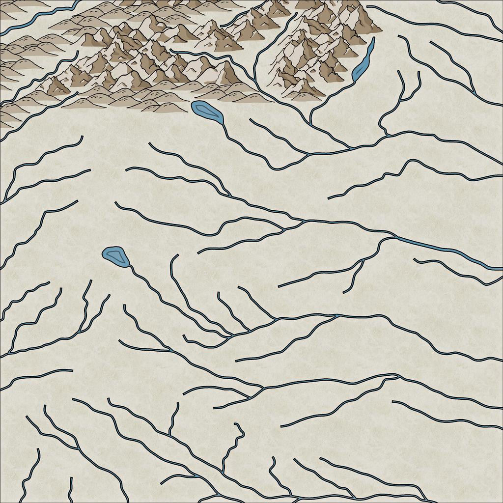
This still needs a lot of tweaking - hiding the ends of the river lines, filling-in the blank valley bottoms, and so forth. Here's a shot partway through that "cleaning-up" process, and a bit further along more generally:
I tend to do this in segments of the map, to try to avoid too many problems with the ordering of which symbol overlies which ("Sort Symbols in Map" can create as many problems as it solves with styles of this sort that involve fade-out lower symbol edges, unfortunately). Thus all this took a couple of mapping sessions, and another couple more to complete the whole terrain layout:
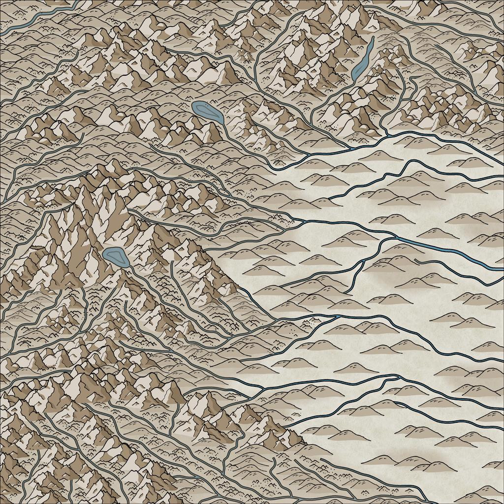
By this point, I've also added the background mountain-shading polygons as well. The absence of smaller terrain features in the lower-lying areas is because there are going to be woodlands here, which would make many such smaller symbols redundant, as largely hidden away.
Still quite a lot more to do, but that's definitely long enough for today's round-up, I think!


-
Postcard Maps
Resurrecting this topic, as another, but much larger, map in a similar style has recently come to my attention, as a version of it was recently republished by the H P Lovecraft Historical Society as a period prop to accompany their latest Dark Adventure Radio Theatre audio show, "The Blood Red Sphinx". It's a 1932 pictorial map of the Greater Los Angeles area:
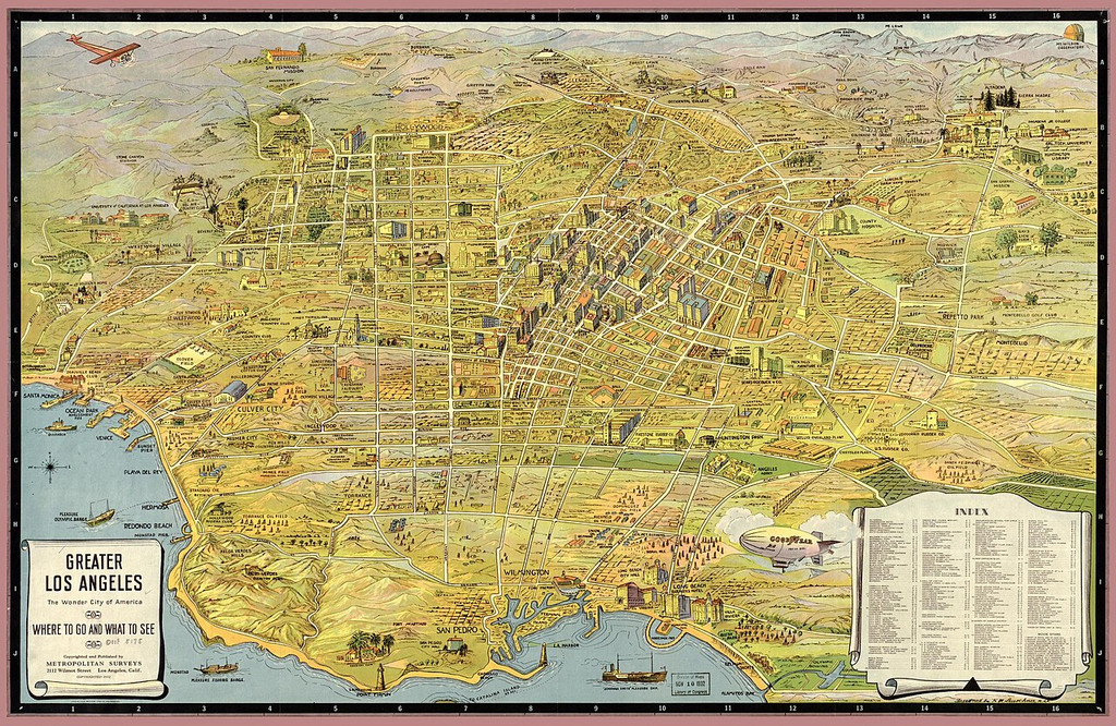
The reason I can post it here, is because this version comes from Wikimedia, and that's where you can find a much larger, higher-res version (albeit the Index list is STILL too small on the largest version to read clearly!). Its colour palette reminds me of the beautiful E Prybylski Watercolour style, from the 2023 Cartographer's Annual. All we'd need is a vast array of suitable building and other object symbols to match 😉😁!


-
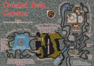
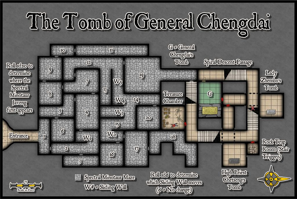
Community Atlas: Mingjue Ruins, Xinxing Region, Kumarikandam
Naturally, I wanted to continue the overall hand-drawn theme here, now using Ralf's more recent Hand-Drawn Dungeon style:
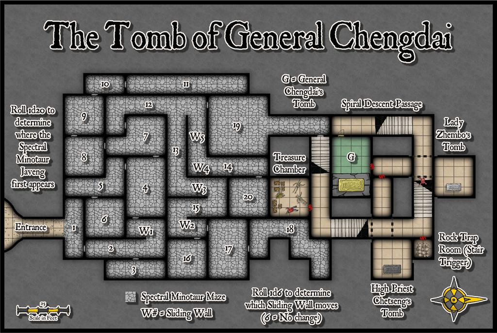
I did think of adding a surface map too, but decided against that, and just showed a simple Entrance cave, which is open at ground level, leading down and inside. Rather than use another fill style here, I reused that for the inner section of the Tomb, with a scatter of small rocks, as the entryway is supposed to be half-buried and not that easy to access (noted in the PDF description).
The two main blocs underground were determined from lightly adapted versions of the notes in the Inkwell Ideas book that accompanies the "Trailblazer" geomorphic dice set, the "Dungeonmorph: Book of Modular Encounters - Delver, Trailblazer & Voyager Edition", with the names again provided via the "Nomicon". The Spectral Minotaur Maze layout was enlarged a little compared to the actual dice design, including a few extra doors, because although the dice-only version was good, it didn't feel quite "mazy" enough here, which changes also brought in the sliding walls concept, to further muddy the waters.
In the Atlas FCW file, with luck, there will be toggles to allow the five Sliding Walls to be switched individually from one position to their alternates. Here of course, I have to show five different illustrations, for all the changes in each are very slight, best-seen if you save copies of all six images and switch from one to the next as a slideshow.
The shot above is the default view. This shows the moved W1 wall:

This W2:

W3:

W4:
And W5:
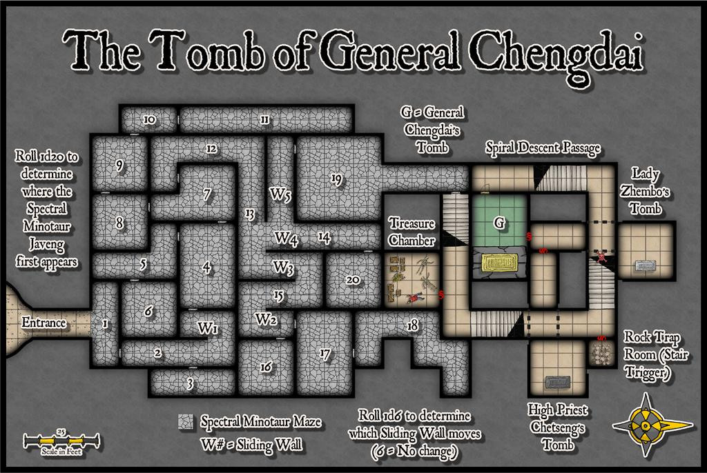
There is, as noted on the map, an actual Spectral Minotaur, Javeng, to defend the Maze, plus six more that he's created over time from treasure-seeking adventurers. Like all the undead here, he's powerful and reforms even if destroyed, plus the strong magics that operate and maintain the complex mean none of the undead can be turned away by priestly characters, while unattended doors close on their own, and markers in the Maze vanish or are moved. The Minotaurs can't leave the Maze area at least, hence why the floors are so clearly differentiated.
The Tomb area is constructed around the square Spiral Descent Passage. I'd have been happier with stairs that didn't have that black "corner", as they can work less well on maps such as this, which show multiple levels on the same drawing. However, I preferred to use just the symbols currently available in the style, and they don't look as bad here as those which simply cut through and remove part of the lower stairs, making it seem they've crumbled away!
The Treasure Chamber should have a boat and a wagon in it, although as neither are present as symbols (yet!) in this style either, I made-do with what there is. There are also five skeletons there as well, but that looked a little too cluttered and "samey" with the current options, so the room contents overall are just a sketch-reminder version instead. The PDF notes say more, of course.
Deeper down, the Rock Trap triggers via the lowest step on the third staircase, hence the trap marker there. The whole wall section fronting the hidden room pivots to block the Descent Passage up, then the damaging rocks roll right down to the door to Tomb G. A short while later, magically, they all roll back up to the secret room to reset!
The General's Tomb (he's the only one here not undead; a legendarily masterful leader in life, famed for many great deeds) is floored and roofed with green marble, with a black marble platform for his large, brass sarcophagus, with illustration-engraved brass wall panels all around. No green marble available here, so I improvised with an RGB Matrix Process effect. And spent ages tweaking it to look reasonably OK! The platform is the varicolor closed pit symbol, stretched to become rectangular.
Lady Zhembo, yet another spectre, betrayed her lover, the General, to his death, was caught, executed and cursed to remain here, perpetually mourning him. High Priest Chetseng, the strongest spectre in the complex, who in life set the curse, is here to make sure she never leaves.
Next time, it's a return visit to Peredur, to find a suitable location in Ruma Helrevy there...
-
Maps of Anglo-Saxon England
When hunting for maps today to assist a colleague on an ancient history forum, I happened upon this page on Kemble: The Anglo-Saxon Charters Website, which has links to a host of beautiful, sometimes annotated, hand-drawn, black-and white maps of Anglo-Saxon England, all done by the cartographer Reginald Pigott for various books in the early 21st century. They're especially valuable, as some show the established, or best-estimated, extents of features like forests, marshlands, and coastlines, many of which have altered since the 7th to 11th centuries CE. They're free to download for personal use, and are well worth a look.


-
Is there a way to make a square grid such that the different squares are offset from each other?
OK, maybe try this.
1) Set up a suitably-sized snap grid that'll let you draw squares of the exact size you need, and keep the snap grid turned on.
2) Draw an outline square of the size you require, with the line thickness you need it to be, using the snap grid.
3) Copy that square, and paste it immediately below the first one. Again, the snap grid is your friend.
4) Then paste another line of two squares to the right of the first two, with the half-square offset required. You may need to adjust your snap grid to allow this correctly.
5) This gives you a base of four squares in the correct pattern that you can then copy, making a larger area of squares with the necessary offset. Depending on how large an area of squares you need, once you have a larger part of the pattern available, you can simply copy said larger number of squares to speed things up. If you group the batches of squares too, that will make copying the groups easier.
6) Once you've filled the area you need with the offset squares pattern, save this as your base file that you can then open and re-save each time you want to draw a map using this offset grid.
By using the snap grid and basic commands like grouping the areas of squares, the whole process should be pretty quick to do, and hopefully fairly problem-free.
[Edited this where boldfaced, as I realised after posting that the pattern actually needs a four-square group, not a five as I originally suggested! (Otherwise you end up repeatedly overlapping the column with three squares in it.)]


-
Ricko's Questions
Sorry to be late replying. The simple answer is "no", because the render export will always use the larger value for the larger map edge in a rectangular JPG export, and hold the other to the correct proportion accordingly.
This may mean having to switch the orientation before printing, depending on exactly how the image is to be printed, but when creating just the image file, that's irrelevant.
I always put the same value in both, because it save me worrying about which edge might be marginally longer in some almost square maps, or (and this is more likely!) me entering the wrong value for the obviously longer side because I forgot which box was which in the export pane!

-
Community Atlas: Selenos, Statrippe, Artemisia
Heading back to Artemisia from Lizard Isle in Alarius, this time I was aiming for somewhere in Statrippe, the southernmost sliver of the continent:
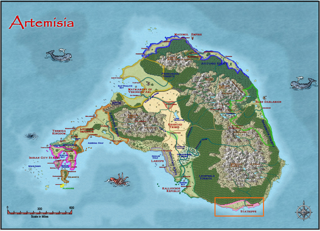
When I started a closer examination of this area for a suitable site for this latest map, there was an immediate complication, because the northern half of this area has been mapped twice in the Atlas, once on the Statrippe map, and once as part of a much larger map to its north covering the Dworaguz Ranges. To avoid the problem that a map can be linked to only one parent map in the Atlas, and as Statrippe was the map already identified here, this did rather restrict the options somewhat to a site in the southernmost sliver of the sliver that is Statrippe!
Luckily, there was an intriguing small island off the south coast, labelled as "Castle Peris (Ruins)", item 13 on the map here:
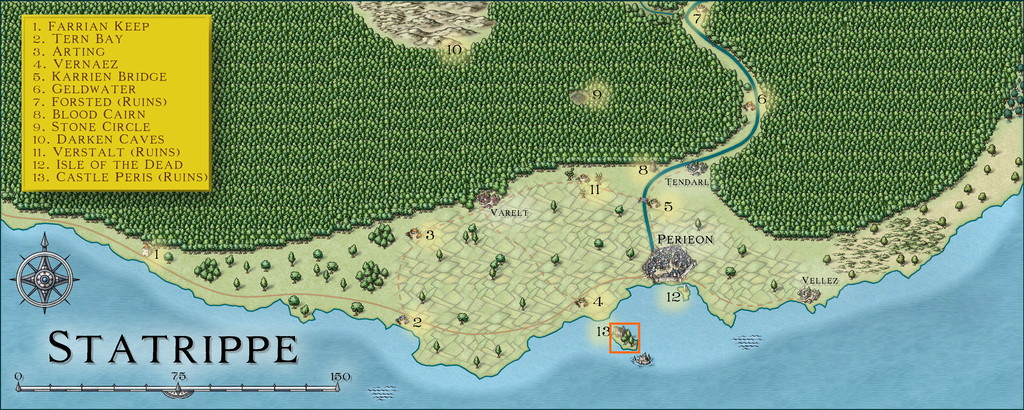
With no additional information about the isle available, its size, about 14 miles by 8 (22 km by 13), felt like a convenient area to map complete, and then drill-down to add the dungeon layout. Castle Peris was thus already suggesting scope for how to proceed 😉.
My initial thought for the isle's castle ruins was to reuse an ancient map of my own, a castle wrecked in a figure wargame 46 years ago for the specific purpose of creating an RPG setting. Of course, I then couldn't find the original hand-drawn map... Instead, I thought to source an alternative from one of the two - roughly as old - Judges Guild "Castle" books. I have though used quite a few of those layouts previously, and after a few duplicated random rolls, chanced-upon a handily-ruined castle with a neighbouring settlement, also partly ruined, in the second of those volumes.
The map layout for the dungeon was already decided from the Inkwell Dungeonmorph Dice designs, which just left the isle itself, a base image for which was quickly generated from the Statrippe map, with a grid to place random features set over it.
Rather than use random tables to fill-out the various points of interest, this time I'd decided well in advance to go with the latest set of card prompts produced by The Story Engine, their Loremaster's Deck and its Loremastery Expansion, cards designed especially to help create RPG settings. These have only just been published this year. The concept is pretty straightforward, in that you draw random cards from various sub-sets within the main deck, and choose suitable prompts, called "cues", from what's on each one. There are instructions to assist, but of course, you're free to adapt as you see fit, given their purpose is to help spark-off your own creativity - maybe in directions you might not otherwise have gone.
To give an idea of what this all means in practice, this is the spread I generated for the isle's general features:
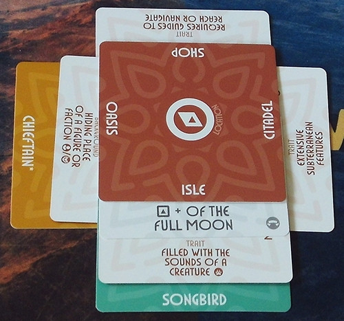
As you can see, there are cues on all four edges of each card, and each is also double-sided, but with more descriptive concepts on the white-coloured reverse. You simply pick which one (or ones) you prefer, and run from there. I chose the Location card with "Isle" on, because obviously, it's an island I'm designing, but the rest were all randomly drawn.
So now we have a name for it, "Isle of the Full Moon". It's filled with the sounds of songbirds. It has extensive subterranean features, and requires guides to get to, as well as being the hiding place for a chieftain of some kind.
To find out more, I delved into what the songbirds might be:
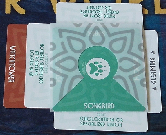
Here, I've fitted the Songbird Creature card with a Focus Sleeve, to help remind me what it is I'm examining further. The birds are gleaming, they use echolocation or specialised vision, they're not simple physical animals, and there's a notable subspecies at a Watchtower. So now we have a new island feature with this watchtower (which might be part of the ruined castle still at this stage), as well as more details on these magical birds. Intrigued, what of the Watchtower?
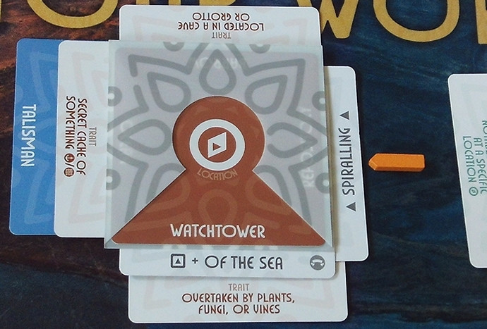
That little yellow 3D wooden arrow comes with the card deck, and helps identify what's from where, when creating complex card webs, incidentally. Now we know this is the Watchtower of the Sea. It has a spiralling form, has been overtaken by plants or fungi of some kind, is located in a cave or grotto, and there's a hidden Talisman in it somewhere. On down the rabbit-hole...
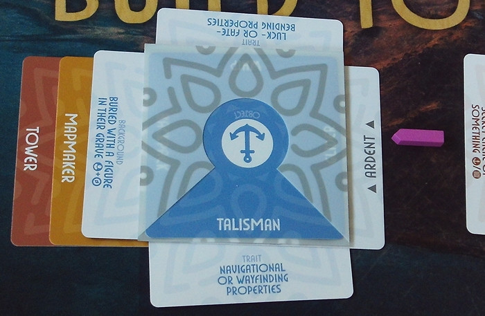
Those little wooden arrows come in different colours as well! So we've now an ardent Talisman with navigational powers, that can also bend luck or fate, and which is buried with a mapmaker in - where else? - the tower. And that's where I stopped for this card-chase, because by this point, my own ideas had begun to spiral like the Watchtower. But I still needed to check what the Chieftain was:
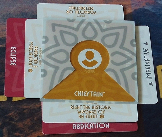
I doubt I need to walk you through how to read the card spreads by now, but this character was starting to feel less like a "classic" chieftain, and more like the leader of a group of sages or scholars, who'd made a mistake in the past, and exiled himself to the isle to try to find a solution ("he" was just randomly rolled for).
There was a lot more of this card-design process subsequently, for all the features of the isle, with developments, adaptations and changes in what was already done as things went along, and further ideas were sparked. It was a particularly rich process using the cards, rather more so than can be the case with only random tables sometimes. Without going into too many details, as there will be a full set of notes in the final Atlas version, these are some of the more important elements.
The isle became formally called Selenos, which is a loose ancient Greek-ish version of "Isle of the Full Moon", in-keeping with the main cultures of Artemisia. Despite being in the tropics (it's at about 16°N), I decided it could be oddly temperate at times, opting for it being where a cold current from the Frigid Ocean to the north sweeps down the east coast of Artemisia, then turns west, meeting a warm current from the Doriant Ocean to the southwest, helping to create frequent mists and fogs, hiding the isle, and making the extensive offshore reefs, shoals and sandbanks severe hazards for navigators. Thus only expert local sailors stand any chance of sighting the isle, let alone landing on it safely, as many wrecks in the waters nearby confirm.
The isle has alternative names, including The Hidden Isle, and The Isle of the Lost and Broken. The latter comes from it being the home and rebirth-place of the goddess Eunike Lysistratedoros, aka Gaiane, or more commonly The Twisted Torchbearer, whose domain is misplaced, broken and imperfect things. She may have created Selenos as her home. Tales hold the isle can be found only on nights when the White Moon is full, with the waxing and waning Moon reflecting the goddess' cyclical nature, periodically dying and being reborn here.
Fairly naturally, the songbirds became Moon Birds, which fill the air with strange, haunting music all across the island and the seas around, and which look like flamboyant, colourful Birds of Paradise. Plus they're magical creatures made from solidified moonlight, able to see equally well by day or night, and see the invisible too. Some say the isle is home to Sirens, because of the birdsong.
Aside from the Greekier personal names being derived randomly from tables in the Hyperborea RPG, everything else came from, or was inspired by, the cards.
And so, finally, to the map! I wanted to try to use a connected style-group again, as with the Snakeden Swamp maps on Lizard Isle, and chose the Jon Roberts Overland style here (and the Dungeon one for the later maps).
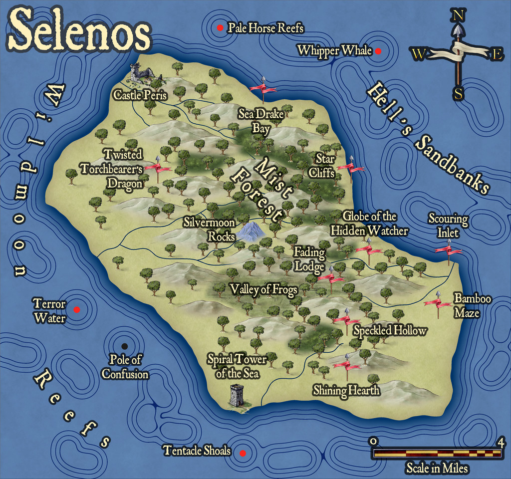
Ordinarily for a map of this size and scale, I might have tried to make the coastline more varied. However, as the isle's so little-known and under-explored, I'd already decided to keep it fairly close to the lines of the original from the Statrippe map. Plus as I wanted to use the edge striping coastal effects option available in this style - for the shoals, reefs, etc., offshore - a more complex coastline can sometimes make those look a bit too messy, so the cleaner lines overall looked better to my eye. As you might expect by this point, the names don't always mean quite what you might think!
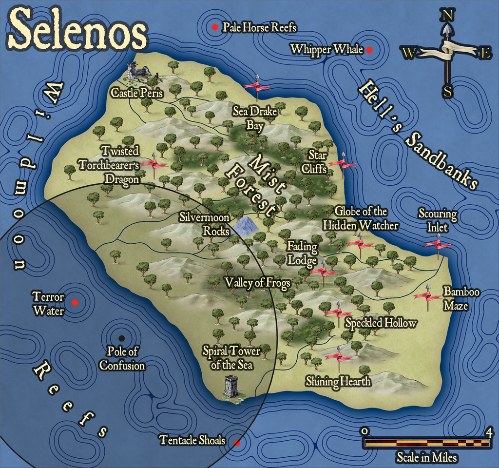
There is also an alternative version of the map, with an eventual Atlas toggle, because there's a curious magnetic effect centred on the offshore - actually undersea - Pole of Confusion, which deflects lodestones and compass needles within about five miles (8 km), as shown on this view:
More to follow!


-
Community Atlas: The Hall of the Seer, Glaciär Kristol, Ezrute
As I mentioned last time, this little trio of maps all grew up together, and not altogether in the neat order presented here. Realising early on that the underground complex was set to have a pair of entrances, reminded me that one of the still-to-come dice-design maps also had a couple of cave mouths in a cliff. Although that was from one of the "Ruins" dice, those designs also feature on the "Cities" dice set, die 6R from that (6R* in the Ruins set), without the ruined buildings, fallen trees, and so forth. So rather than use the Shadowdark settlement design rules to create the settlement, I simply reused that Cities dice layout, with a few tweaks, instead, to create Seer's Hall Village:

The mapping style was chosen a while ago for the ten small settlements in the Whispering Wastes of Peredur, which was reused here, with a variant design for the roads and paths, to give them their rough stone-edged, gravelly look, as distinct from the ice and snow elsewhere (one advantage of a B&W style!). I made the chimneys more prominent, given the high-southerly latitude, and adjusted the property sizes a little, as the inhabitants here are primarily Ice Dwarfs, a cold-immune, stocky folk, able to change into small animals and back when they wish (based on the Dverg from the Cursed Scroll #3 zine, writ larger, given the Dvergs are essentially arctic gnomes). In addition, the folk here also have pet Arctic Mastiffs, for a little more colour (cold-immune dogs, basically).
Part of the Village contents were determined from the Shadowdark rules, as before in Peredur, with some tweaks to fit the established setting here, given the whole place is only where it is because of the Hall of the Seer inside the large ice hill to the settlement's north. That cliff-line, with its entrances and stairway, and the two pylons on the hilltop were all from the dice design, like the placement of the buildings and the road layout, again with some adjustments to fit how the road was on the Plain map, as illustrated previously. Indeed, this map was changed partway through to accommodate elements of what the Plain map showed, including the Ley Line.
I tried fitting the existing cliff symbols from this style for the Great Ice Cliff, but ran into the same problem with these as previously in Peredur, where the lines won't fit to a suitable concave form. So I just drew the cliff as a polygon - well, actually two lines, mirror-copied to give a symmetrical four, and then added a shaded polygon by hand-tracing the lines. Dot-shading gravel symbols and fractal lines were then added to give it more of a "cliff" feel. The cave mouth was mirror-copied too, to look more or less identical, while the stairs reused a symbol and railing lines already drawn for the underground map, just copied across from that. The hilltop platform was an addition though, to give some purpose for the pylons and stairs, a place where the locals hold ceremonies at midwinter, midsummer, first sunrise, last sunset, and whenever the aurora is particularly strong overhead. Ceremony Hall has the feasting tables for such events, to be set up at the northern end of Pylon Way.
Next time, into Seer's Hill.

-
Community Atlas: Barrows of the Ferine Magi area, Feralwood Forest, Alarius
The last of this, as it turned out, quartet of maps from the heart of the Feralwood Forest region in Alarius, is for the Barrow of the Forgotten Wardens. The layout, of course, is more or less identical to the previous "Noble Jewels" Barrow, except this one has no lights inside, and two of the hidden Transdimensional Passageways are in slightly different places:
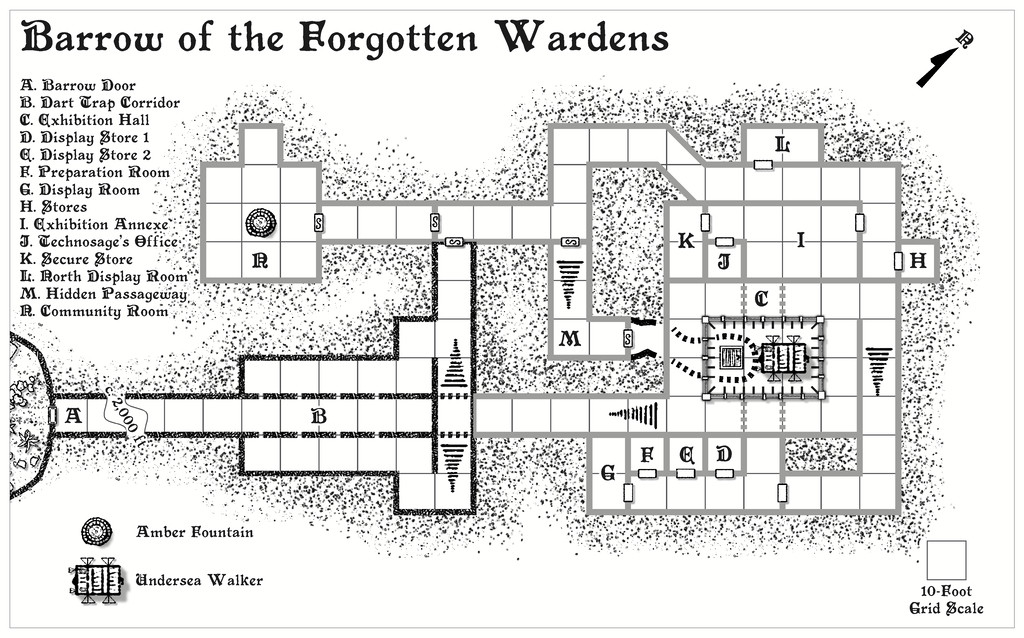
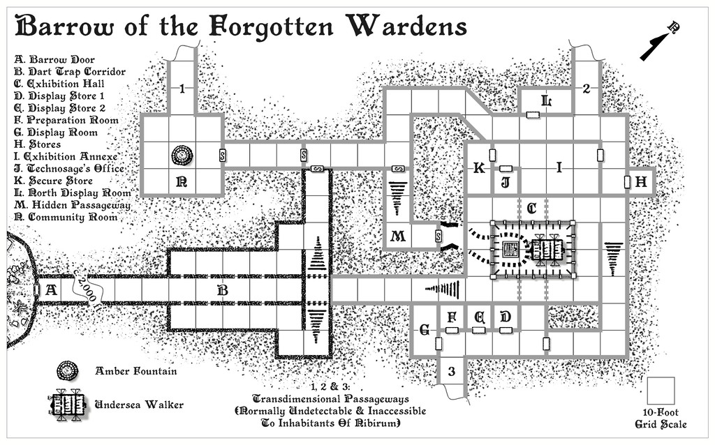
It was a little curious that there turned out to be three random exits selected for each of the Barrow maps, and that there was some duplication between the trio for where those exits were. I did consider changing them up for more variety, but in the end decided to let randomness have its way.
I reused the glass-panel railing for the pit section of area C from Noble Jewels, although here the railing is just a metre, 3 feet, high, leaving the central area fully open to the lower level. There are also a couple of new features here, both larger techno-magical items. The Undersea Walker is a vehicle adapted from the Hyperborea RPG. In the accompanying text notes, and as originally intended on the drawing, it partly hides the floor trapdoor on the lower level of area C. However, that wasn't practical on the map for clarity. The Amber Fountain, drawn from the Numenera RPG, is a main food source for the external community not represented on the map, on the world outside that isn't Nibirum, and for which the first Transdimensional Passageway provided a useful choice for its location.
Internally, this layout is essentially an ancient museum, so there are display cabinets with all manner of items extracted from both Numenera and Hyperborea in them, most still functional, if anyone can work out how they operate without draining their power (one-shot items) or accidentally killing someone in finding out. To assist, there is a semi-resident Technosage from beyond Nibirum here, and the whole non-Nibirum section of the complex is surrounded by a functional loop of telepathy wire (also listed among the items from Noble Jewels), so the Nibirese may be able to communicate with her. Rho the Mysterion makes its third identical appearance here as well - another telepathic communicator - along with a couple of weirder denizens from outside Nibirum, as the map notes will reveal.
I've not added the PDF notes here this time, and have now also removed the earlier ones, as the final PDFs and textfiles have been submitted for the Atlas, which should hopefully avoid any confusion as to which version to prefer! I have though added higher-res versions for this map to my Gallery, and am now preparing to move on to the last of the four "Explorer" Dungeonmorph Dice designs in this project, which is scheduled for a home somewhere in the Glaciär Kristol region of Ezrute...

-
Community Atlas 1000th map Competition - with Prizes [August/September]
Map four of my ten small settlements is Toresk Village:
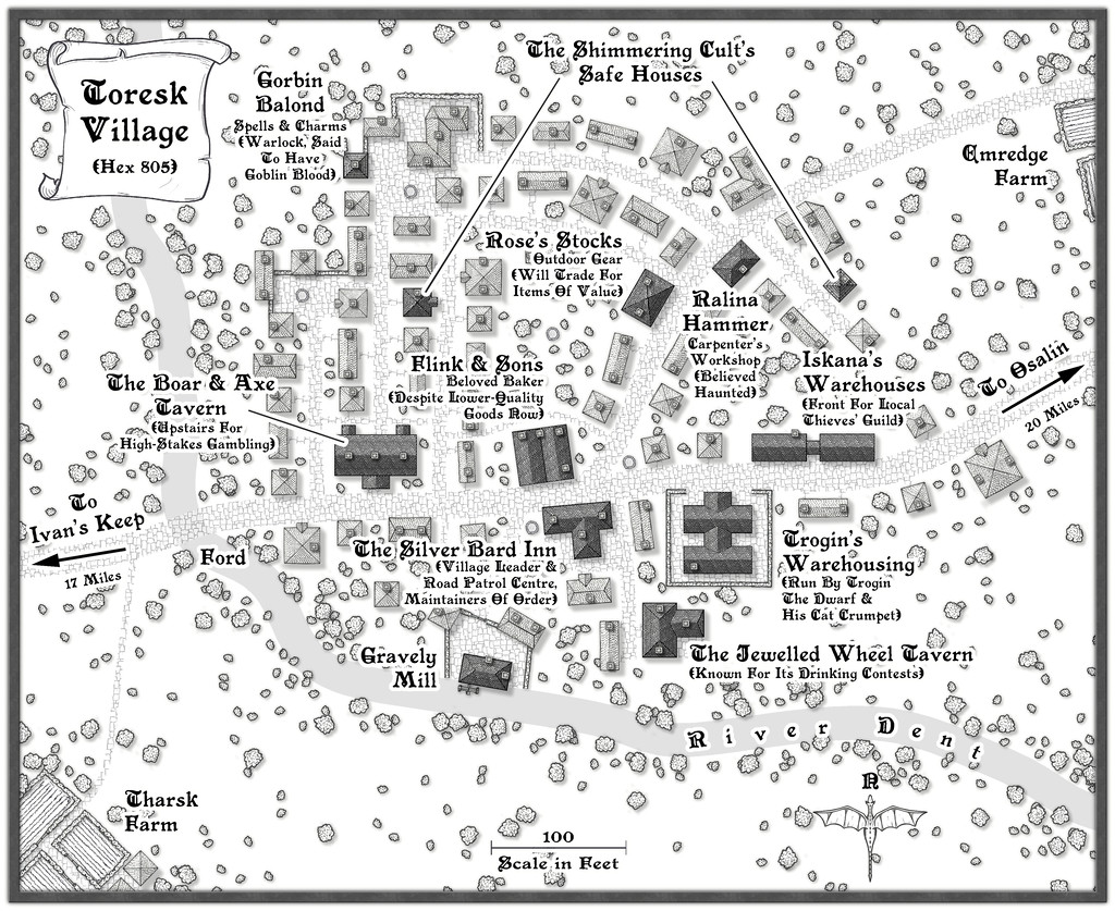
I've updated my WIP topic with this map today too, and there's a higher-res version in my Gallery as well. The FCW and PDF notes follow:


