


Wyvern
Wyvern
About
- Username
- Wyvern
- Joined
- Visits
- 3,267
- Last Active
- Roles
- Member
- Points
- 5,585
- Rank
- Cartographer
- Badges
- 24
Latest Images


-
[WIP] Community Atlas August Mapping Contest: Cloven House
Today, I've managed more, and relatively speaking, things have moved on some way from that. This is with the CD3 rooftop bitmaps still showing:
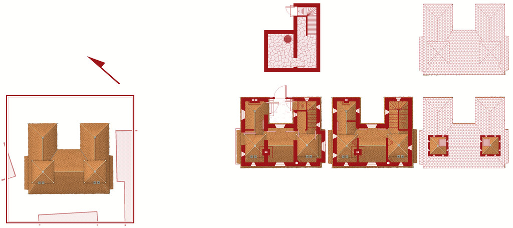
and this is it without:
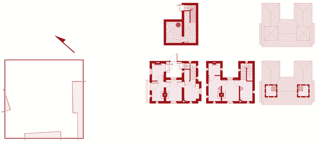
Clearly, there's still lots to do - the roofing needs adding over the lower floor extension and porch on the upper floor plan, for instance, and other items need adding and tweaking in places. Such as a scale and the labelling! Plus I've decided life will be easier to reorient the north direction than the floorplans, and have rotated the surrounding buildings (or now technically building blanks) to suit that.
At some point, I'll need to work up some notes to go with this for the Atlas of course, though the map has the sharper deadline, obviously. The observant may notice the grille in the cellar. The local ghouls like to use the fabulous sewer network to get about unseen, especially after they created tunnels between the sewers and the cemetery beyond the city's northern wall. The ambiance of this haunted house - I'm thinking now "Cloven House" currently - and the fact nobody comes near the place ordinarily, makes it ideal for their feasts!


-
WIP tavern
While the size may seem wrong, by a strict comparison with some medieval European structures, this isn't for medieval Europe, it's for fantasy D&D, and is close to the scale size for this specific tavern as shown on Mike Schley's map of Saltmarsh in the Ghosts of Saltmarsh scenario book (Wizards of the Coast, 2019), assuming five-foot grid squares here. The appearance isn't quite the same as on that map, but this is an adaptation after all, and although there are a number of designs for the Wicker Goat Tavern online, I don't think there's an official D&D version, so some leeway is to be expected.
In the original adventure (The Sinister Secret of Saltmarsh, TSR's Module U1, from 1981), you were expected to create your own version of the town from scratch - there are a few guidelines for key points, such as Point 4: "Decide where the characters could stay when resting in the town between adventures (the best inn? the only inn?); draw up a tariff (list of expenditures) for their accommodation and food." But that's as close as we got to a description for the inn/tavern, which didn't even get a name back then!
That's not to say such points should just be ignored necessarily, and the heating and access points are useful considerations. However, if the final tavern is meant to fit to the size of the official Saltmarsh map, this is close enough to work for that.


-
WIP Ruins of Charn
One alternative you might try would be not using the RGB Matrix effect, but setting up a simple rectangular polygon that covers all the map on its own, new, sheet, setting the polygon to have a solid red colour, and then adding a Transparency effect to that sheet. If you move the sheet to be below the text, but above the rest of the map sheets, that might work. You'll probably need to keep adjusting the Transparency, and probably also the colour of the polygon (likely somewhere in the reds and oranges range) to get to something you're happy with. Not guaranteed to work ideally, but it should give you more control over the final colour of your text, at least.

-
Snowy lands
Looking at the symbol and terrain use here, I think these could be used to create an illusory city too, or a literal ghost town, perhaps with some additional colour overlay effects, and perhaps some transparency about the symbols (less sure about the latter point, however). Or indeed a city of glass.

-
Good sizes for fantasy cities etc
As Jim said, there's going to be a lot of personal preference involved here, heavily dependent on how you see your world setting developing, what types of civilizations exist in different places there, as well as how much time and effort you have available for designing and mapping it all.
Plus you're really asking two different, if related, questions - 1) the number of key buildings desirable for different types of settlement, and 2) what the appropriate size of different types of settlement can be for different types and numbers of special buildings.
The question of settlement sizes has come up on the Forum here before, and you might like to look over the comments on these two topics, both of which coincidentally came-up in late 2018:
Looking for advice on starting Village/Town/City size
There are also various systems for designing RPG settlements available online, some paid for (on sites such as DriveThru RPG), some not (such as blogs), as well as a number of random design systems, such as those on the Watabou site, although those provide primarily maps, rather than lists of the specific places you indicated as of interest.
Those should get you started at least, or perhaps help clarify what it is you want (or even don't want!) from such systems, from where you might feel more confident about creating your own settlement design system.
Good luck!
-
[WIP] Community Atlas, 1,000 Maps Contest: Villages in The Whispering Wastes of Haddmark, Peredur
Map six - Hex 1304, Arvika:
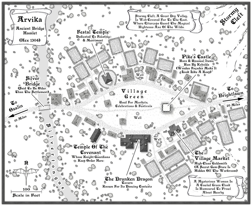
Arvika was one of the three settlements in this area that were originally shown on the existing Atlas map. In the absence of any text notes for it there, I simply looked at what the symbol was - a hamlet. As luck had it, no random feature was selected during the creation of my Whispering Wastes regional map for the hex it was in, but there was something in an immediately adjoining one, a mysterious ravine partly filled with webs, where a legendary artifact was guarded by a nest of Ettercaps. So I simply moved the ravine into the hamlet's hex, combining both elements. The hexes are six miles across, north-south, after all, so there's room for a lot more than just a single feature in each one.
The setting for the place was to be in a river valley, the Silvertongue, and I randomly discovered instead of the fords, so popular elsewhere so far, the proximity to the uplands had clearly provided stone enough for a bridge here for once, and it also turned out to be notably ancient, something that, like the Stormy Cleft ravine, simply helped reinforce why this hamlet had ended up being shown on the Atlas's area map, while other, seemingly larger or similarly-sized, settlements in the Whispering Wastes had not appeared there. Mapping it was straightforward enough, with the contour symbols fitted-in to act as the entrance to the ravine, although I did add a few more fields than I'd initially thought to provide some further interest around the settlement itself, which also lessened the impact of the ravine on the whole drawing.

-
[WIP] Community Atlas - Eknapata Desert
Sometimes getting things to stand out more means just changing the colour or line thickness a little (or font size for text). An outer glow of some kind can help, but it can also make things look too misty, which I think it what's happening with some of the smaller text labels presently. I'm not sure that brown colouring on the labels is working well enough, and even the grey labels could be a little clearer.
The general textures seem fine, although the desert edge is maybe a bit too abrupt (very obvious where the green coloration alongside the river ends currently). That seems to be accentuated by the line of desert-edge dunes north of the river too. The more wavy edge of the dunes south of the river looks more natural to my eye at least.
-
The Creepy Crypt project
Yet still no cat... 😁🐈️

-
Is there a reference that gives the latitude and longitude for locations on Toril?
Monsen's right in that virtually everything that tries to equate the Forgotten Realms setting to anything genuinely geographic has been done by the fans only. Part of the problem is that the size of some of the continents were changed at different times, and as the setting developed through various novels written by different people at different times, there was never a single basis on which any of this was hung. It's extremely irritating!
Even the official TSR 1990 "Forgotten Realms Atlas" by the great Karen Wynn Fonstad shows nothing of any latitude and longitude lines, though she does demonstrate very clearly in that just how little of the planet had been even approximately mapped by that time.
The only thing I have come across is a mention on the Candlekeep.com site in their FAQs regarding a map in "Faiths & Avatars" (TSR, 1996) regarding where the equator is. I found that via this discussion post on the Forgotten Realms Wiki site, which mentions the same map shows the canonical lines of lat and long, though so far as I can tell, while there are some lines shown, none have labels attached.
-
The Creepy Crypt project
Dee-licious! 🍳
