


Wyvern
Wyvern
About
- Username
- Wyvern
- Joined
- Visits
- 3,267
- Last Active
- Roles
- Member
- Points
- 5,585
- Rank
- Cartographer
- Badges
- 24
Latest Images


-
Where can I find great resources for the creation of a subterranean world?
For the crystal city concept, it may depend exactly how you envisage it. For a large-area map such as the Dungeon Worlds Annual will let you create, you could perhaps repurpose some of the standard CC3+ overland map symbols, like glaciers or icebergs (though you may have to get creative about hiding what are intended as water lines for the latter!), and making use of the varicolor options to recolour other features - and also with CD3 house symbols, for instance, if you wanted to map the city itself, or parts of it, in more detail.
It's definitely worthwhile to take some time to look through all the symbol catalogues you have available, and make a note of any symbols that might work in such map creation, even if that's a long way from what the symbol was originally meant to be! As you can resize any symbol in CC3+, imagine too how it might look if a given symbol were larger or smaller, or a different colour (which you can set and see while you're browsing through each symbol catalogue that includes varicolor symbols).


-
CC3+ Update Can't Find FCW32.mac File
Not sure if you've seen this FAQ post by Monsen Scott, but it may help.


-
CA style development - "Darklands City" (issues for September and December 2021)
Looks like Wyvern dropped off the end of the page.
Just as well Wyverns can fly 😎🐲
![[Deleted User]](https://secure.gravatar.com/avatar/c75d9a245b74d9c59be0999ea81ca541/?default=https%3A%2F%2Fvanillicon.com%2F92add7f8c954488718110edc4896ad39_200.png&rating=g&size=200)

-
WIP: Mega-dungeon, Dorag Skel Level 1A
As you might tell from my frequent use of random options in my Community Atlas maps, I've been a long-time fan of such random design systems, for all they can need a bit of nudging sometimes to get things to work out OK. I've not used the 5E system as yet, though almost exactly 20 years ago (July-August 2001), I created a classic 12-level dungeon using the random system in the original (1979) AD&D DMs Guide, each level filling an A4 page of graph paper. All done by-hand then, however. I did make a start converting it to CC3 not long after I got the program, around 2014 or 2015, I think, but that was very slow going, as I hadn't the option then to scan the hand-drawn maps to trace in CC3.
Have to say that your map looks a lot more elegant and less cluttered than any of my old ones from that dungeon set, so the 5E system may be something I should experiment with in future, perhaps...


-
Install Order?
Can't really do more than reiterate what Sue's said already re you and your mother's ongoing situation, and to hope things settle for you very soon.
With CC3+, I think we all feel for you too. Even a short spell away, and I find I've forgotten something critical... If time and circumstances allow, it might be worth checking-in on one or two of the live PF mapping sessions on YouTube - or checking them later as VOD - as Ralf usually goes through all the basics of setting up a new map, as well as whatever the session's about, for instance, which might help get you back in the swing of things a bit quicker.
-
[WIP] Community Atlas: Oracle Mountains Area, Ruma Helrevy, Peredur
Having performed the usual New Dungeon Map Ritual, in consultation with the CC3+ Wizard of the New Drawings, and imported the hand-sketch for the map to a fresh Bitmap Sheet and Layer, as normal, the first section of the subterranean level could be prepared, essentially amplifying the Below-Ground Level of the Quezzal Tower map:

As we see, I'm using Ralf's Hand-Drawn Dungeon style again here, and it's likely also obvious to those more familiar with the style, that there are a couple of cavern walls missing here. These are where the next areas connect to this one, connections which are somewhat complicated by the fact the link-areas are actually cliff-lines in the cave, indicating steep rises and falls in the level. This part of the drawing already shows what happens when floors are all drawn on the one Floors Sheet, which has a nice inner glow effect on it, that the walls increase with their own glows. All the floors flow straight into one another, without any such shading effects. That's great if all the floors are on the same level, but cliff-lines mean they aren't. Thus, enter some new Floors Sheets:

Only it's not quite that simple, because to fool the eye properly, the floor level above the drop-line needs to be lighter up to its edge than the one below. Thus the floor level apparently above the drop line has to be drawn a little longer there, on a Sheet BELOW that on the other side of the drop-line. So the way I had the floor edges on the initial snapshot image here was only correct for the broader of the two connection points. The narrower passage one had to be edited after the fact to extend under the next upper, though actually lower in Sheet order, floor. And as the second shot above indicates, there were sometimes going to be multiple levels on the same passageway...
This wasn't actually quite so bad as it may sound, because I'd already discovered how to get round the problem when drawing the map for the Tomb of General Chengdai previously. Although I didn't draw attention to it there, nearly all the adjacent floor areas of that dungeon map are on different Floors Sheets as well, and the sliding walls have had an additional external glow effect added to their Sheet to help maintain a similar darkening close to them too.
Even so, it needed a couple more sessions to get the whole layout drawn, and I had to add an extra Sheet at one point because, for entirely unfathomable reasons, one of the new Floors Sheets started causing transparency acne problems with the next Floors Sheet in the stack (but none of the others did so, despite all being identical, and having minor overlaps in places, nor did the problematic Sheet with others that weren't adjacent in the stack...):

The freestanding rock stacks were drawn using the Cave, Cut-out drawing tool, that makes use of the Color Key effect to punch through the grey stone floors to show the brown stone background, and make it seem like they're upstanding features within the caverns. Occasional tweaks were needed to get rid of a few too-sharp fractal points along the edges, taken-out individually rather than using the "Simplify" command, which I find sometimes takes away a bit too much on this kind of smaller map.
One element that slowed things a little more was adding the cave walls after various segments of floor were completed. "Trace" does help hugely in this, although the individual floor patches meant constant chopping and changing as to which part was being traced at times. So this didn't leave a lot of time to start adding the first interior details:

Just some debris and the floor circle in the Old Summoning Chamber, the pool in the next main cave along (yes, that's going to need its own pool-edge drop-line at some stage!), a large central-cavern chasm, and, ooh, glowing spiderwebs! What can those mean? More next time...

-
[WIP] Community Atlas August Mapping Contest: Cloven House
Today, I've managed more, and relatively speaking, things have moved on some way from that. This is with the CD3 rooftop bitmaps still showing:
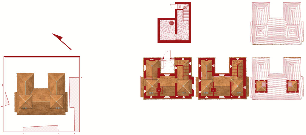
and this is it without:
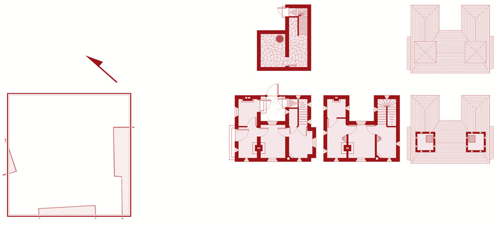
Clearly, there's still lots to do - the roofing needs adding over the lower floor extension and porch on the upper floor plan, for instance, and other items need adding and tweaking in places. Such as a scale and the labelling! Plus I've decided life will be easier to reorient the north direction than the floorplans, and have rotated the surrounding buildings (or now technically building blanks) to suit that.
At some point, I'll need to work up some notes to go with this for the Atlas of course, though the map has the sharper deadline, obviously. The observant may notice the grille in the cellar. The local ghouls like to use the fabulous sewer network to get about unseen, especially after they created tunnels between the sewers and the cemetery beyond the city's northern wall. The ambiance of this haunted house - I'm thinking now "Cloven House" currently - and the fact nobody comes near the place ordinarily, makes it ideal for their feasts!

-
Good sizes for fantasy cities etc
As Jim said, there's going to be a lot of personal preference involved here, heavily dependent on how you see your world setting developing, what types of civilizations exist in different places there, as well as how much time and effort you have available for designing and mapping it all.
Plus you're really asking two different, if related, questions - 1) the number of key buildings desirable for different types of settlement, and 2) what the appropriate size of different types of settlement can be for different types and numbers of special buildings.
The question of settlement sizes has come up on the Forum here before, and you might like to look over the comments on these two topics, both of which coincidentally came-up in late 2018:
Looking for advice on starting Village/Town/City size
There are also various systems for designing RPG settlements available online, some paid for (on sites such as DriveThru RPG), some not (such as blogs), as well as a number of random design systems, such as those on the Watabou site, although those provide primarily maps, rather than lists of the specific places you indicated as of interest.
Those should get you started at least, or perhaps help clarify what it is you want (or even don't want!) from such systems, from where you might feel more confident about creating your own settlement design system.
Good luck!
-
Seven Pines Lodge (keep it simple stupid)
Now everyone should have a good idea where to poop after experiencing a Eldritch horror.
Yeah, as Don says that's not really an issue for anyone who's ever played Call of Cthulhu. Surviving long enough to actually get to that point, now THAT'S the tricky part 😉.
-
World of Myirandios - Mivlis-Gyaflaggio region (400 x 400 km)
Lot of detail there, certainly!
If this was going into the Atlas, I'd suggest a rethink on some of the labelling, as to my eye much of it's getting lost amongst the terrain in places (using the larger Gallery version to check this). Indeed, there are labels visible on that version that I didn't spot on the Forum one. Since it's for personal use, that's probably less of an issue though!

