Wet medley and a city!
 AleD
🖼️ 11 images Surveyor
I am about to start a series new maps.They will be dedicated again to the RPG Brancalonia. The game has a series of free assets inspired to a daily medieval journal (should be free to get on drivethruRPG under the name "The daily Jinx", it is quite funny to read if you like the genre). In the first number there is an adventure called "The Phantasm of the Sea of Shadows" for which I will (slowly) create a couple of themed maps.
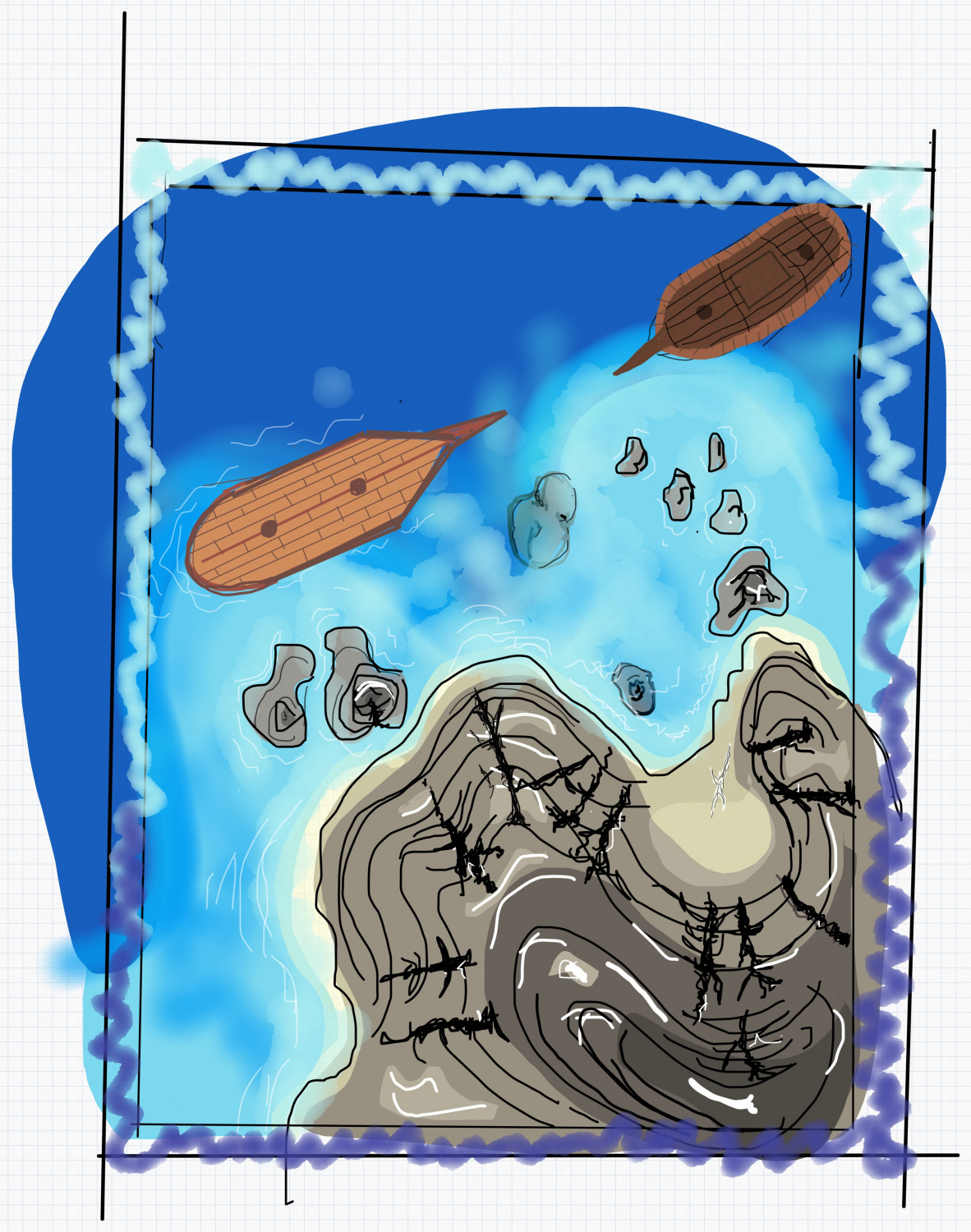
I was thinking about a city map (of Borgo Guiscardo) and a small battle map of the "Fang of Bitchfish". For the last, I will merge the marine dungeon by @Loopysue and the Ship Deckplans (did @Ralf put it together? Correct me if I am wrong). I think the two may work very well together! For the city, I am still not sure. I would like to try out the Darkland City style but suggestions are welcome 😊.
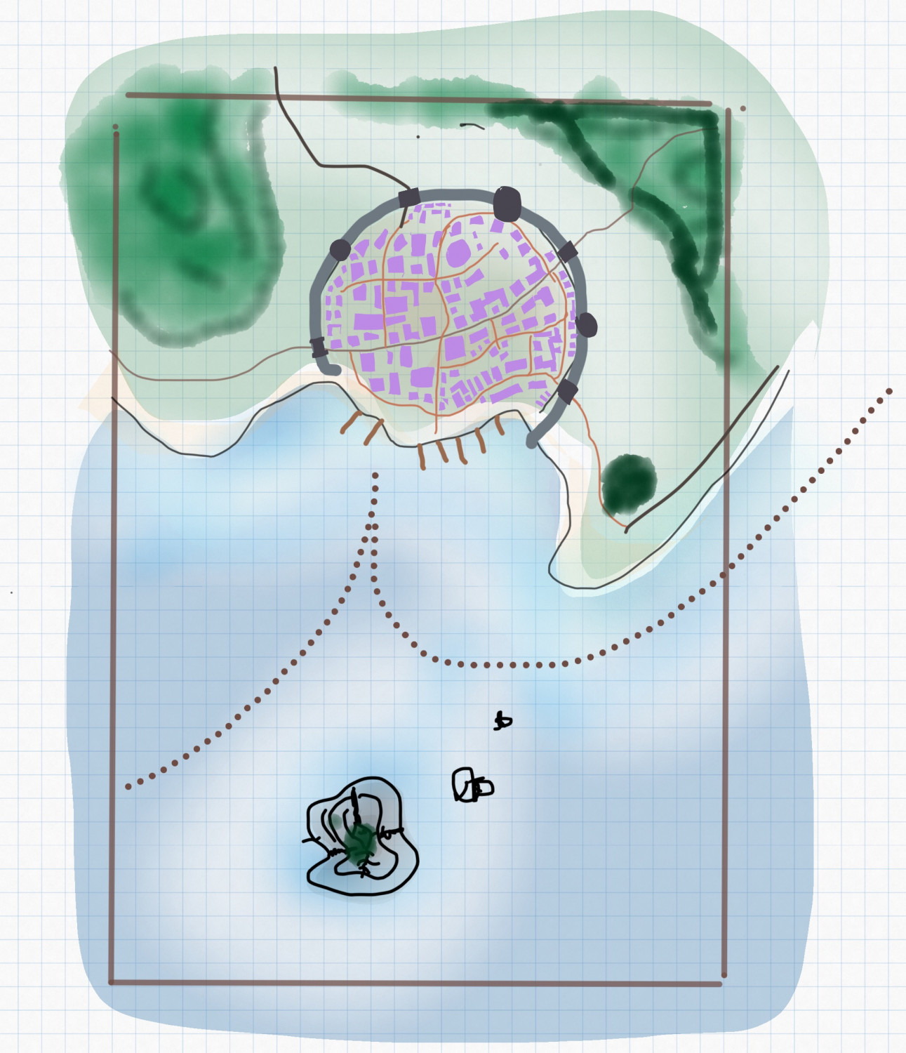
Below are the two suuuuuuuuper preliminary sketches:
That's just an idea for now... things may change (and my drawing skills should improve or stay hidden 😅).






Comments
Sounds like a really interesting idea. I'm looking forward to seeing it :)
Hadn't come across the Branconia RPG before (there's a lot of RPGs I haven't - so many RPGs, so little time...). I see it describes itself as "Spaghetti Fantasy", and I'd recommend a quick review of the short video on any of the DTRPG pages off AleD's link in the first posting here - Ennio Morricone-ish music meets Italian Fantasy gaming!
Oh my! I wish I had more time to work on this project.
So far I just outlined a bit of the city:
This will be the general composition. Just to give you a scale, the diameter of the city wall is bout 1400 feet.
I used the symbol along (a piece of circumference) to draw the city wall. Doing it twice and mirroring the symbols once you can obtain a nice "double wall":
Good point @DaltonSpence. That was the next step in the list: gates, towers and streets.😊
After changing the scale of the city (going for something much much smaller) I did some progress:
There is still a lot to do. But besides the obvious things (cartouches, some fields, more plants), I feel I am missing something... 🤨
I can't say what I am doing wrong but I know that things are not looking nice. Is it the background of the houses? Is that just a matter of adding more details?
Suggestions?
Thanks for the help.
I like it :)
But I am wondering why there is so much water at the bottom.
Thanks, @Loopysue! The original idea was to add a big-ish island on the south with a small dungeon. But you are right: as it is now, all that water is useless 😅
True, that is a good idea! I'll definitively do it.
Small update on the map. Added some details as fields, rocks and docks... Still, a lot to do (the next step will be to add some paths between fields and fill the top)
Looking good :)
There are connecting wall and hedge symbols if you want to divide those fields and add a bit more detail?
Yes! That and some trees and bushes and paths. 😉
Oh no no. The plan is to make some rocky islands with, probably, some buildings.
Some extra work... Going on, slowly slowly!
Some small improvements on the map...
I really have little time to work on maps ultimately... 😥😥😥😥😥😥😥😥😥😥😥😥😥😥😥😥😥
It's looking really great, though, despite the lack of time :)
Thanks, @Loopysue!
In this last version I addded a bit of displacing on the coastline:
I think It works really well on the close-up!!
beautiful
@AleD When you say you added a little displacement on the coastline, what do you mean? It looks wonderful, and the foamy water is great too.
Thanks @Ricko Hasche !
Hi @Bidmaron !
The foamy water is part of the style... Thanks to @Loopysue :)
For the coastline, I added to the sheet "Water" and as the
first effect a "Displace" effect:
As displace map "image" you can use anything more or less random. Attached below are some examples (feel free to use):
I used at least some here:
Ink Paint effects
The best place to store such maps so you can find them again in the future is in this folder, in your own 'User' subfolder.
C:\ProgramData\Profantasy\CC3Plus\Filters\Images
You will also find plenty more PF texture maps to try out there.
@AleD Thanks for the displacement tutorial. Bookmarked.
@Loopysue A treasure to the community.
I am still going through the years of annuals and have much to catch up on. My career has finally reached the point where I'm able to enjoy my Profantasy acquisitions. I started when Campaign Cartographer didn't have a number behind it, and have bought everything they've done (although it took me decades to finally buy WWII).
Small progress on the map:
Just some details added. Slowly slowly working on it.
Detail is what makes it look real ;)
Looks good. What style did you use for the map?
This is the darkland city.
And below the last version of the map:
You've done a wonderful job, Ale :)
Do the labels need to be so large and the glow so intense?
Thanks @Loopysue for the hint!
What about this: