WIP - Water's Edge Exercise Distraction
 Lillhans
🖼️ 7 images Surveyor
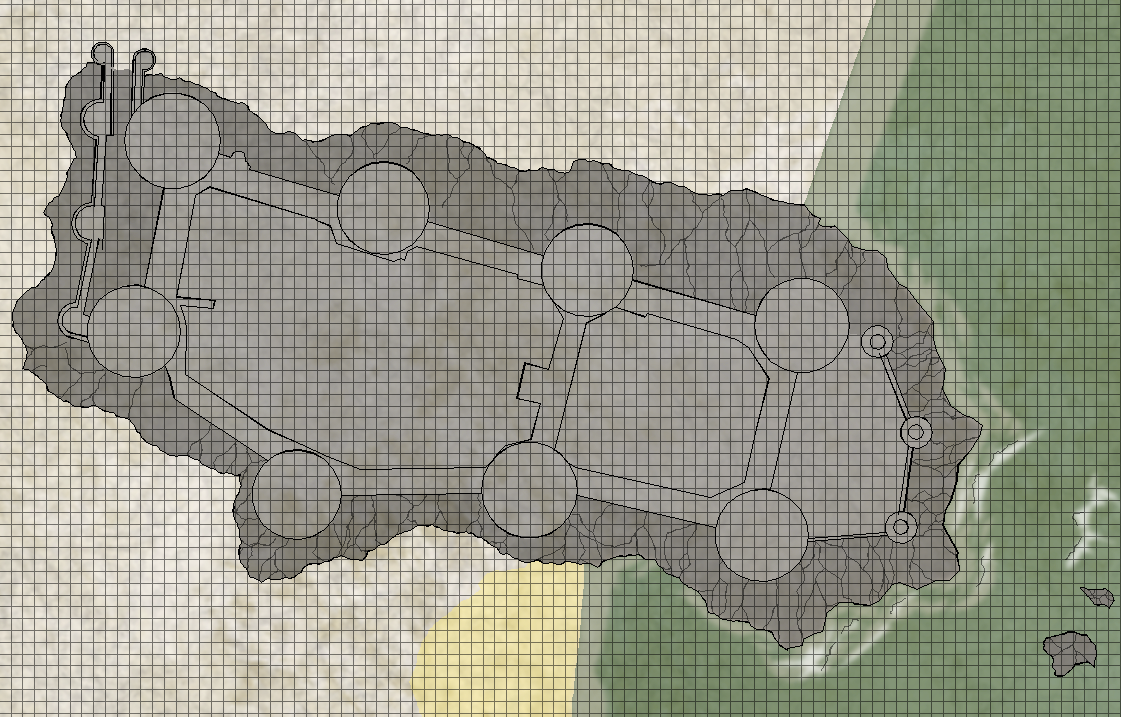
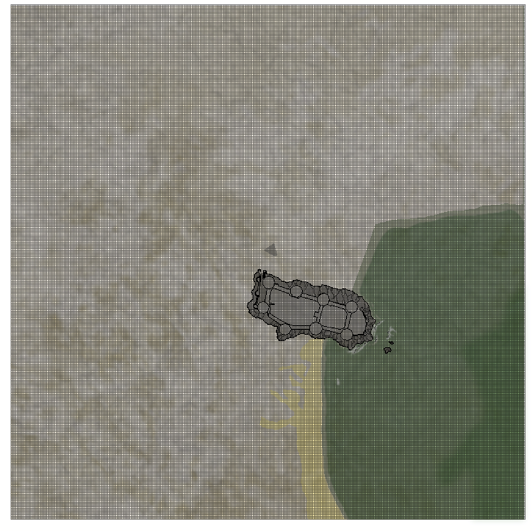
Water's edge excersise needs beach. Beach also needs cliffs. Cliffs need Conwy castle rehash. Conwy castle rehash needs immediate surroundings. Surroundings demand space. Space facilitates flying monsters.
I am my own worst enemy.





Comments
It might be easier to see this without the grid for now.
True that. For scale mostly (5 ft:ers)
While I still remember; any suggestions for how - if at all - to work shadow with overcast/worse weather? Perspective gets lost real fast without shadows, I find.
You can mess around with the global sun settings (right click the hourglass). Just playing with the Intensity a bit can give a more stormy appearance.
Though this only seems to affect the roof shading in this map. If you look at the shadow effects they are the same. To alter those you would need to adjust the shadow effects themselves.
Where you tend to use a lot of raw colour polygons and draw your own shadows, you could do something by playing with the palette colours, I guess, but that would be a whole lot more fiddly. Overcast light is much colder than sunlight. So you would need to turn everything more blue-greyish. Maybe a single overlay sheet might do it? Kill the bright hot yellows and reds a bit?
Hey Lillhans,
Could you describe how you're drawing these entities? Some of it I can see clearly: circle tool, possibly the pencil tool, etc. Other entities I'm not sure heh. Smooth poly tool, maybe?
Anyway, awesome work as usual
Cal
Sure thing!
For fractal paths I use a custom tool since it allows for dialling up or down on the frequency, but the rest is the standard arc/smooth/etc - everything but the pencil tool, really.
Colours primarily on the one sheet (smudge/embellishments go elsewhere). This of course allows for flannelgraph maneuvers with a minimum of covering-up.
It's very much this:
Arcs, fused with paths and then some fractal paths. Adding colours for bells and whistles like so:
Process isn't too bad, for time, once you get where you want to be visually.
And here's a section of the water's edge folly for comparison:
Process very much in progress for water's edge specifically, but the working theory of the proto-dwarf portal thing above shows (I think!)
Absolutely never will be a sea-worthy encounter map.
But the beach is coming along nicely and I think that it, at the proper zoom level, could pull off some rather neat area map qualities.
Absolutely never will be a sea-worthy encounter map.
Most maps in general aren't sea-worthy. That's why people tend to put ships around them when they need to be near water. Highly recommended.
I shall have to design a ship then.
I seem to have failed designing a ship.
Well, I guess that too will serve to keep a map dry. Well, unless you try to use it as a flotation device that is....
You know what, I am not ruling out it could pass for an encounter map after all...
Anyway. This Water's Edge exercise - which supposedly is a means to propel the Quay Thing into greatness - has lead to the discovery that patching together cells of a certain shape is not really applicable for larger tiles of less structured patterns. So for slabs of this size, or greater, "folding" a single straight path by way of node insertion I find is not only meditative; the natural lack of precision ensures there will be gaps, and those gaps kind of will do for slab texture what closed fractalized polygons do for contours.
But what fascinates me the most is that it lead to my, finally, realising that custom symbols is a sound investment after all, @Loopysue. :)
Here's what I didn't get at first, everybody, because stupid:
This is all those lines and polygons turned into a symbol, as per the Symbols -> Define Symbols operation: it grabs everything and turns it into - in this case - a circular object which displays whatever was put into it as one single visual representation.
And that means everything goes into the same sheet as one single object too. While possible to force a Sheet destination for the symbol, you would neeed seperate symbols for each individual element to get the colour effects I am pushing with this style of map design. For the tower (as well as the rest of the piece) I am using sheets for Contours, Base Colour, Toning Colour and also Smudged Colour.
Furthermore, since it's just one symbol object - there is nothing to manipulate other than its size, placement and mirror-copying it. You can't add nodes to a symbol, trace along its edges, or remove things from it etc.
Alltogether not very positive for this particular approach to designing maps in Campaign Cartographer. Karma, I guess :D
Above, however, is the symbol in editing mode, accessed from the Symbol Manager. It's all there: lines, paths, and polygons. All drawn to specifications as per the moment of making a symbol of them.
Removing all the colour polygons, then, I am left with the very basics of the design in question: the contours.
And this is what I want from a symbol. I want a pattern clone which I can freely manipulate. And I can, because copying from the editor means I get to copy the lines and paths as such, rather than as a symbol object.
This tower can now be kitbashed into the basis for a wall turret or a ruin or whatever. Colouring is no time at all!
And so, the Symbol catalogue becomes the Mandala catalogue. For my flannelgraphing.
For symbols, instead of copying from the symbol editing window, you can just place the symbol, then use Explode on it to turn it into it's basic entities.
You can also make symbols that place on multiple sheets:
Hurry up, everybody, the stupid and backwards ways have all but left my brain now! :D
Multi-sheet symbols seem like a viable option, then @Monsen - but it takes away the backwards idea of manual colouring....
Oh, and to save you a click on the explode button, you can configure a symbol to automatically explode on placement, although this option is not compatible with the multi-sheet option for symbols.
Well, I will not go down the path of multi-sheets for the time being, I think: colour sheets are highly chaotic with regards to how I configure them - but contours are a constant.
First template below. City wall will go brrr. As far as distractions go, this one is turning out to pay off quite a lot :)
City wall will go brrr.
May want to wait for Summer then...
Left, right?
I like the right one, but thinking about architecture, if you really want a stone floor up high, it is vital to get the stone supporting each other correctly, and that kind of require a more regular pattern and proper planning. Not really sure that those tiles there are the best option, but at least it is a planned pattern.
Also, a tower requires stones to be hoisted up by a lift, which means you only want the "right" stones up there in the first place. The right pattern is great when stones are resting on the ground, and you have a heap of random rocks to pull from, but up in a tower, you would probably only have the rectangular ones guaranteed to fit correctly together.
Thanks!
The wall sections get the random pattern. 40 x 3 m with a turret between towers is what I am currently going for. Wood for the turrets so probably will want that for the towers too.
Yeah, wood's the ticket!
For turret, I think flipping boards 90 degrees and extend to cover the wall - throwing in a cut-out with a ladder down also.
Mockup making an awful lot of promises, methinks.
OMG!
Teach me how to do this 😁
Cal
I wish I could! Lol.
At the fundamental level it's just lines and colour inbetween lines, and colour on colour. And as always, it is deciding where to put down nodes and the order in which coloured polygons are placed which is the difficult bit.
I like watching terrain sculpting videos for pointers lately. We obviously have very little in common with regards to their painting: we have no real facilities for coating or wash etc. But we do get sheet effects, and that's where you can approximate the method of colour application. Not so much technique, however, as it is finding the setting/specifications we like.
For me it's these enthusiasts' turning - essentially - waste or by-products into brick and mortar which is the big deal. It will come down to paint properties and brush techniques in the end, to make it a tiled roof or whatever, but they have to acquire the shapes from somewhere. Granted, you can't use any of it in Campaign Cartographer, but that creativity flow is just amazing to tap into. And working a slab of styrofoam seems more akin to what we do with our nodes in the coordinate system, than sprinkling pixels in a brush simulator is. That being said, there will always be a great wealth of how-to/execution to steal from proper painting - lighting and perspectives in particular.
Maybe you could write a blog article about the process and your thought patterns some time?
But the above is probably as coherent as my thought patterns are ever going to be! 😂 Working on some intro level video scripts also. Will consider!
I was going to say 'you should see mine'... but I don't think that would be a good idea. My can be rather scattered.
Coastline was never going to work out with a big slab of castle rock like that...
Encircling it with water of course has consequences for elevation - especially with regards to the waterfront part of town. Looking at an Amalfi coast solutionf for sure!
I like that a lot better :)
Also means having to work on terrain skills! A win in its own right...
So the beach gets sorted out first.
A+B: different colours on the same blush sheet. It's to the back of the base colour sheet (C) so it's very subtle and with proper blur settings you can get these lovely gradual shifts in tone rather than clunky contrasts.
C: the base colour sheet.
D: a smudge sheet stacked in front of the base colour. Less subtle and apparently has a talent for sand slopes!
The smudge and blush sheets effectively add to the overall opacity of the colour sheets, and at some point that will have an impact on the underlying texture - but since it's effectively texture covering other texture I don't see any real reason why it couldn't work for the grass area topography. The real challenge will be applying the formula in a way that doesn't look like shit, is all.
Smudge sheets and marble backdrop in the open:
Base colour sheet engaged:
It's a teddybear sat down looking at their smartphone. Obviously.