AleD
AleD
About
- Username
- AleD
- Joined
- Visits
- 943
- Last Active
- Roles
- Member
- Points
- 826
- Birthday
- February 21, 1982
- Location
- Padova, Italy
- Real Name
- Alessandro Devigili
- Rank
- Surveyor
- Badges
- 9
Latest Images
Reactions
-
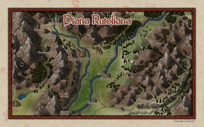
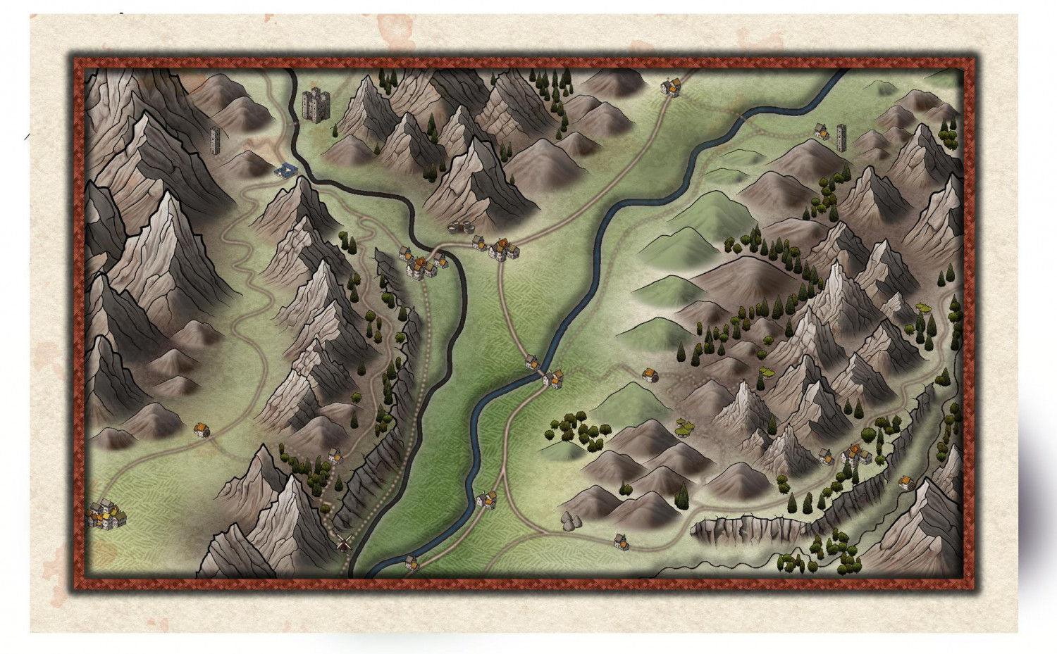
Rotaliana WIP. A dark map of home.
I think I just finished refining a bit that map (one tree at a time, one day after the other 😅).
I quickly add some contrast and details with a picture-handling software.
All names are jokes made out of the real names.
If you happen to visit northern Italy, go there and taste some teroldego 🍾... Or climb the Brenta 😊... It is a nice area.


![[Deleted User]](https://secure.gravatar.com/avatar/c75d9a245b74d9c59be0999ea81ca541/?default=https%3A%2F%2Fvanillicon.com%2F92add7f8c954488718110edc4896ad39_200.png&rating=g&size=200)


-
Rotaliana WIP. A dark map of home.
Hi!
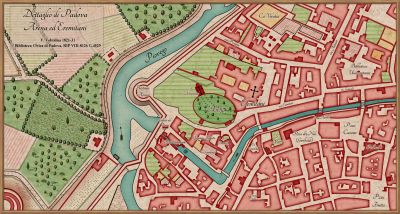
I started a new map to use (hopefully) with the 5ed expansion Brancalonia (have a look if you don't know it and like the "spaghetti fantasy" style). It is the map of the rural area where I come from. 🙂
It is still far from being done. but, what are your impressions/suggestions? Thanks @Loopysue for the Darklands style (which I am maybe misusing on a quite small map 😓).


 and 2 others.
 -
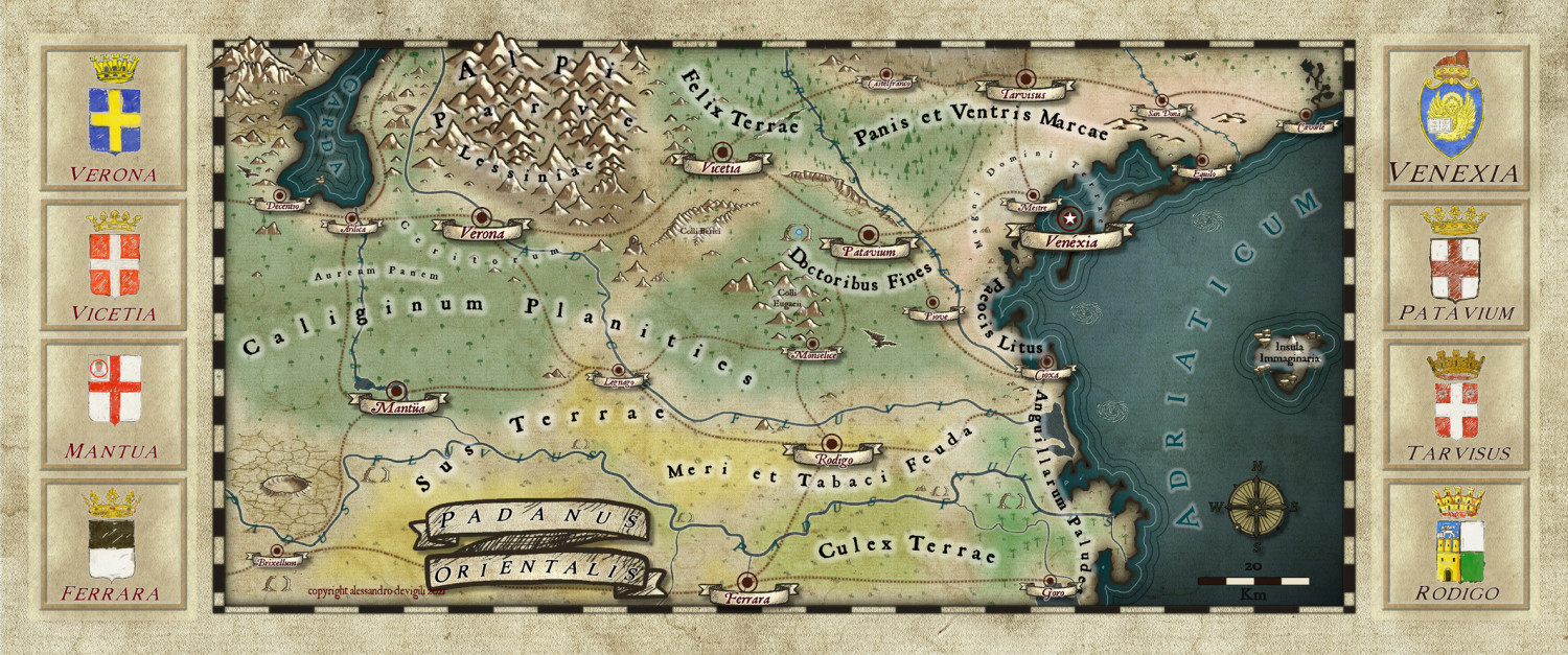
Map of a real region
I think I finished refining the map.
After quite some effort I decided to keep the frames very simple.
I quickly edit the map with a bit of contrast and some sharpened effect as last touch.


-
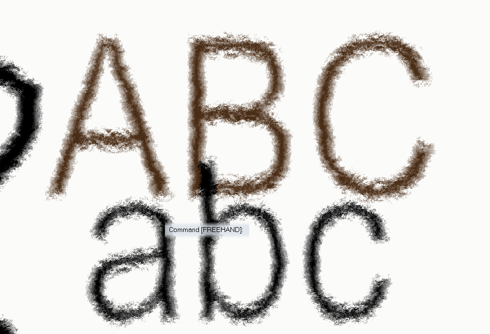
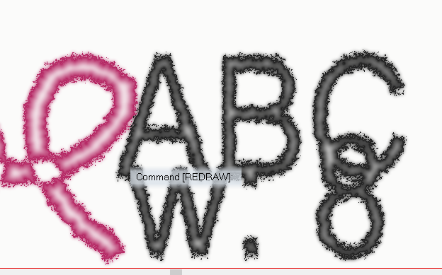
Ink Paint effects
I recently wanted to have something on my map that looked like ink (for a frame). So I started to explore a bit the possibilities that the "displace" effect has (inspired by this discussion by @WeathermanSweden), especially when used multiple times.
I wanted to get something similar to a watercolour but, after some testing, I stumbled in something that resembles (for me at least) oil colour or wax colour. I created different sheets where the effect works better for lines of different widths but is always based on a series of "displace" effects and some edge fade. For the displace I created some .png files (displace maps). This can definitively be improved but it doesn't look too bad:
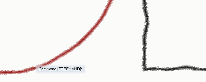
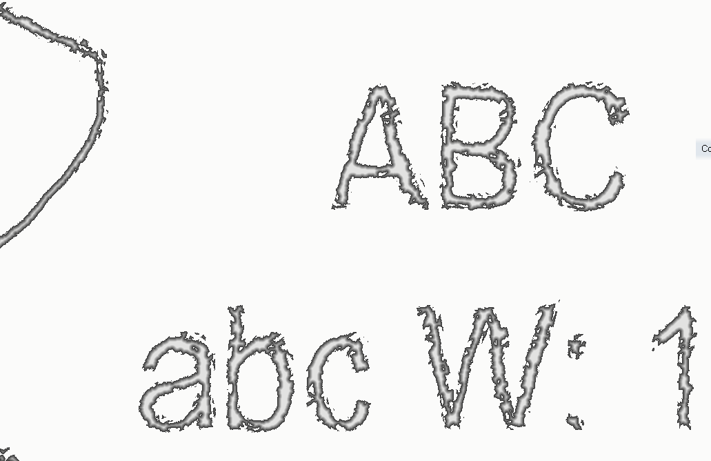
The first two are not super nice and have a touch of waterish... The wider the line, the better the "oil effect".
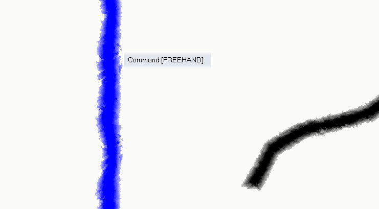
Of course, it can be used on text:
Or with textures rather than solid colours:
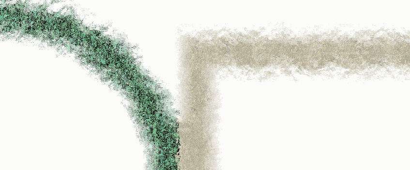
A quite different result can be obtained just by moving up and down the effects on the sheet. For example:
This is an "old ink" effect (for narrow lines).
The wider the line the closer to wet paint or spray it becomes:
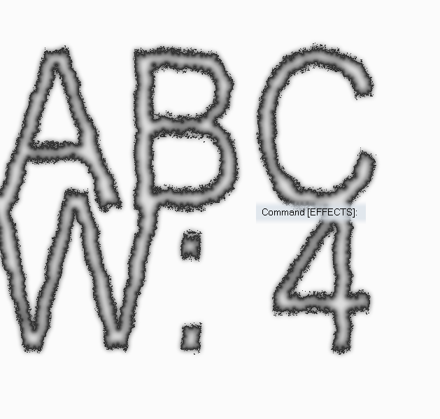
These are all based on "normal" png files:
and this
that was originally provided by @WeathermanSweden.
Using "bump maps" can also result in interesting things (those seem to work, generally, on a more detailed scale, given the same "displacement amount" and "texture size") and you can easily get them from the web.
Below two maps (Mike Schley inks) with the 4 sheets used for the examples above.
To use them just copy the .png images to the "...CC3Plus\Filters\Images" folder.
I suggest to play around a bit to get how the displace efefct works (also trying other displace map files). Adding "blurs", "fades" and "transparencies" can also give some interesting extra twists.
Note that @roflo1 opened a super interesting topic about "pencil drawing effect" and @Lillhans provides a suuper cool way to get that result completely different from the one I explored here.
I think I will explore a bit more this topic, maybe combine the two methods and post the results here.

-
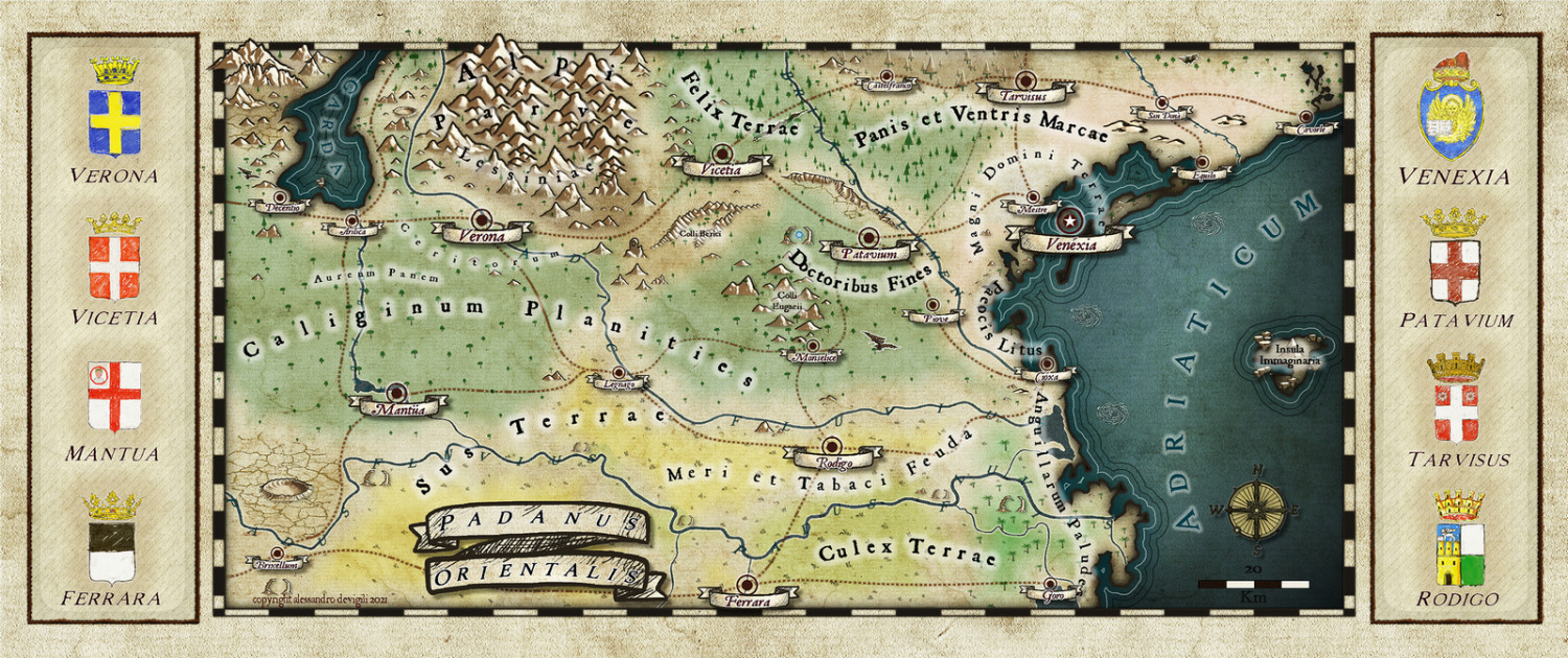
Map of a real region
I worked a bit more on the map, basically changing the heralds png files and trying to add a frame for them in the map.
For the heralds I added a couple of layers on the original files with the style background texture and a mix of darkening and lighting effects. They don't look bad when in the original size. The "paper" effect get a bit lost in the map. I think this is due to the different size of the texture in the map and in the symbol. Something I may work on in the future.
The frame for the heralds don't satisfy me to much. Do you have suggestions on how to make something that could look more drawn?